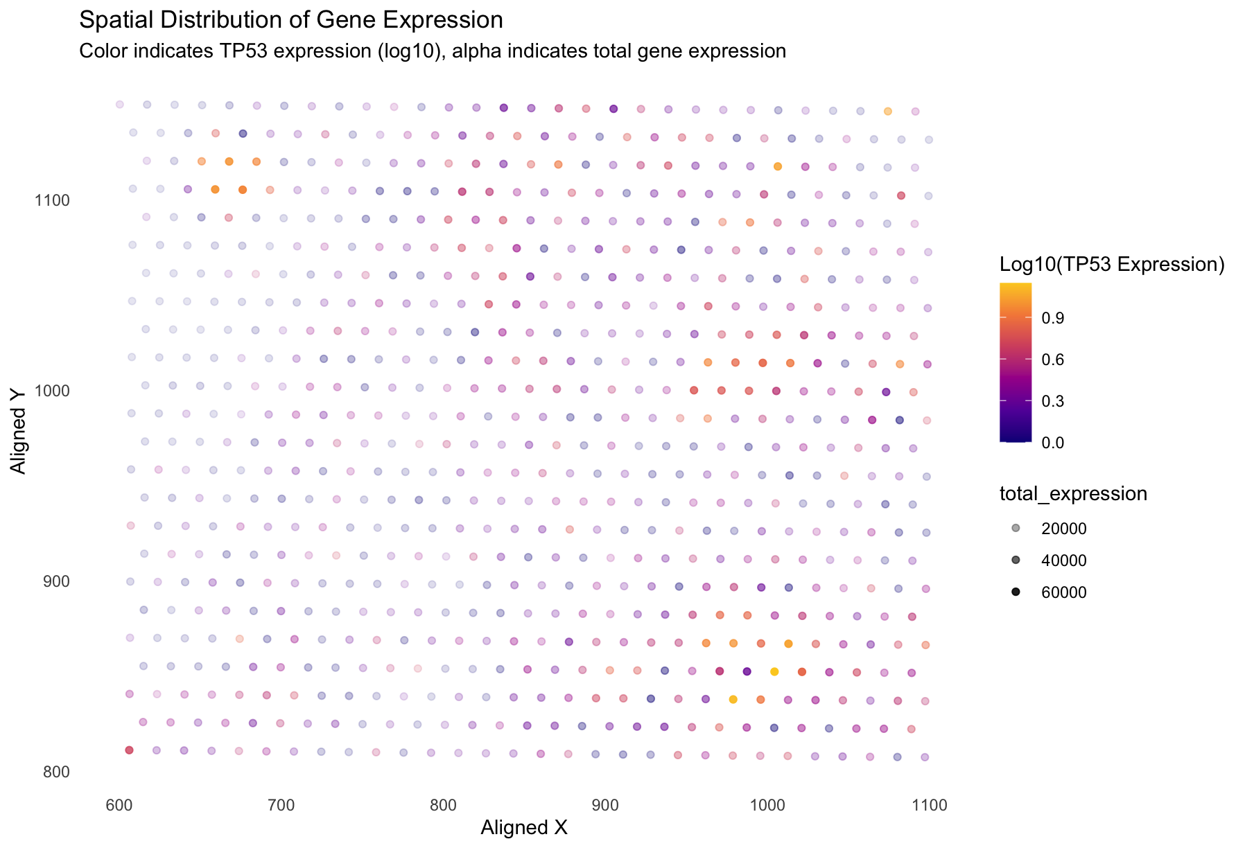
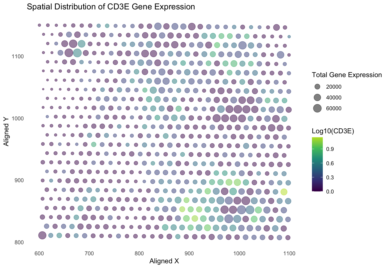
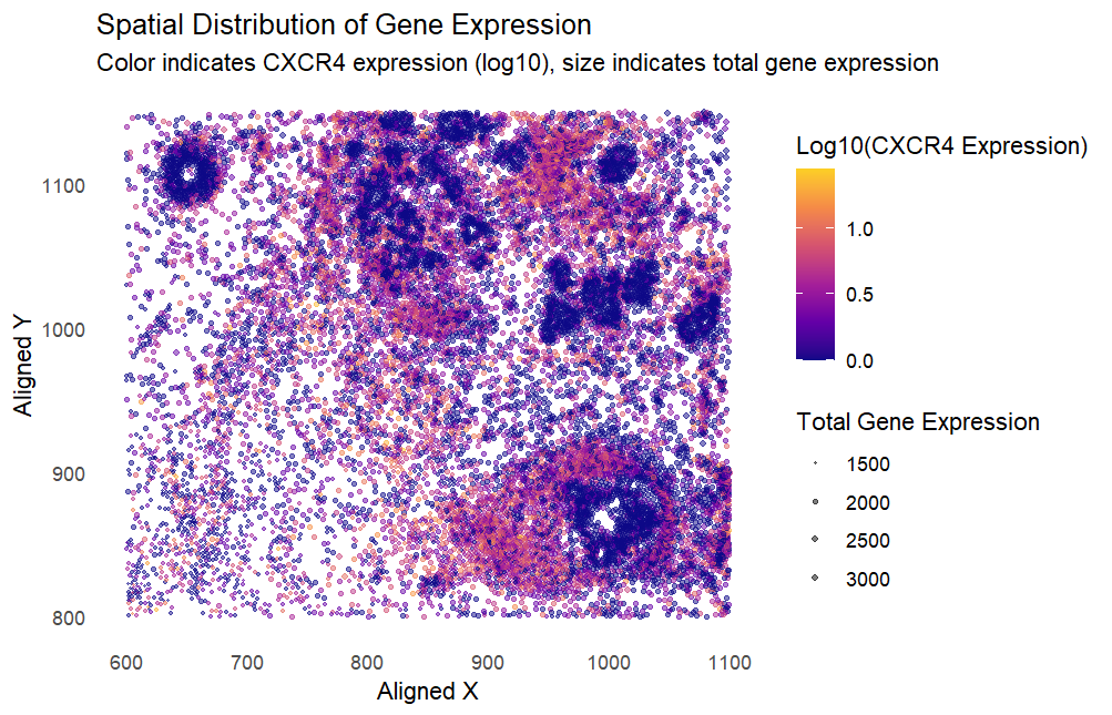
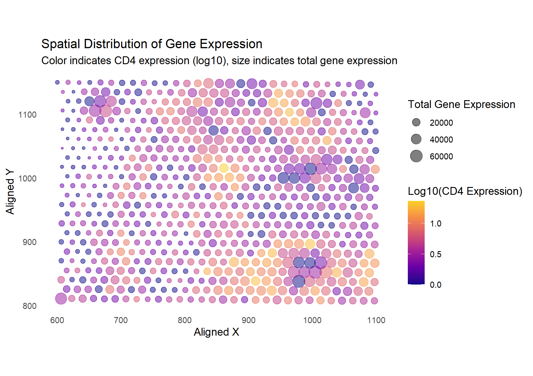
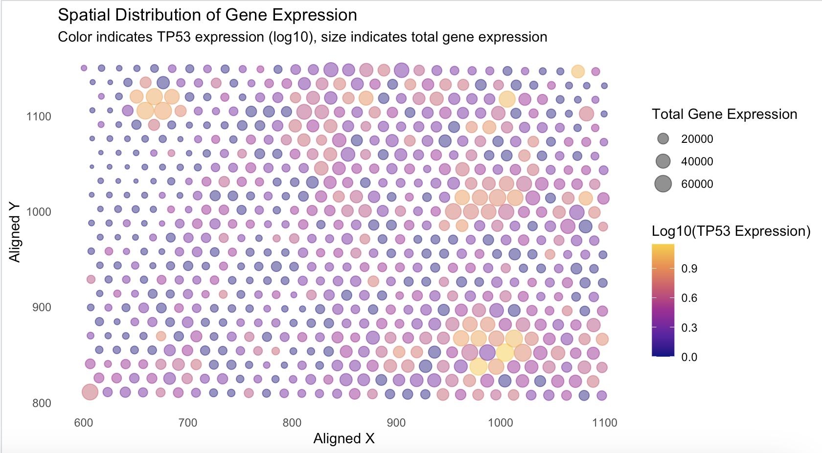
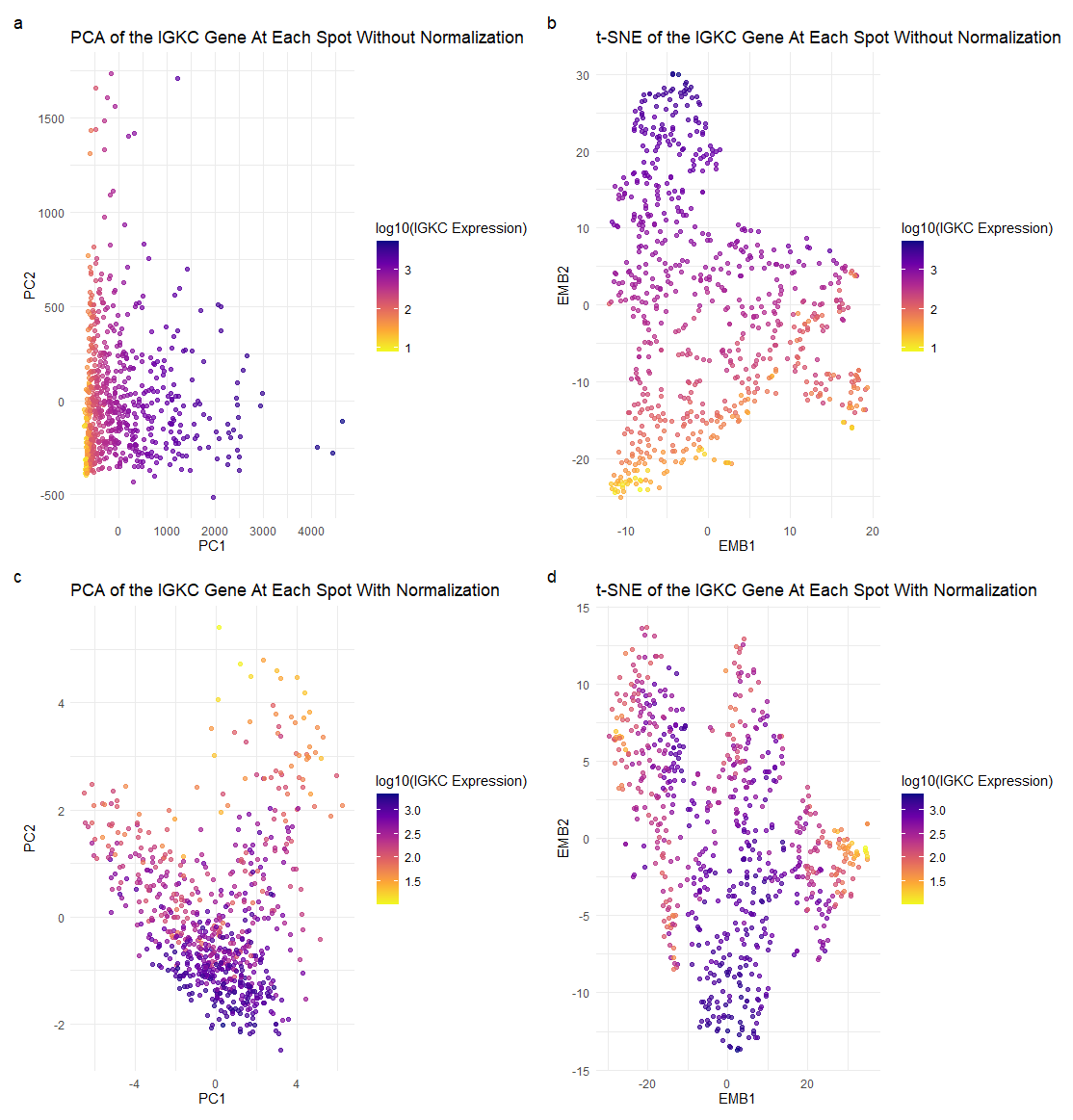
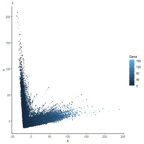
What data types are you visualizing? I am visualizing quantitative data of the log-10-transformed expression level of the TP53 gene, quantitative data of the total gene expression, and spatial data...
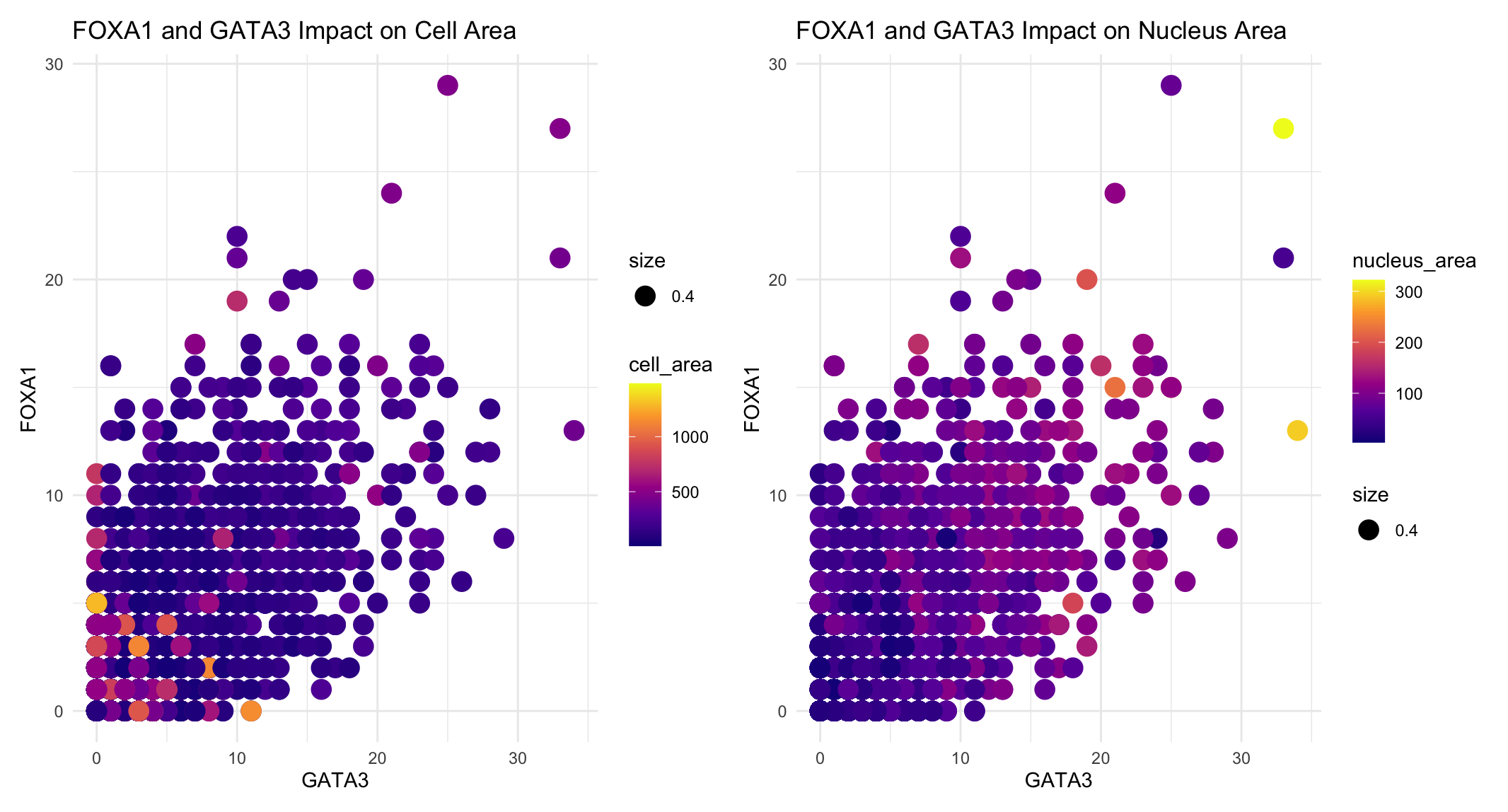
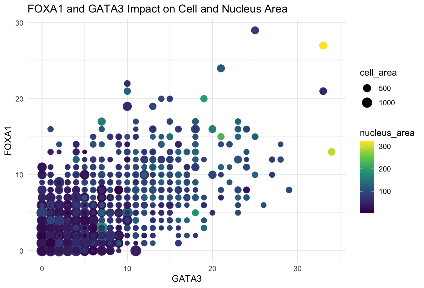
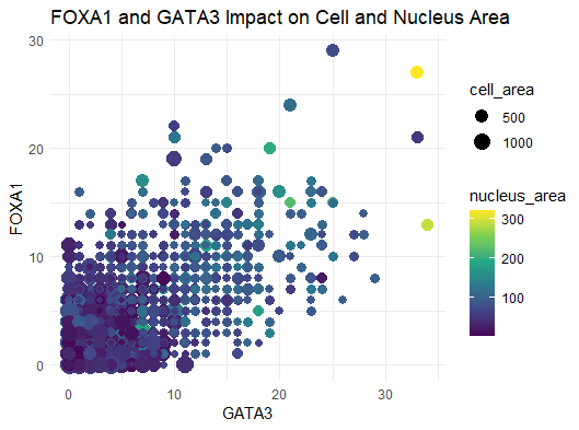
What data types are you visualizing? I am visualizing the quantitative data of the expression count of the FOXA1 gene for each cell, quantitative data of the expression count of...
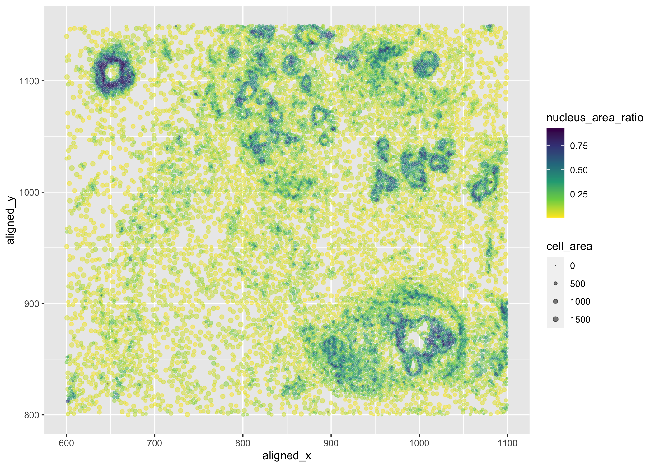
What data types are you visualizing? I am visualizing quantitative data of the ratio of nucleus area to cell area for each cell, quantitative data of the area for each...
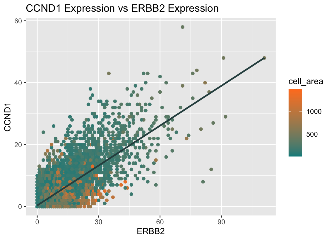
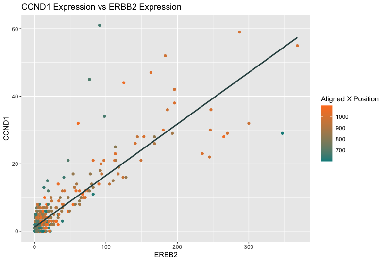
What data types are you visualizing? I am visualizing quantitative data for the expression counts of ERBB2 and CCND1, as well as the quantitative data for the cell area of...
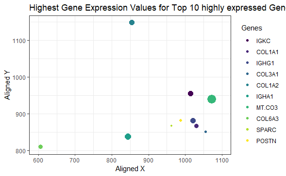
What data types are you visualizing? I am visualizing quantitative data of the expression count of the top 10 highly expressed genes in the eevee dataset, quantitative data of the...
What data types are you visualizing? I am visualizing the quantitative data of the expression count of the FOXA1 gene for each cell, quantitative data of the expression count of...
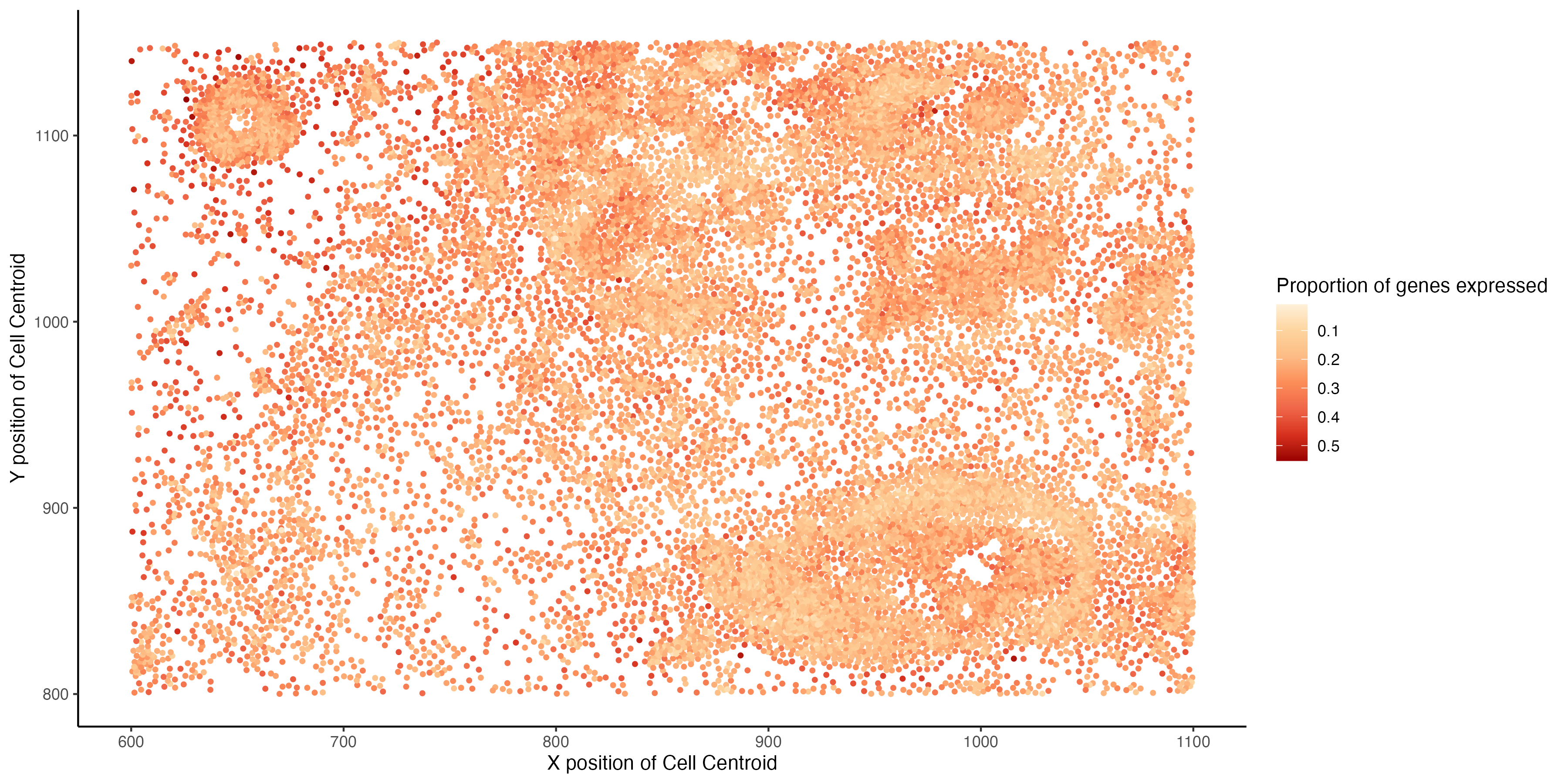
[description] For my data visualization, I analyzed 15 different genes and displayed the proportion of genes expressed in a certain spot, also showing their location. I have spatial data that...
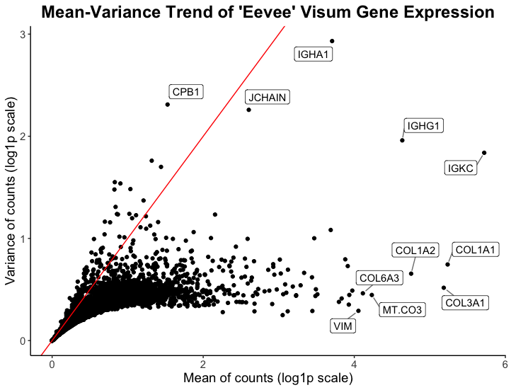
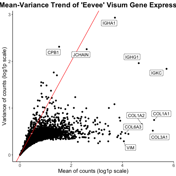
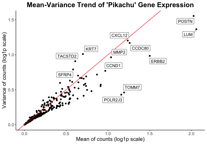
What data types are you visualizing? I am visualizing quantitative and categorical data. The quantitative data is the mean and variance of gene expression for all genes, while the categorical...
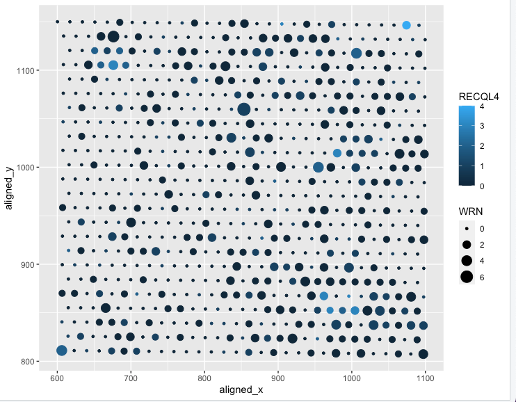
What data types are you visualizing? I am visualizing quantitative data of the expression count of the WRN gene for each spot, quantitative data of expression count of the RECQL4...
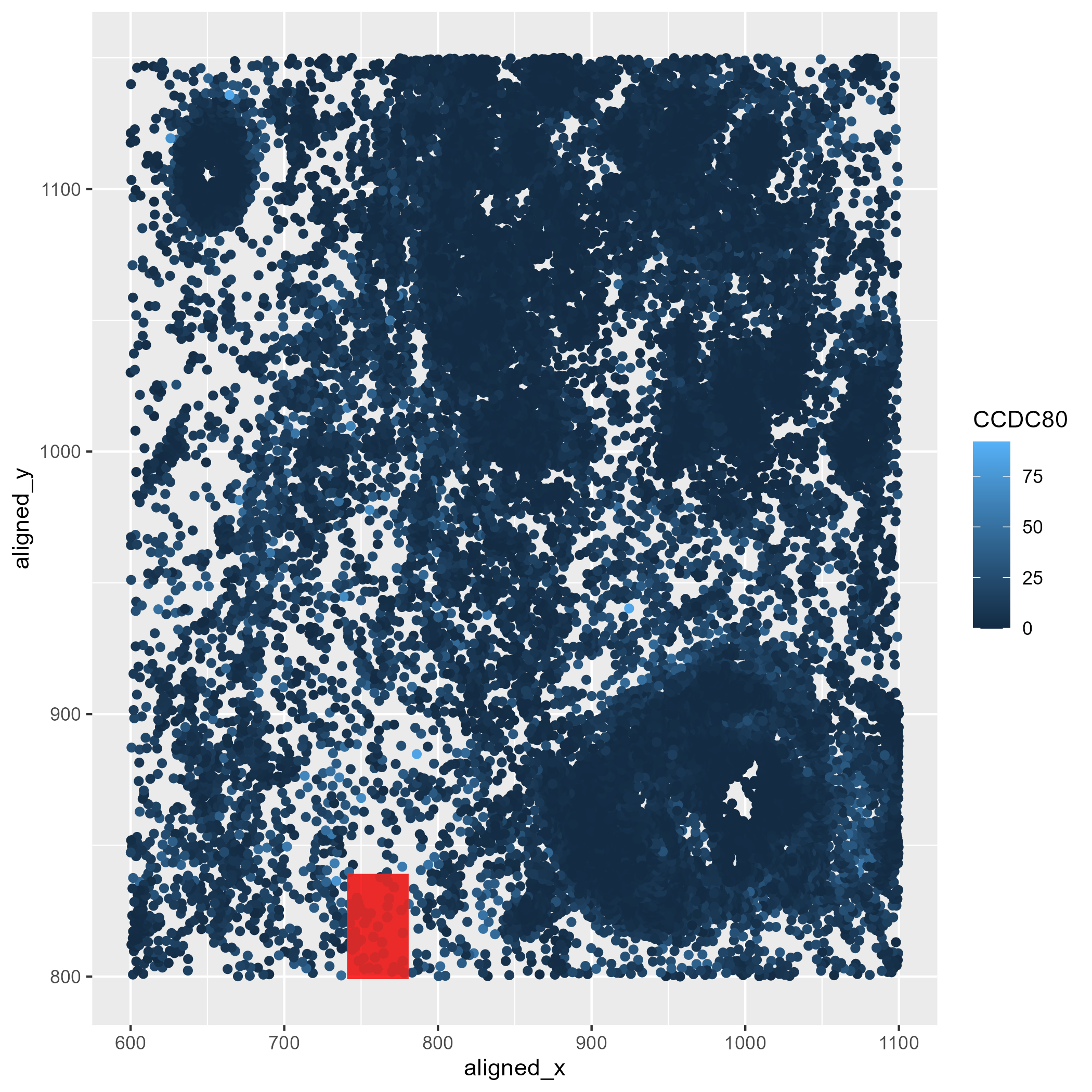
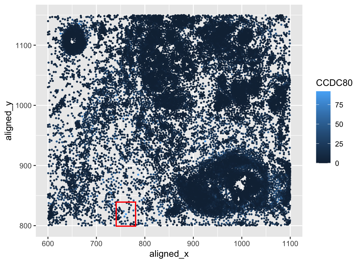
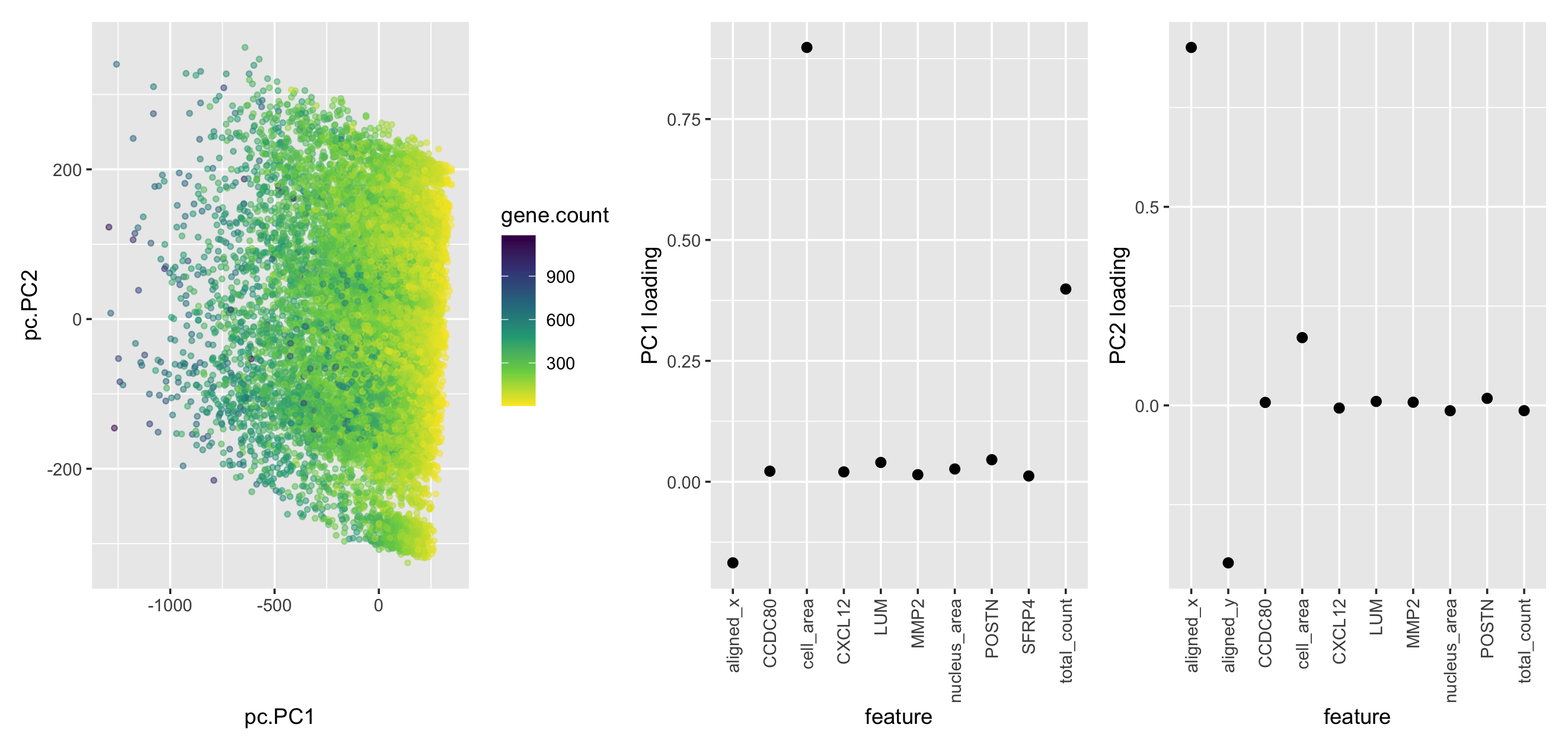
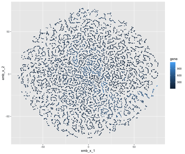
What data types are you visualizing? In the following plot, quantitative data of the expression count of the CCDC80 gene for each cell was generated. X and Y coordinates were...
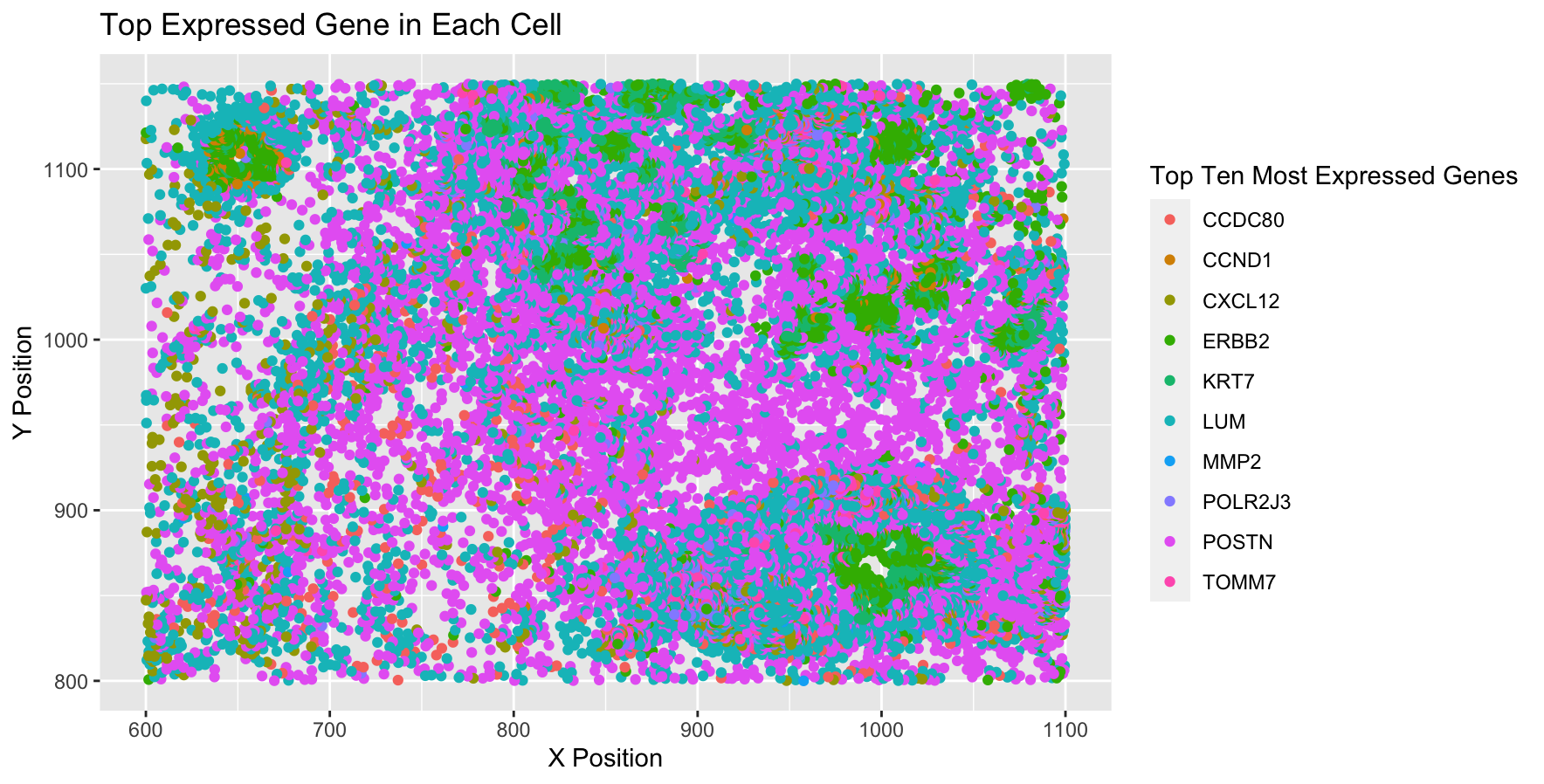
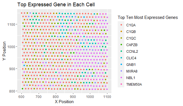
What data types are you visualizing? I am visualizing spatial data regarding the x,y centroid positions for each cell, and I am visualizing the categorical data representing the most expressed...
I am visualizing the spatial variation of the proportion of total number of genes expressed by a cell. The proportion is computed for each cell as the number of genes...
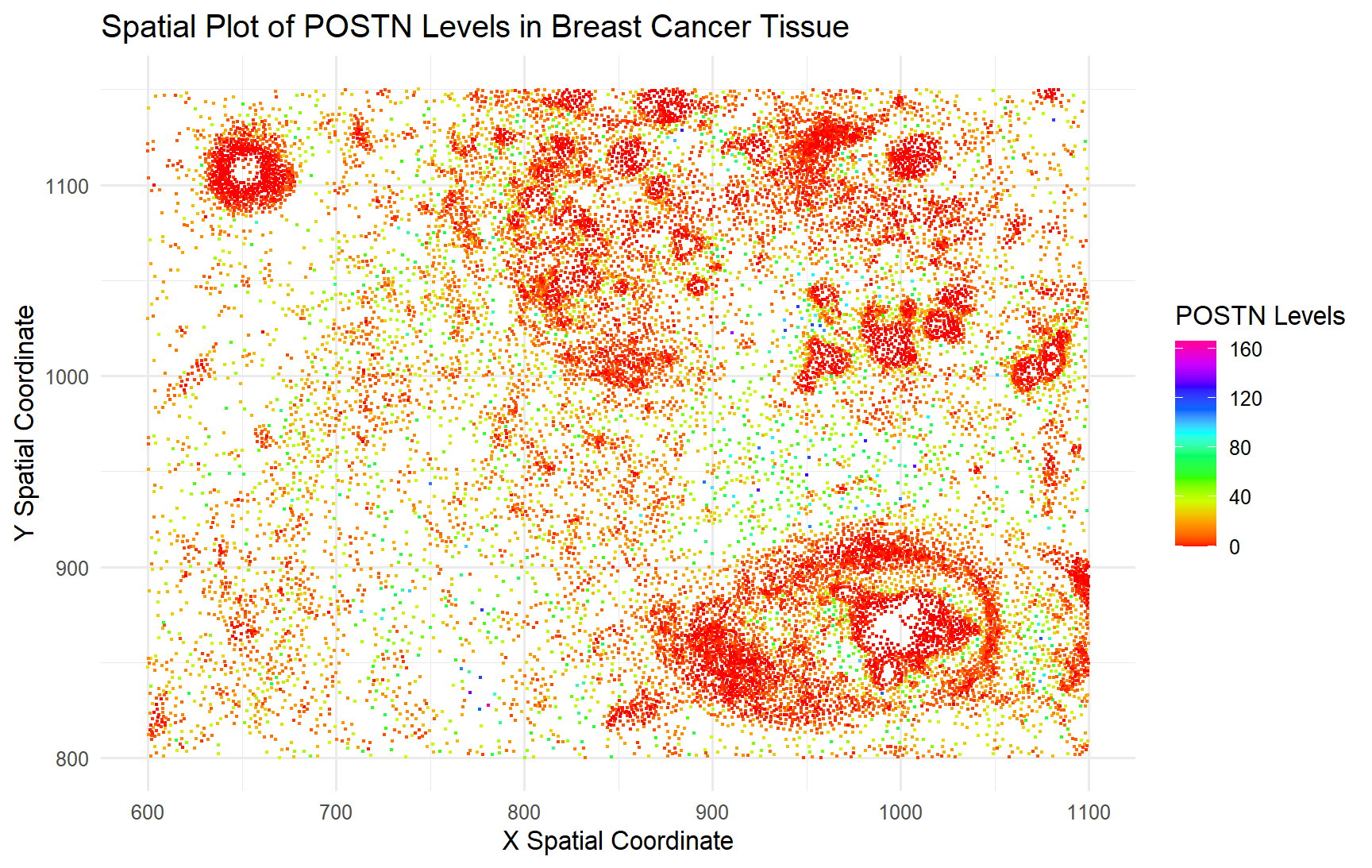
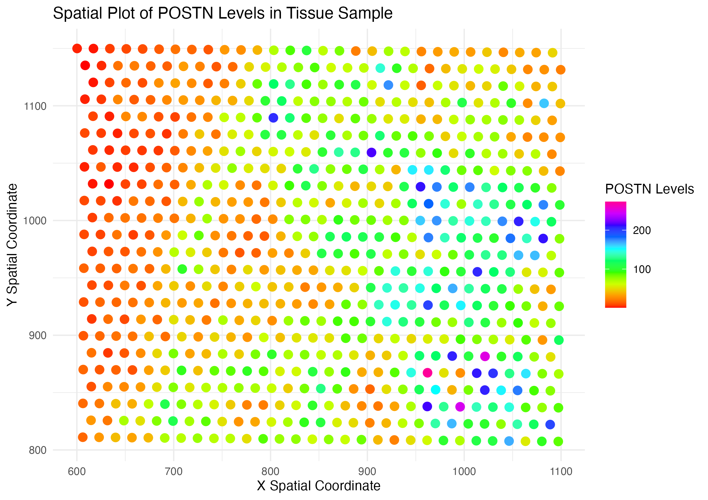
What data types are you visualizing? I wanted to visualize quantitative data in regards to the gene expression for POSTN, the most expressed gene on average across all the cells,...
What data types are you visualizing? I am visualizing quantitative data of the log-10-transformed expression level of the TP53 gene, quantitative data of the total gene expression at each spot,...
What data types are you visualizing? I am visualizing three types of quantitative data: firstly, the spatial locations of each cell given by their (x,y) Cartesian coordinates; secondly, the area...
What data types are you visualizing? I am encoding spatial data because you can see the genes being expressed in the cell via the x,y alignment. I am also encoding...
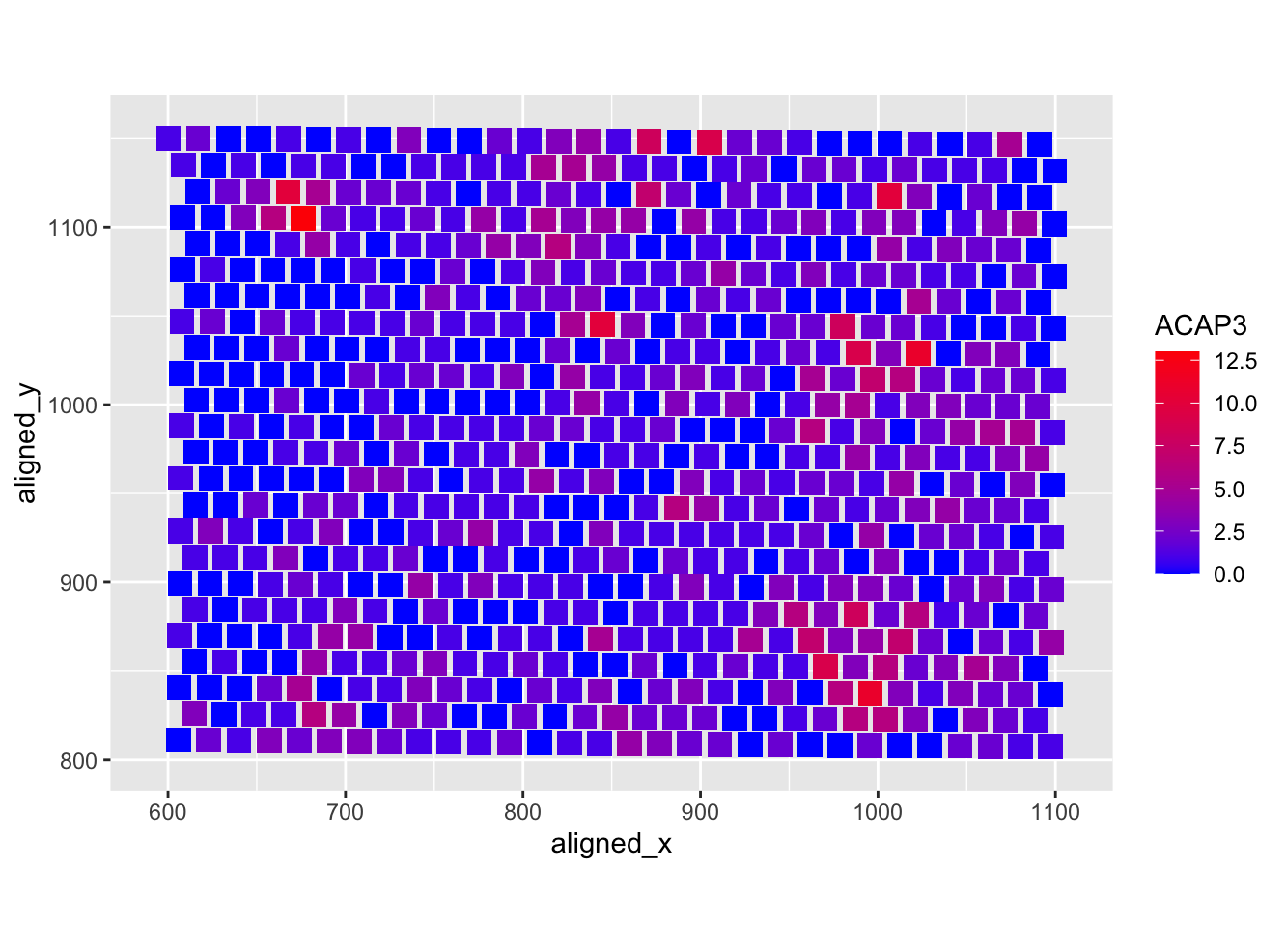
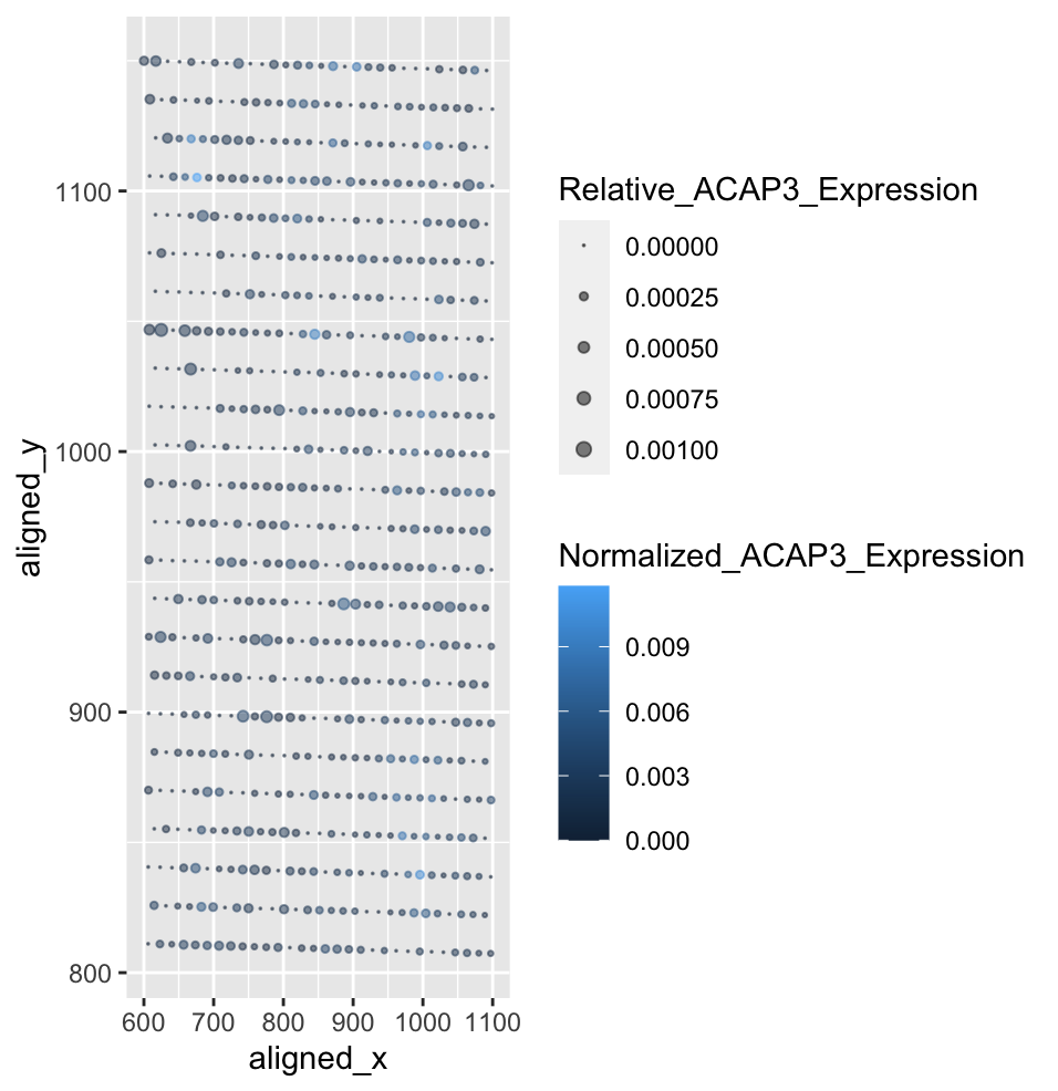
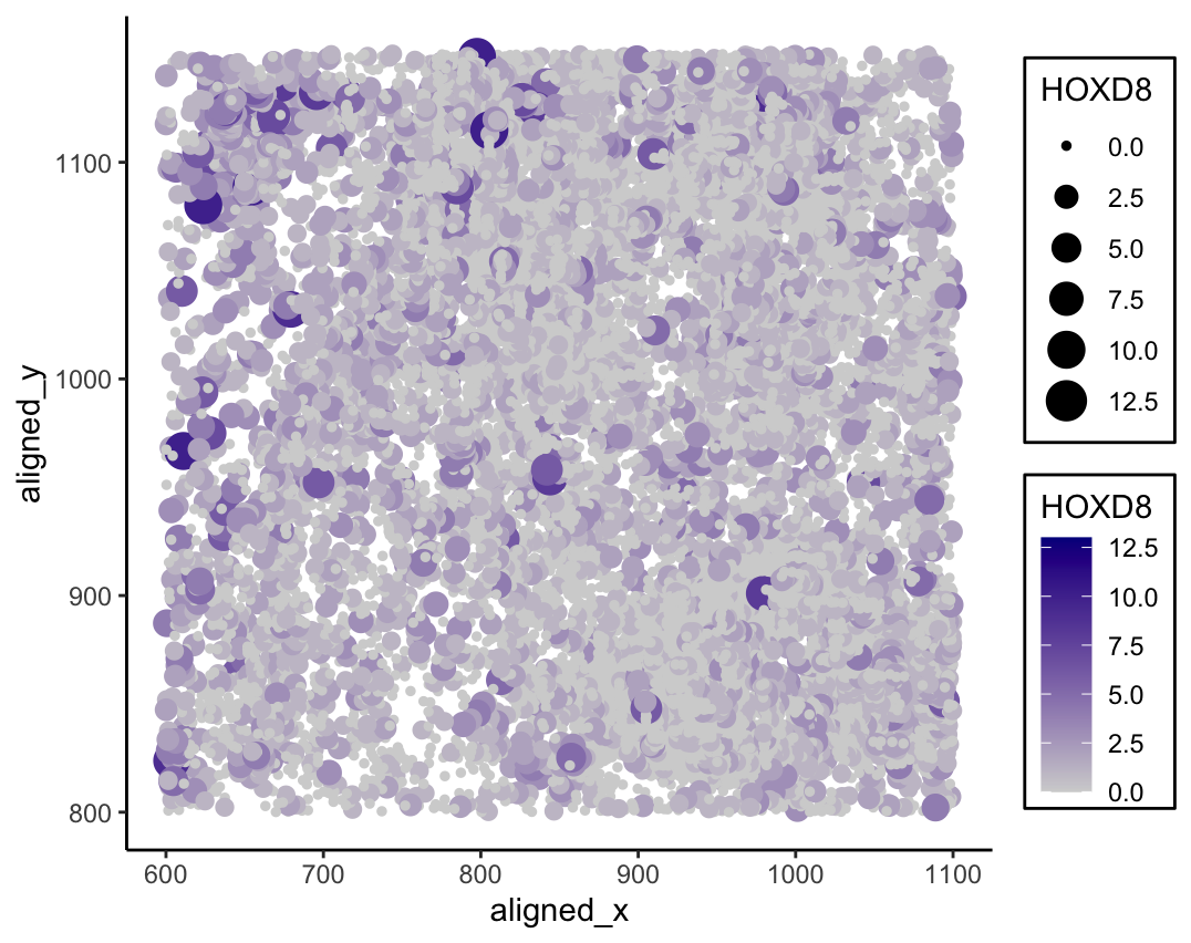
What data types are you visualizing? I am visualizing quantitative data of the expression count of the ACAP3 gene within a single cell and spatial data regarding the x,y position...
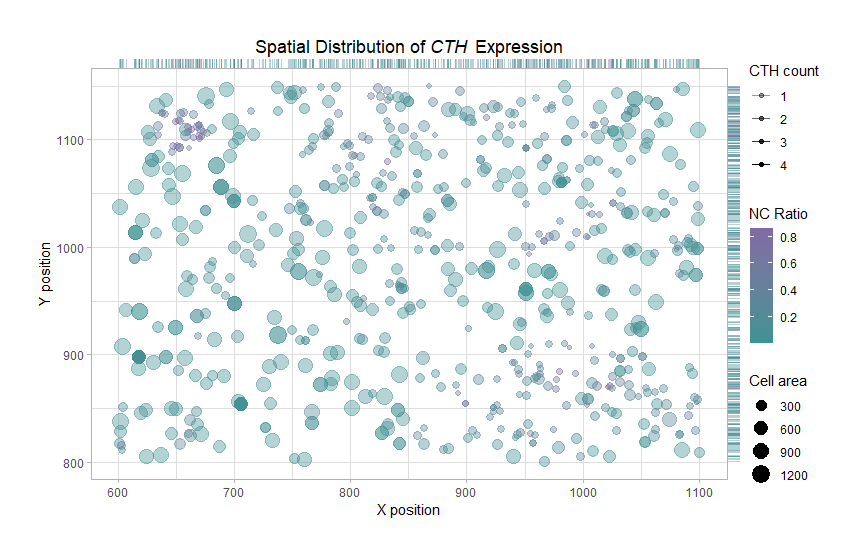
What data types are you visualizing? In homework1, I am visualizing a subset of the spatially resolved transcriptomic data expressing CTH (pikachu group). The visualization contains quantitaive data of the...
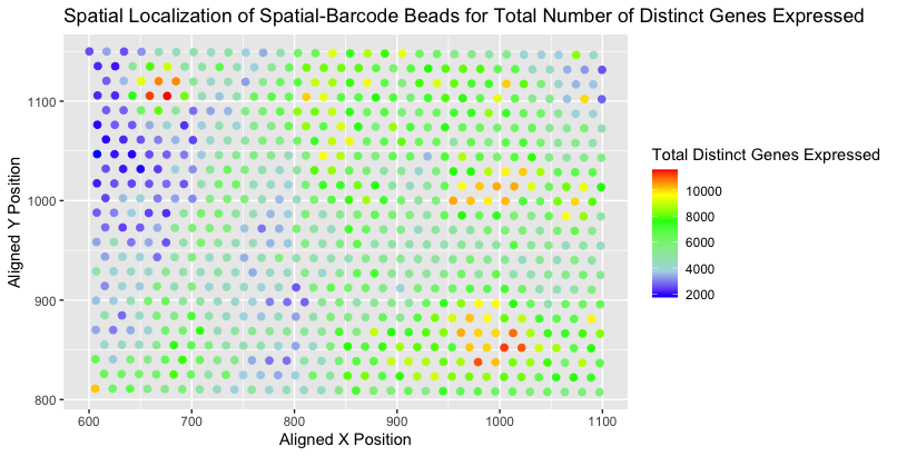
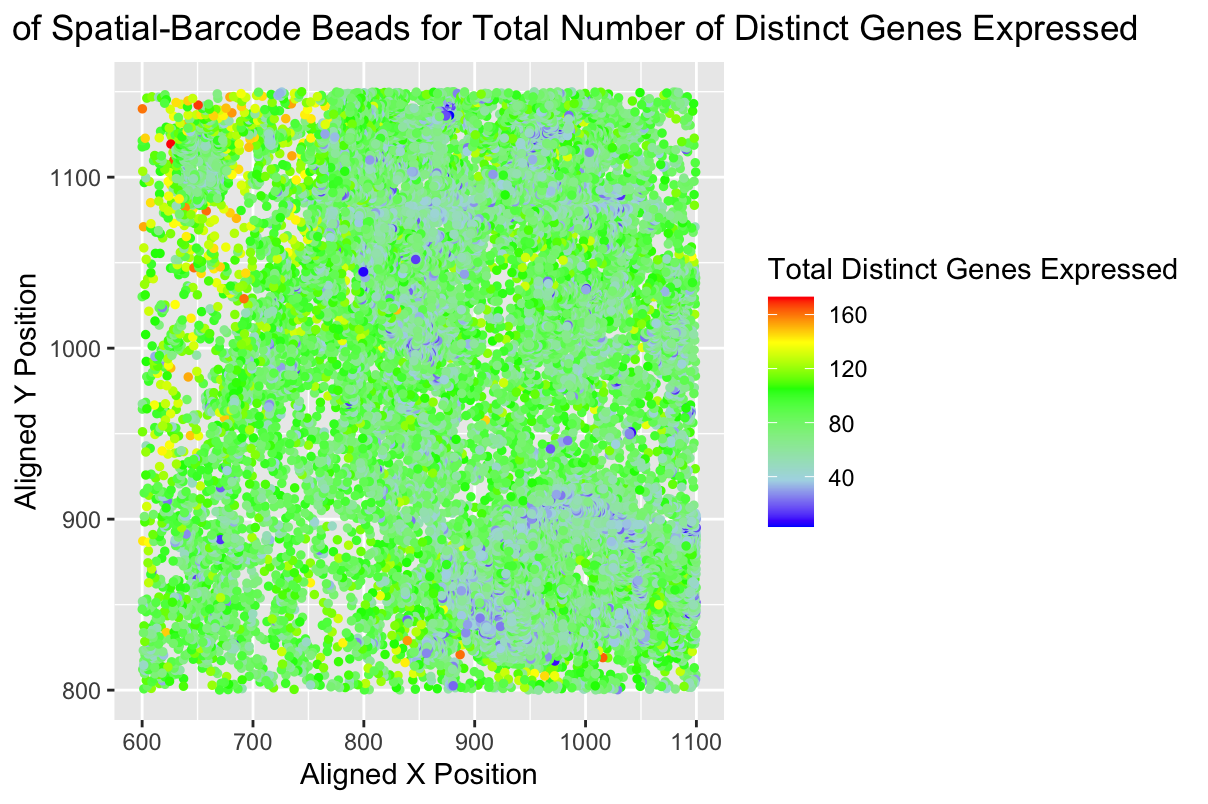
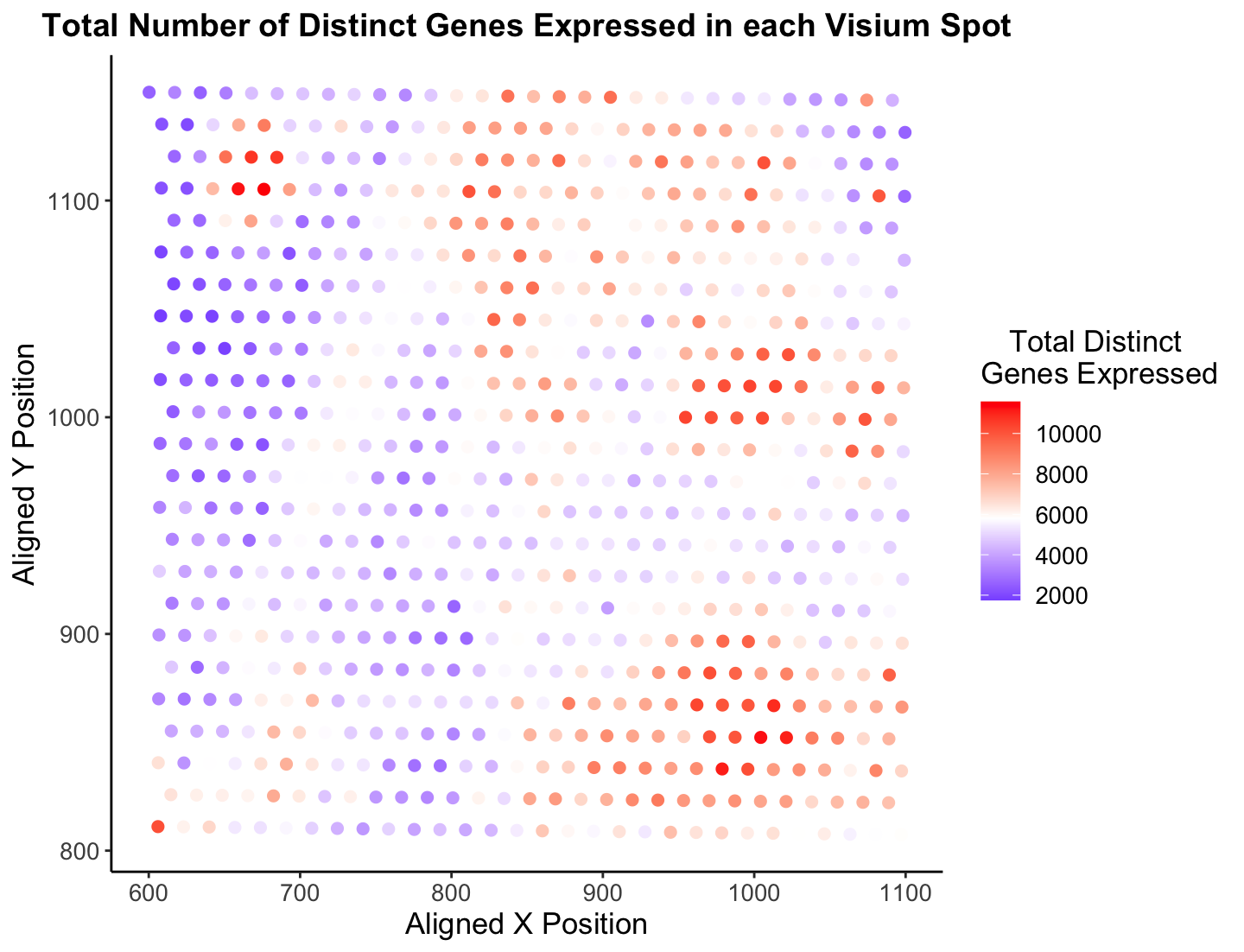
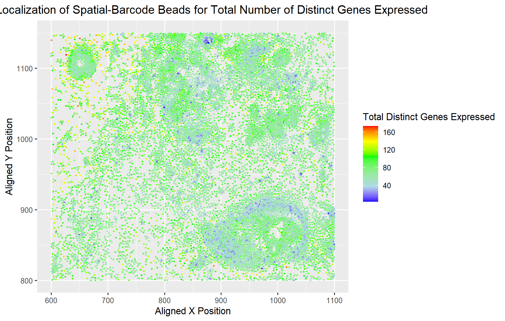
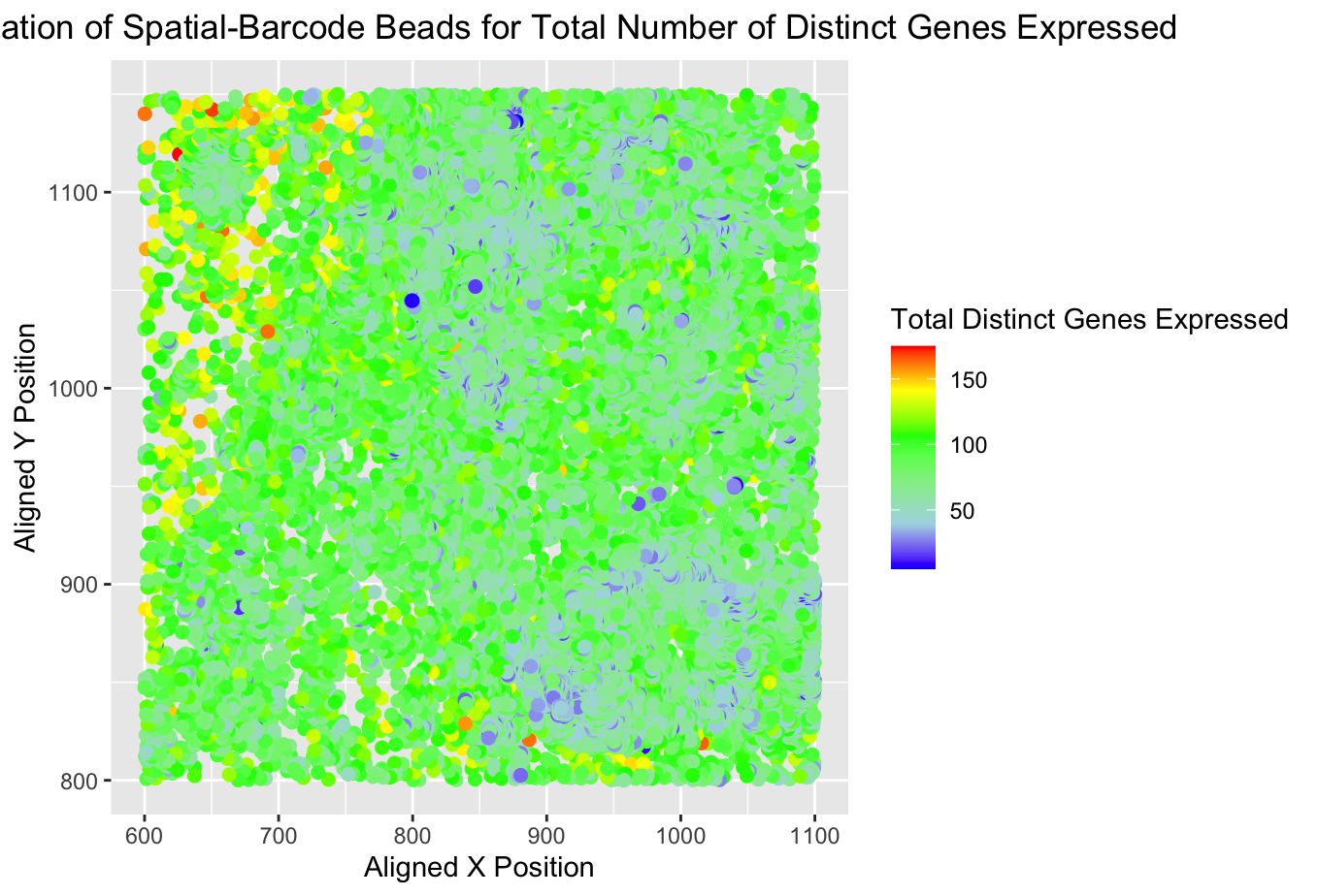
What data types are you visualizing? I am visualizing the (1) quantitative data for the total number of distinct genes expressed for each spatial-barcode bead and (2) spatial data for...
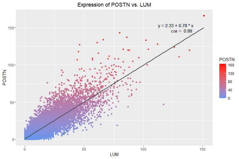
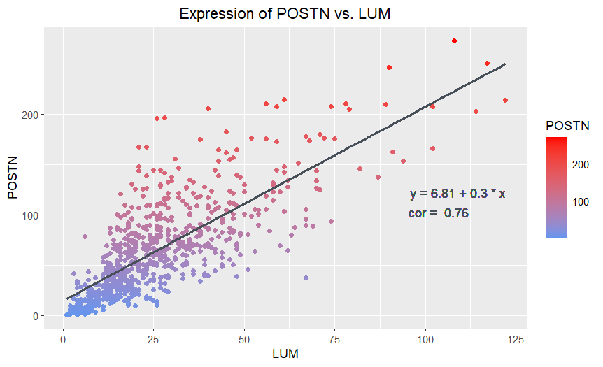
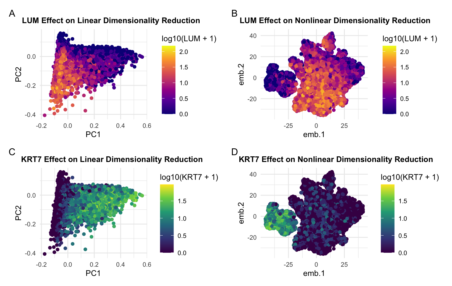
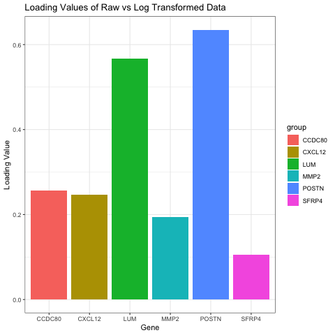
What data types are you visualizing? I am visualizing quantitative data of the expression counts of the LUM gene and its relationship to the expression counts of the POSTN gene....
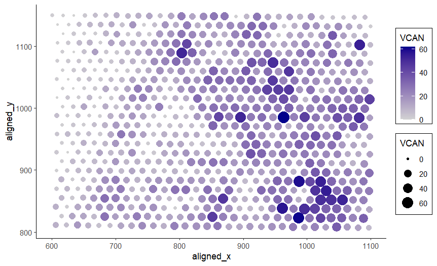
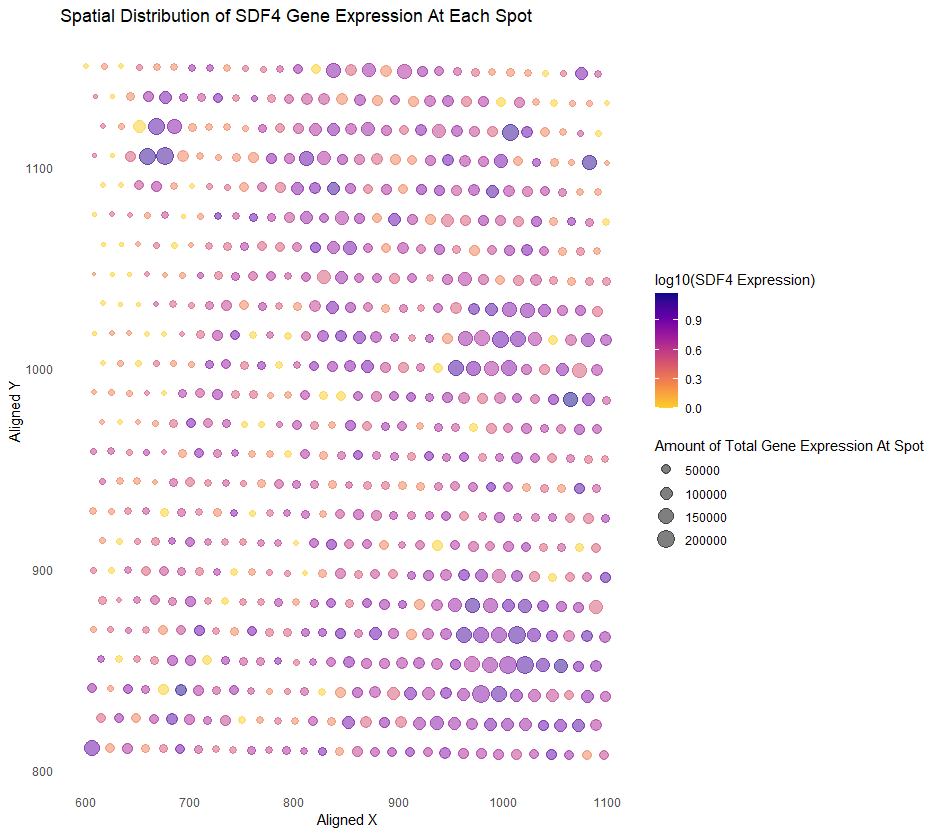
What data types are you visualizing? I am visualizing quantitative data of the expression count of the VCAN gene for each spot, and spatial data regarding the aligned x and...
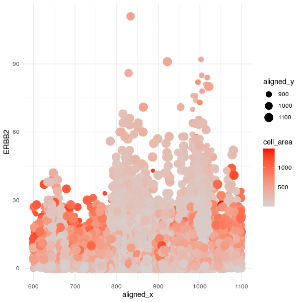
What data types are you visualizing? I am visualizing quantitative data of the expression count of the ERBB2 gene for each cell, quantitative data of the area for each cell,...
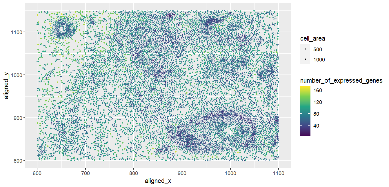
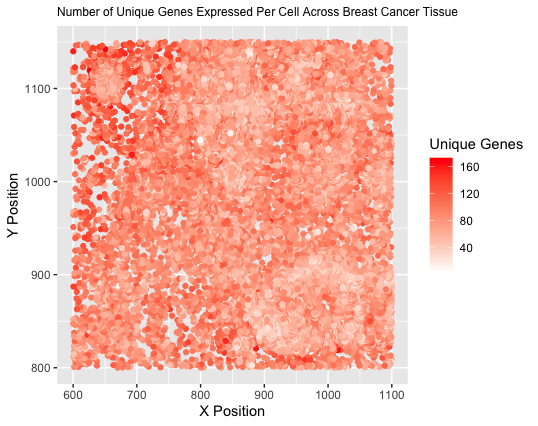
What data types are you visualizing? I am visualizing quantitative data of the number of unique genes expressed in each cell, as well as spatial data including the x and...
What data types are you visualizing?
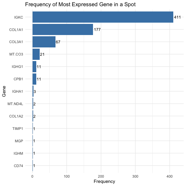
We are visualizing quantitative data, the number of spots in which the gene is most expressed, and categorical data, the gene.
What data types are you visualizing? The spatial data regarding the x,y centroid positions for each cell are visualized, and the categorical data representing the most expressed gene in each...
Caleb’s (challin1) visualization seeks to make more salient which genes have high mean or variance in expression. I believe this visualization is very effective because it uses position to encode...
Whose code are you applying? Provide a JHED. I am applying the code by Kiki Zhang (szhan128) for the eevee dataset to my pikachu dataset. There are two changes that...
Whose code are you applying? Provide a JHED
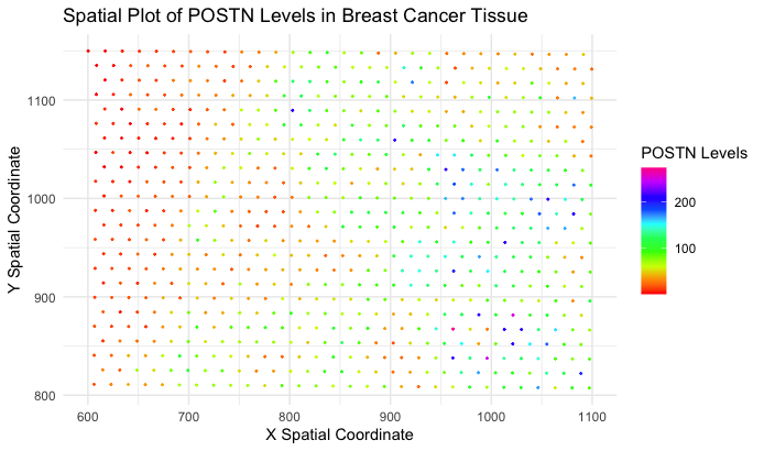
I am critiquing Wenyu Yang’s (wyang51) “A Spatial Plot of POSTN Levels in Breast Cancer Tissue” https://jef.works/genomic-data-visualization-2024/blog/2024/01/28/wyang51/.
Whose code are you applying? Provide a JHED I am recreating the code of aperei13. Critique the resulting visualization when applied to your data. Do you think the author was...
Whose code are you applying? Provide a JHED
I am applying the code of Amanda Kwok (originally for the pikachu dataset) to the eevee dataset. Her JHED is akwok1.
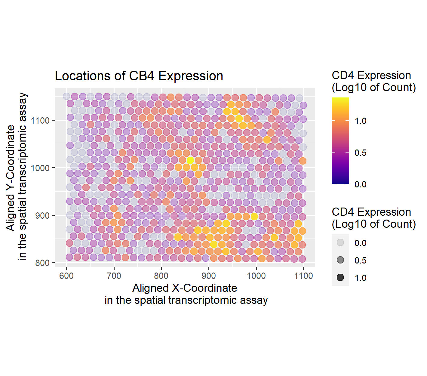
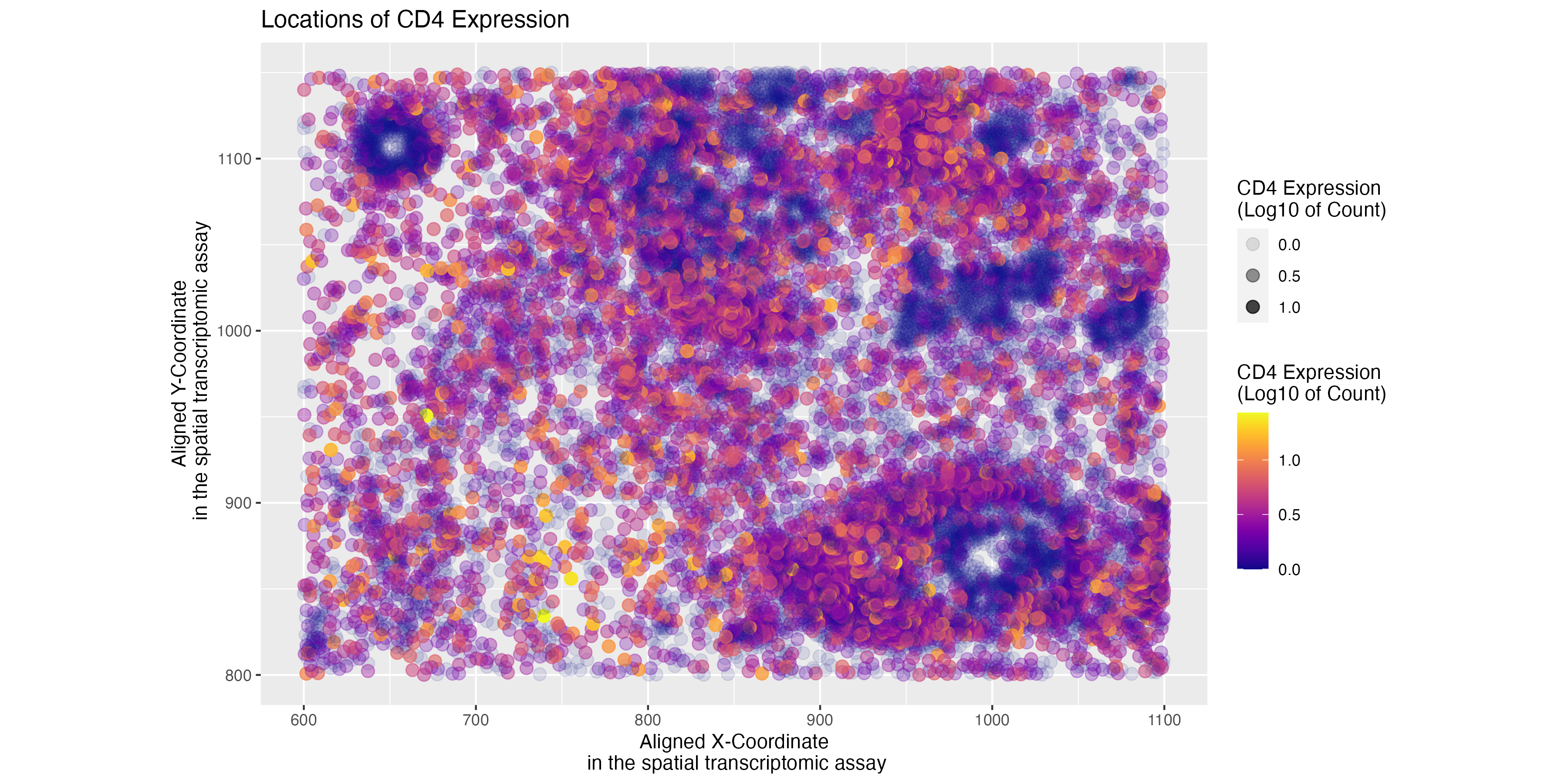
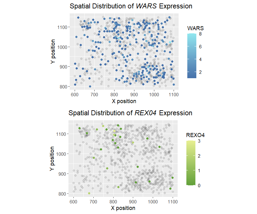
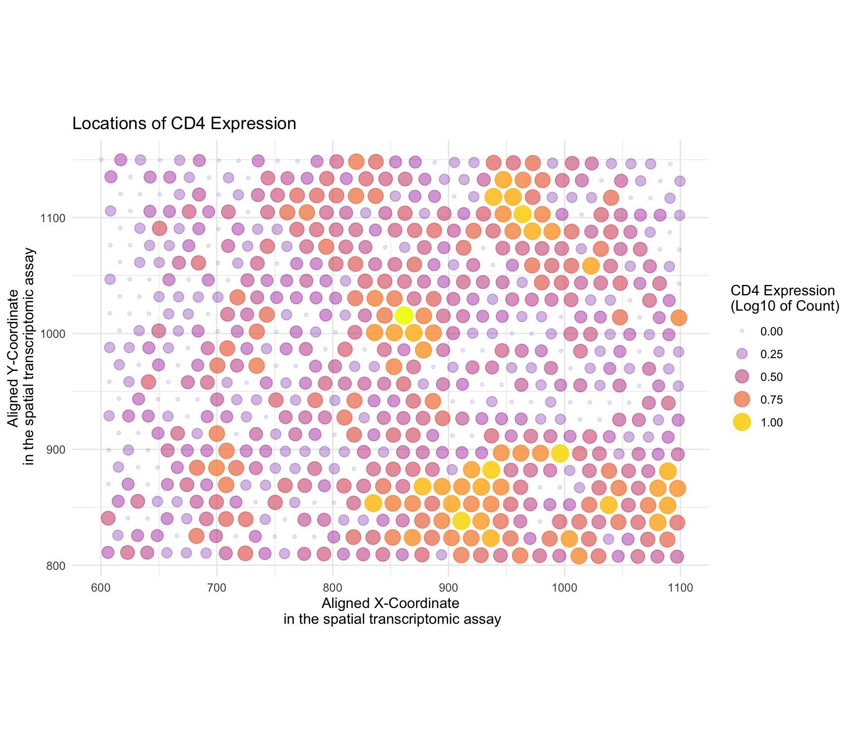
Whose code are you applying? Provide a JHED I am applying code by ewhang. The author visualized the eevee dataset. Their goal was to see the specific locations of CD4...
Whose code are you applying? Provide a JHED
I am applying Wenyu Yang’s (wyang51) code onto the eevee dataset. The source and modified code can be
found below.
Whose code are you applying? Provide a JHED I am applying Andrew’s code (aying2). I switched out the gene he used (VCAN), as it was not in the pikachu dataset....
What data types are you visualizing? I am visualizing quantitative data of the most expressed gene POSTN for each cell, and spatial data regarding the x,y positions for each cell...
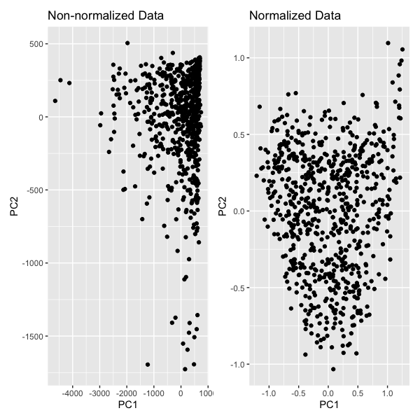
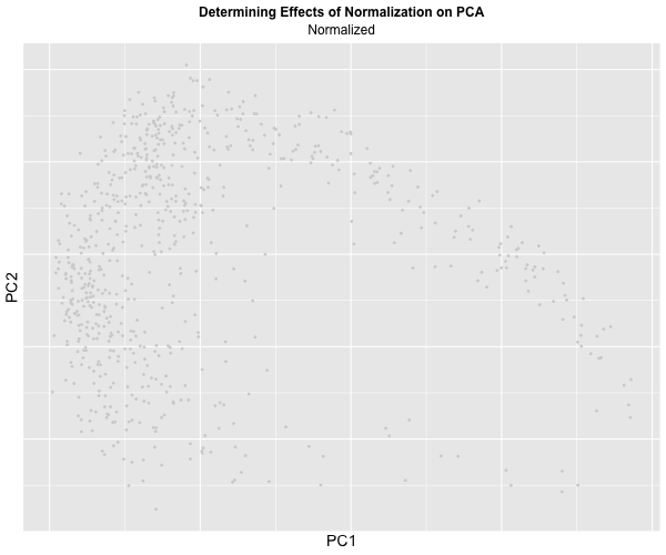
With this visualization, we are comparing PCA with non-normalized and normalized data. We are encoding the categorical data, spots, using the geometric primitive of point. We encoded the quantitative data,...
What question are you exploring?
What happens if I do or not not normalize and/or transform the gene expression data (e.g. log and/or scale) prior to dimensionality reduction?
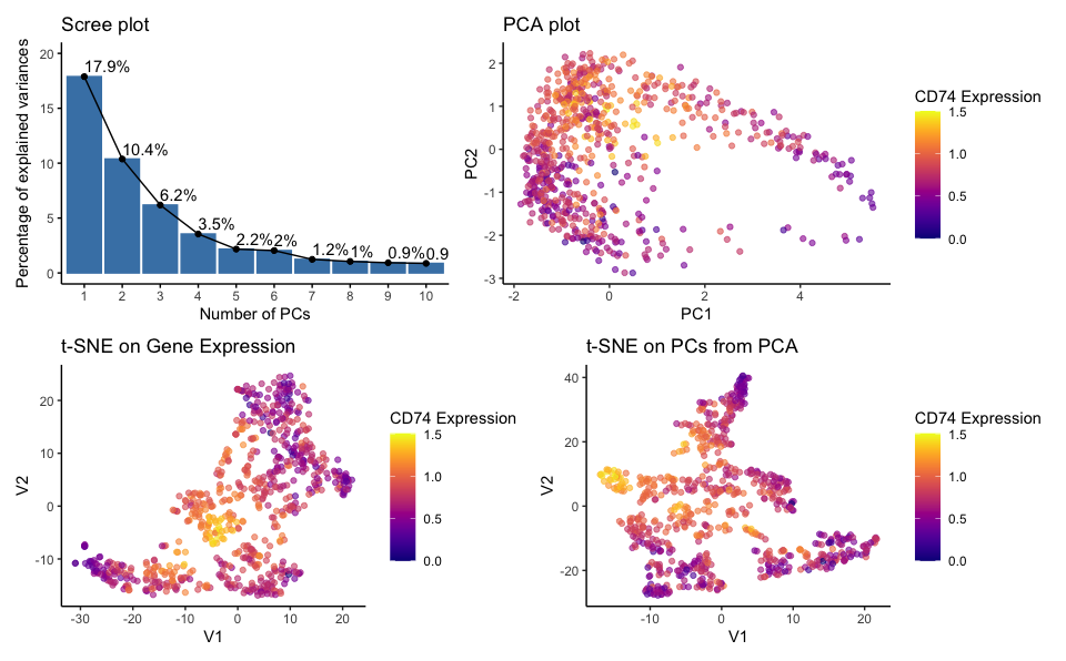
What data types are you visualizing? quantatative data of the percentage of variance explained by each principal component; quantatative data of CD74 gene expression; quantatative data of pc1 and pc2...
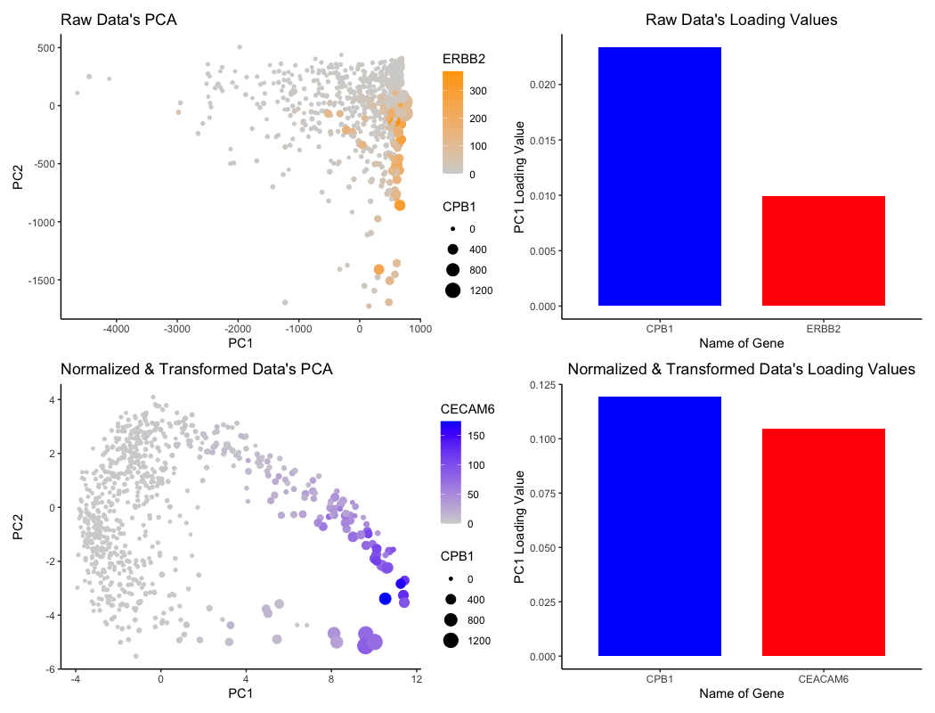
Description of data visualization In this data visualization, I have plotted four graphs. The primary aim of the visualization is to compare between gene expression data that has not been...
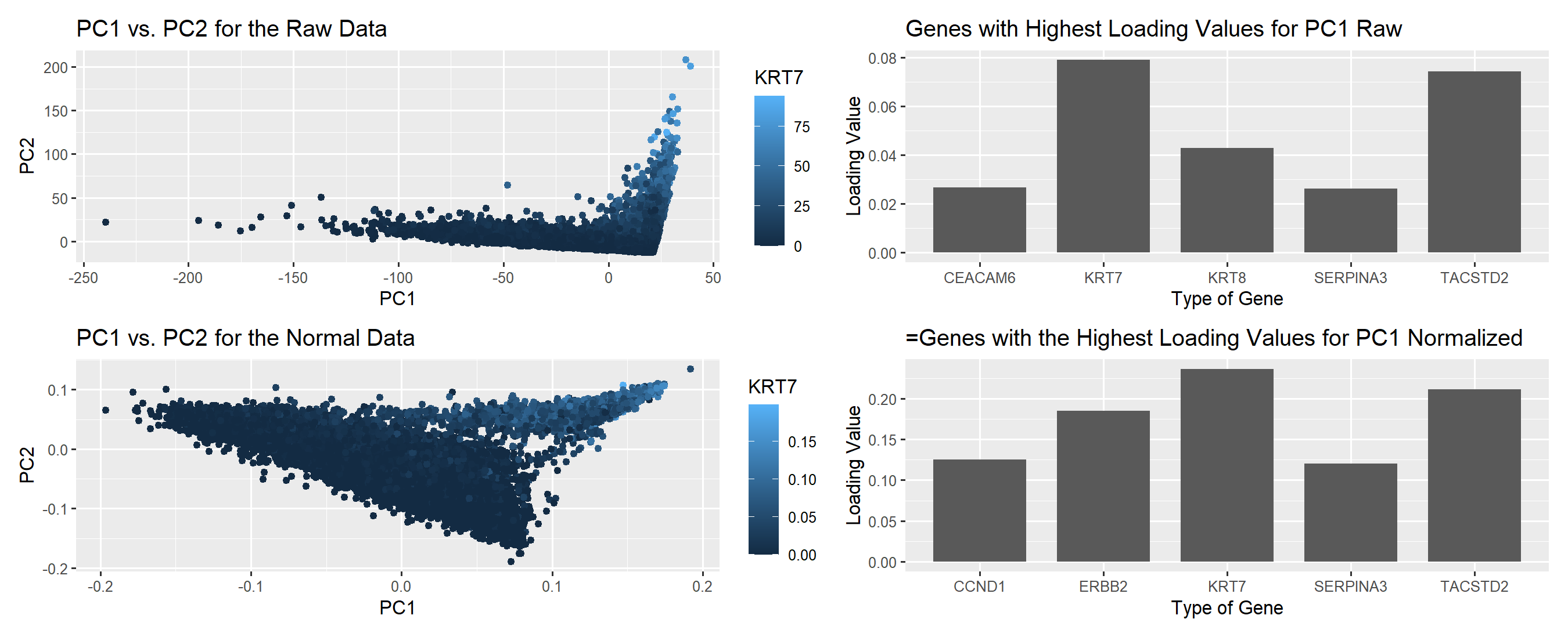
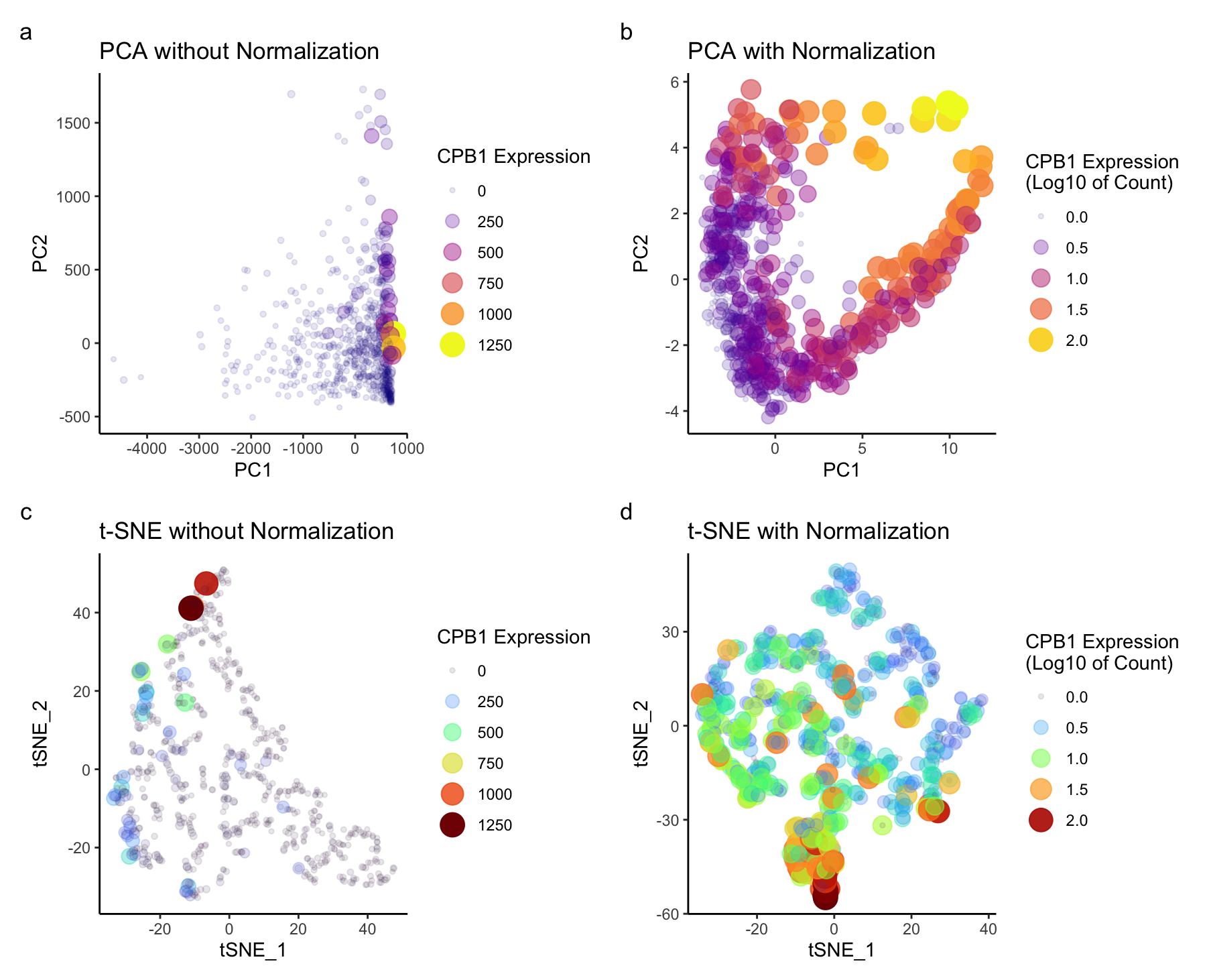
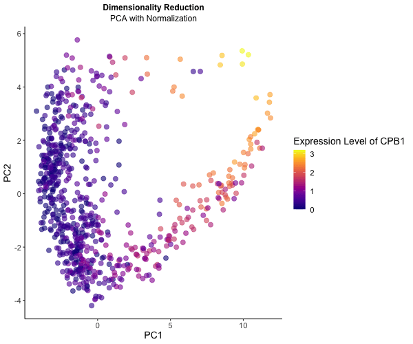
What data types are you visualizing? For the graph titled “Raw Data’s PCA”, I am visualizing the (1) quantitative data of ERBB2 expression, (2) quantitative data of CPB1 expression, (3)...
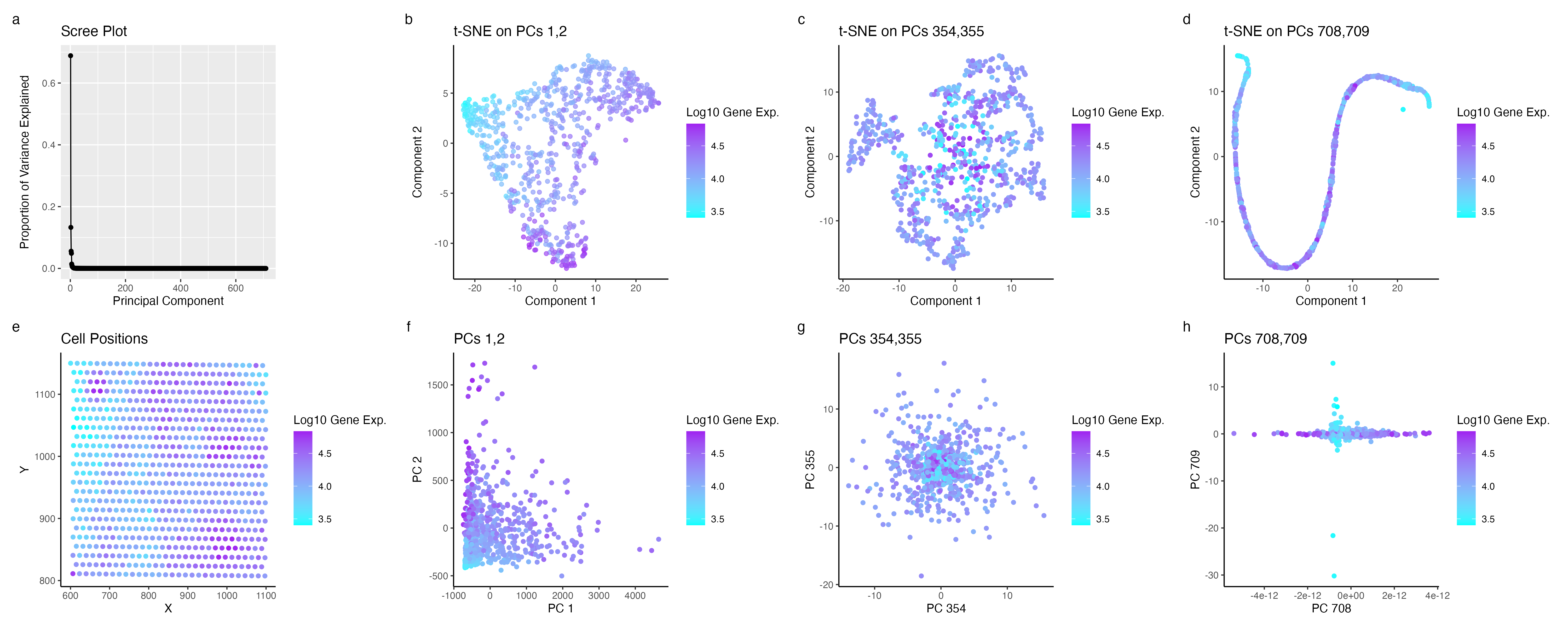
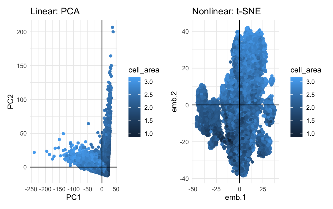
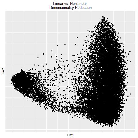
What’s the difference if I perform linear or nonlinear dimensionality reduction to visualize my cells in 2D? There are fundamental differences in performing Principal Component Analysis (PCA), or a linear...
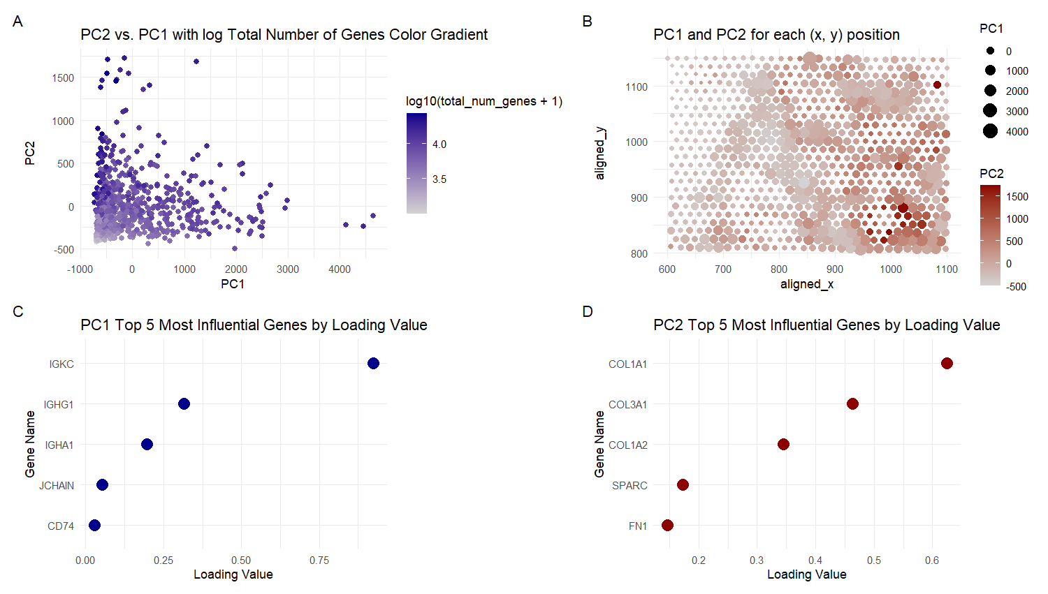
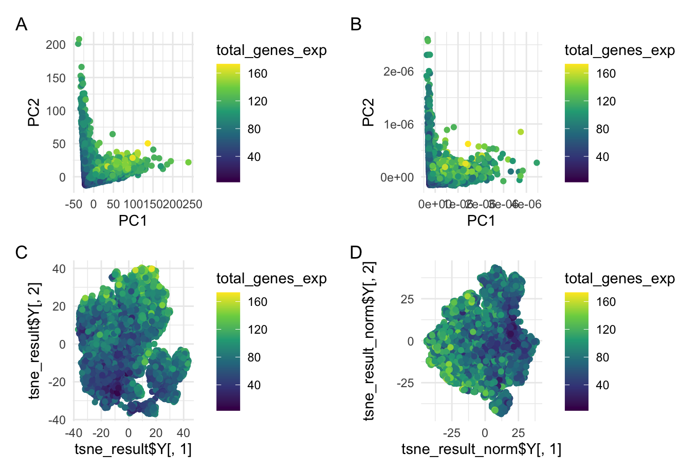
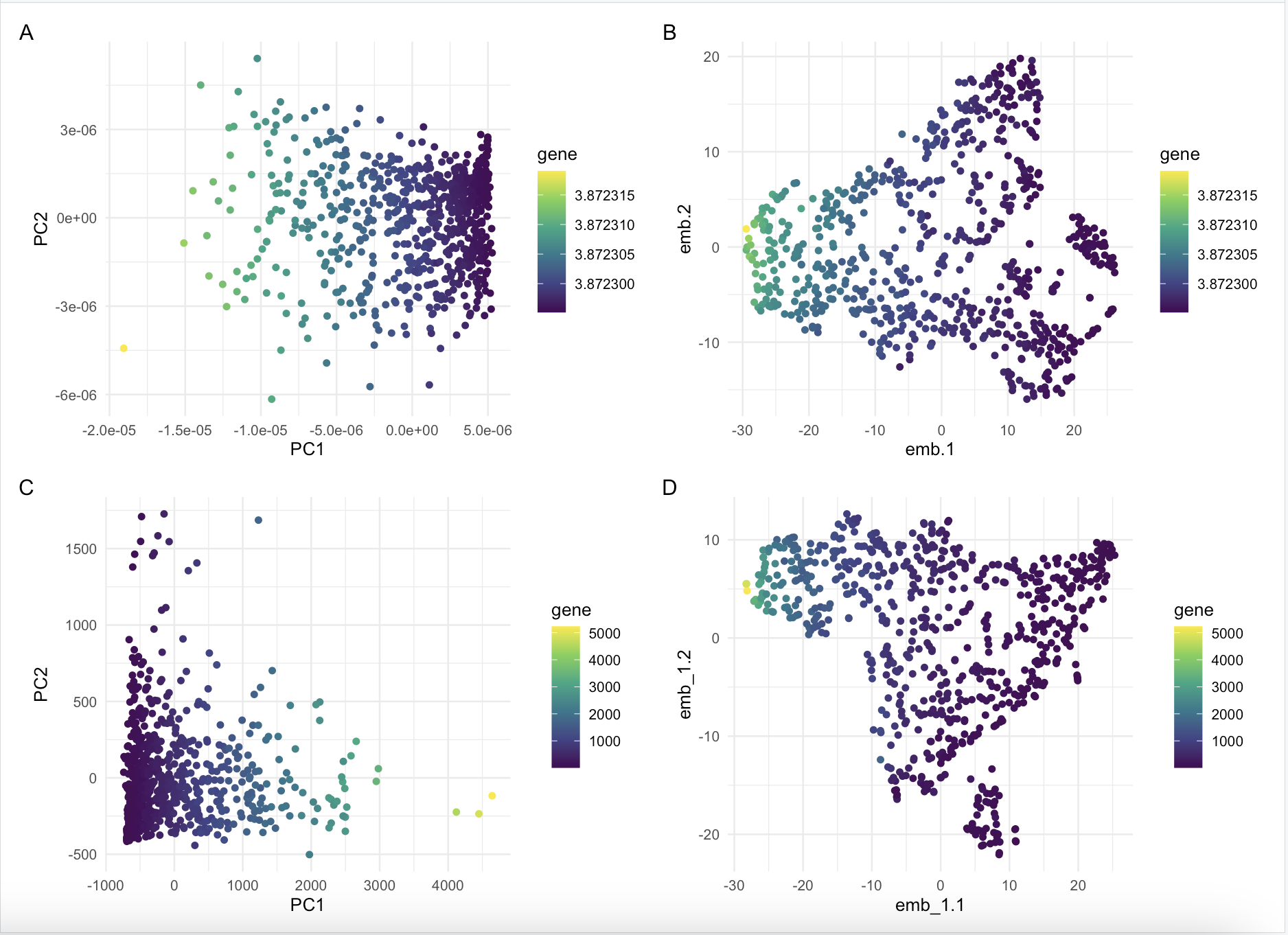
What data types are you visualizing? For plot A, I am visualizing quantitative data of the PC1 and PC2 values, and qualitative data of the total number of genes for...
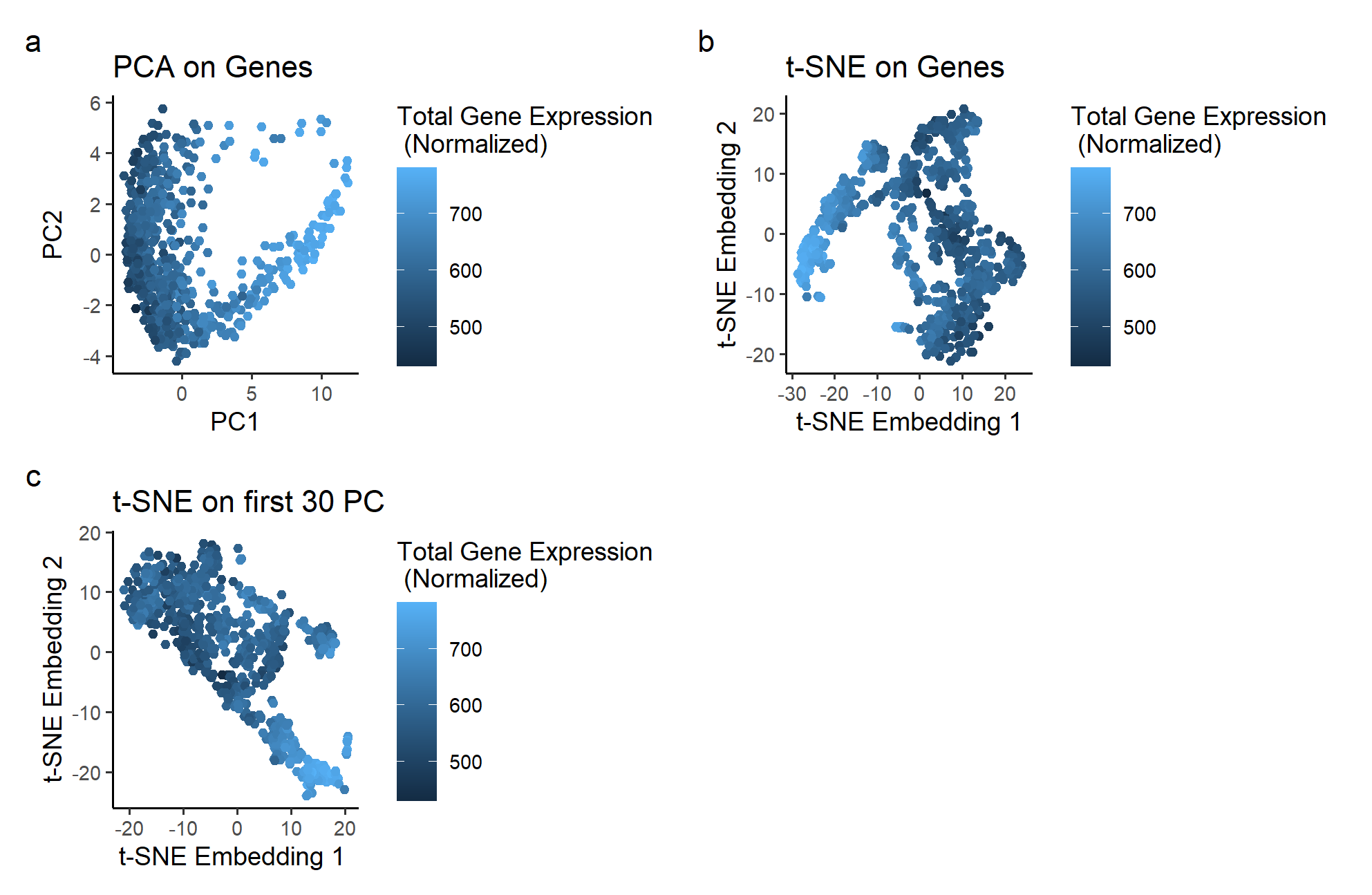
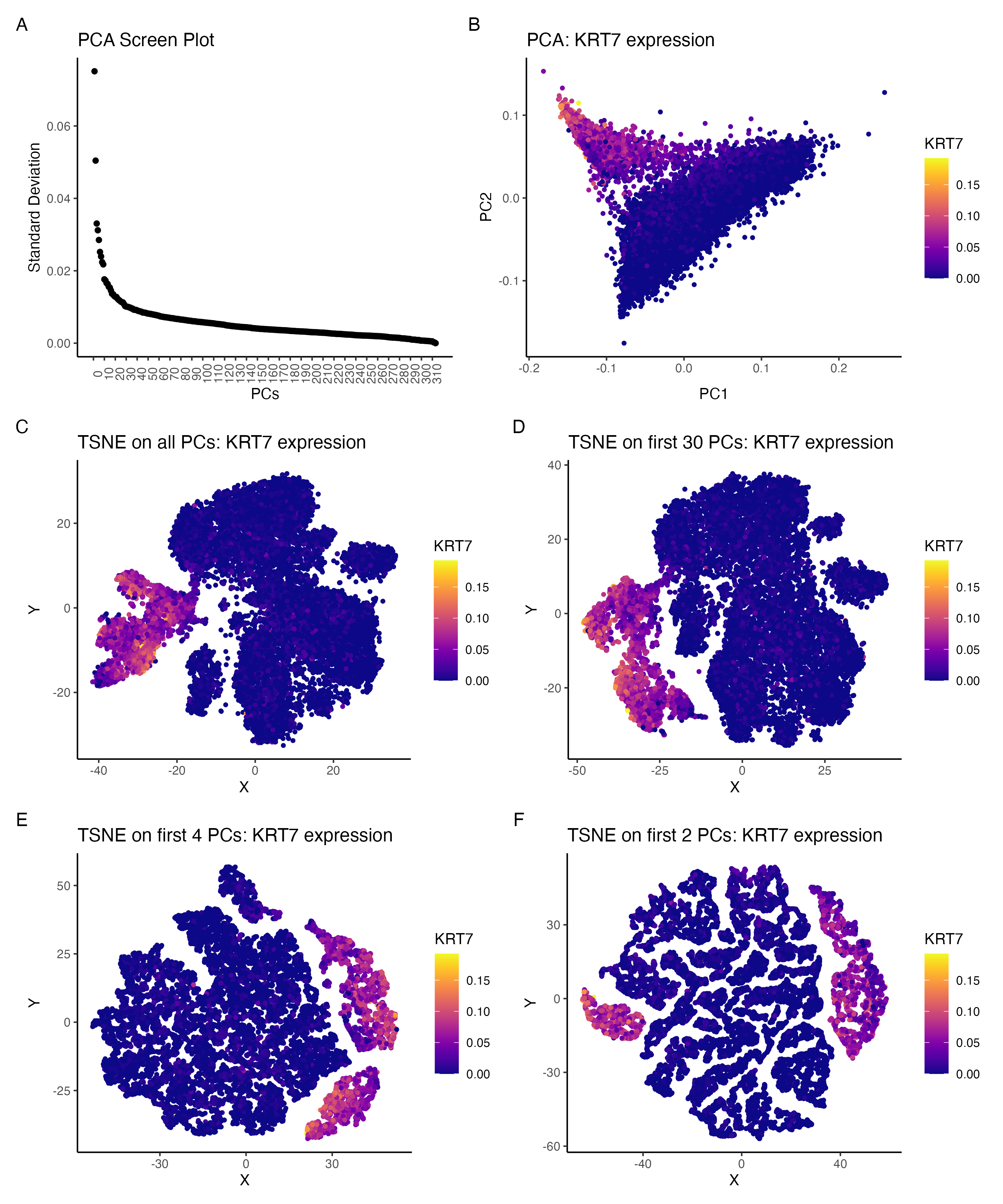
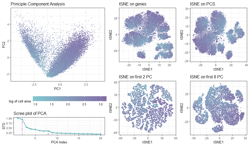
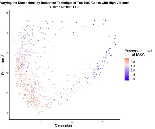
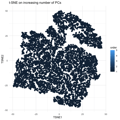
I am visualizing the effect of performing non-linear dimensionality reduction (TSNE) on varying number of PCs. The gene expression was normalized (by total gene expression for each cell) prior to...
Description of Data Visualization Three graphs are used to illustrate the impact of increasing the number of principal components used for non-linear dimensionality reduction. Points are used as a geometric...
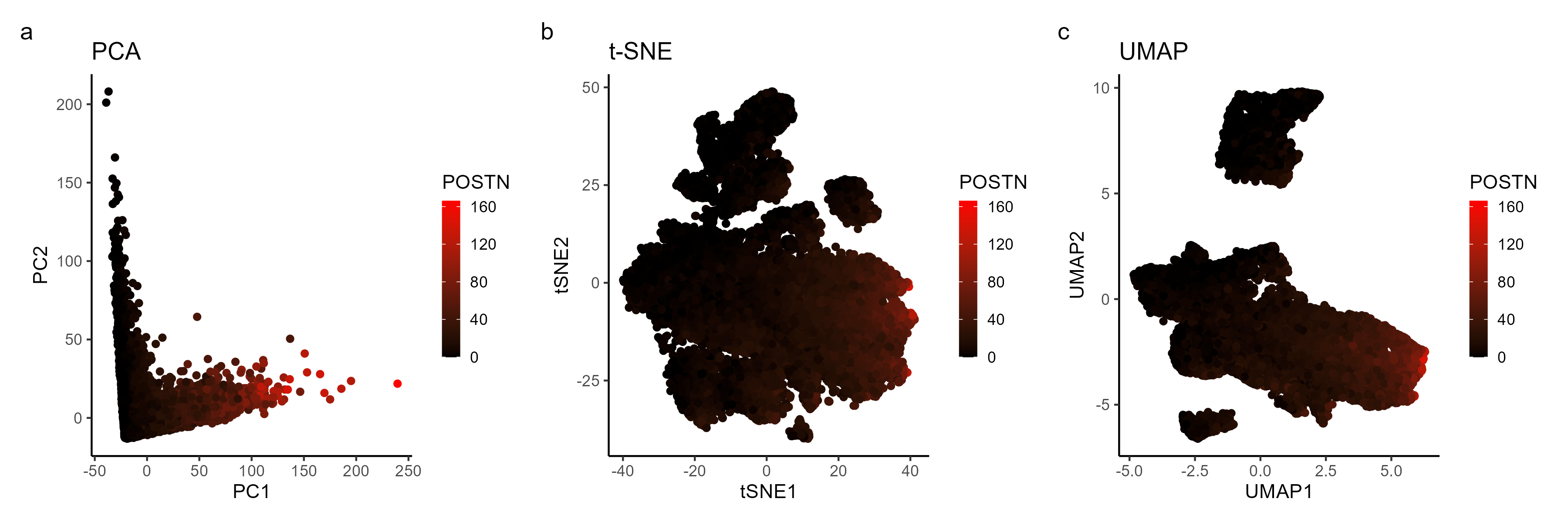
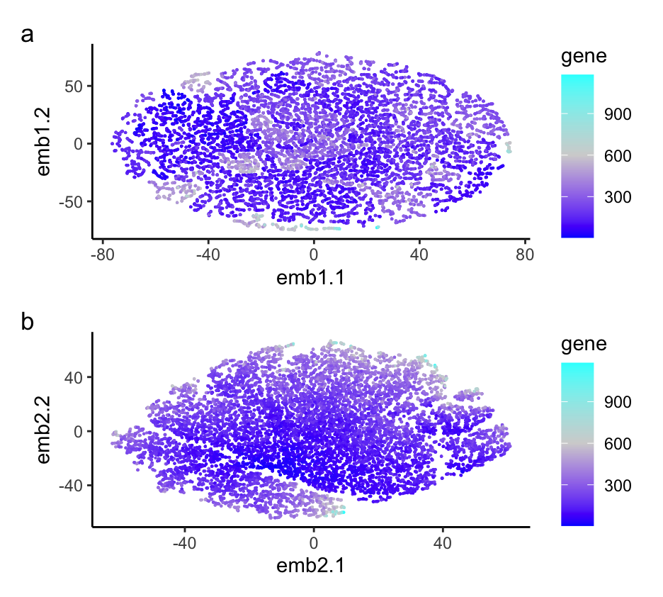
What data types are you visualizing? In the multi-panel plot, I am visualizing spatial and quantitative data with diffrerent projection approaches. The visualization contains spatial data of each cell’s position...
Write a description describing your data visualization using vocabulary terms from Lesson 1. What data types are you visualizing? What data encodings (geometric primitives and visual channels) are you using...
What happens if I do or not not normalize and/or transform the gene expression data (e.g. log and/or scale) prior to dimensionality reduction? I compared dimensionality reduction on normalized vs...
What’s the difference if I perform linear or nonlinear dimensionality reduction to visualize my cells in 2D? When visualizing the cells in 2D, nonlinear dimensionality reduction showed a more well-defined...
What’s the difference if I perform linear or nonlinear dimensionality reduction to visualize my cells in 2D? Linear dimensionality reductions, such as principle component analysis, works best with data that...
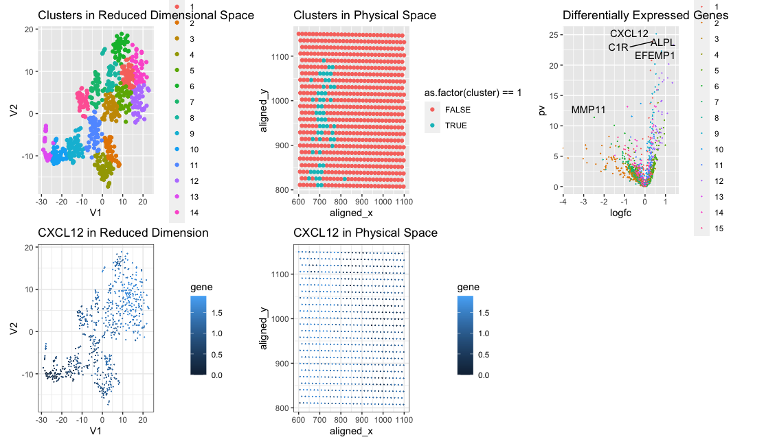
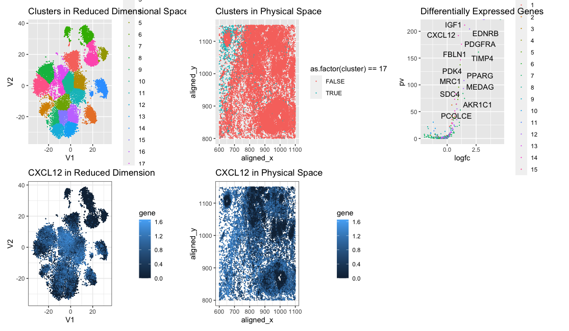
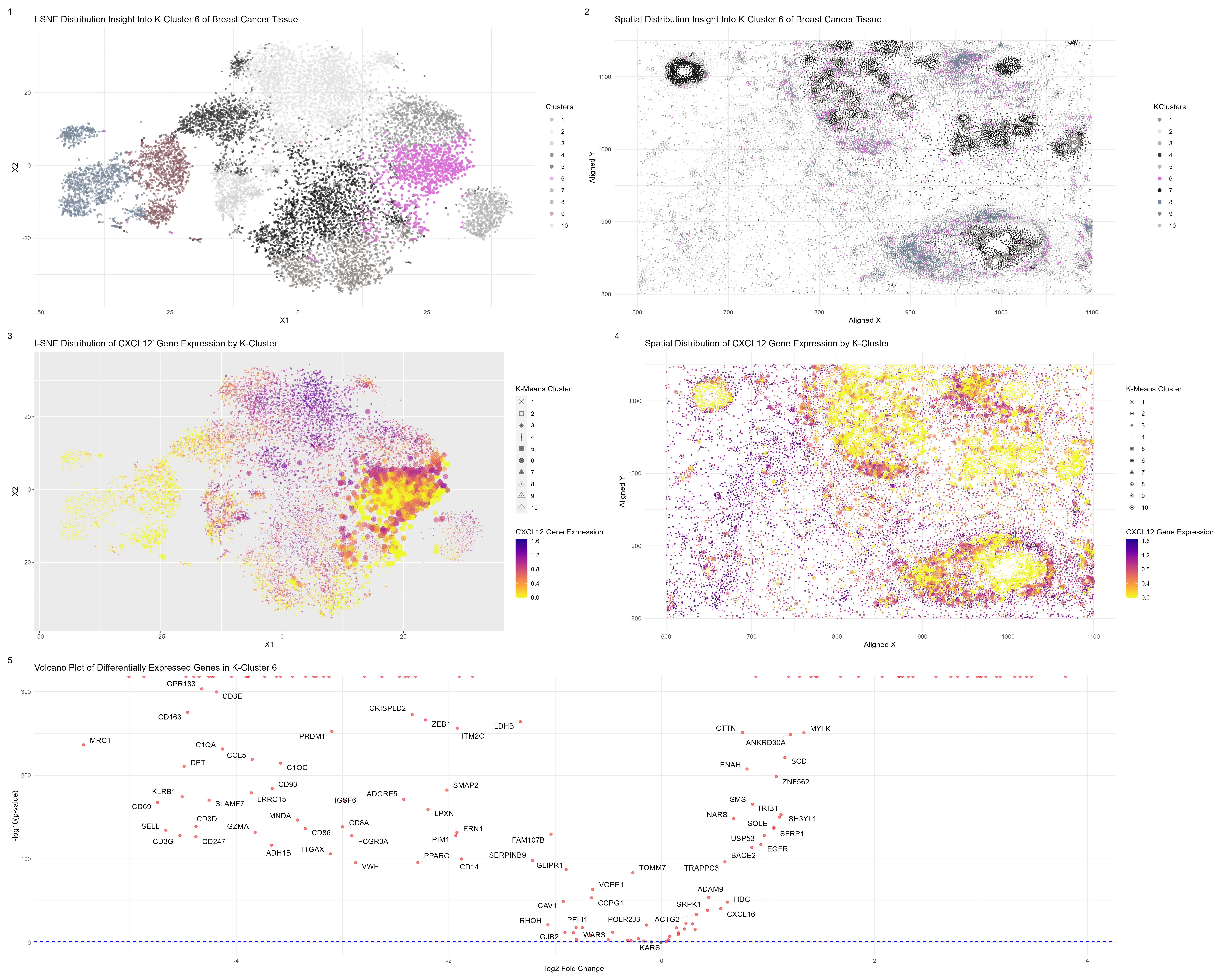
We are visualizing clusters in reduced dimensional space and identified cell cluster 1. We found this cell cluster to have several upregulated genes, including CXCL12, which plays a role in...
Write a description to convince me that your cluster interpretation is correct. Your description may reference papers and content that allowed you to interpret your cell cluster as a particular...
Figure Description: Looking at the data in the pikachu data set, we can see that there are various cells, each with their own gene expression and cell type. However, our...
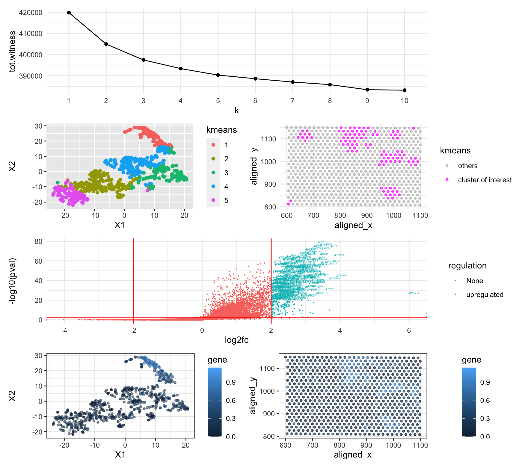
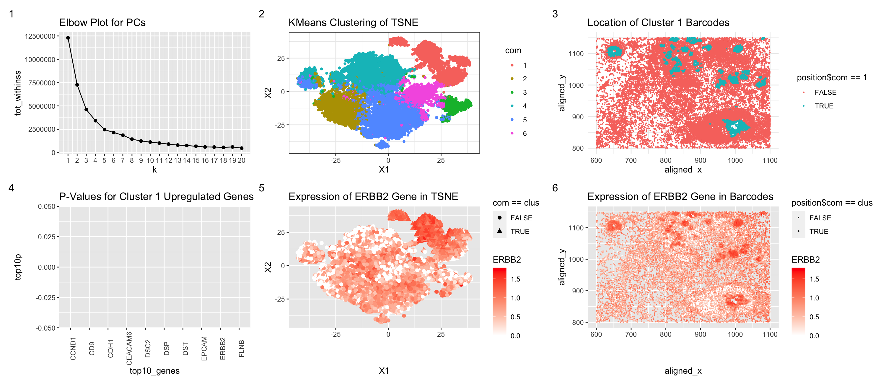
Figure Description Figure 1 shows an elbow plot using points to display the withiness based on the k value. Figure 2 shows the 4 clusters created via kmeans clustering of...
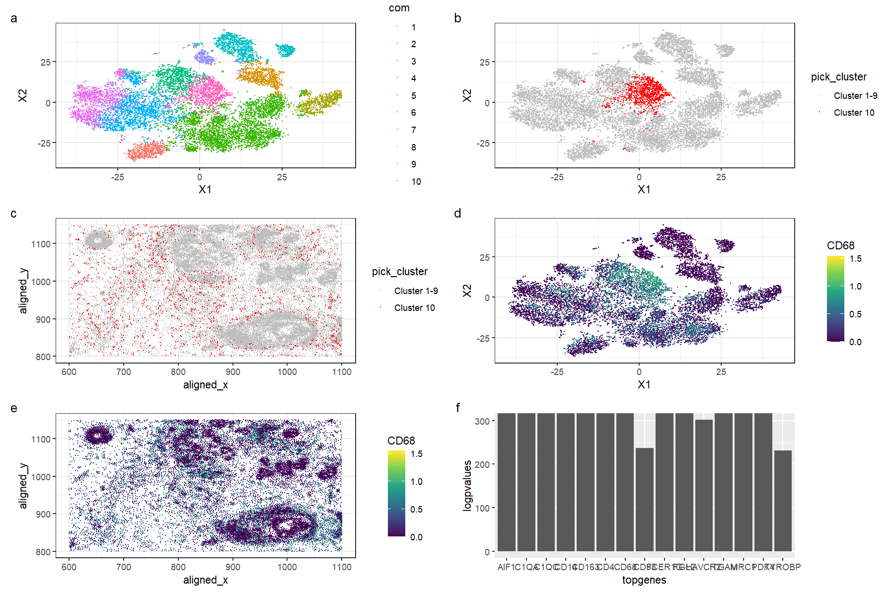
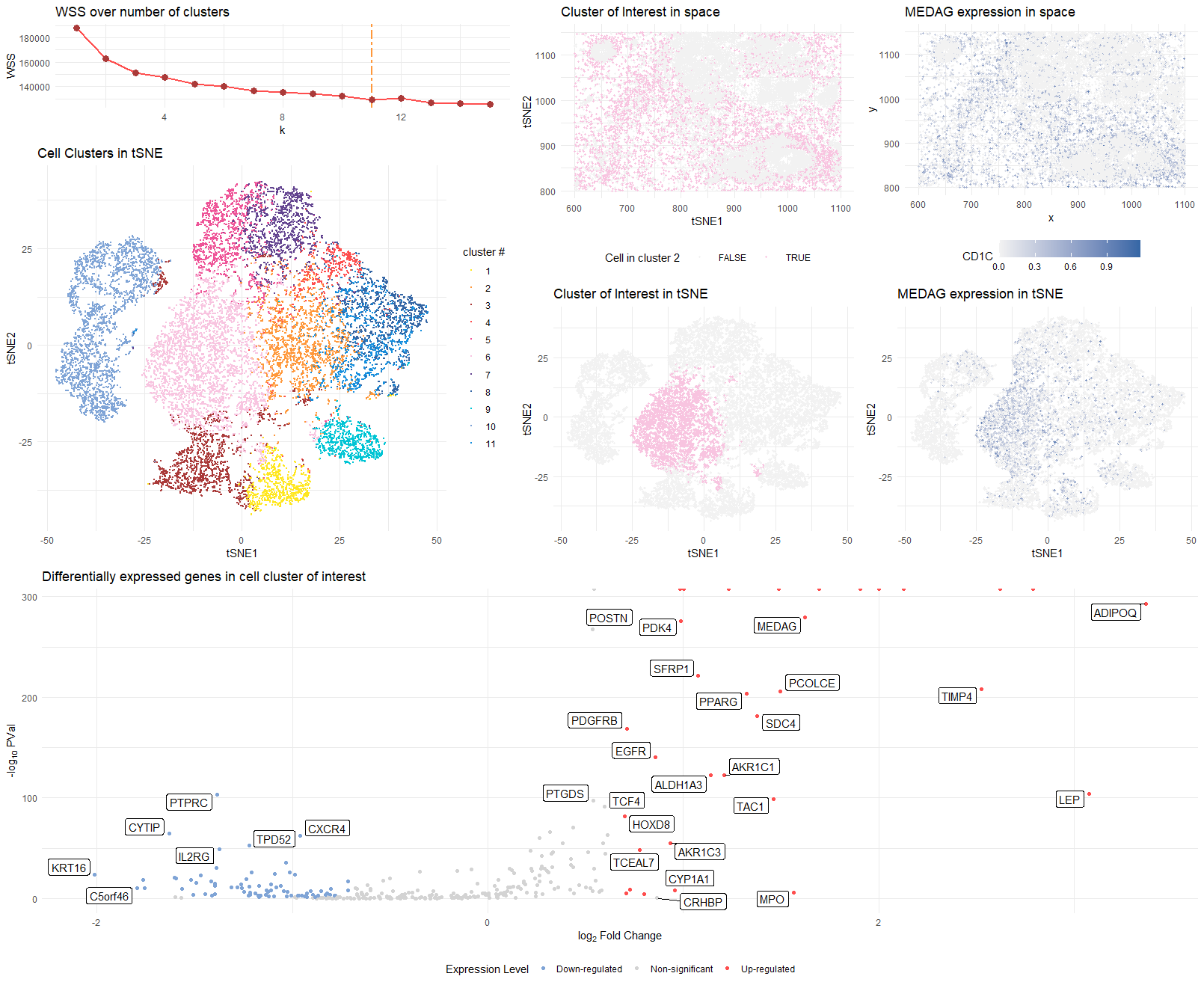
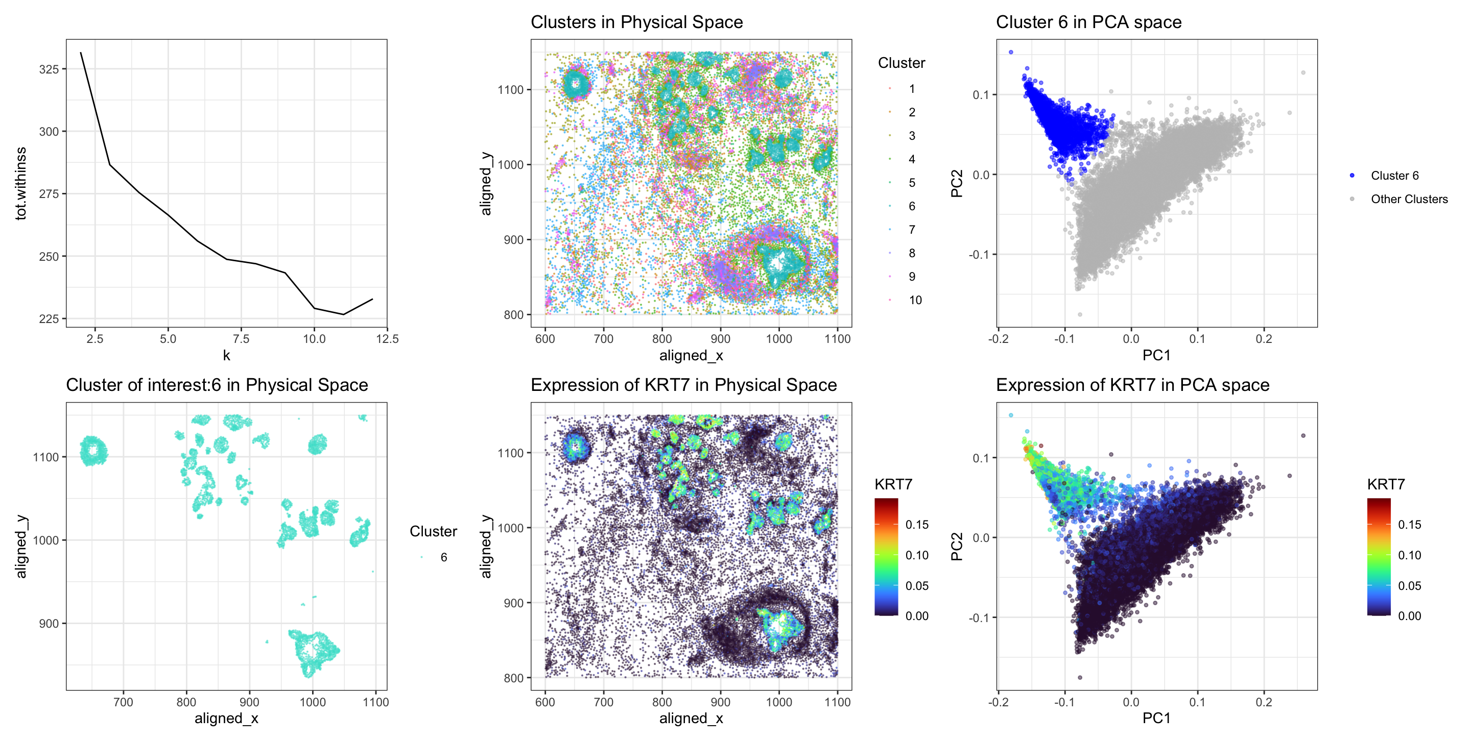
Things to know about my visualization The visualization aims to provide evidence for characterizing a specific cluster of cells and understanding its gene expression profile. For data pre-processing, I first...
Describe your figure briefly so we know what you are depicting (you no longer need to use precise data visualization terms as you have been doing). This figure is a...
Describe your figure briefly so we know what you are depicting (you no longer need to use precise data visualization terms as you have been doing).
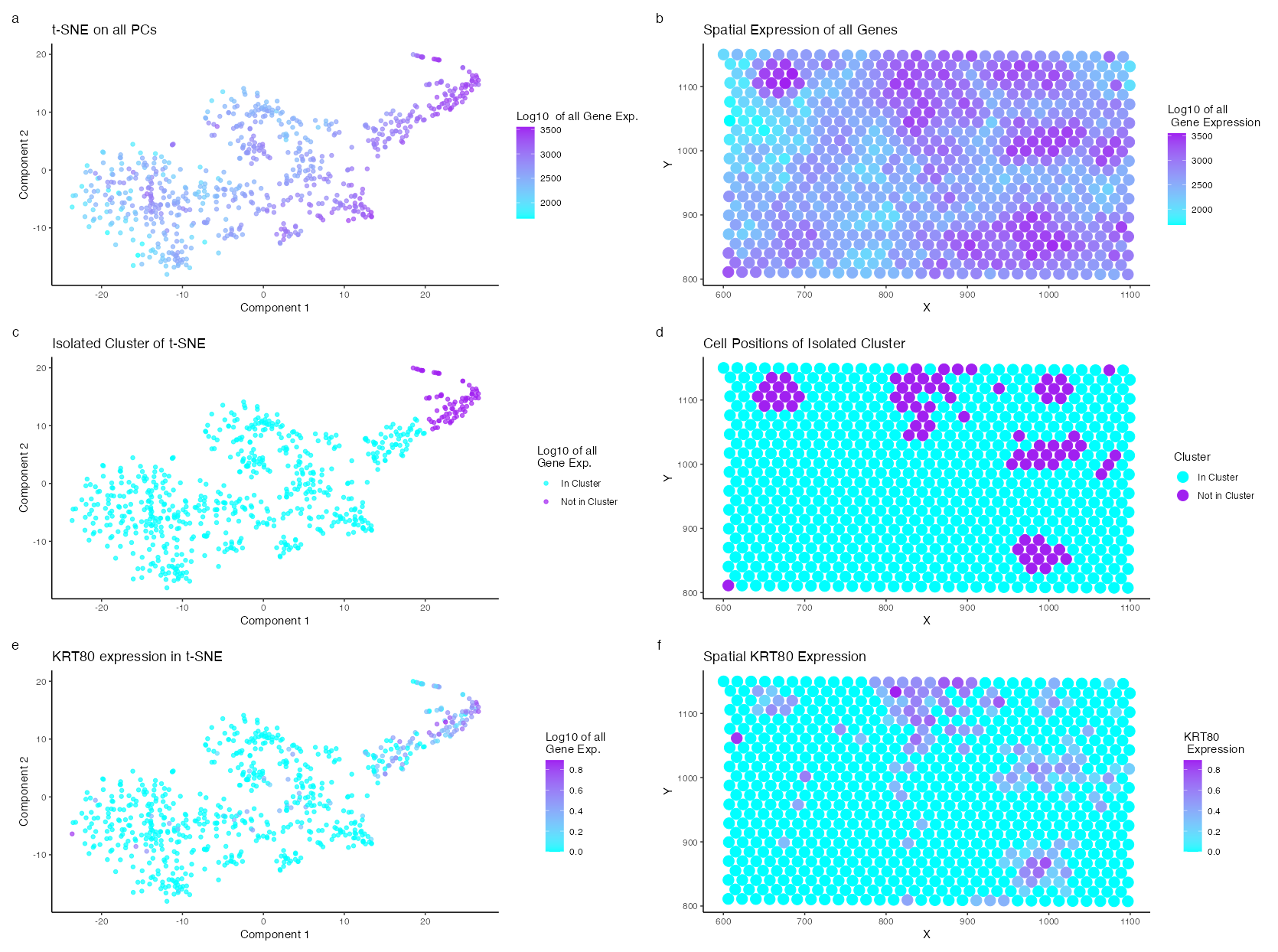
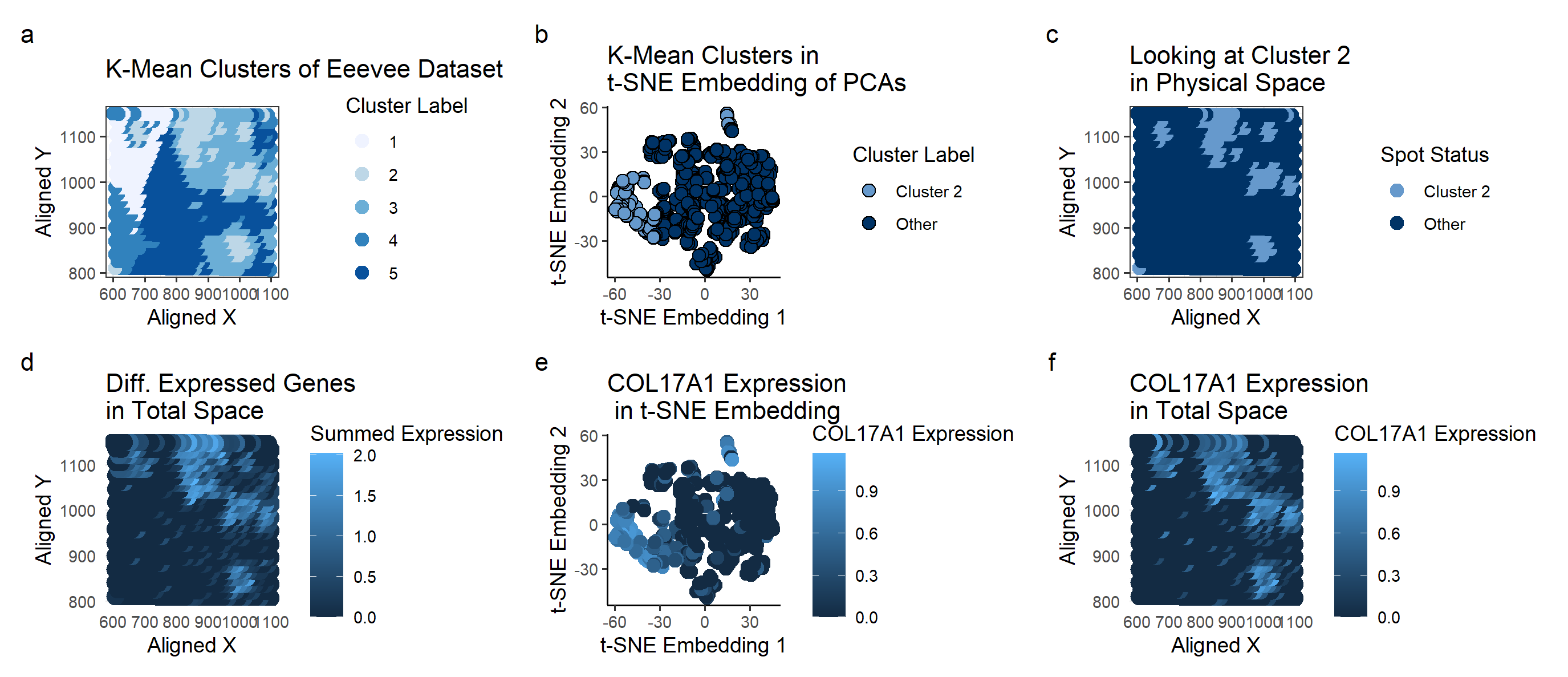
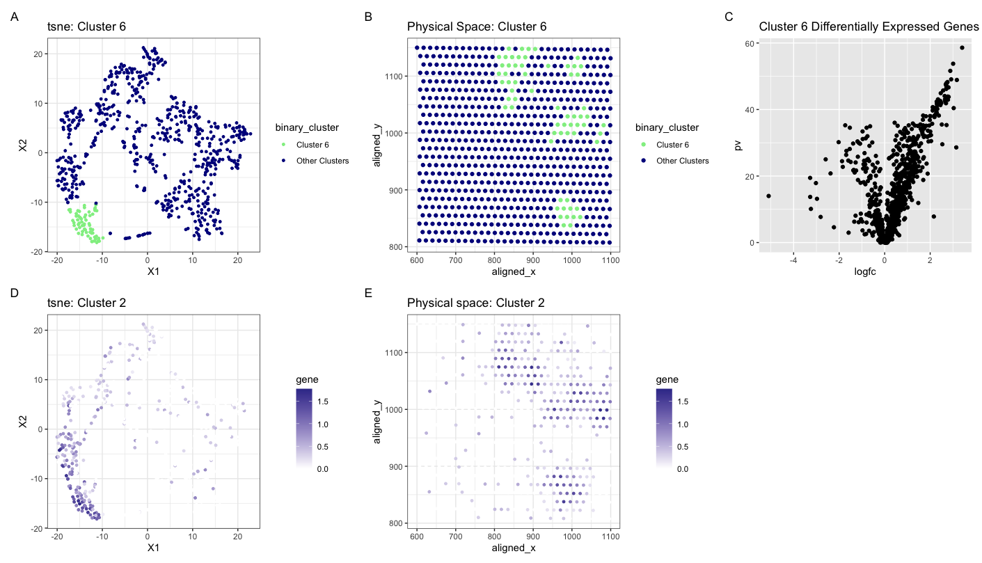
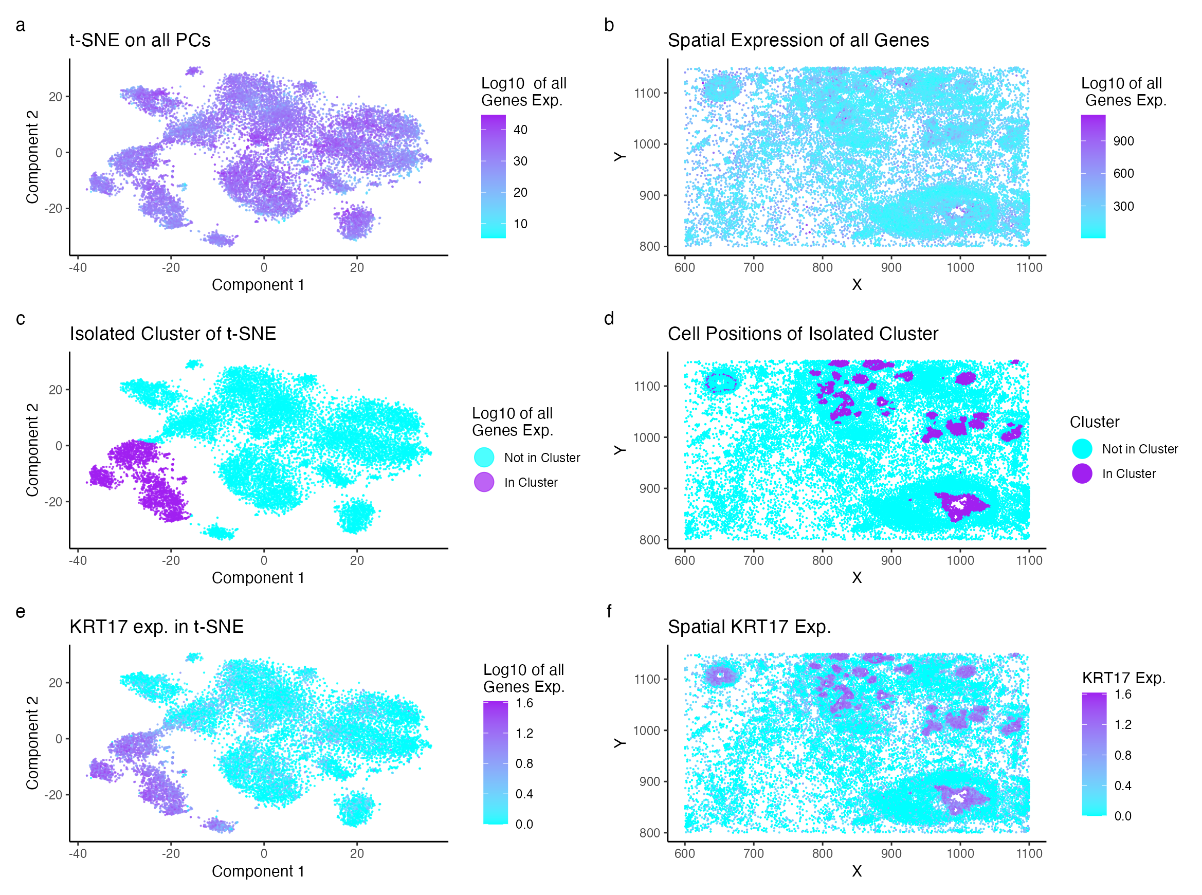
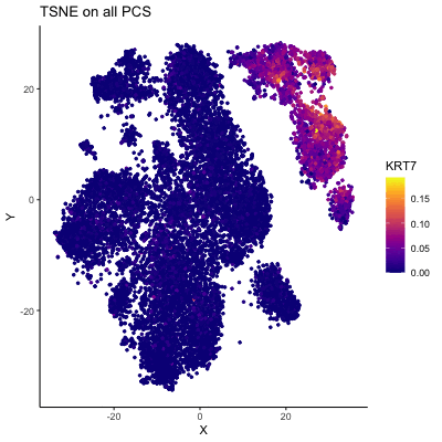
Description of Visualization I am visualizing the expression of a distinct cell type identified through clustering of the dimensionally reduced log-normalized gene expression in the Eevee dataset using t-SNE and...
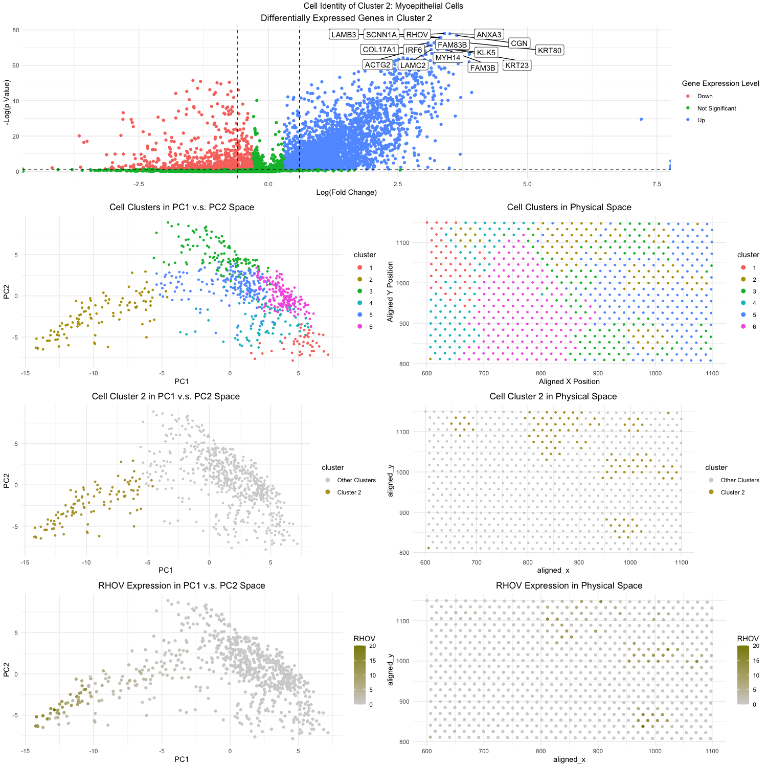
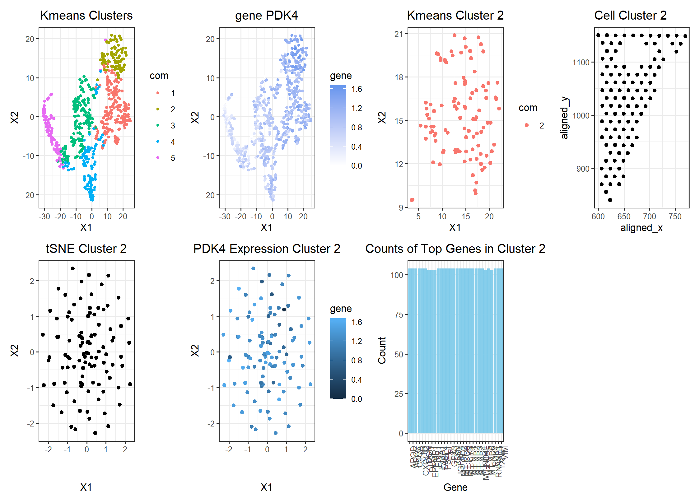
Figure Description: Through k-means clustering and gene expression analysis, I wanted to identify a specific cell type in the breast cancer tissue in the eevee data set. To start off,...
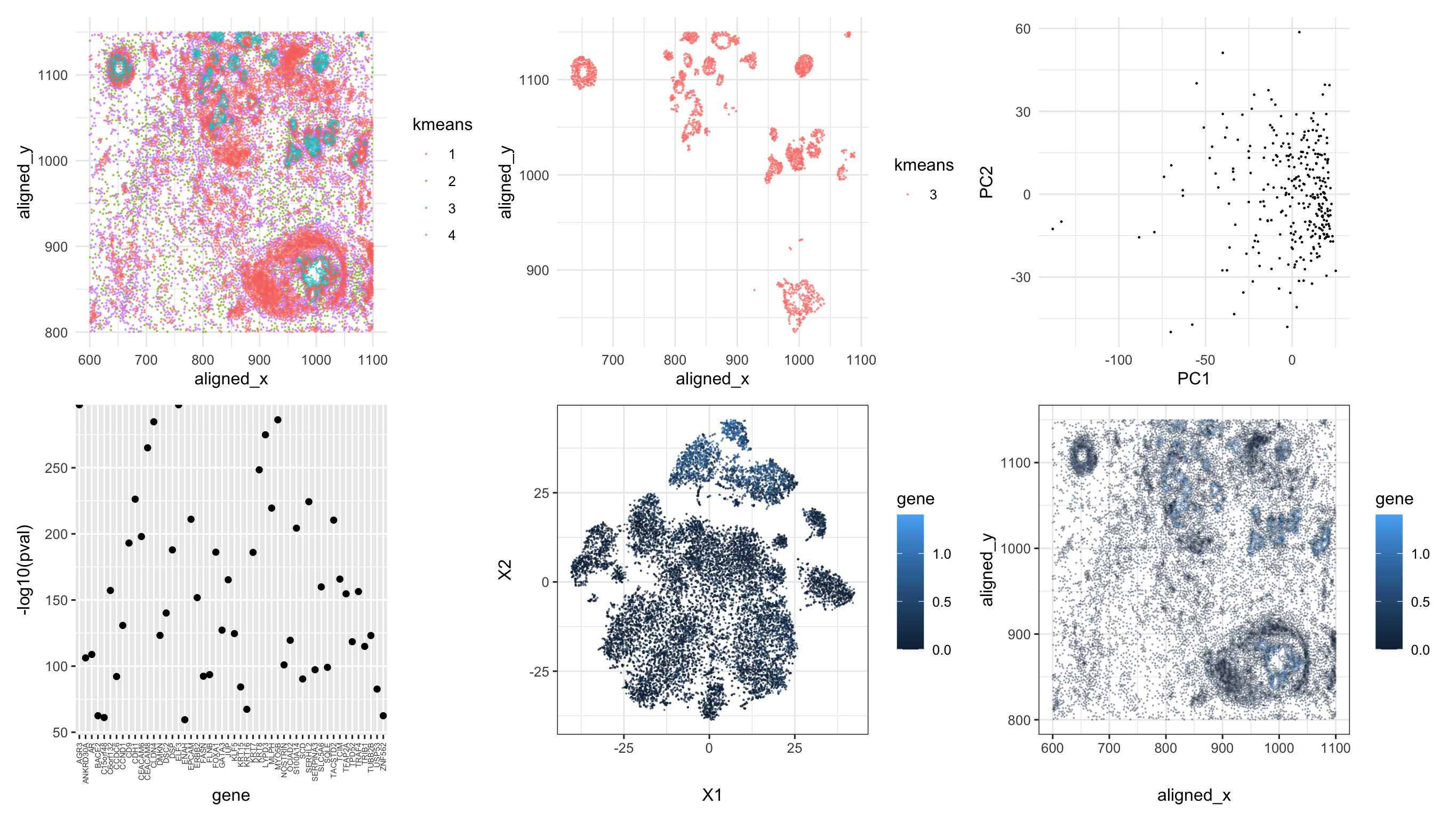
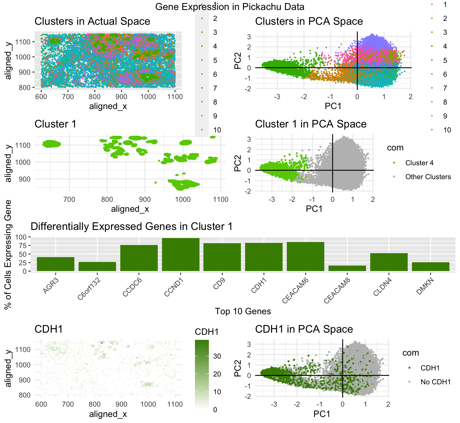
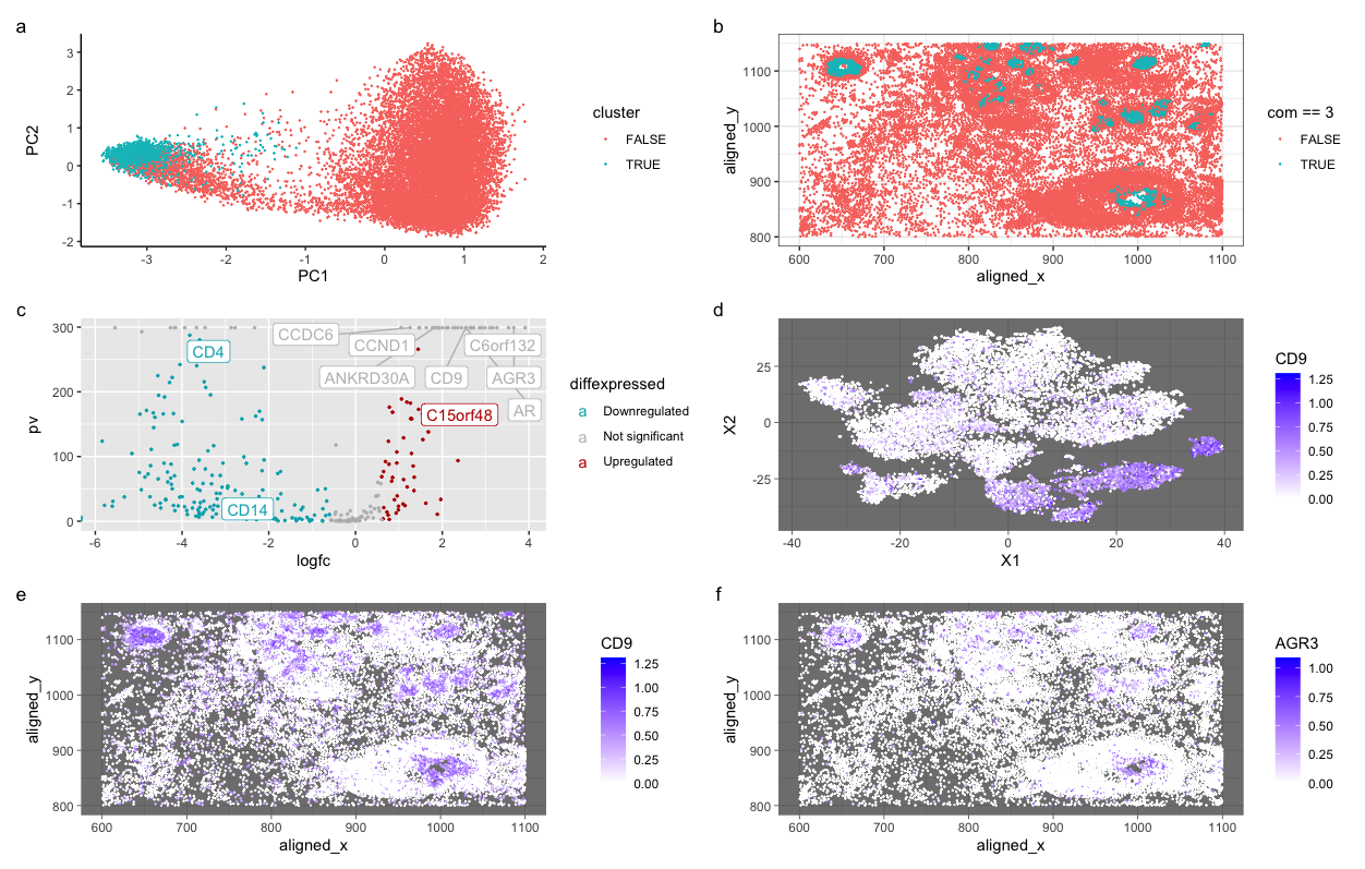
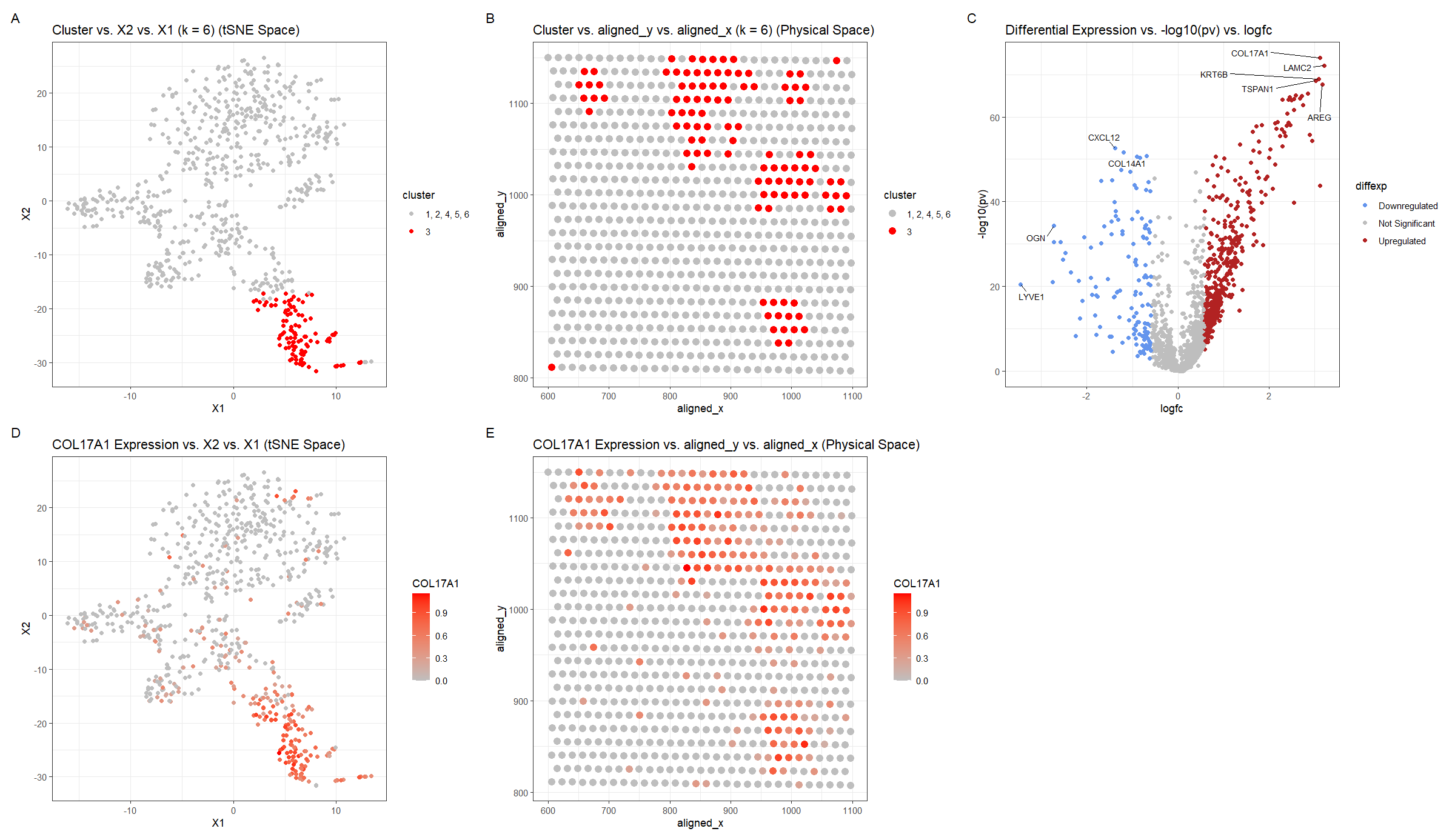
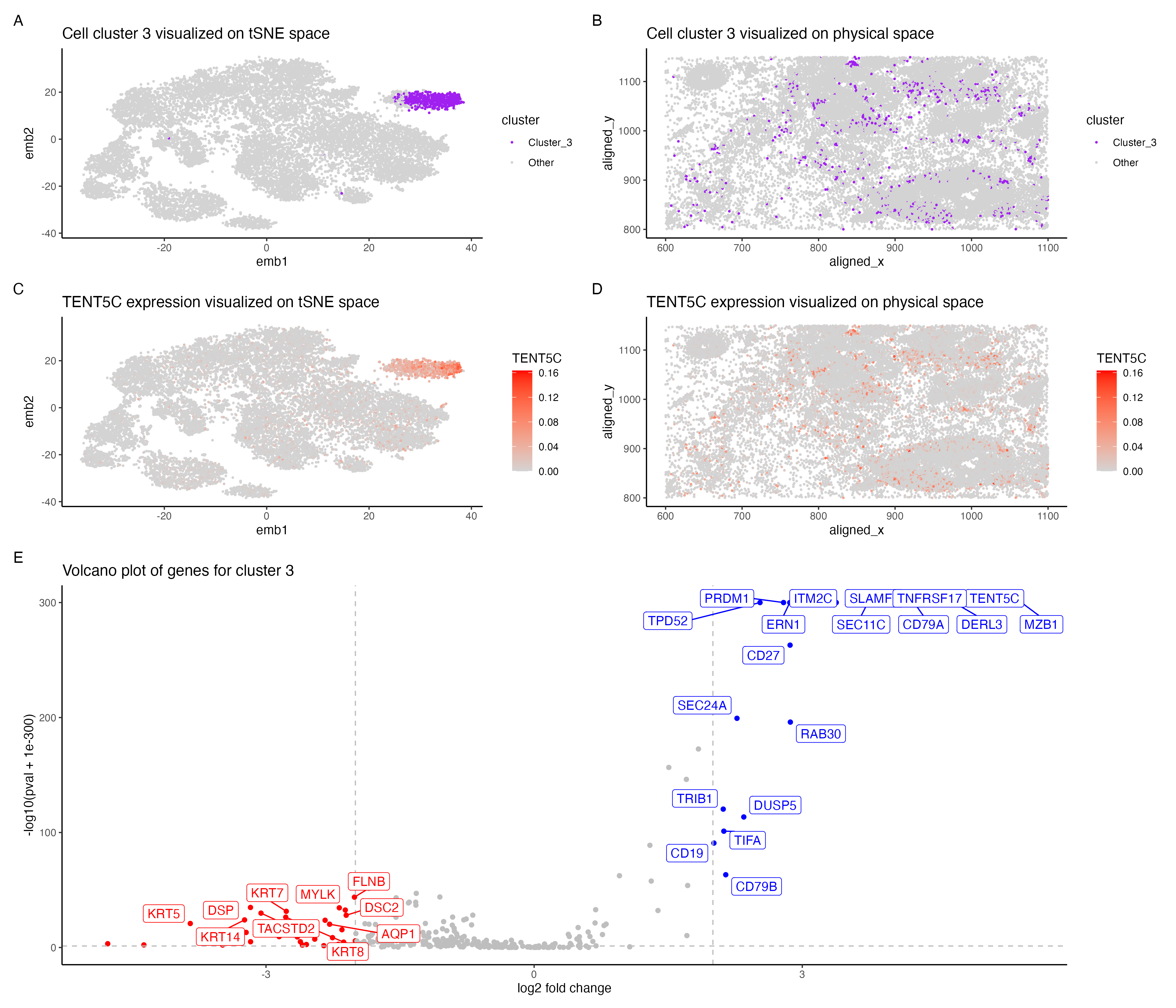
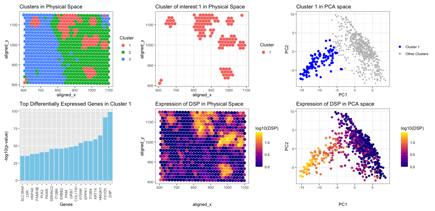
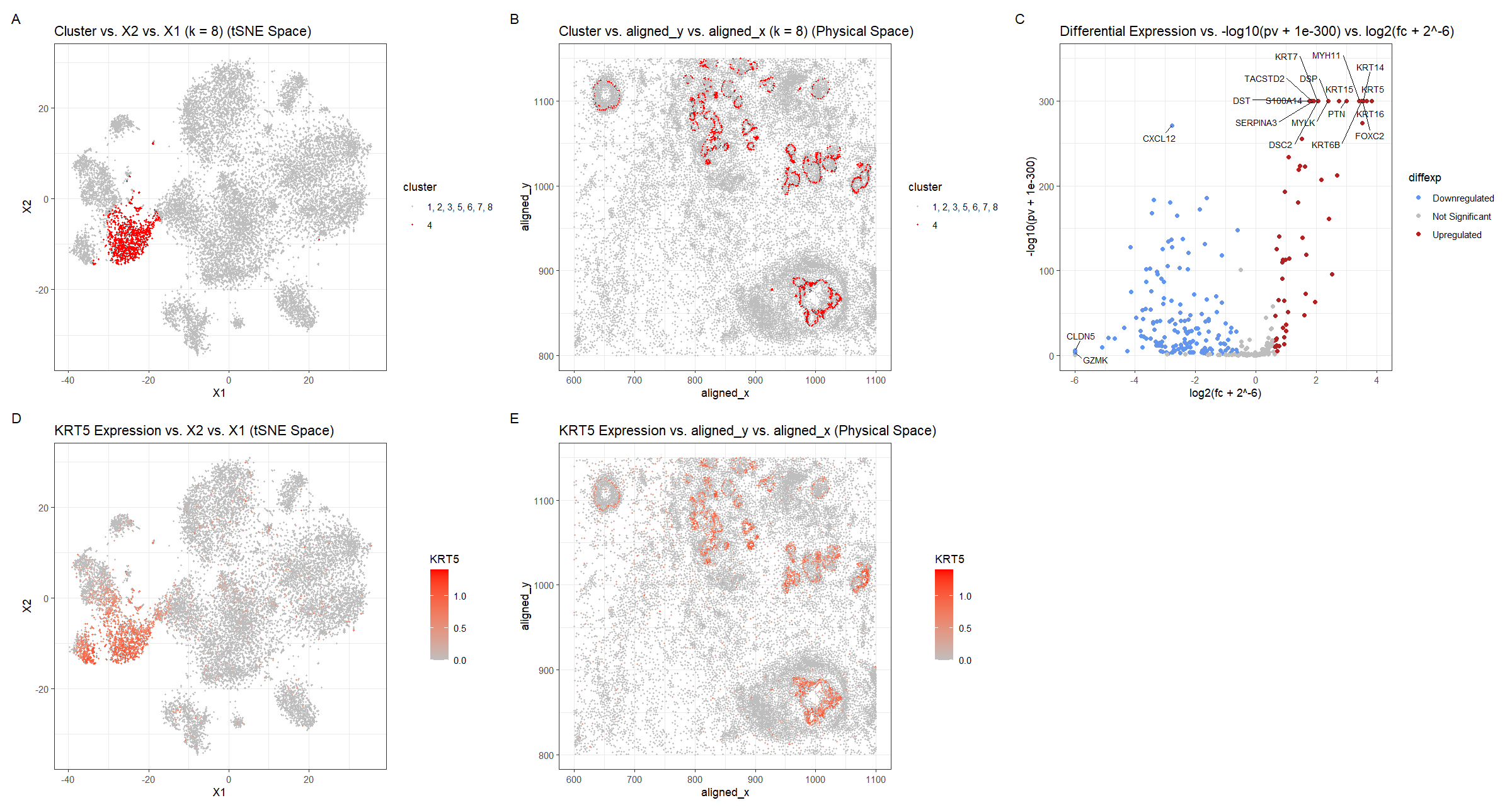
My figure features cluster 3 and links the expression of a known breast cancer gene in mammary epithelial cells to cluster 3. Further investigation showed two genes expressed in mammary...
Description of Plot
I used the K-means clustering method to identify potential groupings of cell types in the Eevee dataset, specifically for breast cancer tissue.
What am I visualizing? After normalizing and filtering out the top 150 genes present in a subsection of breast cancer tissue, I wanted to know if I could be able...
Describe your figure briefly so we know what you are depicting (you no longer need to use precise data visualization terms as you have been doing). There are five plots...
Describe your figure briefly so we know what you are depicting (you no longer need to use precise data visualization terms as you have been doing) For plot A, I...
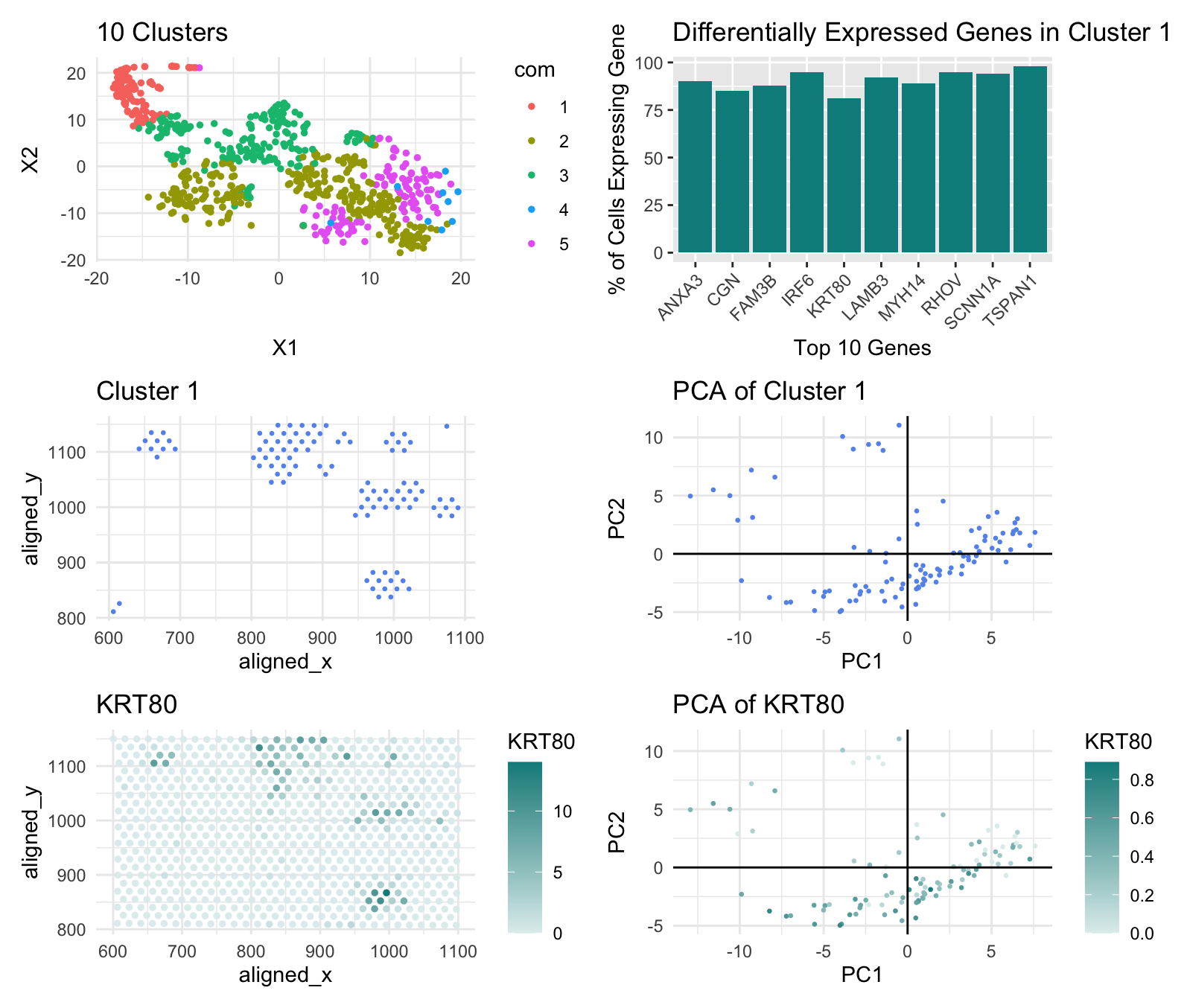
Create a multi-panel data visualization that includes at minimum the following components: # A panel visualizing your one cluster of interest in reduced dimensional space (PCA, tSNE, etc) plot name:...
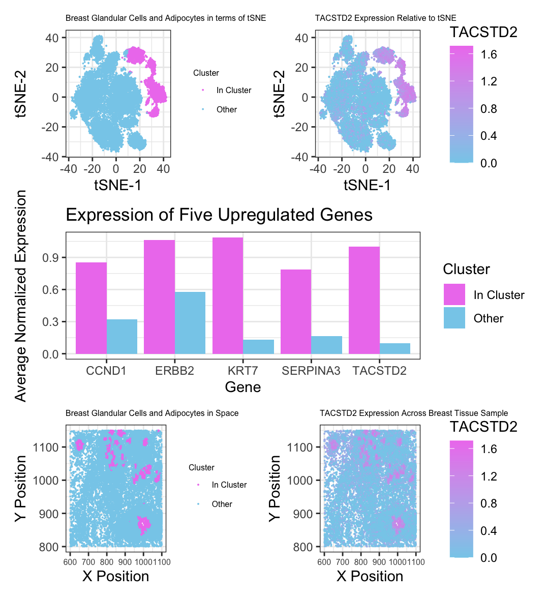
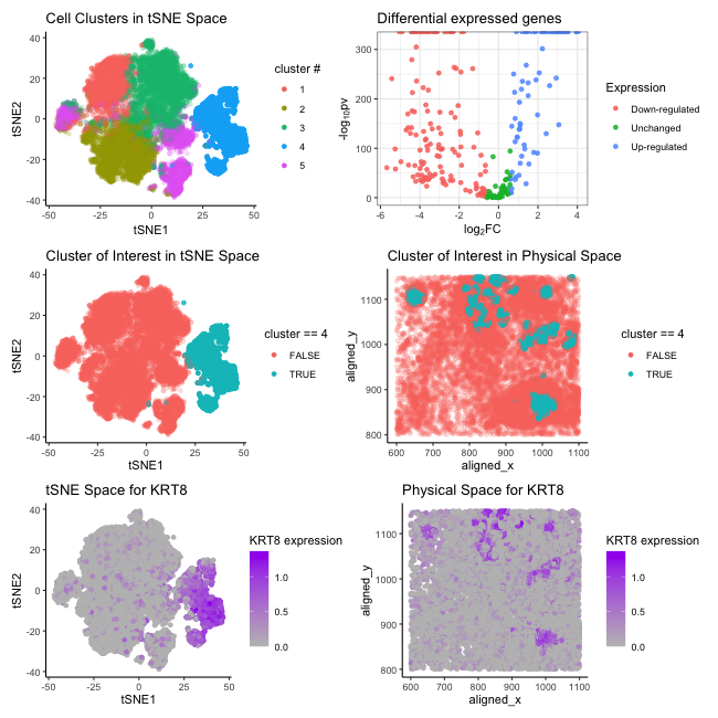
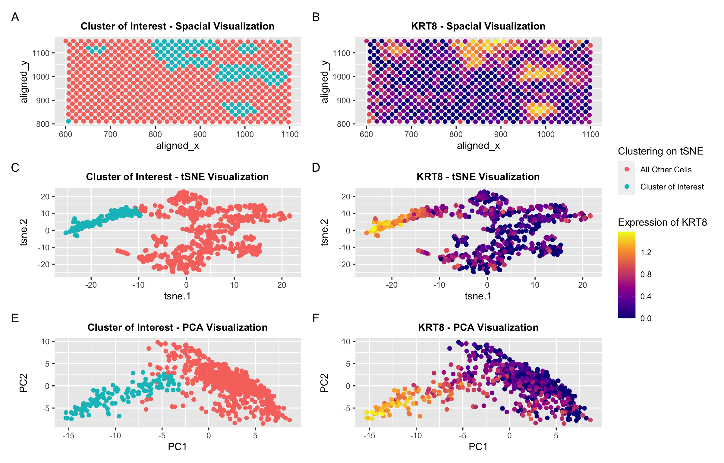
In this visualization, I explore the expression of KRT8, a cancer related gene, in breast cancer tissue. In panel A and E, I use points to represent cells in a...
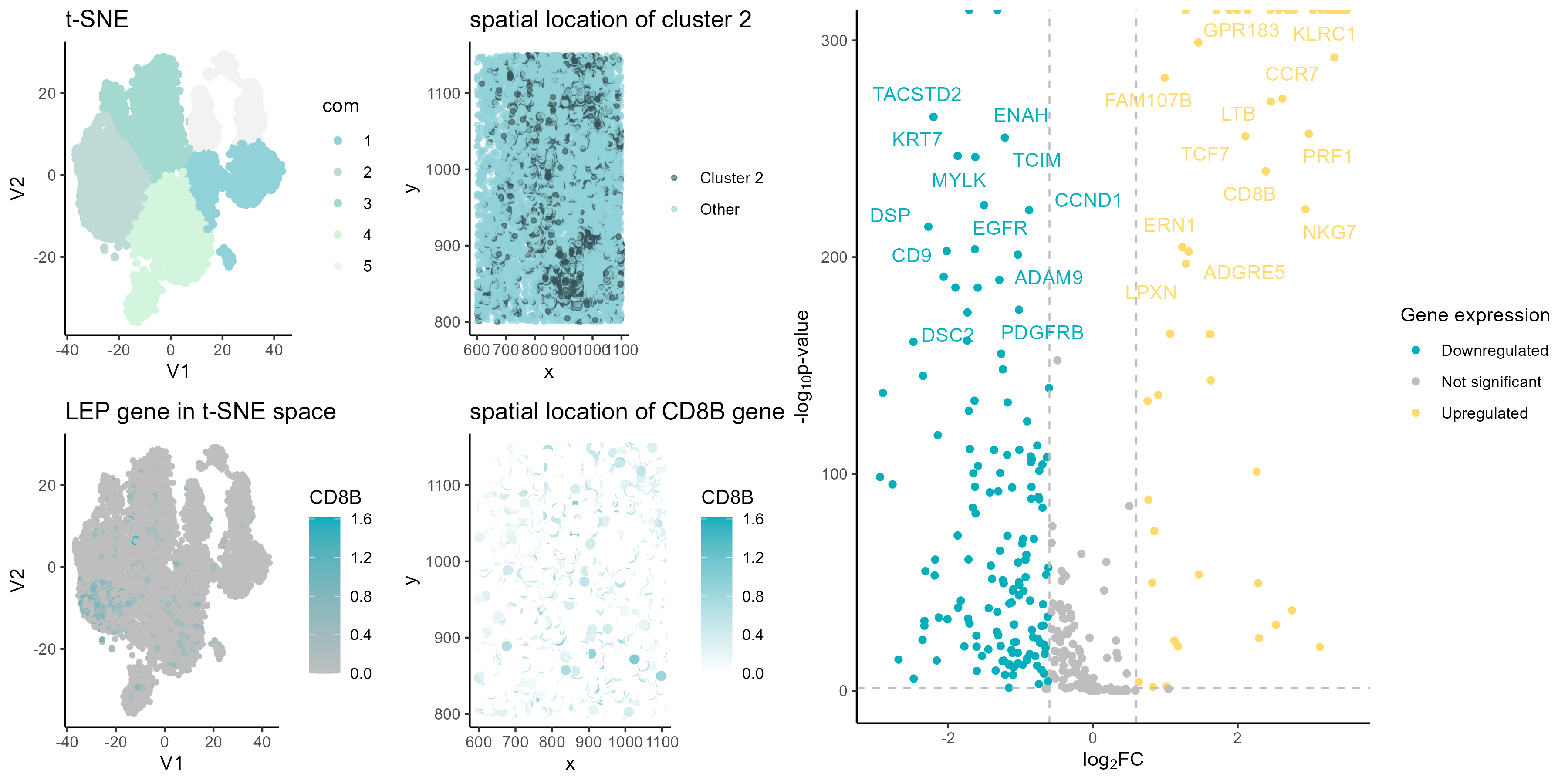
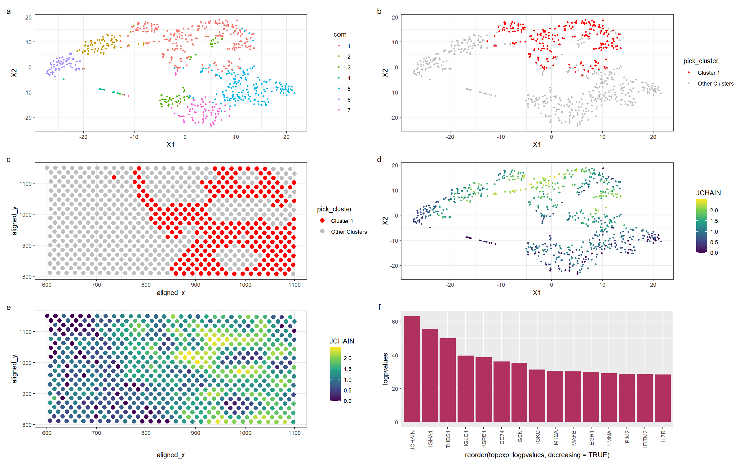
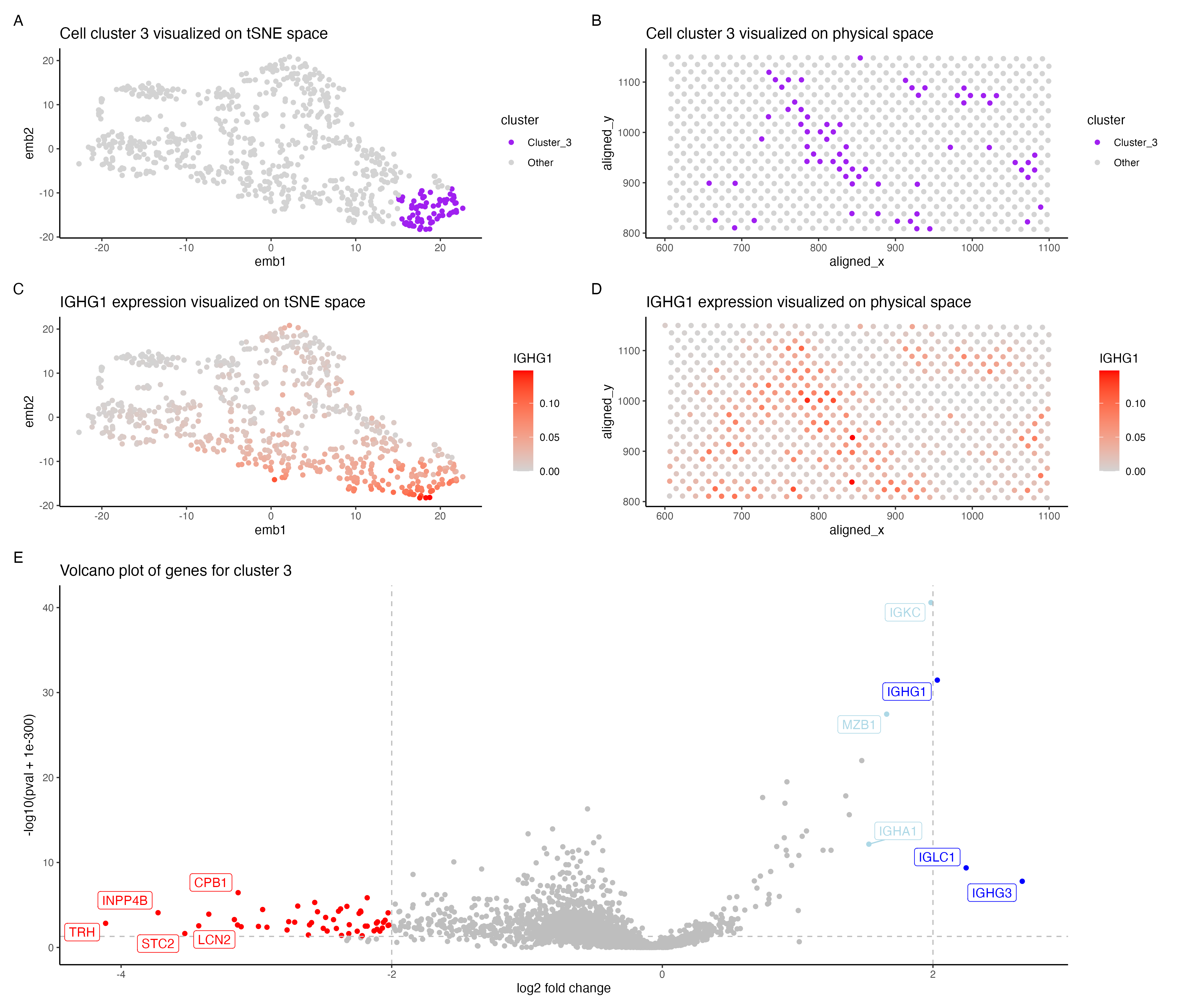
In the above visualization I have identified a cluster that belong to plasma cells or mature B cells. I started with normalizing the gene expression data by the total gene...
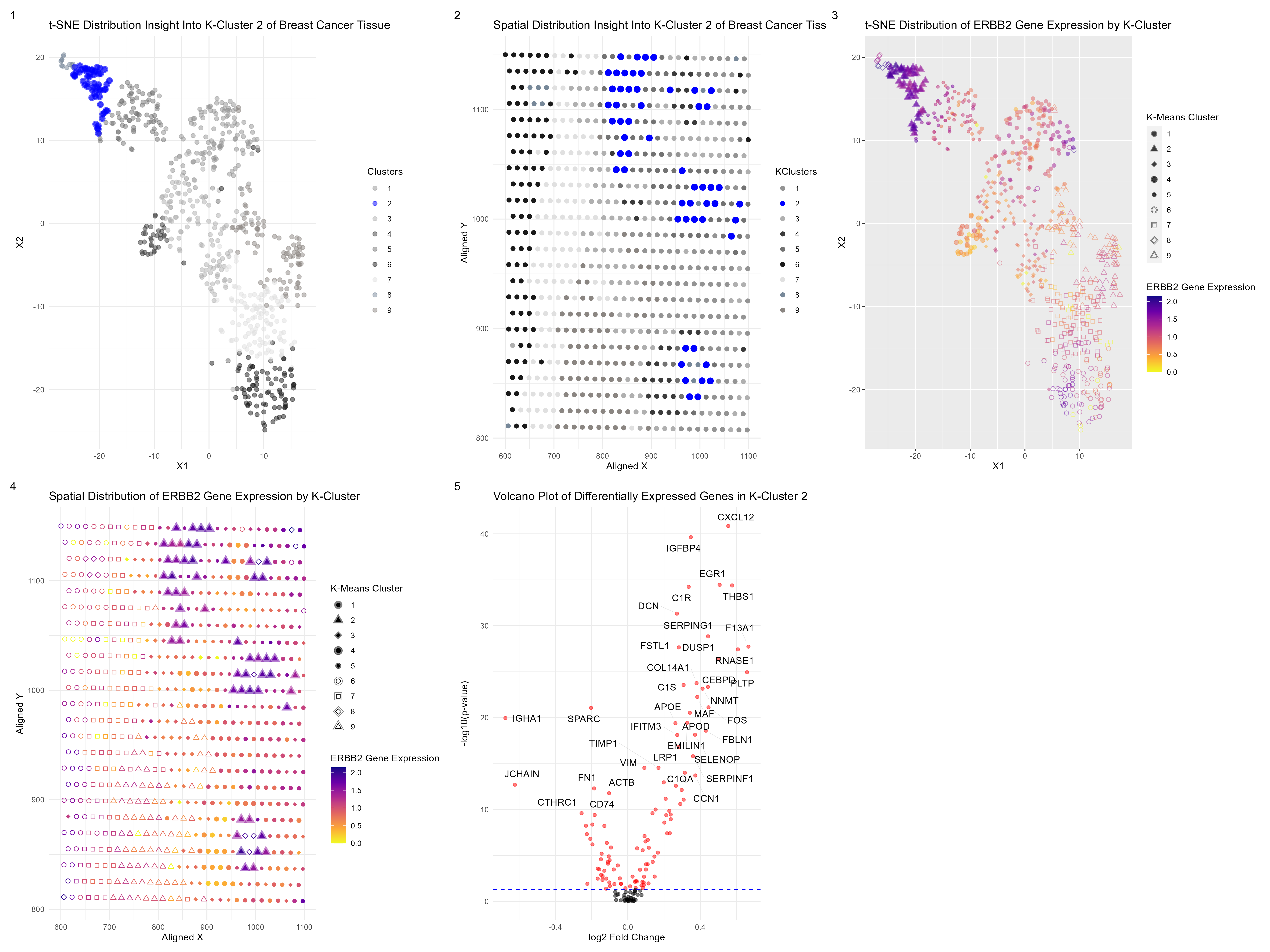
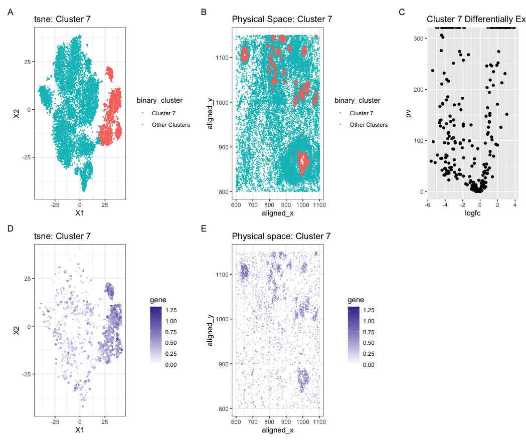
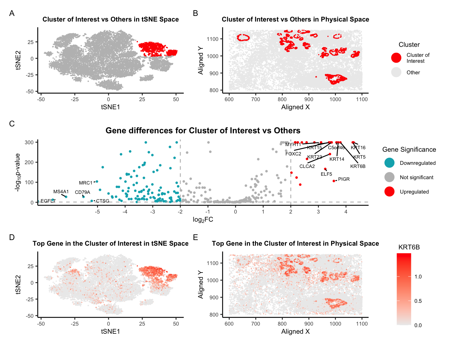
Plot Description This visualization presents differential gene expression to validate cell type identification by k-means on 2D tSNE space. The spatial-transcriptomics data on breast tumor tissue is preprocessed by removing...
Describe your figure briefly so we know what you are depicting (you no longer need to use precise data visualization terms as you have been doing). Write a description to...
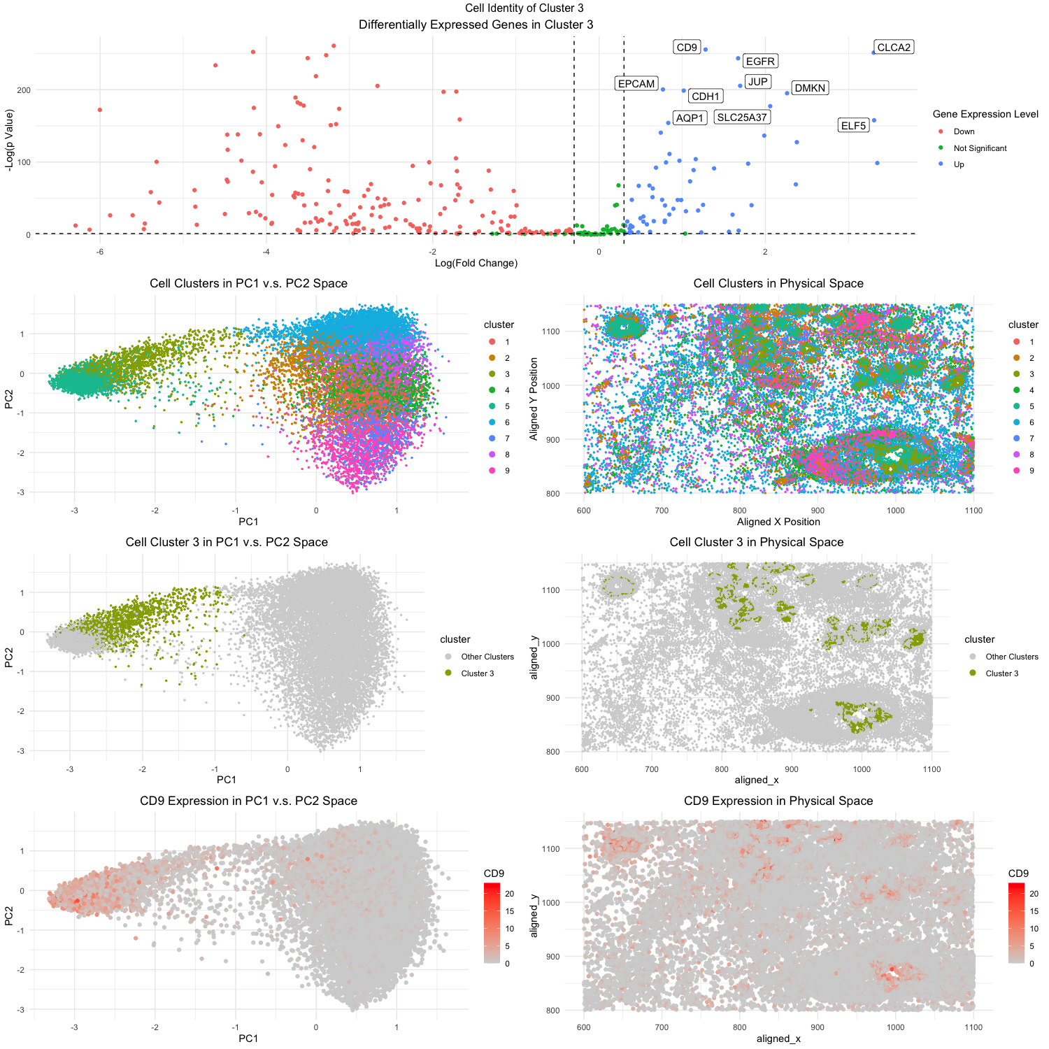
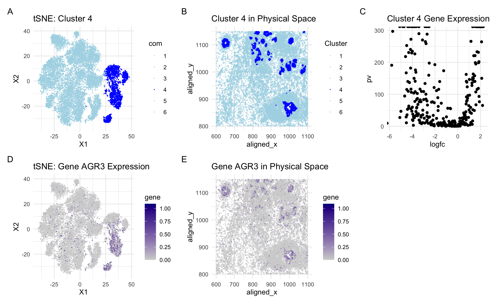
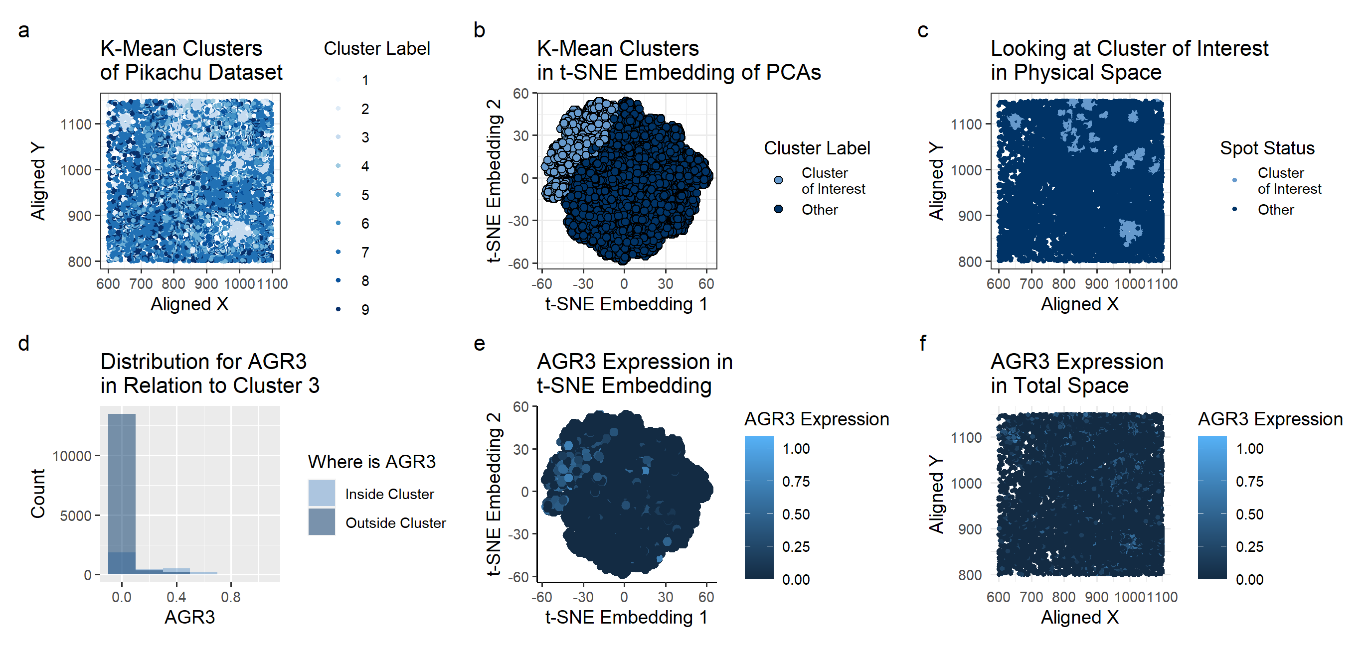
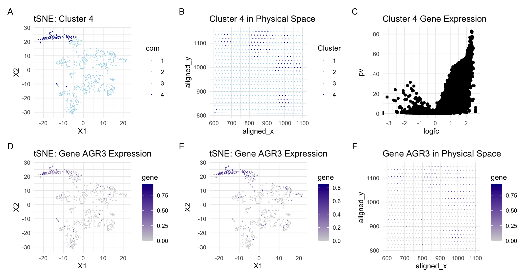
General Description This figure is an analysis of AGR3 expression within a specific cluster and its spatial distribution across the tissue sample. The plots show clustering into groups of 6...
Describe your figure briefly so we know what you are depicting (you no longer need to use precise data visualization terms as you have been doing). Write a description to...
In this data visualization we are visualizing clusters in the pikachu dataset. We identified cluster 17 as potentially being the same cell type we identified from the Eevee dataset due...
Use/adapt your code from HW4 to identify the same cell-type in the other dataset. Create a multi-panel data visualization and write a description to convince me you found the same...
Figure Description: The workflow from homework 4 was applied with some modifications (as described below) to analyze the eevee dataset and identify a cluster of cells that were of the...
Figure Description I switched from the Eevee dataset to the Pikachu dataset. As a result of the elbow plot, I judged that the optimal k for k-means clustering of the...
Describe what you changed and why you think you had to change it. I switched from Eevee dataset to Pikachu dataset. In my previous visualization, I performed K means clustering...
Use/adapt your code from HW4 to identify the same cell-type in the other dataset. Create a multi-panel data visualization and write a description to convince me you found the same...
### Plot Description This visualization presents differential gene expression to validate cell type identification by k-means on 2D tSNE space. The spatial-transcriptomics data on breast tumor tissue is preprocessed by...
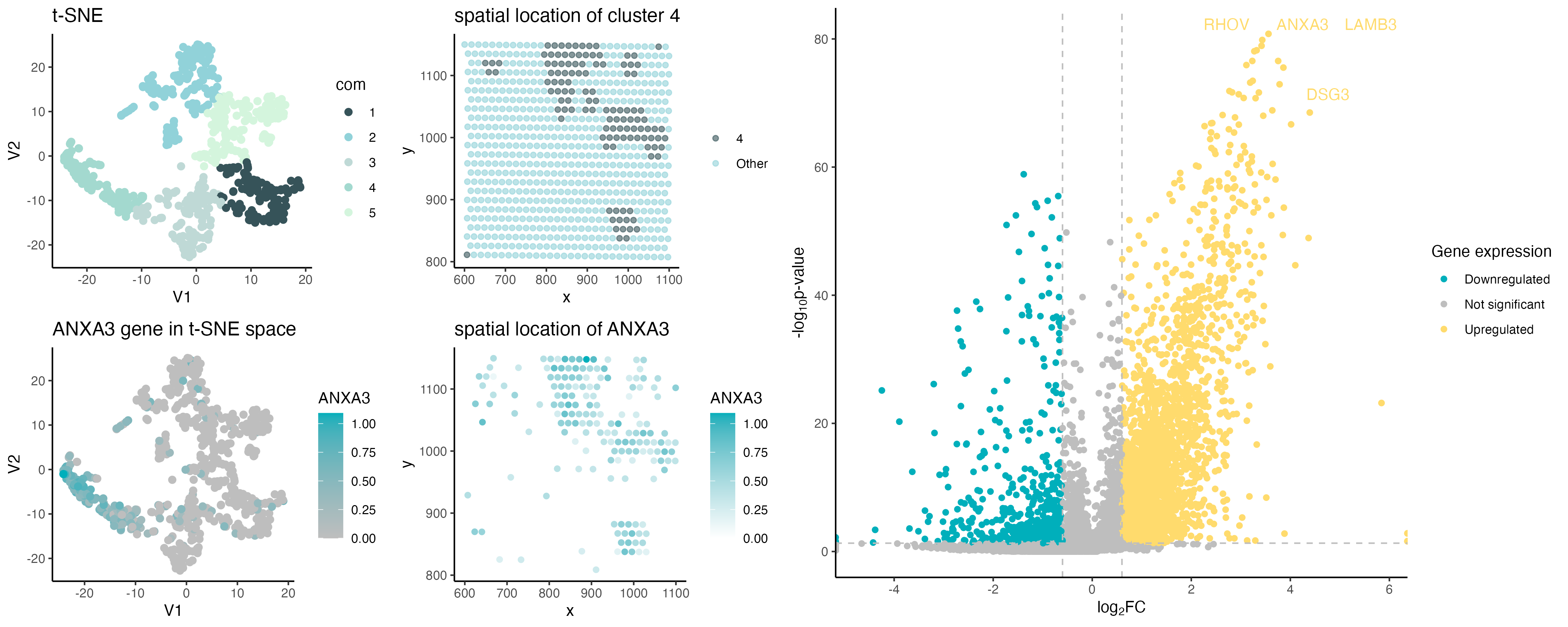
Description of Visualization Changes When visualizing the Eevee data set, I had visual analysis to determine the optimal number of clusters to be K=10. In the pikachu data set, I...
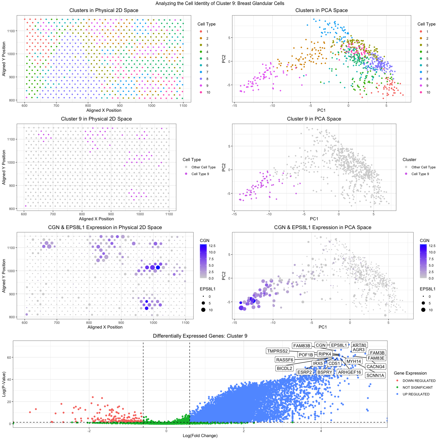
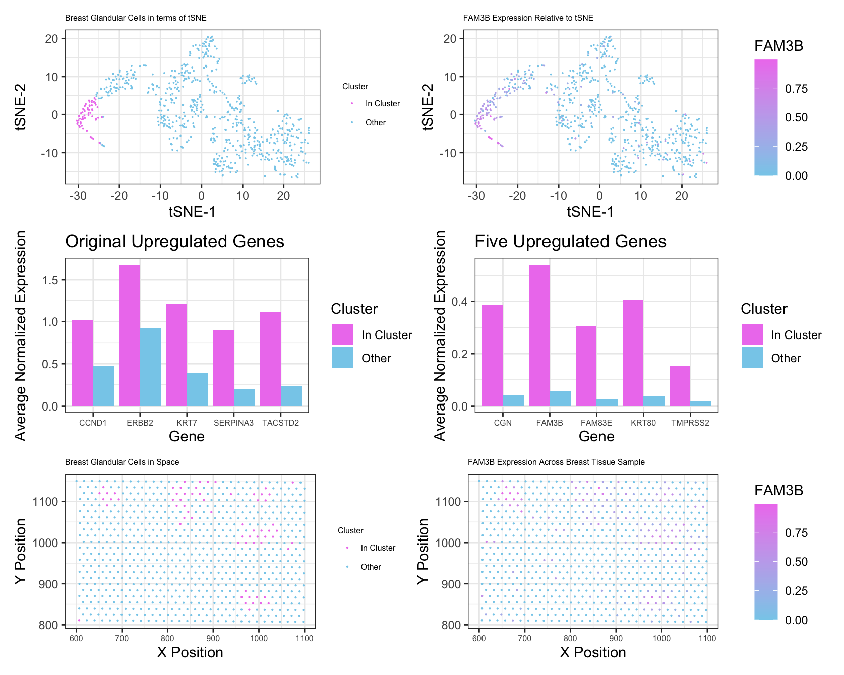
Figure Description: In applying the workflow adapted from homework 4 (k-means clustering and differential gene expression analysis), I believe I was able to identify breast glandular cells, or more specifically,...
Write a description to convince me you found the same cell-type My figure features cluster 5 and links the expression of a known breast cancer gene in mammary epithelial cells...
What am I visualizing? My visualization accomplishes the same goals as my previous one, honing in on a particular k-means cluster and identifying potential cell-types. In my previous Eeevee dataset,...
Create a multi-panel data visualization and write a description to convince me you found the same cell-type. In my original Eevee dataset, I identified a cell cluster that differentially expressed...
Describe your figure briefly so we know what you are depicting (you no longer need to use precise data visualization terms as you have been doing) For plot A, I...
Edits to the code Description: I switched from the pikachu to the eevee datset. To choose a better cluster size, I ran a loop to determine the total withiness plotted...
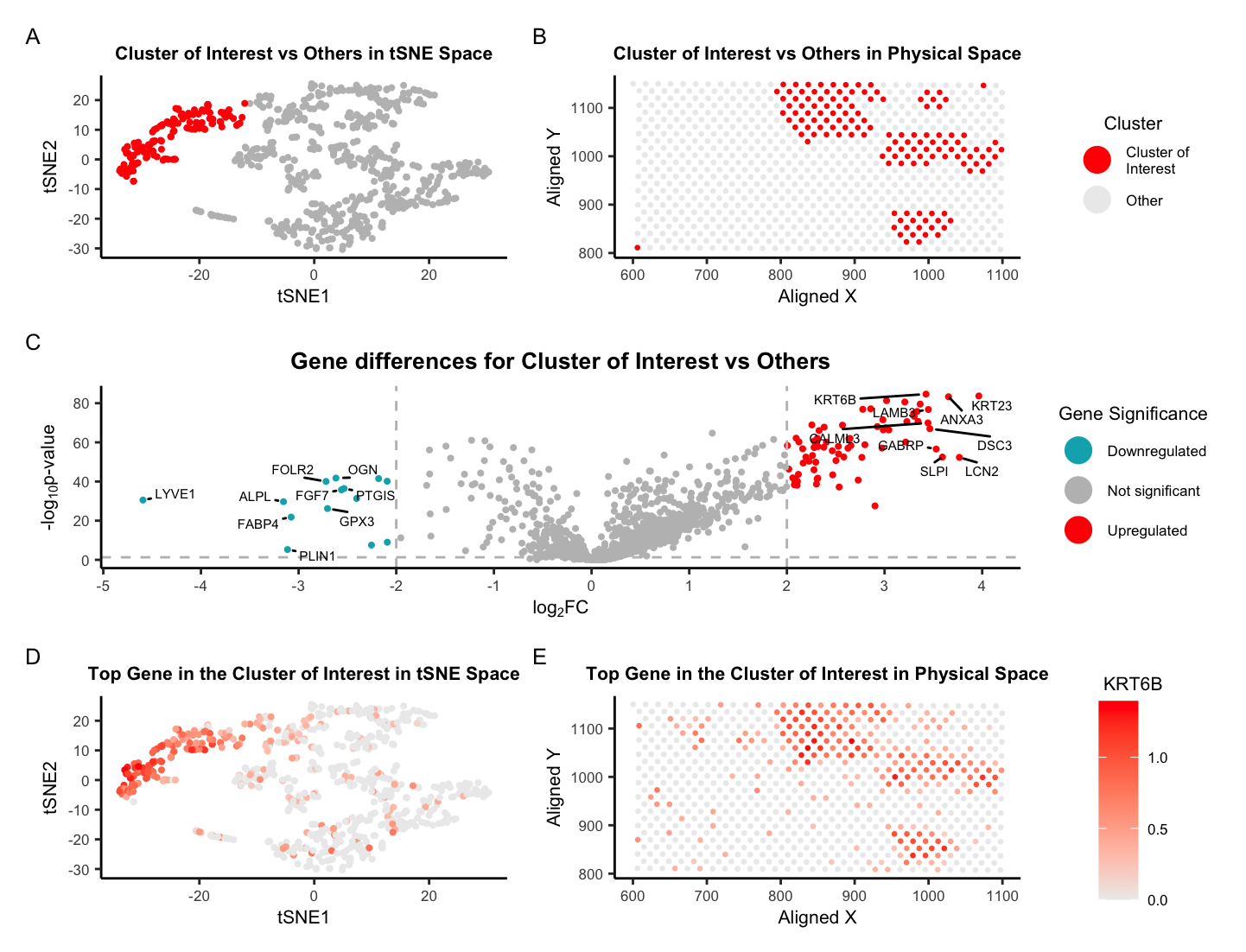
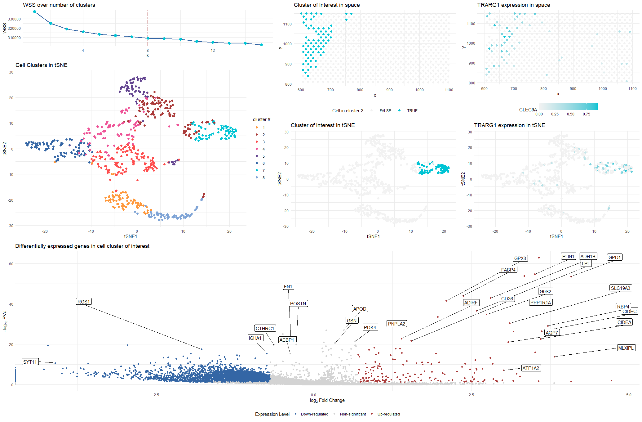
In the pikachu Single Cell Data Set, I identified a cluster of cells that had high expression of the KRT8 gene. I hypothesized that these cells were epithelial cells.
Write a description of what you changed and why you think you had to change it. For Homework 5, I am switching from the Eevee dataset to the Pikachu dataset....
Description For this assignment, I switched from the Pikachu to the Eevee dataset. I previously found that most of the variation was captured by about 20 PCs following PCA. With...
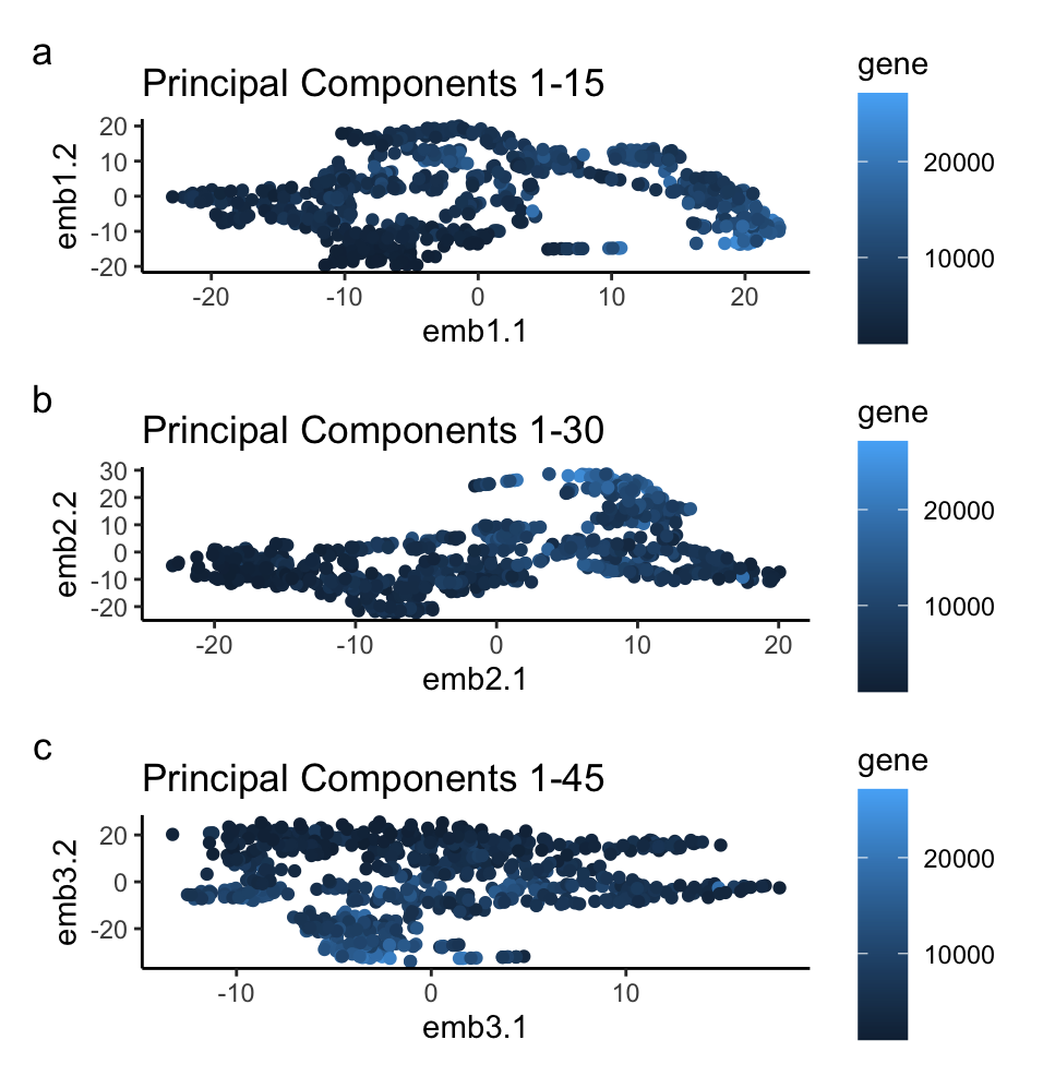
If I perform non-linear dimensionality reduction on PCs, what happens when I vary how many PCs should I use? If I perform non-linear dimensionality reduction on varying PCs the clustering...
Description of figure In the gif, I visualized the pca (linear) dimensionality reduction in 2D space which transitions into the tSNE (nonlinear) dimensionality reduciton in 2D space. The axes for...
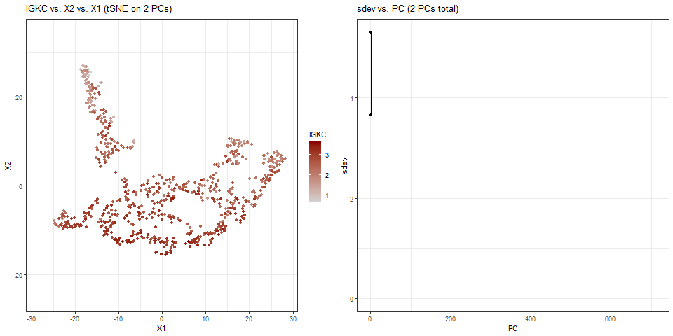
What data types are you visualizing? For the plots on the left side of the animation, I am visualizing the quantitative data of the X1 and X2 tSNE embedding values,...
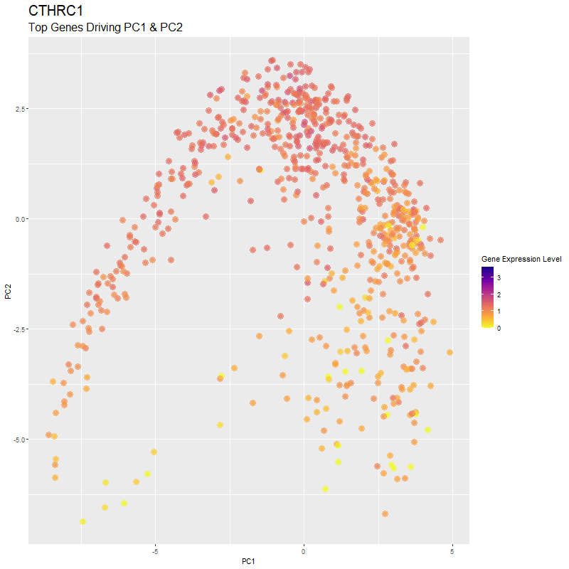
What are you visualizing? What genes are driving my reduced dimensionality components? I used gganimate to visualize the gene expression levels of genes that are driving the principal components (PC1...
What’s the difference if I perform linear or nonlinear dimensionality reduction to visualize my cells in 2D? I decided to explore the impact of linear versus nonlinear dimensionality reduction techniques...
gganimate animation from hw3
Animation of the expression of the top gene POSTN can be expressed across different dimensionality reduction plots (PCA, t-sne, and UMAP).
Description This gif is a visualization of what happens when you run nonlinear dimensionality reduction (in this case tSNE) on an increasing number of principal components (PCs) after principal component...
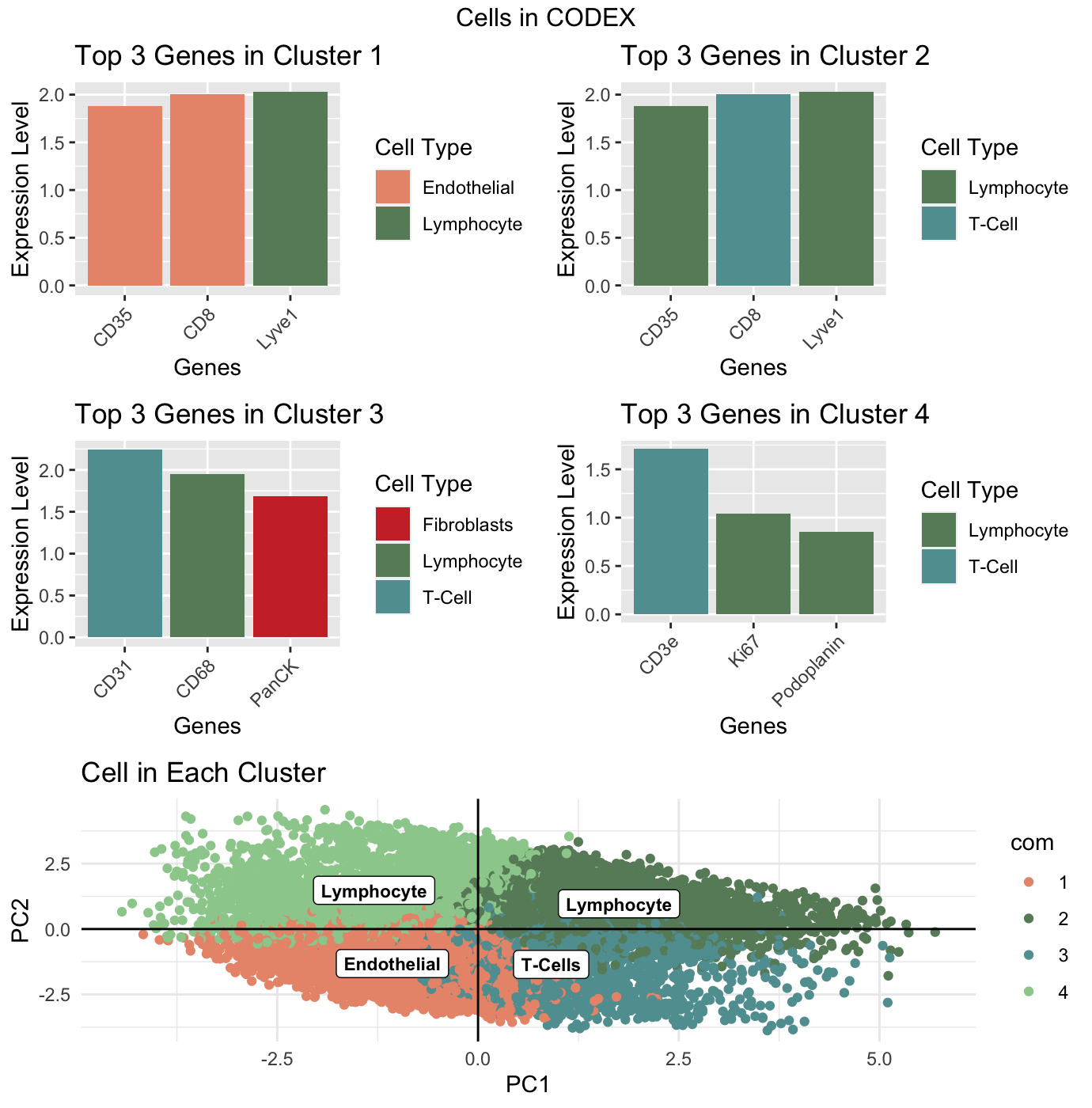
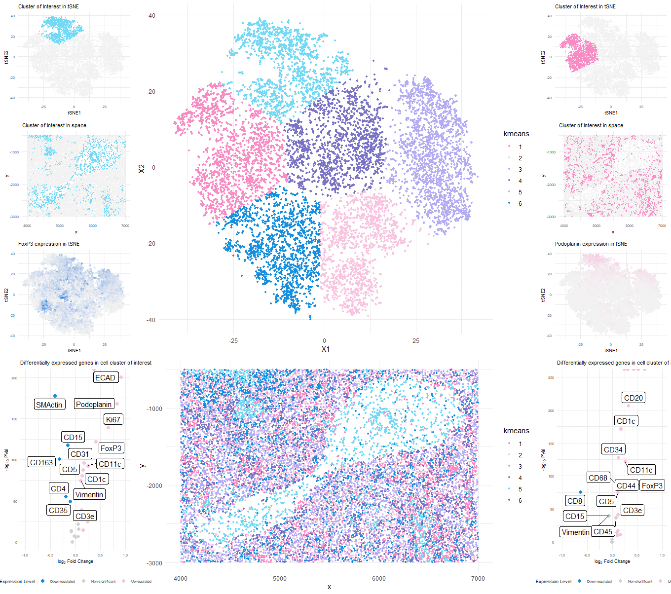
Perform a full analysis (quality control, dimensionality reduction, kmeans clustering, differential expression analysis) on your data. Your goal is to figure out what tissue structure is represented in the CODEX...
Figure Description: The general workflow from homework 5 was applied with some modifications, namely utilizing tSNE instead of PCA for dimensionality reduction, to analyze the CODEX dataset. I ultimately believe...
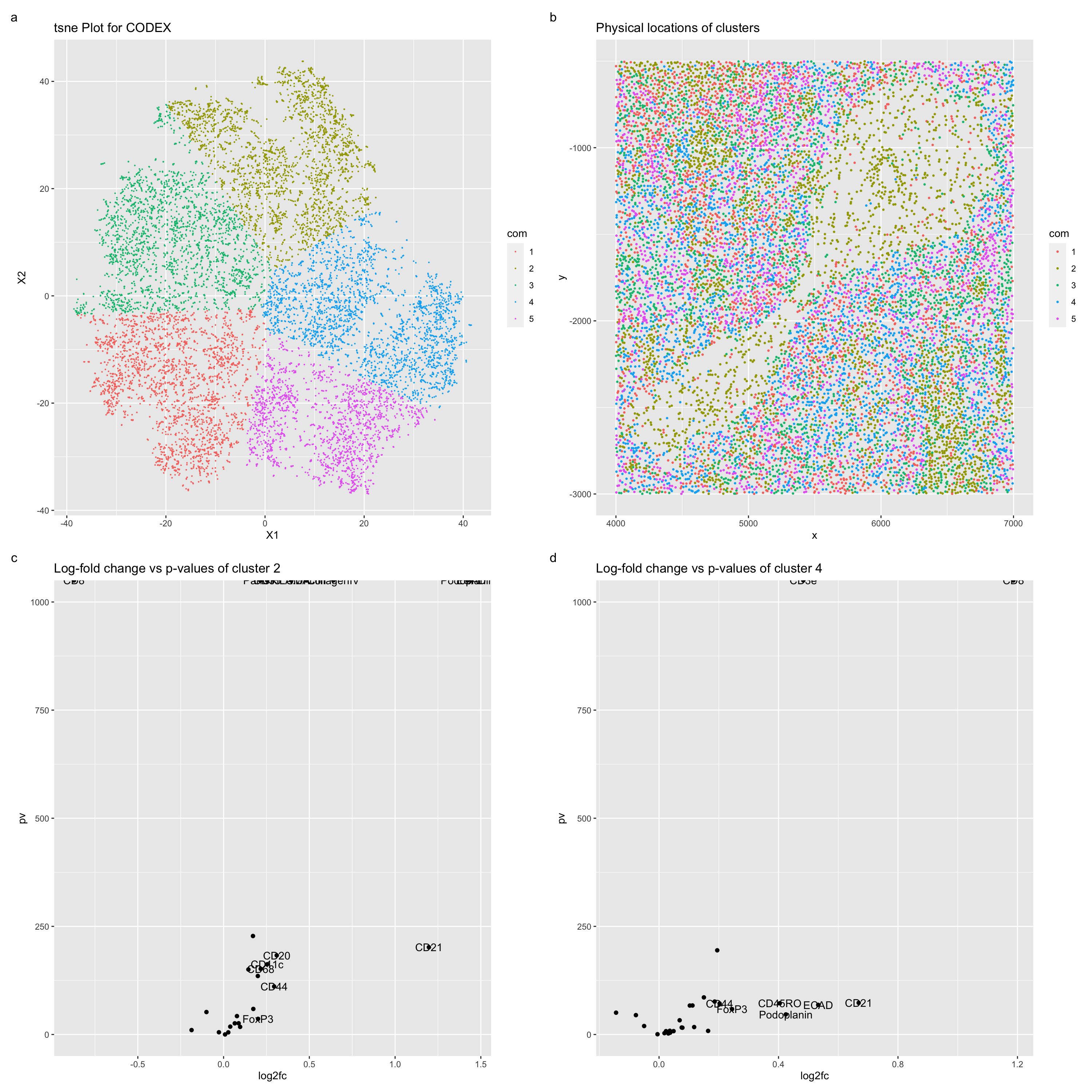
Figure Description Figure a describes a TSNE plot for the CODEX data, with the color hues used to represent the kmeans clustering of this plot with a k = 5....
Describe your data visualization After normalizing the protein expression, I applied PCA and t-SNE for dimensionality reduction. Then I determined the optimal number of clusters using the elbow method. Choosing...
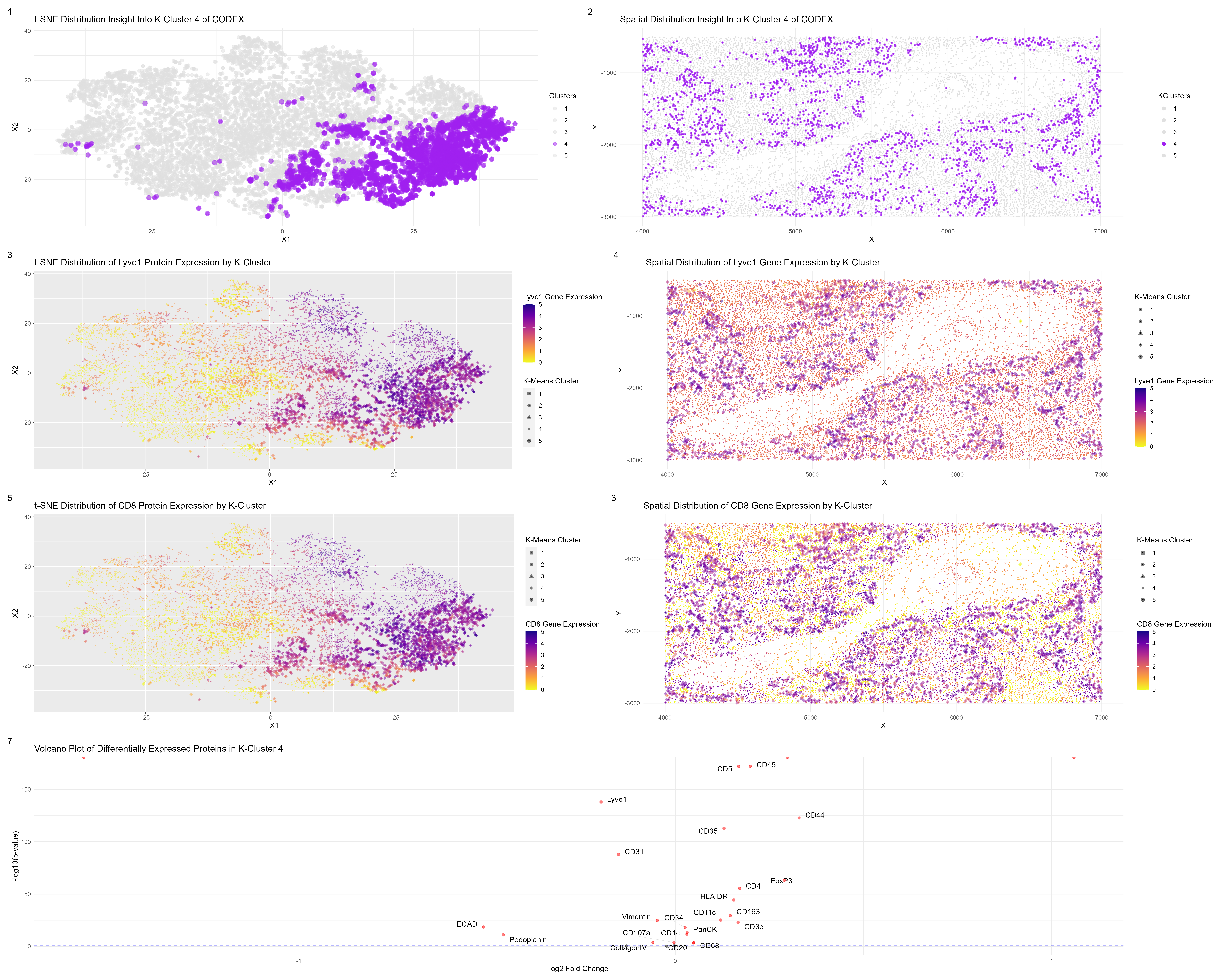
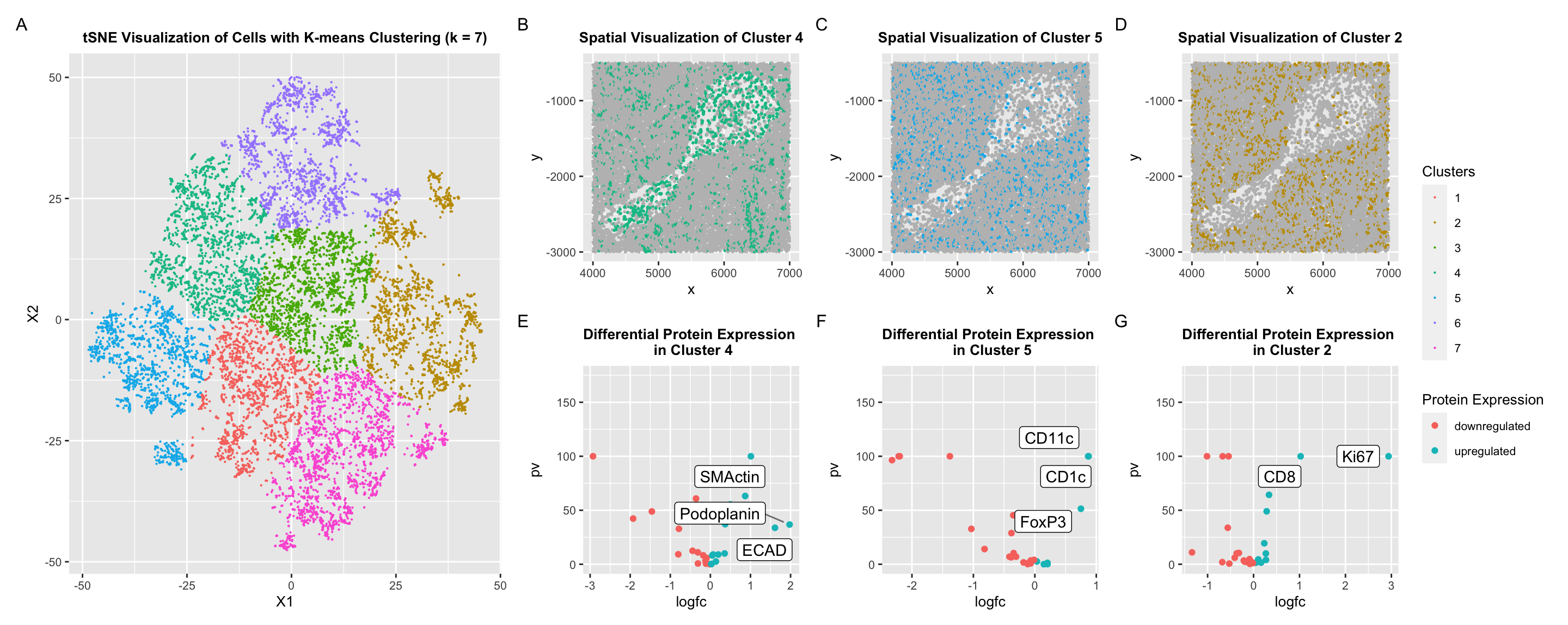
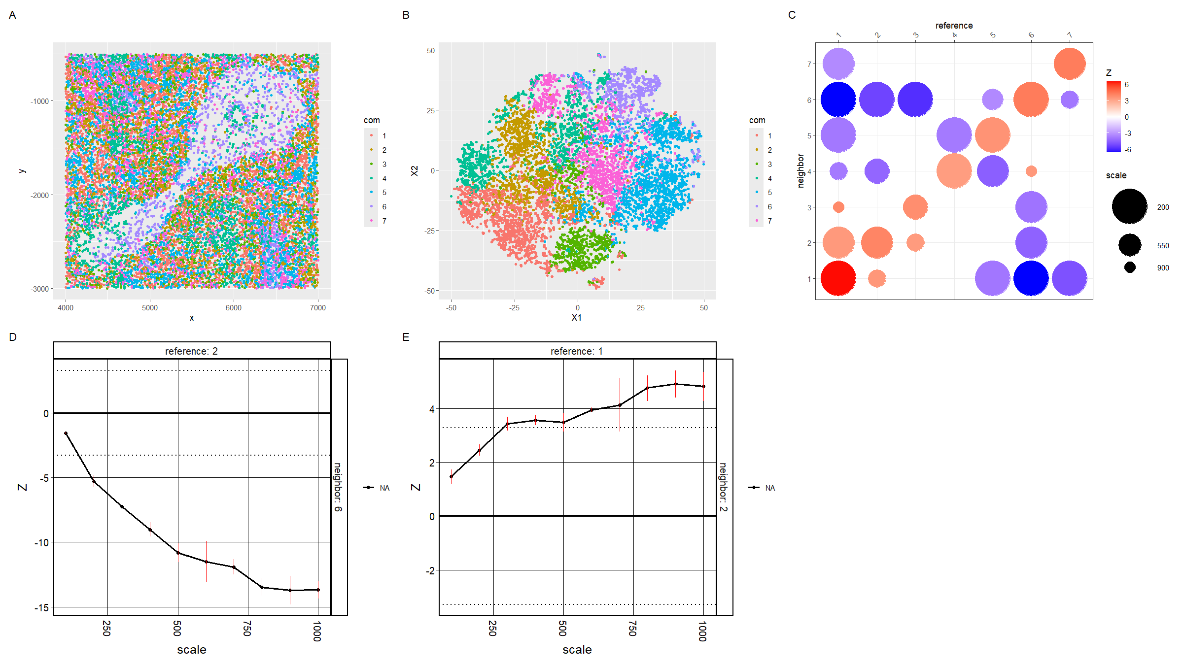
Tissue structure representation in the CODEX data In this visualization, we investigate the tissue structure from spleen protein localization data. For the first row of visualizations, in plots a and...
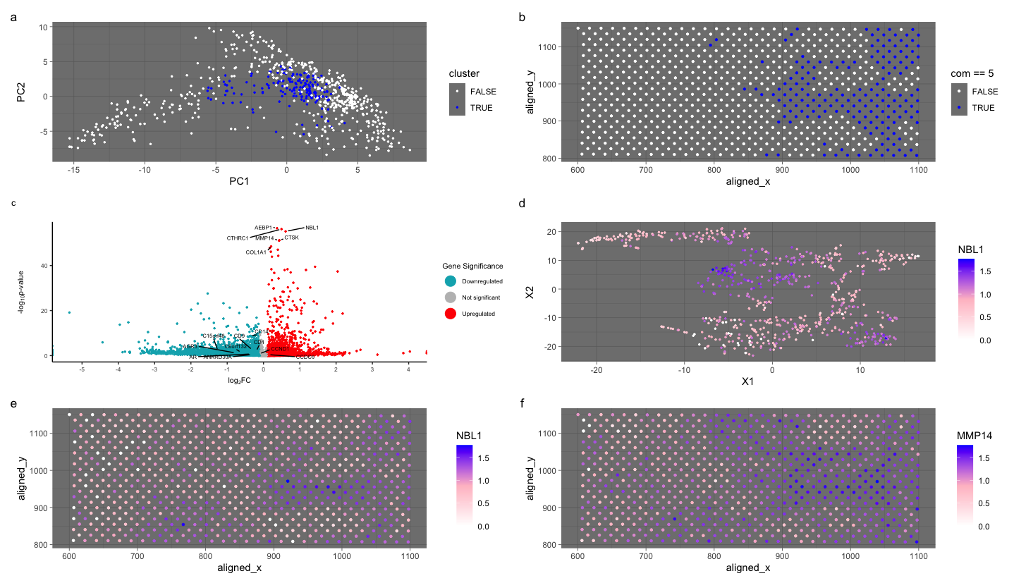
###Cluster of interest 1 (cluster 5) Based on the upregulated markers in the volcano plot it seems like the cell cluster could be representing Artery/Vein tissue structure. CD31 (PECAM-1): CD31...
You will need to visualize and interpret at least two cell-types. Create a data visualization and write a description to convince me that your interpretation is correct.
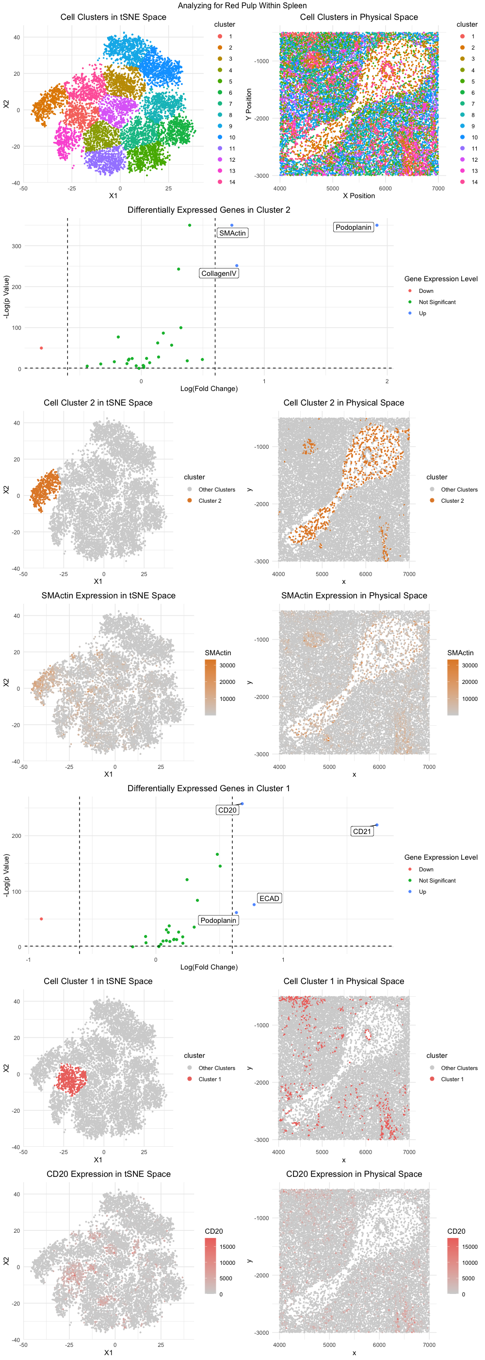
Your goal is to figure out what tissue structure is represented in the CODEX data. Options include: (1) Artery/Vein, (2) White pulp, (3) Red pulp, (4) Capsule/Trabecula. You will need...
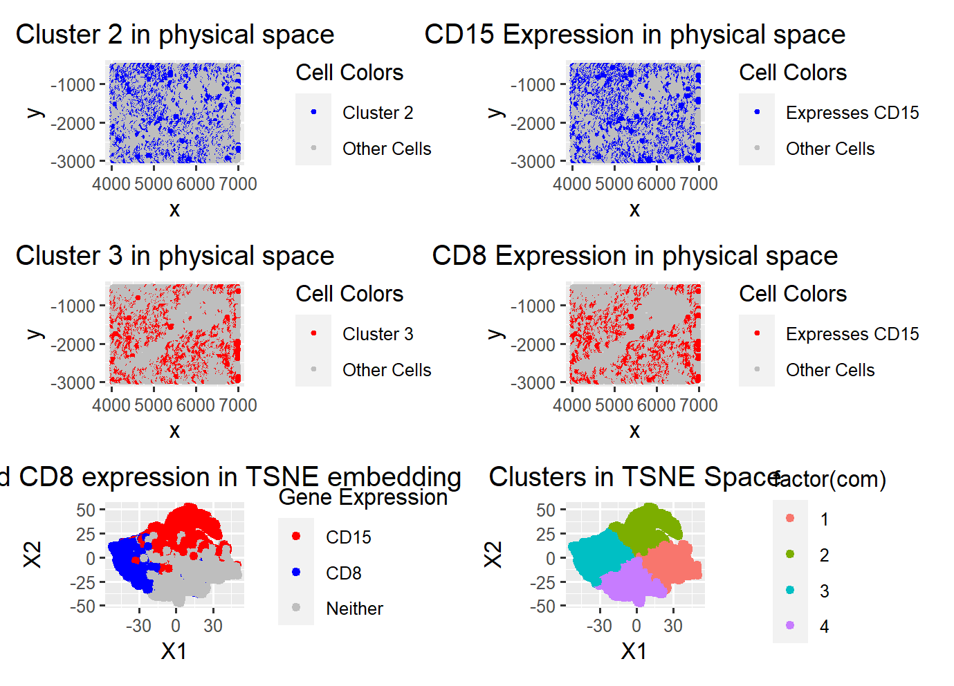
What am I visualizing? Here, I am visualizing a particular cluster from the CORDEX dataset, full of proteins, of an unknown tissue structure, in the hope of identifying the tissue...
Your goal is to figure out what tissue structure is represented in the CODEX data. Options include: (1) Artery/Vein, (2) White pulp, (3) Red pulp, (4) Capsule/Trabecula The tissue structure...
Describe your figure briefly so we know what you are depicting (you no longer need to use precise data visualization terms as you have been doing) For plot A, I...
Perform a full analysis (quality control, dimensionality reduction, kmeans clustering, differential expression analysis) on your data. Your goal is to figure out what tissue structure is represented in the CODEX...
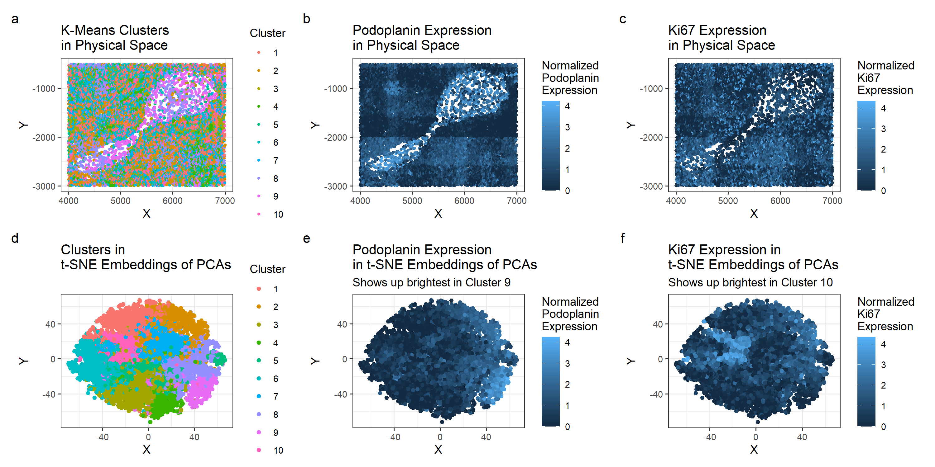
My hypothesis is that this data represents a section of spleen tissue which includes an artery and surrounding white pulp. My hypothesis is based off of the cell types I...
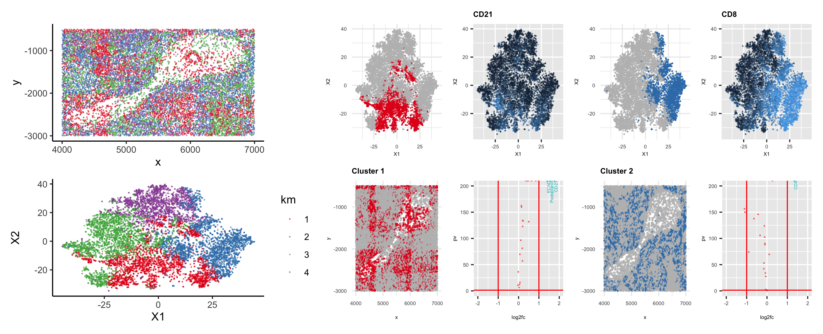
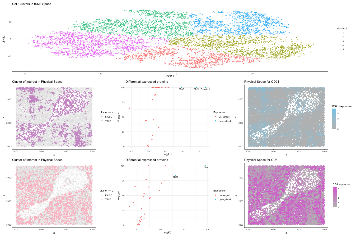
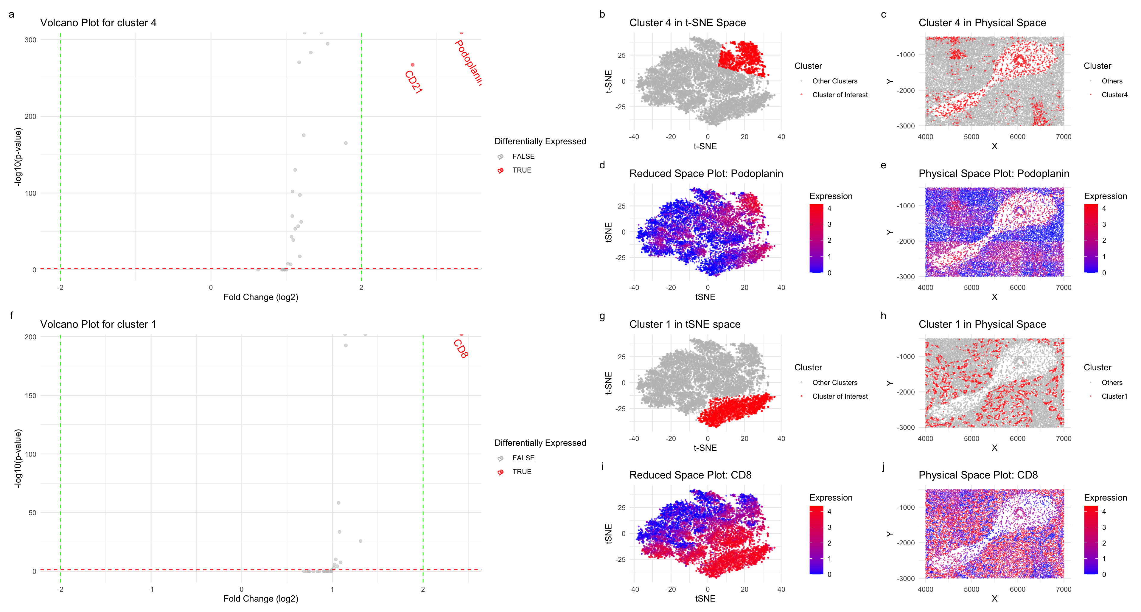
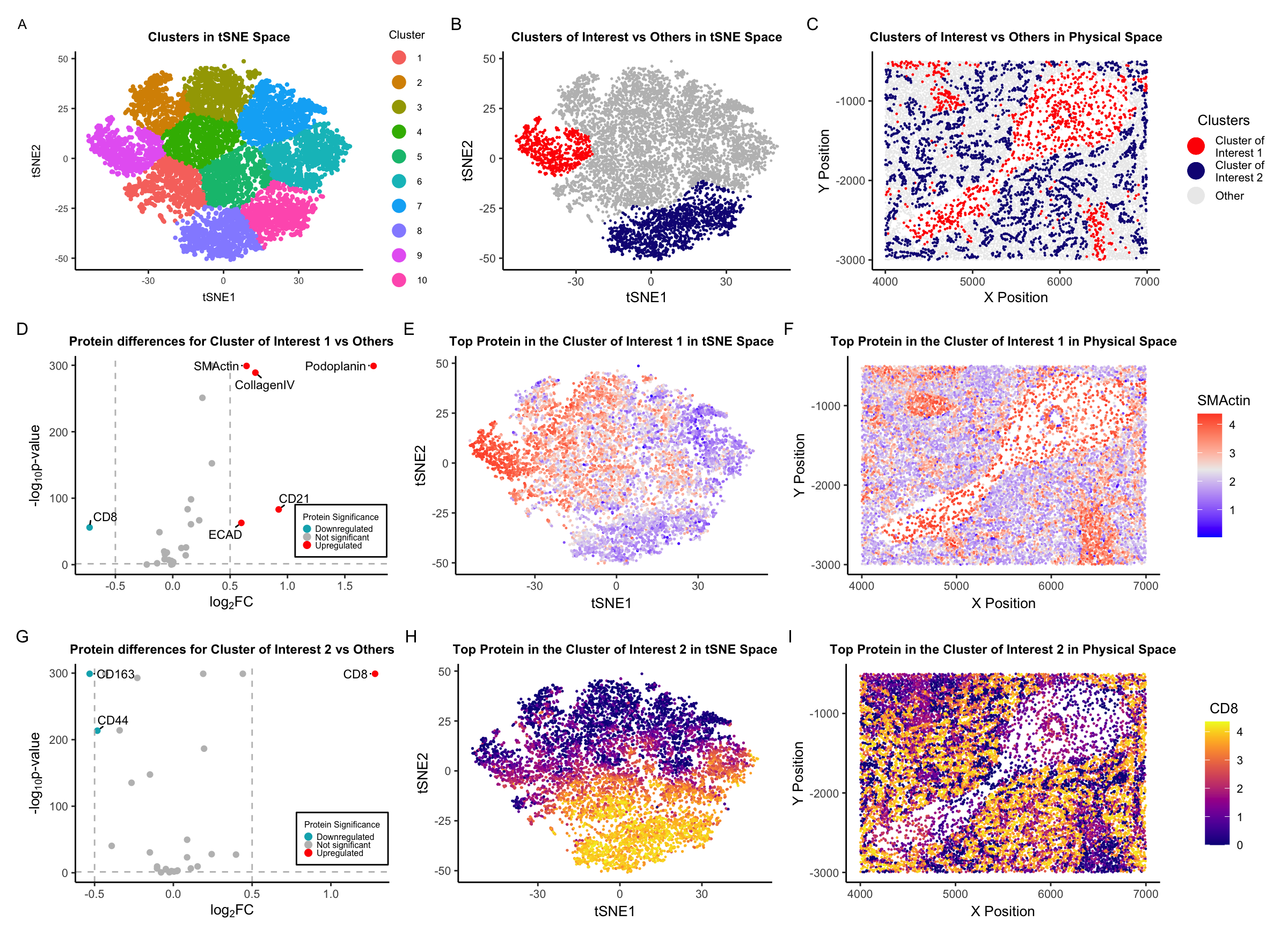
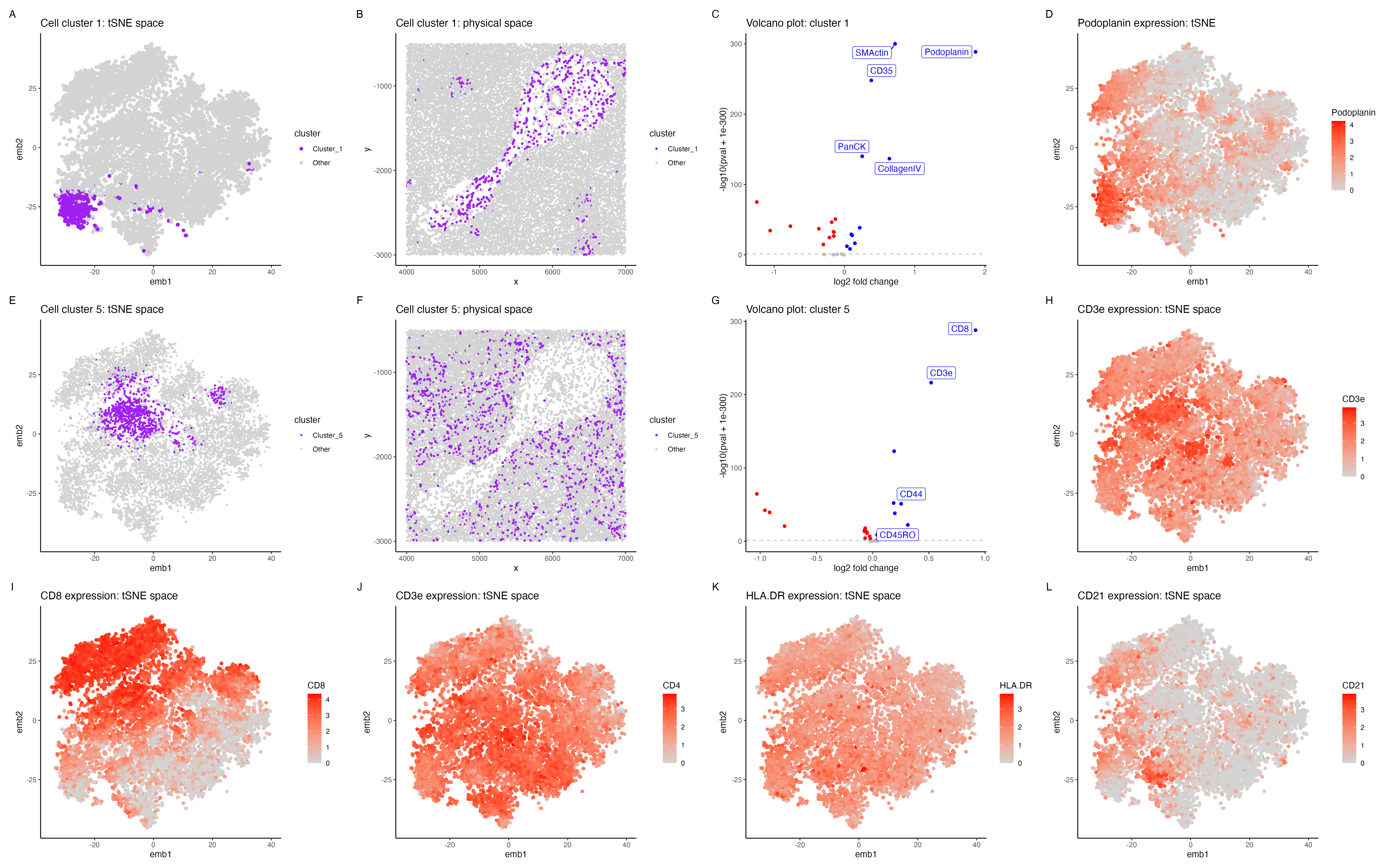
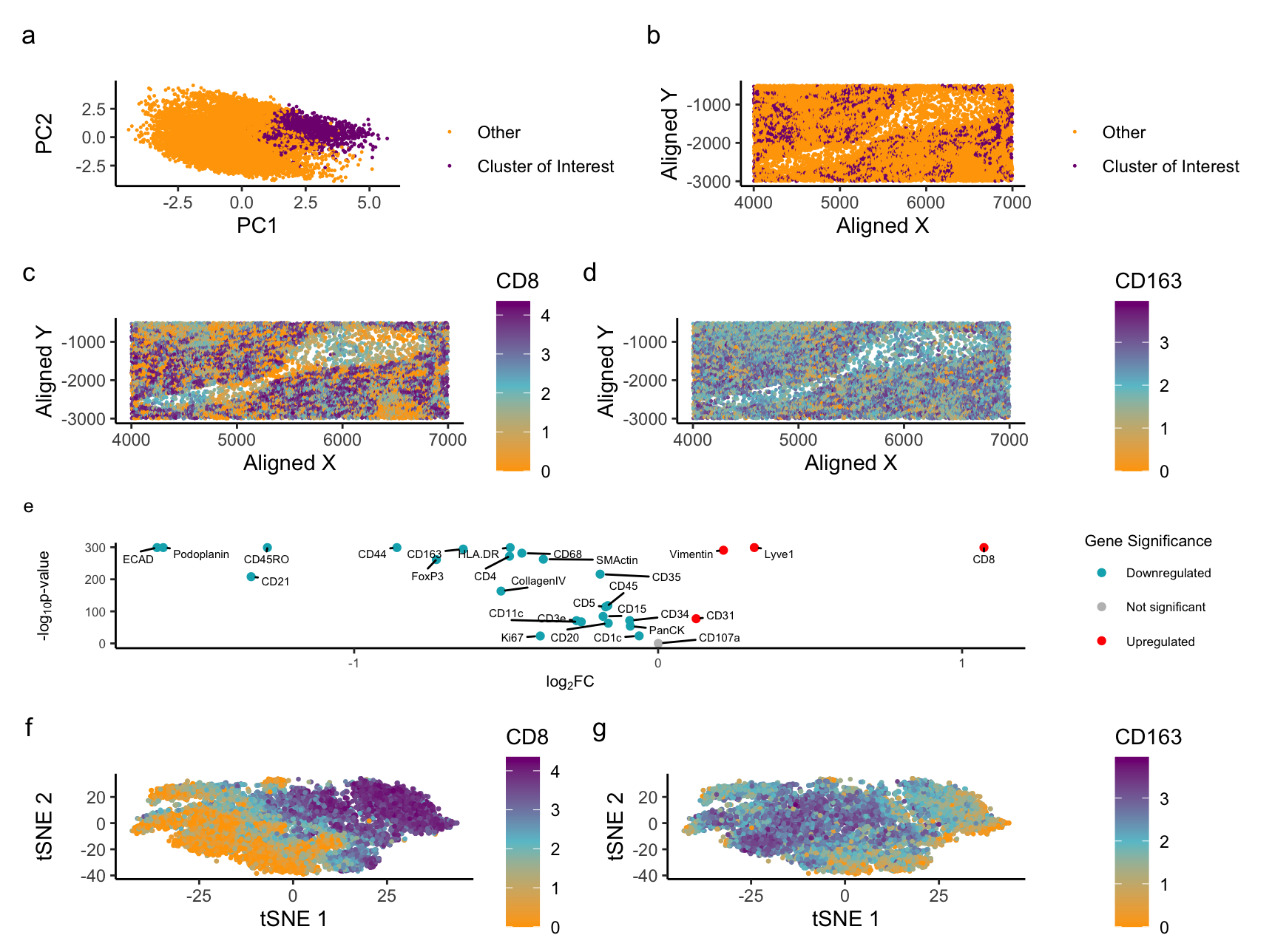
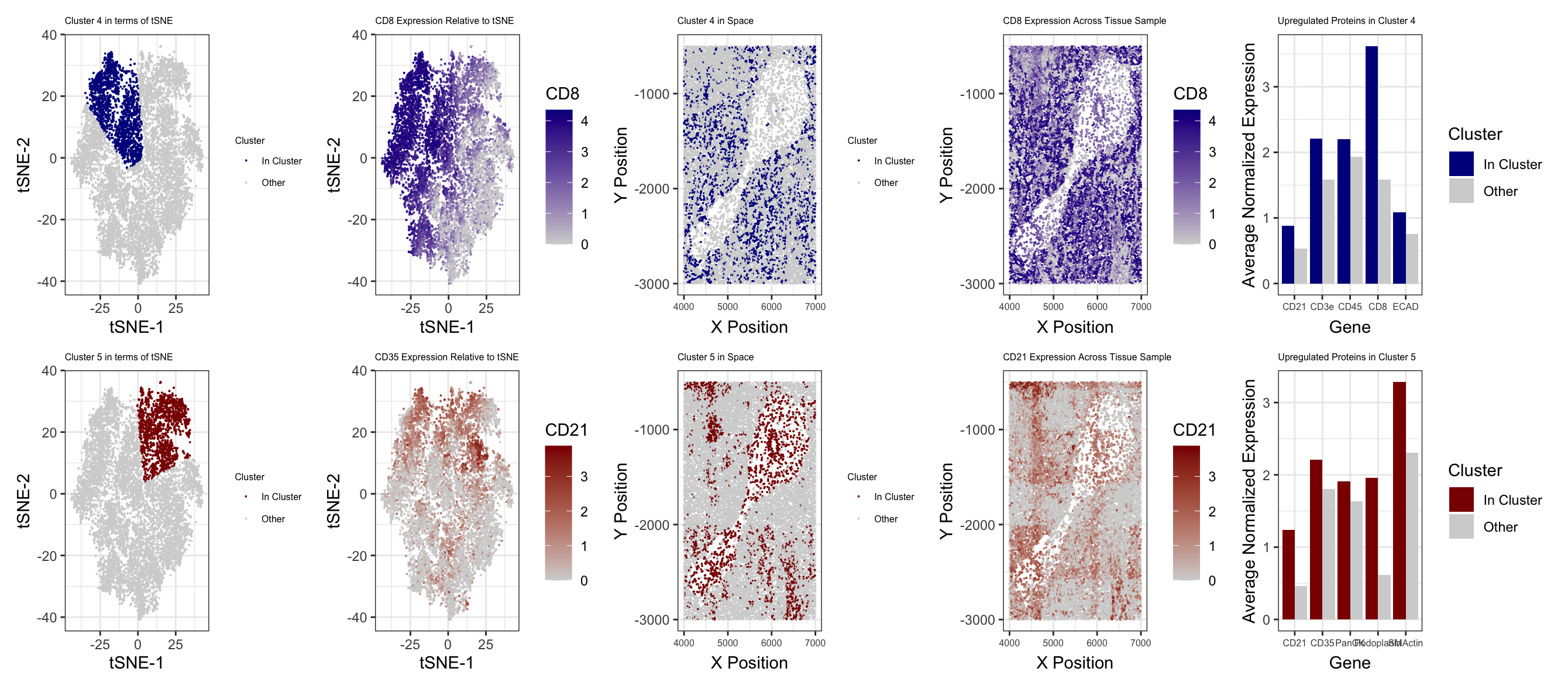
In the above visualization I have identified a cluster that belongs to endothelial cells (panels A-D), a cluster that belongs to T cells (panels E-H), followed by exploring highly expressed...
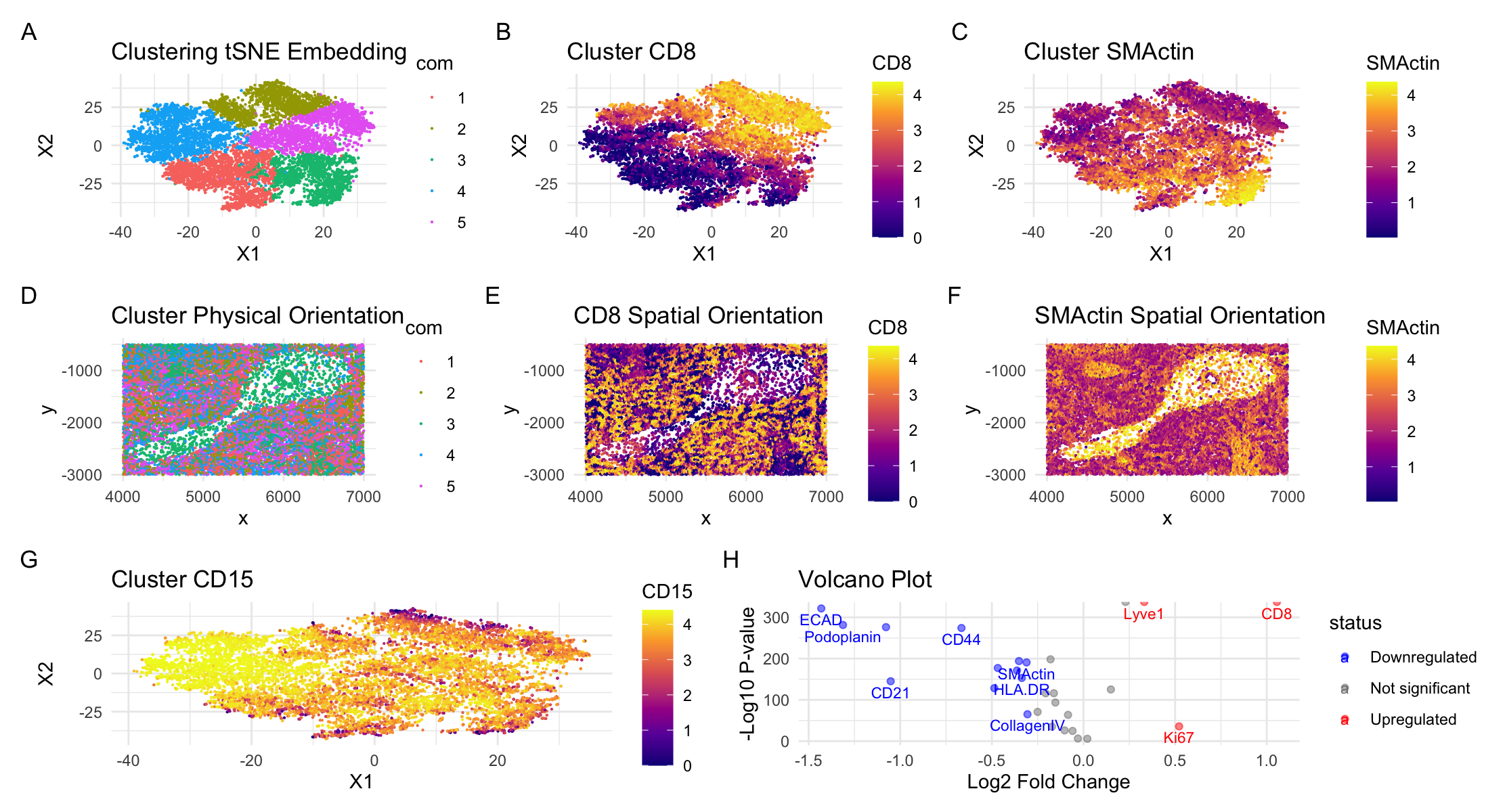
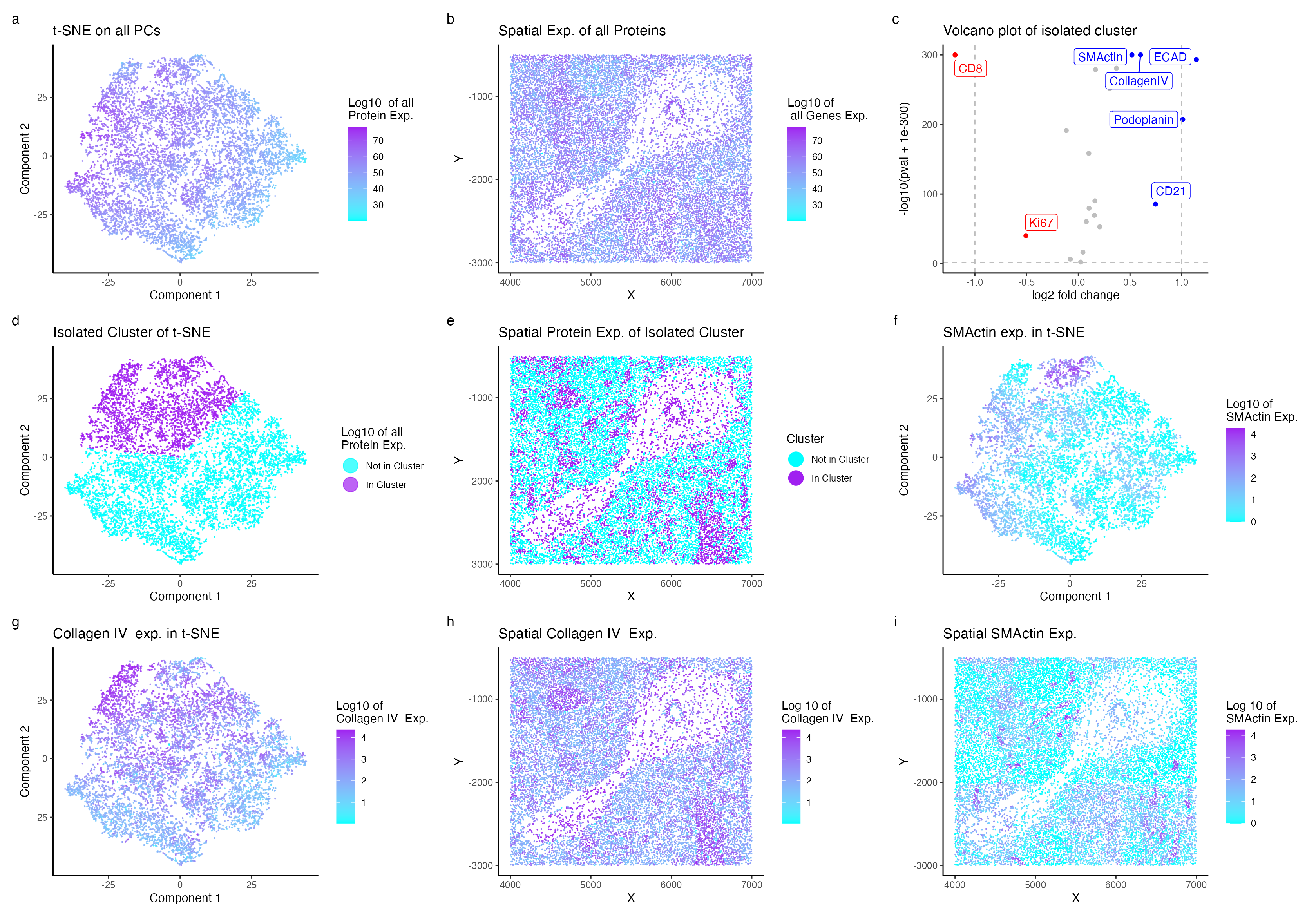
Description of Visualization I am analyzing spleen tissue from the CODEX dataset and have identified a region composed of artery/vein cell types. Specifically, this cluster of cells expresses SMActin and...
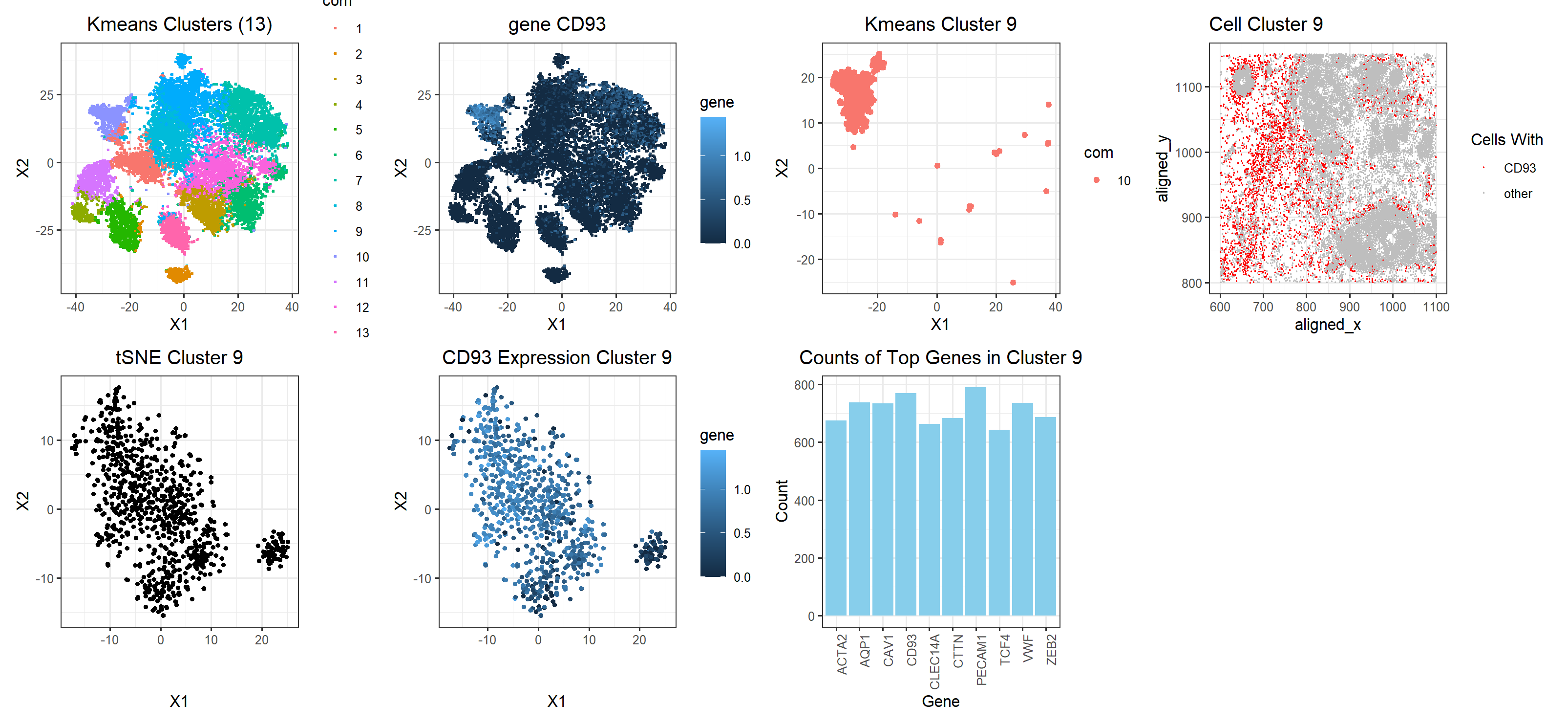
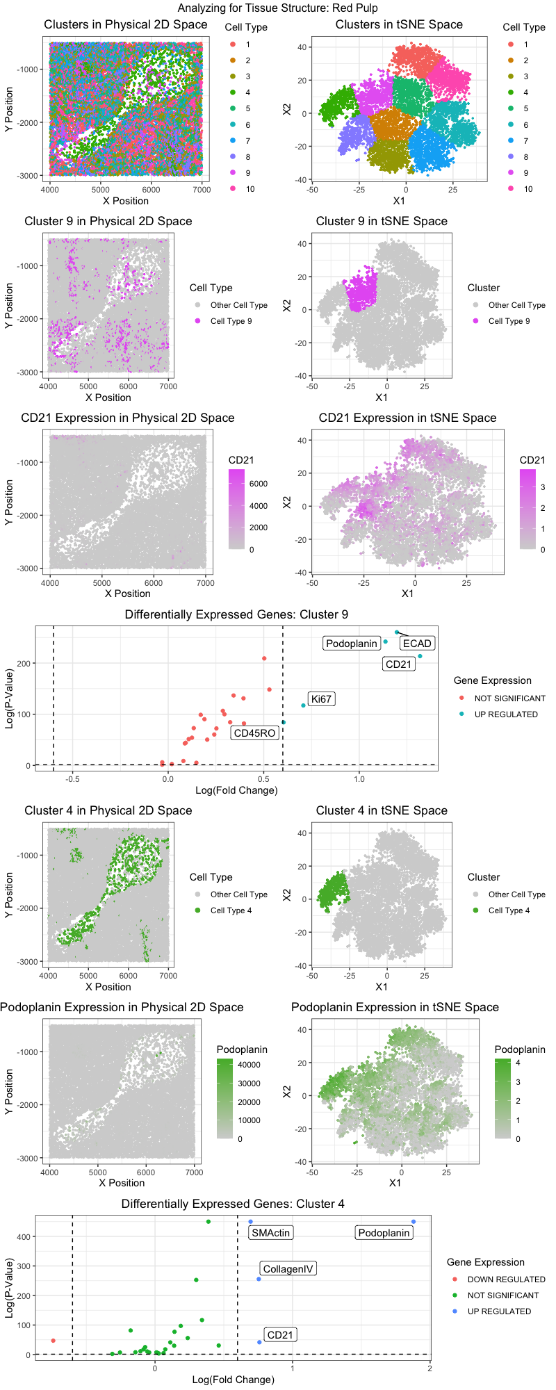
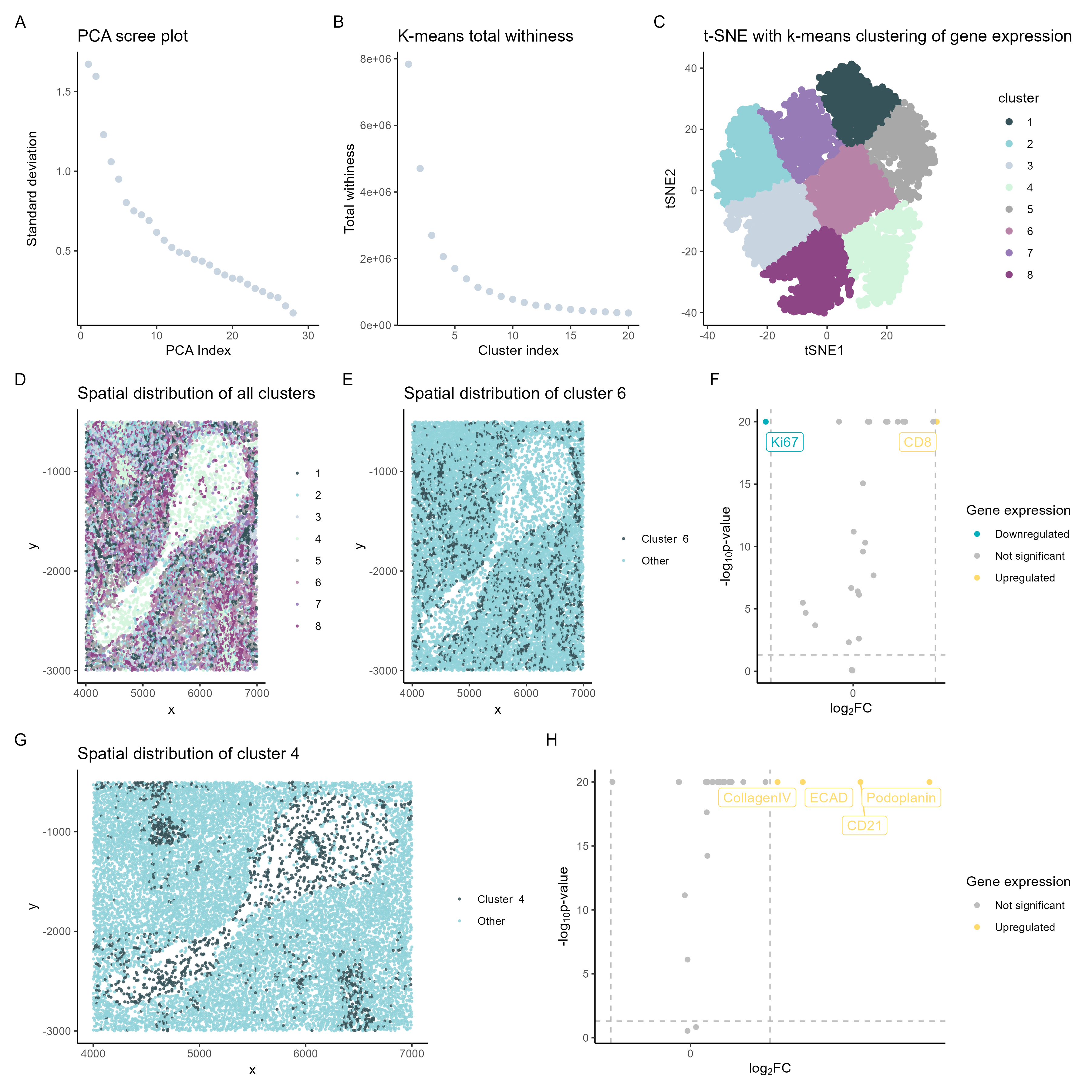
Figure Description: Adapting the workflow from homework 5 (k-means clustering and differential gene expression analysis), I believe I was able to identify two distinct cell types in clusters 9 and...
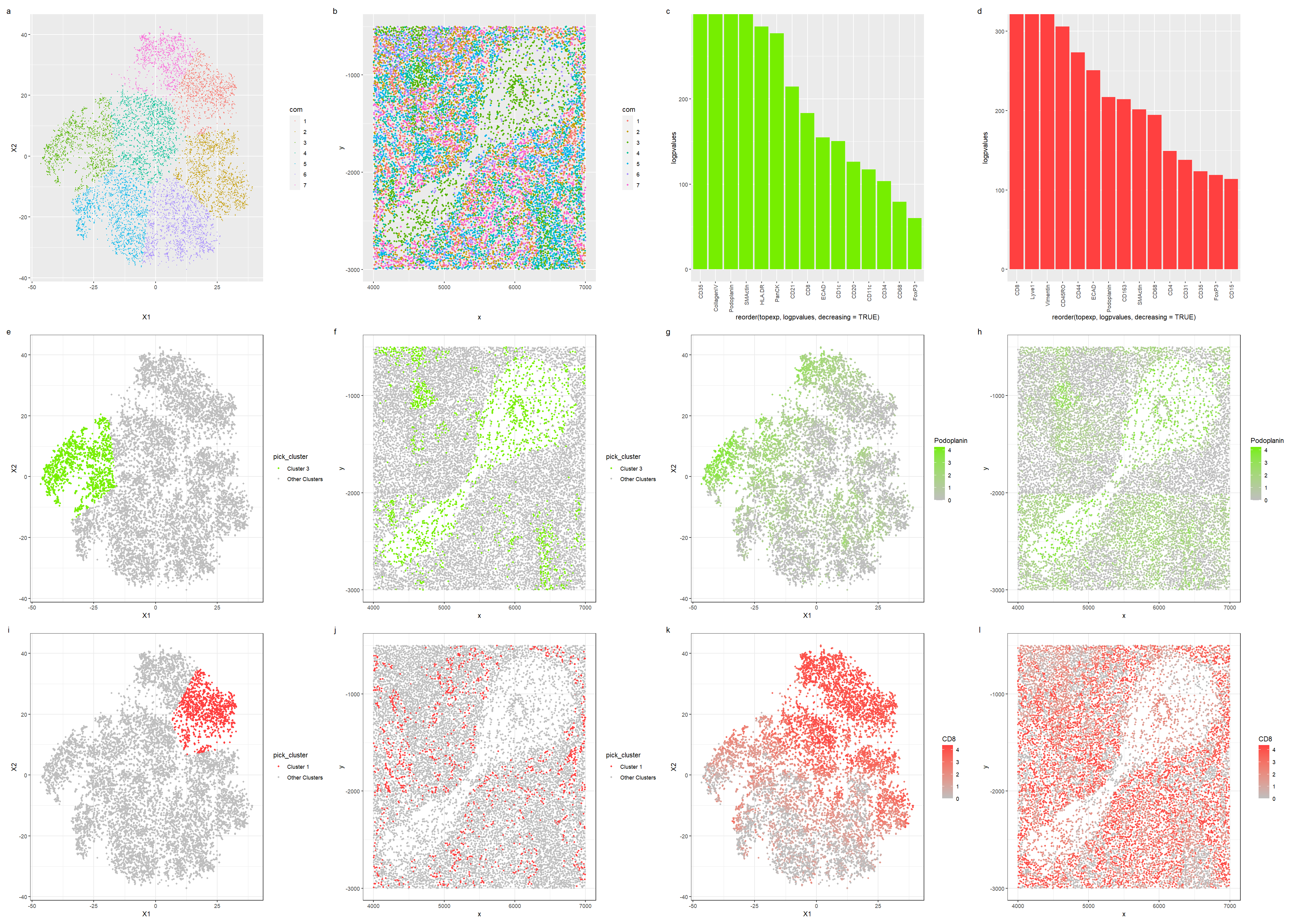
Your description should reference papers and content that allowed you to interpret your cell clusters as a particular cell-types. My figure visualizes the white and red pulp of the spleen....
You will need to visualize and interpret at least two cell-types. Create a data visualization and write a description to convince me that your interpretation is correct.
Plot Description The visualization shows the effect of varying number of principle components (2,4,6,10,20,30) on later non-linearity reduced space. Expression of CD1c gene is color-coded to see how well the...
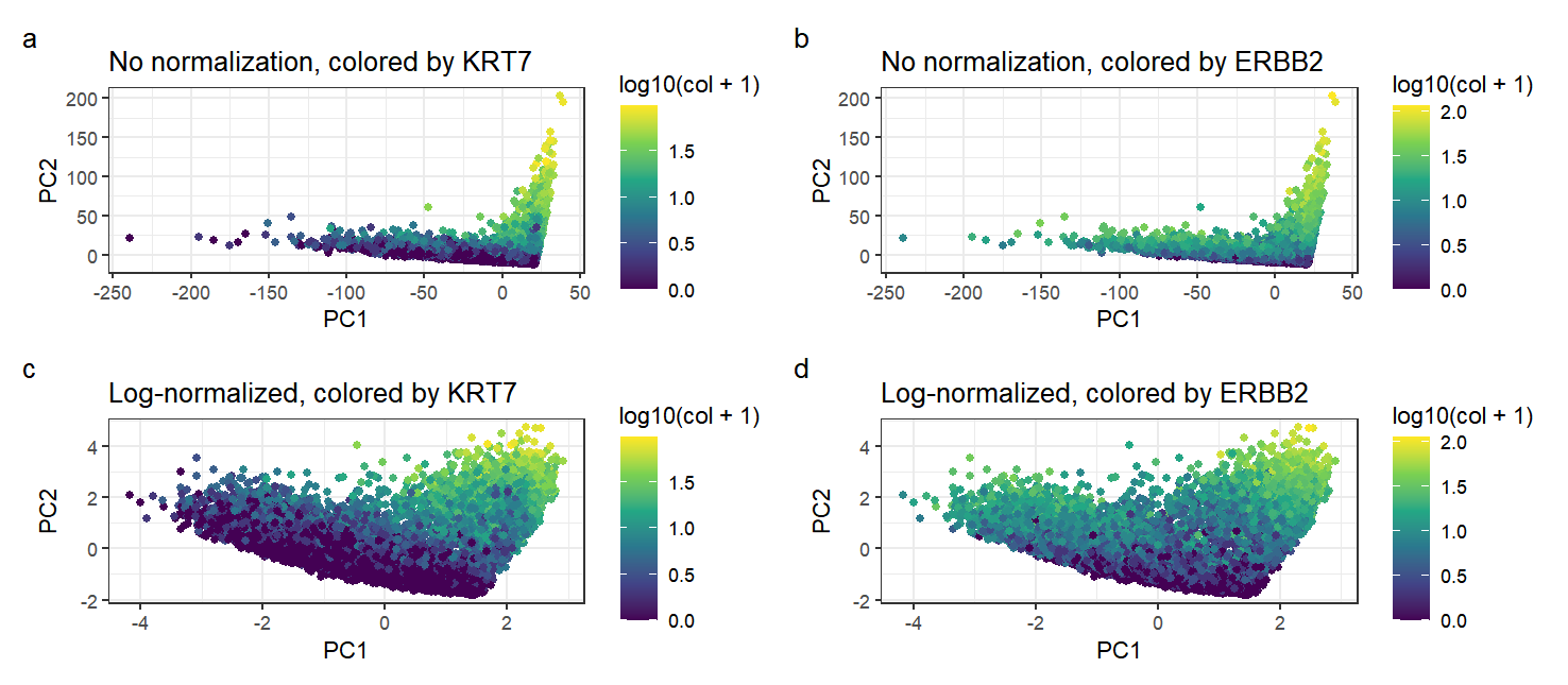
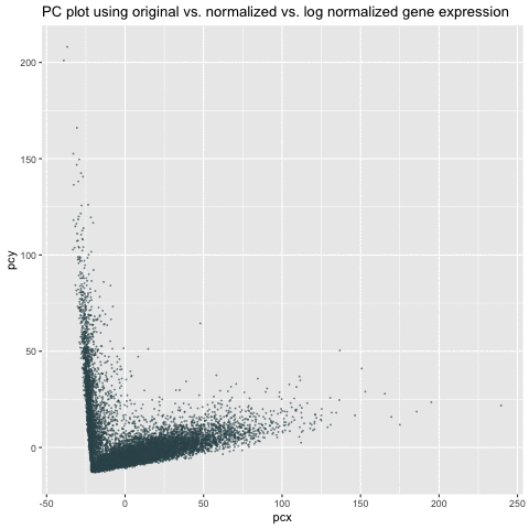
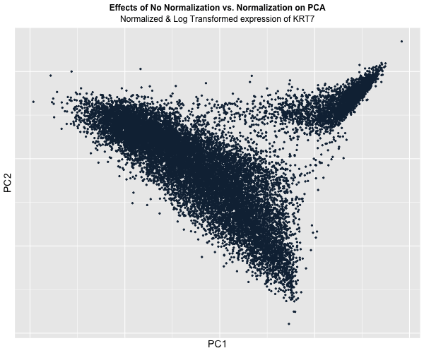
Figure Description: I animated the transition between two plots: one depicting the raw, unaltered data, and the other showcasing the data after normalization and log transformation. In the initial plot,...
Figure Description: I decided to animate the effects of normalization and transformation on PCA by transitioning between two plots: (1) where the data is not normalized or transformed and (2)...
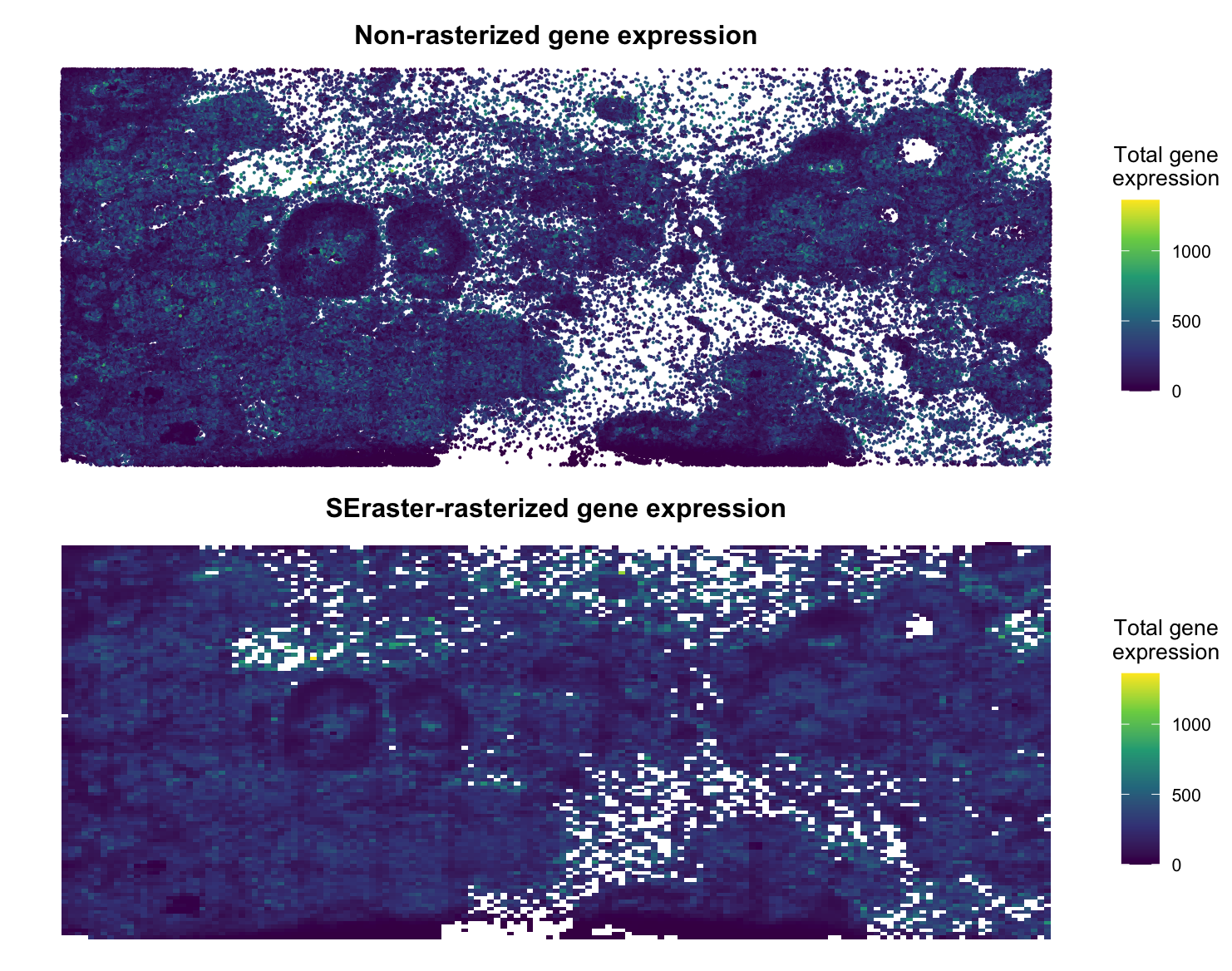
Brief Description I decided to utilize SEraster on a Xenium breast cancer dataset (https://www.10xgenomics.com/products/xenium-in-situ/preview-dataset-human-breast) to rasterize gene expression. Plotted below is the non-rasterized gene expression compared to the rasterized gene...
Apply SEraster, STalign, or CRAWDAD to a spatial omics dataset from the class I applied CRAWDAD to the pikachu dataset. After normalizing the dataset, I performed Kmeans clustering using the...