HW2

1. Write a description explaining what you are trying to make salient and why you believe your data visualization is effective using vocabulary terms from Lesson 1.
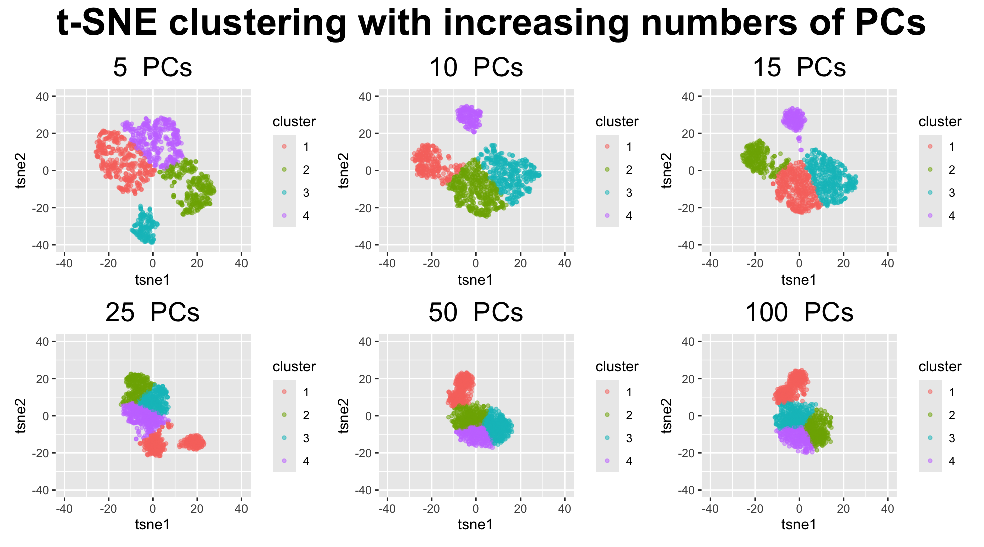
My visualization is designed to make changes in cluster structure salient as a function of the number of principal components used as input to t-SNE. Each spatial barcode spot is represented as a geometric primitive of a point that encodes quantitative positional data. Its position in 2D t-SNE space encodes quantatiative data of a non-linear high-dimensional transcriptional similarity. Cluster identity is encoded using the visual channel of color to represent categorical data to quickly assess grouping patterns.
I hoped to make salient that when very few PCs are used (around 5), there is more dispersion and fragmentation as some points are spread out with visible gaps, and clusters appear subdivided into many smaller clusters. Even with the gestalt pincriple of similarity by color, it clashes witht the Gestalt principles of proximity, where there are many cases of small groups of points that are more much closer to each other than other points of the same color and cluster label. This creates some ambiguity in the perceived structure, highlighting how under-representation of variance can exaggerate local differences.
At intermediate PC values (around 10/15 PCs), the visualization becomes most effective. Points belonging to the same transcriptional populations move closer together, improving continuity and proximity, and resulting in clearly separated clusters that align well with k-means clustering. We can easily distinguish one large population split into two major clusters, along with two smaller but distinct populations. This balance makes the true clustering structure more salient.
At high PC values (>25 PCs), the visualization becomes less effective at conveying cluster boundaries. Points collapse into a dense cloud occupying a smaller spatial footprint, reducing the effectiveness of position as a visual encoding. The loss of empty space weakens Gestalt cues such as continuity and proximity, making cluster boundaries difficult to perceive. As a result, k-means clustering appears to impose artificial structure rather than revealing natural groupings. \
2. How do tSNE coordinates change as you increase or decrease the number of PCs?
With fewer PCs at around 5, the input captures only a limited portion of the total variance. As a result, t-SNE exaggerates local differences, causing points to spread out and form many small, fragmented and artificual clusters. The coordinates are more dispersed, and distances between points are larger, leading to visible gaps in the embedding.\
With a moderate number of PCs at around 10 to 15, the input better captures meaningful biological variation while filtering out noise. Points corresponding to the same cell populations move closer together, and distances between clusters become more stable. The t-SNE coordinates reflect clearer global structure, producing well-defined clusters with interpretable boundaries.\
With too many PCs, additional dimensions dominated by noise are introduced. This causes t-SNE to compress the embedding, pulling points closer together and reducing inter-cluster distances. The coordinates collapse into a dense region, and meaningful separation is lost as clusters overlap or merge.\
3. Code
1
2
3
4
5
6
7
8
9
10
11
12
13
14
15
16
17
18
19
20
21
22
23
24
25
26
27
28
29
30
31
32
33
34
35
36
37
38
39
40
41
42
43
44
45
46
library(ggplot2)
library(Rtsne)
library(patchwork)
data <- read.csv("genomic-data-visualization-2026/data/Visium-IRI-ShamR_matrix.csv.gz")

pos <- data [,c('x', 'y')]
rownames(pos) <- data[, 1]

gexp <- data[, 4:ncol(data)]
totgexp <- rowSums(gexp)
mat <- log10(gexp/totgexp * 10^6 + 1)


## PCAs
pcs <- prcomp(mat, center=T, scale=F)
pcs$rotation[1:5, 1:5]
plot(pcs$sdev[1:50])

numPCs <- c(5, 10, 15, 25, 50, 100)
plots <- list()
for(i in 1:length(numPCs)){
  n <- numPCs[i]
  toppcs <- pcs$x[, 1:n]
  tsne <- Rtsne::Rtsne(toppcs, dims = 2, perpexity = 30)
  emb <- tsne$Y
  rownames(emb) <- rownames(mat)
  colnames(emb) <- c('tsne1', 'tsne2')
  km <- kmeans(emb, centers=3)
  cluster <- as.factor(km$cluster)
  df <- data.frame(emb, cluster, pos, pcs$x)
  print(n)
  p <- ggplot(df, aes(x = tsne1, y = tsne2, col = cluster)) + geom_point( size = 1, alpha = 0.5) +
    labs(title = paste(n, " PCs"), ) +
    coord_cartesian(xlim = c(-40, 40), ylim = c(-40, 40)) +
    theme(plot.title = element_text(hjust = 0.5,size = 20))

  plots[[i]] <- p
}
# Plotting using patchwork assisted by ChatGPT
wrap_plots(plots, nrow = 2, ncol = 3) +
  plot_annotation(
    title = "t-SNE clustering with increasing numbers of PCs",
    theme = theme(
      plot.title = element_text(hjust = 0.5, size = 28, face = "bold")
    )
  )