CODEX Spleen Data: White Pulp

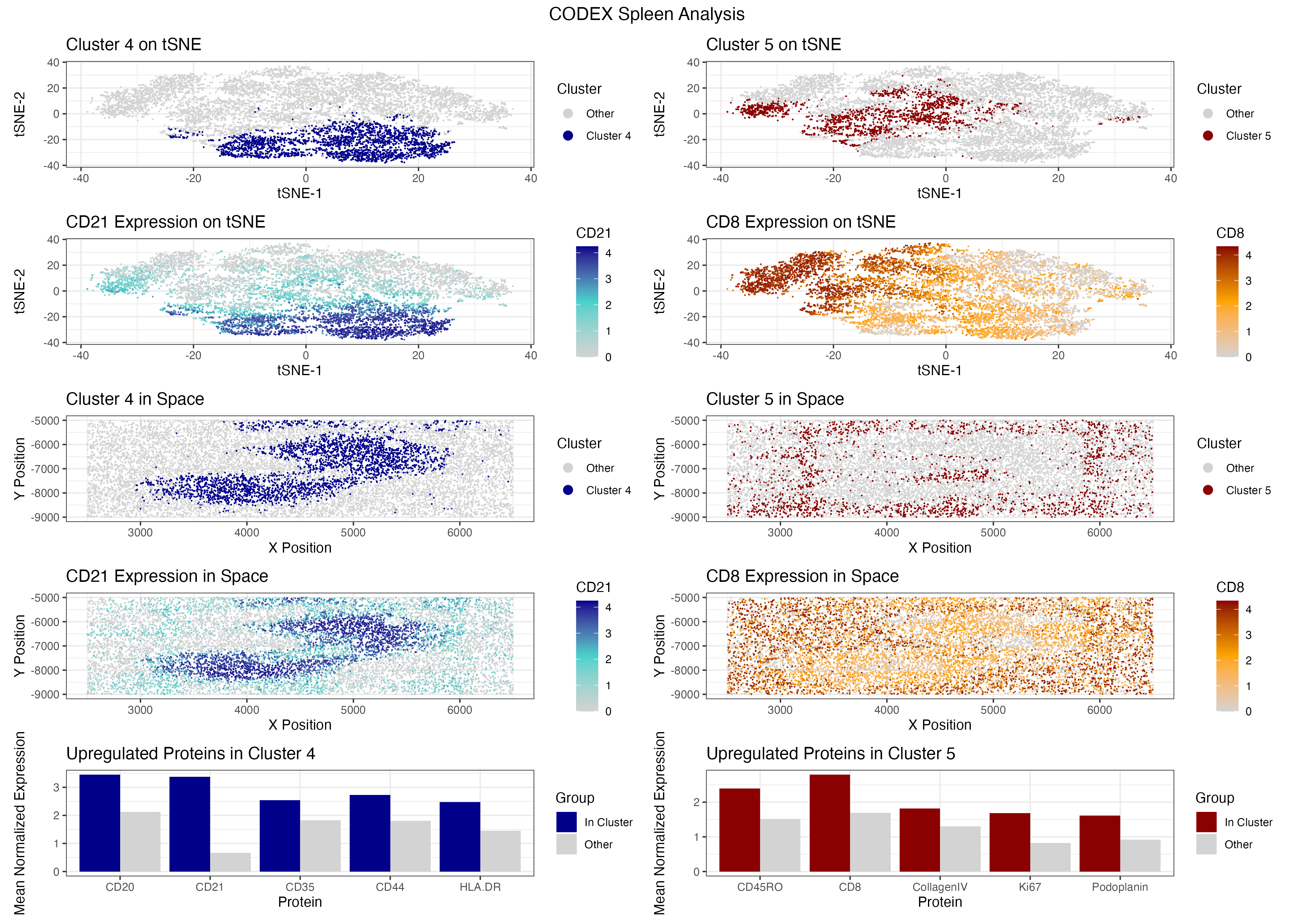
##Description I filtered out the bottom and top 1% of cells by total signal and cell area to remove dead cells, doublets, and extreme outliers, retaining 9,599 out of 10,000 cells. I normalized expression per cell and log10 transformed the values, then ran PCA and used a scree plot to select 18 PCs. I ran k-means clustering on these 18 PCs directly, using k=5 chosen from an elbow plot, and used tSNE purely for visualization. To identify marker proteins I ran a Wilcoxon test for each cluster against all others, then filtered to only proteins with higher mean expression inside the cluster than outside, ensuring I was selecting genuinely upregulated markers. Cluster 5 had CD45RO, CD8, CollagenIV, Ki67, and Podoplanin as its top upregulated markers. While this cluster shows some stromal markers, the dominant upregulated lymphocyte markers CD8 and CD45RO point to a cytotoxic memory T cell population. CD8 is the standard marker for cytotoxic T cells and CD45RO is a well established marker for memory T cells [1]. Spatially, this cluster is distributed broadly across the tissue rather than being confined to a single zone. Literature confirms that memory T cells migrate through the white pulp following chemotactic gradients, where they search for dendritic cells presenting cognate antigens from blood [3] [4]. This diffuse spatial pattern alongside strong CD8 and CD45RO upregulation supports my interpretation of this cluster as a recirculating memory T cell population residing in the white pulp. The broad distribution of CD8 positive cells throughout the tissue may also suggest the white pulp is actively responding to an antigen or pathogen, as CD8 positive cytotoxic T cells are recruited and activated in the white pulp during immune responses to infection [5]. Cluster 4 had CD20, CD21, CD35, CD44, and HLA-DR as its top upregulated markers. CD20 is the standard B cell marker and CD19 and CD20 are primary markers for B cells, commonly used in immunohistochemistry to identify B cells in tissues, and CD20 is expressed during B cell development but is absent in plasma cells [6] [7]. CD21 and CD35 further support a follicular B cell identity because CD21 and CD23 are markers expressed on follicular dendritic and B cells, particularly in germinal centers, and are useful in identifying B cell follicles and follicular zones within lymphoid tissues [9]. Spatially, this cluster forms a dense elongated band through the tissue, which is consistent with a large B cell follicle population occupying a defined region of the white pulp [16]. Literature also confirms that CD20 stains B lymphocytes, particularly in follicles [10]. Buckner et al (2007) even states “CD20 has long been thought to be a specific marker for B-cell lineage and has been used to help differentiate T-cell and B-cell neoplasms” [10]. Based on these two clusters I believe this tissue is white pulp. The other options do not fit. Red pulp would be dominated by macrophage markers like CD68, CD163, and CD169, and none of my chosen clusters show that pattern [11]. Capsule and trabecula would show fibroblast and smooth muscle markers, not lymphocytes [12]. Artery and vein would be defined by endothelial markers like CD31 and CD34 [13] [14] [15]. The co-presence of a broadly distributed CD8 positive memory T cell population alongside a dense CD20 positive B cell population occupying distinct spatial regions is the hallmark of white pulp architecture. As literature describes, T and B cell compartments are intricately organized within the human splenic white pulp [16], and that is exactly what I see in the spatial plots for clusters 4 and 5. References [1] https://pmc.ncbi.nlm.nih.gov/articles/PMC2556200/ [2]https://www.nature.com/articles/ncomms9306#:~:text=Introduction,reside%20in%20peripheral%20tissues5. [3]https://www.sciencedirect.com/science/article/pii/S107476131400449X#:~:text=Trm%20Ontogeny,et%20al.%2C%202001). [4]https://pmc.ncbi.nlm.nih.gov/articles/PMC3618989/#:~:text=Na%C3%AFve%20T%20cells%20migrate%20through,to%20reenter%20normal%20draining%20LNs. [5]https://healthmatters.io/understand-blood-test-results/cd3cd8cd45ro#:~:text=Elevated%20levels%20of%20CD3/CD8,inflammatory%20conditions%2C%20or%20autoimmune%20disorders. [6]https://www.abcam.com/en-us/technical-resources/research-areas/marker-guides/b-cell-markers [7] https://www.novusbio.com/products/cd20-antibody-l26_nbp2-48307 [8] https://e-century.us/files/ijcep/9/8/ijcep0029454.pdf [9] https://pmc.ncbi.nlm.nih.gov/articles/PMC3256970/ [10] https://www.annclinlabsci.org/content/37/3/263.full [11] https://pmc.ncbi.nlm.nih.gov/articles/PMC5916003/ [12] https://pubmed.ncbi.nlm.nih.gov/1200408/ [13] https://www.frontiersin.org/journals/oncology/articles/10.3389/fonc.2022.956451/full [14]https://www.sciencedirect.com/science/article/pii/S001448001730076X#:~:text=next%20several%20years.-,Here%20we%20present%20the%20most%20commonly%20used%20endothelial%20cell%20markers,et%20al.%2C%202002). [15] https://pmc.ncbi.nlm.nih.gov/articles/PMC4695694/ [16] https://pubmed.ncbi.nlm.nih.gov/12704213/ [17] https://jef.works/genomic-data-visualization-2024/course AI Prompts: “For each cluster, I want to rank proteins by differential expression. Do a Wilcoxon test comparing (cluster i) vs (all other cells) for each protein column. Please write an efficient R implementation that returns a named vector of p-values per cluster, sorted ascending, and prints the top 5 per cluster” “I want ‘top upregulated markers’ not just lowest p-values. Compute mean difference (mean in cluster - mean out of cluster) per protein, filter to positive differences, then within those pick the 5 smallest p-values. Write the code for cluster 4 and 5 and return the top marker name for each.” “I have plots p1 to p10 and want two vertical stacks side-by-side (cluster 4 stack | cluster 5 stack), plus a single global title. Show the patchwork syntax using ‘/’ for vertical and ‘|’ for horizontal, and plot_annotation() for the title” Note: I also initially ran k-means on the tSNE embedding rather than the PCA space, which produced visually cleaner cluster separation, but since tSNE distorts global distances this may not reflect true biological groupings, so I reran clustering on the PCA coordinates for a more principled approach
##Code
1
2
3
4
5
6
7
8
9
10
11
12
13
14
15
16
17
18
19
20
21
22
23
24
25
26
27
28
29
30
31
32
33
34
35
36
37
38
39
40
41
42
43
44
45
46
47
48
49
50
51
52
53
54
55
56
57
58
59
60
61
62
63
64
65
66
67
68
69
70
71
72
73
74
75
76
77
78
79
80
81
82
83
84
85
86
87
88
89
90
91
92
93
94
95
96
97
98
99
100
101
102
103
104
105
106
107
108
109
110
111
112
113
114
115
116
117
118
119
120
121
122
123
124
125
126
127
128
129
130
131
132
133
134
135
136
137
138
139
140
141
142
143
144
145
146
147
148
149
150
151
152
153
154
155
156
157
158
159
160
161
library(ggplot2)
library(patchwork)
library(Rtsne)
library(dplyr)
library(reshape2)

# load and split data
data <- read.csv("~/Desktop/GDV/codex_spleen2.csv.gz", row.names = 1)
pos <- data[, 1:2]
area <- data[, 3]
pexp <- data[, 4:ncol(data)]

# QC filtering: remove bottom/top 1% by total signal and area
total_signal <- rowSums(pexp)
keep <- total_signal > quantile(total_signal, 0.01) &
  total_signal < quantile(total_signal, 0.99) &
  area > quantile(area, 0.01) &
  area < quantile(area, 0.99)
print(paste("Cells before QC:", nrow(data)))
print(paste("Cells after QC:", sum(keep)))
data <- data[keep, ]
pos <- data[, 1:2]
area <- data[, 3]
pexp <- data[, 4:ncol(data)]

# normalize: scale by total signal then log transform
pexpnorm <- log10(pexp / rowSums(pexp) * mean(rowSums(pexp)) + 1)

# PCA and scree plot to pick number of PCs for tSNE
pcs <- prcomp(pexpnorm)
plot(pcs$sdev[1:20], type = 'b', col = "steelblue",
     main = "PCA Scree Plot", xlab = "PC", ylab = "Standard Deviation")

# run k-means on first 18 PCs directly before tSNE
set.seed(42)
tw <- sapply(1:20, function(i) kmeans(pcs$x[, 1:18], centers = i, nstart = 10, iter.max = 50)$tot.withinss)
plot(1:20, tw, type = 'b', col = "steelblue",
     main = "Elbow Plot for K-Means", xlab = "Number of Clusters (k)", ylab = "Total Within-Cluster SS")
set.seed(42)
com <- as.factor(kmeans(pcs$x[, 1:18], centers = 5, nstart = 10, iter.max = 50)$cluster)

# tSNE on first 18 PCs for visualization only
set.seed(42)
emb <- Rtsne::Rtsne(pcs$x[, 1:18])$Y

clusters <- data.frame(pexpnorm, pos, emb, com)

# wilcoxon test each cluster vs all others, print top 5 markers per cluster
results_list <- lapply(1:5, function(cluster_num) {
  sort(sapply(colnames(pexp), function(p) {
    wilcox.test(pexpnorm[com == cluster_num, p],
                pexpnorm[com != cluster_num, p])$p.value
  }), decreasing = FALSE)
})
for(i in 1:5) {
  cat("\nCluster", i, "top markers:\n")
  print(head(results_list[[i]], 5))
}

# get top 5 upregulated markers: compute fold change, keep positive, re-sort by p-value
fc4 <- sapply(colnames(pexpnorm), function(p) mean(pexpnorm[com == 4, p]) - mean(pexpnorm[com != 4, p]))
fc5 <- sapply(colnames(pexpnorm), function(p) mean(pexpnorm[com == 5, p]) - mean(pexpnorm[com != 5, p]))
prots4 <- names(head(sort(results_list[[4]][names(which(fc4 > 0))]), 5))
prots5 <- names(head(sort(results_list[[5]][names(which(fc5 > 0))]), 5))

# pick visualization marker as the one with highest fold change among top 5
marker4 <- names(which.max(fc4[prots4]))
marker5 <- names(which.max(fc5[prots5]))

cat("Top marker for Cluster 4:", marker4, "\n")
cat("Top marker for Cluster 5:", marker5, "\n")

clusters$infour <- ifelse(clusters$com == 4, 1, 0)
clusters$infive <- ifelse(clusters$com == 5, 1, 0)

# cluster 4 plots
p1 <- ggplot(clusters) +
  geom_point(aes(x = X1, y = X2, col = as.factor(infour)), size = 0.01) +
  theme_bw() +
  scale_colour_manual(name = "Cluster", labels = c("Other", "Cluster 4"),
                      values = c("lightgrey", "darkblue")) +
  xlab('tSNE-1') + ylab('tSNE-2') + labs(title = 'Cluster 4 on tSNE') +
  guides(colour = guide_legend(override.aes = list(size = 3)))

p2 <- ggplot(clusters) +
  geom_point(aes(x = x, y = y, col = as.factor(infour)), size = 0.02) +
  theme_bw() +
  scale_colour_manual(name = "Cluster", labels = c("Other", "Cluster 4"),
                      values = c("lightgrey", "darkblue")) +
  xlab('X Position') + ylab('Y Position') + labs(title = 'Cluster 4 in Space') +
  guides(colour = guide_legend(override.aes = list(size = 3)))

p5 <- ggplot(clusters) +
  geom_point(aes(x = X1, y = X2, col = .data[[marker4]]), size = 0.01) +
  scale_colour_gradientn(colours = c("lightgrey", "mediumturquoise", "darkblue")) +
  labs(title = paste(marker4, "Expression on tSNE")) +
  xlab('tSNE-1') + ylab('tSNE-2') + theme_bw()

p6 <- ggplot(clusters) +
  geom_point(aes(x = x, y = y, col = .data[[marker4]]), size = 0.01) +
  scale_colour_gradientn(colours = c("lightgrey", "mediumturquoise", "darkblue")) +
  labs(title = paste(marker4, "Expression in Space")) +
  xlab('X Position') + ylab('Y Position') + theme_bw()

p9 <- ggplot(melt(data.frame(
  prot = prots4,
  incluster = sapply(prots4, function(p) mean(pexpnorm[com == 4, p])),
  outcluster = sapply(prots4, function(p) mean(pexpnorm[com != 4, p]))),
  id.vars = 'prot'), aes(x = prot, y = value, fill = variable)) +
  geom_bar(stat = 'identity', position = 'dodge') +
  scale_fill_manual(name = 'Group', labels = c("In Cluster", "Other"),
                    values = c("darkblue", "lightgrey")) +
  labs(title = "Upregulated Proteins in Cluster 4") +
  xlab('Protein') + ylab('Mean Normalized Expression') + theme_bw()

# cluster 5 plots
p3 <- ggplot(clusters) +
  geom_point(aes(x = X1, y = X2, col = as.factor(infive)), size = 0.01) +
  theme_bw() +
  scale_colour_manual(name = "Cluster", labels = c("Other", "Cluster 5"),
                      values = c("lightgrey", "darkred")) +
  xlab('tSNE-1') + ylab('tSNE-2') + labs(title = 'Cluster 5 on tSNE') +
  guides(colour = guide_legend(override.aes = list(size = 3)))

p4 <- ggplot(clusters) +
  geom_point(aes(x = x, y = y, col = as.factor(infive)), size = 0.02) +
  theme_bw() +
  scale_colour_manual(name = "Cluster", labels = c("Other", "Cluster 5"),
                      values = c("lightgrey", "darkred")) +
  xlab('X Position') + ylab('Y Position') + labs(title = 'Cluster 5 in Space') +
  guides(colour = guide_legend(override.aes = list(size = 3)))

p7 <- ggplot(clusters) +
  geom_point(aes(x = X1, y = X2, col = .data[[marker5]]), size = 0.01) +
  scale_colour_gradientn(colours = c("lightgrey", "orange", "darkred")) +
  labs(title = paste(marker5, "Expression on tSNE")) +
  xlab('tSNE-1') + ylab('tSNE-2') + theme_bw()

p8 <- ggplot(clusters) +
  geom_point(aes(x = x, y = y, col = .data[[marker5]]), size = 0.01) +
  scale_colour_gradientn(colours = c("lightgrey", "orange", "darkred")) +
  labs(title = paste(marker5, "Expression in Space")) +
  xlab('X Position') + ylab('Y Position') + theme_bw()

p10 <- ggplot(melt(data.frame(
  prot = prots5,
  incluster = sapply(prots5, function(p) mean(pexpnorm[com == 5, p])),
  outcluster = sapply(prots5, function(p) mean(pexpnorm[com != 5, p]))),
  id.vars = 'prot'), aes(x = prot, y = value, fill = variable)) +
  geom_bar(stat = 'identity', position = 'dodge') +
  scale_fill_manual(name = 'Group', labels = c("In Cluster", "Other"),
                    values = c("darkred", "lightgrey")) +
  labs(title = "Upregulated Proteins in Cluster 5") +
  xlab('Protein') + ylab('Mean Normalized Expression') + theme_bw()

# final figure: blue column (cluster 4) | red column (cluster 5)
((p1 / p5 / p2 / p6 / p9) | (p3 / p7 / p4 / p8 / p10)) +
  plot_annotation(title = "CODEX Spleen Analysis",
                  theme = theme(plot.title = element_text(size = 14, hjust = 0.5)))

ggsave("~/Desktop/GDV/hw4_ssingha9.png", width = 14, height = 10, dpi = 300)