HW 5

Write a description to convince me you found the same cell-type.
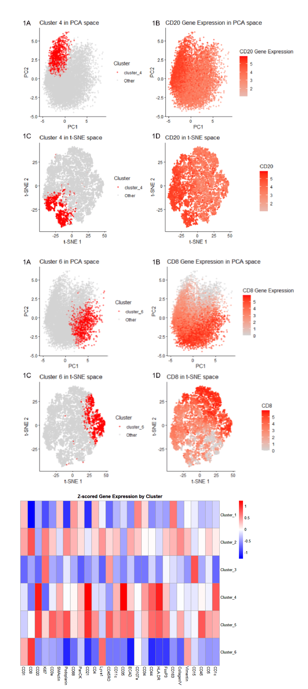
Cluster 4 most likely represents white pulp due to its association with CD20 expression, a B-cell marker found in lymphoid compartments. In the PCA plots, Cluster 4 and CD20 expression show partial overlap, indicating a concentration of CD20-positive cells within this cluster. In the t-SNE visualization, Cluster 4 and CD20 display near-complete overlap, with CD20 expression extending slightly beyond Cluster 4. This suggests that Cluster 4 captures most CD20-expressing cells, though some CD20-positive cells are present in neighboring clusters. The heatmap further supports this interpretation by demonstrating CD20 upregulation, although CD20 is also elevated in Clusters 5, indicating that CD20-positive populations are not entirely restricted to Cluster 4. According to the National Cancer Institute, white pulp consists primarily of lymphatic tissue composed of lymphocytes surrounding central arteries. Because CD20 marks B lymphocytes, and lymphocytes are a defining component of white pulp, high CD20 expression is consistent with a white pulp identity. Additionally, a study by Vlaming et al. reported that CD20-positive lymphocytes localize to the periarteriolar lymphoid sheath (PALS) of the spleen, a region of the white pulp. Therefore, CD20-positive cells tend to reside in the same areas that define white pulp; thus, Cluster 4 corresponds to white pulp tissue.
https://pmc.ncbi.nlm.nih.gov/articles/PMC8520003/#:~:text=Within%20the%20spleen%2C%20CD20%2Dpositive,of%20CD20%2Dpositive%20T%20cells. https://training.seer.cancer.gov/anatomy/lymphatic/components/spleen.html#:~:text=The%20white%20pulp%20is%20lymphatic,such%20as%20lymphocytes%20and%20macrophages.
Similarly, Cluster 6 most likely represents white pulp due to its association with CD8 expression, a marker of cytotoxic T lymphocytes. In the PCA plots, Cluster 6 and CD8 expression show nearly complete overlap, indicating a strong presence of CD8 expression within cluster 6. In the t-SNE graphs, cluster 6 and CD8 display nearly complete overlap, suggesting a positive correlation. The heatmap further supports this interpretation by demonstrating CD8 upregulation in Clusters 2 and 6, indicating that CD8-positive populations are especially prominent in Cluster 6 but not entirely exclusive to it. According to Sixt et al., because CD8 marks T lymphocytes, and lymphocytes are a defining component of white pulp, high CD8 expression is consistent with a white pulp cell type. This is further supported by Martin et al., who describe the functional properties and migration patterns of CD8 T cells within splenic white pulp, including their localization to specific spleen regions. Therefore, the strong PCA and t-SNE similarity between Cluster 6 and CD8 expression supports the conclusion that Cluster 6 corresponds to white pulp tissue.
https://pubmed.ncbi.nlm.nih.gov/32433942/ https://pmc.ncbi.nlm.nih.gov/articles/PMC3262935/
Code
library(ggplot2)

# set up data
data <- read.csv('codex_spleen2.csv.gz')
head(data) # columns: X (id), x/y (position), area, gene names
pos <- data[,c('x', 'y')]
rownames(pos) <- data[,1] # includes all rows and only the first column
head(pos)

area <- data[, 'area']
names(area) <- data[,1]
head(area)

gexp <- data[, 5:ncol(data)] # includes all rows and the fourth through last column
rownames(gexp) <- data[,1]
gexp[1:5,1:5]
dim(gexp) # 10000    28

totgexp <- rowSums(gexp)
names(totgexp) <- data[, 1]
head(totgexp)
# count how many samples are in totgexp
length(totgexp)

# quality control
# remove samples that have zero total gene expression across all genes
totgexp <- totgexp[totgexp > 0]
length(totgexp) # there are no samples that have a total gene expression < 0
min(totgexp) # 504.8984
max(totgexp) # 91299.37
mean(totgexp) # 25457.23

# how many total genes are detected per cell/spot?
df <- data.frame(
    name = rownames(gexp),
    totgexp = rowSums(gexp)
)
before_qc <- ggplot(df, aes(x = name, y = totgexp)) + geom_col()
# plot suggests need to normalize data

# normalize and log-transform data
mat <- as.matrix(log10(gexp / totgexp * 1e6 + 1))
head(mat)

# how many total genes are detected per cell/spot?
df <- data.frame(
    name = rownames(gexp),
    totgexp = mat
)
after_qc <- ggplot(df, aes(x = name, y = totgexp)) + geom_col()

library(patchwork)
before_qc + after_qc

# dimensionality reduction
# pca
pcs <- prcomp(mat) # make sure mat is a matrix/array through class(mat)
plot(pcs$sdev[1:50]) # scree plot
count <- which(cumsum(pcs$sdev^2) / sum(pcs$sdev^2) >= 0.9)[1]
count # 12 pcs until cummulative sum of the variation >= 90
# 8 pcs until elbow point

# tSNEn(just for visualizing local neighbourhoods)
library(Rtsne)
pcs_use <- pcs$x[, 1:8, drop = FALSE]
tsne_out <- Rtsne(pcs_use, perplexity = 30, theta = 0.5, verbose = TRUE, check_duplicates = FALSE)

# determine k-centroids through scree plot
totw <- sapply(2:10, function(k) {kmeans(pcs$x[,1:8], centers = k, nstart = 10, iter.max = 500, algorithm = "Lloyd")$tot.withinss})
df_totw <- data.frame(k = 2:8, tot.withinss = totw)
ggplot(df_totw, aes(x = k, y = tot.withinss)) + geom_point() + geom_line() + theme_test()
# possibily k = 6

# k-means clustering
library(cluster)
clusters <- as.factor(kmeans(pcs$x[,1:8], centers = 6)$cluster)
df_km <- data.frame(pcs$x, clusters)
ggplot(df_km, aes(x=PC1, y=PC2, col=clusters)) + geom_point(size = 1)
ggplot(df_km, aes(x=PC2, y=PC3, col=clusters)) + geom_point(size = 1)

# choose cluster 6
# add labels and colors
cluster_label <- ifelse(clusters == 6, "cluster_6", "Other")
cluster.cols <- c("Other" = "lightgrey", "cluster_6" = "red")


# PCA Plot - cluster 6
pca_cluster_6_df <- data.frame(
  pcs$x,
  cluster = factor(cluster_label, levels = c("cluster_6", "Other"))
)
plot_1_A <- ggplot(pca_cluster_6_df, aes(x = PC1, y = PC2, color = cluster)) +
  geom_point(size = 1, alpha = 0.5) +
  theme_classic() +
  scale_color_manual(values = cluster.cols) +
  labs(title = "Cluster 6 in PCA space",
       x = "PC1", y = "PC2", color = "Cluster")


# tSNE plot - cluster 6
tsne_cluster_6_df <- data.frame(
    tSNE1 = tsne_out$Y[, 1],
    tSNE2 = tsne_out$Y[, 2],
    cluster = factor(cluster_label, levels = c("cluster_6", "Other"))
)

plot_1_B <- ggplot(tsne_cluster_6_df, aes(tSNE1, tSNE2, color = cluster)) +
  geom_point(size = 1, alpha = 0.5) +
  theme_classic() +
  scale_color_manual(values = cluster.cols) +
  labs(title = "Cluster 6 in t-SNE space", x = "t-SNE 1", y = "t-SNE 2", color = "Cluster")


# heat-map for gene expression (scaled)
# z-score genes (center and scale each gene across cells)
mat_z <- scale(mat)

# make sure clusters line up with matrix rows
clusters <- as.factor(clusters)

# compute cluster means
cluster_means <- aggregate(mat_z, by = list(cluster = clusters), FUN = mean)

# combine cluster column to rownames
rownames(cluster_means) <- paste0("Cluster_", cluster_means$cluster)
cluster_means <- cluster_means[, -1]
dim(cluster_means)

library(pheatmap)
# AI Prompt: Remove the tree and order clusters from 1 -6
cluster_means <- cluster_means[order(as.numeric(gsub("Cluster_", "", rownames(cluster_means)))), ]

heatmap <- pheatmap(
  cluster_means,
  cluster_rows = FALSE,
  cluster_cols = FALSE,
  color = colorRampPalette(c("blue", "white", "red"))(100),
  main = "Z-scored Gene Expression by Cluster"
)

# determine differentially expressed genes
clusters <- factor(clusters, levels = 1:6)

wilcox_pvals <- apply(mat, 2, function(gene_expr) {
  wilcox.test(
    gene_expr[clusters == 6],
    gene_expr[clusters != 6]
  )$p.value
})

wilcox_padj <- p.adjust(wilcox_pvals, method = "BH")

logFC <- apply(mat, 2, function(gene_expr) {
  mean(gene_expr[clusters == 6]) -
  mean(gene_expr[clusters != 6])
})

de_cluster1 <- data.frame(
  Gene = colnames(mat),
  p_value = wilcox_pvals,
  adj_p_value = wilcox_padj,
  logFC = logFC
)

de_cluster1 <- de_cluster1[order(de_cluster1$adj_p_value), ]
head(de_cluster1)


# choosing CD8 from cluster 6
# z-score mat
mat_z <- scale(mat)

# CD163 PCA Plot - cluster 6
CD8_df <- data.frame(
  PC1 = pcs$x[,1],
  PC2 = pcs$x[,2],
  CD8 = mat[, "CD8"]
)

pca_cd8_plot <- ggplot(CD8_df, aes(x = PC1, y = PC2, color = CD8)) +
  geom_point(size = 1, alpha = 0.5) +
  theme_classic() +
    scale_color_gradient2(
    low = "blue",
    mid = "lightgrey",
    high = "red",
    midpoint = 0
    ) +
  labs(
    title = "CD8 Gene Expression in PCA space",
    x = "PC1", y = "PC2", color = "CD8 Gene Expression"
  )

# CD8 tSNE plot - cluster 6
tsne_CD8_df <- data.frame(
    tSNE1 = tsne_out$Y[, 1],
    tSNE2 = tsne_out$Y[, 2],
    CD8 = mat[, "CD8"]
)

tsne_CD8_plot <- ggplot(tsne_CD8_df, aes(tSNE1, tSNE2, color = CD8)) +
  geom_point(size = 1, alpha = 0.5) +
  theme_classic() +
  scale_color_gradient2(
    low = "blue",
    mid = "lightgrey",
    high = "red",
    midpoint = 0
    )+
  labs(title = "CD8 in t-SNE space", x = "t-SNE 1", y = "t-SNE 2")

library(patchwork)
(plot_1_A + pca_cd8_plot) / (plot_1_B + tsne_CD8_plot)


# choosing cluster 4
# determine differentially expressed genes
clusters <- factor(clusters, levels = 1:6)

wilcox_pvals <- apply(mat, 2, function(gene_expr) {
  wilcox.test(
    gene_expr[clusters == 4],
    gene_expr[clusters != 4]
  )$p.value
})

wilcox_padj <- p.adjust(wilcox_pvals, method = "BH")

logFC <- apply(mat, 2, function(gene_expr) {
  mean(gene_expr[clusters == 4]) -
  mean(gene_expr[clusters != 4])
})

de_cluster1 <- data.frame(
  Gene = colnames(mat),
  p_value = wilcox_pvals,
  adj_p_value = wilcox_padj,
  logFC = logFC
)

de_cluster1 <- de_cluster1[order(de_cluster1$adj_p_value), ]
head(de_cluster1)


# choose cluster 4
# add labels and colors
cluster_label <- ifelse(clusters == 4, "cluster_4", "Other")
cluster.cols <- c("Other" = "lightgrey", "cluster_4" = "red")


# PCA Plot - cluster 4
pca_cluster_4_df <- data.frame(
  pcs$x,
  cluster = factor(cluster_label, levels = c("cluster_4", "Other"))
)
plot_2_A <- ggplot(pca_cluster_4_df, aes(x = PC1, y = PC2, color = cluster)) +
  geom_point(size = 1, alpha = 0.5) +
  theme_classic() +
  scale_color_manual(values = cluster.cols) +
  labs(title = "Cluster 4 in PCA space",
       x = "PC1", y = "PC2", color = "Cluster")


# tSNE plot - cluster 4
tsne_cluster_4_df <- data.frame(
    tSNE1 = tsne_out$Y[, 1],
    tSNE2 = tsne_out$Y[, 2],
    cluster = factor(cluster_label, levels = c("cluster_4", "Other"))
)

plot_2_B <- ggplot(tsne_cluster_4_df, aes(tSNE1, tSNE2, color = cluster)) +
  geom_point(size = 1, alpha = 0.5) +
  theme_classic() +
  scale_color_manual(values = cluster.cols) +
  labs(title = "Cluster 4 in t-SNE space", x = "t-SNE 1", y = "t-SNE 2", color = "Cluster")


# choosing CD8 from cluster 4

# CD20 PCA Plot - cluster 4
CD20_df <- data.frame(
  PC1 = pcs$x[,1],
  PC2 = pcs$x[,2],
  CD20 = mat[, "CD20"]
)

pca_cd20_plot <- ggplot(CD20_df, aes(x = PC1, y = PC2, color = CD20)) +
  geom_point(size = 1, alpha = 0.5) +
  theme_classic() +
    scale_color_gradient2(
    low = "blue",
    mid = "lightgrey",
    high = "red",
    midpoint = 0
    ) +
  labs(
    title = "CD20 Gene Expression in PCA space",
    x = "PC1", y = "PC2", color = "CD20 Gene Expression"
  )

# CD8 tSNE plot - cluster 6
tsne_CD20_df <- data.frame(
    tSNE1 = tsne_out$Y[, 1],
    tSNE2 = tsne_out$Y[, 2],
    CD20 = mat[, "CD20"]
)

tsne_CD20_plot <- ggplot(tsne_CD20_df, aes(tSNE1, tSNE2, color = CD20)) +
  geom_point(size = 1, alpha = 0.5) +
  theme_classic() +
  scale_color_gradient2(
    low = "blue",
    mid = "lightgrey",
    high = "red",
    midpoint = 0
    )+
  labs(title = "CD20 in t-SNE space", x = "t-SNE 1", y = "t-SNE 2")

library(patchwork)
(plot_2_A + pca_cd20_plot) / (plot_2_B + tsne_CD20_plot)
```r