How PC1 Gene Loadings Relate to Gene Mean Expression and Variance

1. What data types are you visualizing?
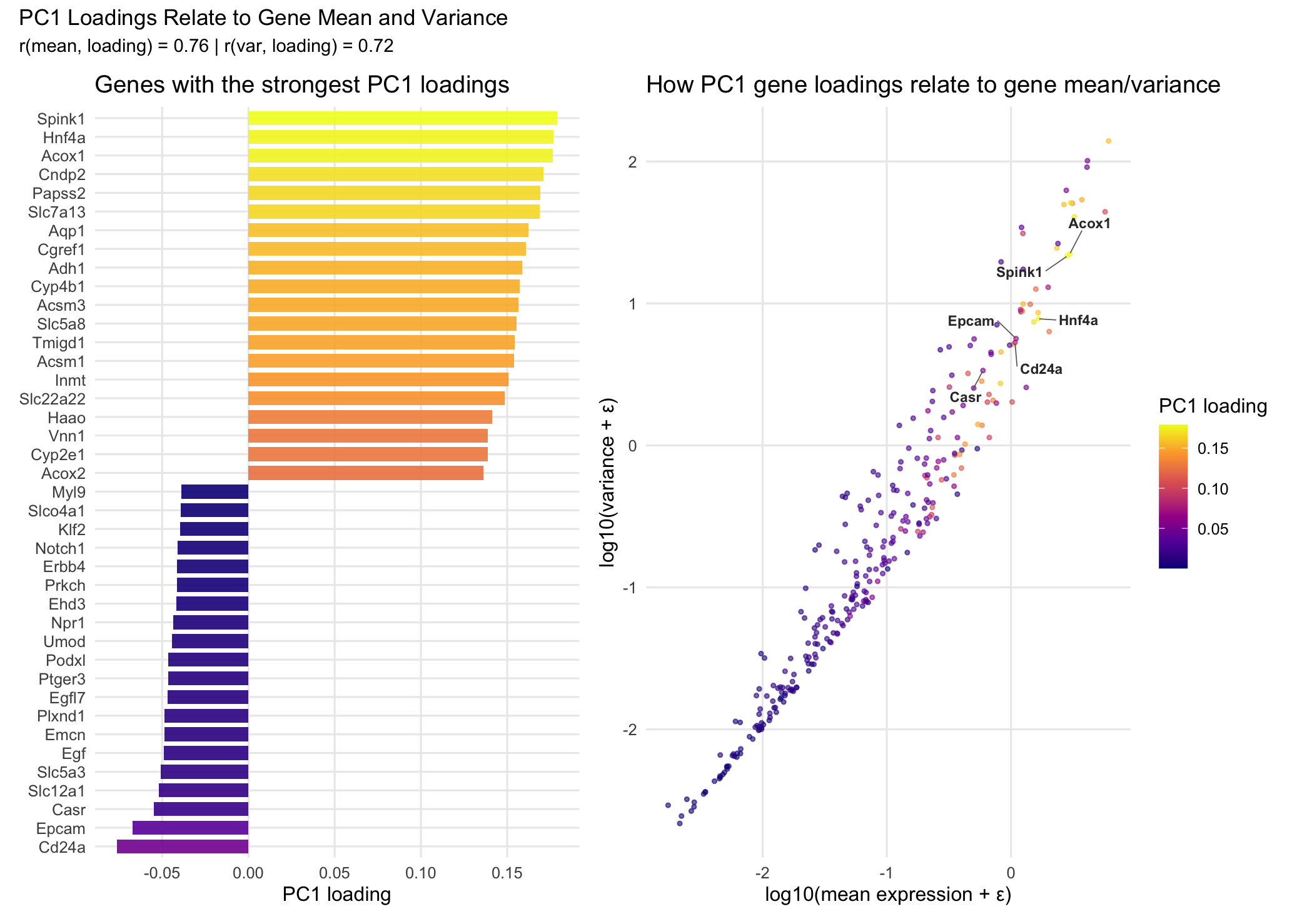
I am visualizing both categorical and quantitative data. The categorical data is the set of gene names in the left panel, since each gene represents a distinct category rather than a numerical value. The quantitative data includes the mean expression and variance for each gene, as well as the PC1 loading values from PCA, which measure how much each gene contributes to the first principal component. I also created derived quantitative variables by log-transforming the mean and variance to compress the scale and make the overall pattern easier to see. Finally, I used the absolute value of the PC1 loadings to represent the magnitude of each gene’s contribution regardless of whether the loading is positive or negative.
2. What data encodings (geometric primitives and visual channels) are you using to visualize these data types?
I’m using two panels with different encodings. In the left panel, I use areas (rectangular bars) as the geometric primitive. Gene identity is encoded using y-position (each gene gets its own row). The PC1 loading value is encoded using x-position and length, where positive loadings extend to the right and negative loadings extend to the left. I also encode the magnitude of the loading (absolute PC1 loading) using color hue through a viridis gradient. In the right panel, I use points as the geometric primitive, with each point representing a gene. Mean expression (log10 transformed) is encoded using x-position and variance (log10 transformed) is encoded using y-position. Absolute PC1 loading is again encoded using color hue with the same viridis gradient to keep the encoding consistent across both panels. To deal with point overlap, I use color saturation/alpha (transparency) so the dense region is still visible without completely blocking other points. Finally, I add an additional encoding by labeling 6 key genes (the ones with the largest absolute PC1 loadings, including both positive and negative loadings). I also draw line segments from each label back to its gene’s point so the reader can identify the genes without cluttering the dense cluster.
3. What about the data are you trying to make salient through this data visualization?
The main thing I’m trying to make salient is the relationship between PC1 loadings and basic gene-level statistics, specifically mean expression and variance. The left panel makes it clear which individual genes contribute the most to PC1 (both in the positive and negative direction), since you can directly compare the PC1 loading values across genes. The right panel then puts every gene into context by showing where it falls in mean–variance space. By using the same color encoding for loading magnitude in both panels, the visualization helps show whether genes with strong PC1 loadings tend to cluster in certain regions (for example, genes with higher variance and/or higher mean expression). Overall, the goal is to connect “which genes drive PC1” to “what kinds of genes those are” in terms of expression behavior.
4. What Gestalt principles or knowledge about perceptiveness of visual encodings are you using to accomplish this?
I’m mainly using the Gestalt principle of similarity by encoding loading magnitude with the same color hue scale across both panels. This makes genes with similar absolute PC1 loadings look visually related, and it helps link the bar chart and the scatter plot without needing to match genes one by one. In terms of perceptiveness of visual encodings, I use position as the main channel for the most important quantitative values, since position is one of the most accurate encodings for comparing numerical data. For example, PC1 loading values are shown using bar length/x-position in the left panel, and gene mean and variance are shown using x-position and y-position in the right panel. Color hue is used to represent loading magnitude, which is less precise than position for exact comparisons, but it’s effective for showing overall patterns and gradients across many genes. Also, as mentioned before, I use transparency (color saturation/alpha) in the scatter plot to reduce overplotting and make dense regions easier to interpret. Finally, I considered continuity as well. Because the scatter plot already shows a clear overall trend (genes with higher mean and variance tending to have higher loading magnitude), I chose not to add a line of best fit. I didn’t want to distract from the distribution of genes or imply a specific functional relationship beyond what the scatter already makes visually obvious.
5. Code (paste your code in between the ``` symbols)
1
2
3
4
5
6
7
8
9
10
11
12
13
14
15
16
17
18
19
20
21
22
23
24
25
26
27
28
29
30
31
32
33
34
35
36
37
38
39
40
41
42
43
44
45
46
47
48
49
50
51
52
53
54
55
56
57
58
59
60
61
62
63
64
65
66
67
68
69
70
71
72
73
74
75
76
77
78
79
80
81
82
83
84
85
86
87
88
89
90
91
92
93
94
95
96
97
98
99
100
101
102
103
104
105
106
107
108
109
110
111
112
113
114
115
116
117
118
119
120
121
122
123
124
125
126
127
128
129
130
131
132
133
134
135
136
137
138
139
140
library(ggplot2)
library(dplyr)
library(ggrepel)
library(patchwork)
library(matrixStats)

# Load data
setwd("~/Desktop/GDV")
xenium_data <- read.csv("Xenium-IRI-ShamR_matrix.csv")

gexp <- xenium_data[, 4:ncol(xenium_data)]
rownames(gexp) <- xenium_data[, 1]

# Clean data
expr_mat <- as.matrix(gexp)
mode(expr_mat) <- "numeric"
gene_sums <- colSums(expr_mat, na.rm = TRUE)
expr_mat <- expr_mat[, gene_sums > 0, drop = FALSE]
cell_sums <- rowSums(expr_mat, na.rm = TRUE)
expr_mat <- expr_mat[cell_sums > 0, , drop = FALSE]

# Calculate gene statistics
gene_mean <- colMeans(expr_mat, na.rm = TRUE)
gene_var  <- matrixStats::colVars(expr_mat, na.rm = TRUE)

gene_stats <- data.frame(
  gene = colnames(expr_mat),
  mean_expr = gene_mean,
  var_expr  = gene_var
) %>%
  mutate(
    log10_mean = log10(mean_expr + 1e-6),
    log10_var  = log10(var_expr  + 1e-6)
  )

# Run PCA
expr_log <- log1p(expr_mat)
pca <- prcomp(expr_log, center = TRUE, scale. = TRUE)

# Get PC1 loadings
loadings_df <- as.data.frame(pca$rotation) %>%
  tibble::rownames_to_column("gene") %>%
  transmute(
    gene,
    PC1_loading = PC1
  ) %>%
  mutate(abs_PC1 = abs(PC1_loading))

plot_df <- gene_stats %>%
  inner_join(loadings_df, by = "gene")

# Select top genes
top_pos <- plot_df %>% arrange(desc(PC1_loading)) %>% slice_head(n = 20)
top_neg <- plot_df %>% arrange(PC1_loading) %>% slice_head(n = 20)
top_bars <- bind_rows(top_pos, top_neg)

label_pos <- plot_df %>%
  arrange(desc(PC1_loading)) %>%
  slice_head(n = 3) %>%
  pull(gene)

label_neg <- plot_df %>%
  arrange(PC1_loading) %>%
  slice_head(n = 3) %>%
  pull(gene)

label_genes <- c(label_pos, label_neg)

# Bar chart
p_bar <- ggplot(top_bars, aes(x = reorder(gene, PC1_loading),
                              y = PC1_loading,
                              fill = abs_PC1)) +
  geom_col(width = 0.75, alpha = 0.9) +
  coord_flip() +
  scale_fill_viridis_c(option = "C", name = "PC1 loading") +
  scale_y_continuous(breaks = c(-0.05, 0.00, 0.05, 0.10, 0.15)) +
  labs(
    title = "Genes with the strongest PC1 loadings",
    x = NULL,
    y = "PC1 loading"
  ) +
  theme_minimal(base_size = 12) +
  theme(
    legend.position = "none",
    panel.grid.minor = element_blank()
  )

# Help from Claude
# Prompt: i have a scatter plot with gene labels using geom_text_repel but they're overlapping
# with the dense cluster in the top right. can you make the labels dark grey and add arrows
# pointing from each label back to its point, and push the labels away from the cluster so
# they're easier to read in the surrounding white space?

# Scatter plot
p_scatter <- ggplot(plot_df, aes(x = log10_mean, y = log10_var, color = abs_PC1)) +
  geom_point(size = 0.9, alpha = 0.6) +
  ggrepel::geom_text_repel(
    data = subset(plot_df, gene %in% label_genes),
    aes(label = gene),
    size = 3,
    fontface = "bold",
    color = "gray20",
    max.overlaps = Inf,
    box.padding = 0.8,
    point.padding = 0,
    min.segment.length = 0,
    segment.color = "gray40",
    segment.size = 0.3,
    force = 2,
    force_pull = 0.5
  ) +
  scale_color_viridis_c(option = "C", name = "PC1 loading") +
  labs(
    title = "How PC1 gene loadings relate to gene mean/variance",
    x = "log10(mean expression + ε)",
    y = "log10(variance + ε)"
  ) +
  theme_minimal(base_size = 12) +
  theme(
    panel.grid.minor = element_blank()
  )

# Calculate correlations
cor_mean <- cor(plot_df$log10_mean, plot_df$abs_PC1)
cor_var <- cor(plot_df$log10_var, plot_df$abs_PC1)

# Combine plots
final_plot <- p_bar + p_scatter +
  plot_layout(guides = "collect") +
  plot_annotation(
    title = "PC1 Loadings Relate to Gene Mean and Variance",
    subtitle = paste0("r(mean, loading) = ", round(cor_mean, 2),
                      " | r(var, loading) = ", round(cor_var, 2))
  )
print(final_plot)
# References:
# Claude AI for coding help (Prompt included in code as a comment)
# Jolliffe, I. T., & Cadima, J. (2016). Principal component analysis: a review and recent developments. Philosophical Transactions of the Royal Society A: Mathematical, Physical and Engineering Sciences, 374(2065), 20150202.
# R documentation pages for base functions used for preprocessing and PCA, including as.matrix(), mode(), colSums(), rowSums(), colMeans(), log1p(), and prcomp().
# Google searches: 1) ggplot reorder factor by value” 2) “extract PC1 loadings from prcomp” 3) “compute variance per column R matrix” 4) “matrixStats colVars example” 5)