EC1-How Normalization and Log Transformation Reshape PCA Geometry in Gene Expression Data

1. Describe your figure briefly.
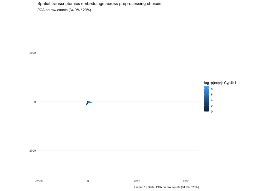
Based on the PCA states in the animation, the plots show that the low-dimensional geometry can shift dramatically. With raw counts (PC1/PC2 = 7.3% / 3.9%), the embedding forms a strong arm-like structure, which is typical when the dominant variance comes from global magnitude effects—most commonly library size and a small set of highly abundant genes—so cells separate partly by “how many total counts” rather than purely by expression composition. After per-10k normalization (PC1/PC2 = 3.6% / 2.7%), depth effects are reduced, the point cloud becomes more branched/spread, and the variance explained by the first two PCs drops because variability is redistributed across many dimensions; the structure now reflects relative expression patterns more than total count scale. After log1p(normalized) (PC1/PC2 = 6.7% / 3.8%), the embedding becomes more compact and less dominated by extreme points because the log transform compresses the dynamic range, reducing the leverage of outliers and very high expression values; the color pattern for the highlighted gene typically looks smoother and less arm-driven, indicating that extreme values are no longer steering the embedding as strongly. Here, the percentages in parentheses indicate the fraction of total variance in the high-dimensional expression matrix explained by PC1 and PC2, respectively; smaller values mean that the variance is distributed across many dimensions.
2. Code (paste your code in between the ``` symbols)
1
2
3
4
5
6
7
8
9
10
11
12
13
14
15
16
17
18
19
20
21
22
23
24
25
26
27
28
29
30
31
32
33
34
35
36
37
38
39
40
41
42
43
44
45
46
47
48
49
50
51
52
53
54
55
56
57
58
59
60
61
62
63
64
65
66
67
68
69
70
71
72
73
74
75
76
77
78
79
80
81
82
83
84
85
86
87
88
89
90
91
92
93
94
95
96
97
98
99
100
101
102
103
104
105
106


library(ggplot2)
library(gganimate)
install.packages("gganimate")
# ---------- Load & parse ----------
dat <- read.csv("/Users/xl/Desktop/JHU2026Spring/Genomic-Data-Visualization/Homework/EC1/Xenium-IRI-ShamR_matrix.csv.gz", row.names = 1, check.names = FALSE)
head(dat)
xy <- dat[, c("x", "y"), drop = FALSE]
colnames(xy) <- c("x", "y")

counts <- as.matrix(dat[, setdiff(colnames(dat), c("x","y")), drop = FALSE])
counts[is.na(counts)] <- 0

libsize <- rowSums(counts)
libsize[libsize == 0] <- 1

# ---------- Transforms ----------
# Normalize to per 10k then log1p
norm10k <- sweep(counts, 1, libsize, "/") * 1e4
log10k  <- log1p(norm10k)

# Pick the gene with the highest variance to visualize
gene_var <- apply(log10k, 2, var)
top_gene <- names(sort(gene_var, decreasing = TRUE))[1]
gene_signal <- log10k[, top_gene]

# ---------- Embeddings ----------
pca_raw  <- prcomp(counts, center = TRUE, scale. = FALSE)
pca_n10k <- prcomp(norm10k, center = TRUE, scale. = FALSE)
pca_log  <- prcomp(log10k, center = TRUE, scale. = FALSE)

var2 <- function(p) round(100 * (p$sdev[1:2]^2 / sum(p$sdev^2)), 1)


df_raw <- data.frame(
  dim1 = pca_raw$x[, 1],
  dim2 = pca_raw$x[, 2],
  state = paste0("PCA on raw counts (", paste(var2(pca_raw), collapse = "% / "), "%)"),
  feat  = gene_signal,
  lib   = libsize
)

df_n10k <- data.frame(
  dim1 = pca_n10k$x[, 1],
  dim2 = pca_n10k$x[, 2],
  state = paste0("PCA on normalized (per 10k) (", paste(var2(pca_n10k), collapse = "% / "), "%)"),
  feat  = gene_signal,
  lib   = libsize
)

df_log <- data.frame(
  dim1 = pca_log$x[, 1],
  dim2 = pca_log$x[, 2],
  state = paste0("PCA on log1p(normalized) (", paste(var2(pca_log), collapse = "% / "), "%)"),
  feat  = gene_signal,
  lib   = libsize
)

df_all <- rbind(df_raw, df_n10k, df_log)
df_all$state <- factor(df_all$state, levels = unique(df_all$state))

xlim <- range(df_all$dim1, finite = TRUE)
ylim <- range(df_all$dim2, finite = TRUE)

# Plot
p <- ggplot(df_all, aes(dim1, dim2)) +
  geom_point(aes(color = feat, alpha = log10(lib)), size = 0.5) +
  coord_equal(xlim = xlim, ylim = ylim, expand = FALSE) +
  scale_alpha(range = c(0.15, 0.9), guide = "none") +
  labs(
    title = "Spatial transcriptomics embeddings across preprocessing choices",
    subtitle = "{closest_state}",
    color = paste0("log1p(expr): ", top_gene),
    x = NULL, y = NULL,
    caption = "Frame: {frame} | State: {closest_state}"
  ) +
  theme_minimal(base_size = 12) +
  theme(
    panel.grid.minor = element_blank(),
    panel.grid.major = element_line(linewidth = 0.2),
    plot.title = element_text(face = "bold"),
    legend.position = "right"
  ) +
  transition_states(state, transition_length = 8, state_length = 18) +
  ease_aes("cubic-in-out") +
  shadow_mark(alpha = 0.08, size = 0.4)

anim <- animate(
  p,
  nframes = 180,
  fps = 20,
  width = 900,
  height = 650,
  renderer = gifski_renderer(loop = TRUE)
)

anim
anim_save("xenium_pca_animation.gif", animation = anim)


#AI prompts used
#“how to save animated pictures”