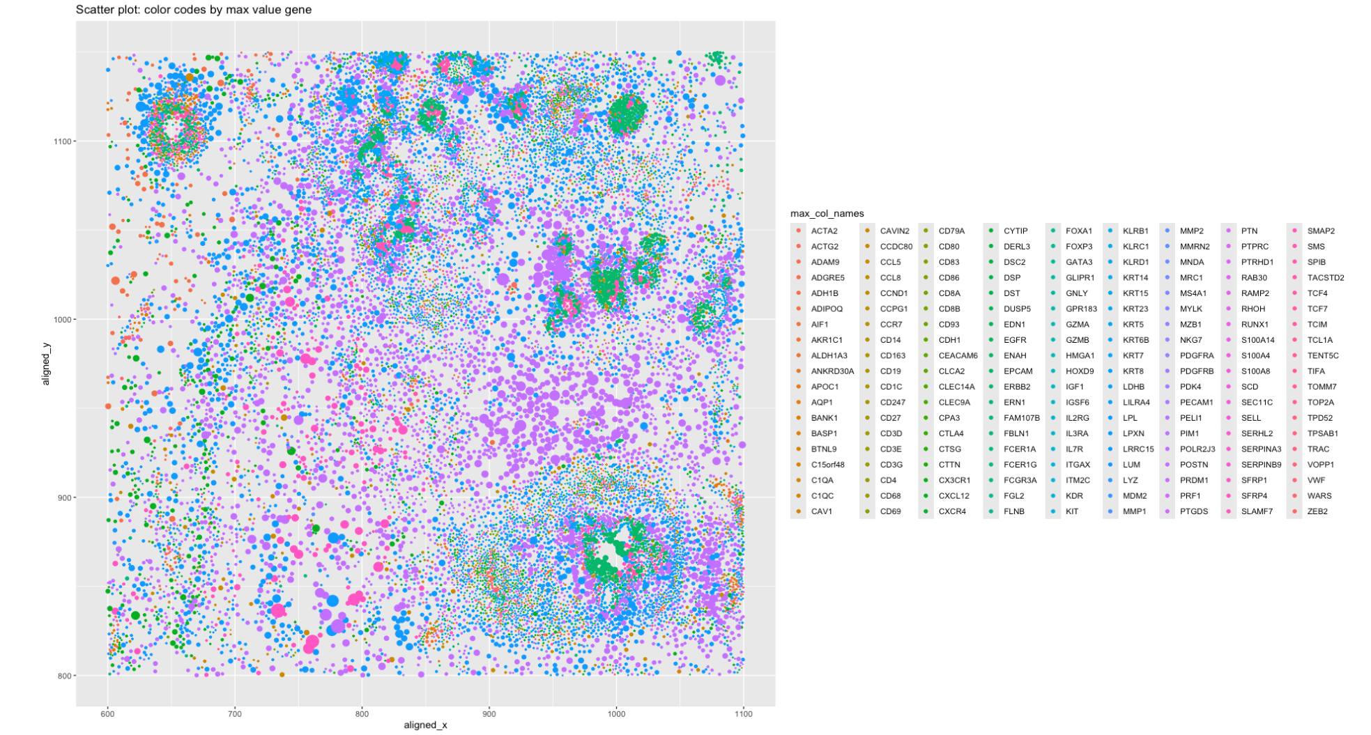
1. What data types are you visualizing? I am trying to visualize aligned_x, aligned_y which is spatial data as it provides location information of the cell. And the gene expression...
1. What data types are you visualizing? I am visualizing quantitative data representing the nucleus-to-cell area ratio for each cell, quantitative data of ERBB2 expression levels to indicate gene activity,...
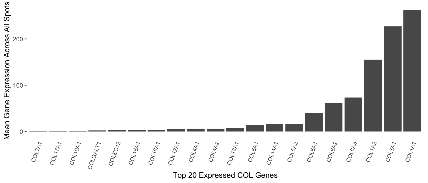
1. What data types are you visualizing? I wanted to visualize the expression of genes related to collagen in the sequencing dataset. More specifically, I looked at the mean expression...
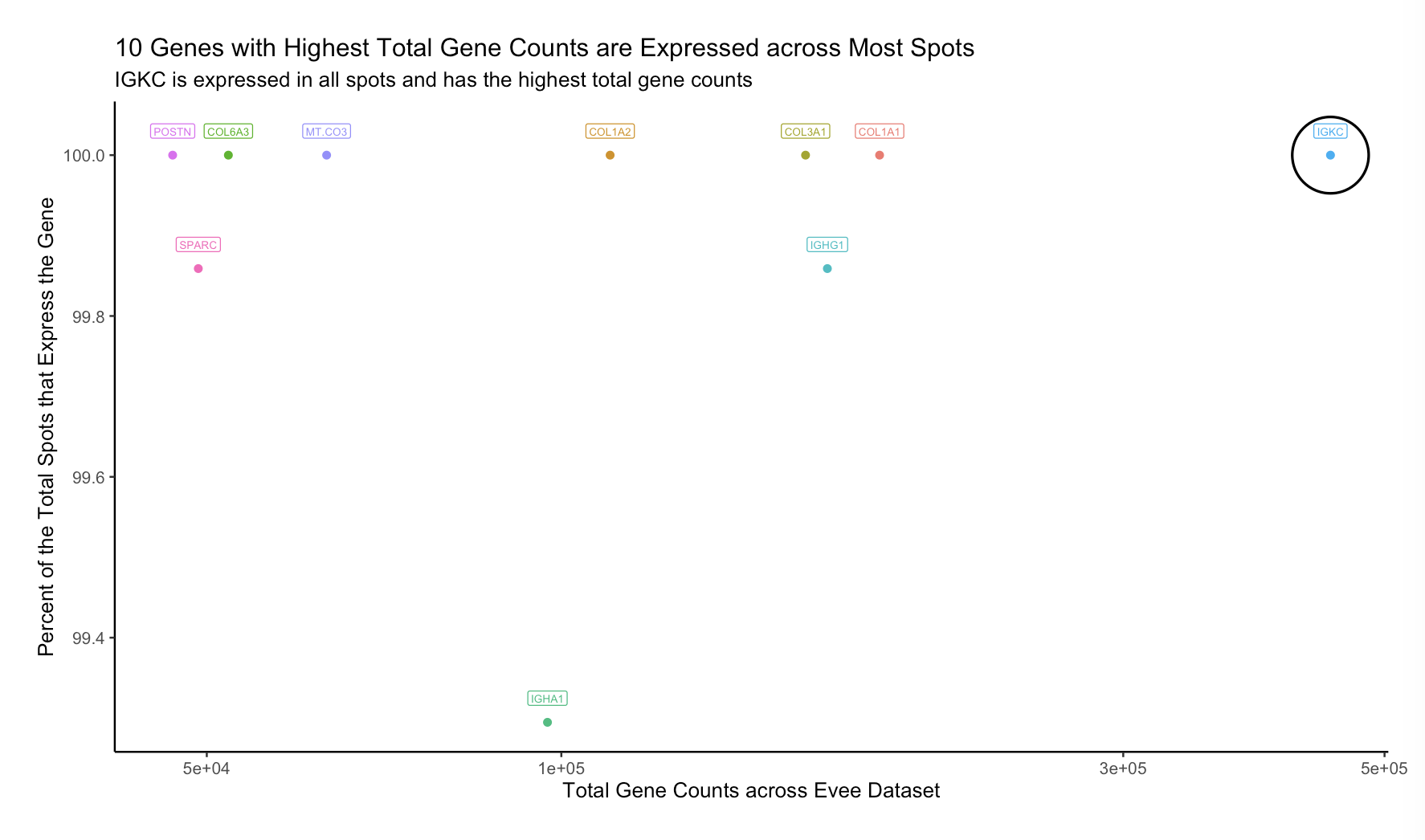
1. What data types are you visualizing?
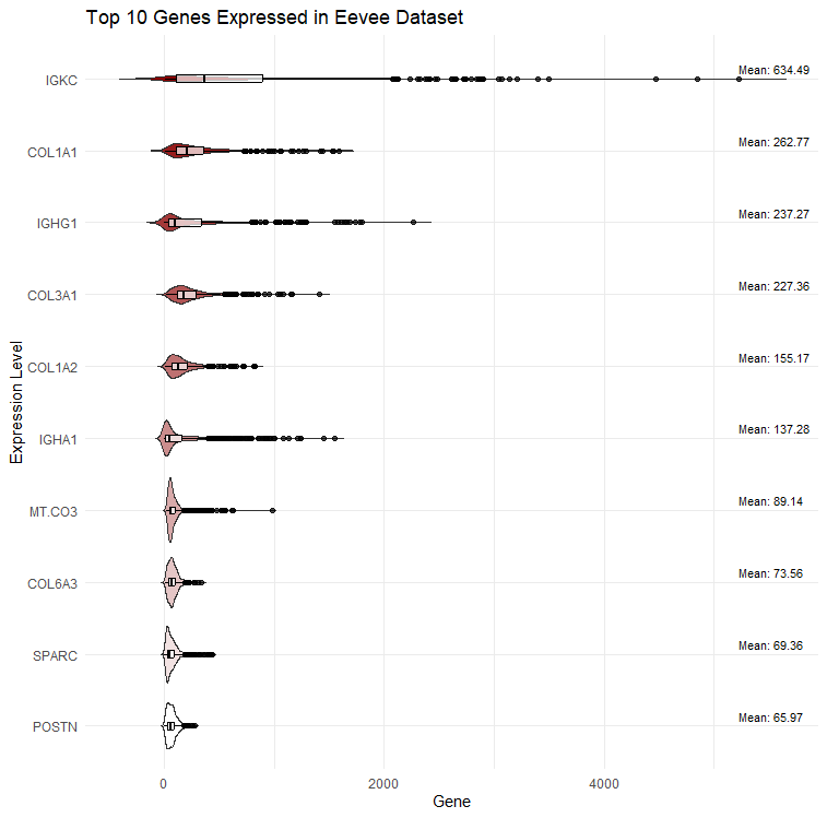
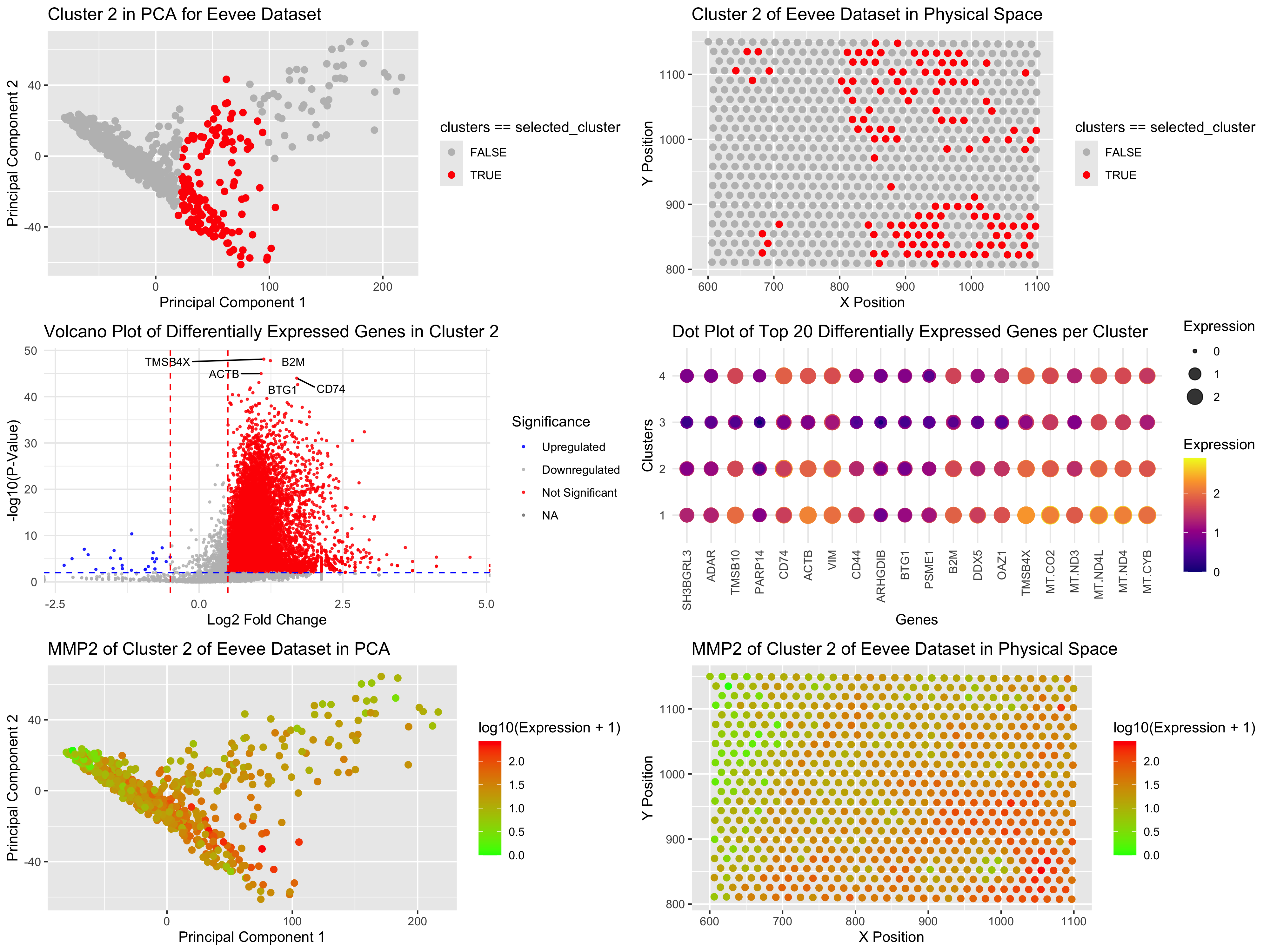
I am visualizing gene expression data obtained through sequencing of the top 10 genes expressed in the Eevee dataset.
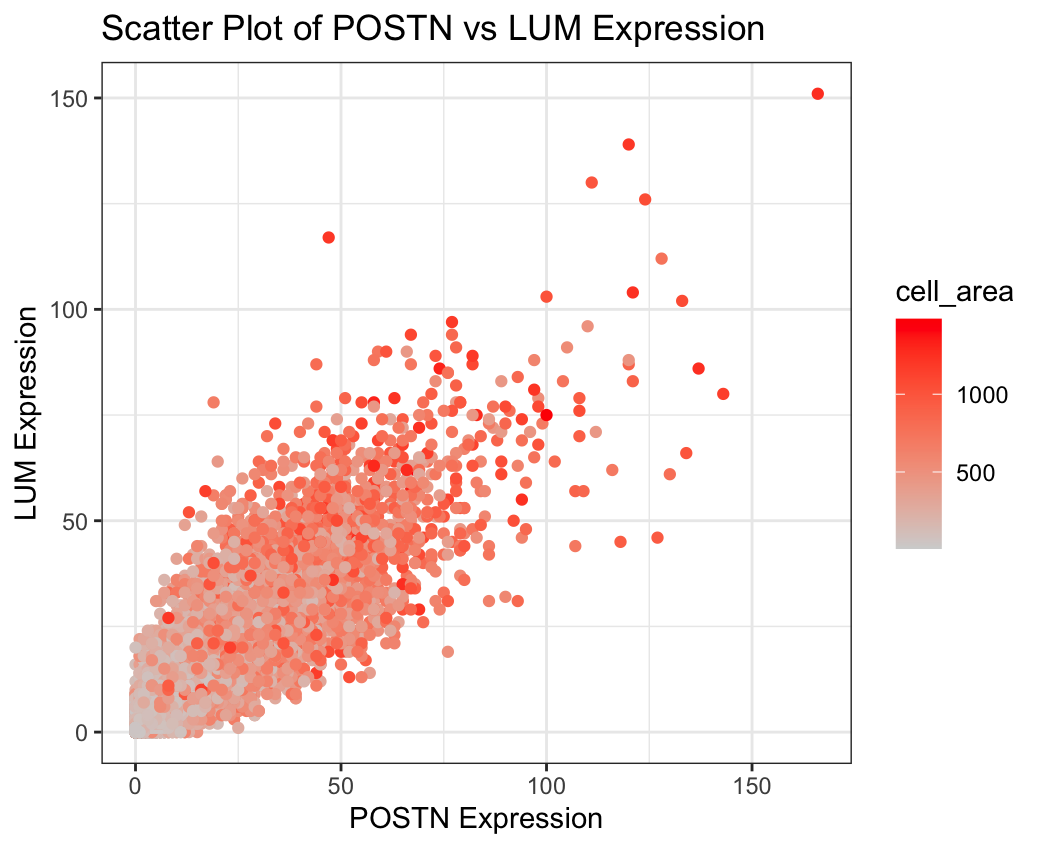
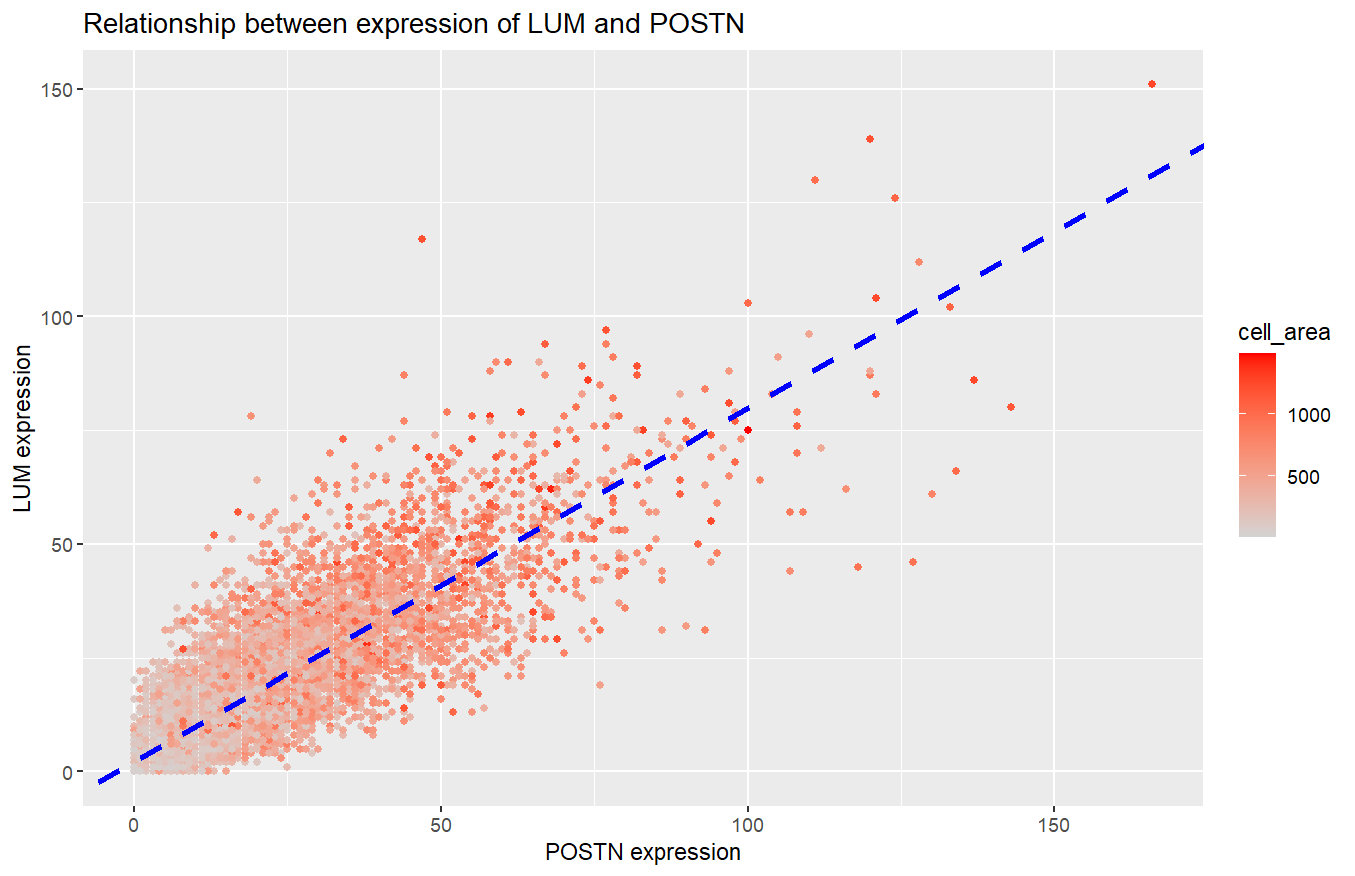
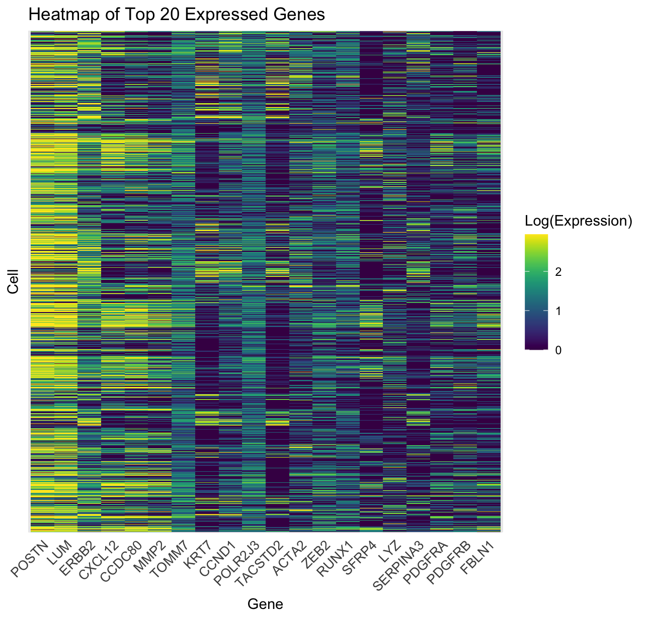
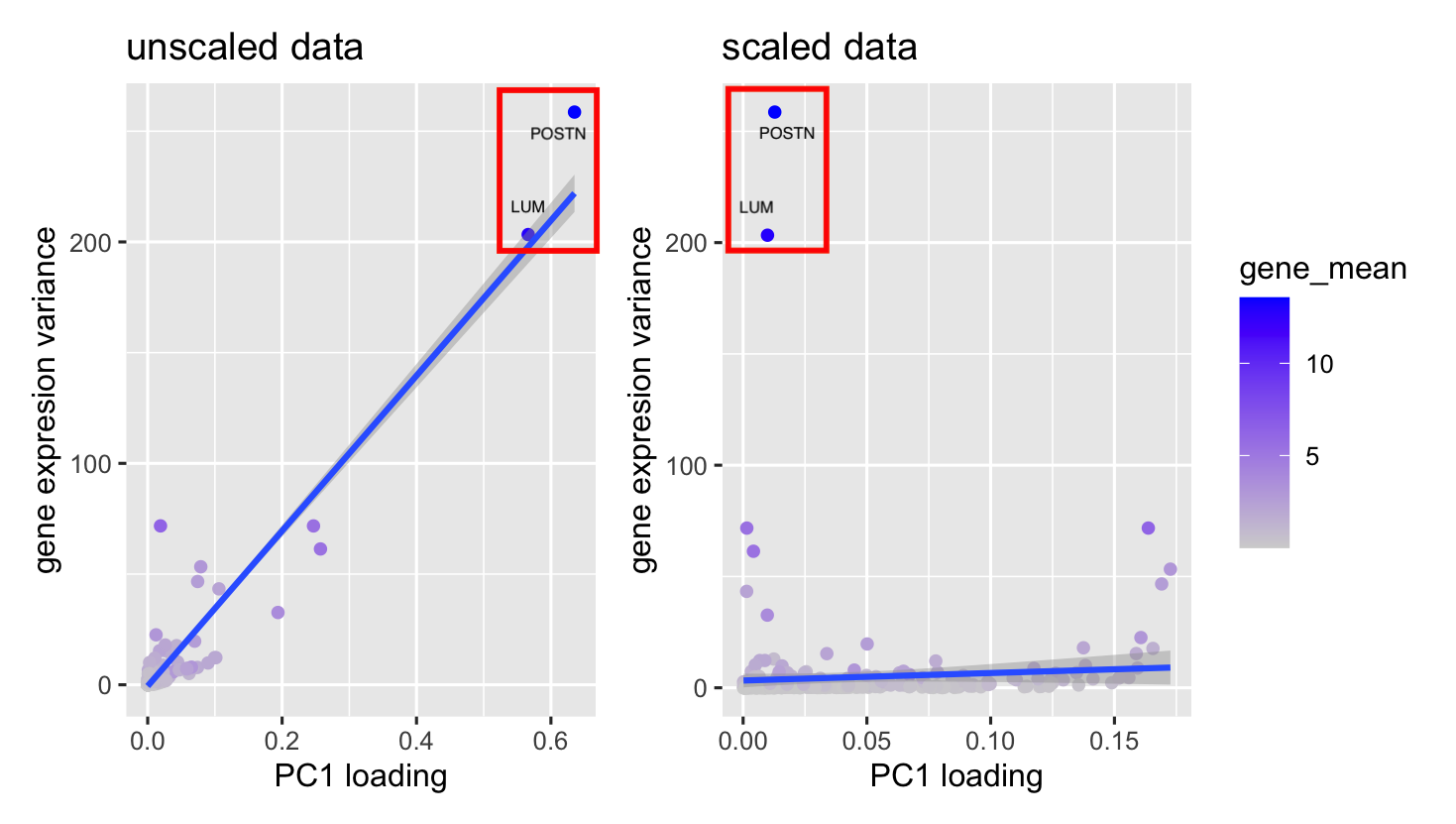
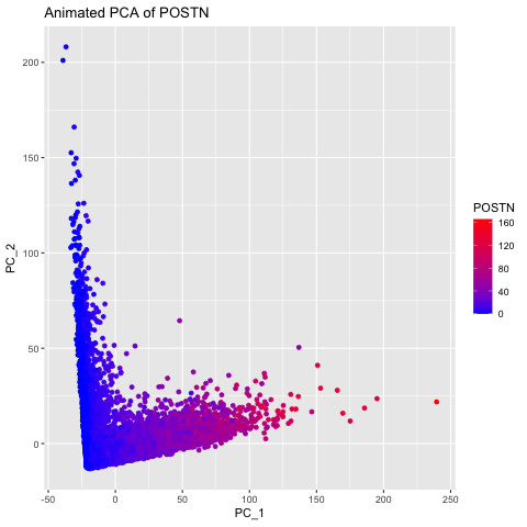
1. What data types are you visualizing? I am visualizing quantitative data for the expression levels of the POSTN and LUM genes in all the individual cells and I am...
1. What data types are you visualizing? I am visualizing quantitative data of the expression count of the POSTN and LUM gene for each cell, and the quantitative data of...
1. What data types are you visualizing?
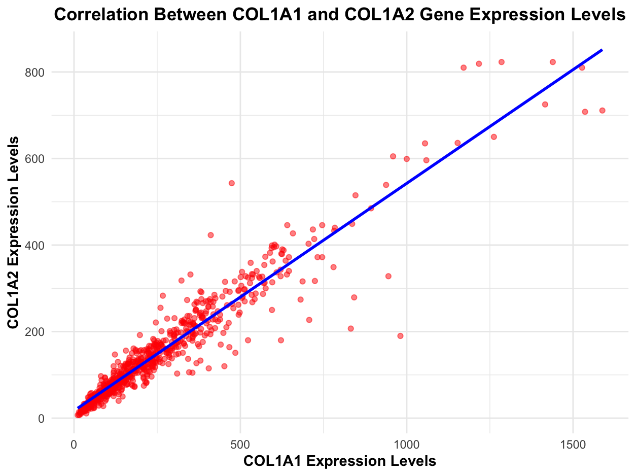
I am visualizing quantitative data of the expression levels of the COL1A1 and COL1A2 genes for each cell in the dataset.
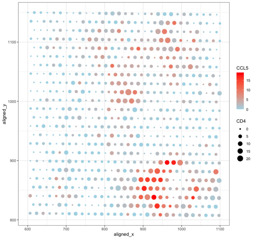
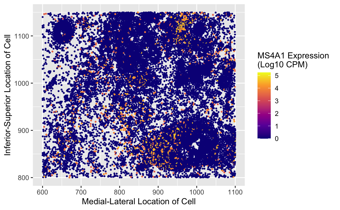
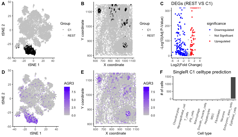
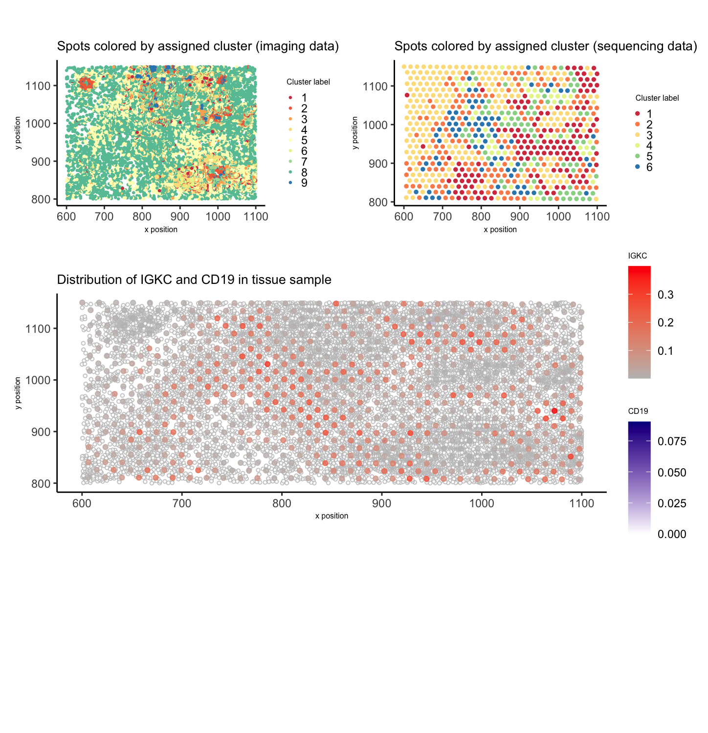
What data types are you visualizing? The data visualized represents the spatial distribution of MS4A1 expression. This is a gene encoding CD20, a well-known surface marker expressed on B-cells, which...
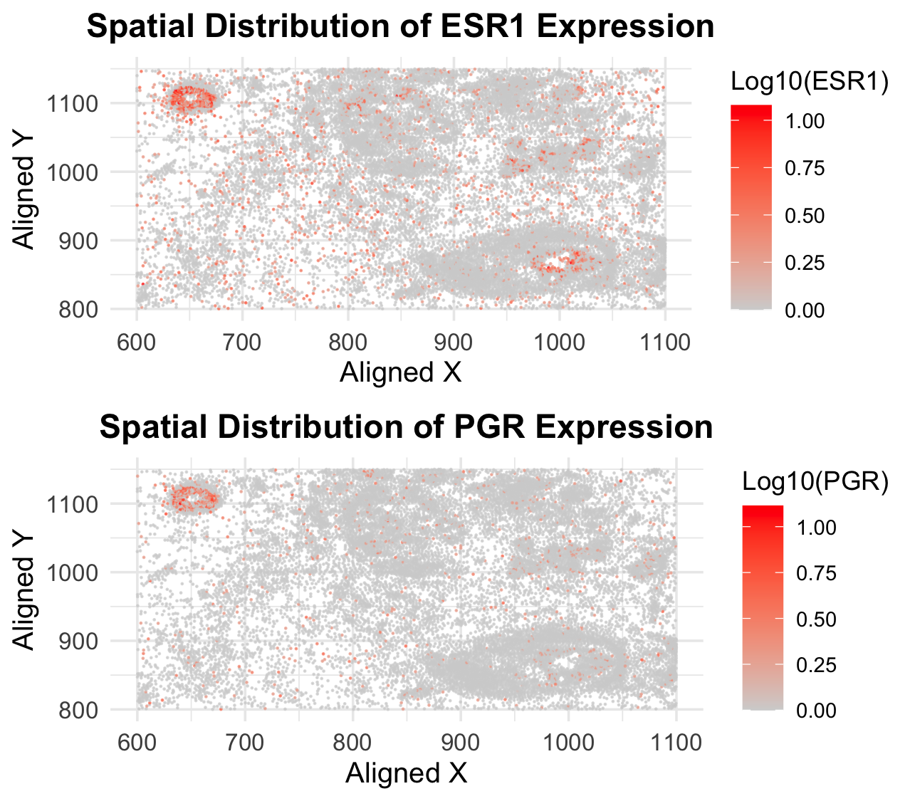
1. What data types are you visualizing? I am visualizing quantitative data representing the expression levels of the ESR1 and PGR genes for each cell. Additionally, I am visualizing spatial...
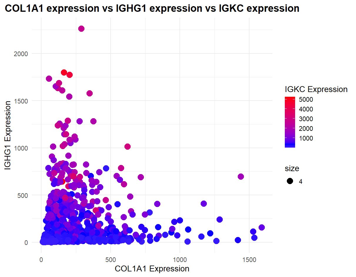
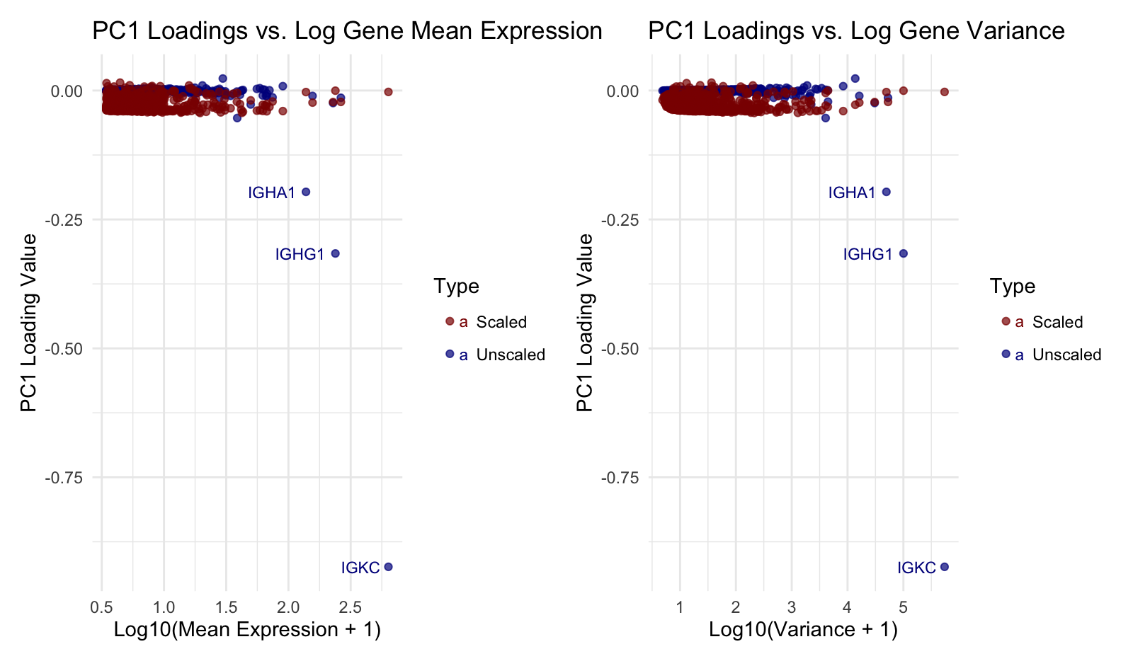
1. What data types are you visualizing? I am visualizing the top 3 genes (COL1A1, IGHG1, and IGKC) expression levels. These are all categorical data types. As in they represent...
1. What data types are you visualizing? For this data visualization of the Eevee spatial transcriptomic data, I visualized both categorical data, the 10 genes of interest, and two types...
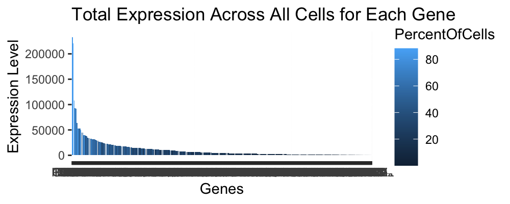
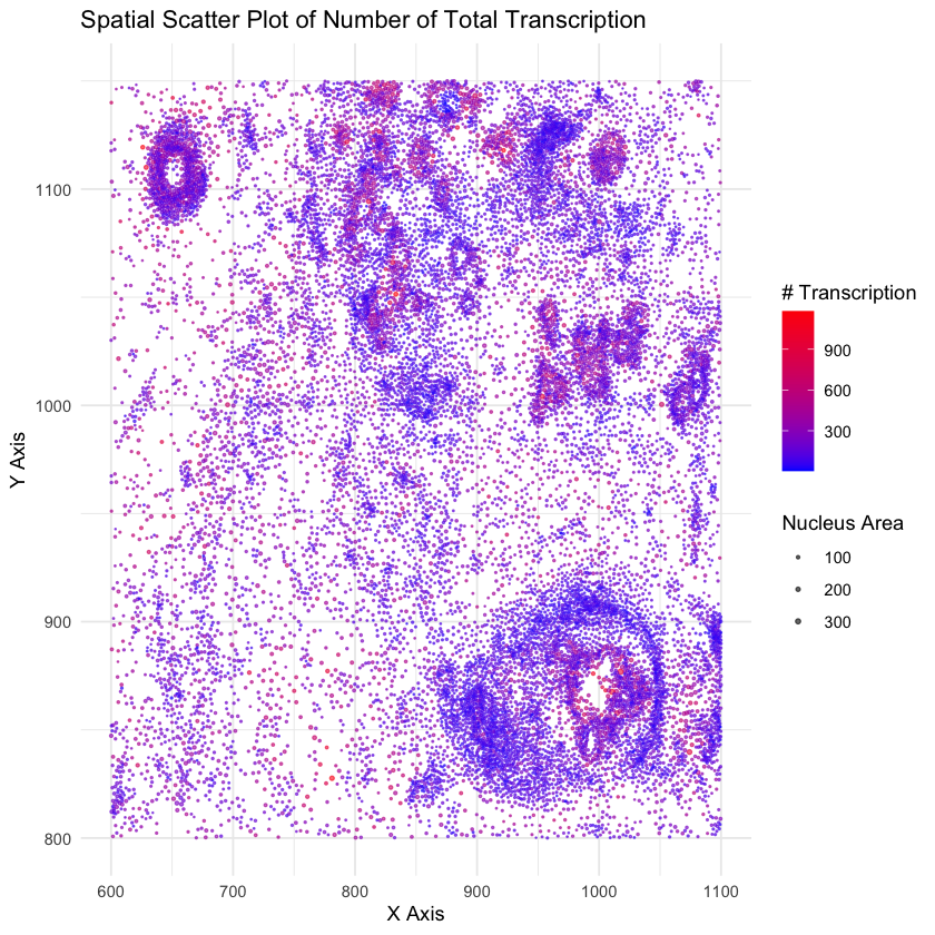
1. What data types are you visualizing? I am visualizing quantitative data of the total expression level of every gene in the panel chosen for imaging data for each cell....
1. What data types are you visualizing?
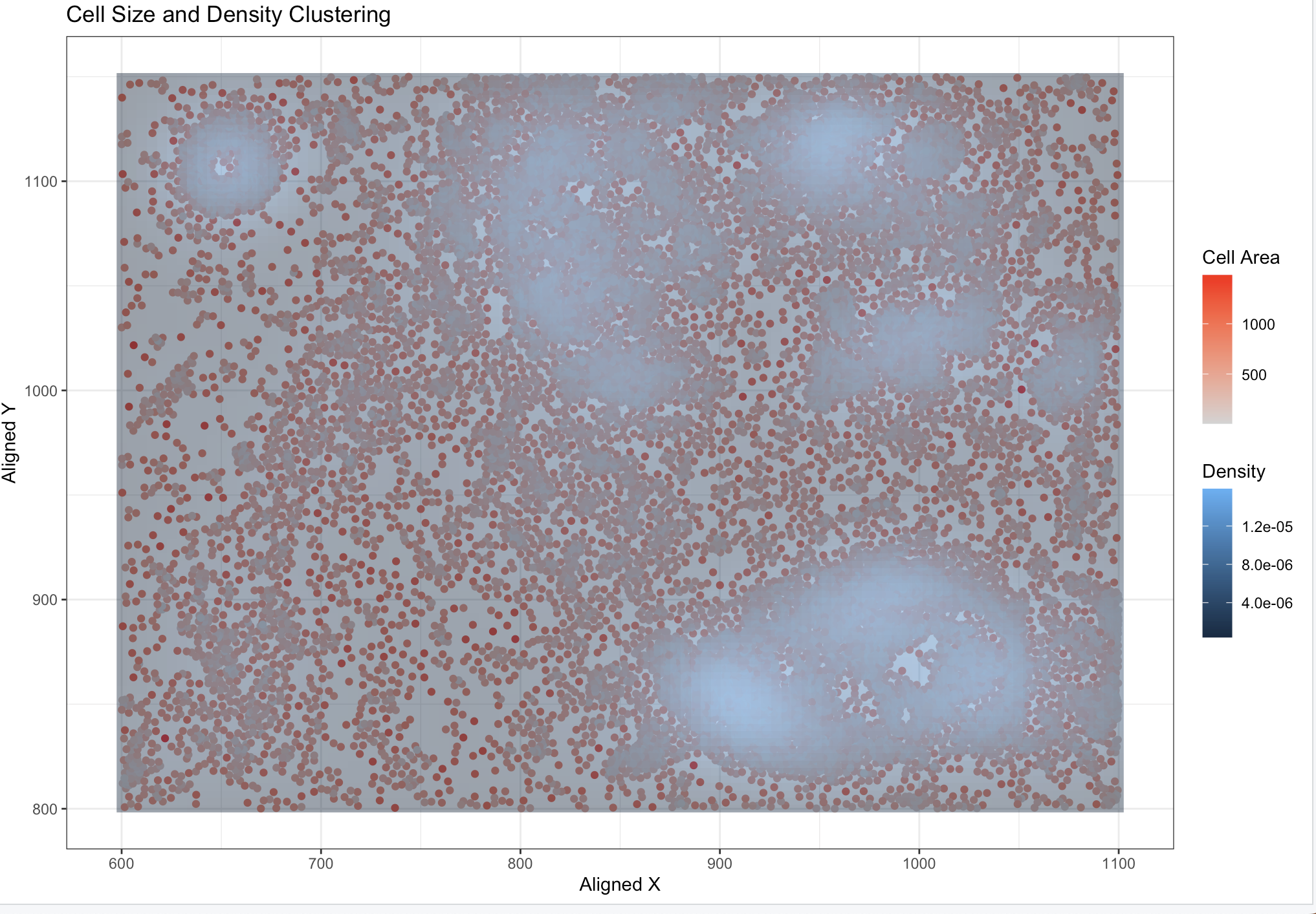
My graph visualizes x,y grid data (spatial) overlaid with the cell areas (quantitative). The overlaid density coloring is also quantitative.
1. What data types are you visualizing? Within the Pikachu dataset that was visualized, gene expression levels across multiple individual cells proved to be a key mechanism in exploring spatial...
1. What data types are you visualizing? Spatial data of each cell, i.e the location of the cell within the section of the image, which is represented by x and...
1. What data types are you visualizing?
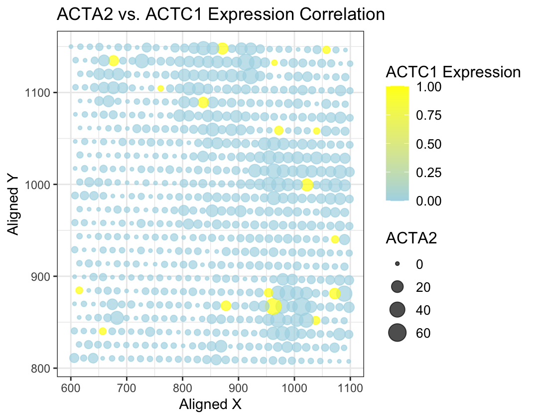
I am visualizing quantitative data of the expression correlation between ACTA1 and ACTA12 genes with its expression levels and spatial coordinates.
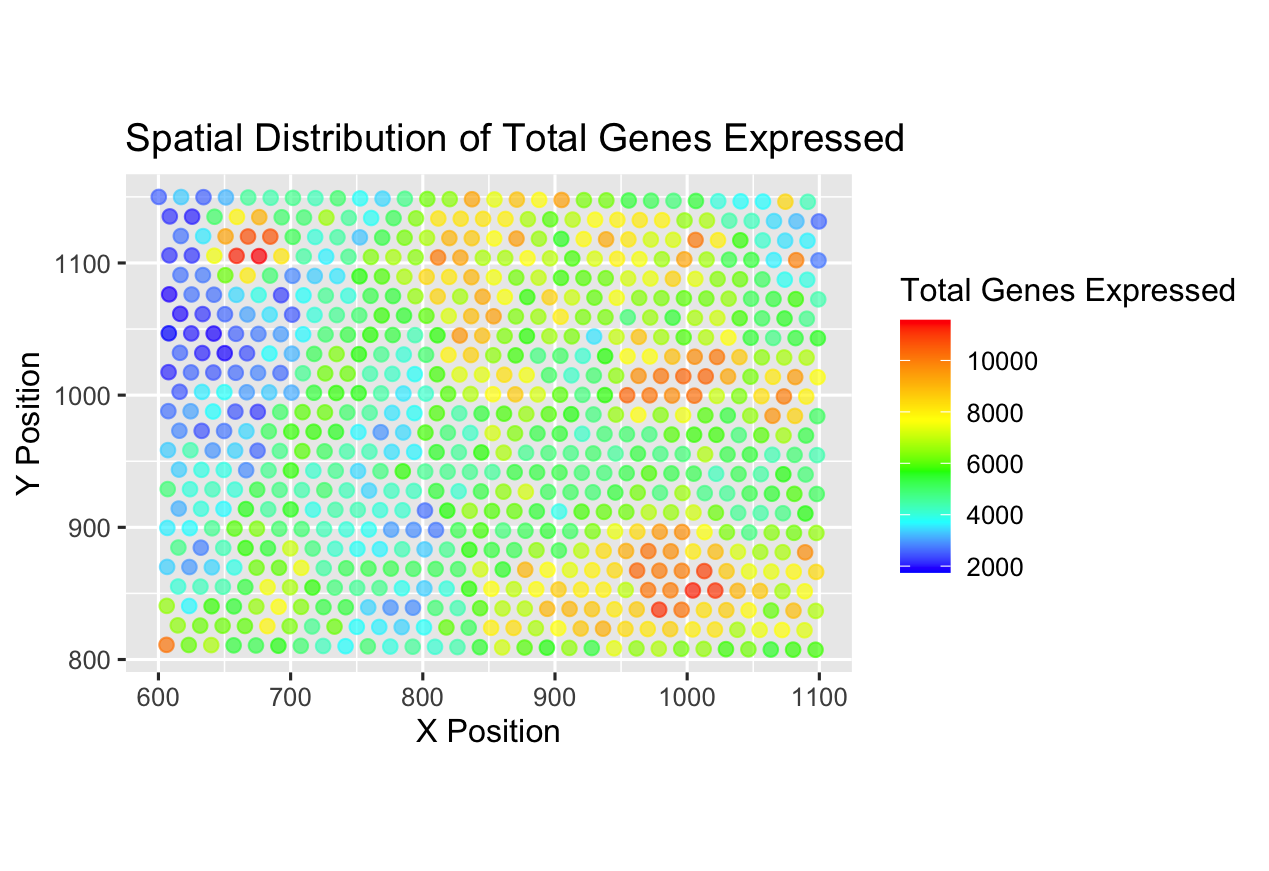
1. What data types are you visualizing? I am visualizing quantitative data of the number of expressed genes for each cell, quantitative data of the area for each cell, and...
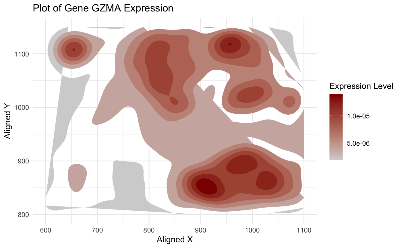
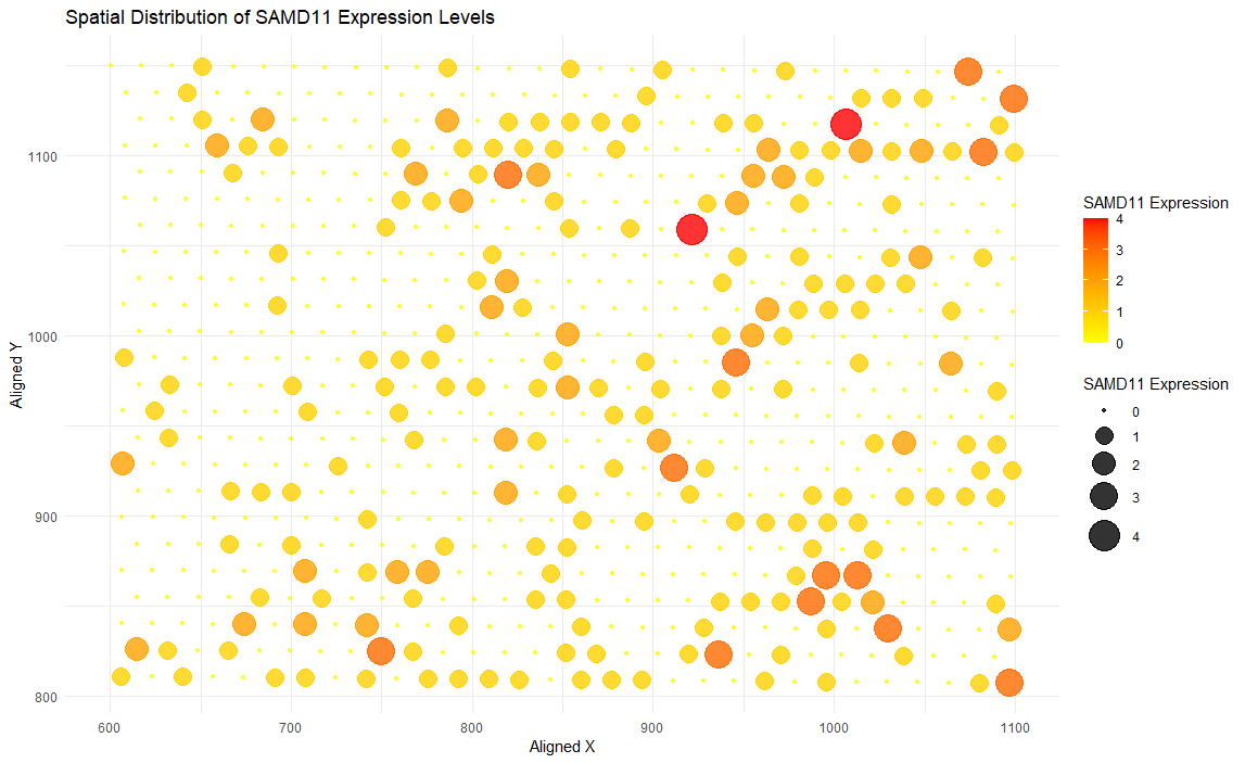
1. What data types are you visualizing? I am visualizing quantitative data representing SAMD11 gene expression levels, and spatial data regarding the x and y aligned positions of data points...
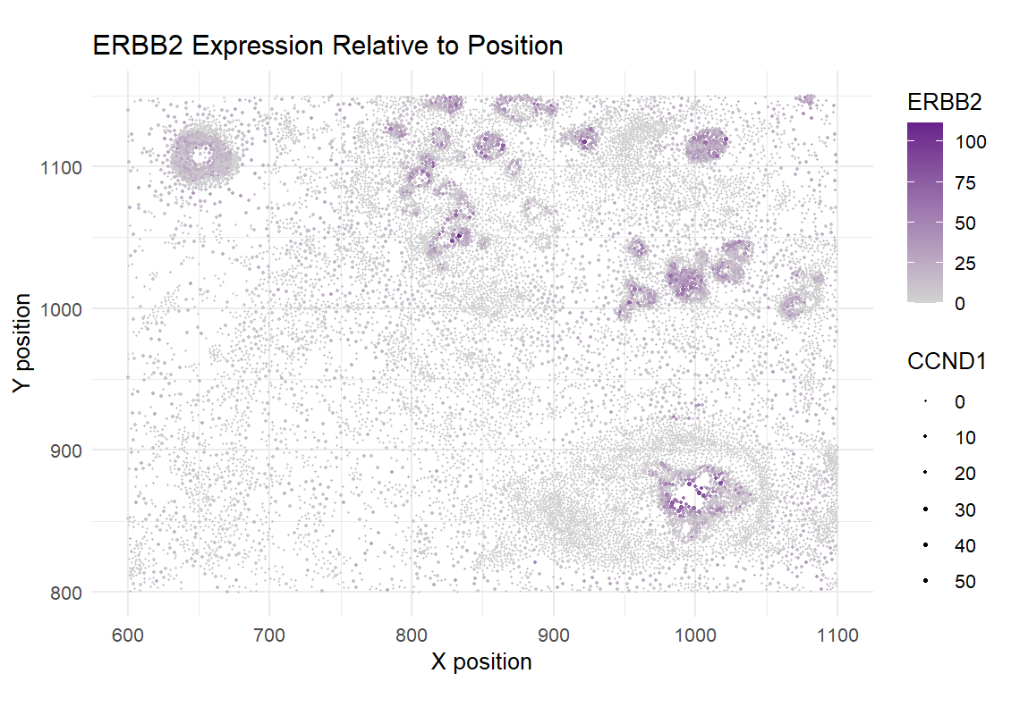
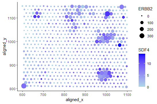
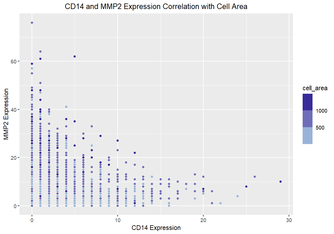
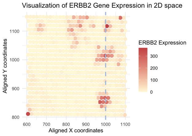
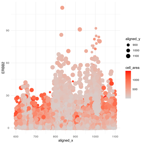
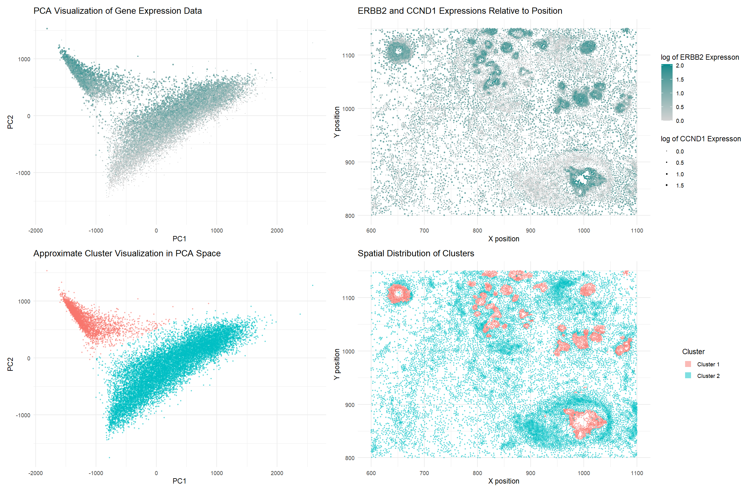
1. What data types are you visualizing? I am visualizing quantitative data of the expression count of the ERBB2 gene for each cell, quantitative data of the area for each...
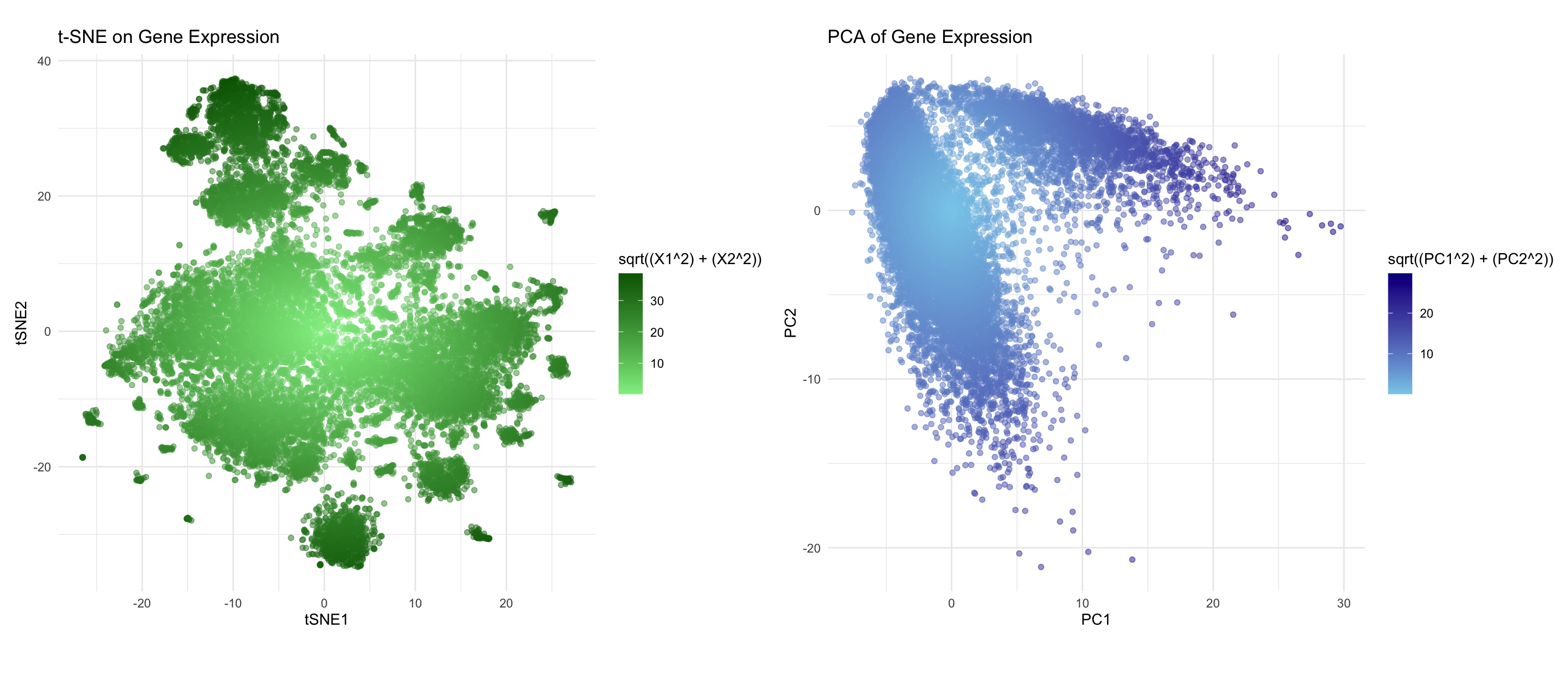
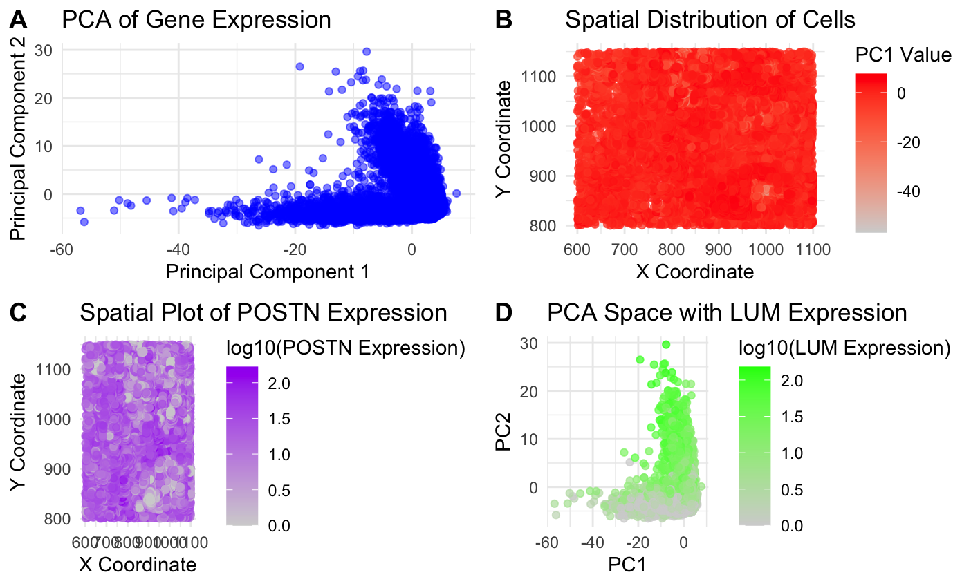
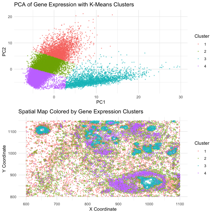
In many tissues, cells with similar gene expression patterns tend to cluster together both in a dimensionality-reduced “gene expression space” (like the PCA or t-SNE plots) and in their actual...
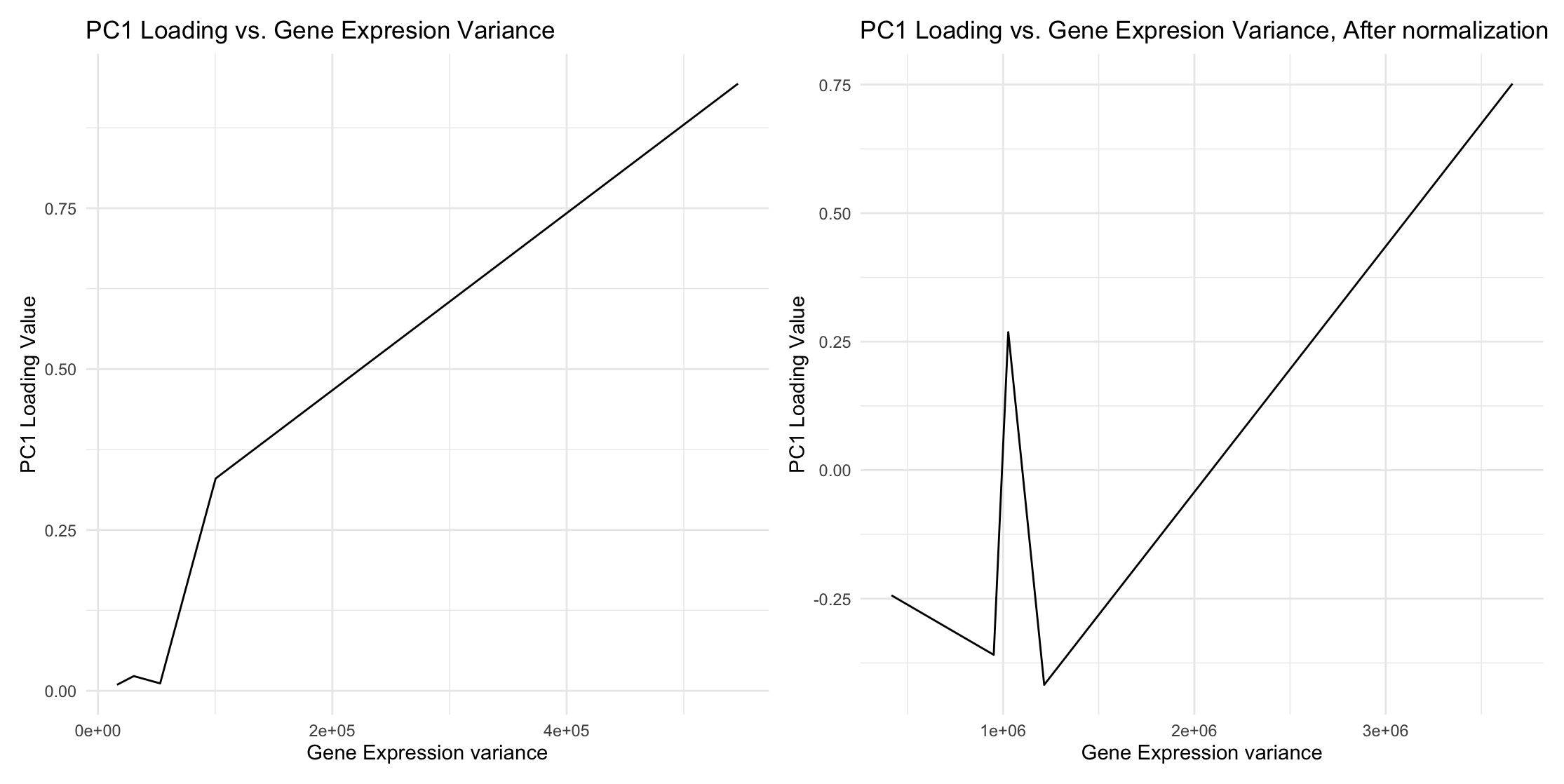
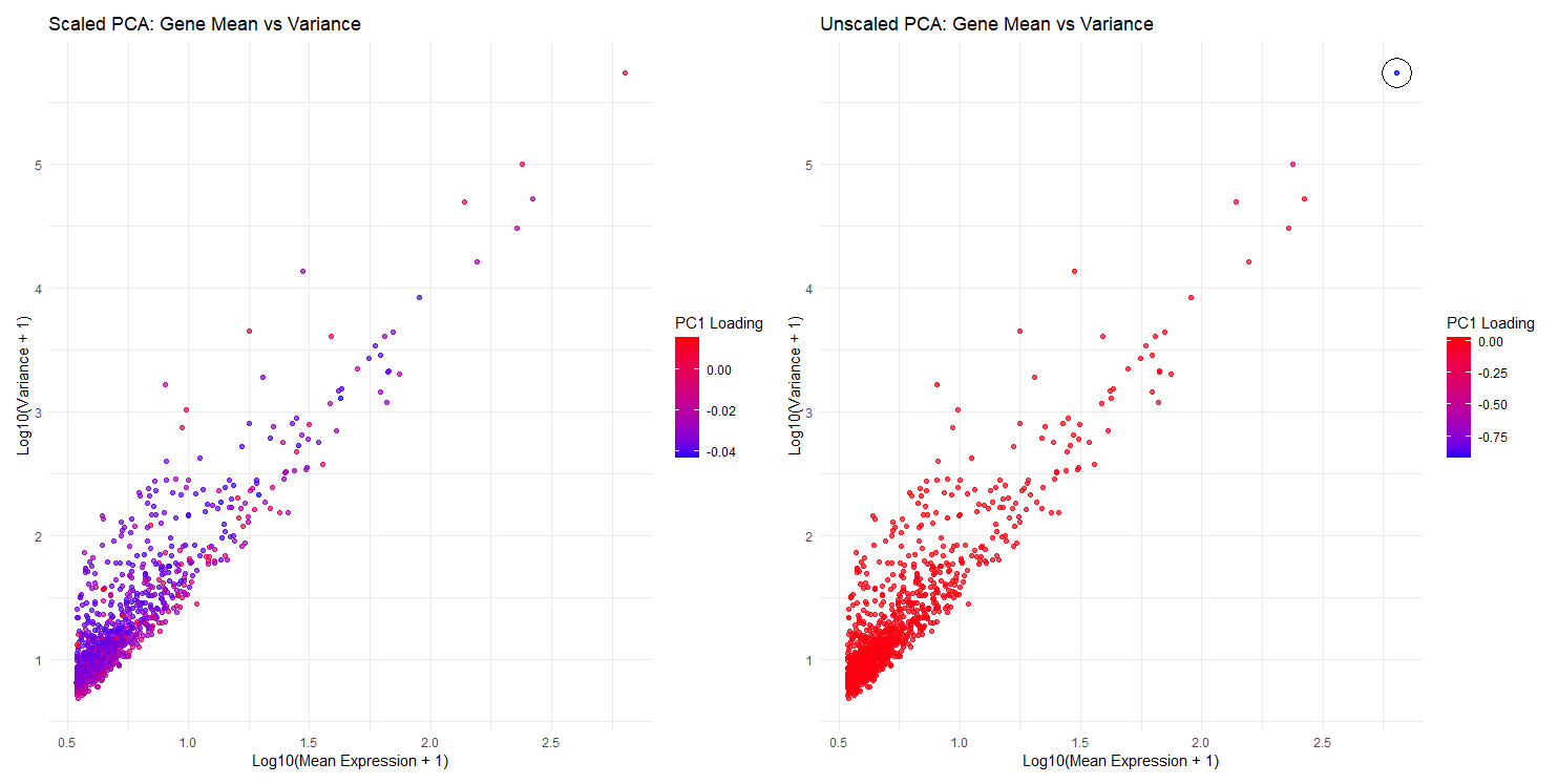
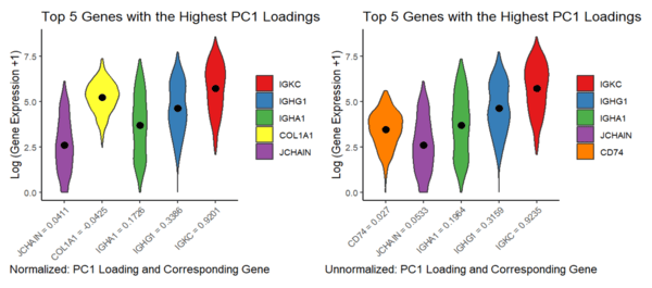
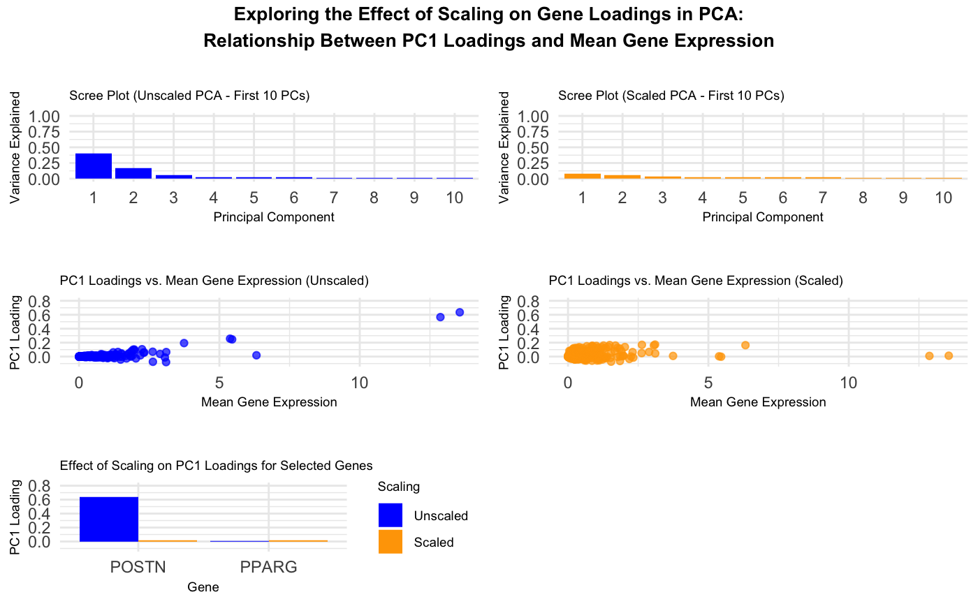
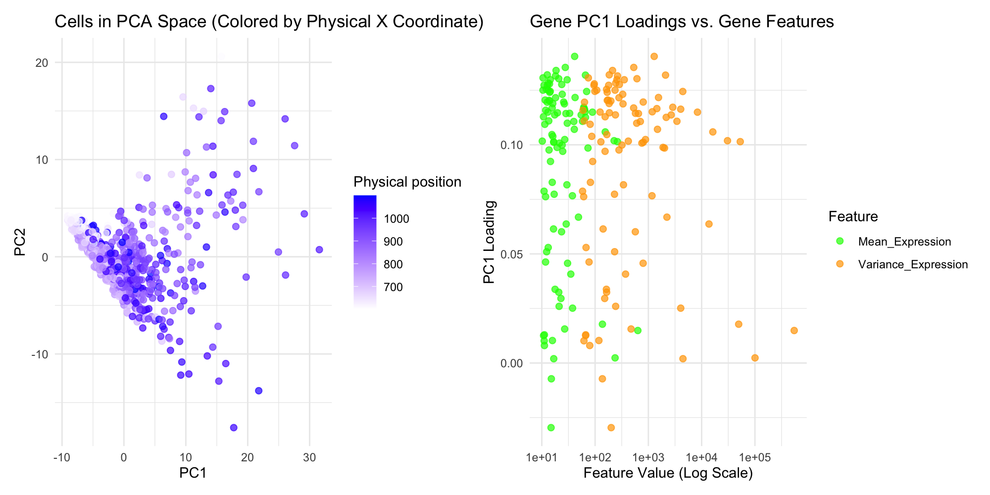
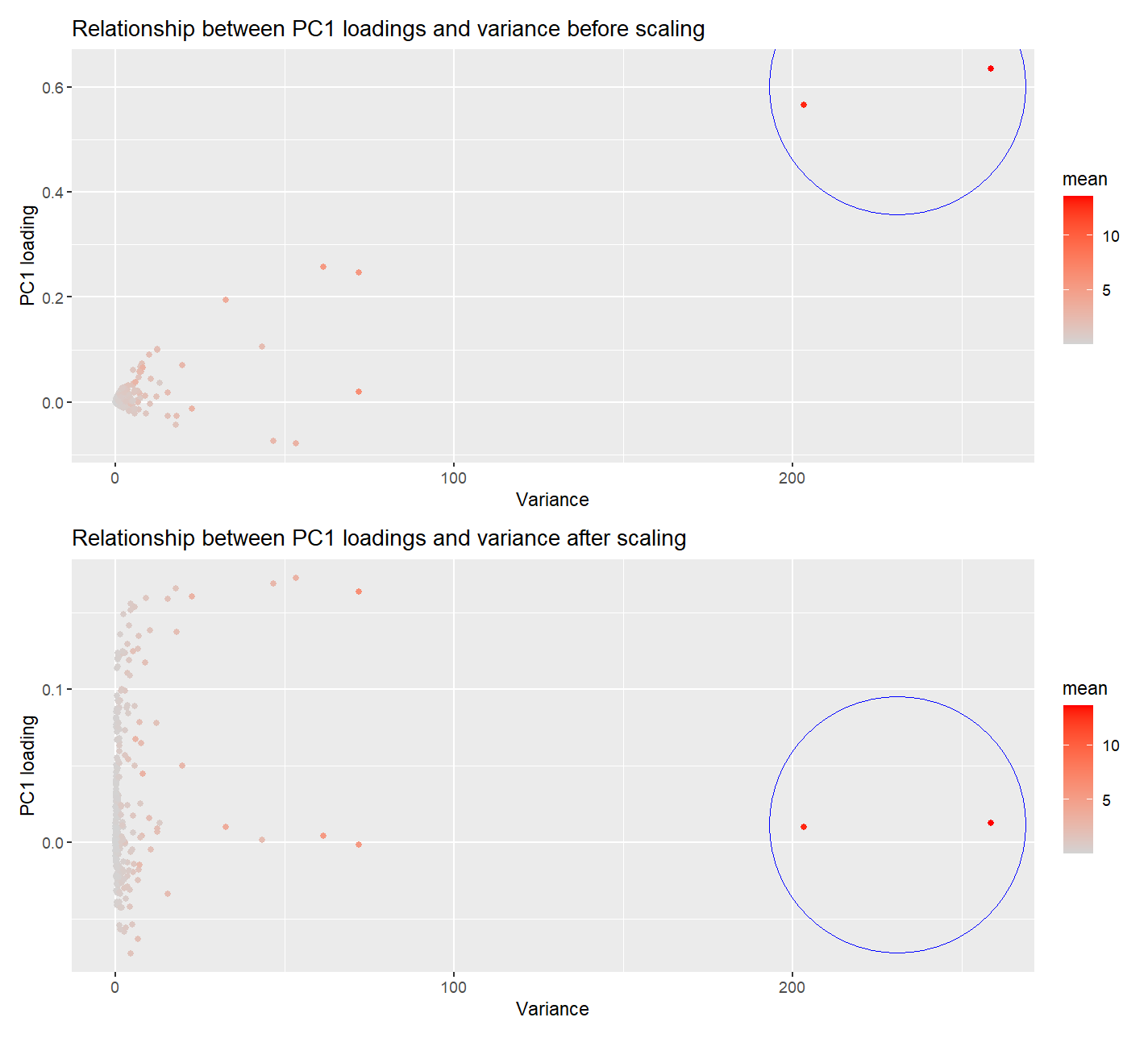
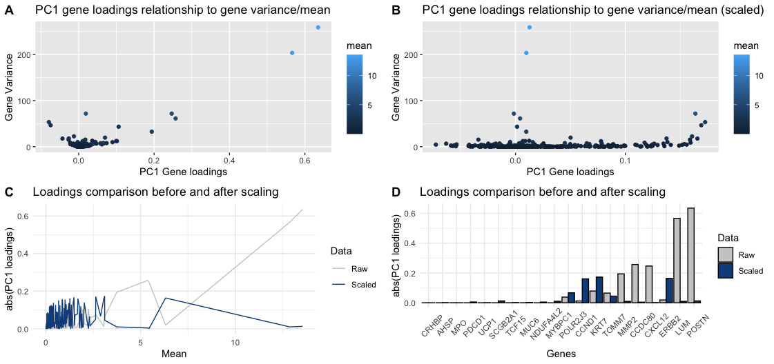
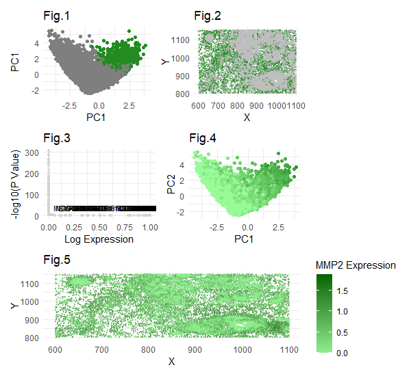
1. How do the gene loadings on the first PC relate to features of the genes such as its variance? Using the raw data, when the gene expression variance is...
[description] In my visualization, I use points as the geometric primitive, angle and color for visual channel. The x-axis represents the PCA loadings for each gene, while the y-axis shows...
The visualization effectively conveys relationships between gene expression and spatial organization by utilizing dimensionality reduction (PCA) to simplify high-dimensional gene expression data. The PCA scatter plot helps distinguish patterns in...
1. What data types are you visualizing?
I am visualizing quantitative data, which includes log-transformed mean expression (x-axis), log-transformed variance (y-axis), and PC1 loading values (color hue).
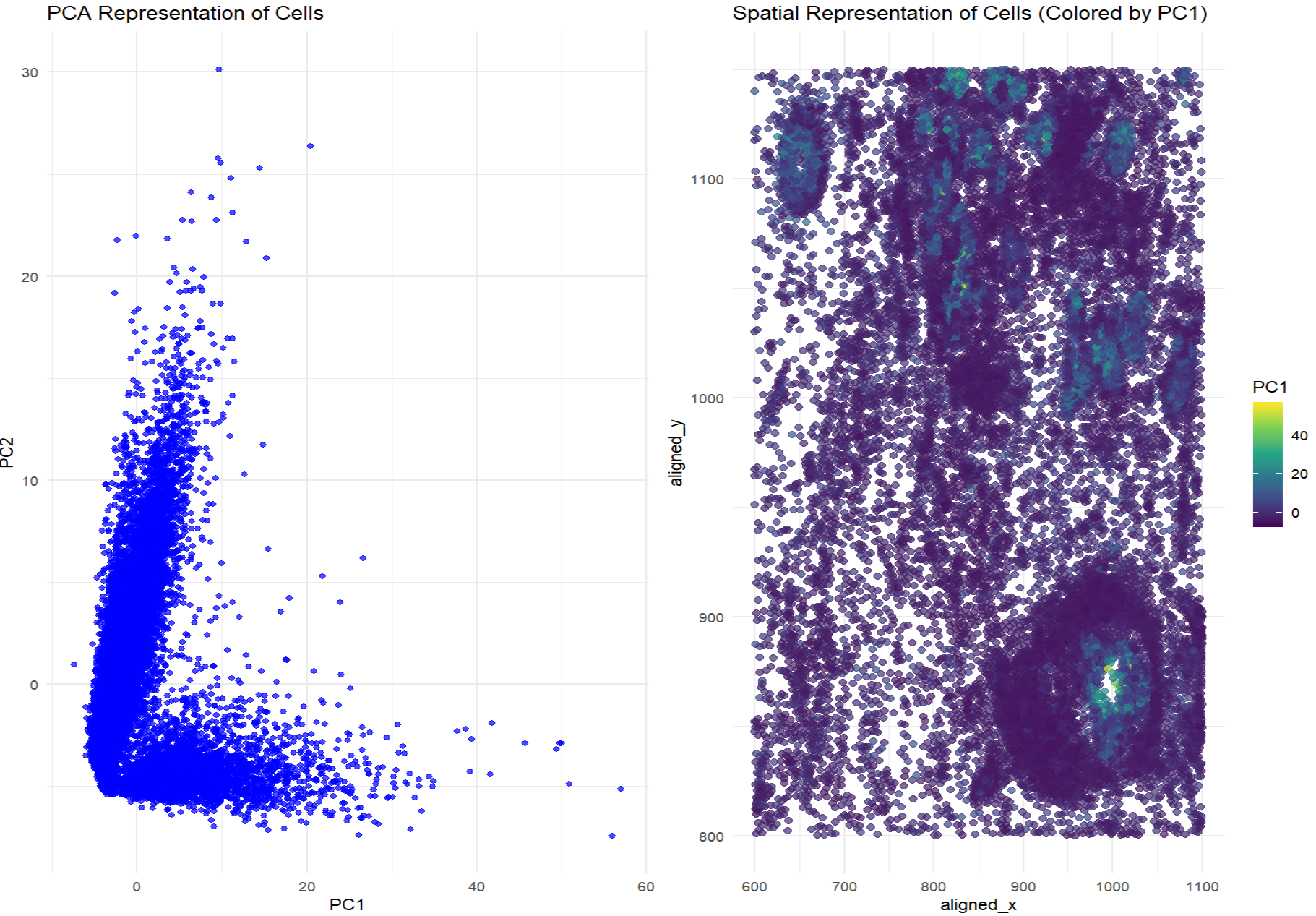
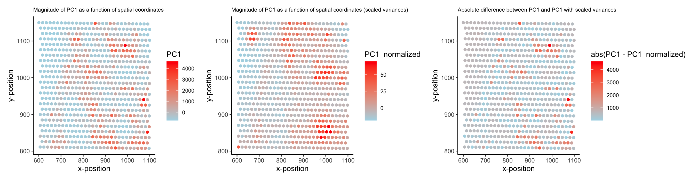
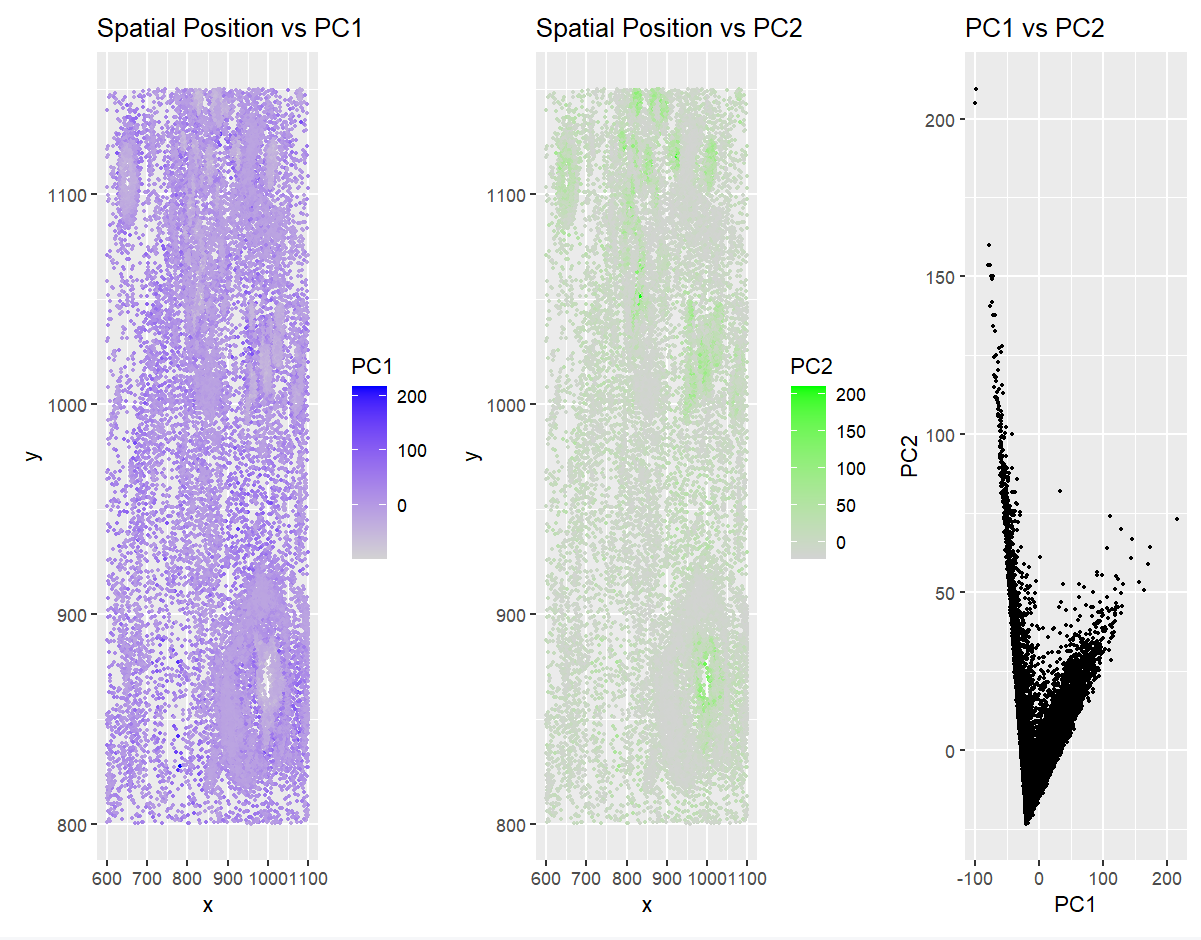
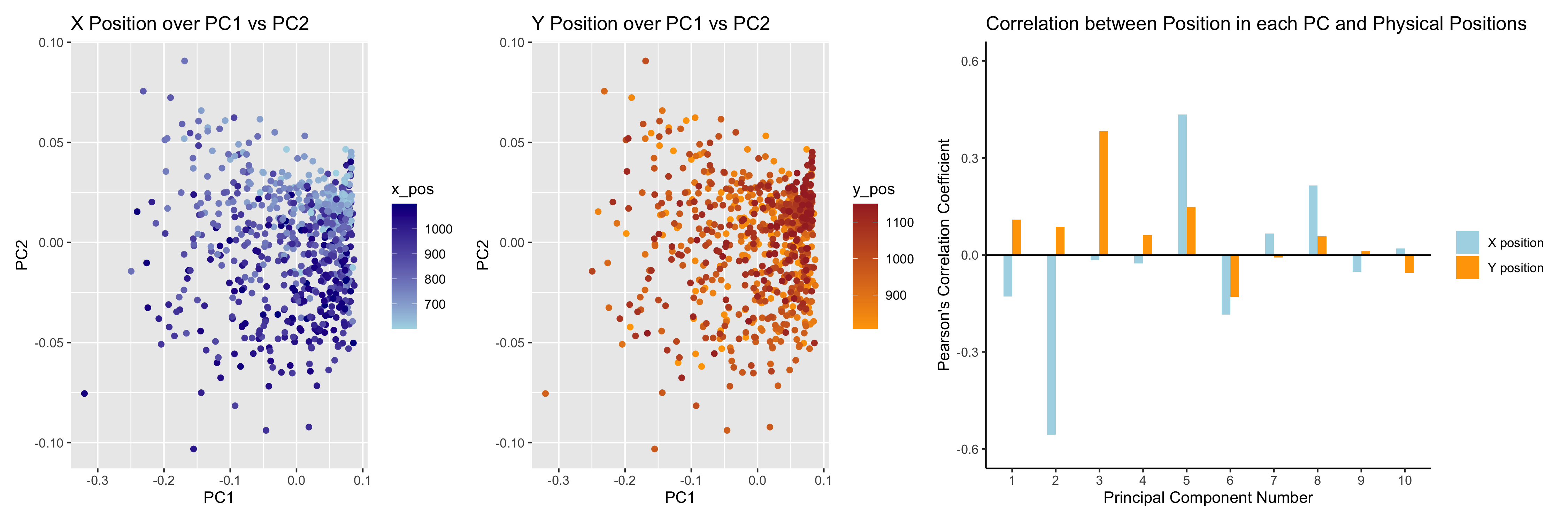
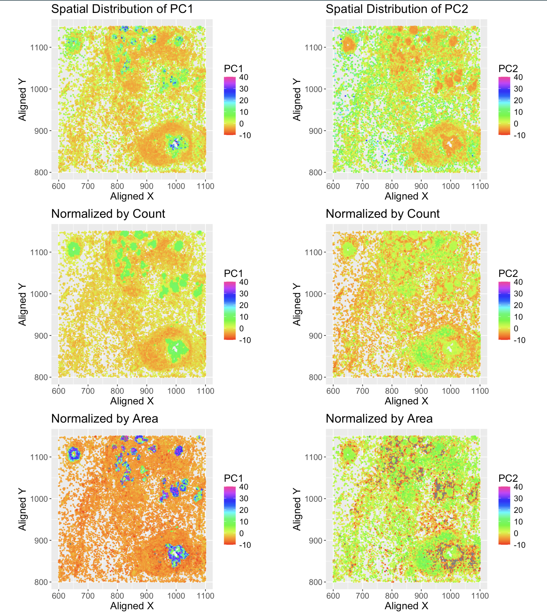
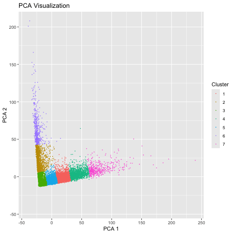
1. What data types are you visualizing? I wanted to visualize spatial data (locations of spots on tissue sample) and quantitative data (PC1 values for each spot). I looked at...
1. What data types are you visualizing?
I am visualizing quantitative data, specifically cell gene expression and positional data (x and y coordinates).
This visualization addressed the second aim, specifically how gene loadings on the first PC relate to features of the gene when scaled and unscaled. Particularly, I used a violin plot...
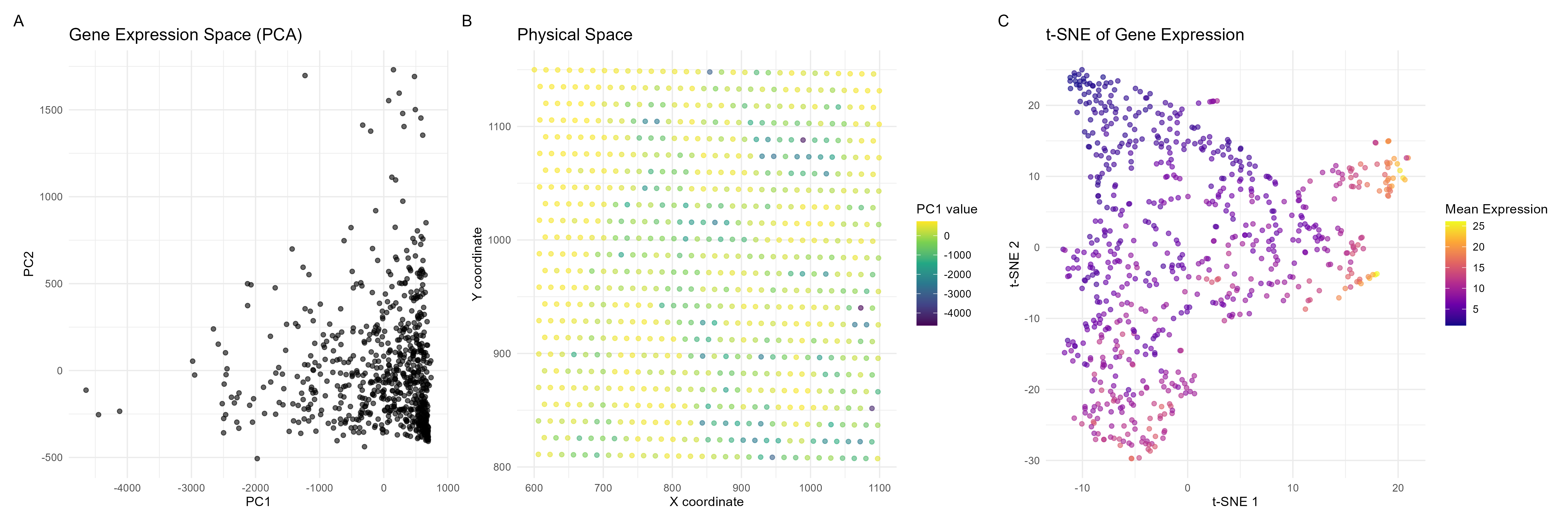
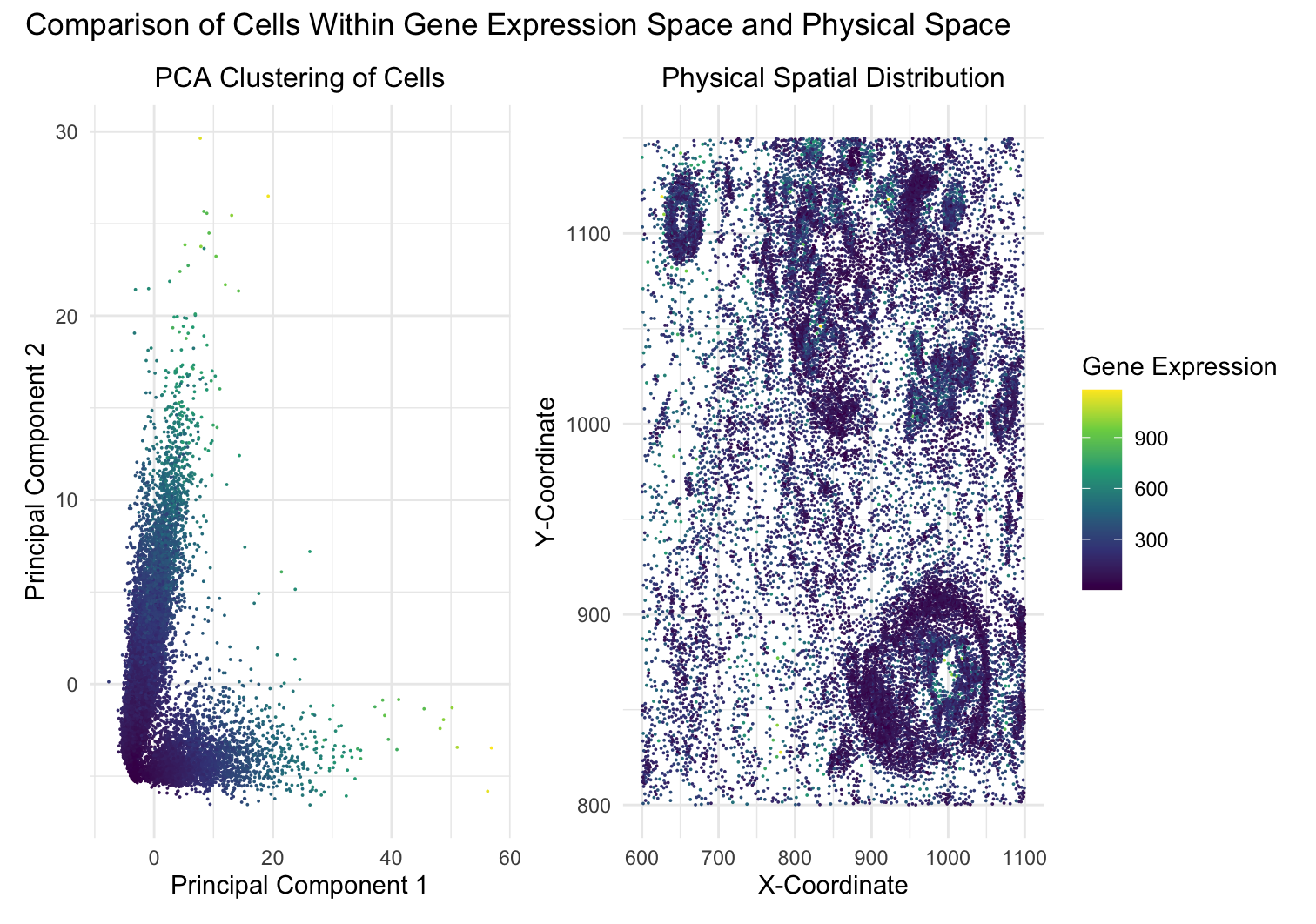
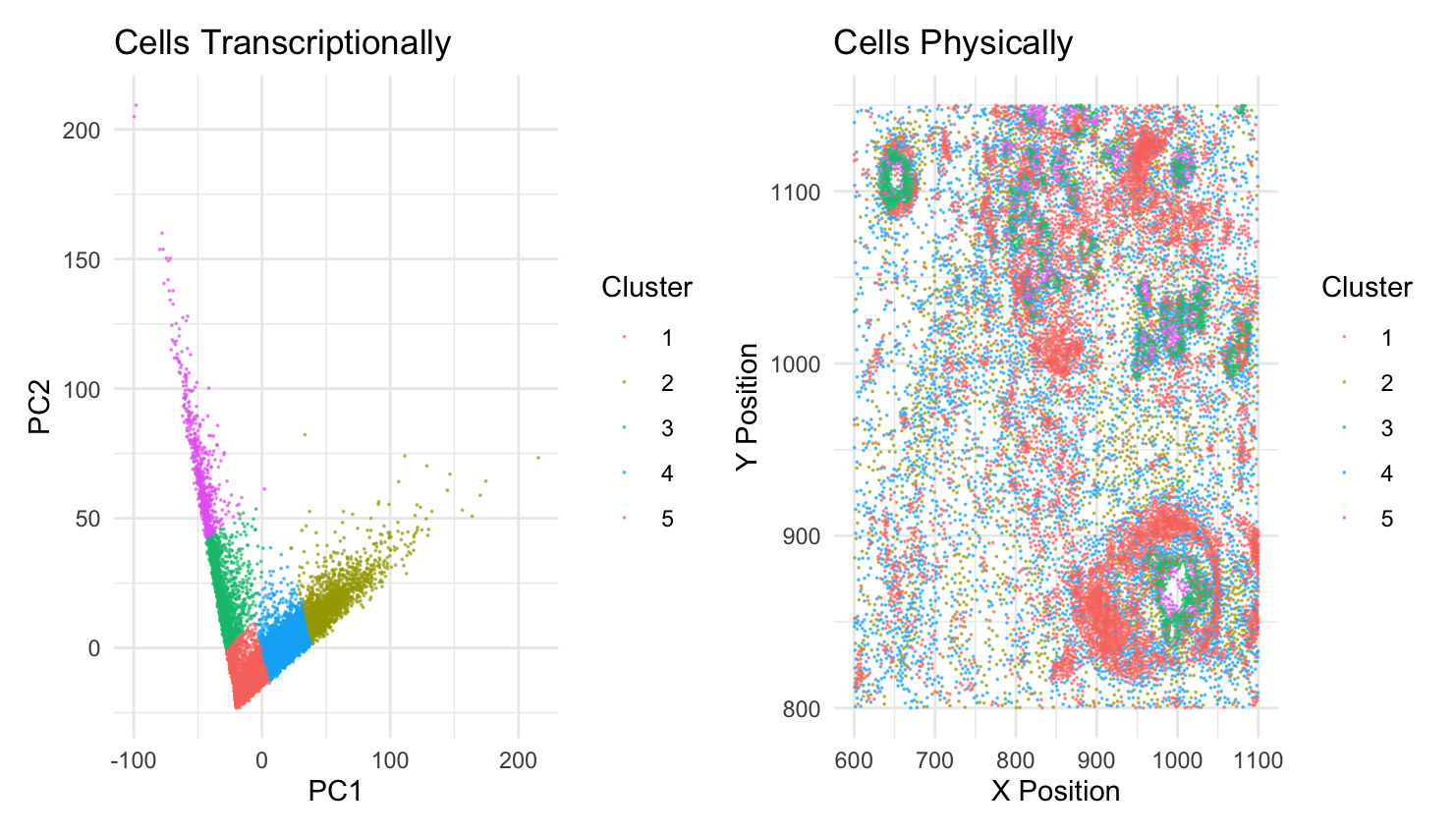
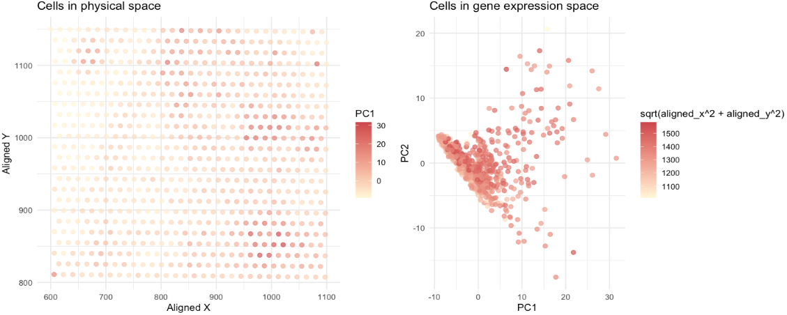
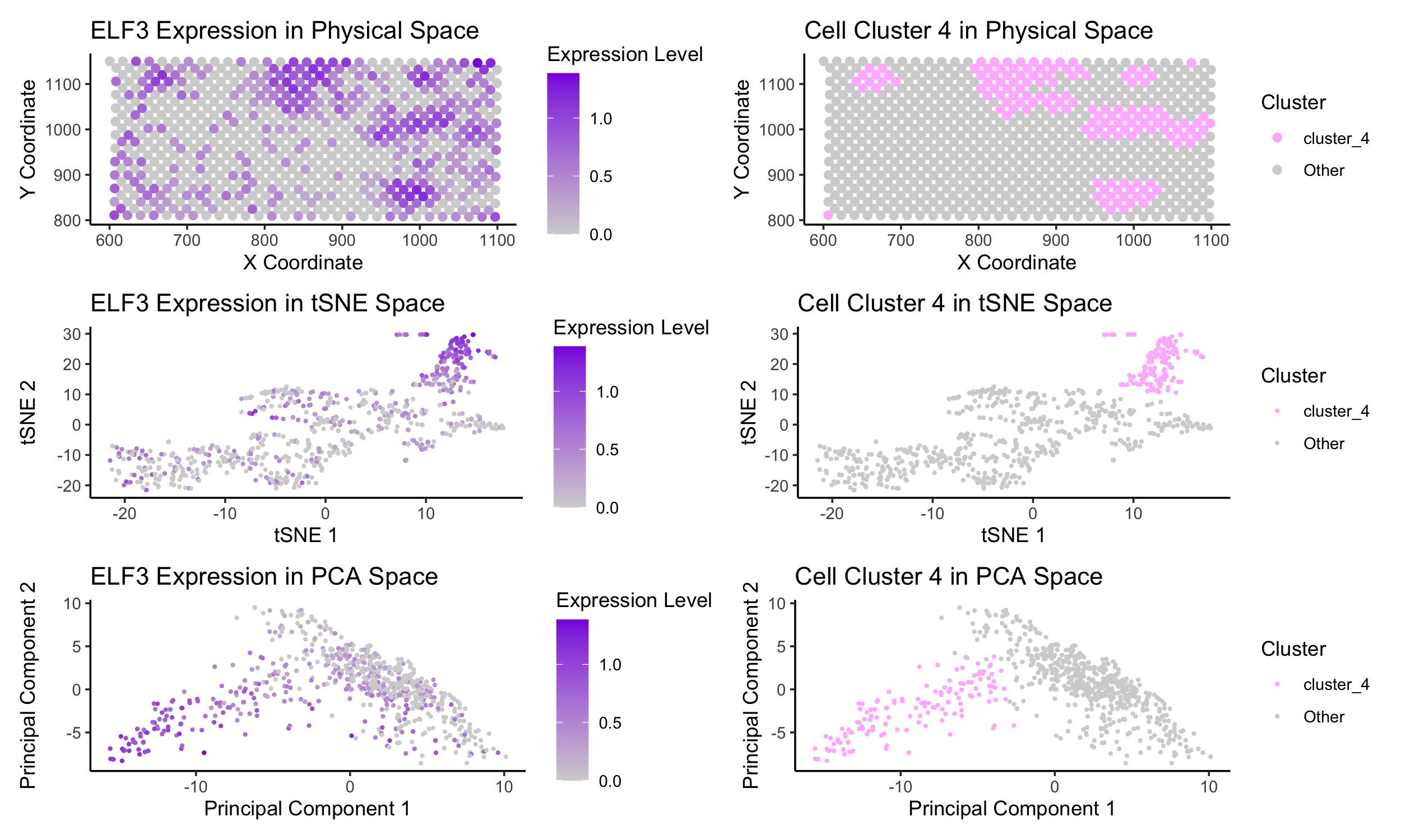
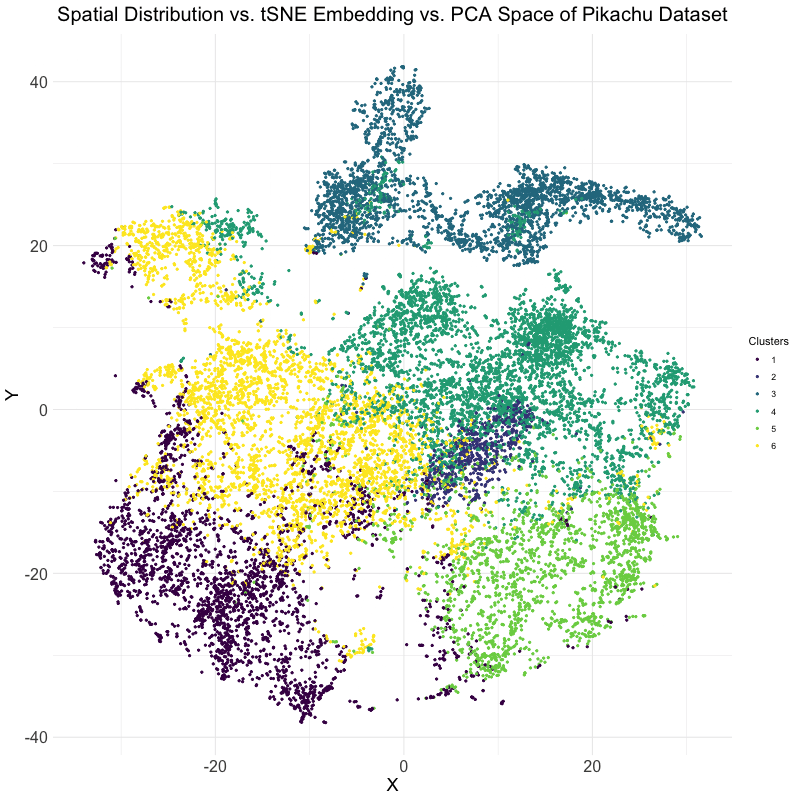
This data visualization utilizes the Pikachu dataset to investigate how cells are related in the gene expression space as compared to their physical space distribution. Even more, the visualization uncovers...
This visualization explores the relationship between gene loadings on the first principal component (PC1) and mean gene expression. The results show that in unscaled data, genes with higher mean expression...
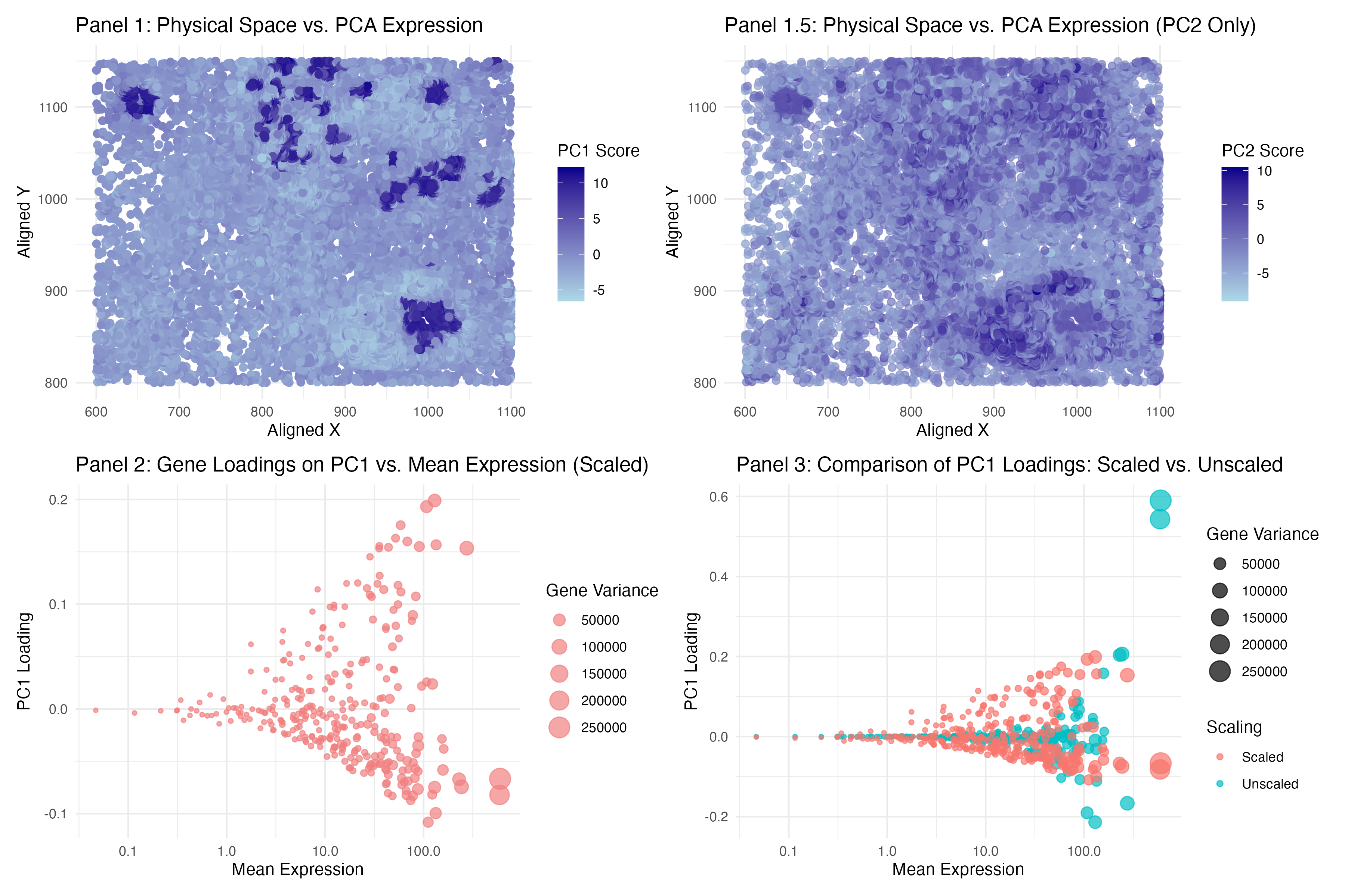
1. What data types are you visualizing? This data visualization is trying to show insights into the spatial transcriptomics dataset using two panels that focus on distinct yet complementary aspects...
Description I have chosen to focus on how cells relate in the gene expression vs. physical space. I analyzed this by creating two visualizations- one which looks at the x...
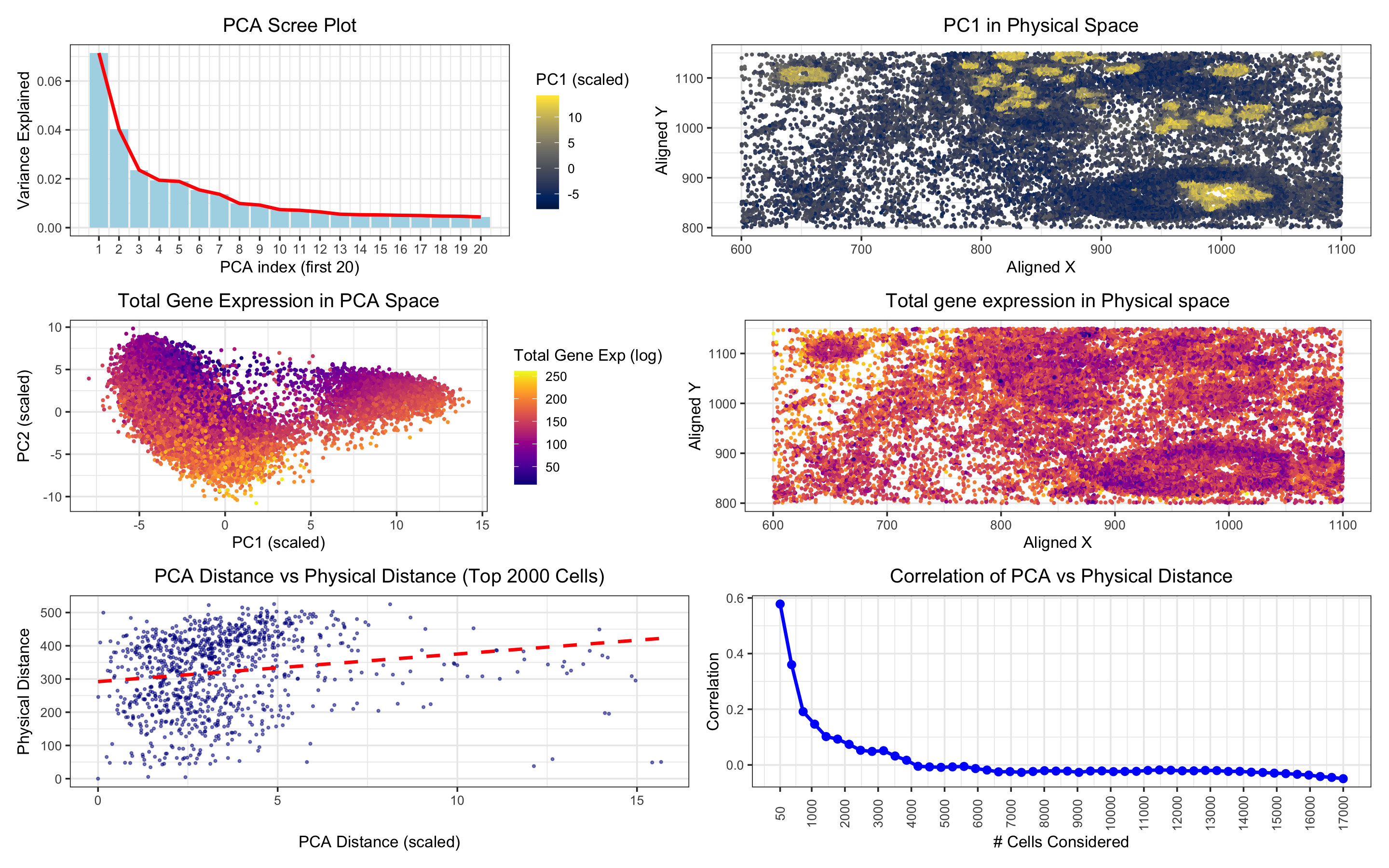
Just for future reference, this is how I will address each graph in my data visualization: Graph 1 the one in the top left, Graph 2 is top right, Graph...
I believe that my data visualization is effective because the 3 panels connect by both visualizing the positional information of the data in gene expression space and quantifying the correlations,...
1. What data types are you visualizing? I am visualizing quantitative data of the X and Y position of the cells. I am also visualizing quantitative data of the gene...
1. What data types are you visualizing? I am visualizing the quantitative data of PC1 loading from each gene, the quantitative data of variance of gene expressions of each gene,...
1. What data types are you visualizing? I am visualizing quantitative data for gene expression statistics. Specifically, I compare gene mean expression and variance (log-transformed) against PC1 loading values from...
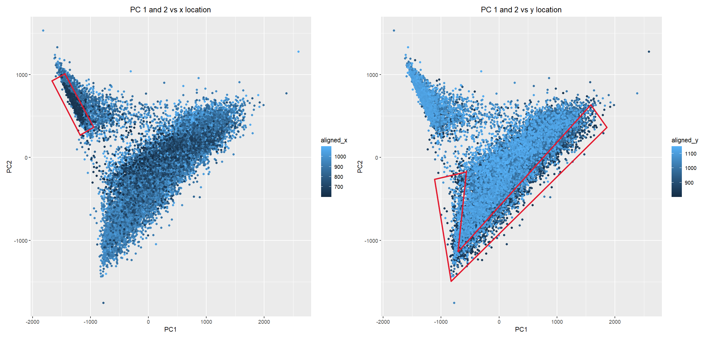
1. What data types are you visualizing? Spatial data of each cell, the x, y coordinates of the cell location. Quantitative: each dot is color coded with the 1st principal...
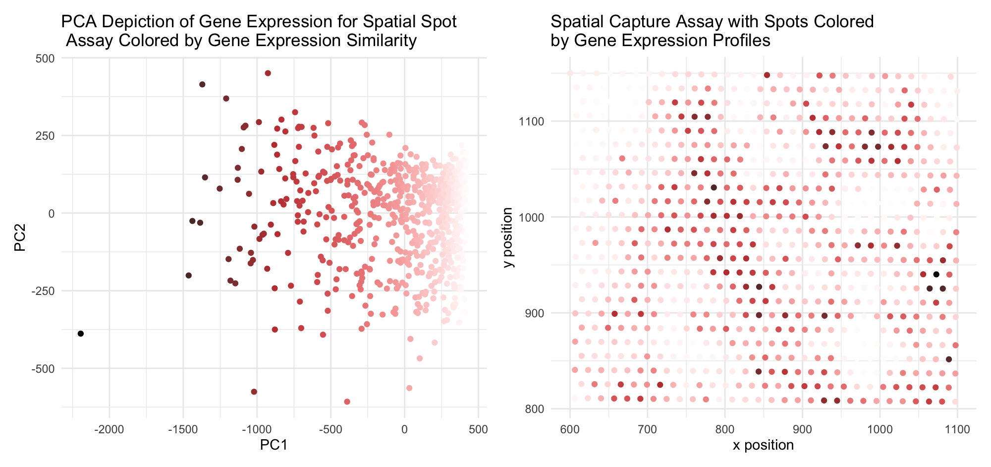
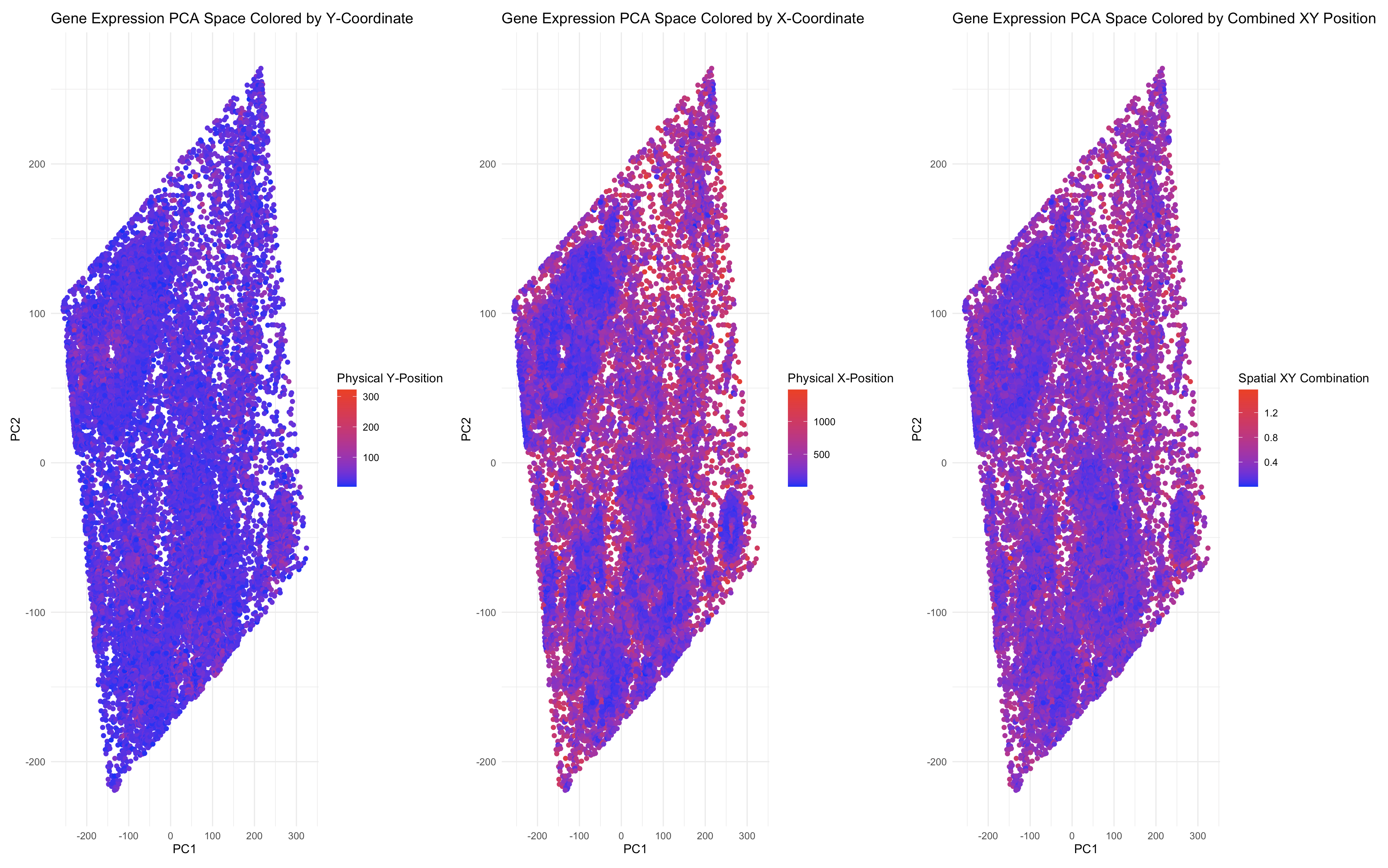
1. Description It uses quantitative data (x and y coordinates of cells and gene expression data) to visualize how cells relates in gene expression space versus physical space. Original data...
1. What data types are you visualizing? I am visualizing quantitative data of the first two PCs of the gene expression of each cell, as well as the quantitative data...
1. What data types are you visualizing?
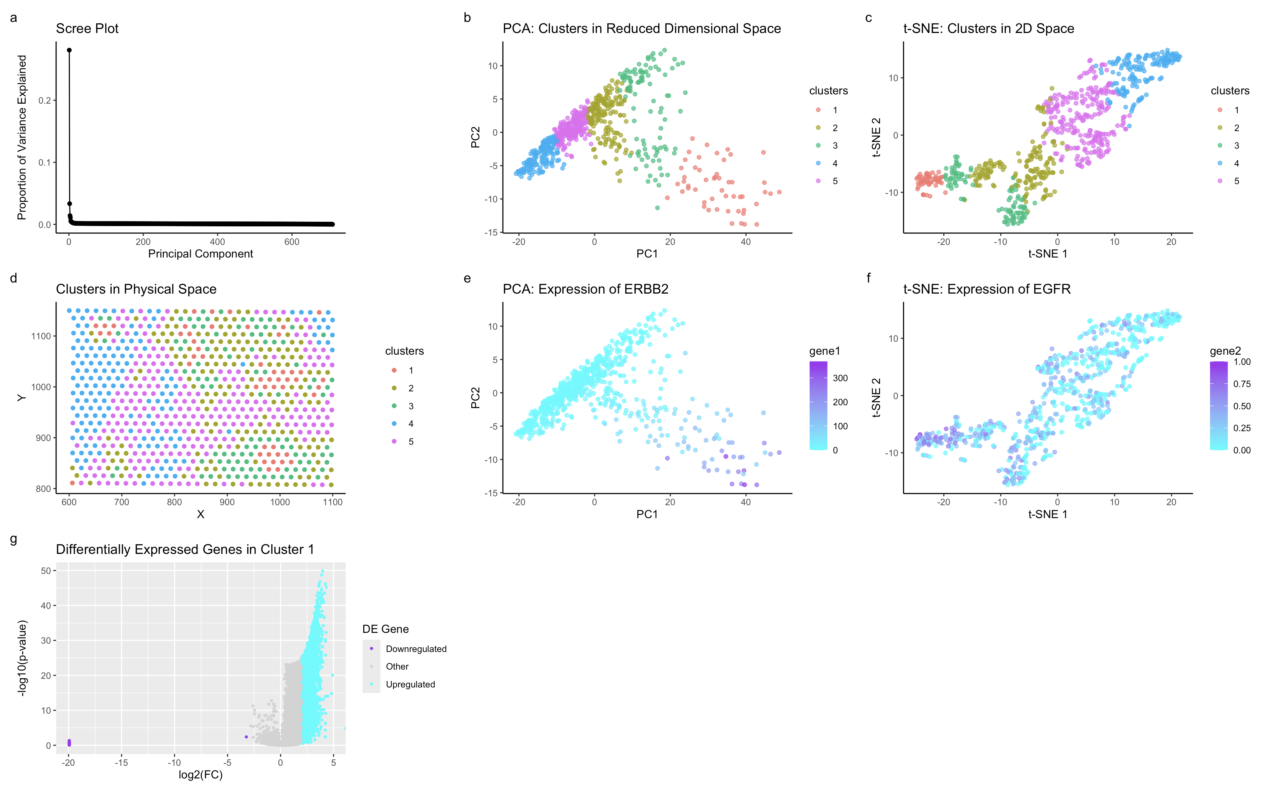
In “PCA Scree Plot,” the data type visualized is quantitative (the variance explained by each principal component, a continuous numerical value).
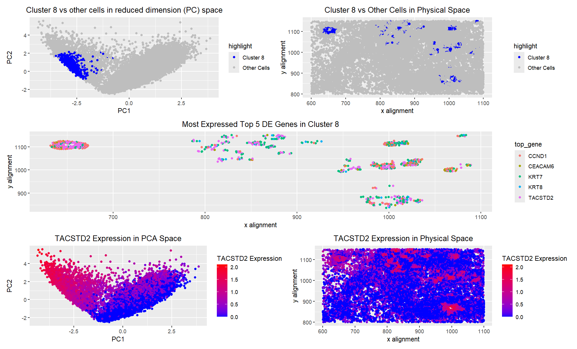
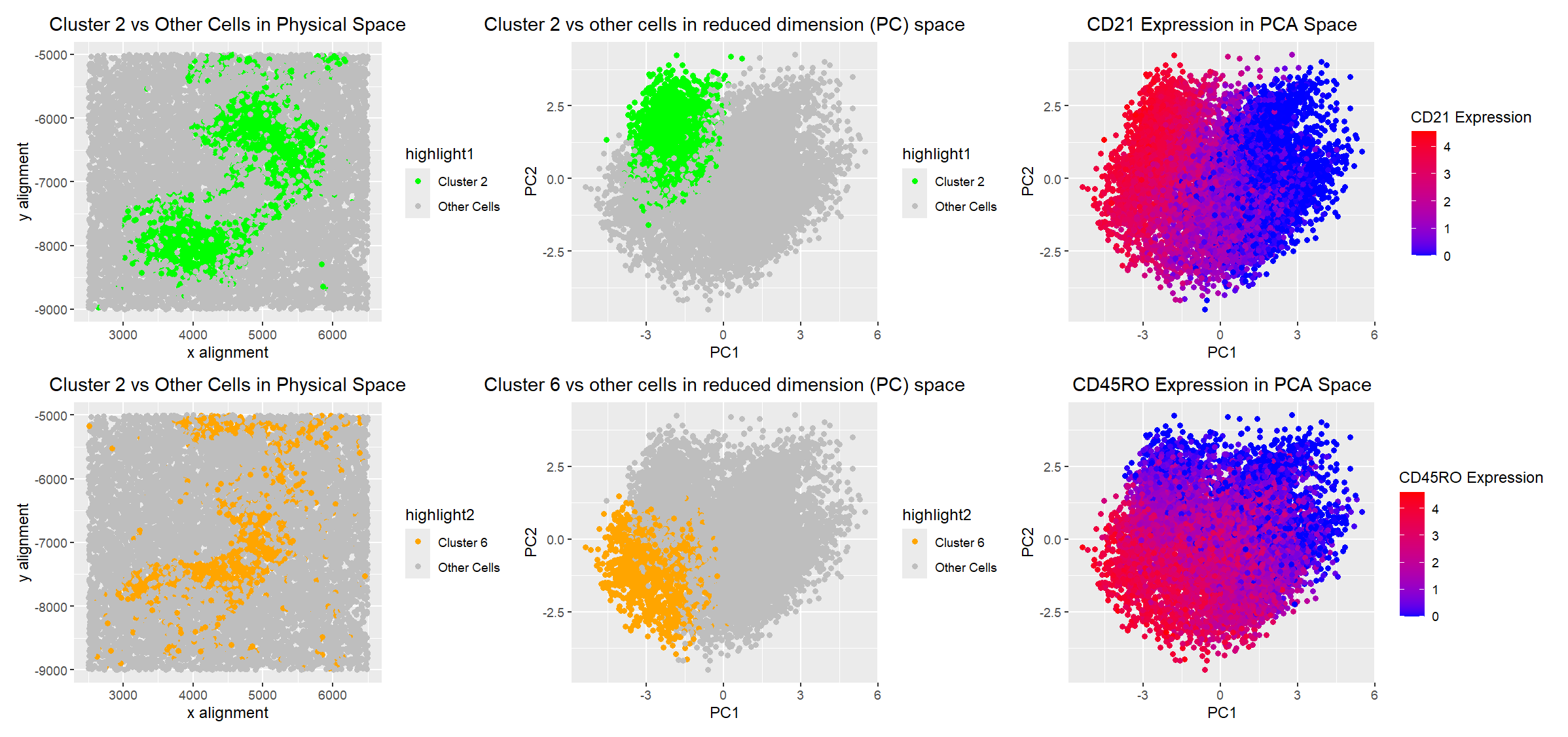
Description I created 5 visualizations of a particular cluster from a KNN clustering process. I chose the cluster which corresponded to a circle of cells in the upper left corner...
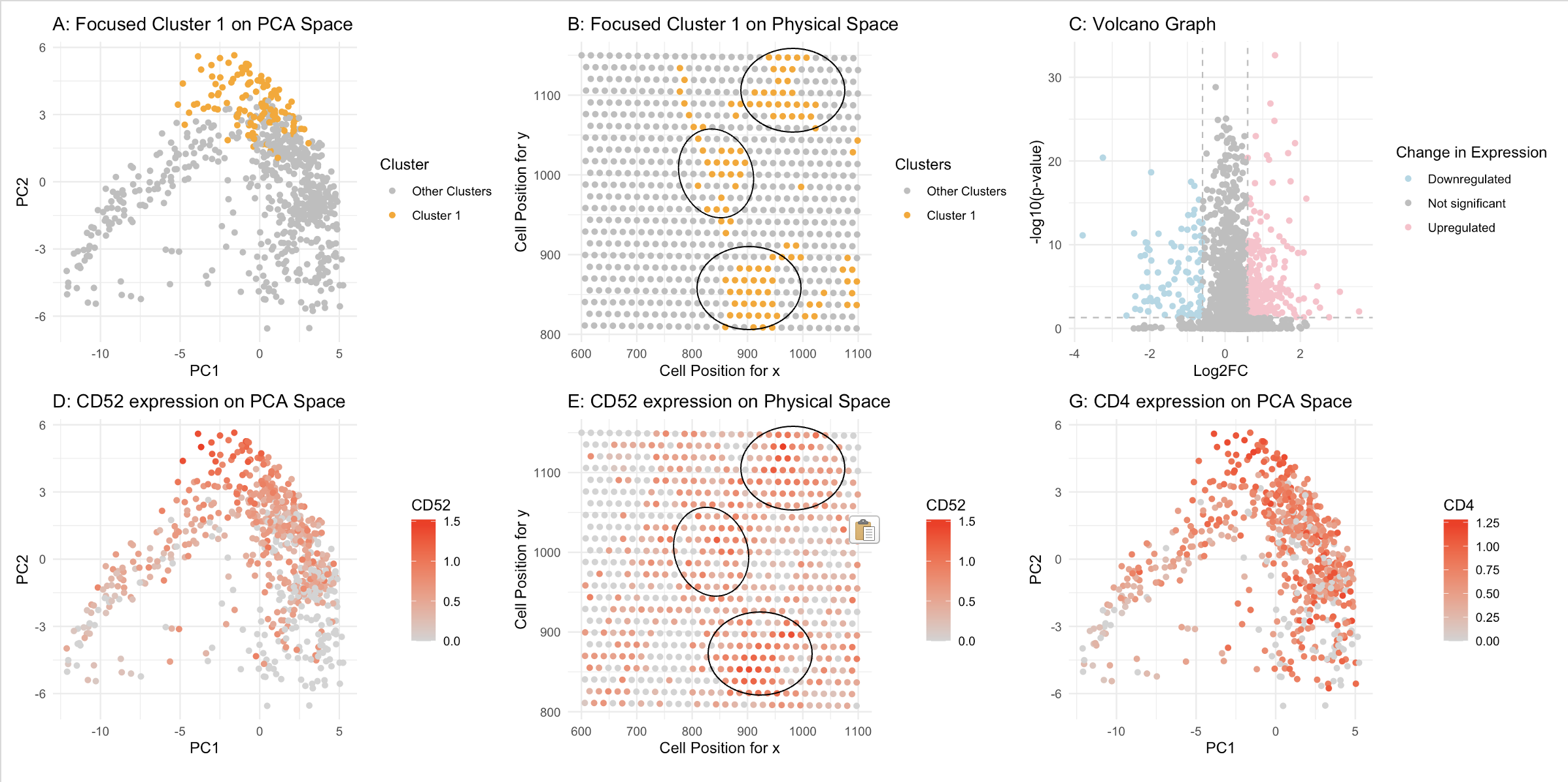
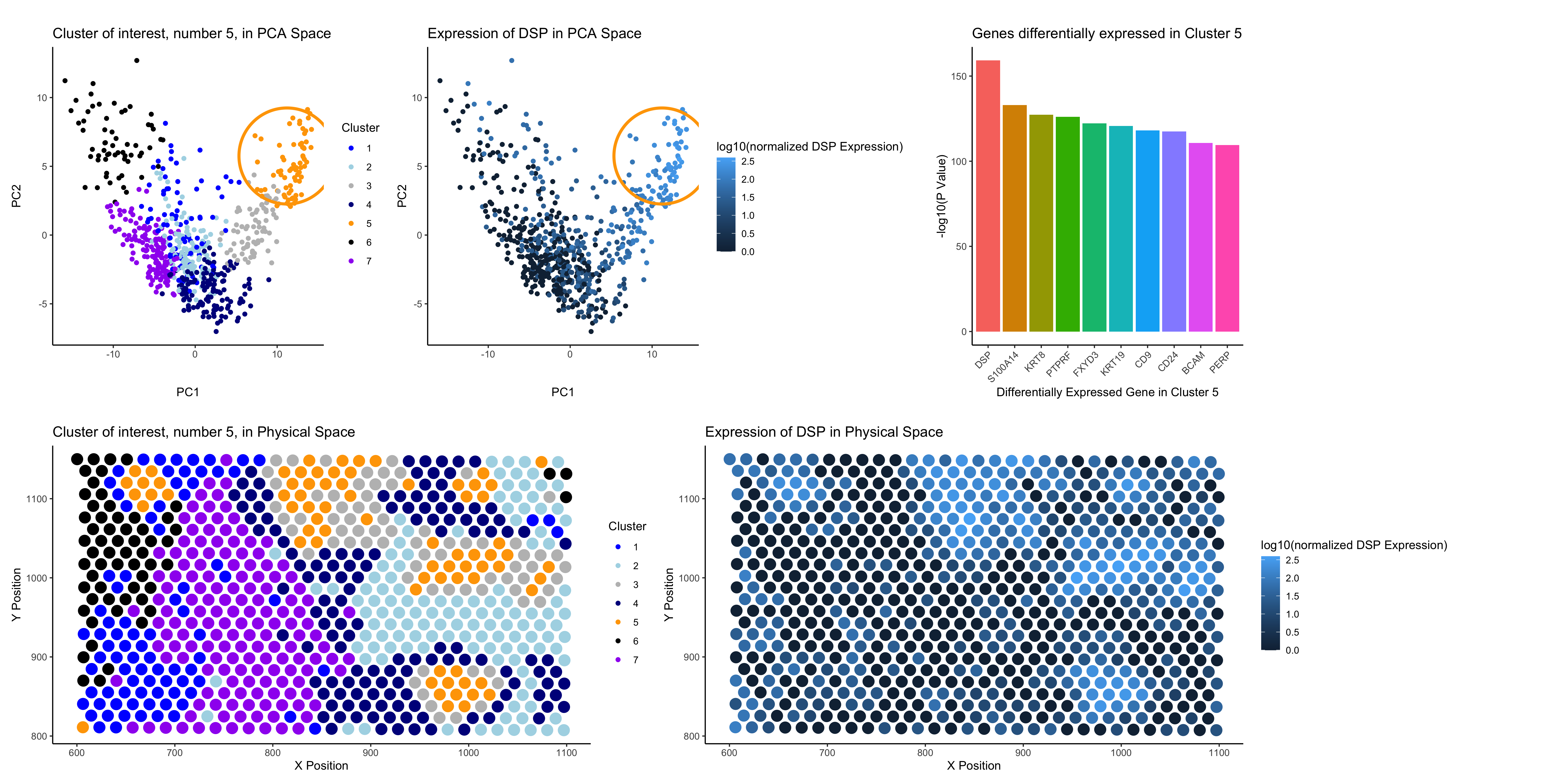
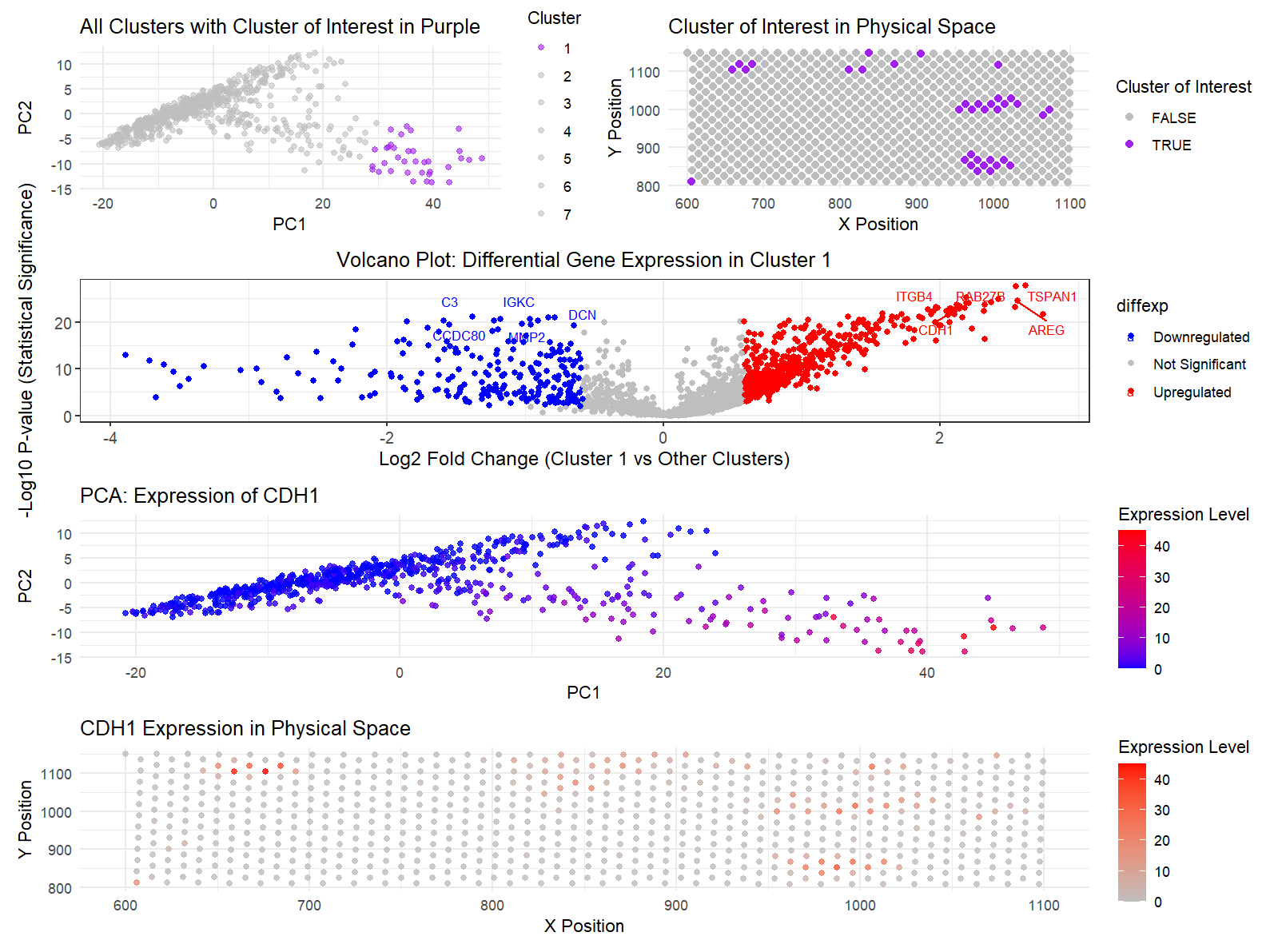
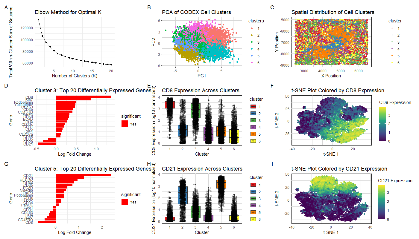
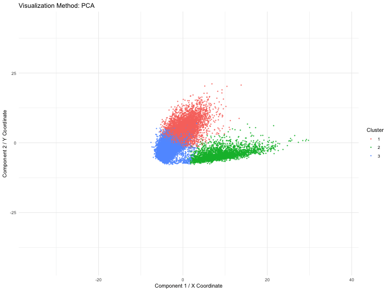
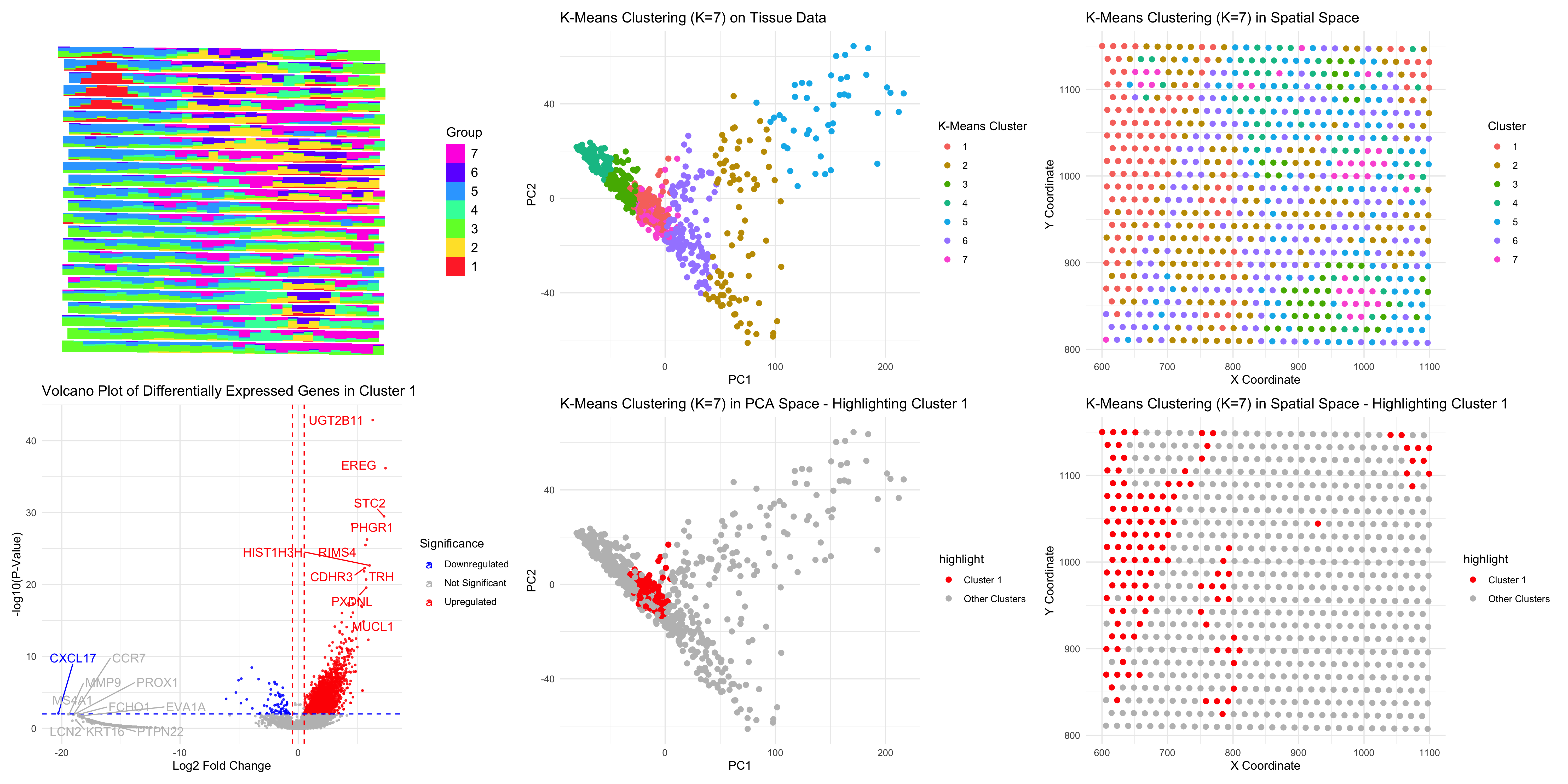
1. Figure Description. Figure A: Cluster 1 is highlighted in orange in PCA space, while the remaining six clusters are shown in grey. The axes represent PC1 and PC2. Figure...
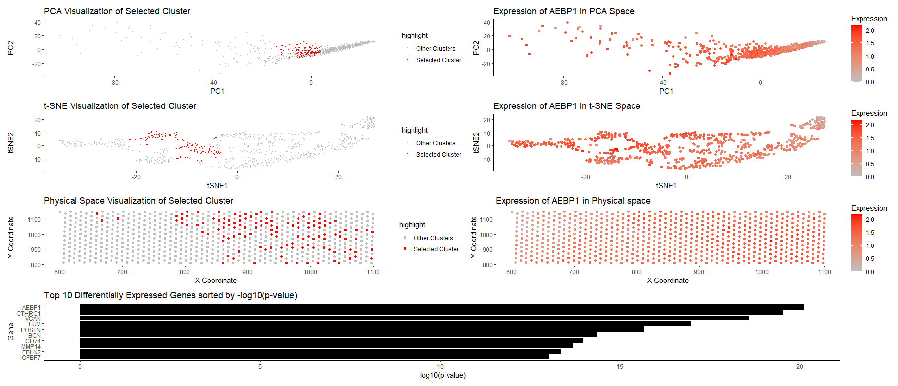
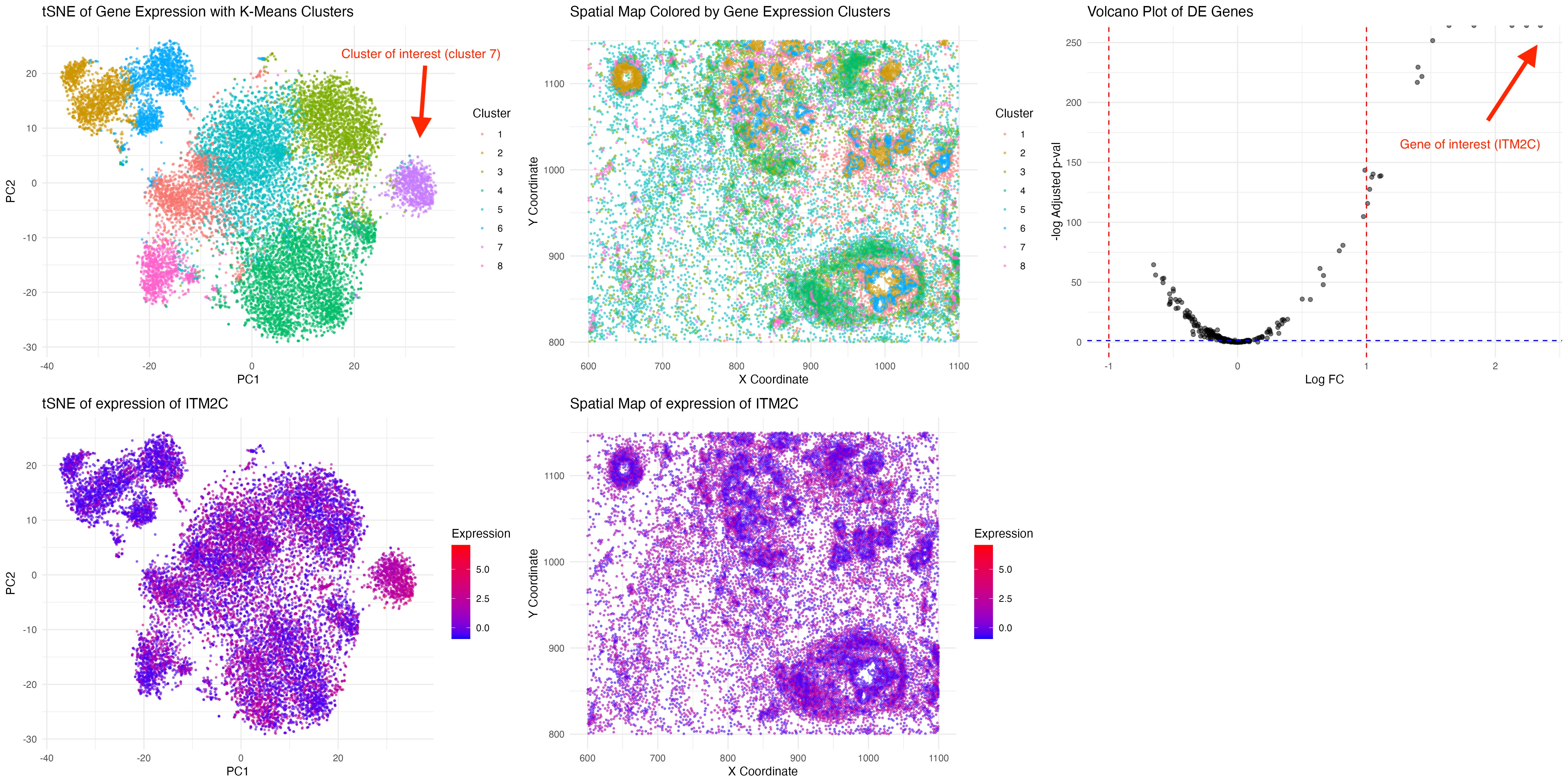
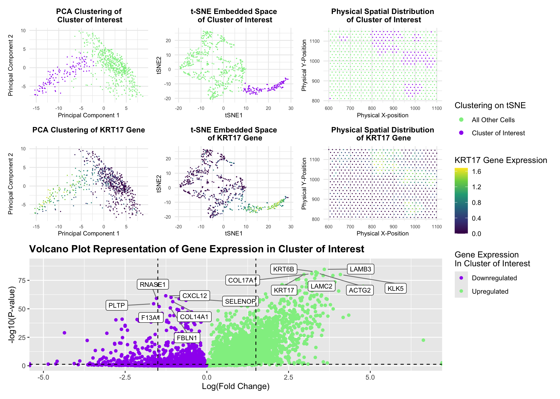
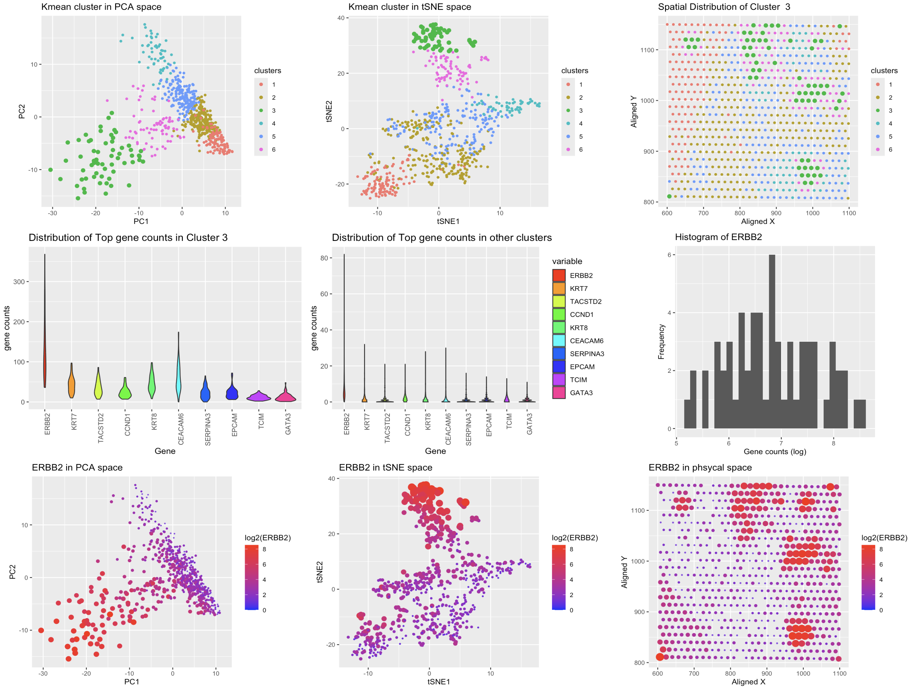
1. Description of the Figure The figure presents a multi-panel visualization of a transcriptionally distinct cell cluster by using dimensionality reduction techniques and differential gene expression analysis. K-means clustering is...
To begin, I normalized by gene expression values by the total counts and subsequently performed PCA. I used a scree plot to verify that PCs 1 and 2 encapsulated much...
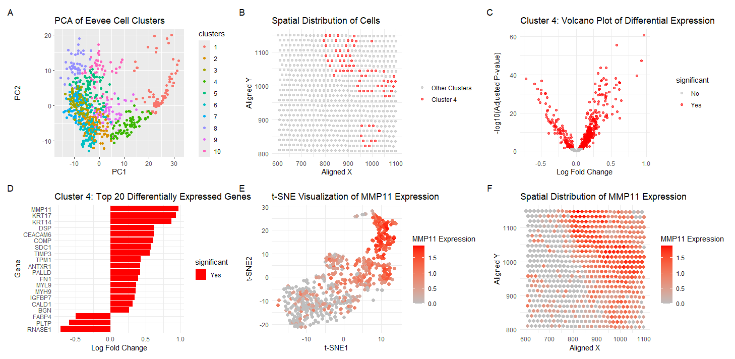
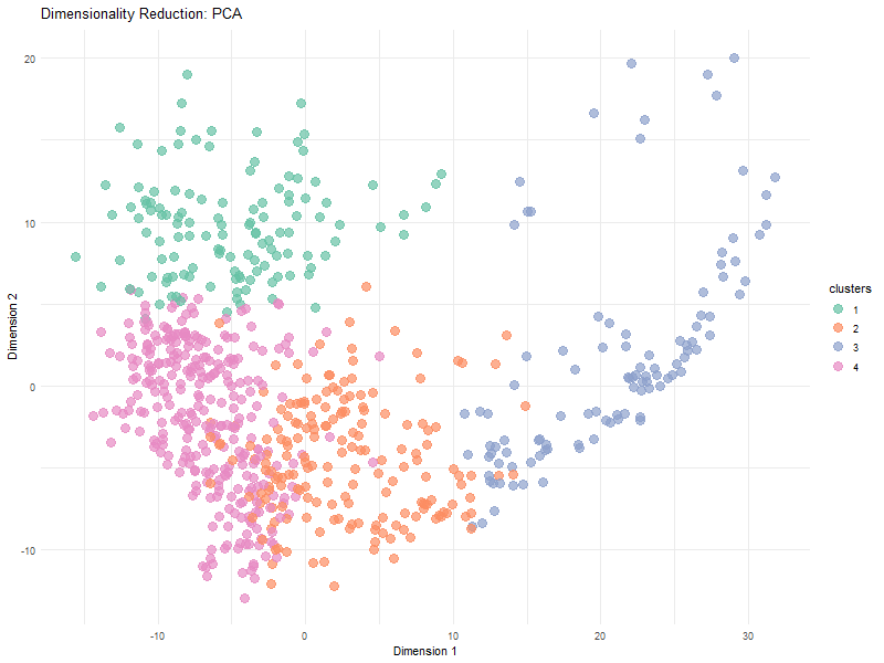
Visualization Summary In this visualization, I am analyzing the Eevee sequencing spatial transcriptomics dataset. The 1000 most highly expressed genes were normalized, log-transformed, and clustered (K = 10). To understand...
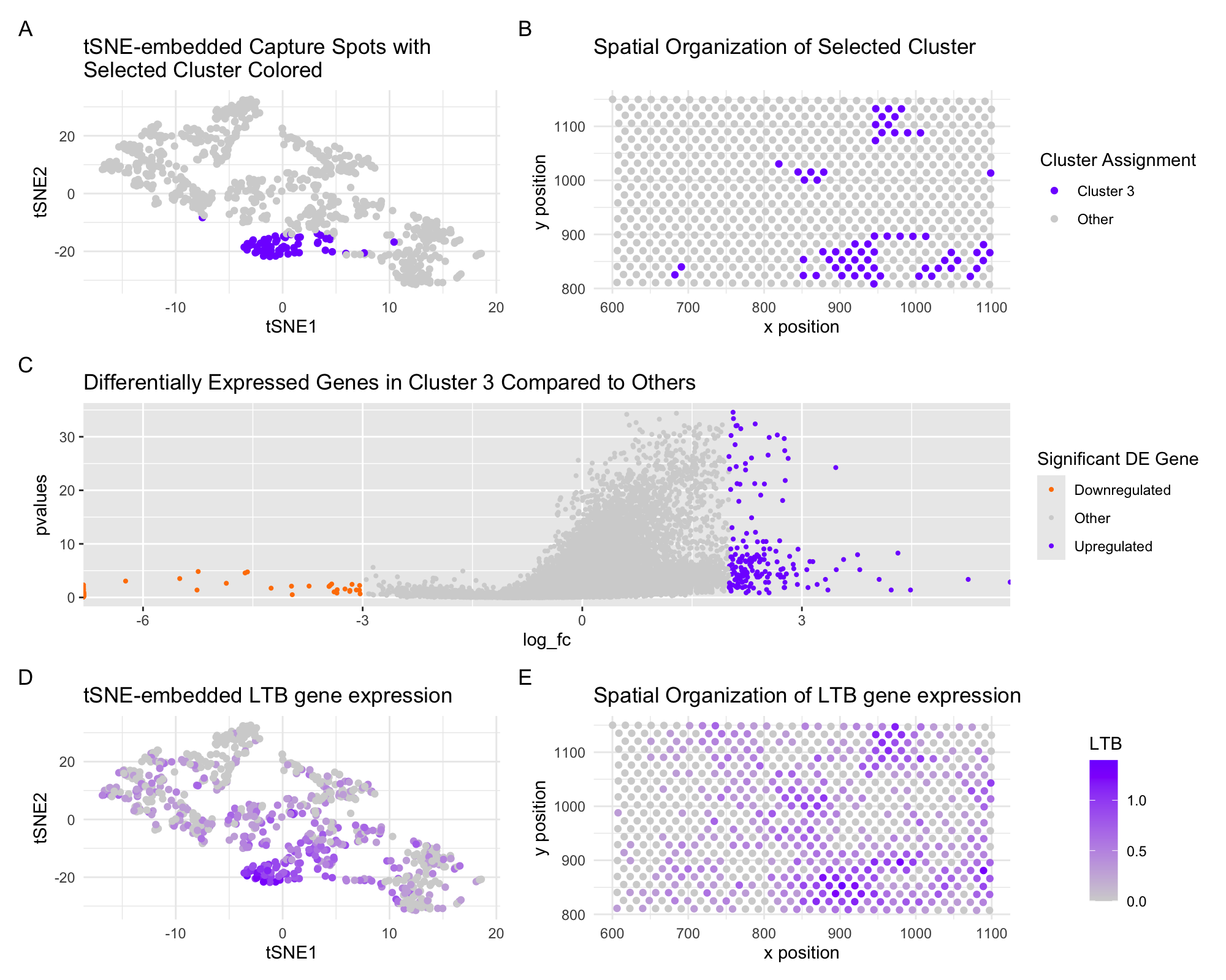
In these panels, I am depicting the representation of a 10x visium dataset in latent tSNE-embedded space and over the original spatial slide coordinates. I select a cluster based on...
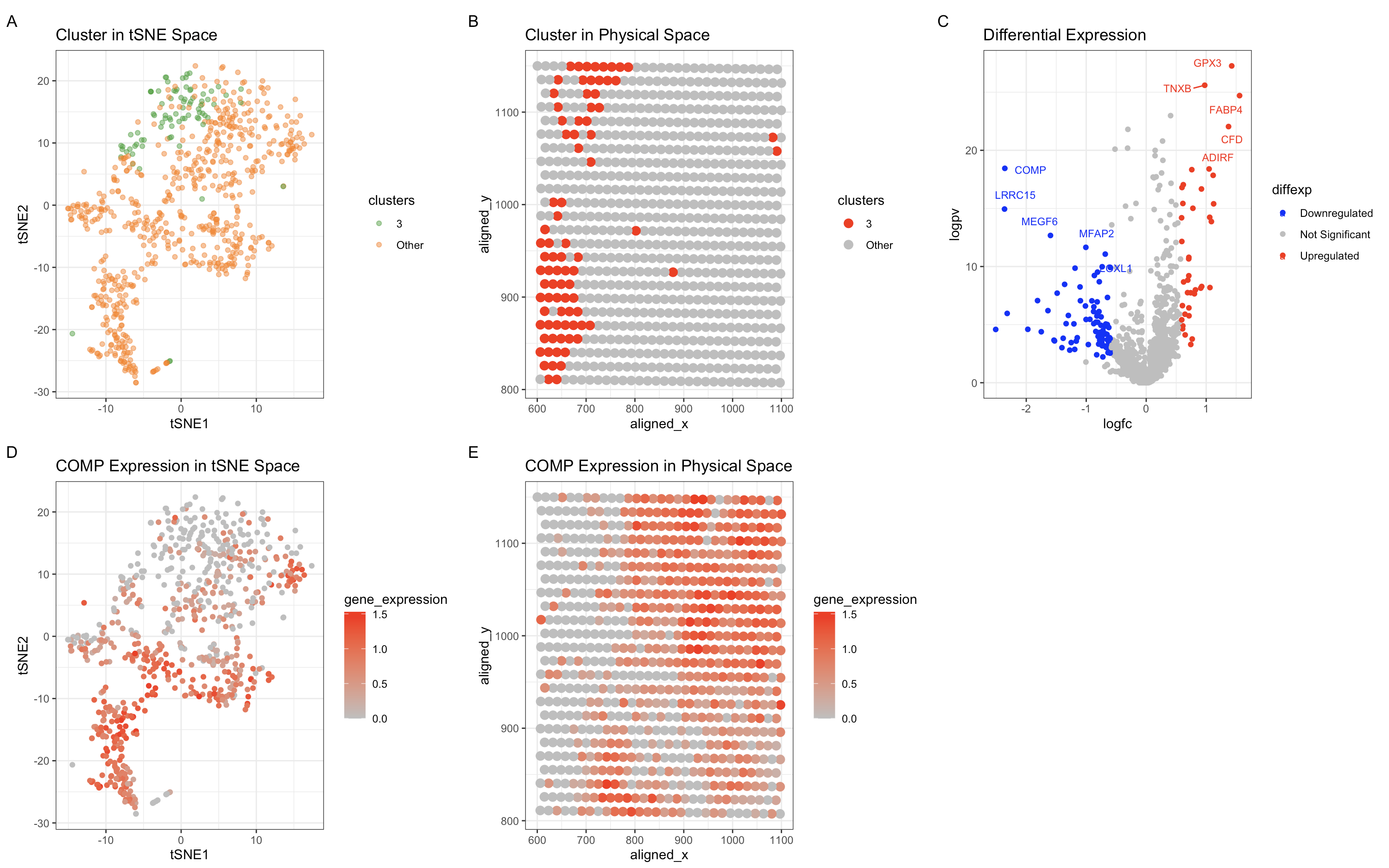
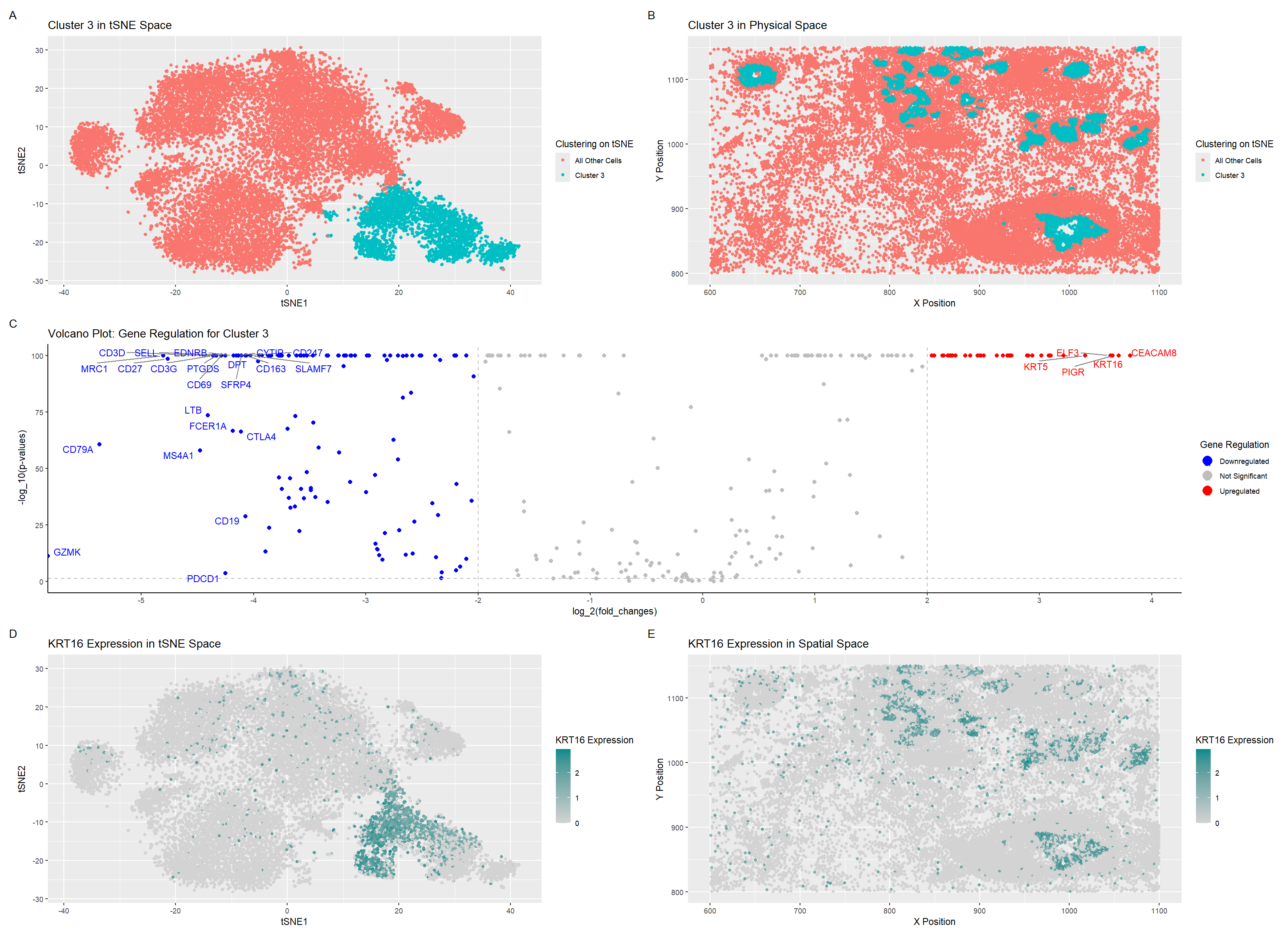
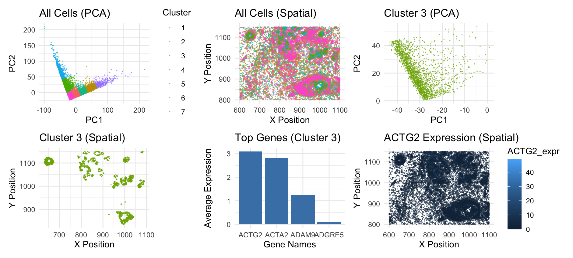
In the first figure, I have visualized cluster 3 in the PCA space by plotting the first and second principal components (quantitative data). I have used points to do so,...
Describe your figure briefly so we know what you are depicting (you no longer need to use precise data visualization terms as you have been doing). There are five plots...
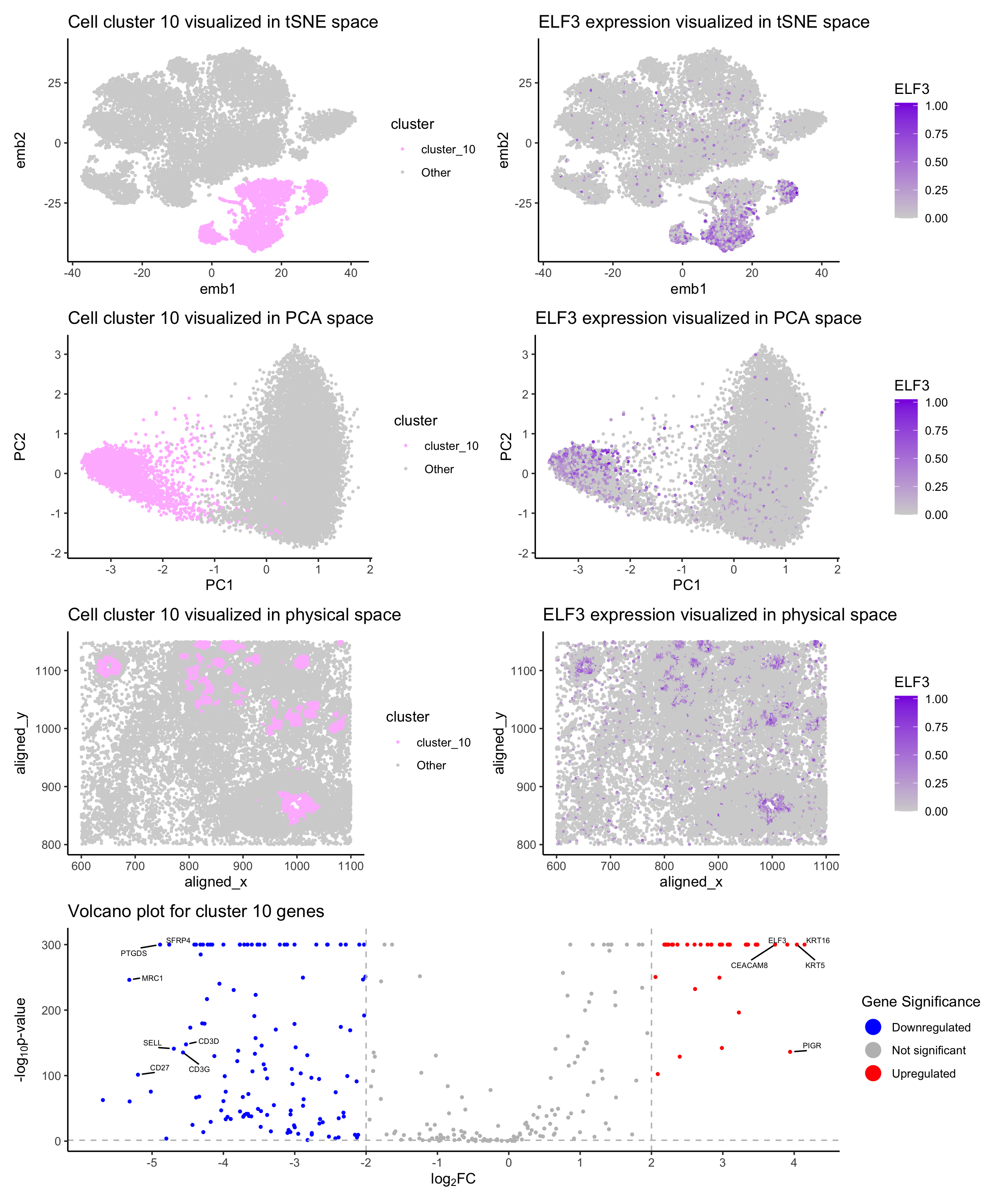
The figure presents a comprehensive analysis of a specific cell cluster, showcasing its position in a 2D space, spatial distribution, and gene expression profile. It also highlights the top differentially...
This figure presents an analysis of cellular clusters within the dataset, focusing on the identification and characterization of a biologically relevant cluster using k-means clustering, dimensionality reduction techniques (PCA and...
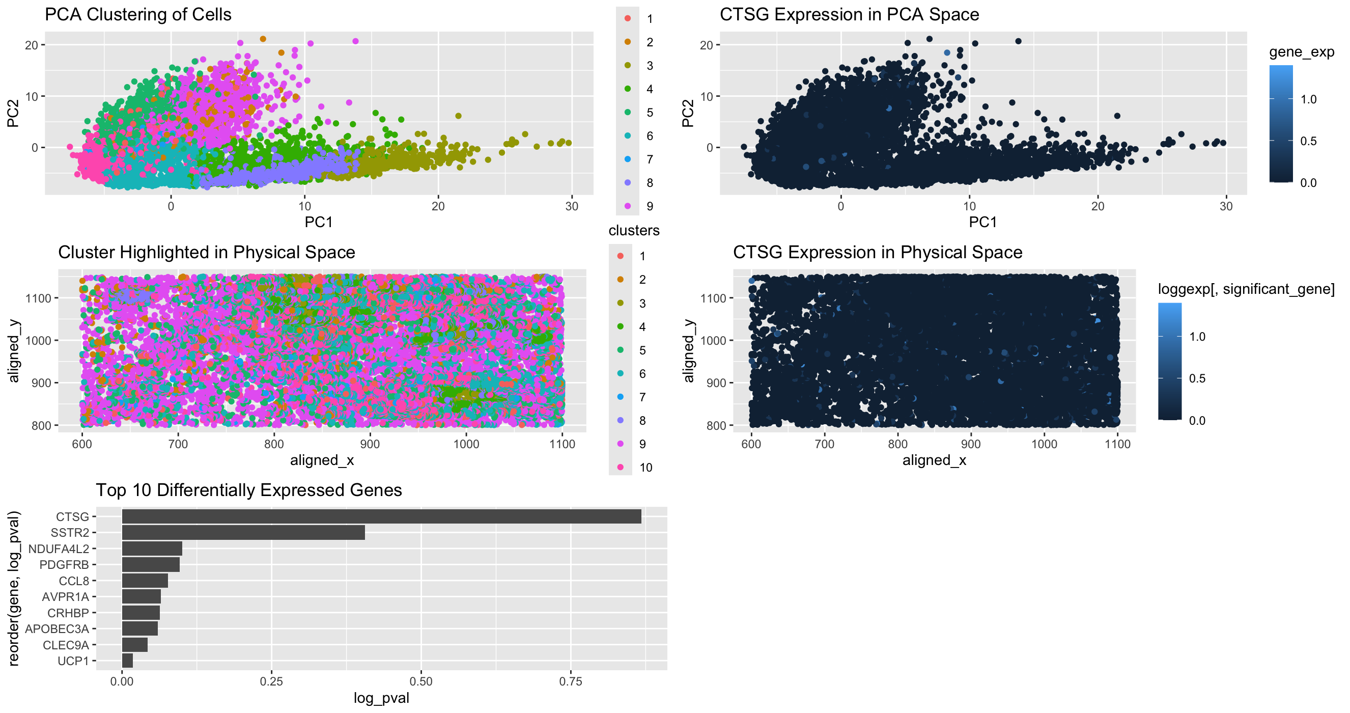
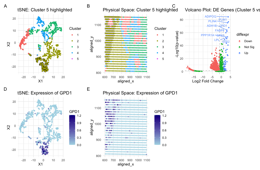
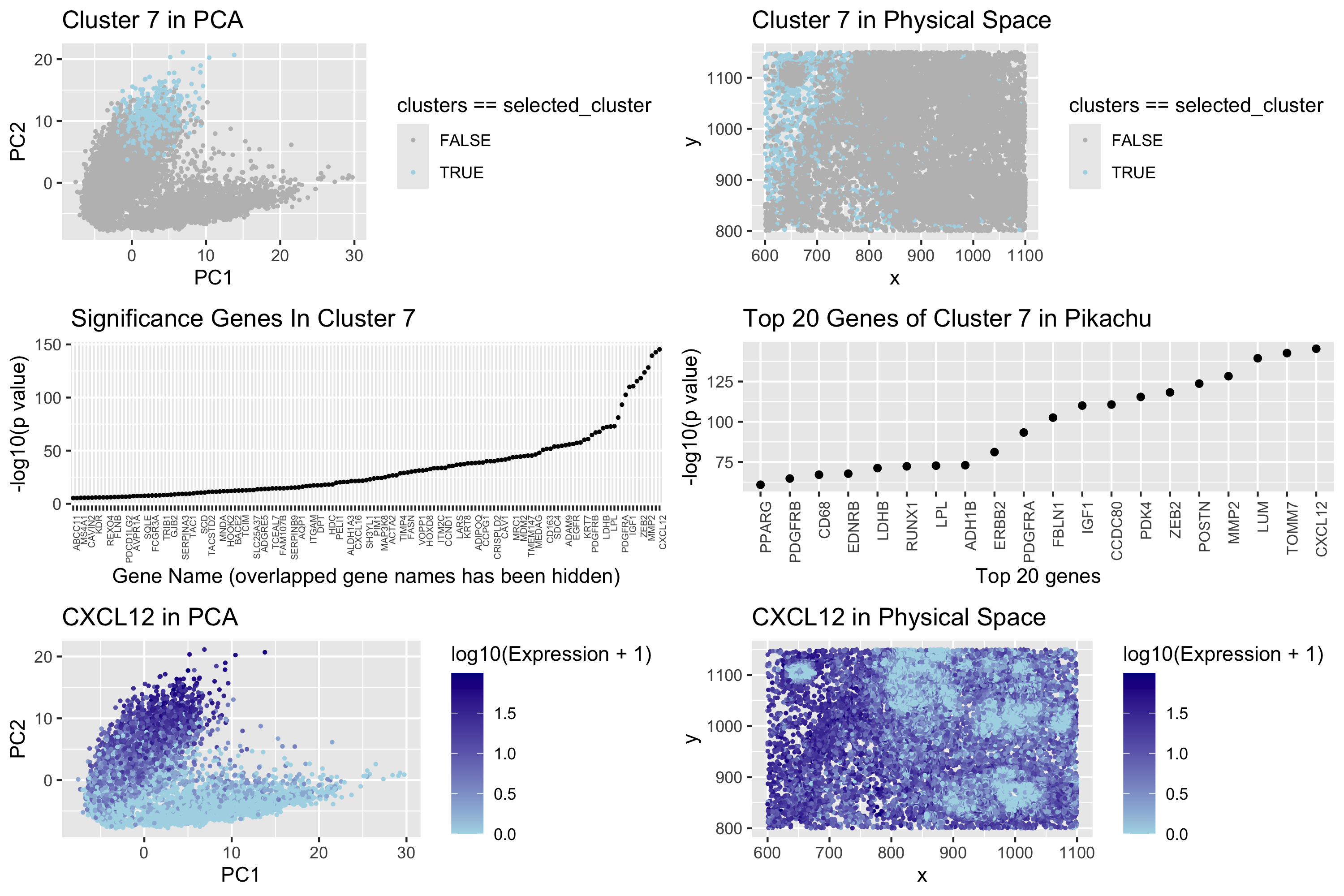
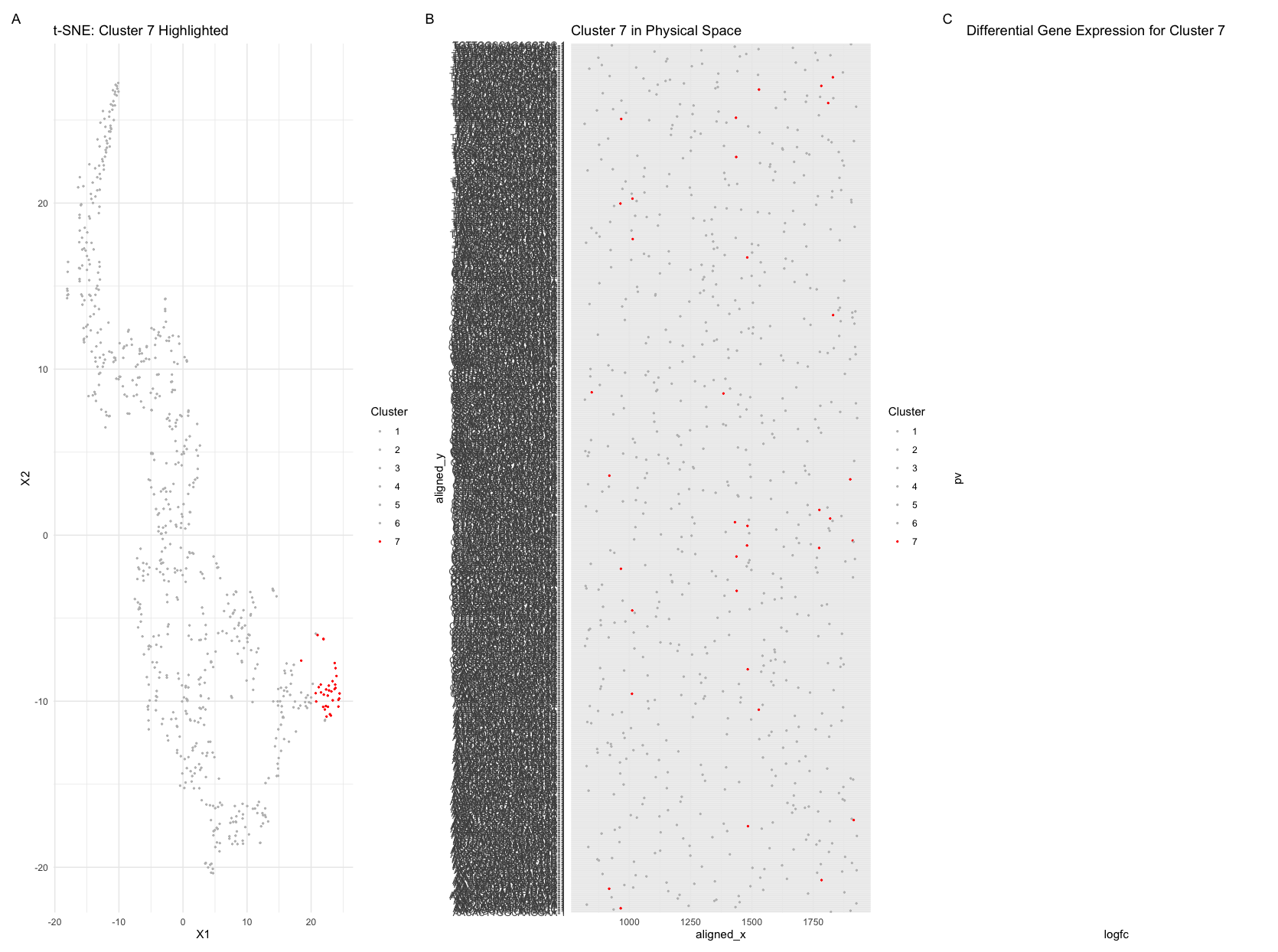
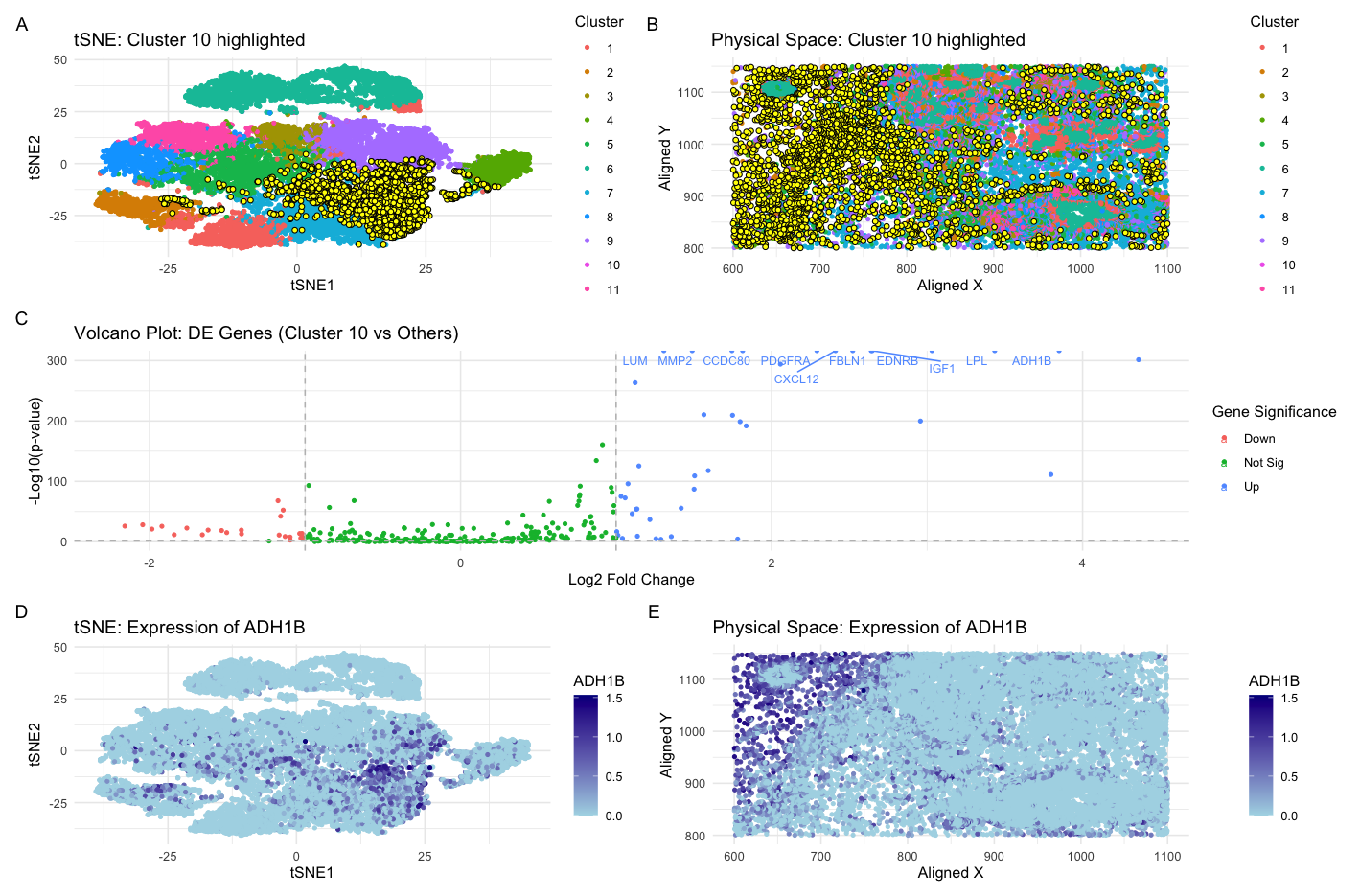
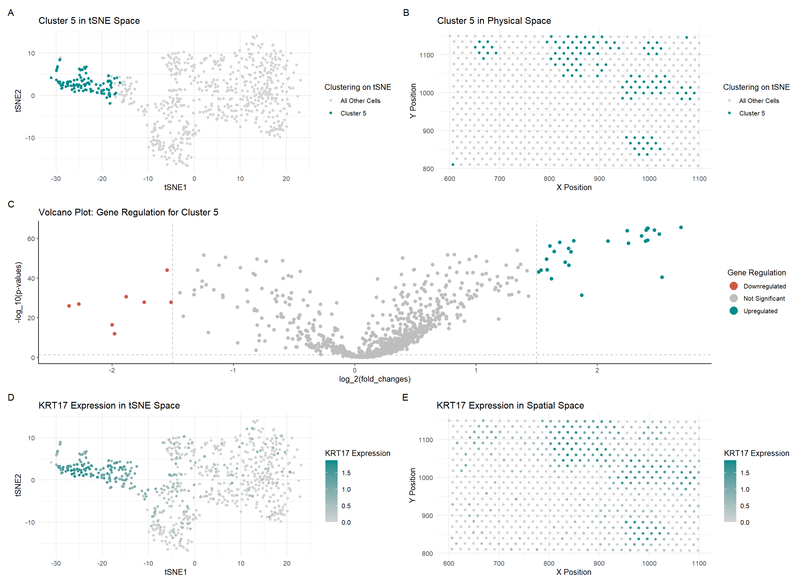
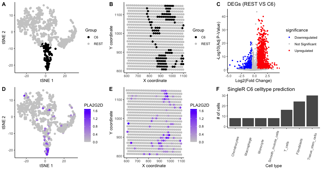
Based on my clustering analysis and differential expression testing, I identified GPD1 (Glycerol-3-Phosphate Dehydrogenase 1) as the most upregulated gene in Cluster 5, distinguishing it from all other clusters. The...
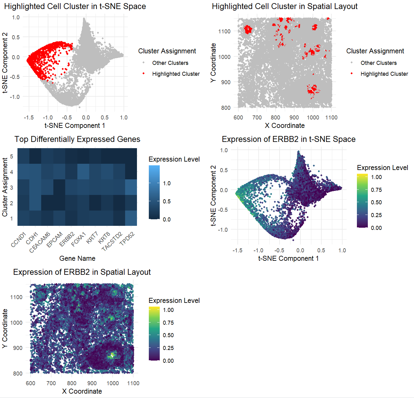
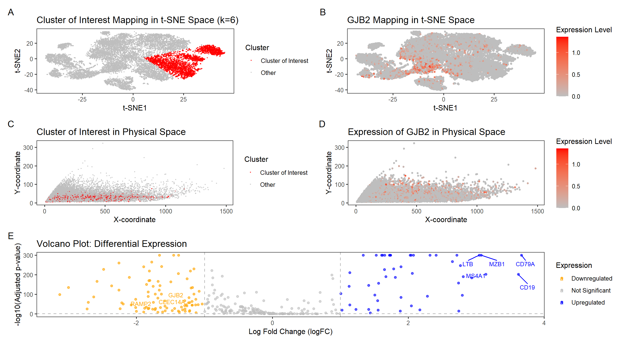
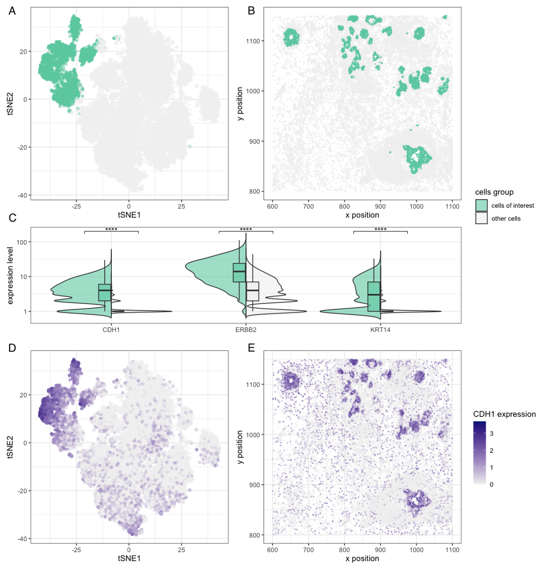
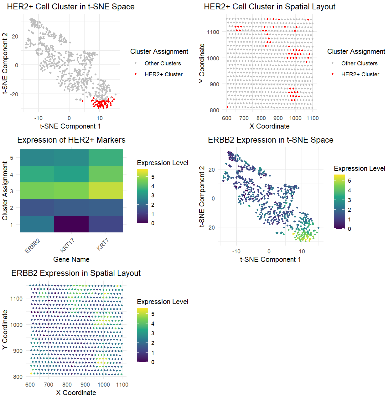
This visualization examines the expression of GJB2 (Gap Junction Protein Beta 2), a gene associated with intercellular communication and epithelial differentiation, within a breast tissue sample. GJB2 encodes connexin 26,...
Describe your figure briefly so we know what you are depicting (you no longer need to use precise data visualization terms as you have been doing). Write a description to...
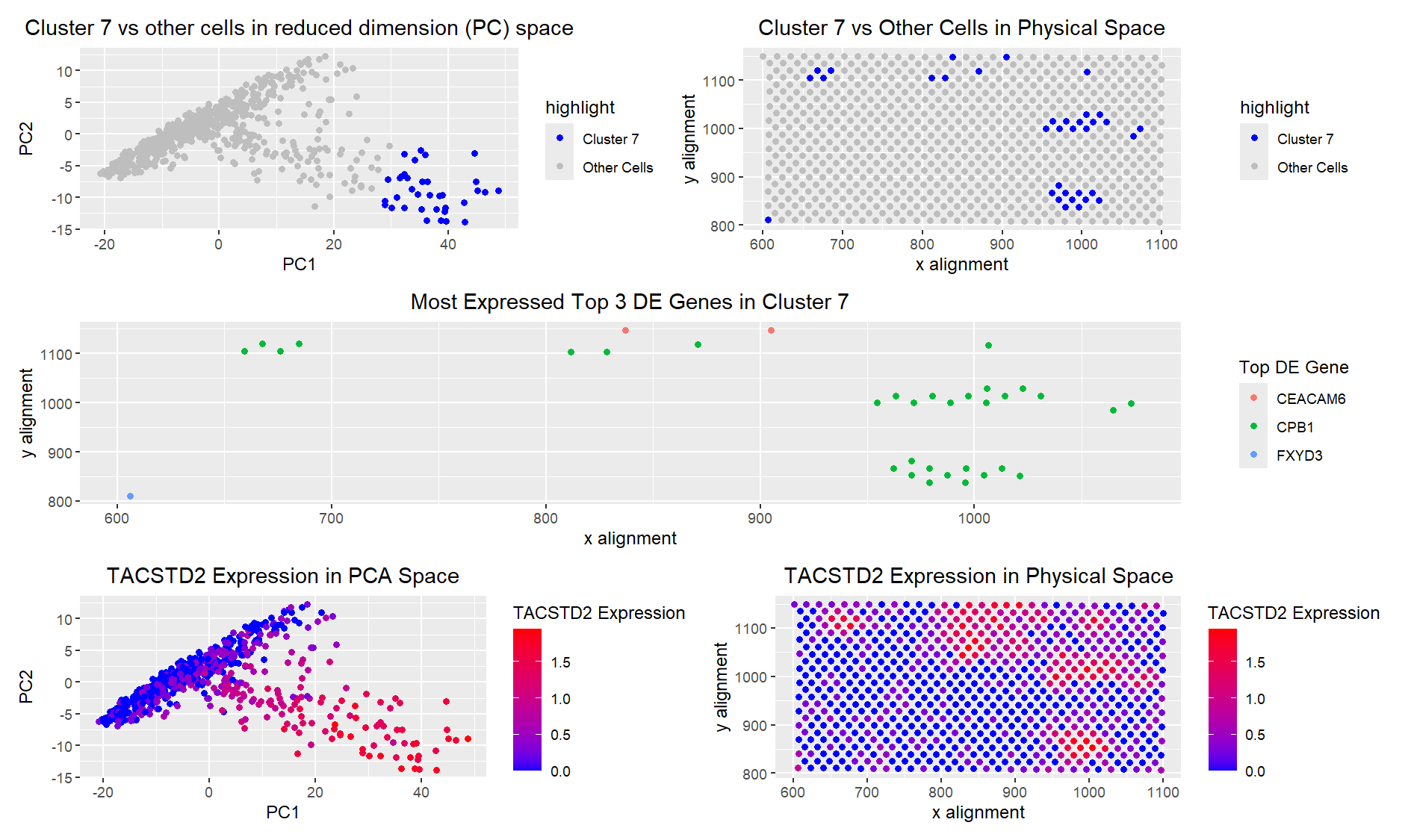
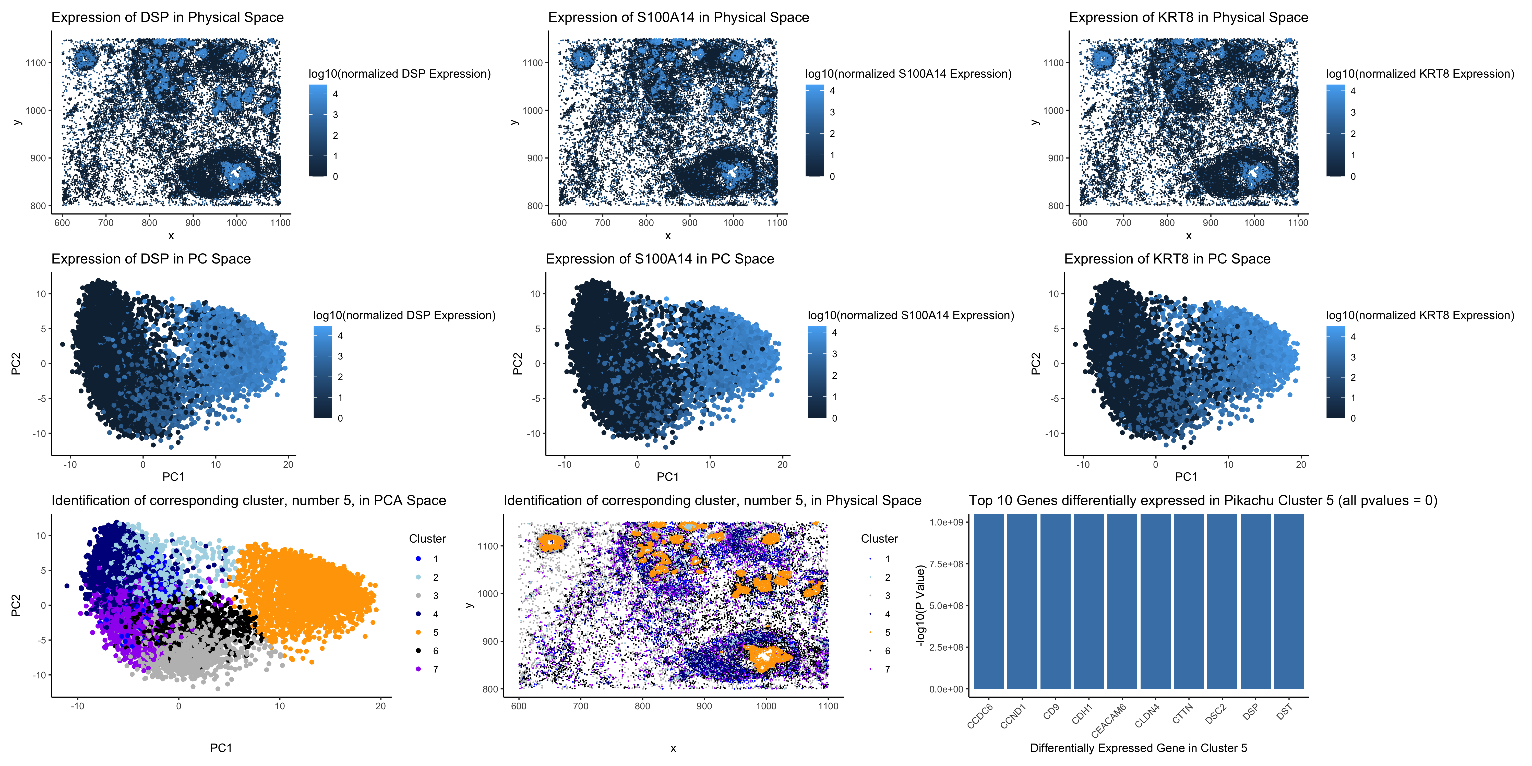
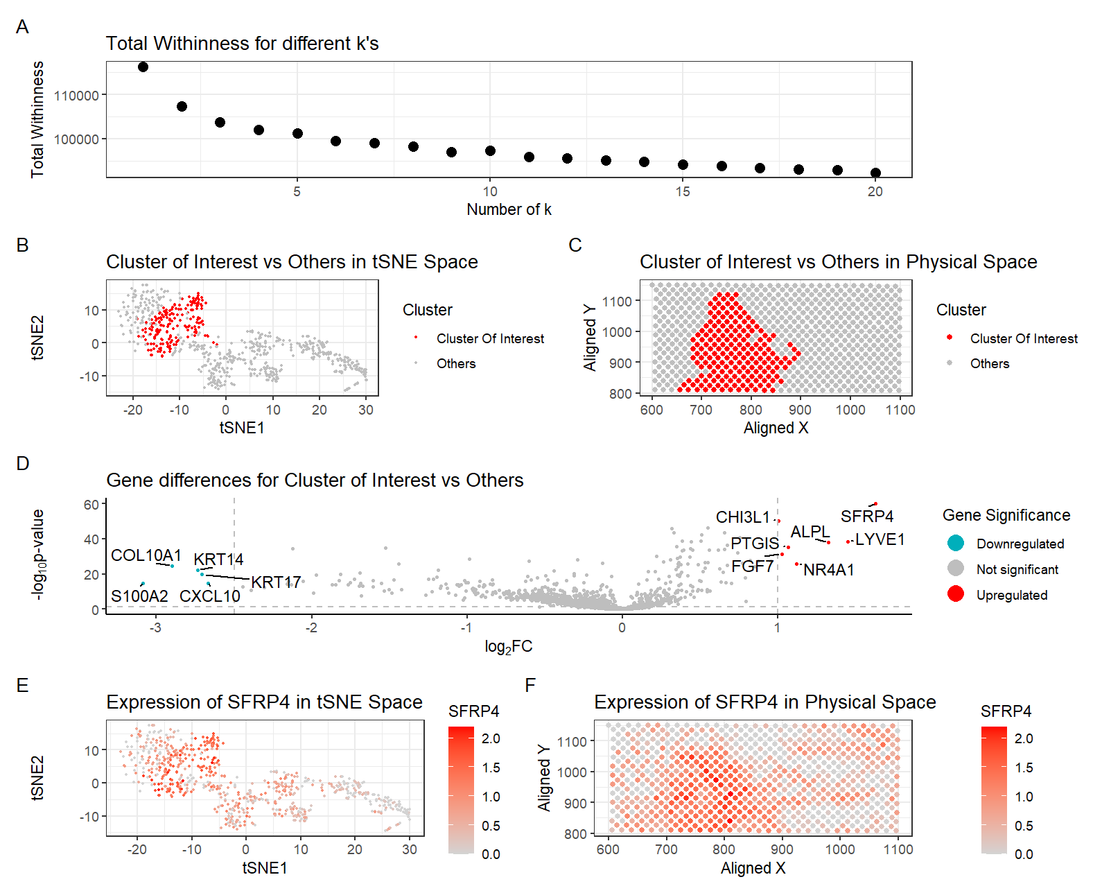
In the top left of my figure, I am depicting both my clusters made by kmeans clustering with k=7 in PCA space (with my cluster of interest circled, cluster 5)...
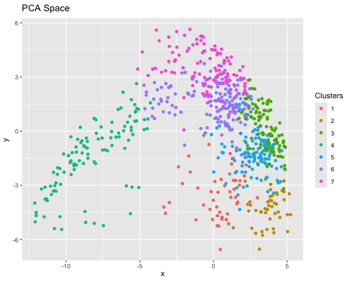
This panel outlines the PCA and spatial analysis for the Pikachu dataset. The first two graphs are from my previous homework, and they give the big picture. Graph 1 shows...
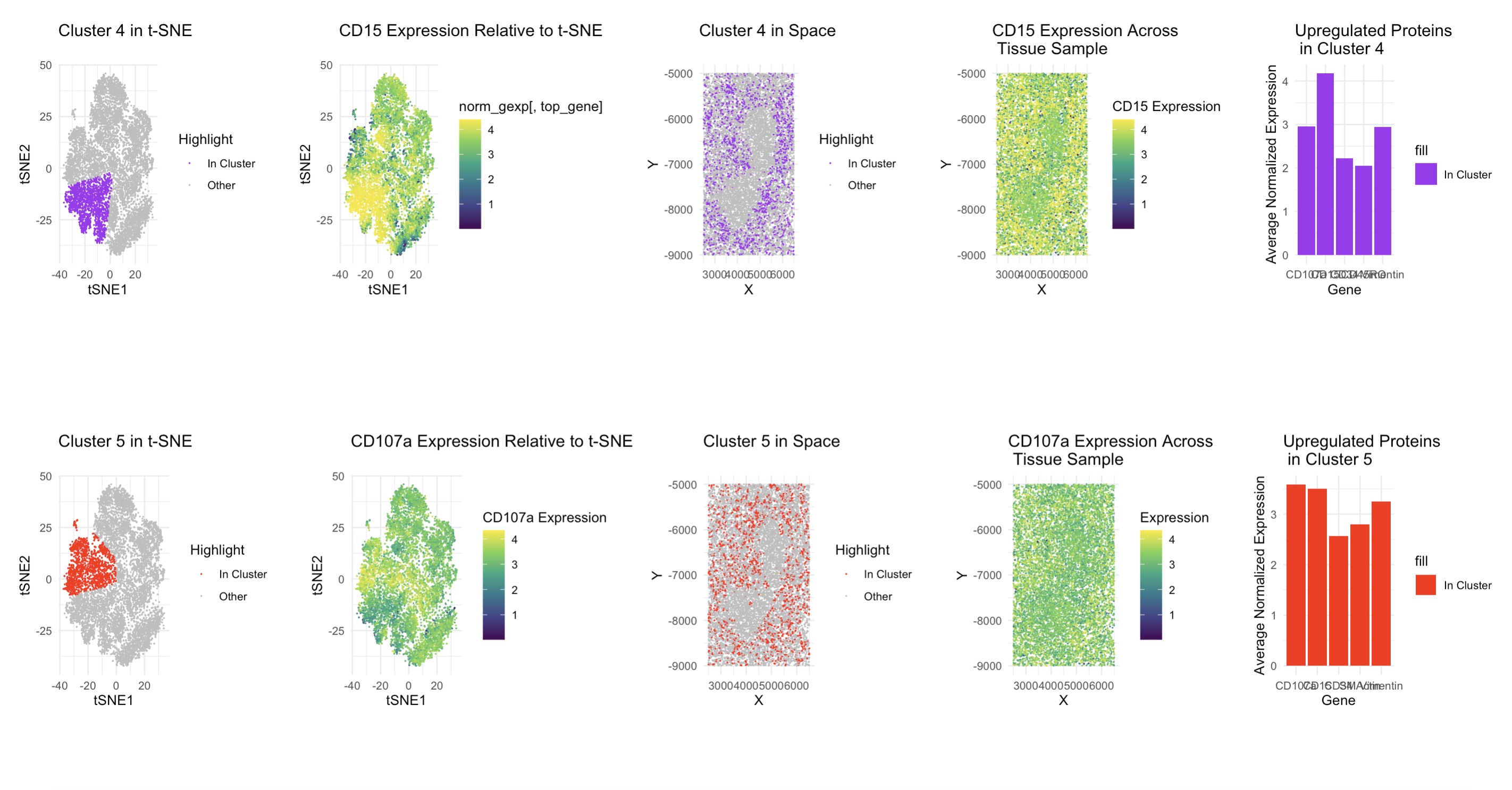
[description] Figures A, B, and C share a common legend and analyze the dataset at the cluster level, where green highlights the cluster of interest and gray represents all other...
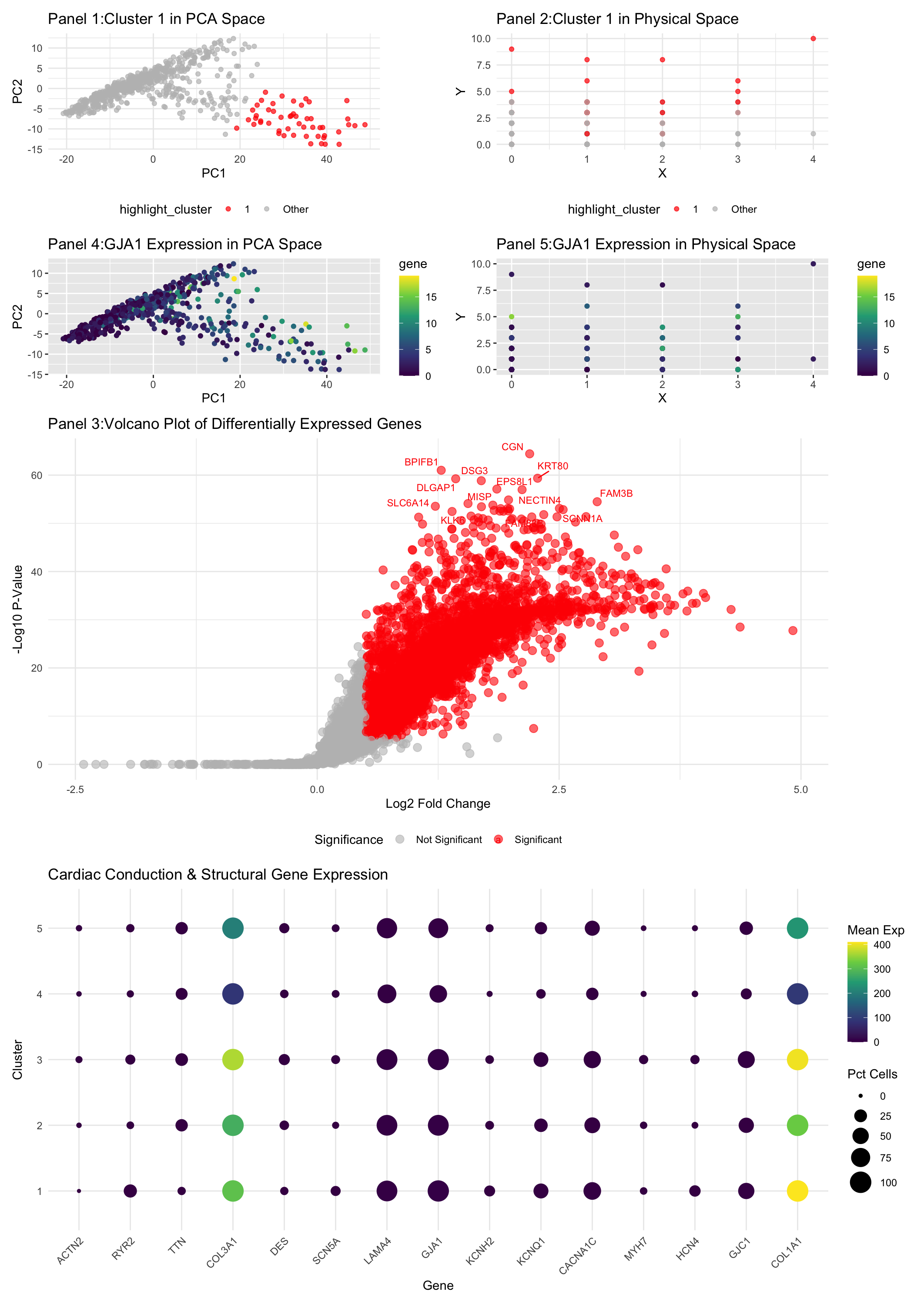
Description of analysis This differential gene expression analysis explores a transcriptionally distinct cluster of cells related to the cardiac conduction system, with a focus on the GJA1 gene, which encodes...
<!– Create a multi-panel data visualization that includes at minimum the following components: A panel visualizing your one cluster of interest in reduced dimensional space (PCA, tSNE, etc) A panel...
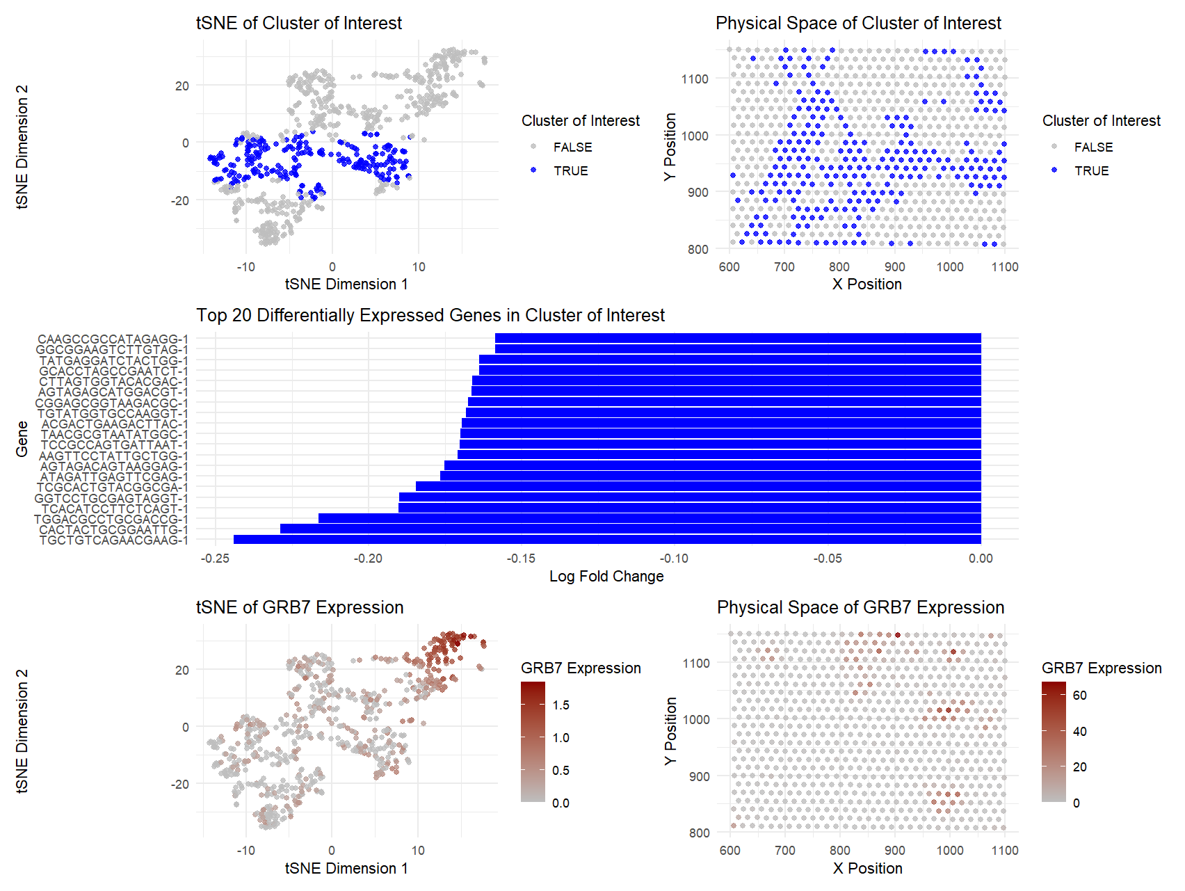
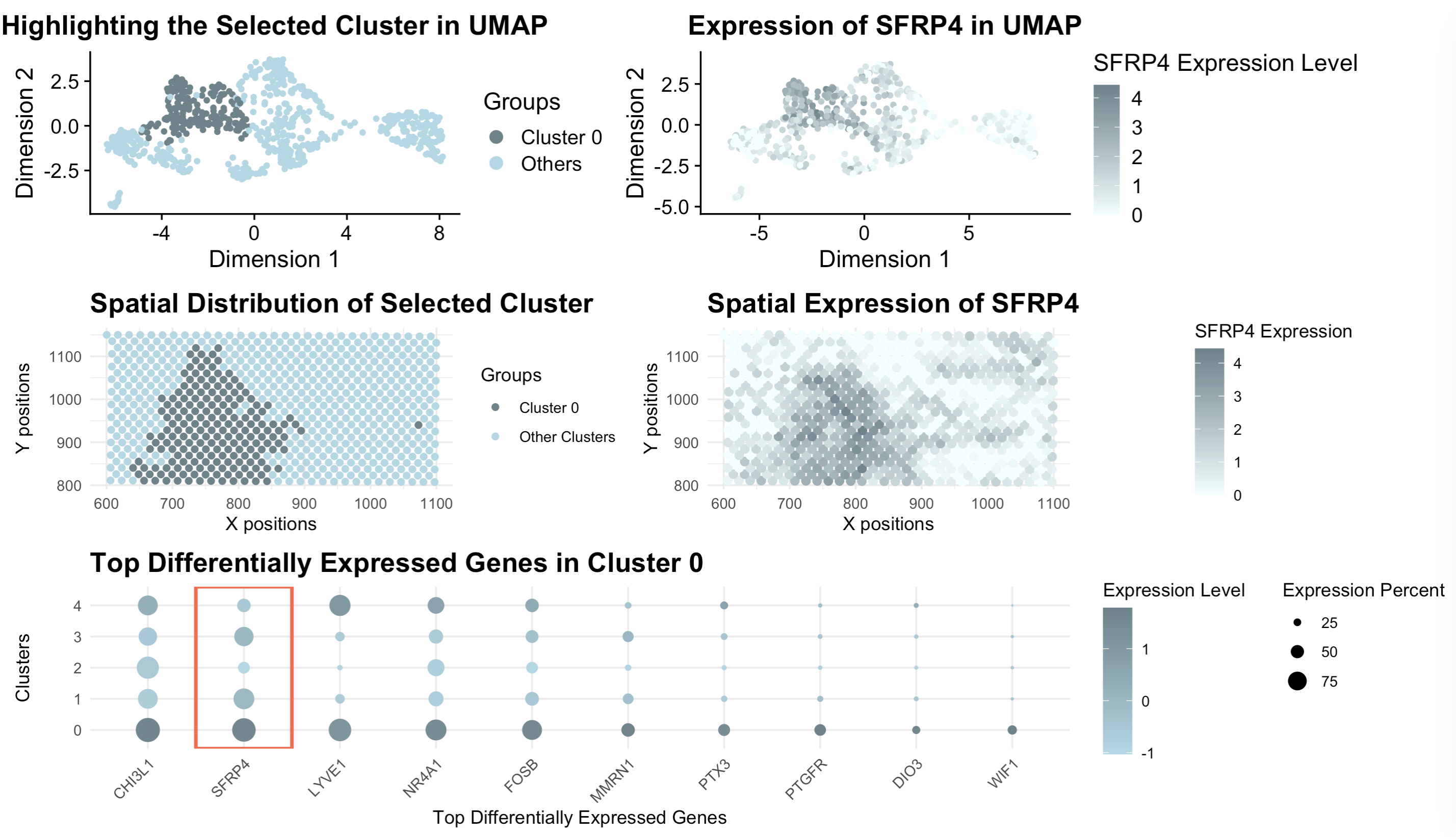
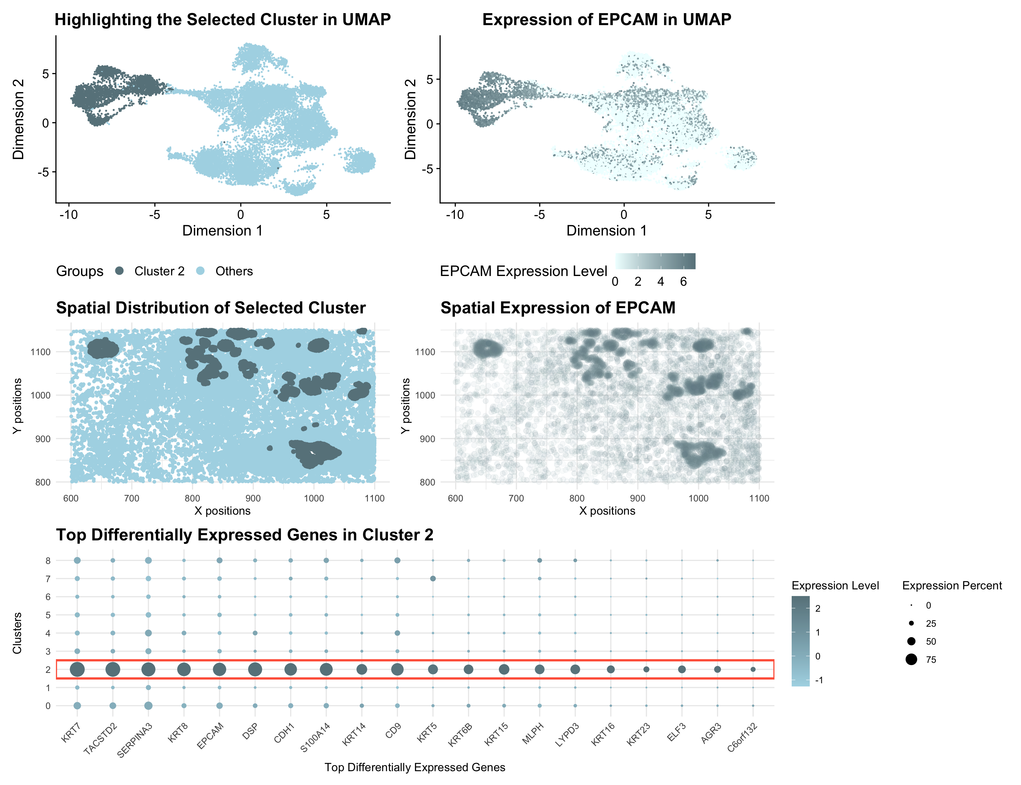
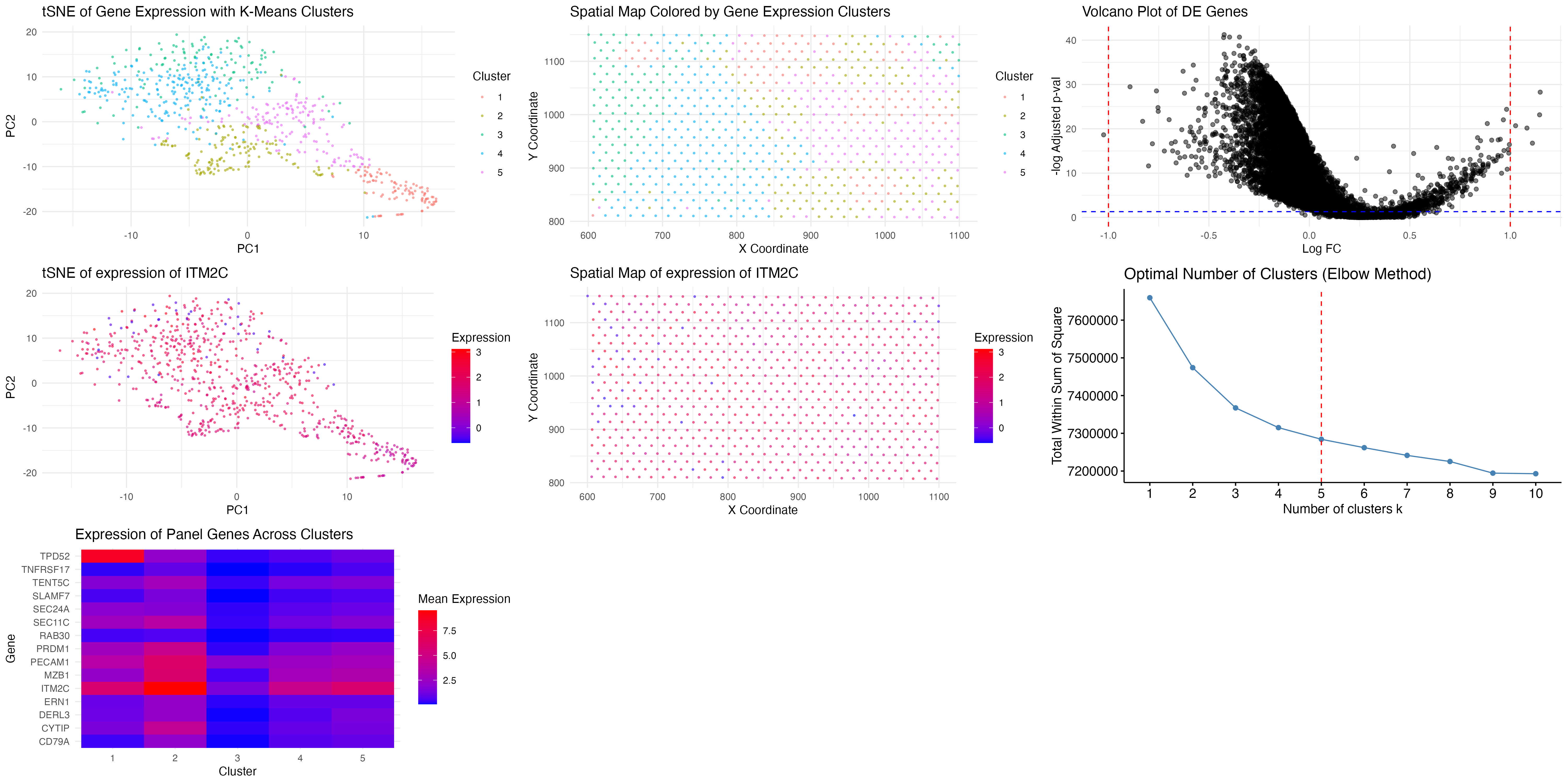
[description] Those panels present a comprehensive visualization of Cluster 0 and its association with the gene SFRP4 through a combination of UMAP, spatial, and gene expression analysis. The top-left UMAP...
Description of analysis The modification from the HW3 using eevee data set is that I changed the selection of cluster based on the overall cluster visualization in physical space. Method-wise,...
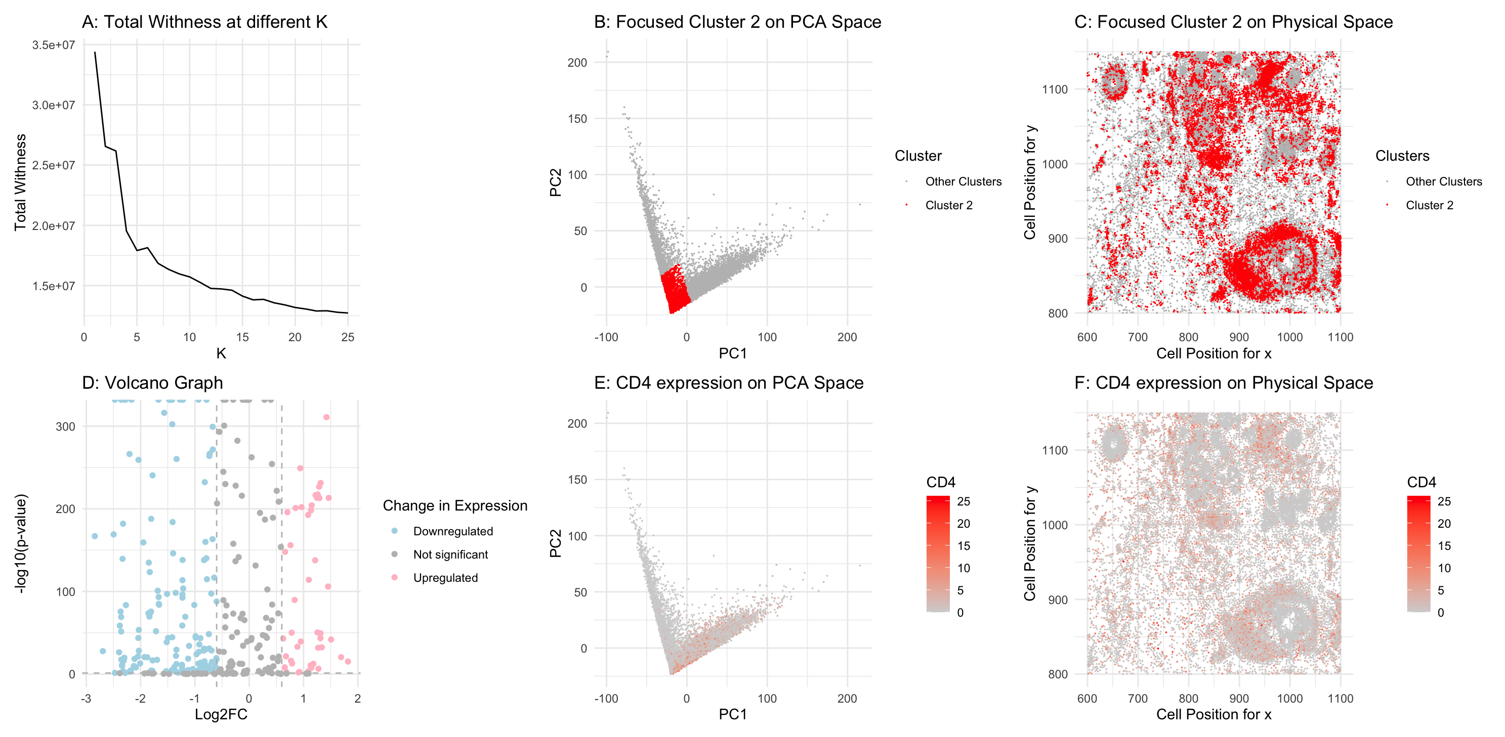
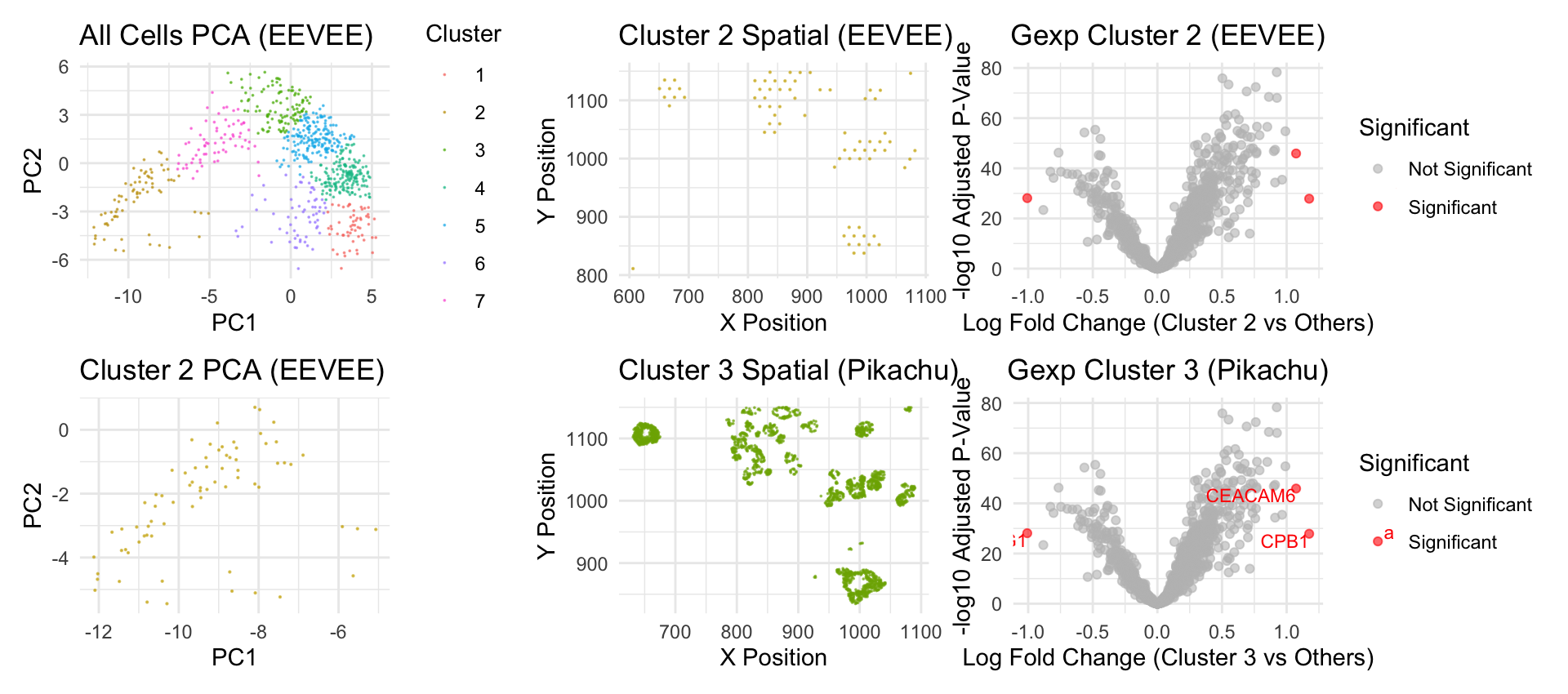
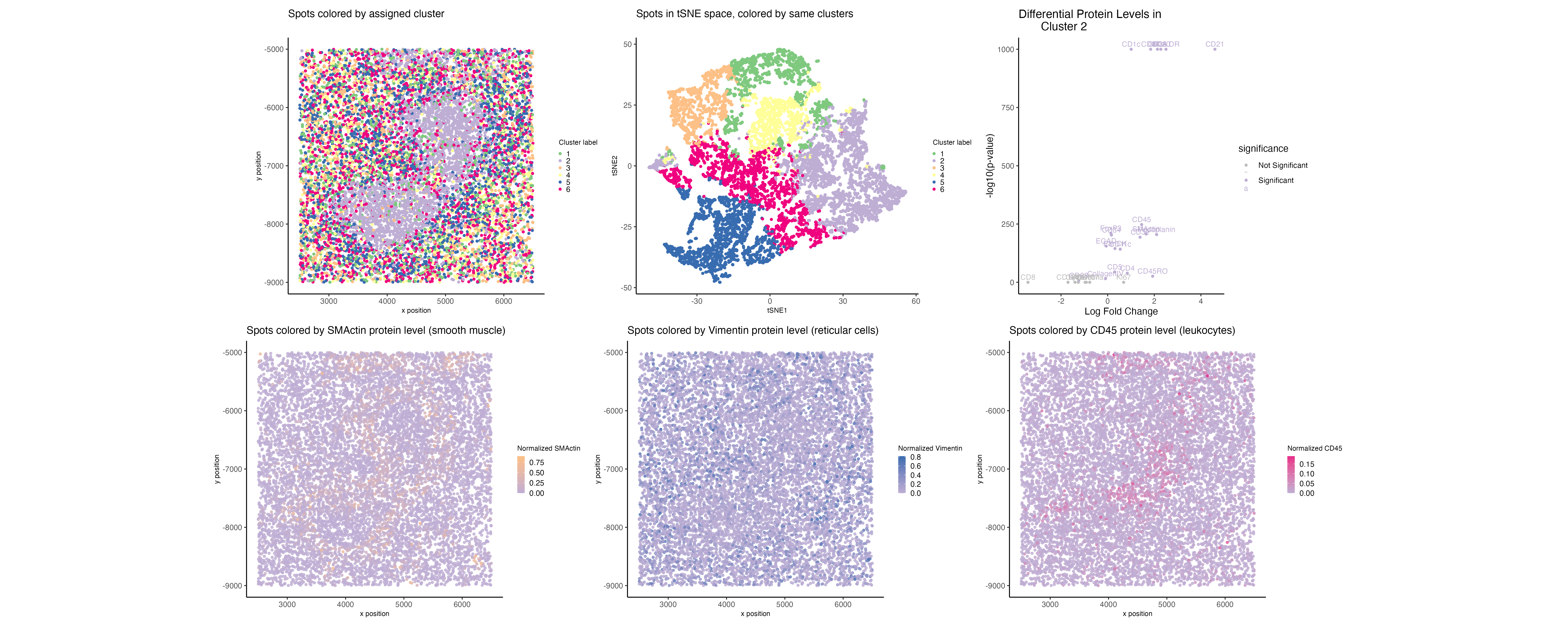
1. Figure Description. Figure A: Total within-cluster sum of squares using different value of k. Figure B: Cluster 2 is highlighted in red in PCA space, while the remaining three...
To begin analyzing the imaging dataset, I decided to normalize by cells’ areas, rather than use count-based normalization. Afterwards, I clustered my normalized gene expression data using k-means and determined...
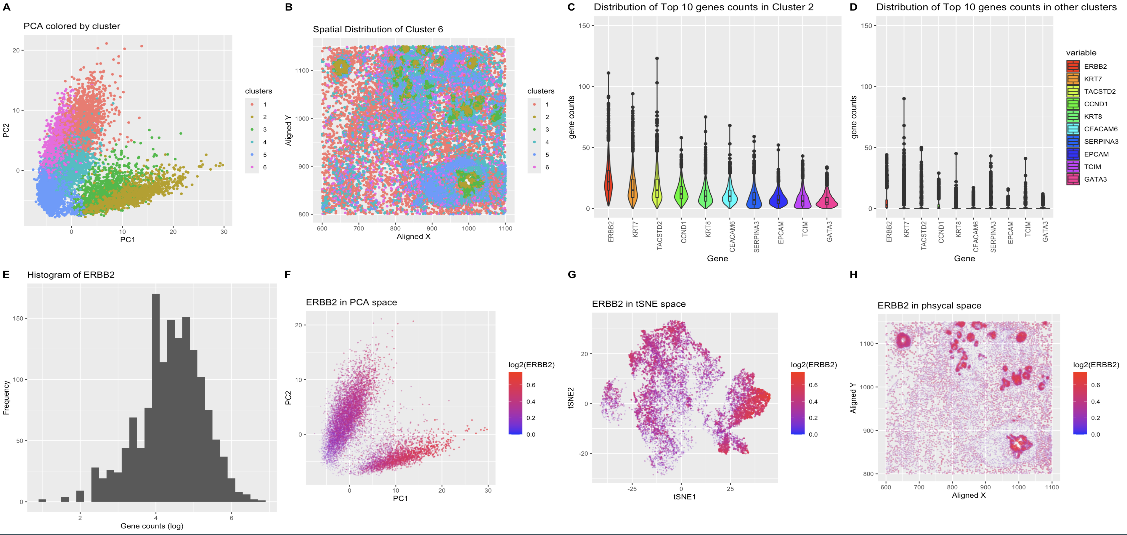
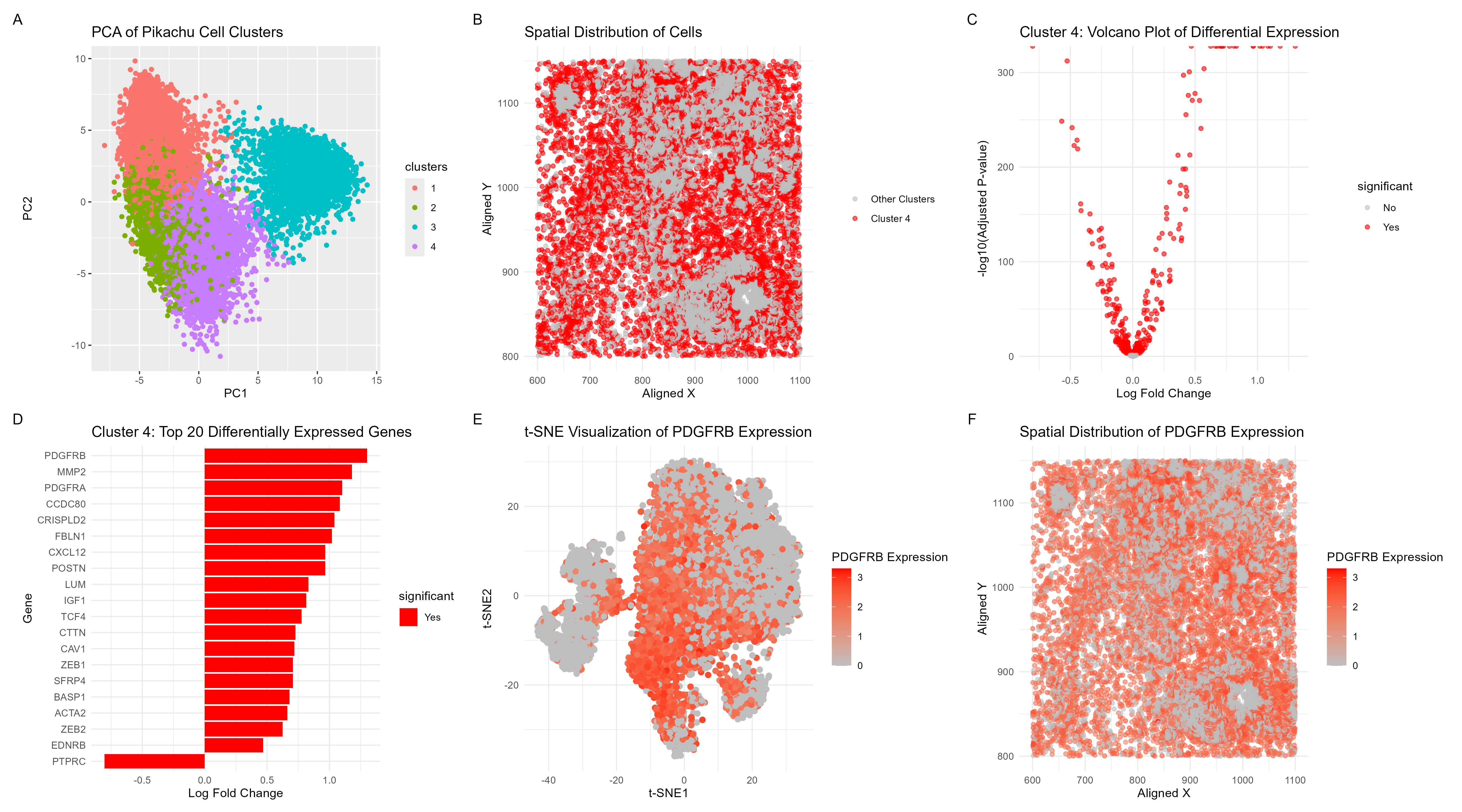
Visualization Summary In this visualization, I analyzed a cluster within the Pikachu dataset responsible for cell growth, and likely cancer. This was a major change from the Eevee sequencing dataset...
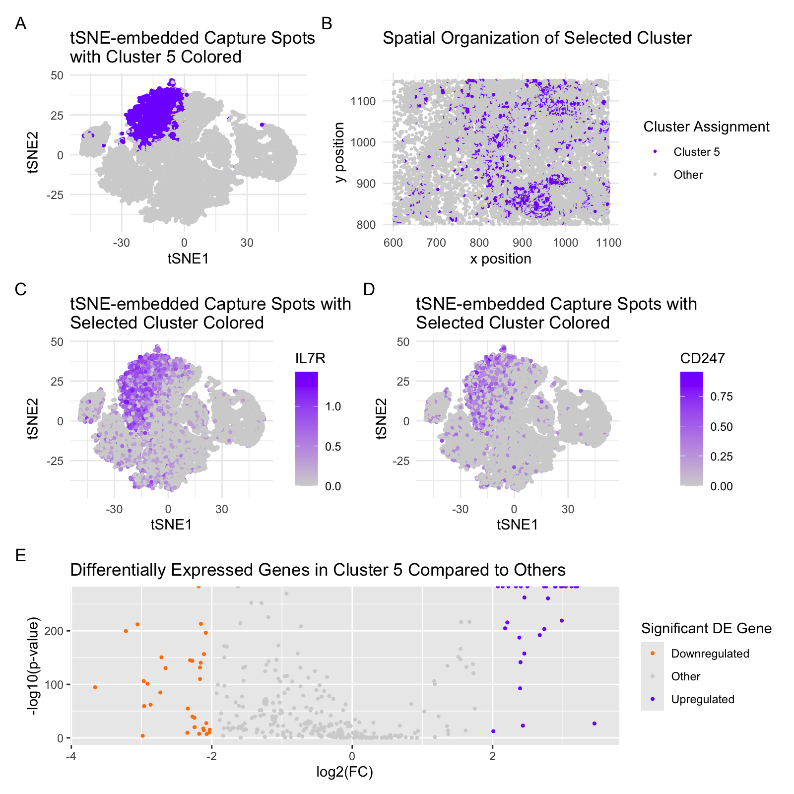
From last week’s results and selected cluster, I identified the genes LTB, CD247, and IL7R , all of which suggest a T cell population (or similar immune cell population comprising...
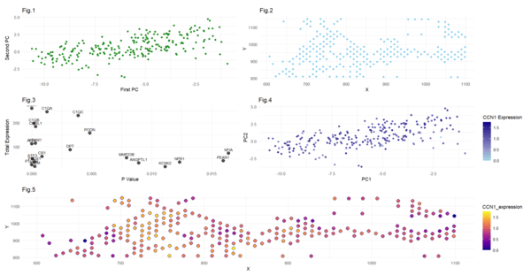
Some modifications for this visualization compared to previous was the gene I selected to focus on - the Pikachu dataset does not contain the CCN1 gene which I focused on...
I previously performed k-means clustering with k=6 to identify distinct transcriptional clusters in the Eevee dataset. When analyzing the Pikachu dataset, I initially used the same approach but found that...
In analyzing both the Pikachu and Eevee datasets, I successfully identified similar cell populations while making several key adjustments to account for the different data types. The most significant change...
This figure presents an analysis of cellular clusters within the Eevee dataset, focusing on the identification and characterization of a biologically relevant cluster using k-means clustering, dimensionality reduction techniques (PCA...
Previously, in HW3, I identified a cluster of cells that were representative of adipocyte-like or lipid-metabolizing cells. This was concluded through the identification of genes GPD1, ADIPOQ, and FABP4 in...
Use/adapt your code from HW3 to identify the same cell-type in the other dataset. Create a multi-panel data visualization and write a description to convince me you found the same...
<!– Create a multi-panel data visualization that includes at minimum the following components: A panel visualizing your one cluster of interest in reduced dimensional space (PCA, tSNE, etc) A panel...
This homework was very similar to HW3, but involved a switch from the Pikachu dataset (imaging-based spatial transcriptomics) to the Eevee dataset (sequencing-based spatial transcriptomics).
I found the same breast granular cell type that I identified in the Eevee dataset in the Pikachu dataset. To do so, I first identified the number of clusters to...
This panel shows that the cell cluster that I found in the EEVEE dataset is the same that I had found in the Pikachu dataset for the previous homework. The...
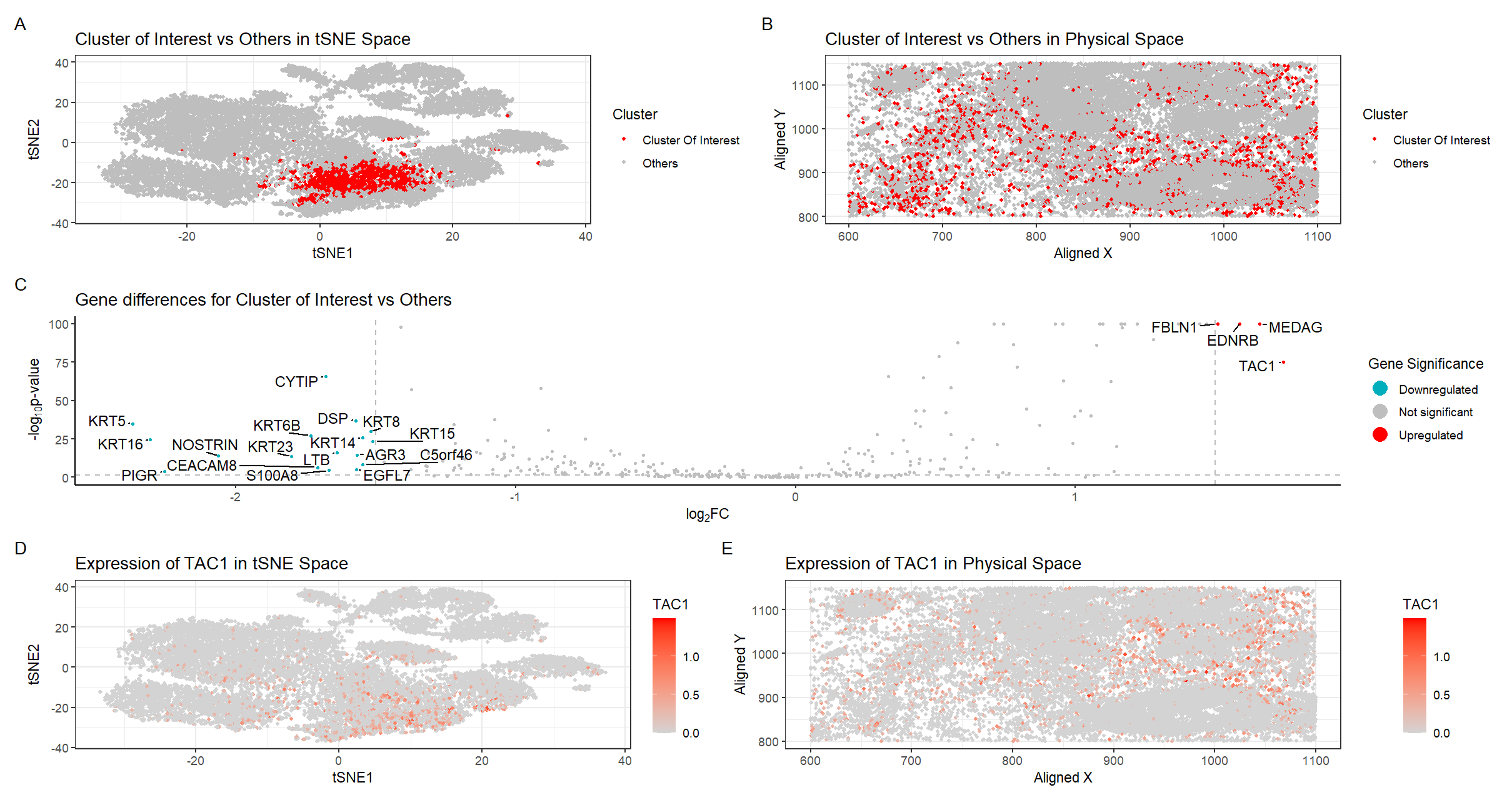
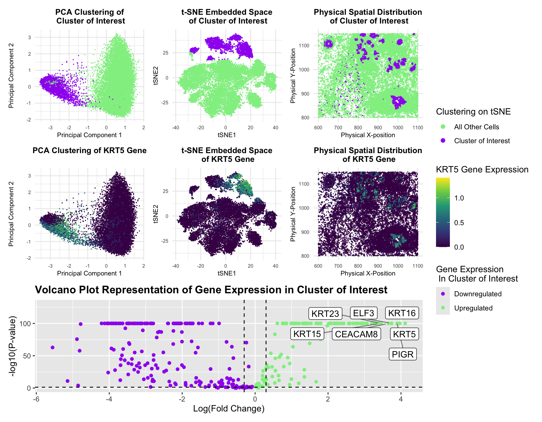
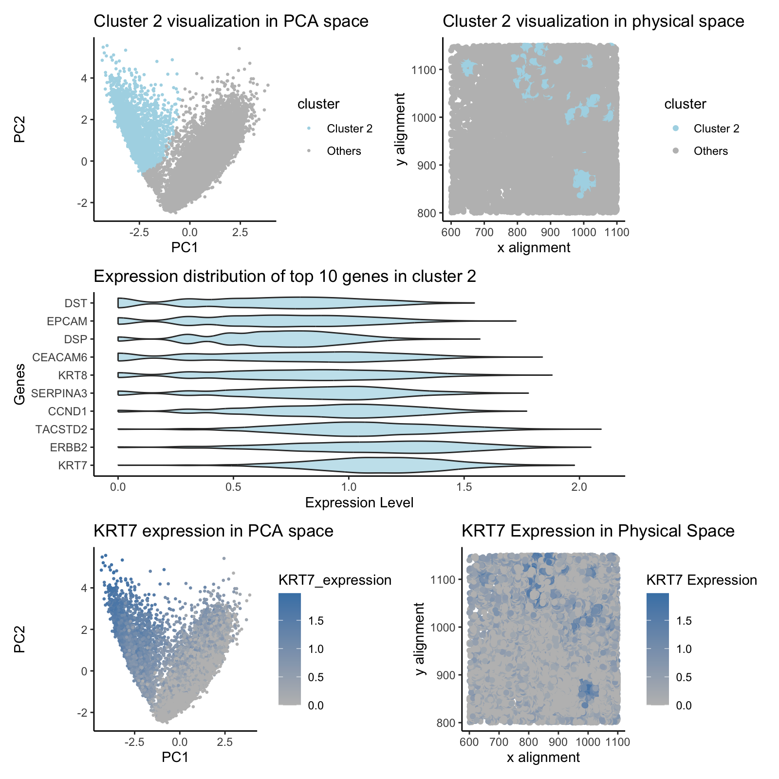
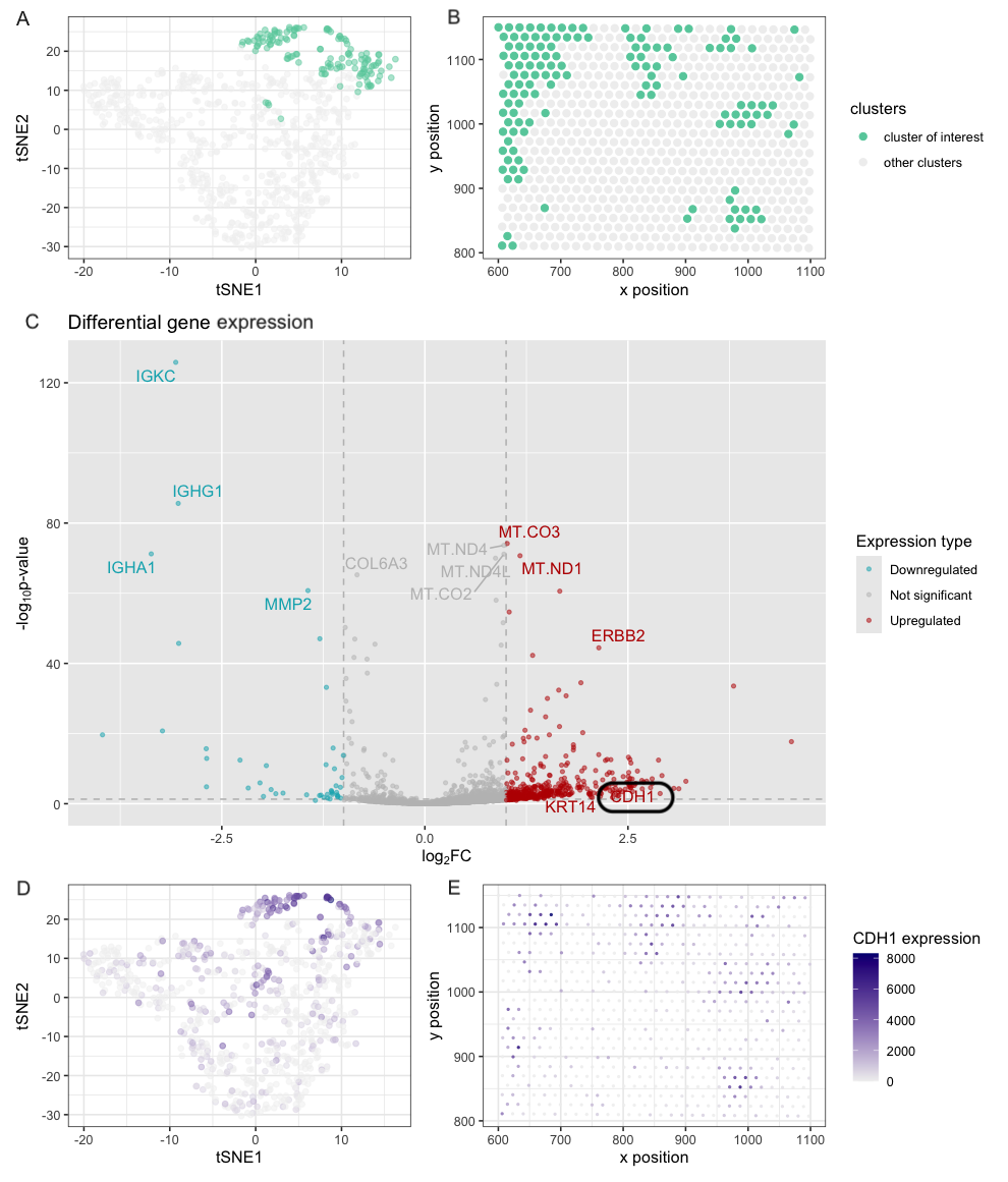
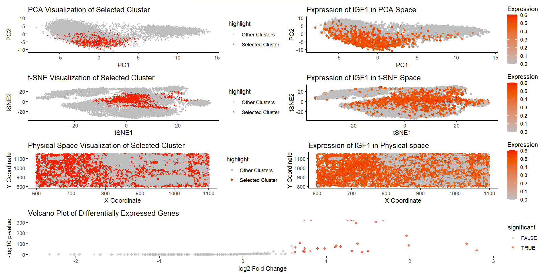
Description Notes: I want to change the cluster identified in HW3. Originally, it is most likely a fibroblast-like stromal cell because the top 20 highly expressed genes include SFRP4, WIF1,...
###1. Description Figures A and B share a common legend and analyze the dataset at the cluster level, where green highlights the cluster of interest and gray represents all other...
We previously performed k-means clustering with k=8, assuming that a higher number of clusters would better capture transcriptional heterogeneity. However, after applying the elbow method, we found that the optimal...
1. Description of the Figure I used similar dimensionality reduction techniques and differential gene expression analysis on the imaging-based pikachu dataset. The figure consists of 7 plots. K-means clustering is...
Describe your figure briefly so we know what you are depicting (you no longer need to use precise data visualization terms as you have been doing). There are six plots...
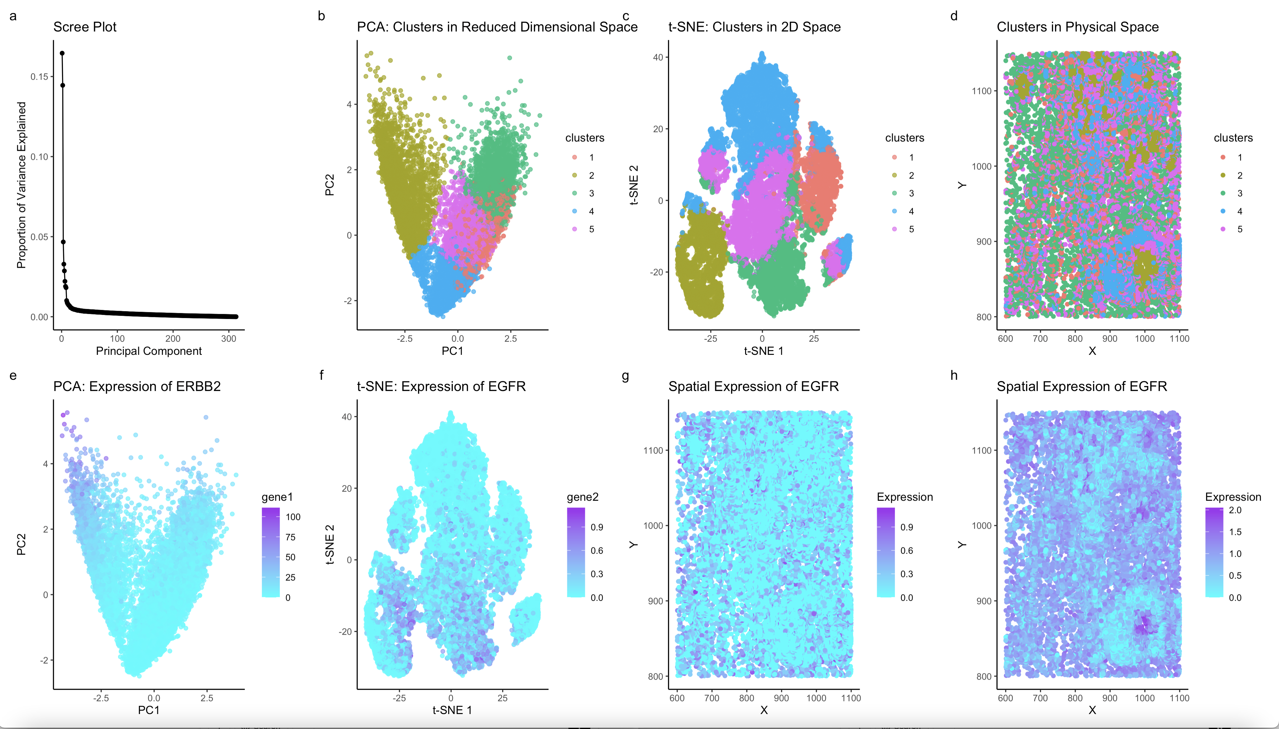
I thought it would be fun to animate the transition from normal space (our x/y positional coordinates) to the tSNE embedded space. Thus, after normalizing my data, I first performed...
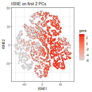
Here, I illustrate the effect of an embedding in either PC-embedded (linear) space or tSNE-embedded (nonlinear) space. As observed, the PC-embedded shape resembles a volcano plot, with prominent spot placement...
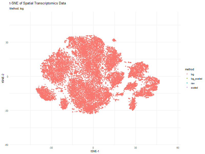
This animation visualizes how different preprocessing methods (raw, log-transformed, scaled, and log-scaled) affect t-SNE dimensionality reduction in spatial transcriptomics data. Each frame represents a different transformation method, highlighting variations in...
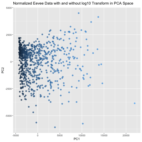
This animated visualization makes salient the answer to ‘What happens if I do or not log10 transform the normalized gene expression data prior to dimensionality reduction?’. The beginning of the...
I used the Pikachu dataset, an imaging based dataset. Therefore, I did not normalize the gene expression, as it was already for each cell. I then used a linear technique...
This visualization explores the differences between linear and nonlinear dimensionality reduction techniques for analyzing spatial transcriptomics data. Specifically, the animation compares the spatial distribution of cells, their representation in t-SNE...
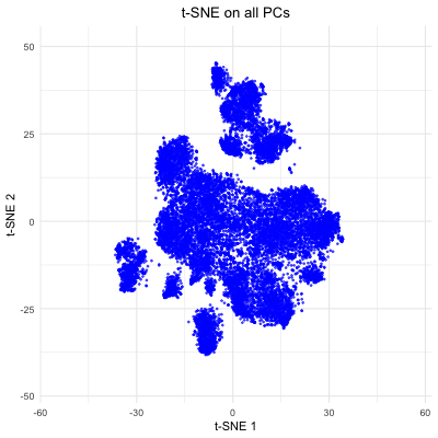
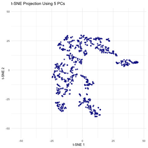
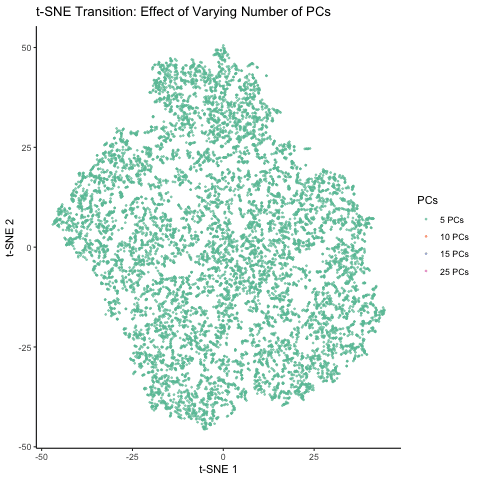
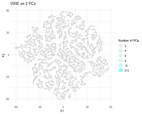
Description visualization This figure visualizes the effect of varying the number of principal components (PCs) used in t-SNE for dimensionality reduction on a spatial transcriptomics dataset. The animation transitions smoothly...
1. Figure Description. Figure State 1: Eevee’s cell spots in PCA space, with x axis for PC1 andy y axis for PC2. Figure State 2: Eevee’s cell spots in t-SNE...
Description The visualization compares three different dimensionality reduction techniques—PCA (Principal Component Analysis), t-SNE (t-Distributed Stochastic Neighbor Embedding), and UMAP (Uniform Manifold Approximation and Projection)—to visualize high-dimensional gene expression data from...
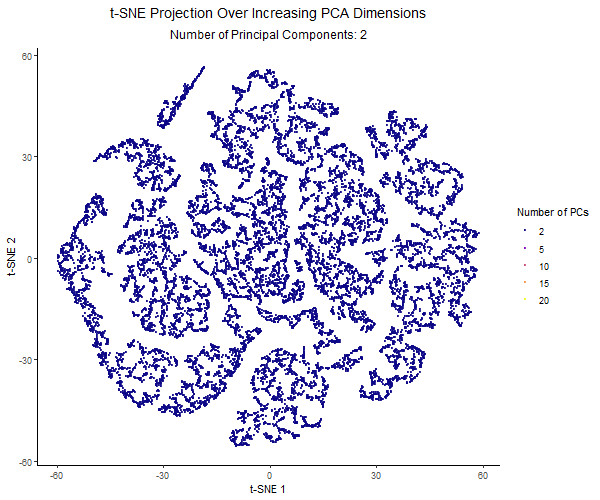
For this project, I created an animation using gganimate to visualize the effect of varying the number of principal components before applying t-SNE. I used the Pikachu dataset. First, I...
What’s vizualized? A gif visualizing the cluster derived with kmeans in reduced dimensional space using linear vs non-linear methods (PCA and tSNE), as well as in the original physical space....
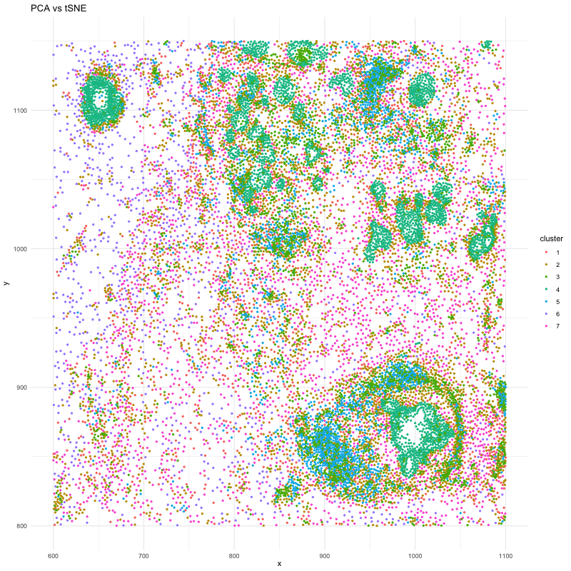
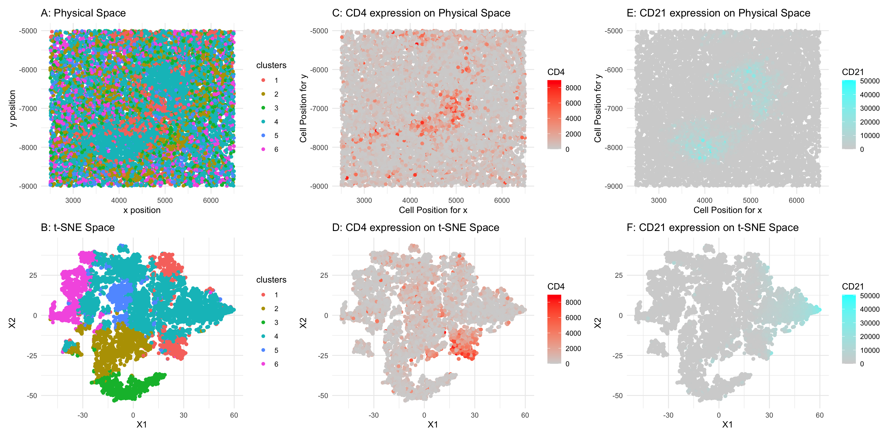
1. Figure Description. Figure A: 6 clusters in physical space. The axes represent x and y position. Figure B: 6 clusters in t-SNE space. The axes represent X1 and X2....
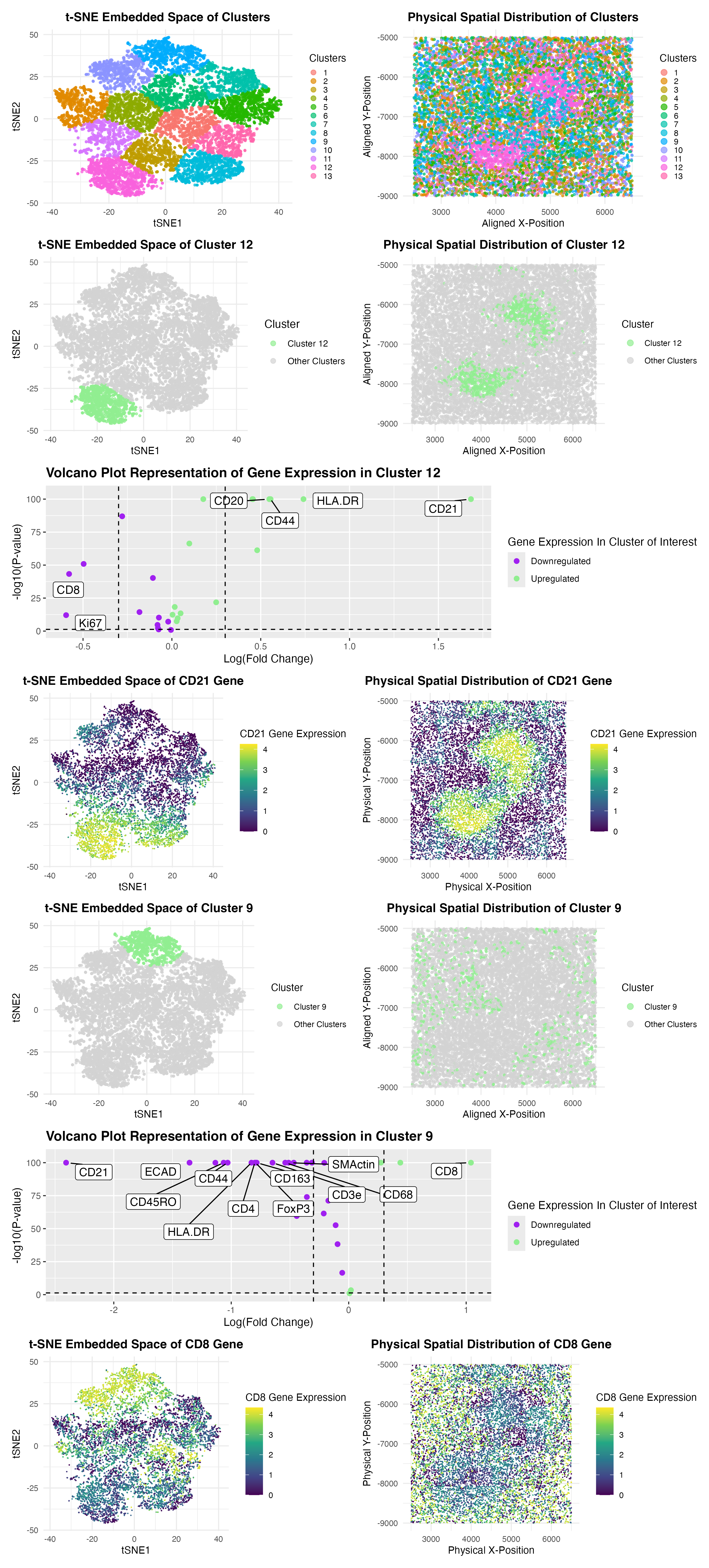
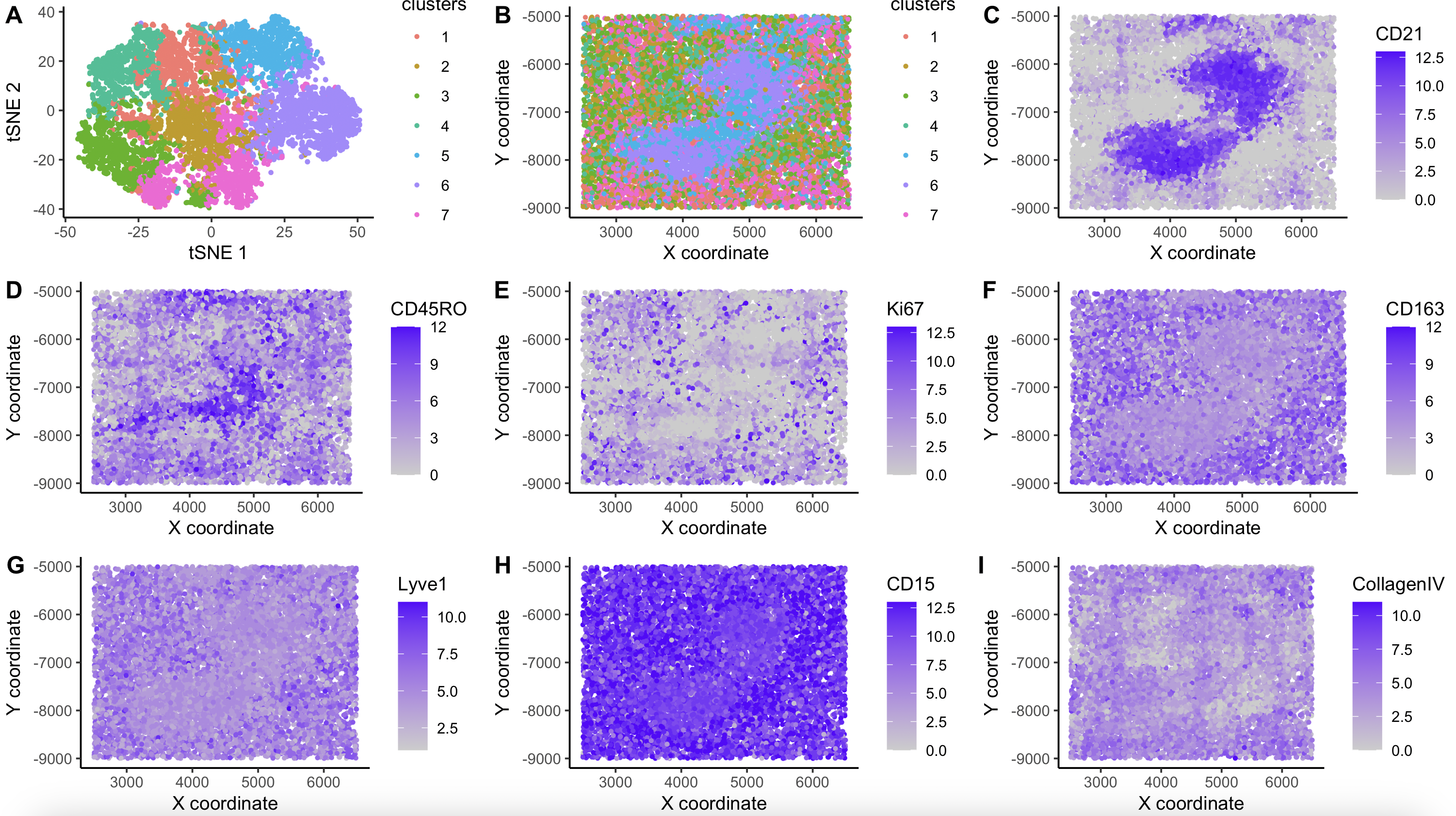
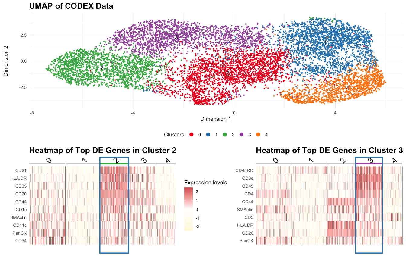
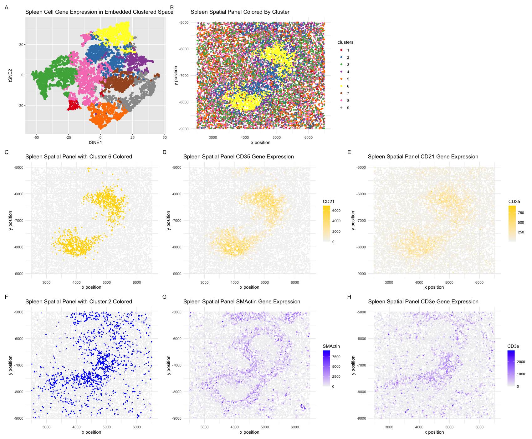
1. Figure Description and Interpretation I have performed quality control, dimensionality reduction using t-SNE, k-means clustering with optimal k=9 (from an elbow plot), and differential expression analysis on the CODEX...
Based on the CODEX data, I hypothesize this tissue sample is taken from the white pulp region of the spleen, which is surrounded by red pulp. Some evidence/reasoning is outlined...
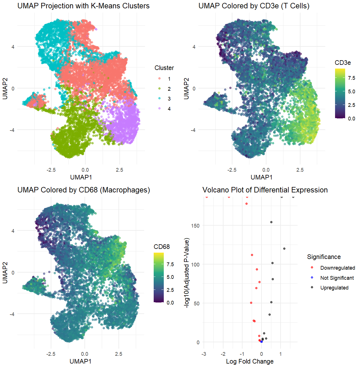
Visualization Summary In this visualization, I analyzed two cell types within the CODEX dataset: T cells and B cells. First, the genes in the dataset were normalized, log-transformed, and clustered...
1. Written Answer I decided to use techniques such as t-SNE and dimensionality reduction as well as normalizing the protein expression data to figure out the tissue structure in the...
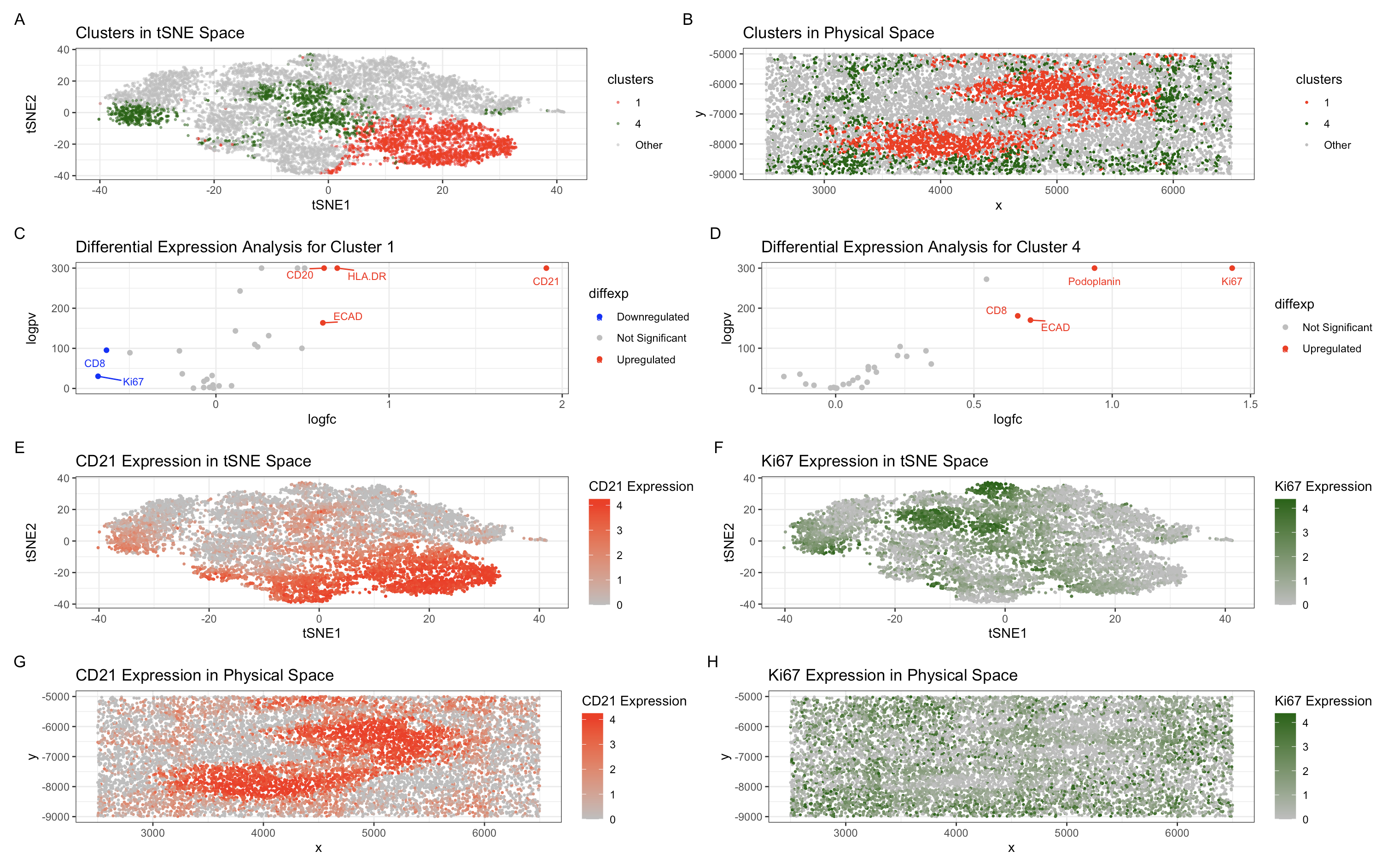
(A) This panel presents the visualization of cellular clusters in tSNE space, where distinct populations (Cluster 1 in red, Cluster 4 in green) are delineated against a background of unclustered...
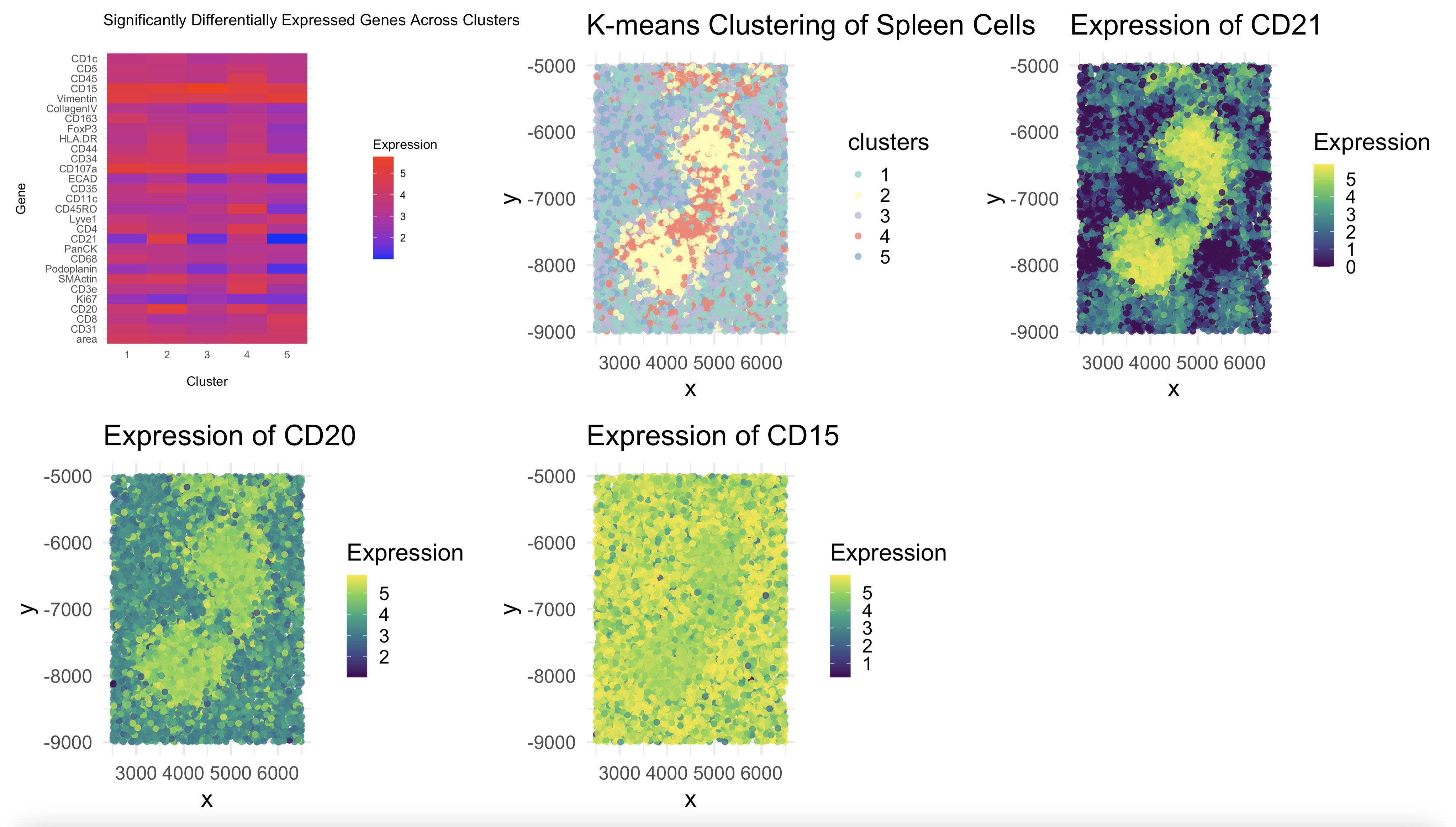
Based on the analysis of the CODEX dataset, I’m interpreting the tissue structure represented as the white pulp of the spleen. This conclusion is drawn from the identification of two...
My analysis of the CODEX dataset aims to determine the tissue structure represented by the CODEX Spleen image by applying quality control, dimensionality reduction, K-means clustering, and differential expression analysis....
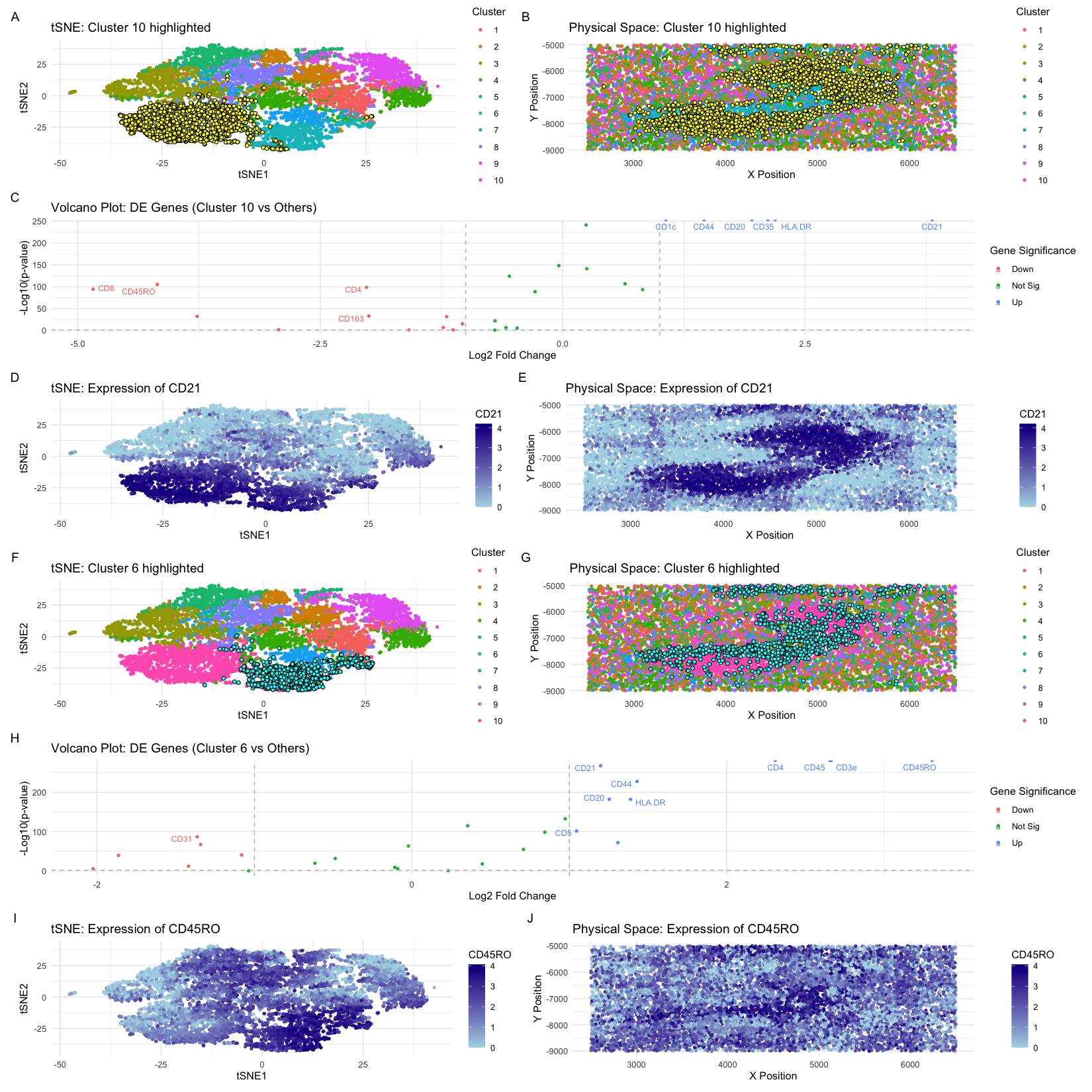
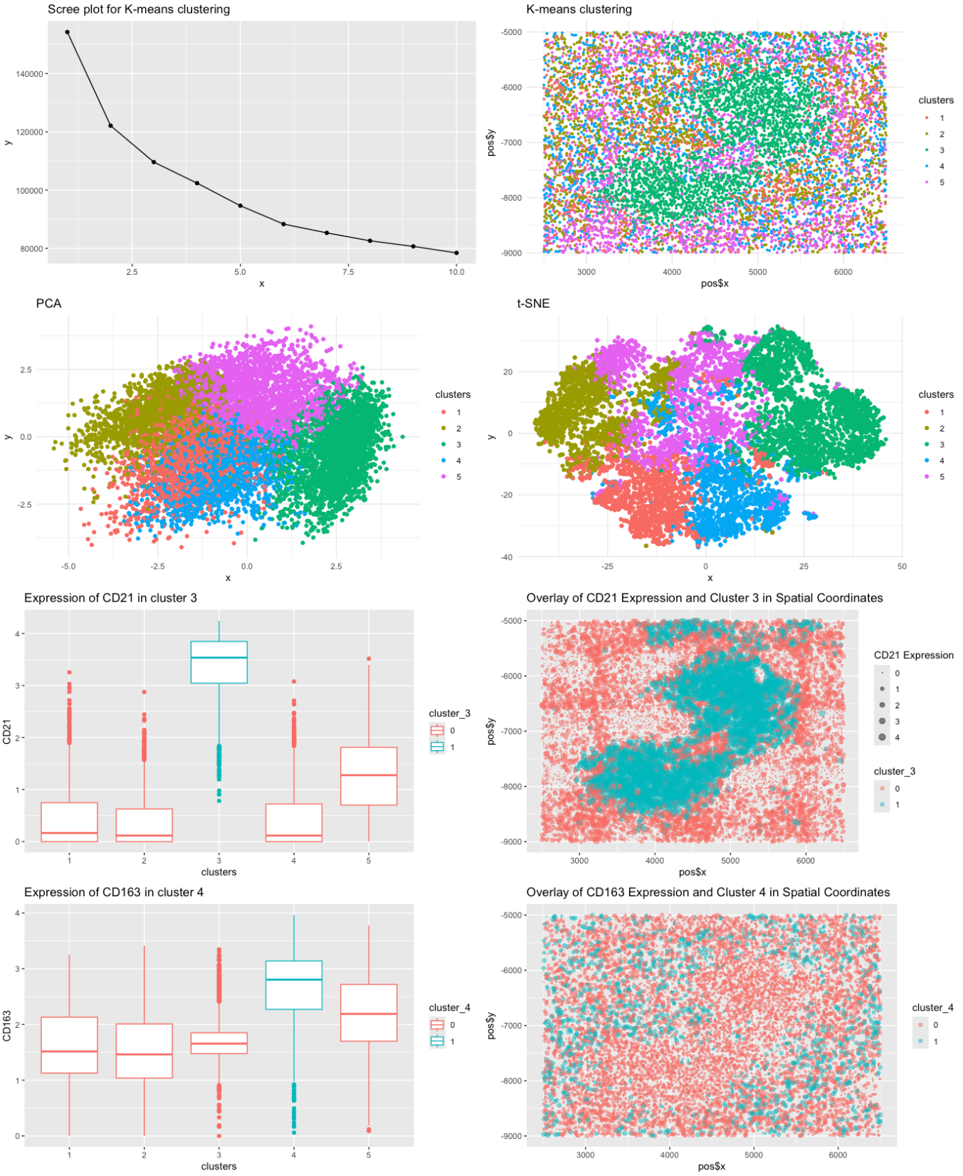
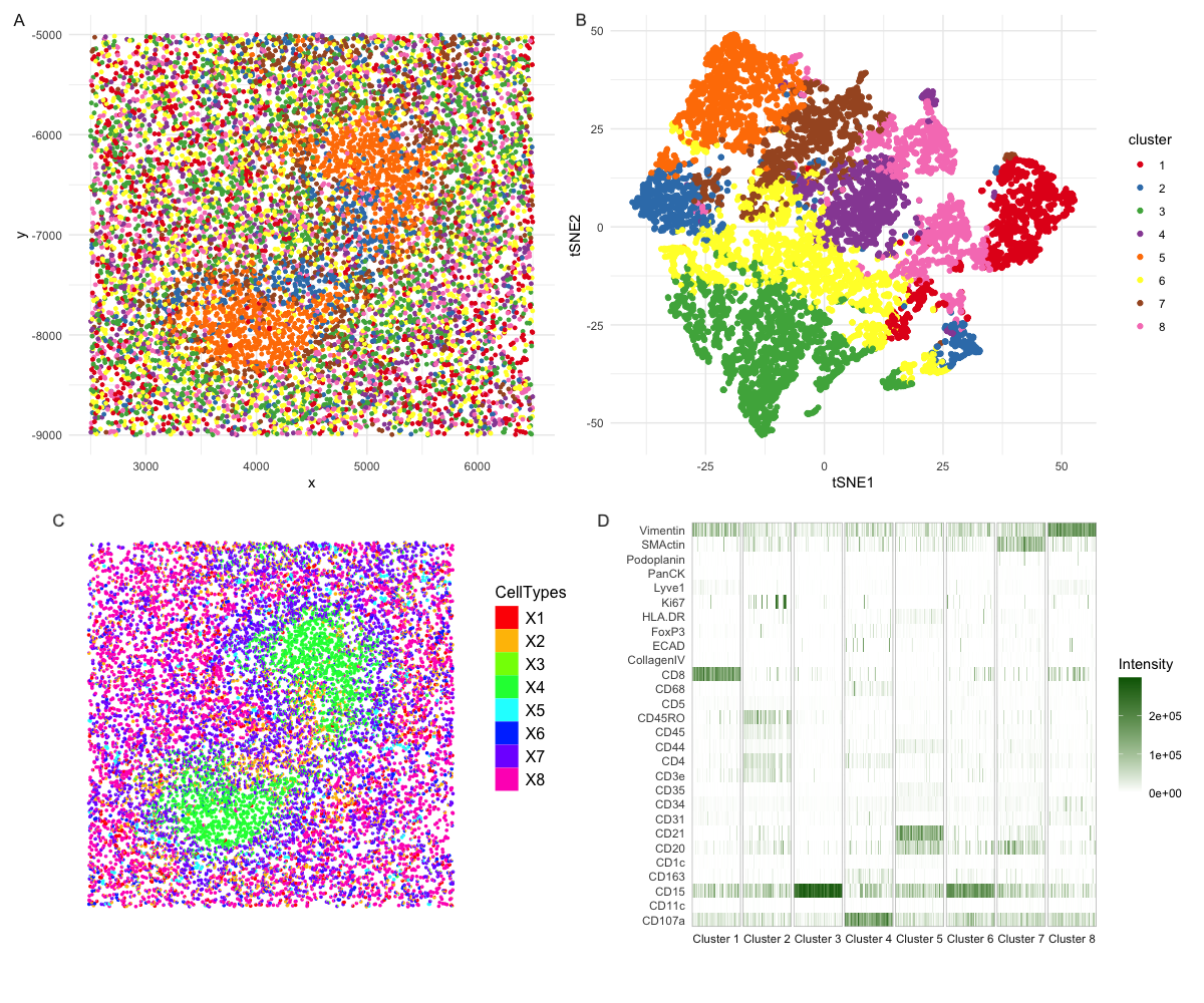
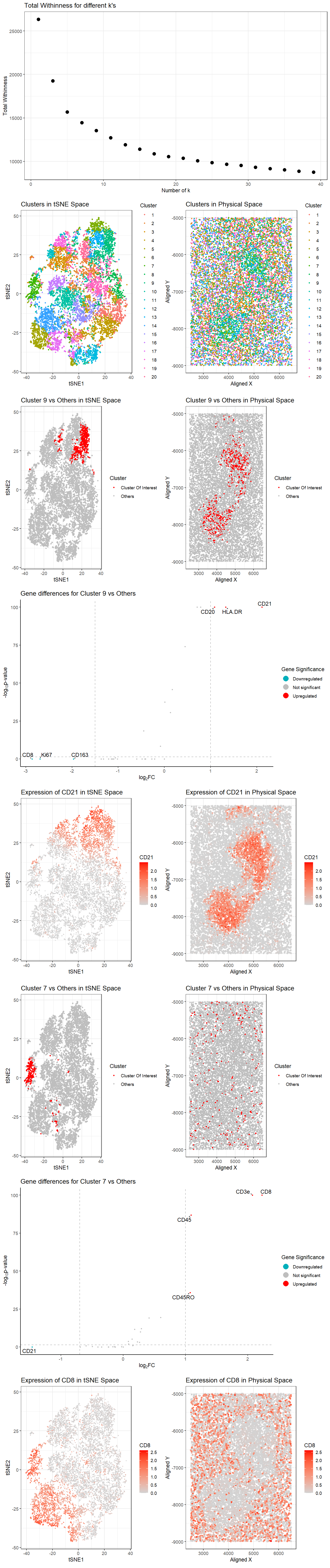
Here I perform clustering and differential expression analysis on a CODEX data set obtained from a spleen sample. Following an identification of the ideal 10 k-means clusters, I visualized the...
### I think the CODEX dataset represents splenic white pulp. With the available dataset, I have performed log transform, removal of extra data point, K-mean clustering. With those preliminary steps...
Objective
The goal to figure out what tissue structure is represented in the CODEX data. Options include: (1) Artery/Vein, (2) White pulp, (3) Red pulp, (4) Capsule/Trabeculae
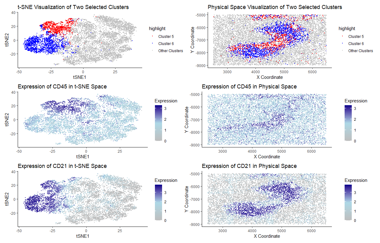
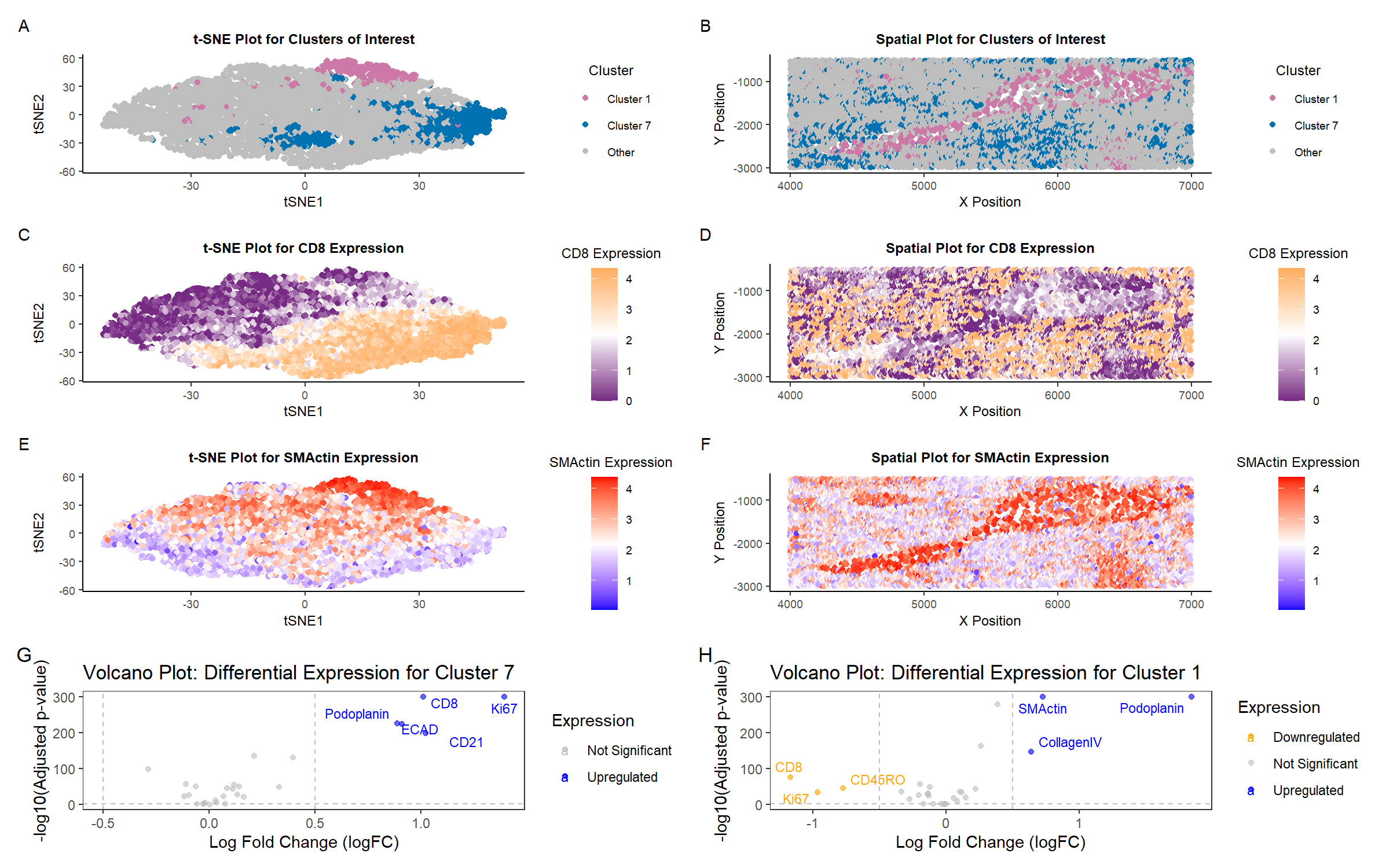
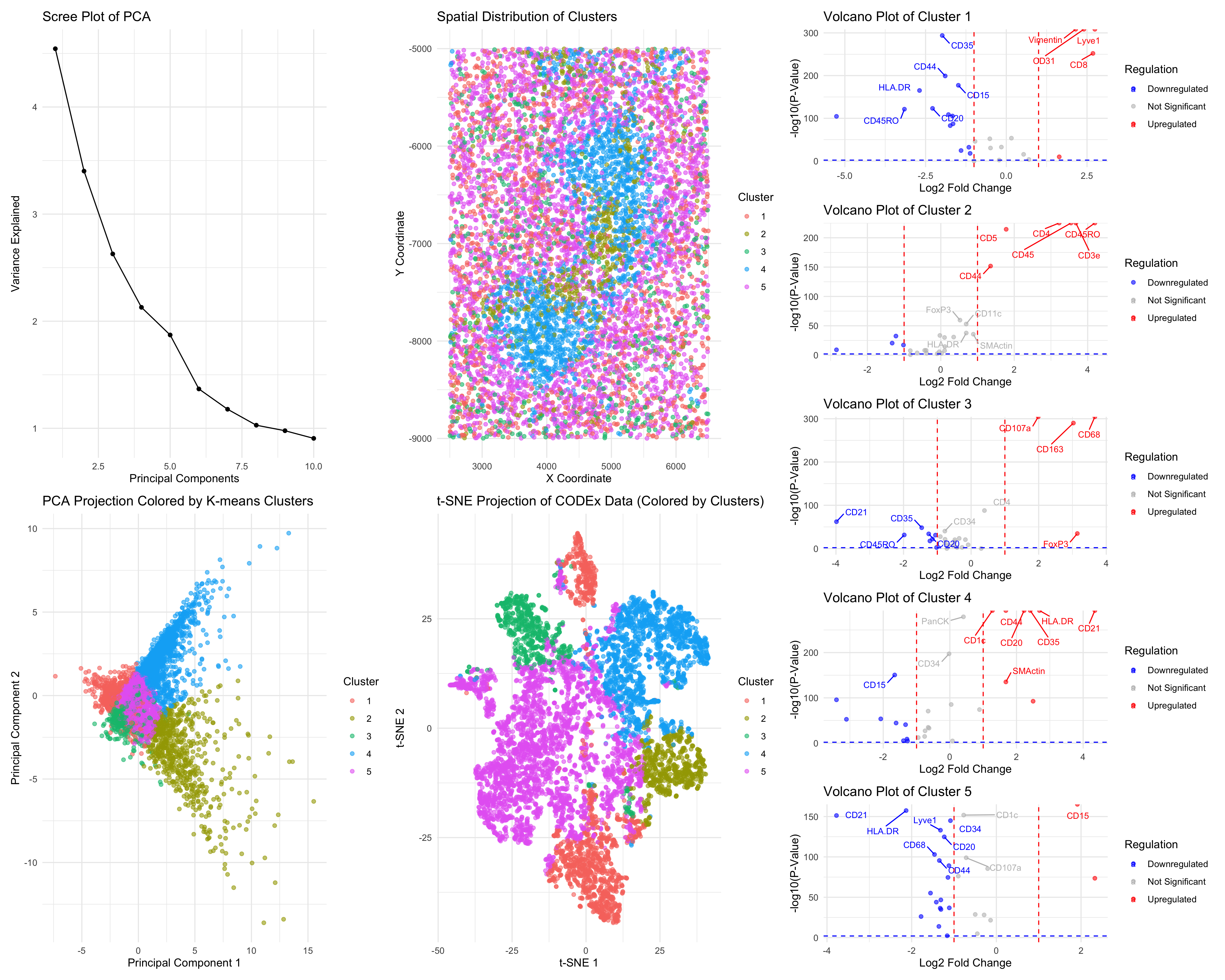
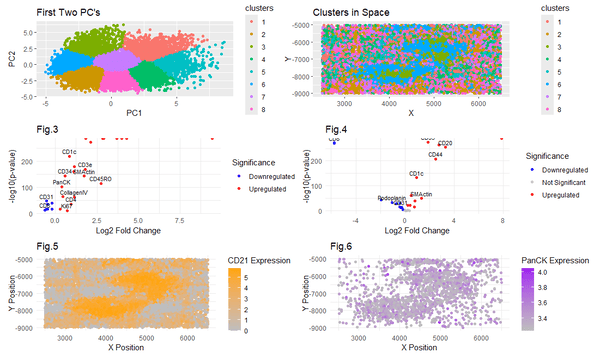
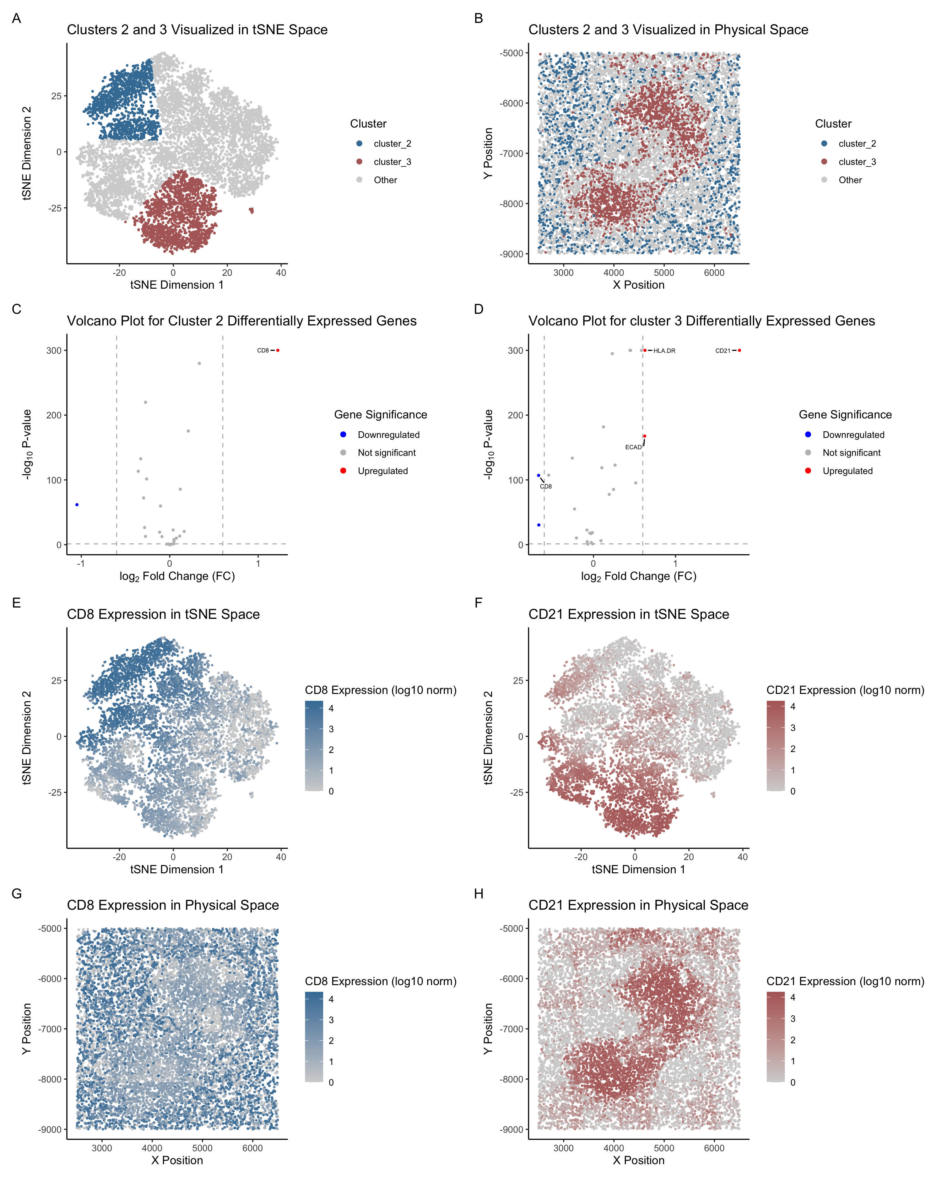
Description of analysis Through a combination of spatial clustering and differential expression analysis, I identified clusters 2 and 6 as the primary contributors to the tissue structure in our CODEX...
Create a data visualization and write a description to convince me that your interpretation is correct. Your description should reference papers and content that allowed you to interpret your cell...
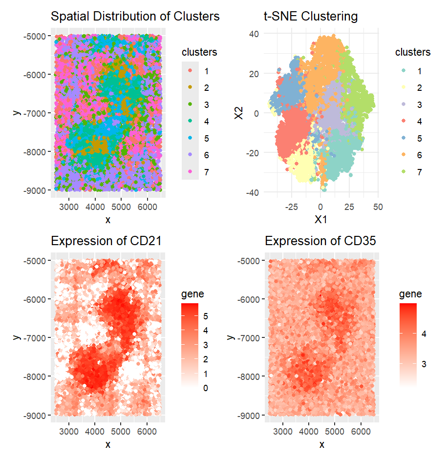
The tissue that is represented in the CODEX data is white pulp (clusters 3, 4, and 5 in my visualization) surrounded by red pulp (all other clusters). I was able...
Through my analysis, I concluded that the tissue sample is white pulp. This is because the main genes that are expressed are in the CD family, which are mainly found...
Description The visualization utilizes UMAP to reduce the high-dimensional CODEX data into a 2D projection, which allows for effective clustering of cells with similar marker expression patterns. Each point in...
Description: For this assignment, I first started out by following similar steps to my previous homeworks - normalizing the data, performing kmeans clustering by using the optimal k value, visualizing...
[description] Figure caption Figure A and B share the same legend. Figure A shows the physical location of each cell on this tissue slide and each cell is colored by...
I select clusters 6 and 2 for further analysis given their distinctive spatial organization. Performing differential gene expression analysis on cluster 6 with the Wilcox “greater-than” test yields significant gene...
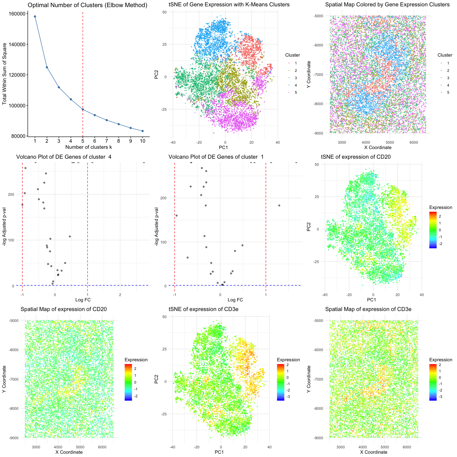
We conducted normalization, standardization, dimensionality reduction, k-means clustering, and differential expression analysis to reveal two distinct cell clusters within the CODEX data. tSNE plots and marker expression heatmaps is plotted...
Describe your figure briefly so we know what you are depicting (you no longer need to use precise data visualization terms as you have been doing). The data was normalized...
1. Written Answer Question: What happens if I do or not not normalize and/or transform the gene expression data (e.g. log and/or scale) prior to dimensionality reduction? I chose to...
In this study, I analyzed the Eevee spatial transcriptomics dataset using deconvolution techniques and clustering methods to identify distinct cell types and visualize their gene expression patterns. The dataset was...
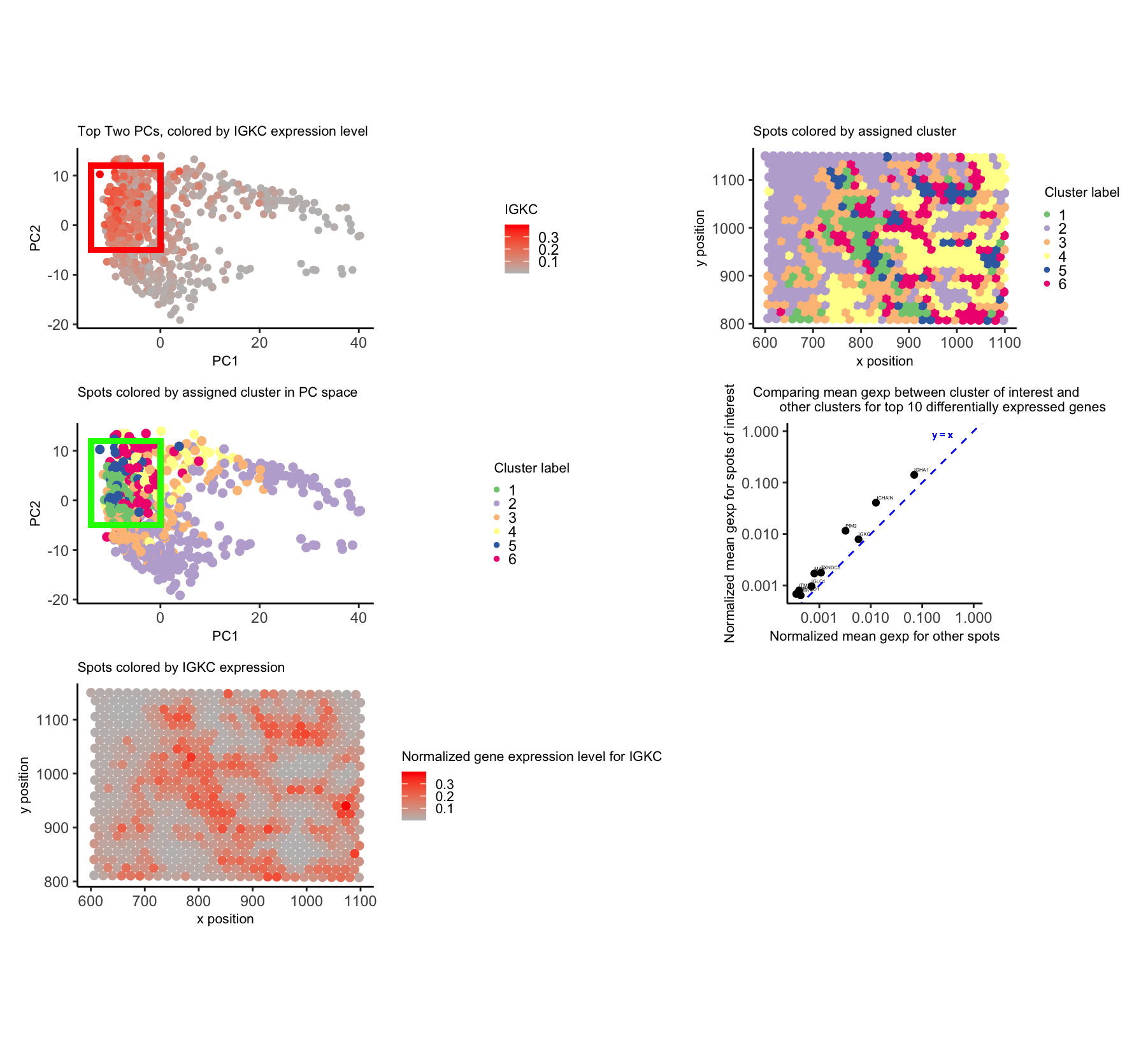
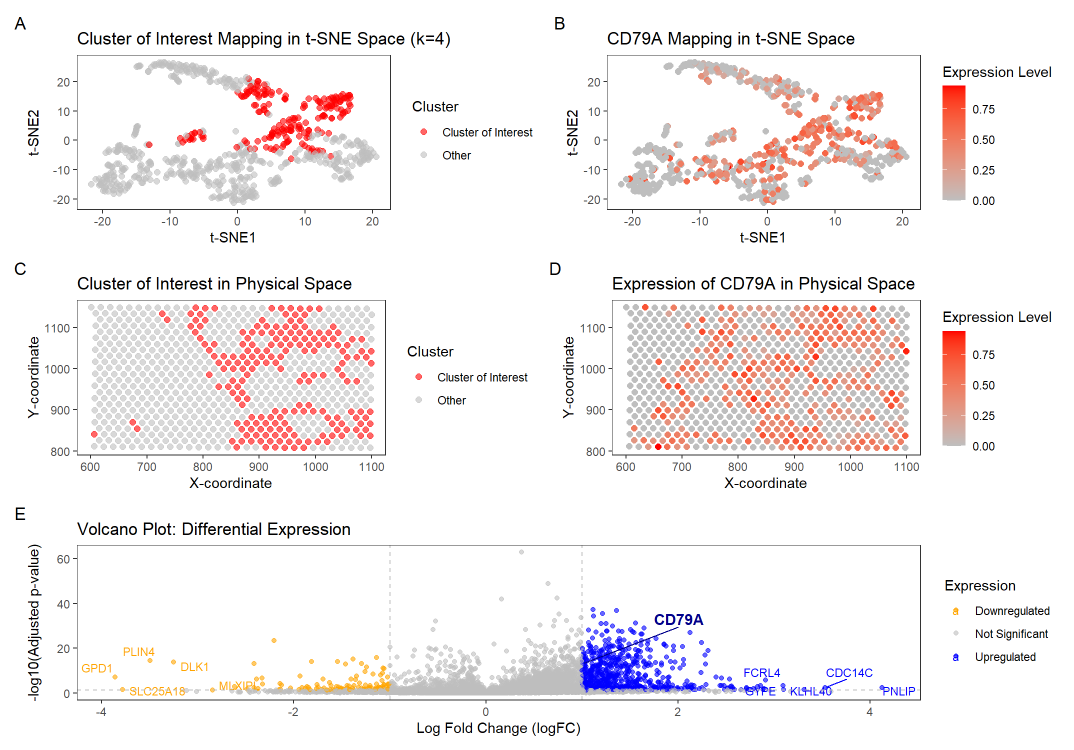
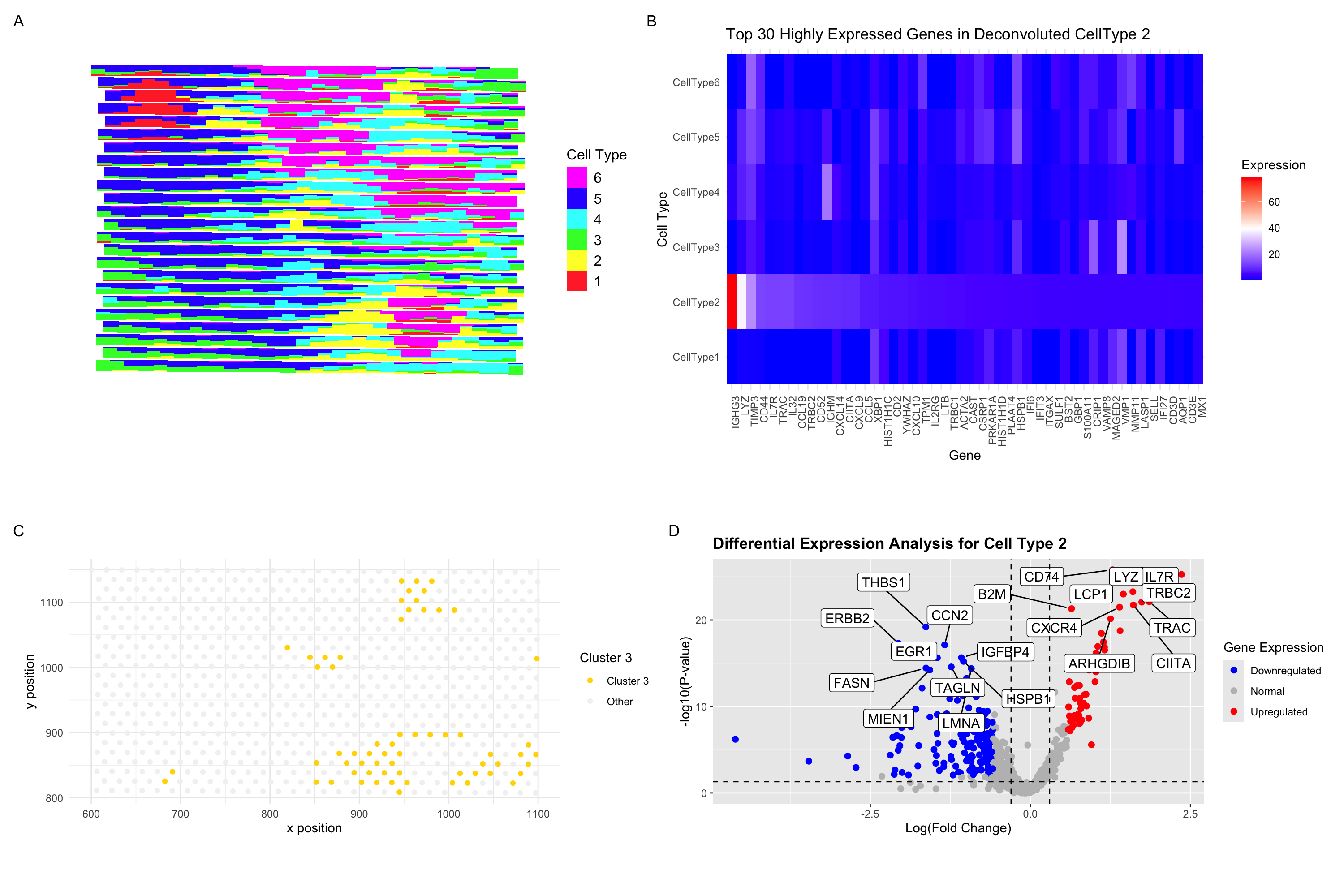
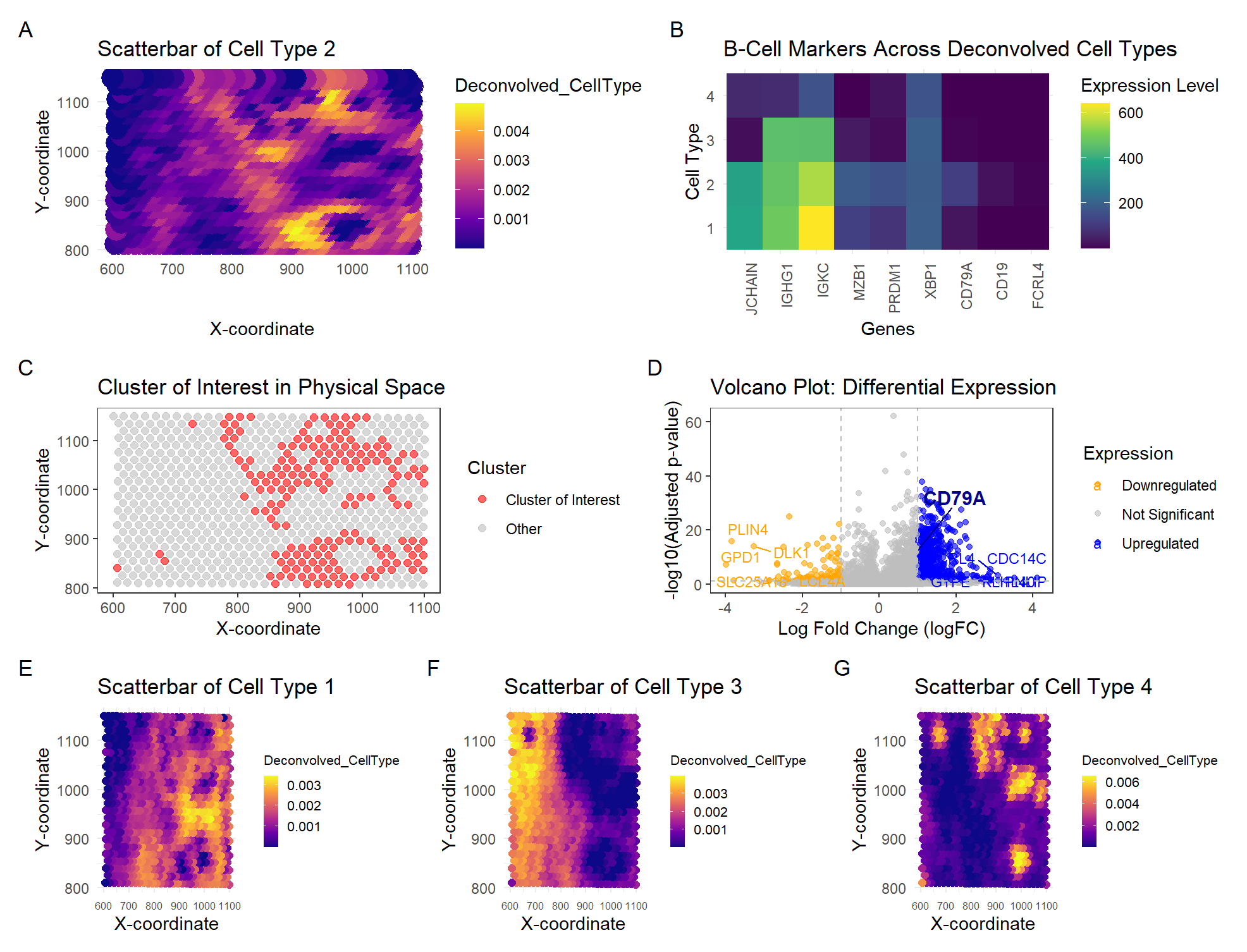
In the previous analysis (HW3), I depicted a visium dataset in embedded space and clustered to identify a B-cell-related cell type. Here, I perform STdeconvolution to parse the cell type...
In HW4, I identified a B-cell population within the Eevee dataset, based on the upregulation of CD79A gene expression. I used K-means clustering with K=4 to classify spatial transcriptomics spots...
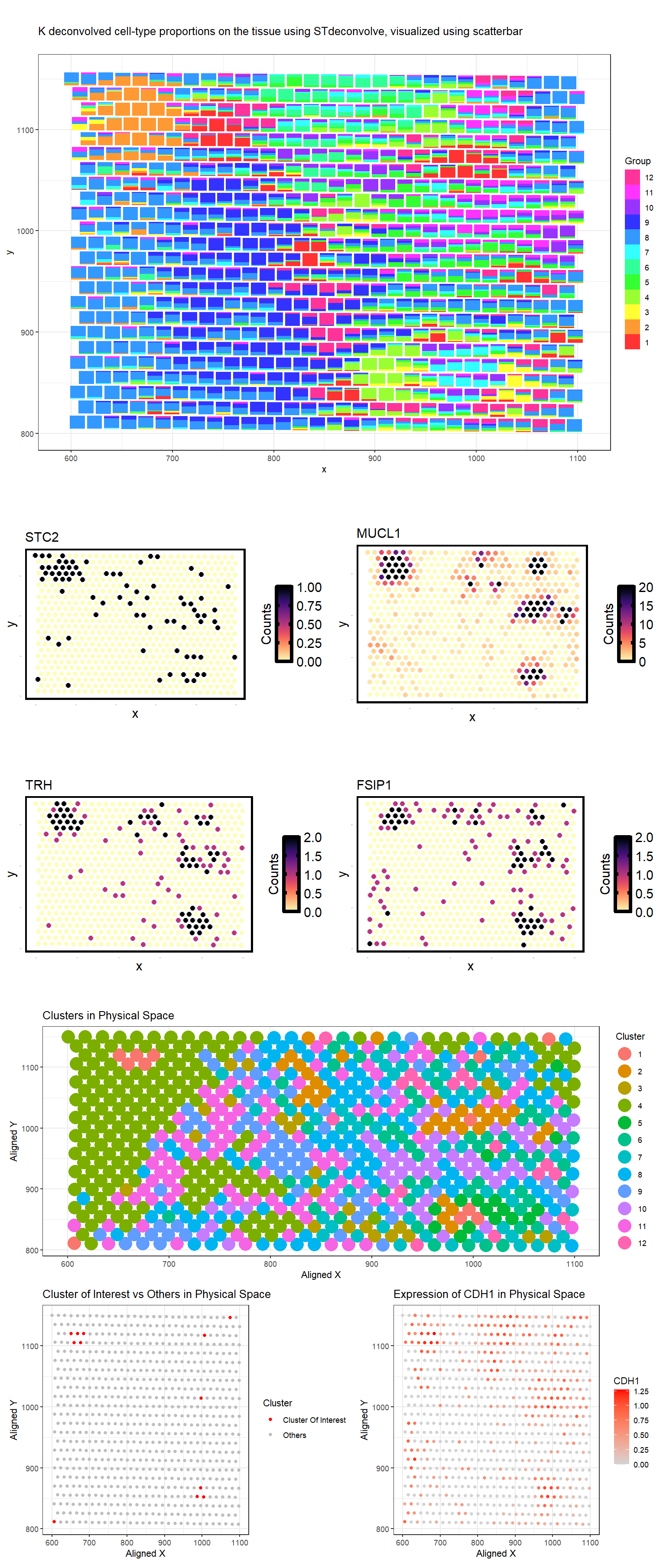
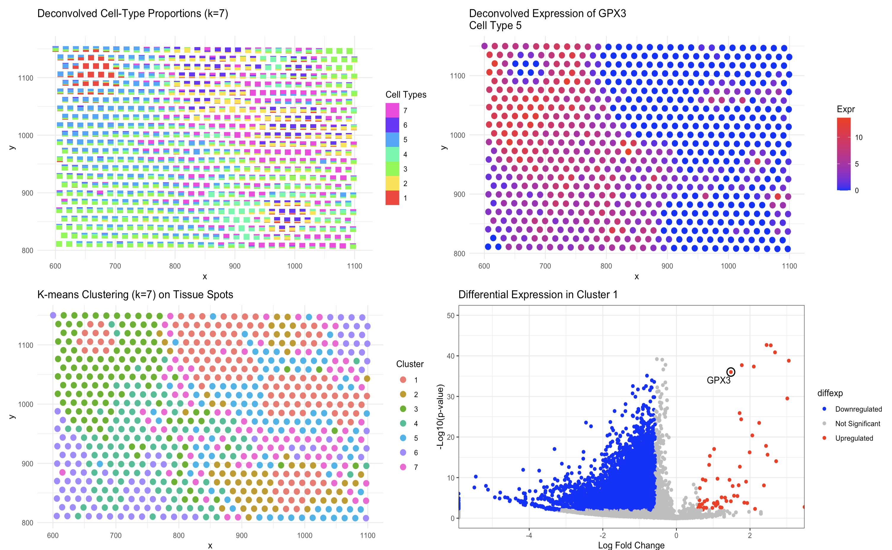
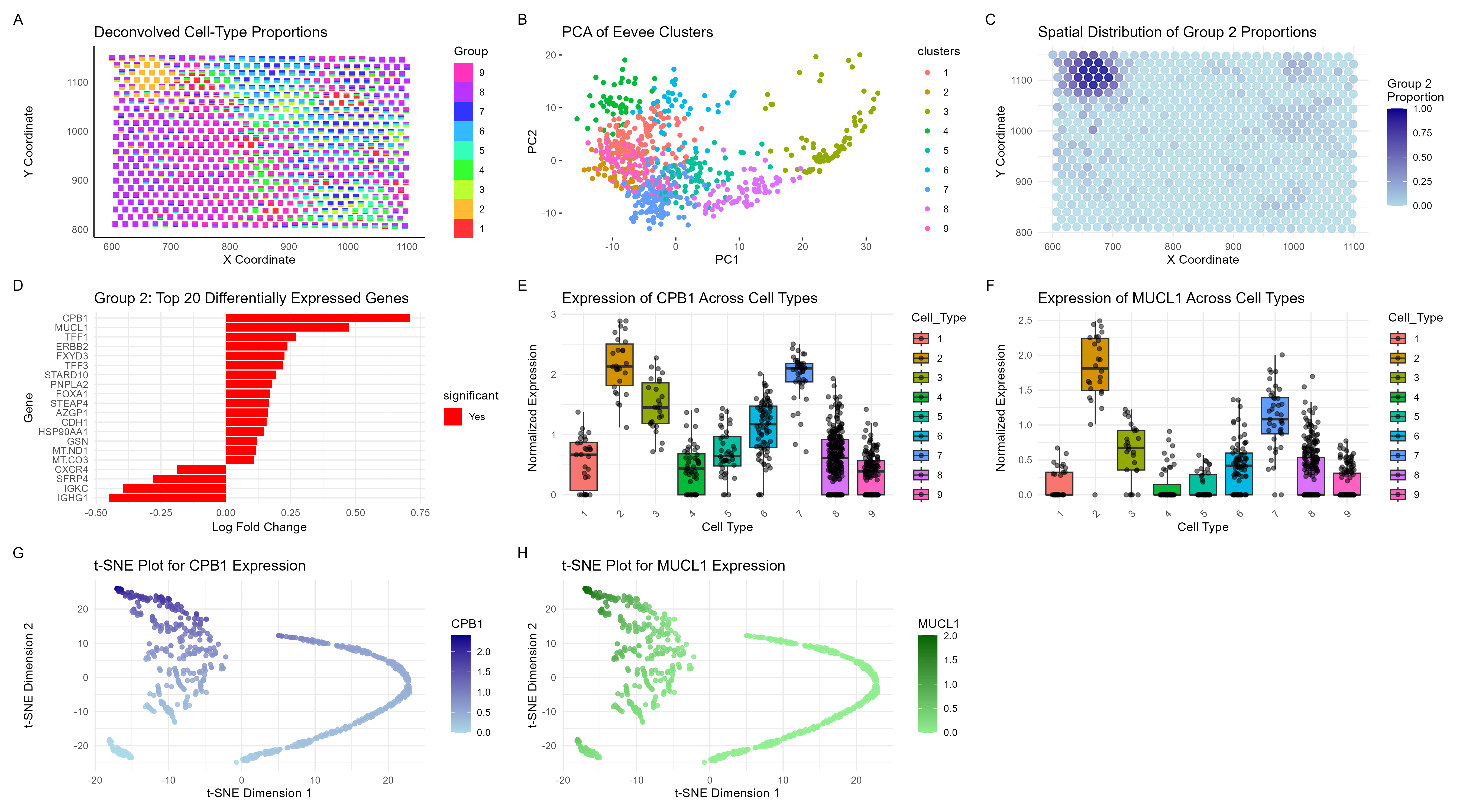
### Same as homework 4, I performed STdeconvolve on the Eevvee dataset to infer cell-type proportions and used K-means clustering (K=7) to analyze tissue organization. The scatterbar plot visualizes the...
Visualization Summary In this visualization, I analyzed the differences between linear and nonlinear dimensionality reduction to visualized cells in the eevee dataset. The animation transitions between Principal Component Analysis and...
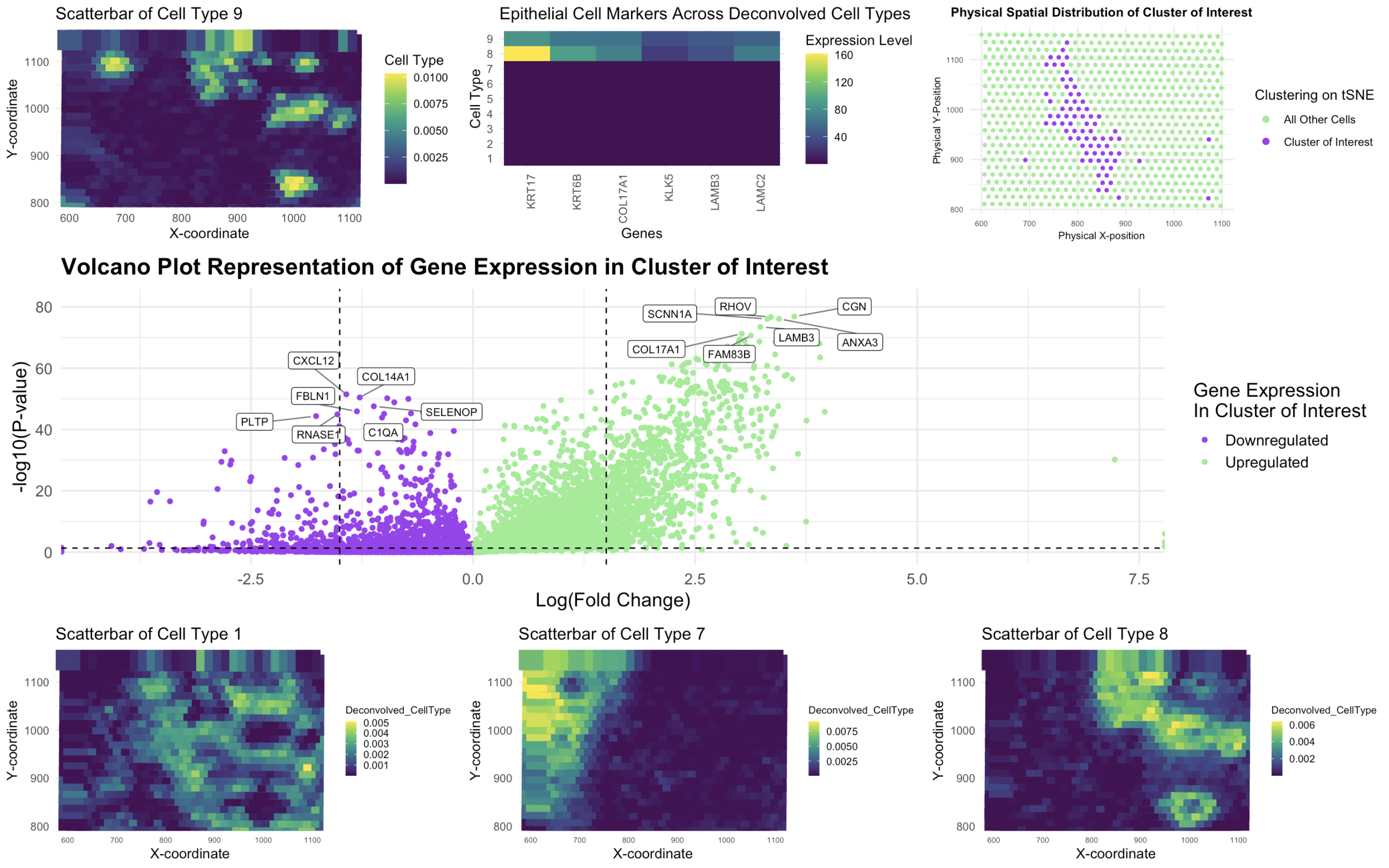
Visualization Summary In this visualization, I analyzed the eevee dataset for unique cell-types using deconvolution (through STdeconvolve) and visualized it using scatterbar. I found 9 distinct cell types (Figure A),...