Welcome
Welcome to the Course Website for EN.580.428 Genomic Data Visualization!
As the primary mode through which analysts and audience members alike consume data, data visualization remains an important hypothesis generating and analytical technique in data-driven research to facilitate new discoveries. However, if done poorly, data visualization can also mislead, bias, and slow down progress. This hands-on course will cover the principles of perception and cognition relevant for data visualization and apply these principles to genomic data, including large-scale single-cell and spatially-resolved omics datasets, using the R statistical programming language. Students will be expected to complete class readings, create weekly data visualizations as homework assignments, and make a major class presentation.
Course Information
Course Staff: Prof. Jean Fan and Caleb Hallinan
Lectures: 8:00am-9:50am Monday, Wednesday, and Friday. See Canvas for location details.
Office Hours: 10:00am-10:50am Monday, Wednesday, and by request. See Canvas for location details.
Course Details
☞ see Course tabFeatured Visualizations
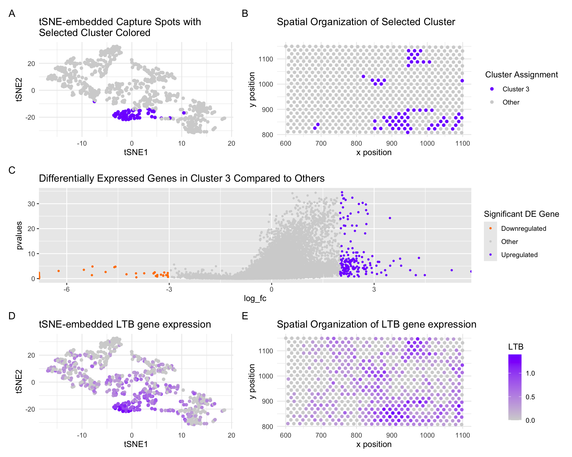
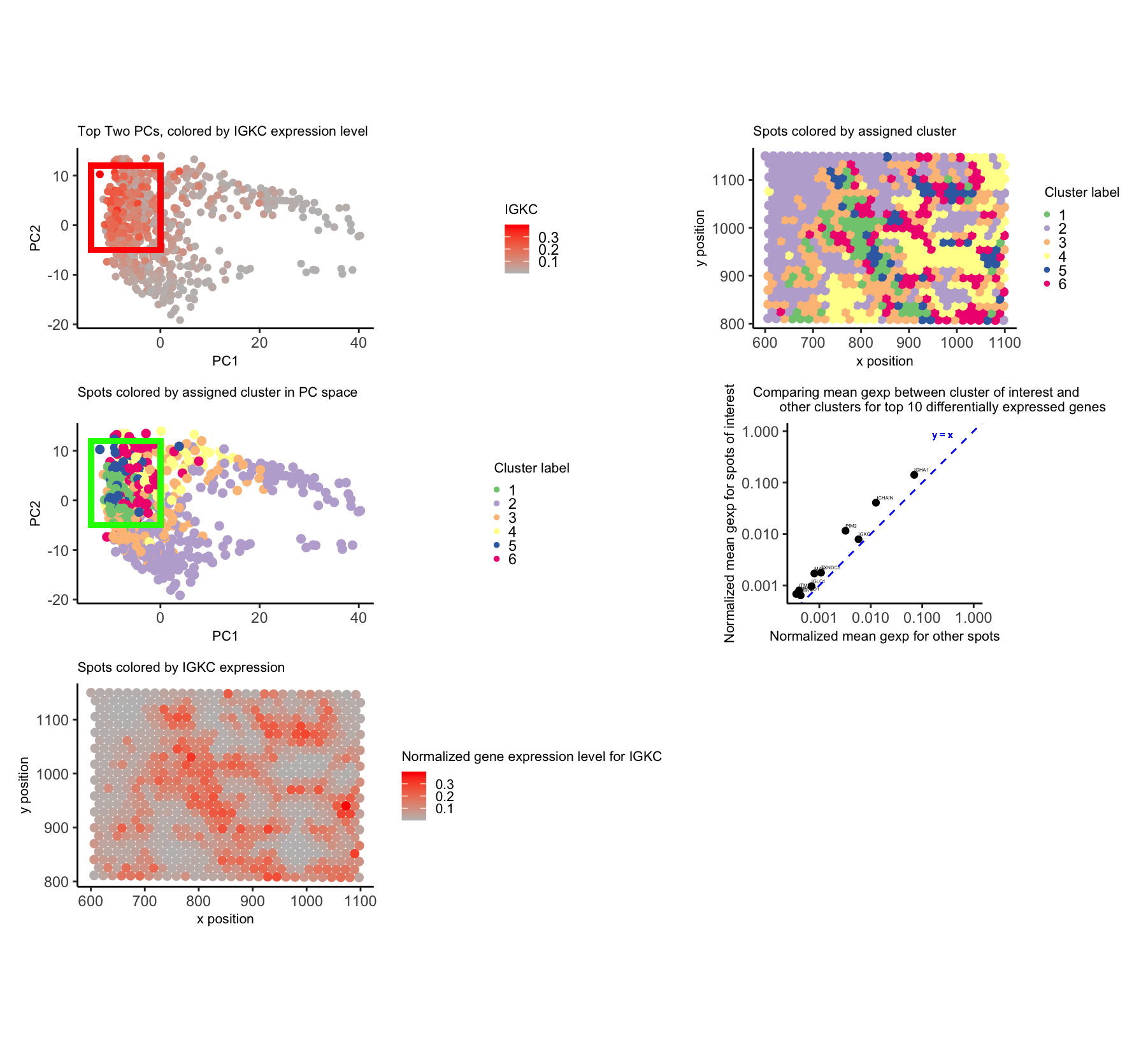
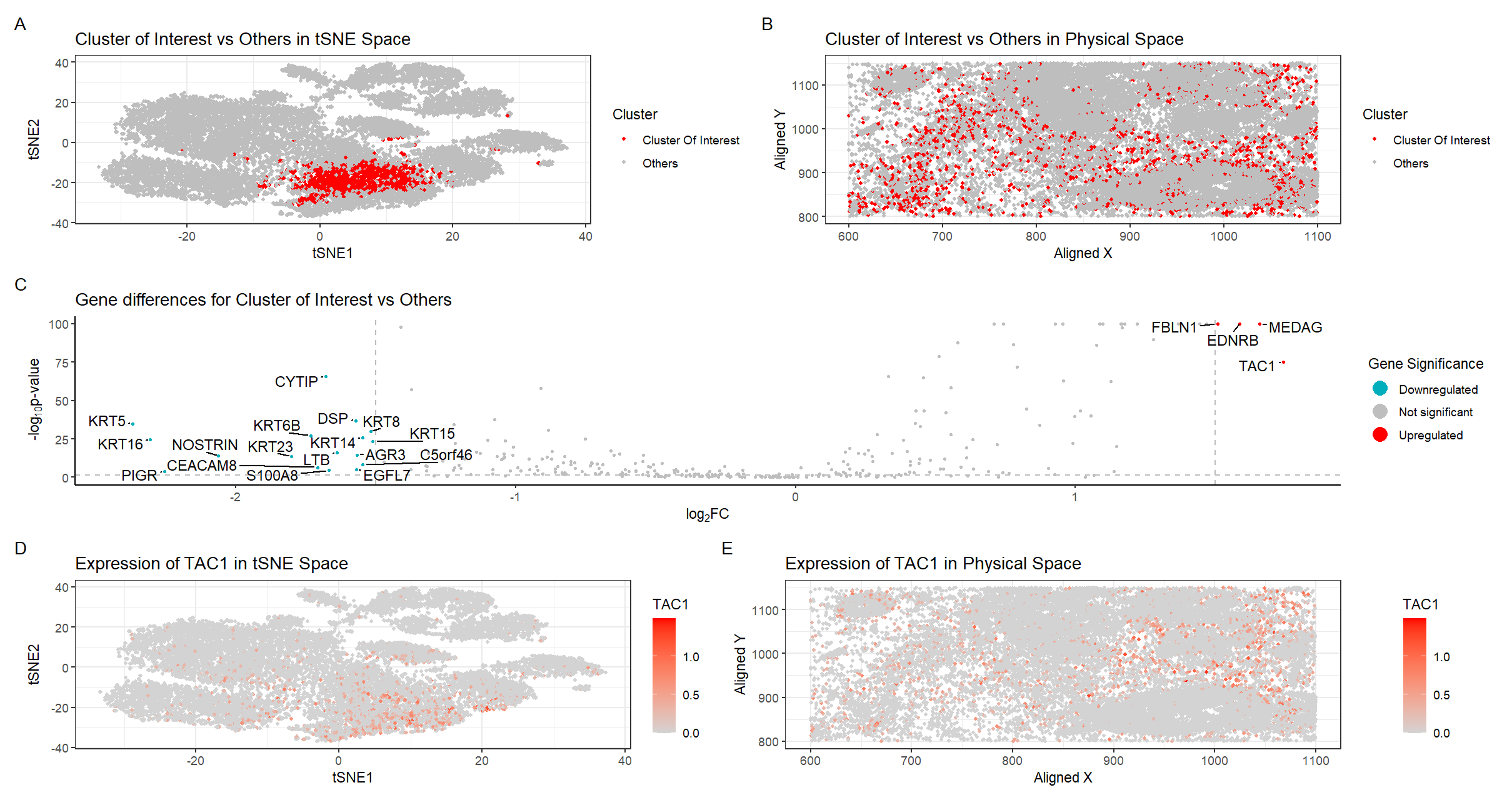
Interrogating Spatial Spot Cluster Differential Gene Expression with 10x Visium
In these panels, I am depicting the representation of a 10x visium dataset in latent tSNE-embedded space and over the original spatial slide coordinates. I...

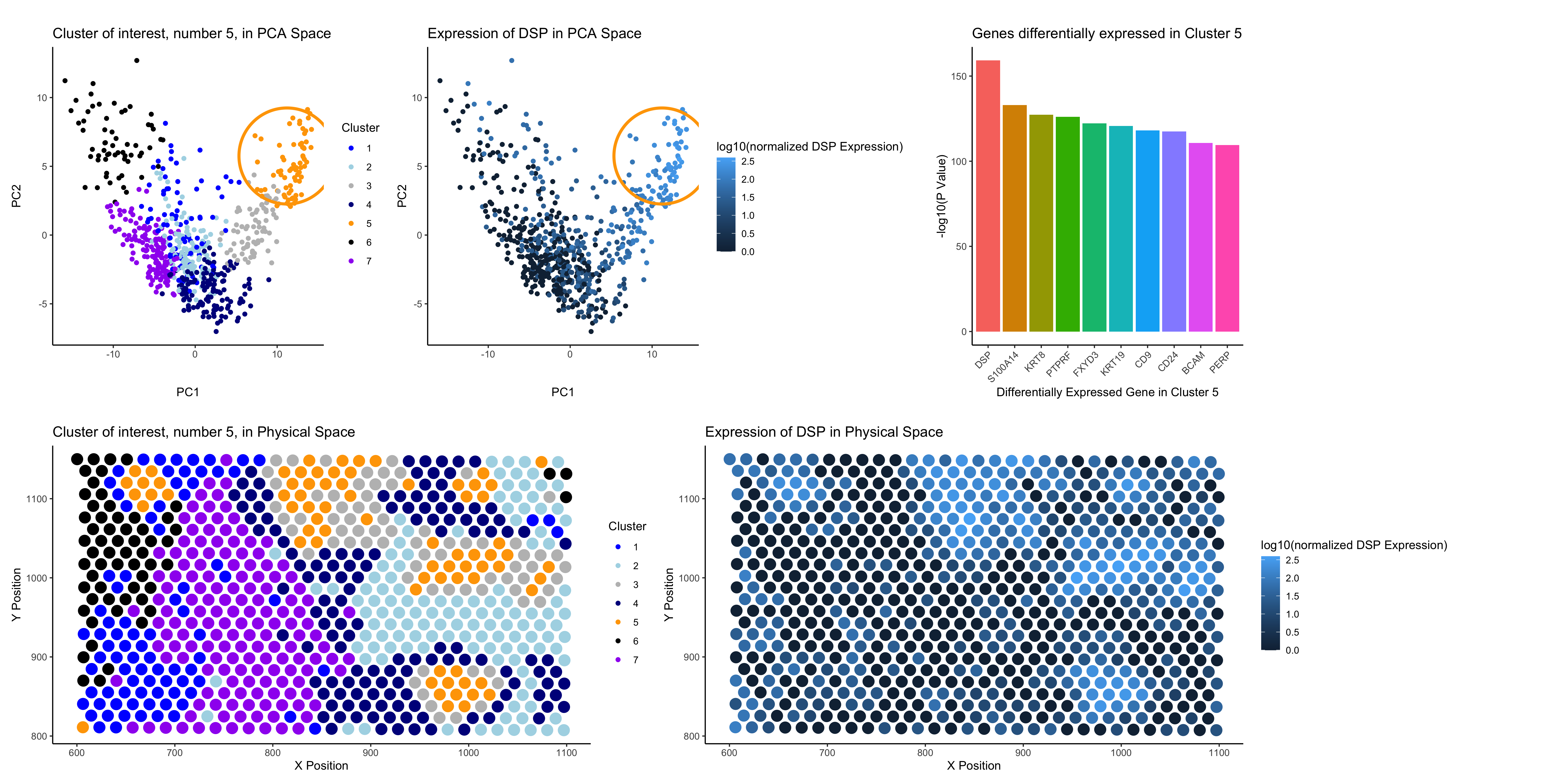
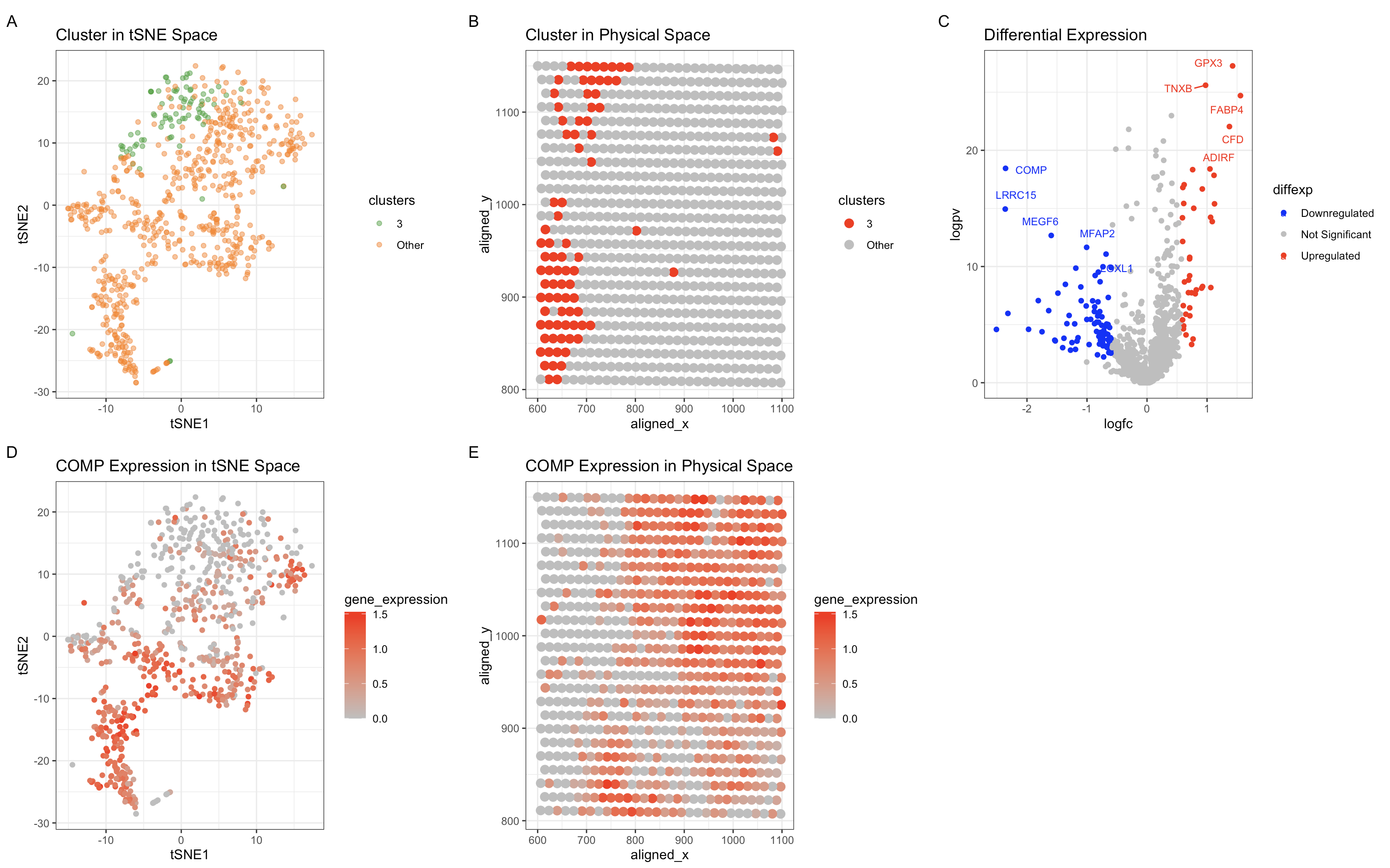
Identifying a Cluster of Breast Granular Cells
In the top left of my figure, I am depicting both my clusters made by kmeans clustering with k=7 in PCA space (with my cluster...

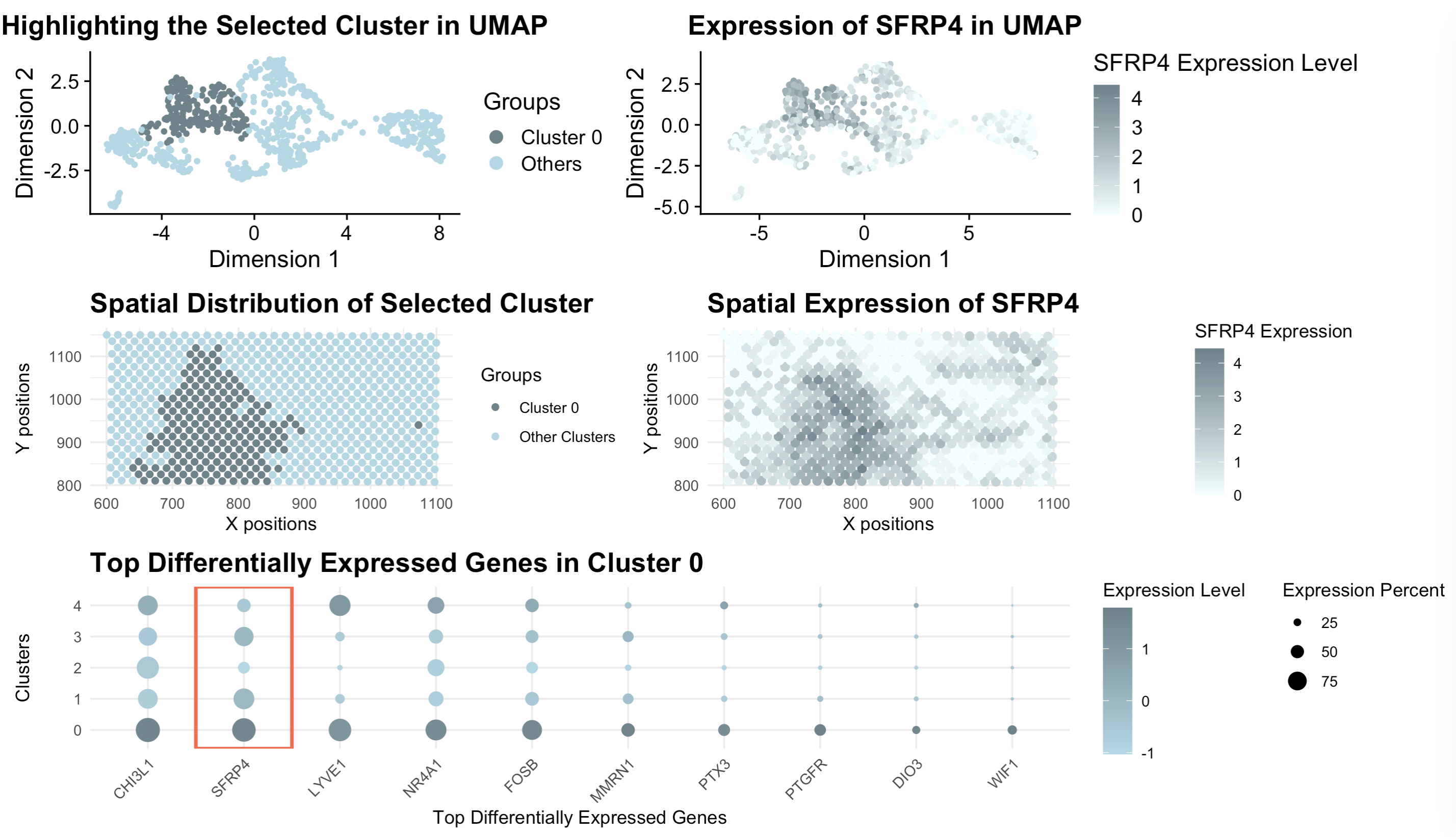
Homework 3: Differentially Expressed Genes analysis
[description] Those panels present a comprehensive visualization of Cluster 0 and its association with the gene SFRP4 through a combination of UMAP, spatial, and gene...

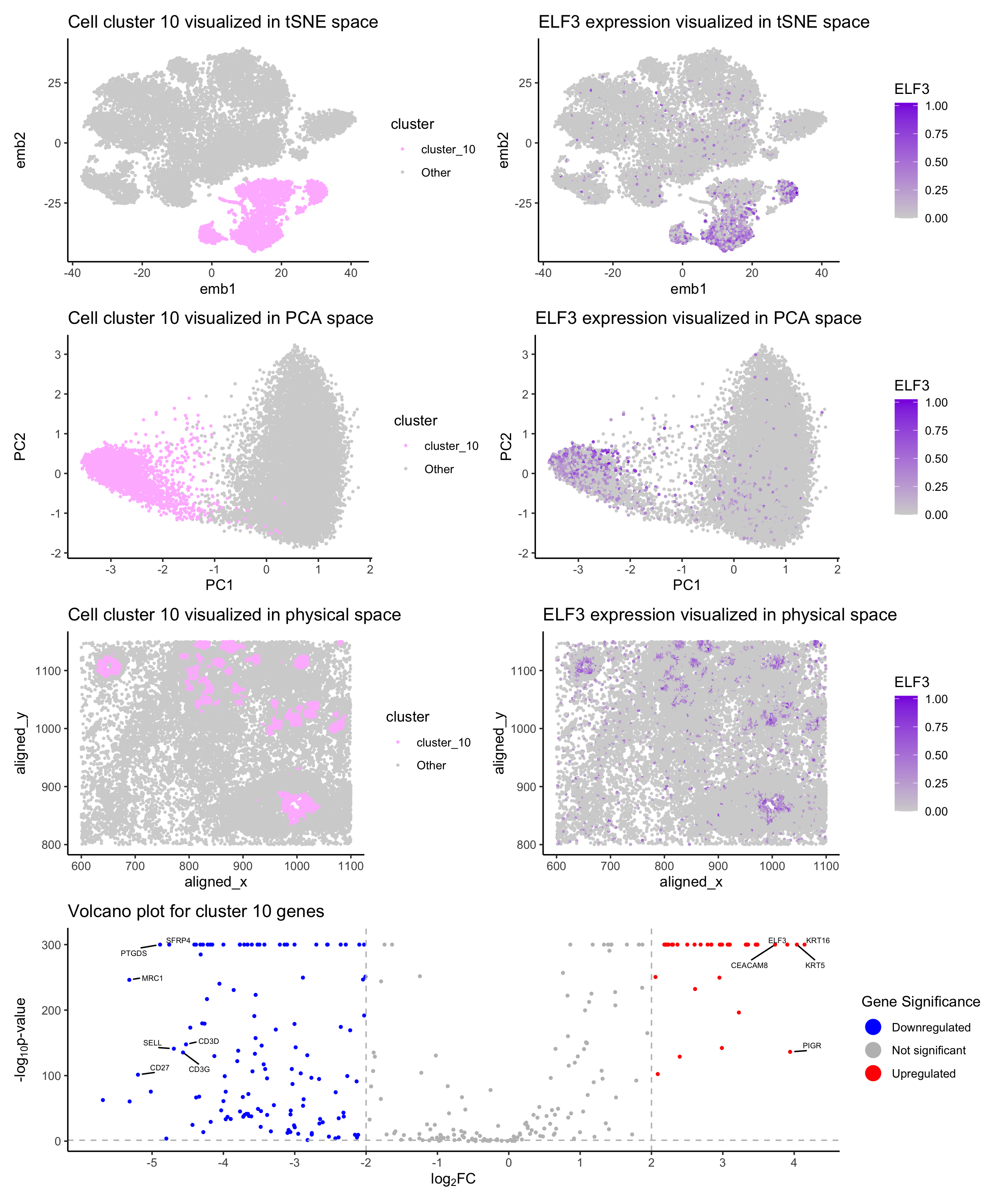
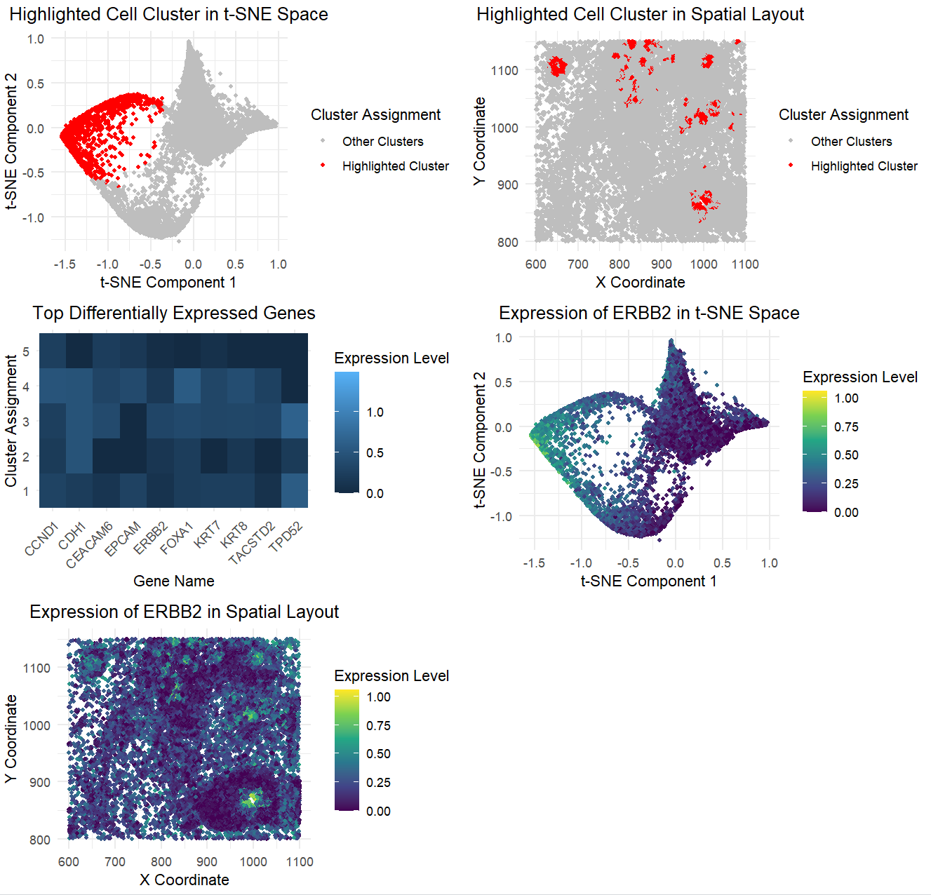
Spatial Transcriptomics Reveals a Distinct Epithelial Cell Population Defined by ELF3 Expression: A Multi-Dimensional Analysis of the Cluster in Interest
1. Describe your figure briefly so we know what you are depicting. Write a description to convince me that your cluster interpretation is correct.

Homework 2 submission
[description] In my visualization, I use points as the geometric primitive, angle and color for visual channel. The x-axis represents the PCA loadings for each...

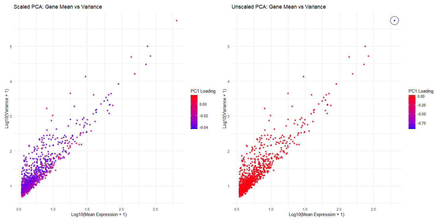
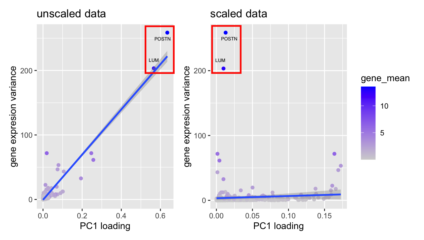
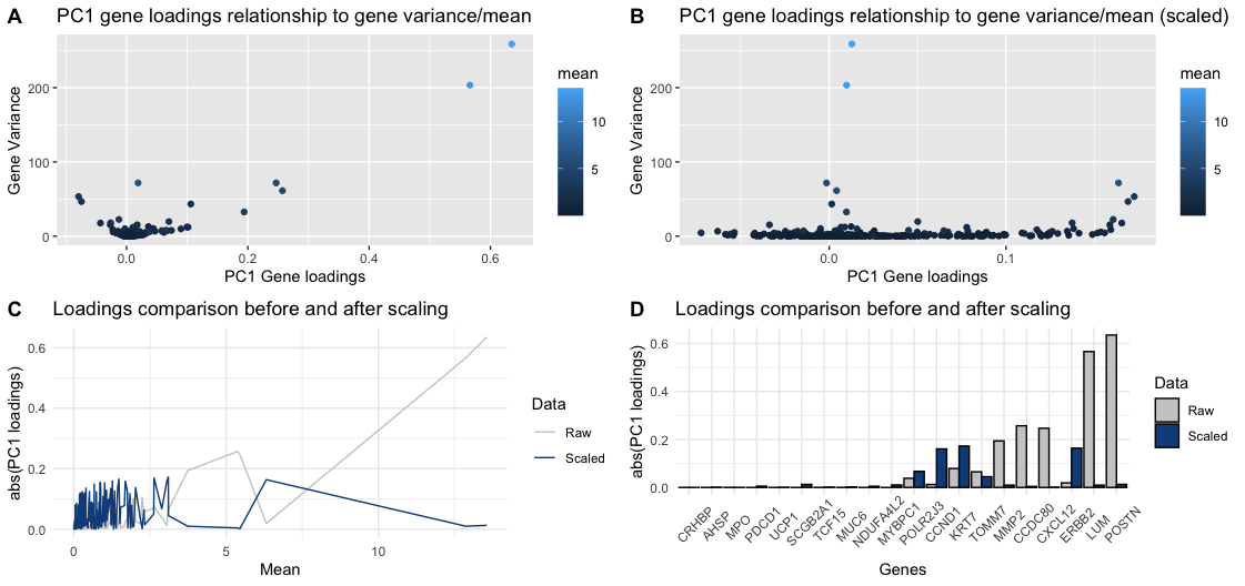
Comparison of Scaled and Unscaled PCA: Gene Mean Expression, Variance, and PC1 Loadings
1. What data types are you visualizing? I am visualizing quantitative data, which includes log-transformed mean expression (x-axis), log-transformed variance (y-axis), and PC1 loading values...

Dimensionality Reduction using PCA
Homework 2

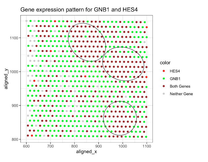
HW1: Gene expression pattern for GNB1 and HES4
1. What data types are you visualizing? I am visualizing HES4 and GNB1’s spatial gene expression patterns for eevee.

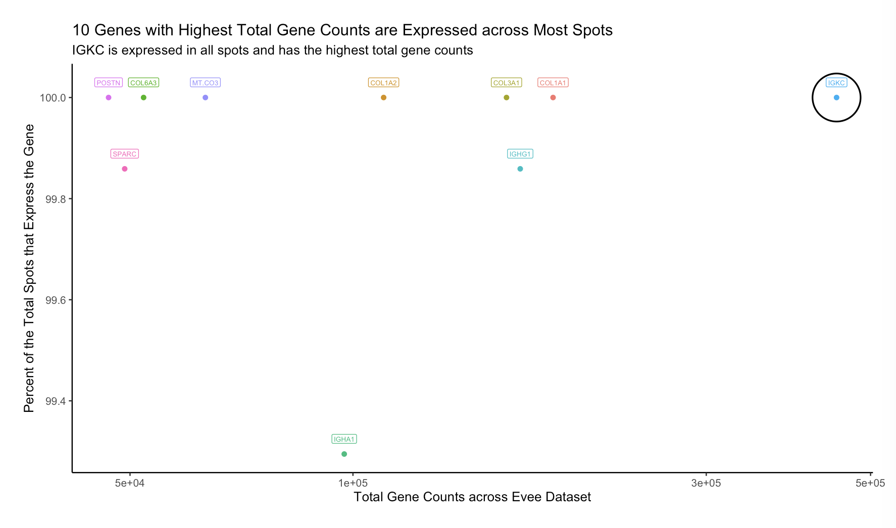
10 Genes with the Highest Counts are Expressed Across Most Spots
1. What data types are you visualizing? For this data visualization of the Eevee spatial transcriptomic data, I visualized both categorical data, the 10 genes...
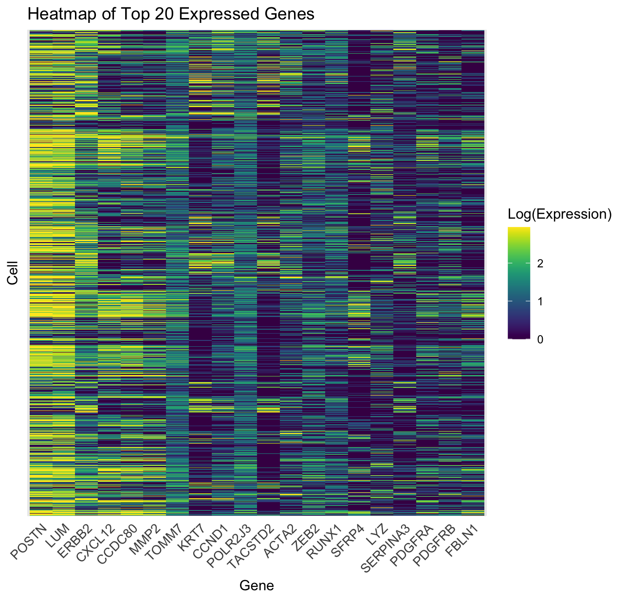
Generation of Heatmap Expressing Top 20 Genes Within Pikachu Dataset
1. What data types are you visualizing? Within the Pikachu dataset that was visualized, gene expression levels across multiple individual cells proved to be a...

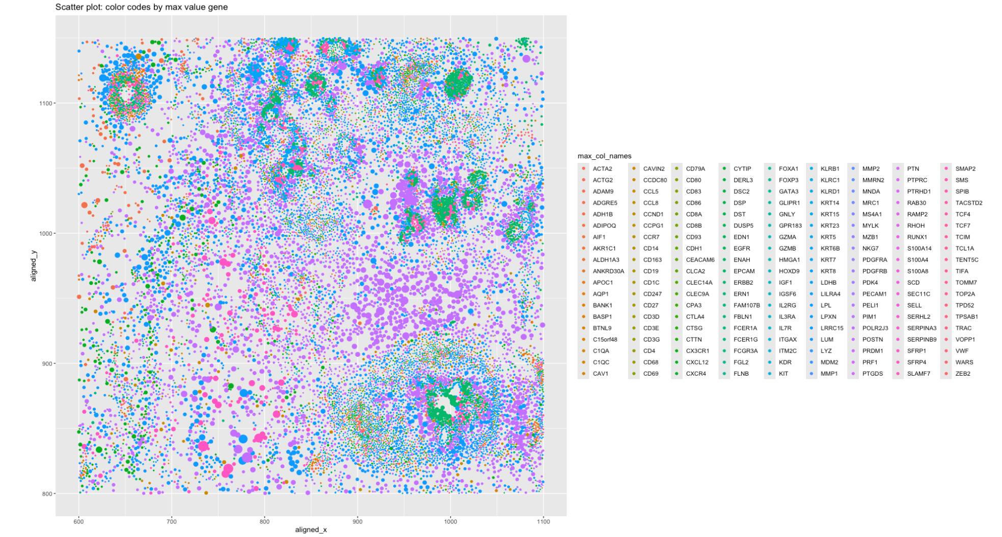
HW1: gene expression scatterplot
1. What data types are you visualizing? Spatial data of each cell, i.e the location of the cell within the section of the image, which...

All Visualizations
Visualization of potential B cell populations in the Eevee sequencing data
To begin, I normalized by gene expression values by the total counts and subsequently performed PCA. I used a scree plot to verify that PCs 1 and 2 encapsulated much...

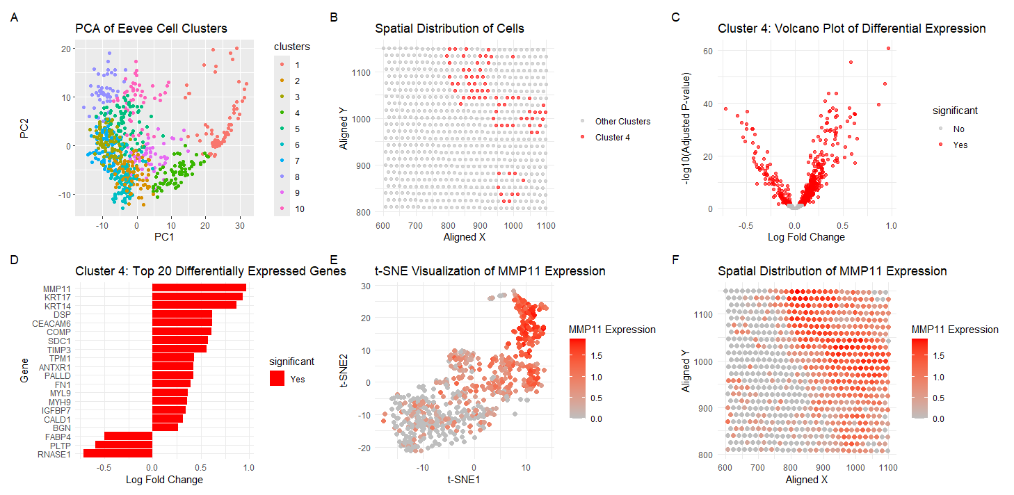
Analyzing MMP11 Gene Expression
Visualization Summary In this visualization, I am analyzing the Eevee sequencing spatial transcriptomics dataset. The 1000 most highly expressed genes were normalized, log-transformed, and clustered (K = 10). To understand...

Interrogating Spatial Spot Cluster Differential Gene Expression with 10x Visium
In these panels, I am depicting the representation of a 10x visium dataset in latent tSNE-embedded space and over the original spatial slide coordinates. I select a cluster based on...
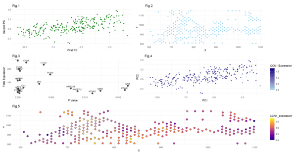
HW3 Data Exploration - Cluster 3 and CCN1 Gene
In the first figure, I have visualized cluster 3 in the PCA space by plotting the first and second principal components (quantitative data). I have used points to do so,...


Locating fibroblasts in breast tissue using spatial transcriptomics data
Describe your figure briefly so we know what you are depicting (you no longer need to use precise data visualization terms as you have been doing). There are five plots...

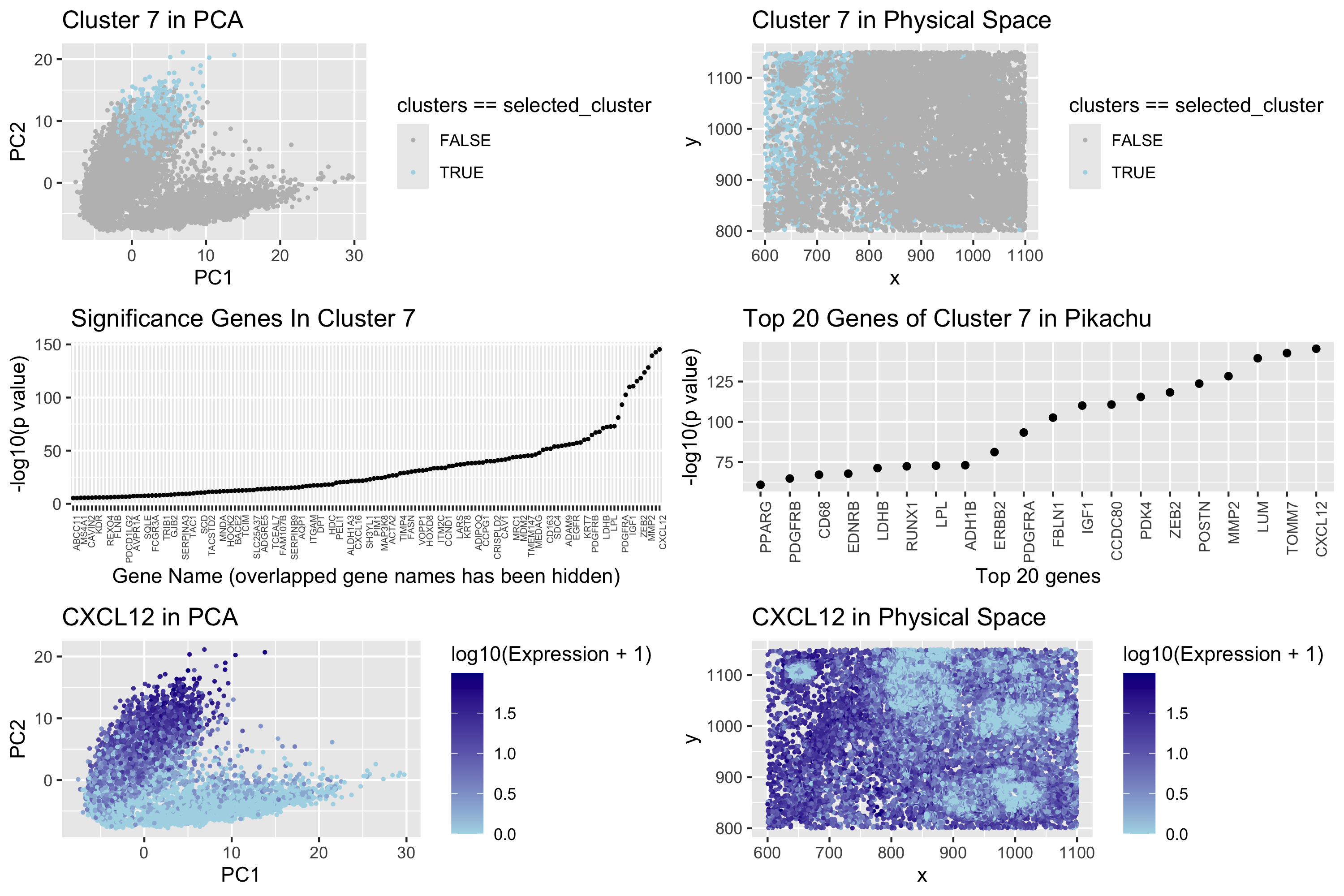
Spatial and Transcriptomic Characterization of a Fibroblast-to-Adipocyte Transition Cell Population
Describe your figure briefly so we know what you are depicting (you no longer need to use precise data visualization terms as you have been doing).

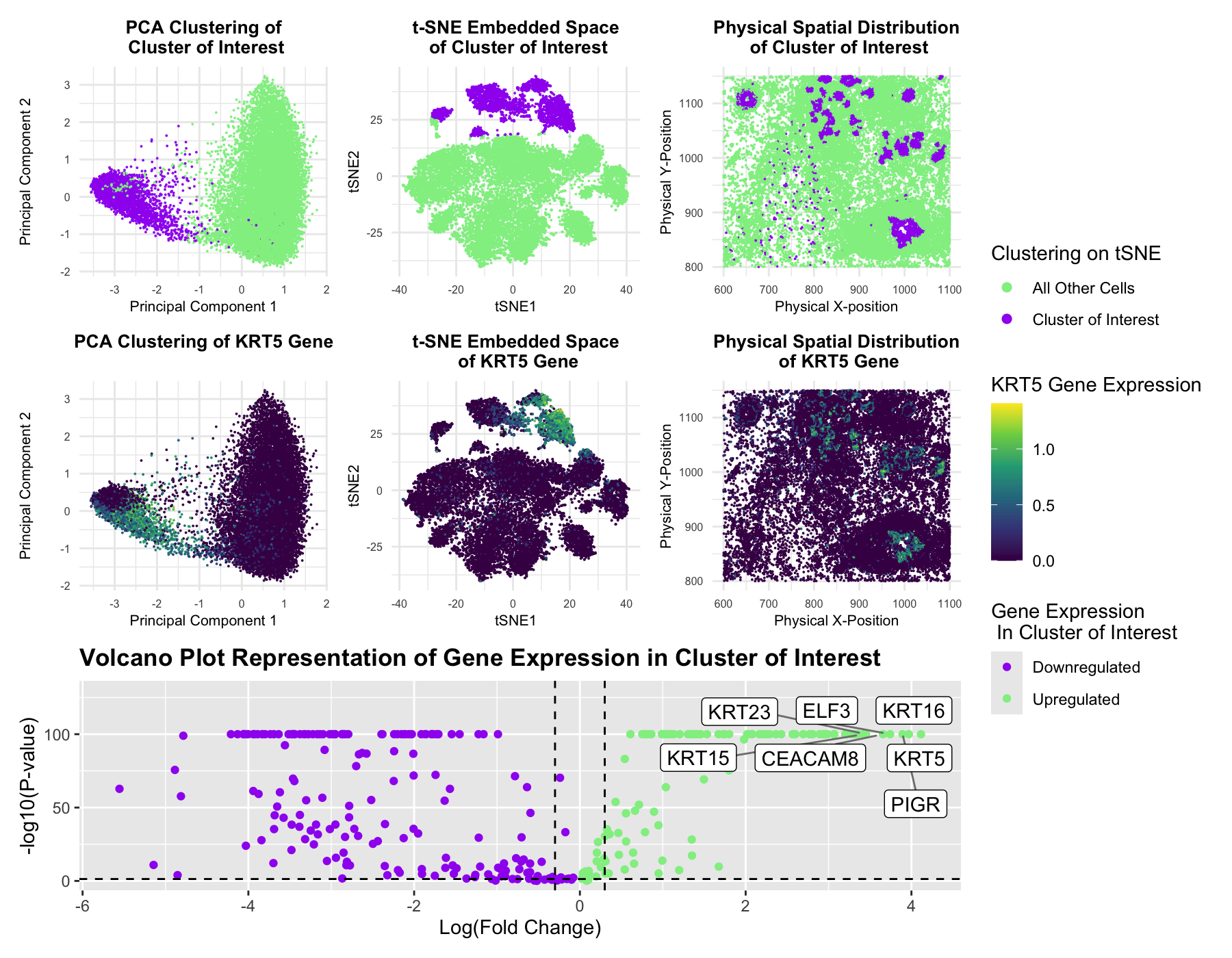
Multi-Panel Data Visualization of Transcriptionally Distinct Cluster
The figure presents a comprehensive analysis of a specific cell cluster, showcasing its position in a 2D space, spatial distribution, and gene expression profile. It also highlights the top differentially...

Multi-Panel Data Visualization of Epithelial Cell Cluster in Pikachu Dataset
This figure presents an analysis of cellular clusters within the dataset, focusing on the identification and characterization of a biologically relevant cluster using k-means clustering, dimensionality reduction techniques (PCA and...
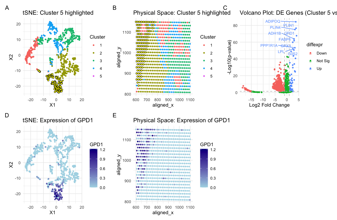
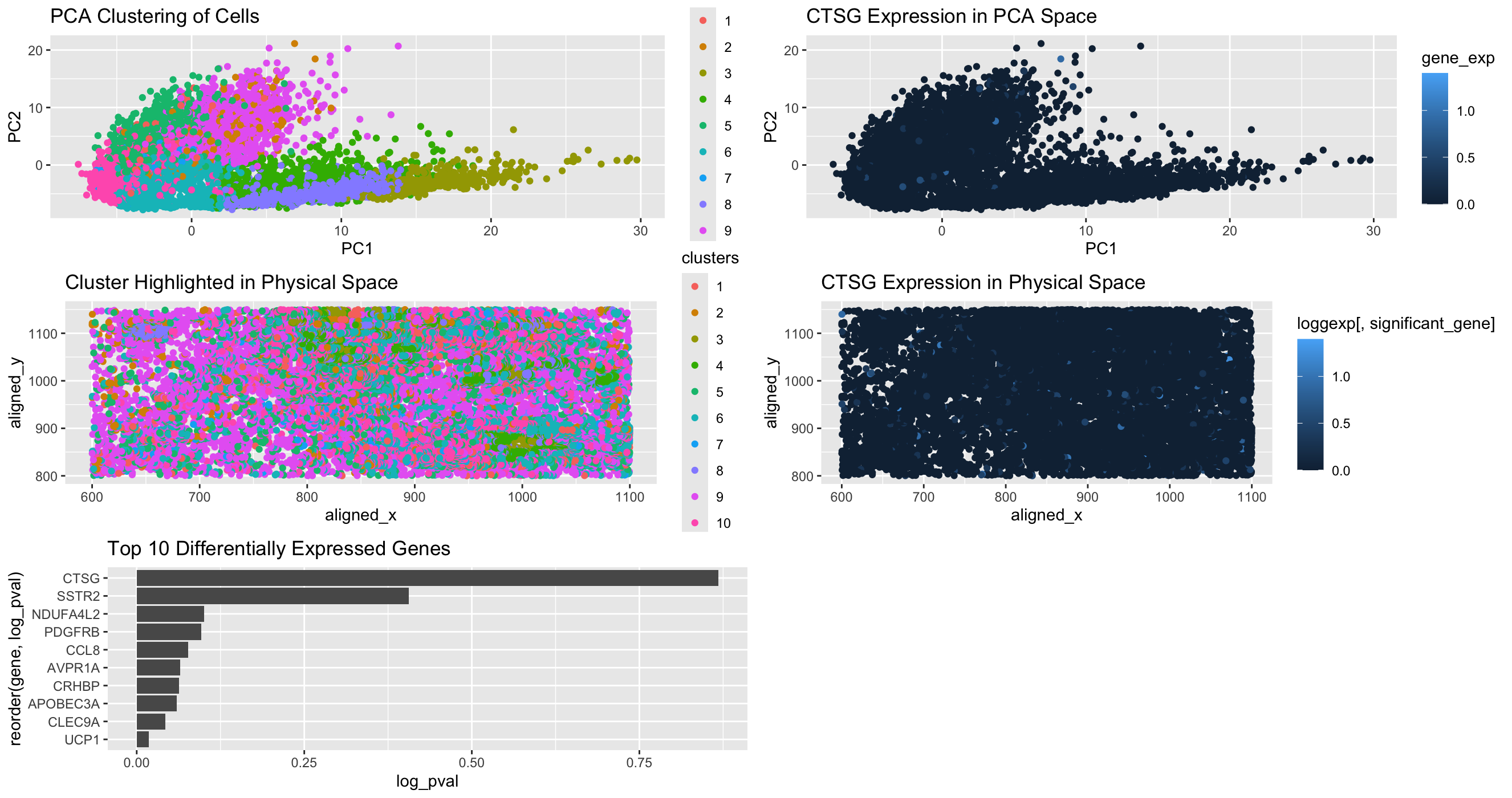
Analysis of Cell Type in Breast Cancer Tissue
Based on my clustering analysis and differential expression testing, I identified GPD1 (Glycerol-3-Phosphate Dehydrogenase 1) as the most upregulated gene in Cluster 5, distinguishing it from all other clusters. The...

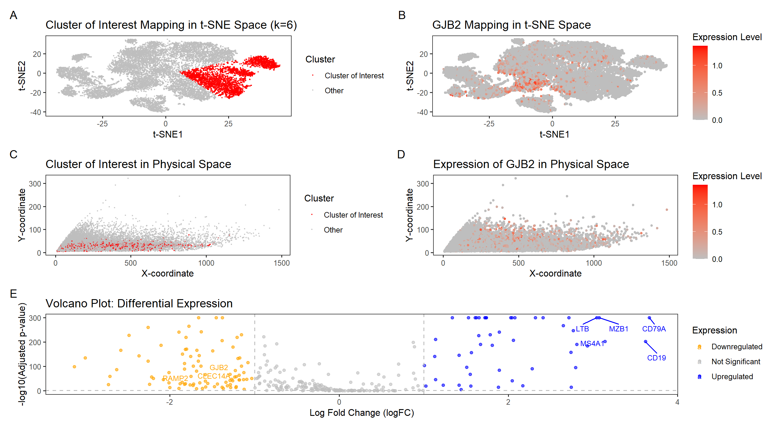
Exploring GJB2 Expression in Breast Cancer Tissue Through Data Visualization
This visualization examines the expression of GJB2 (Gap Junction Protein Beta 2), a gene associated with intercellular communication and epithelial differentiation, within a breast tissue sample. GJB2 encodes connexin 26,...