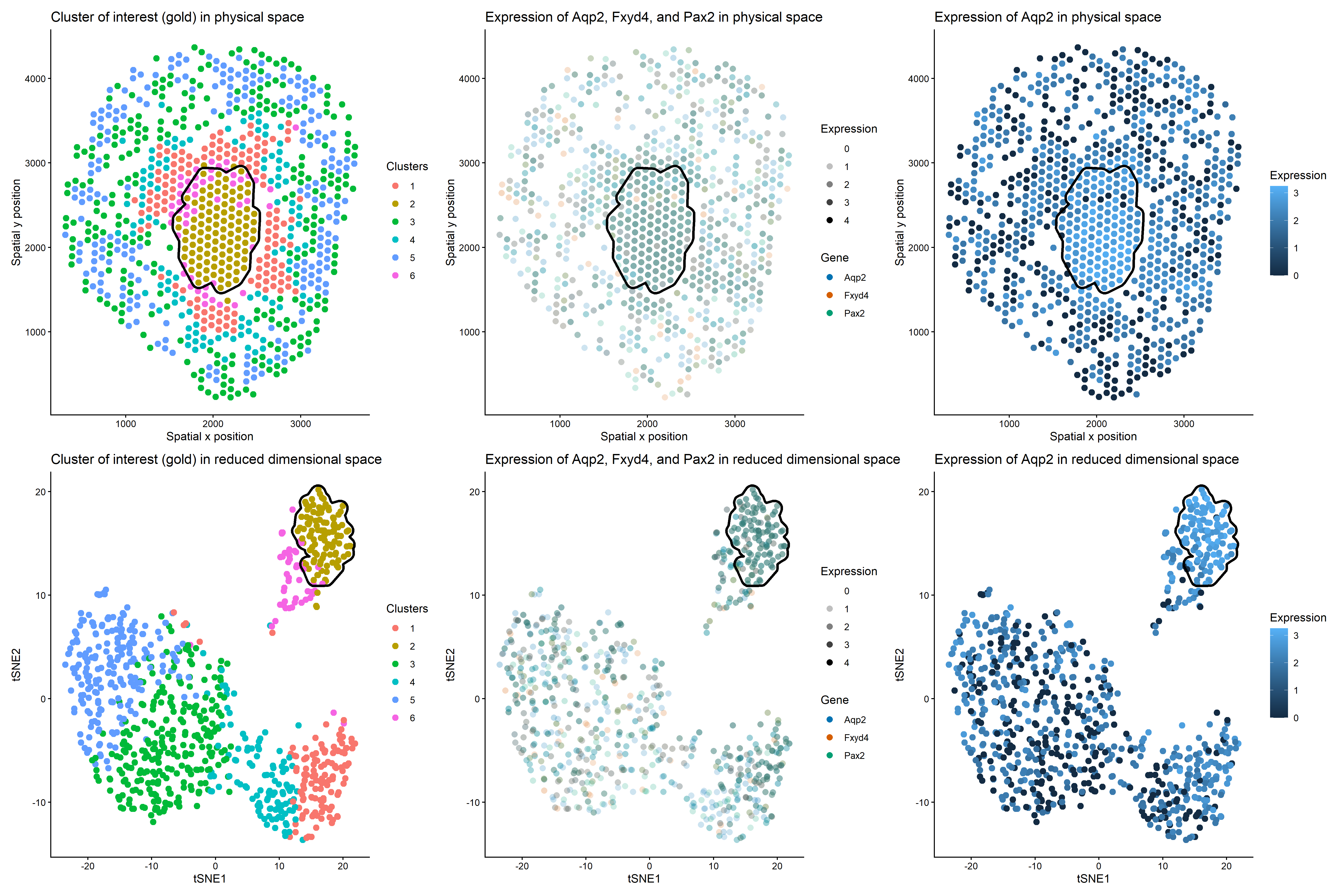
Discussion For the previous homework assignments, I was using the Xenium dataset. For this assignment, I switched to the Visium dataset. To identify the same cell type that I found...
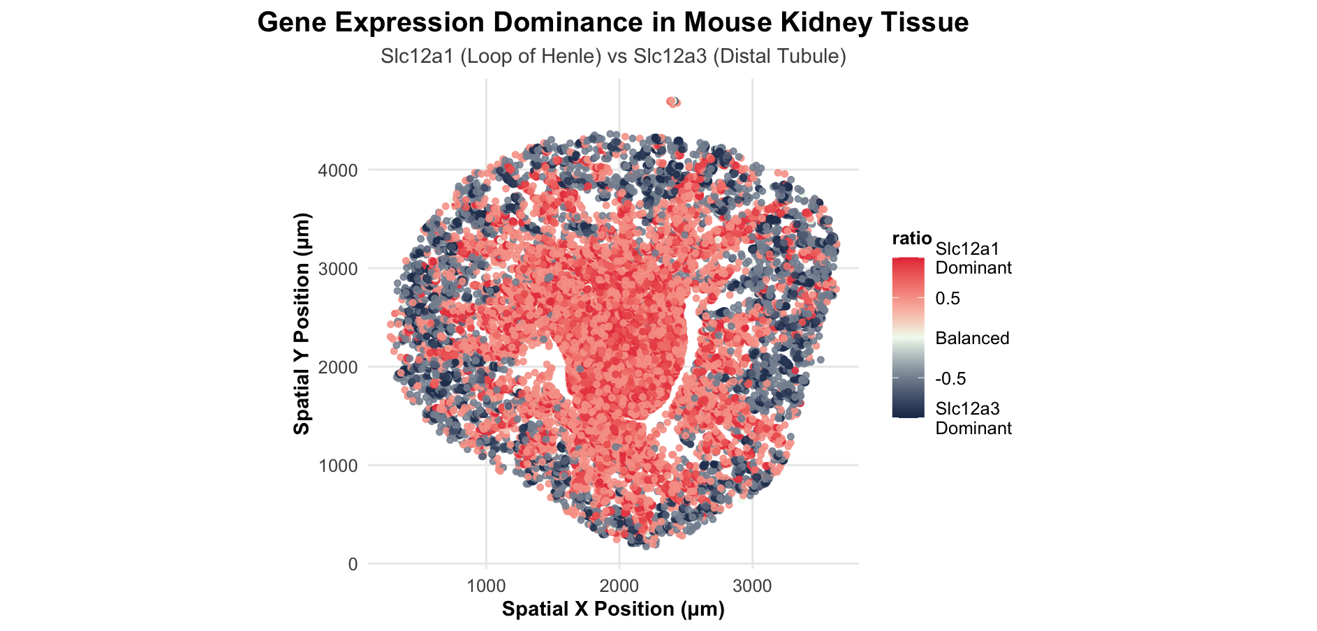
1. What data types are you visualizing? Categorical- Gene type Aqp1, Slc34a1 (in the second plot) Quantitative data- Expression levels of genes Aqp1 and Slc34a1 in each cell The euclidean...
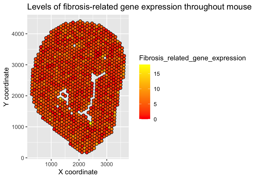
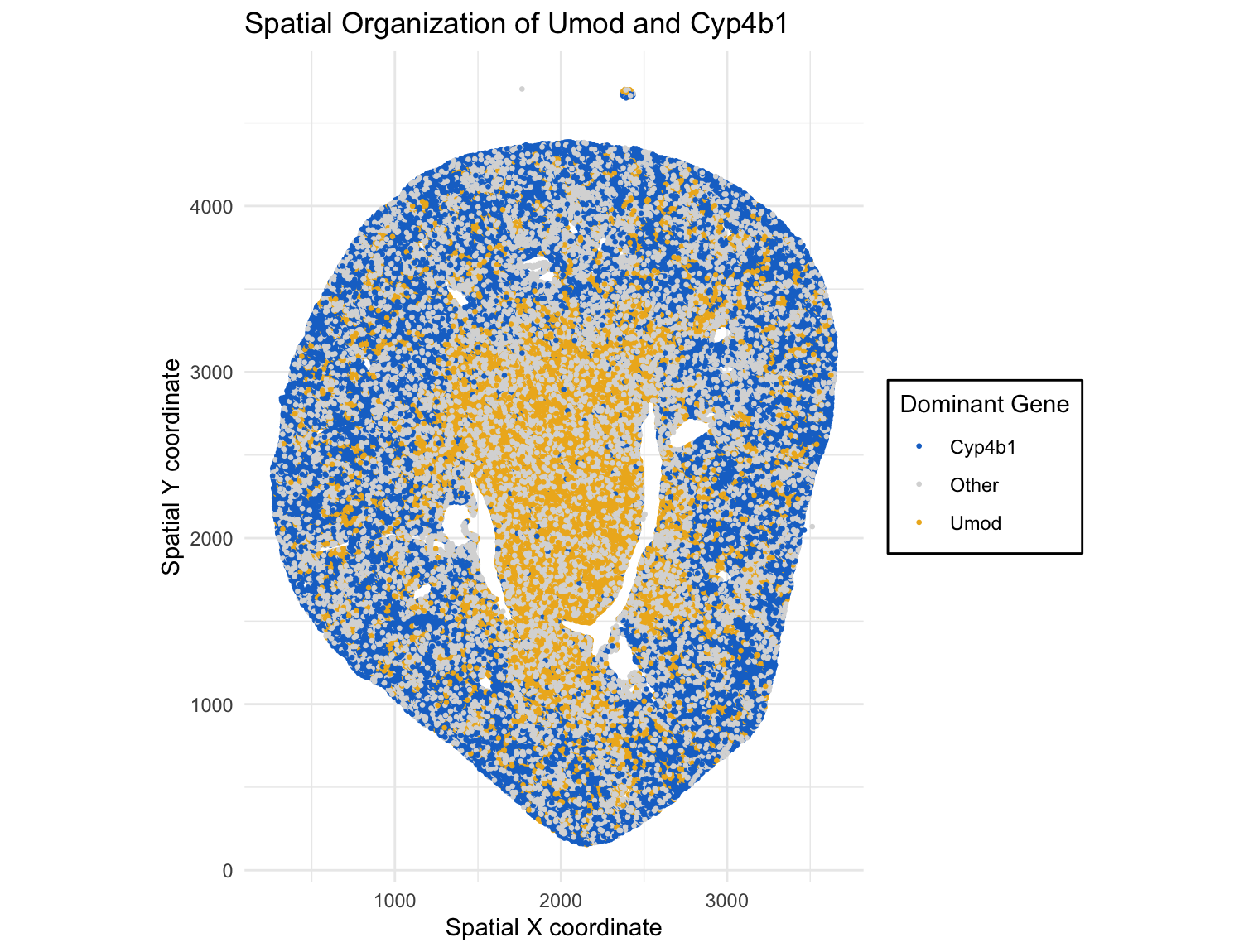
1. What about the data would you like to make salient through this data visualization? I wanted to make the total level of fibrosis-related gene expression for each spot apparent...
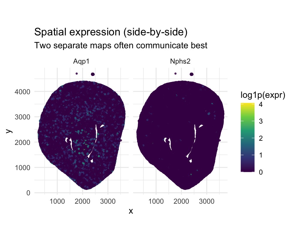
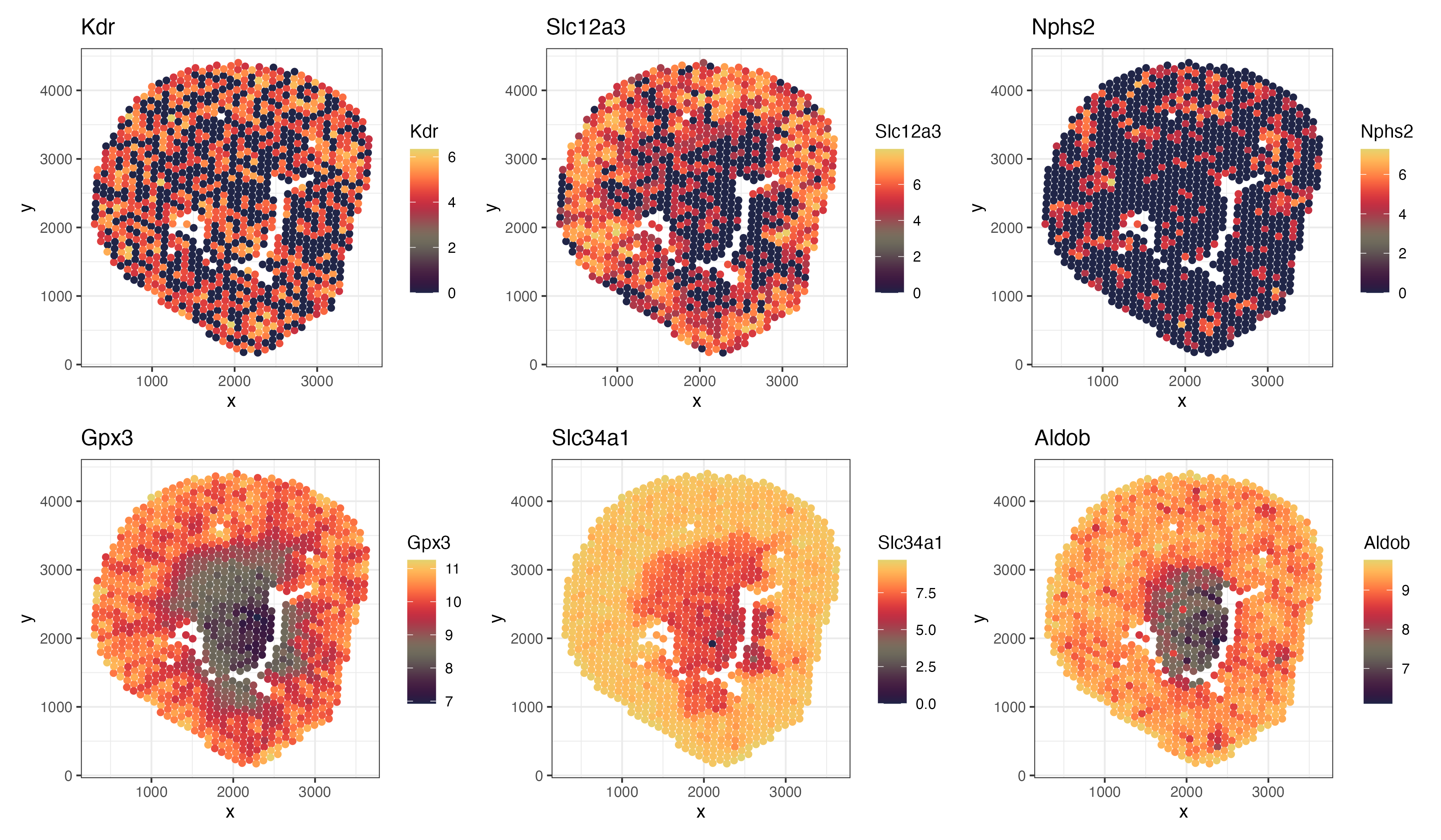
1. What about the data would you like to make salient? The visualization is designed to make spatial differences in gene expression patterns salient. By placing Aqp1 and Nphs2 in...
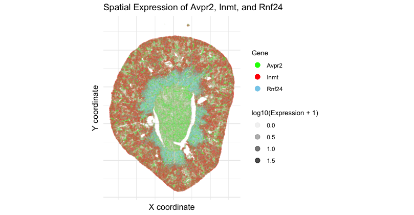
1. What data types are you visualizing? I am visualizing 3 data types. First, categorical data of 3 genes: Avpr2, Inmt, and Rnf24. Second, spatial data regarding the x and...
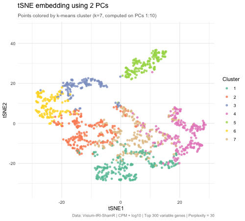
1. What data types are you visualizing? I would like to make salient the spatial distribution of gene expression within the sham tissue, emphasizing how expression of biologically relevant genes...
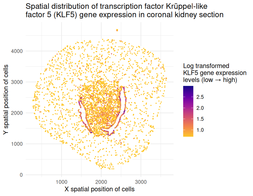
1. What data types are you visualizing? The represented data type is quantitative (x and y spatial positions of cells as well as levels of KLF5 gene expression on the...
1. What data types are you visualizing?
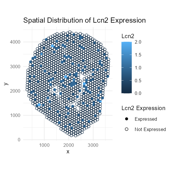
This visualization comprises categorical data for the gene marker and quantitative data for the expression values.
1. What data types are you visualizing? I’m visualizing both quantitative and categorical data. The original dataset contains quantitative data (the x and y coordinates) for each spot in the...
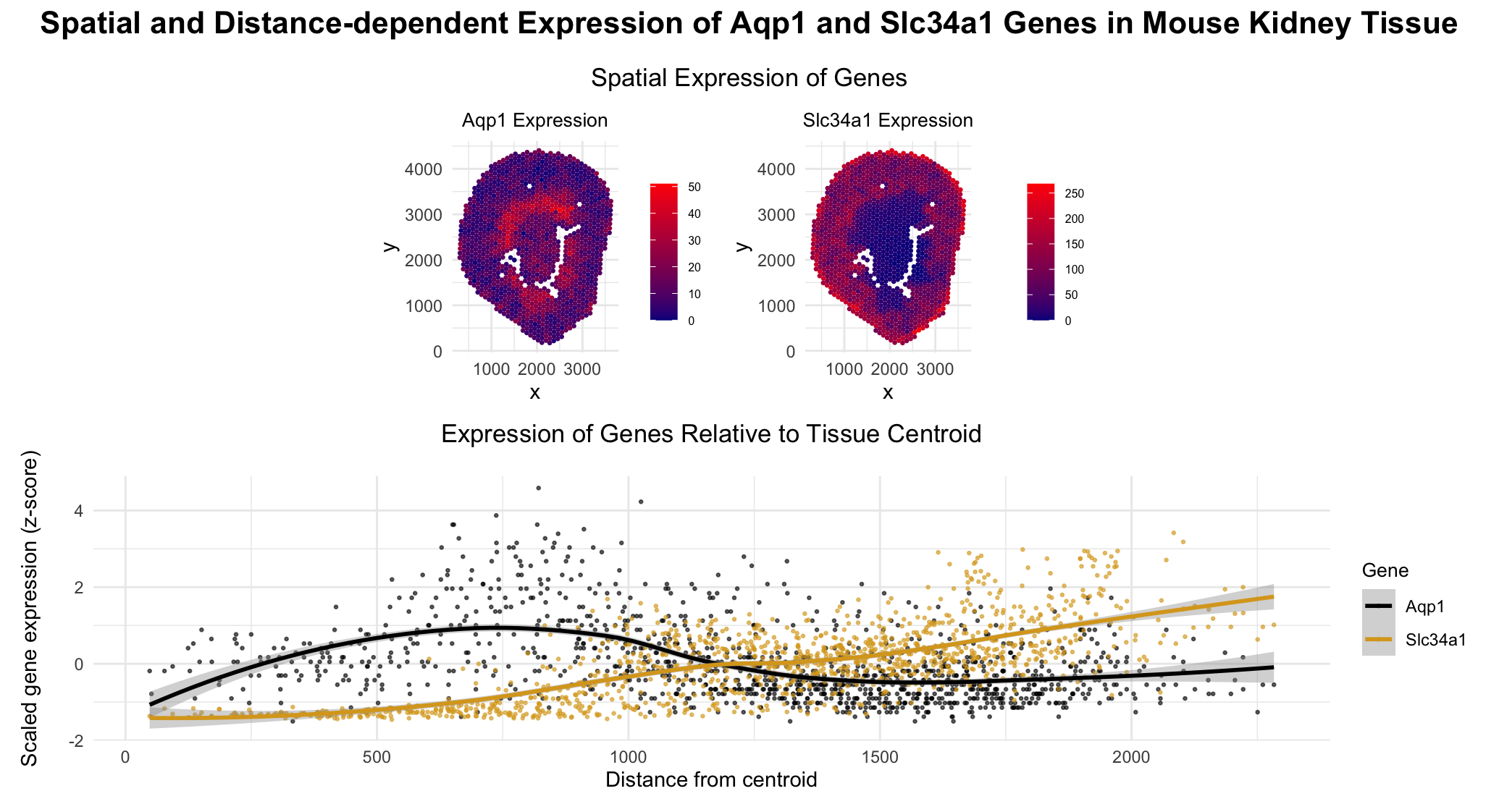
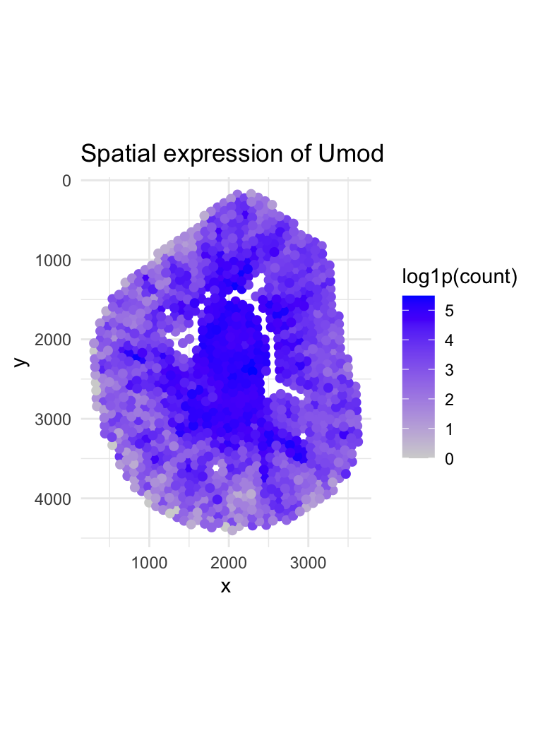
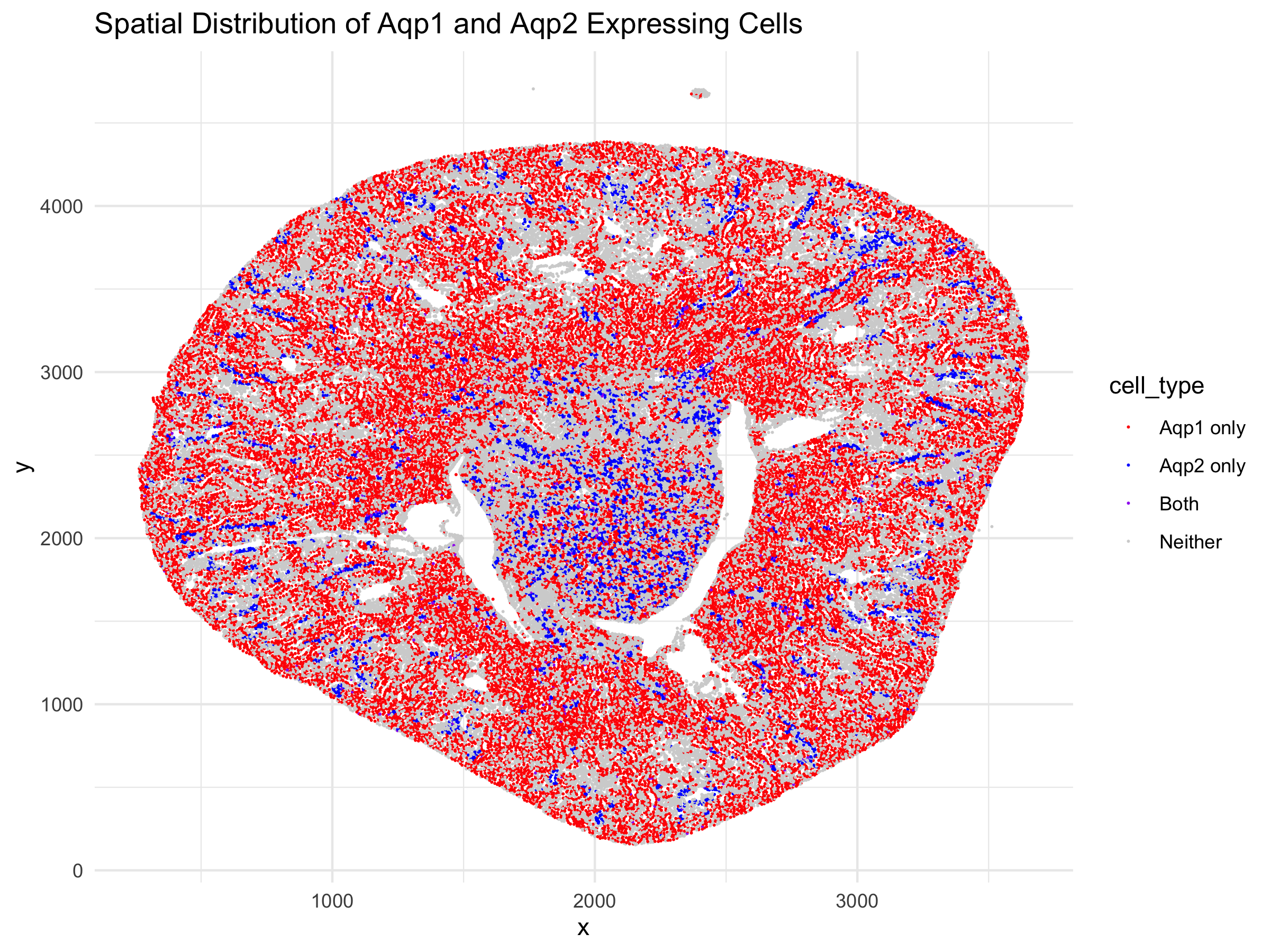
1. What are the data types represented? I am visualizing the cells in a kidney tissue cross section that contain the genes for two water channels, Aqp1 and Aqp2. I...
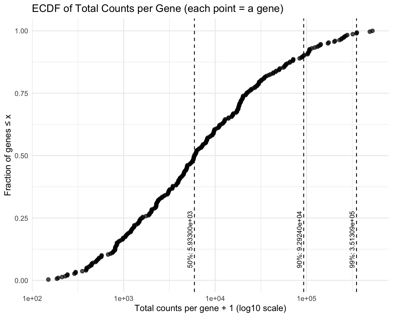
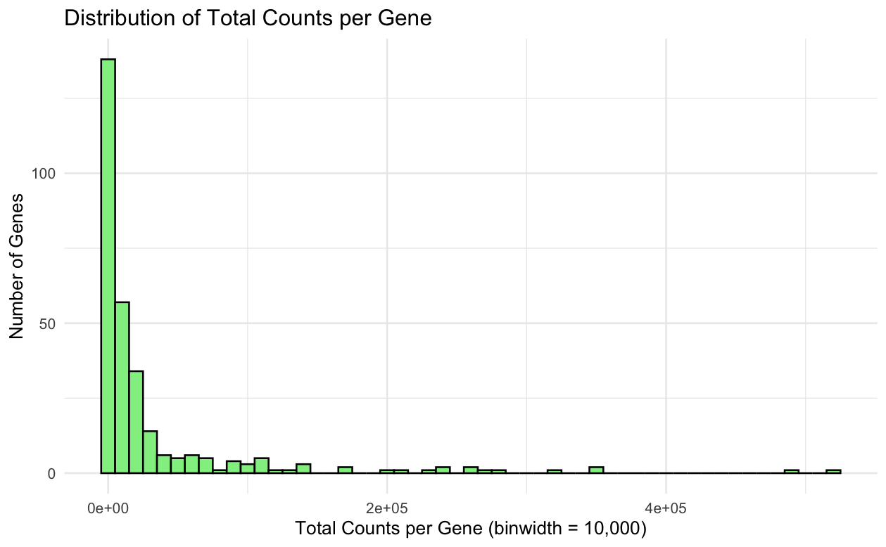
1. What data types are you visualizing? I am visualizing quantitative gene expression count data (non-negative integer counts), specifically the total counts per gene aggregated across all spatial locations/cells. 2....
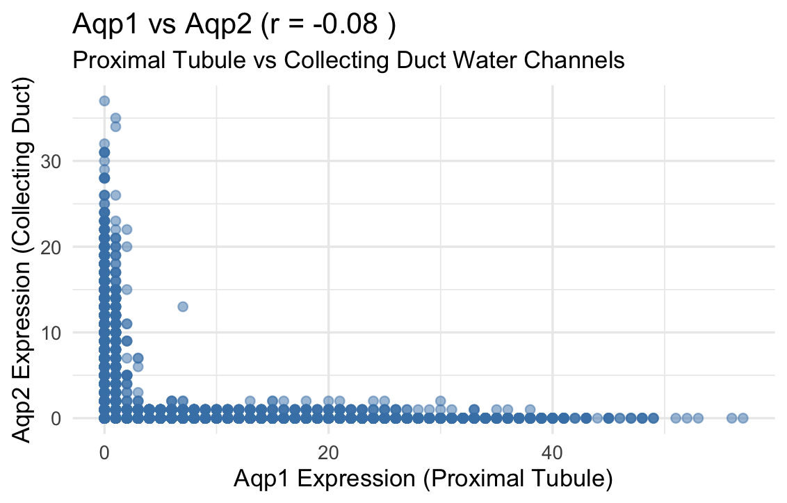
1. What data types are you visualizing? I am visualizing quantitative data representing the expression levels of two genes, Aqp1 and Aqp2, for individual cells. Categorical data is the 2...
1. What data types are you visualizing? I’m visualizing quantitative gene expression values for multiple genes across quantitative spatial coordinates (x, y) for each visium spot. The gene expression values...
1. What data types are you visualizing? I am visualizing spatial data and quantitative data in this plot. The spatial data consists of the X and Y coordinates in micrometers...
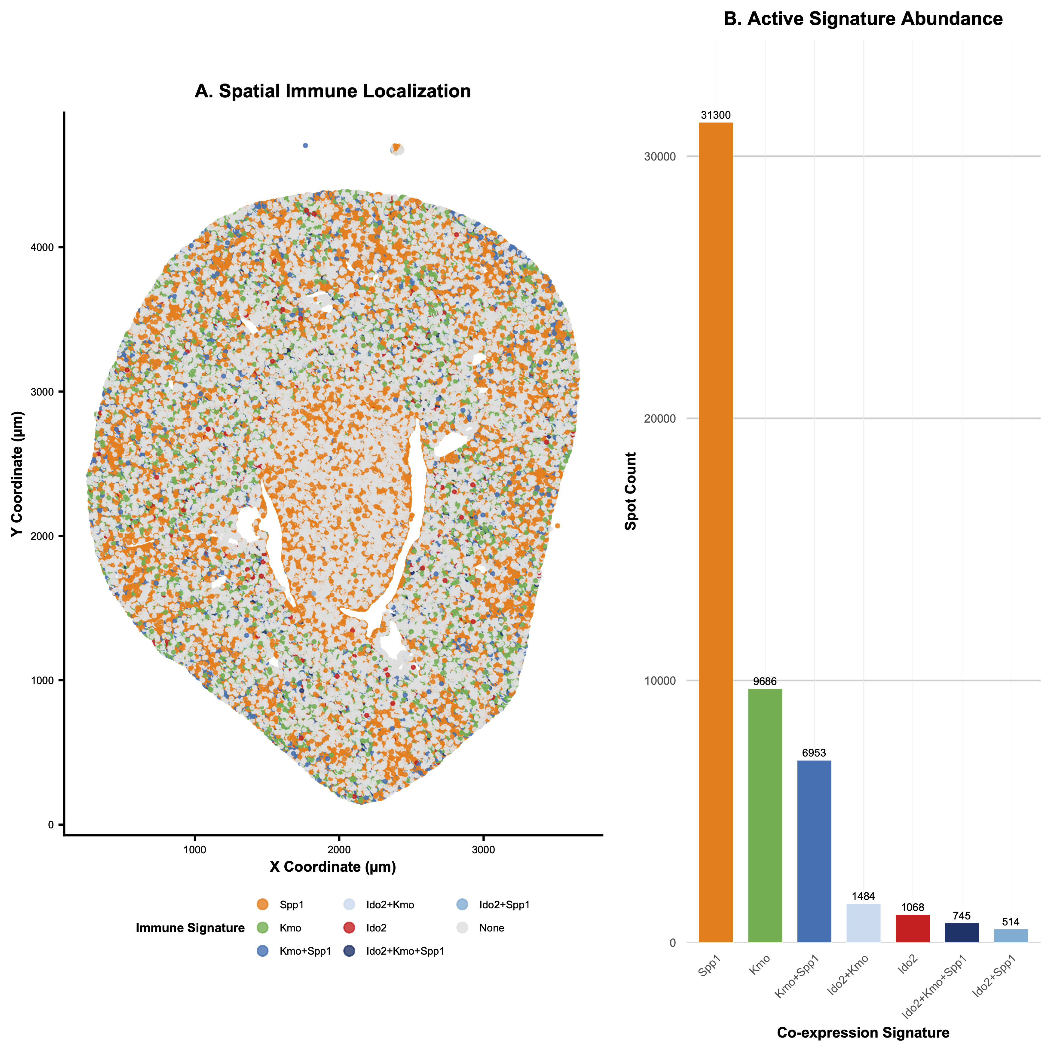
1. What data types are you visualizing? Categorical - each of the three genes and their respective overlaps are split into categories. Quantitative - the spot count for each gene...
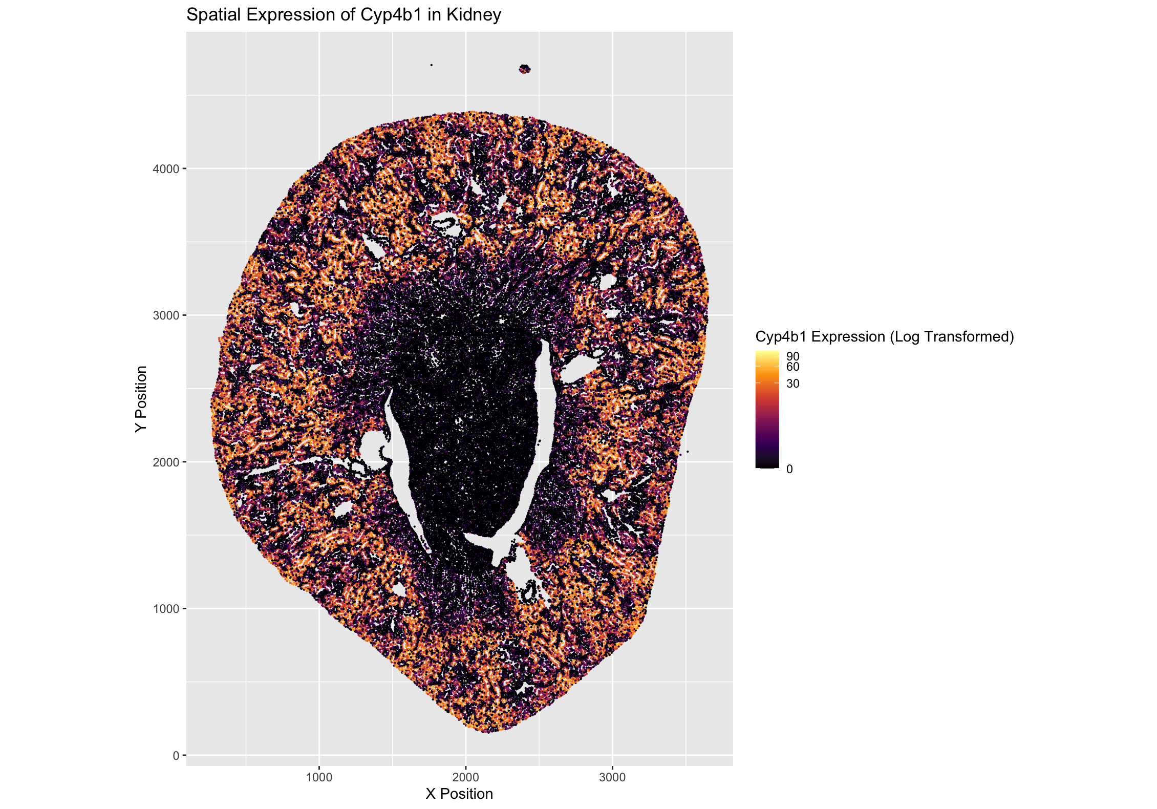
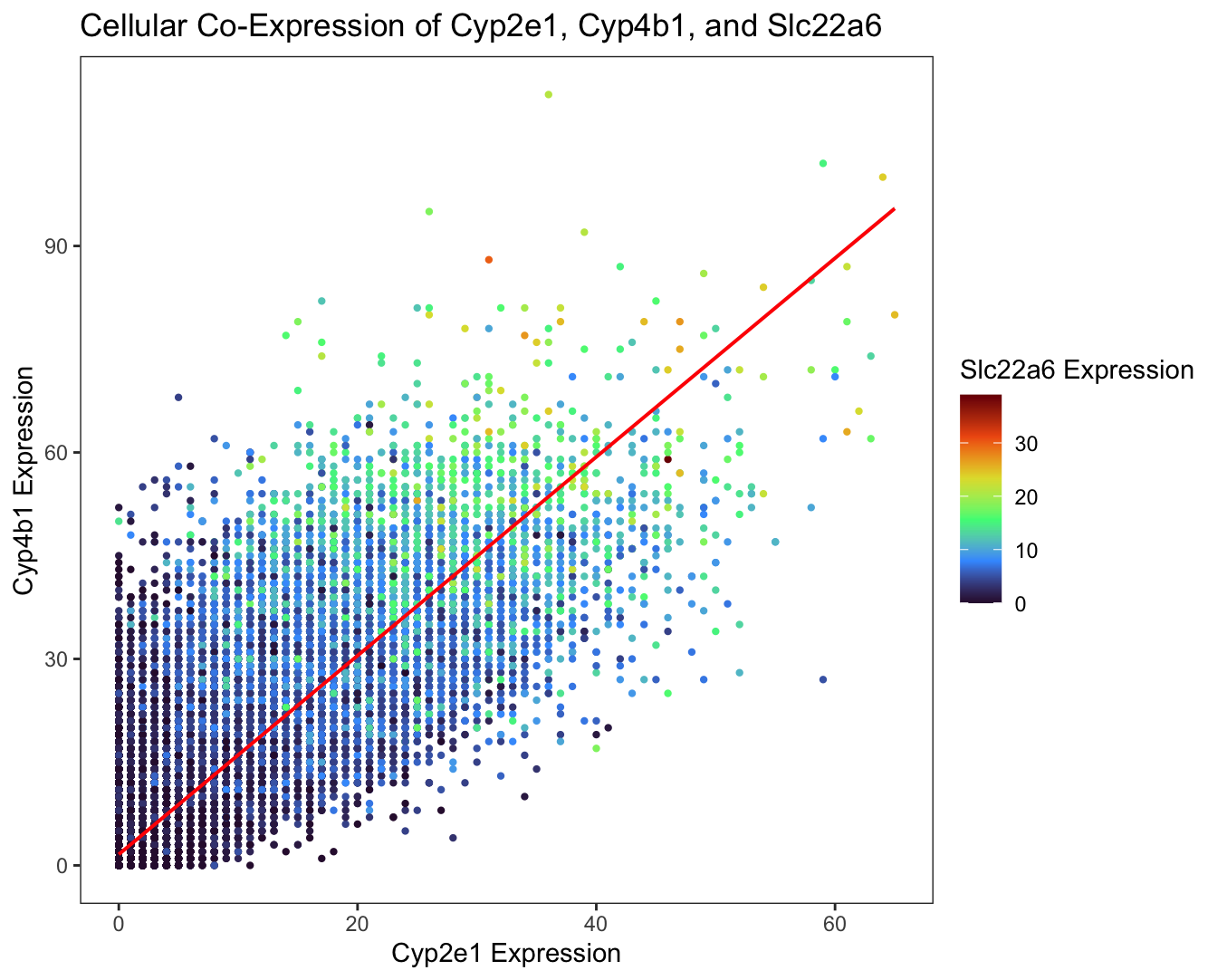
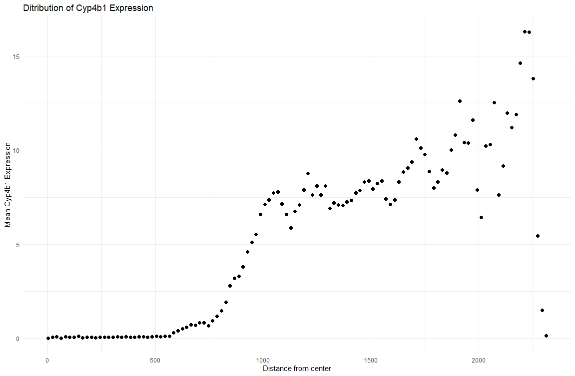
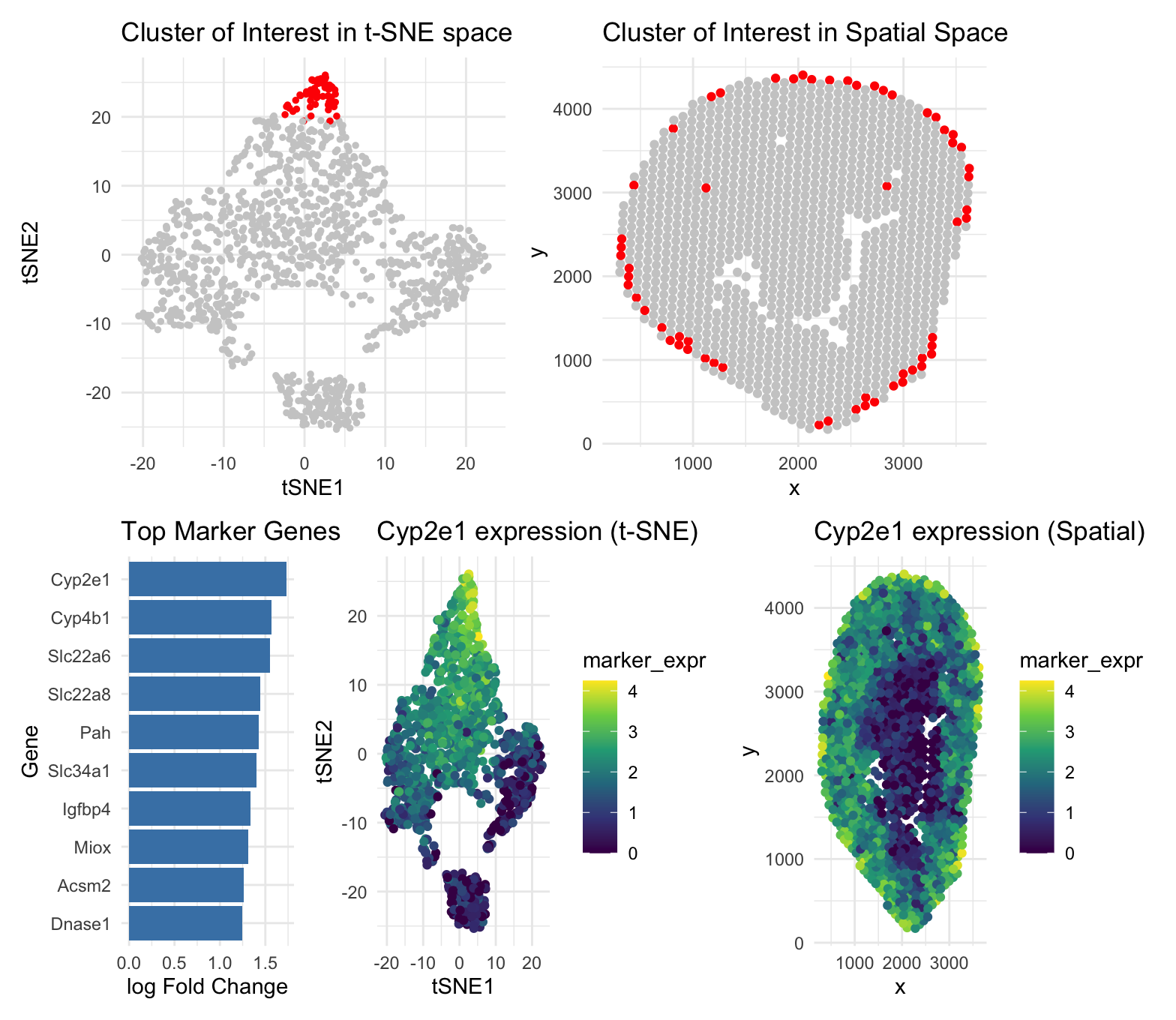
1. What data types are you visualizing? I am visualizing quantitative data in terms of the gene expression levels of Cyp4b1 in each cell across the kidney sample and spatial...
1. What data types are you visualizing?
I am visualizing quantitative data of the gene expression counts of the Cyp2e1, Cyp4b1, and Slc22a6 genes for each cell.
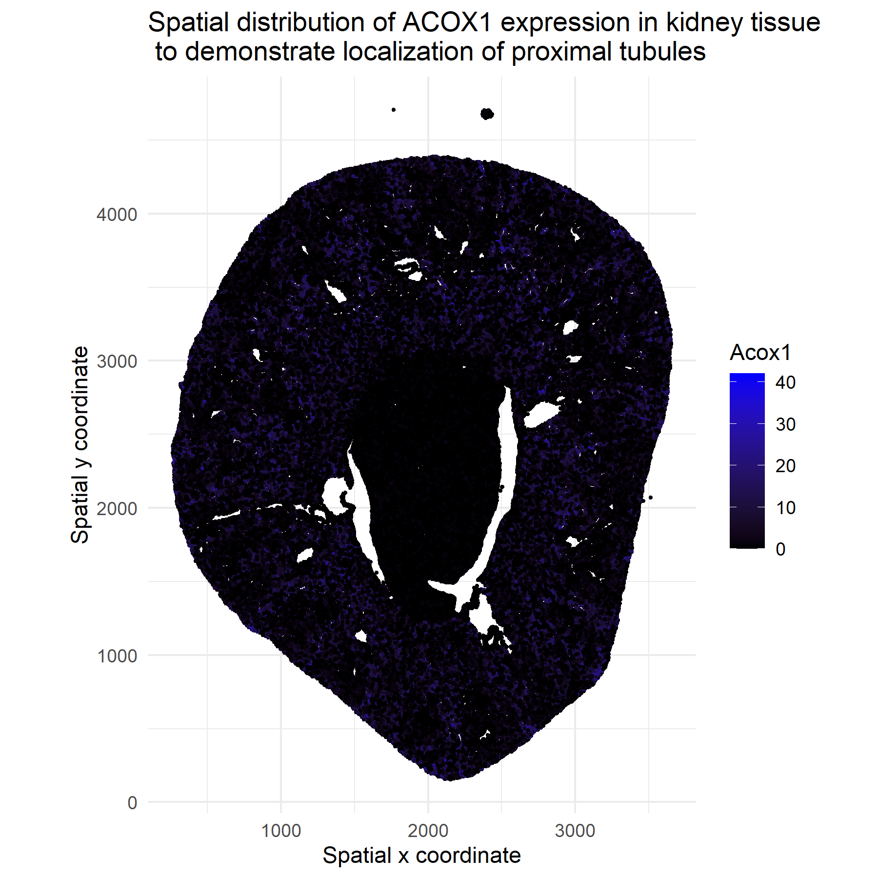
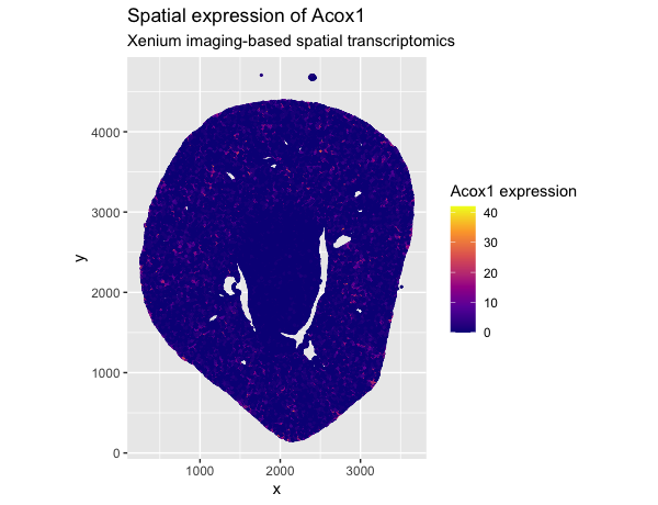
1. What about the data would you like to make salient? I would like to make salient the spatial expression pattern of the gene Acox1 across individual cells in the...
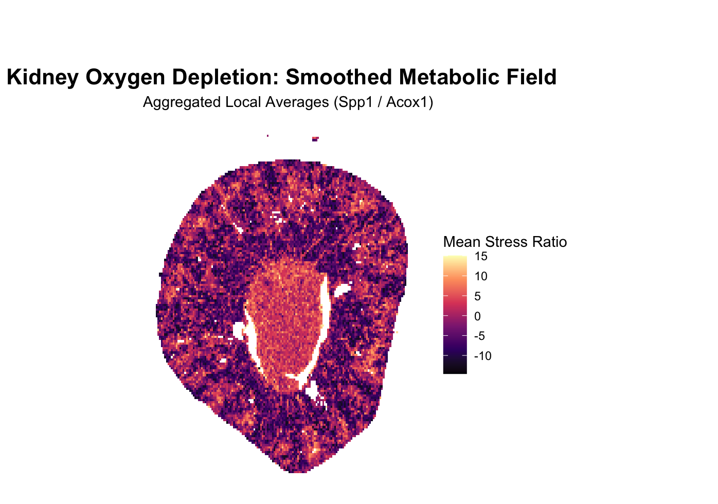
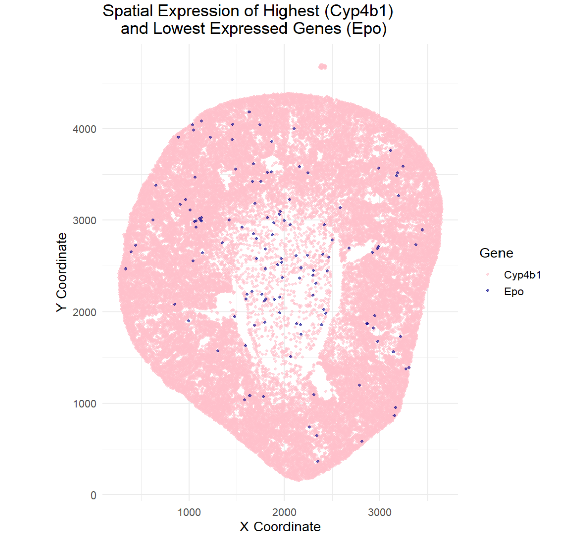
1. What about the data are you trying to make salient through this data visualization? The goal of this visualization was to make salient the spatial location of the highest...
1. What about the data would you like to make salient through this data visualization? Since I am working with Visium 10x geneomics data, every row is a spatial spot...
1. What data types are you visualizing? I am visualizing quantitative data of the expression count of the ERBB2 gene for each cell, quantitative data of the area for each...
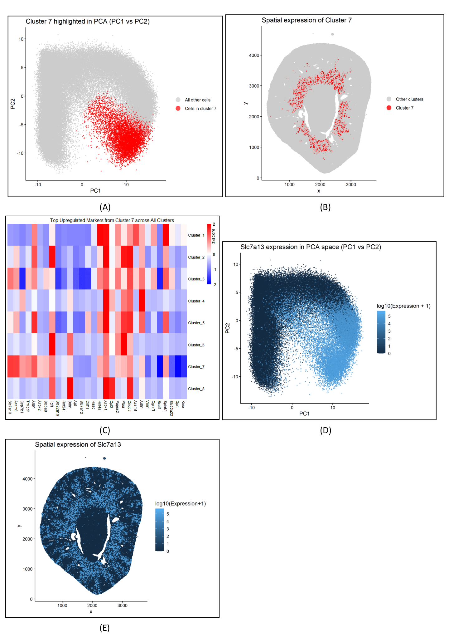
Figure description Panel A describes the PCA plot between cluster 7 and all other cells, depicting the distinct separation of cluster 7 in the reduced dimensional space. Panel B visualizes...
Describe your figure briefly so we know what you are depicting (you no longer need to use precise data visualization terms as you have been doing). Write a description to...
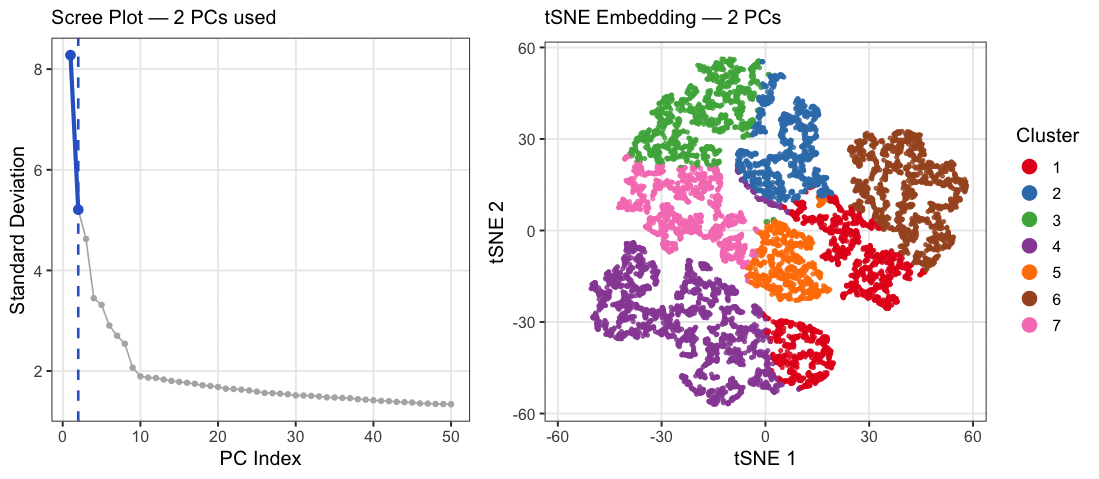
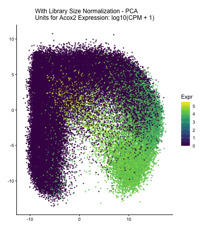
The data were normalized and log-transformed. I then ran PCA on the normalized matrix, used the scree plot of PC standard deviations to pick a safe cutoff (PC = 10)...
Describe your figure briefly so we know what you are depicting (you no longer need to use precise data visualization terms as you have been doing). Write a description to...
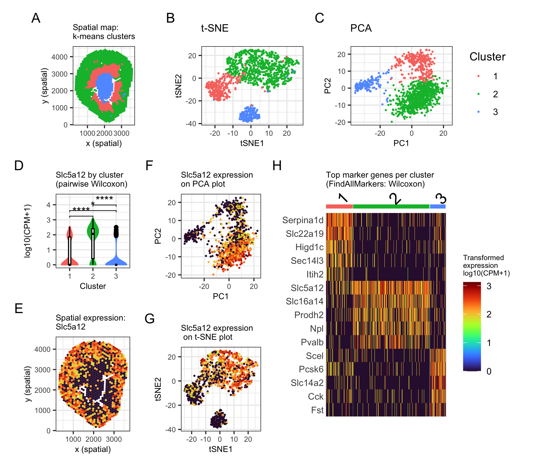
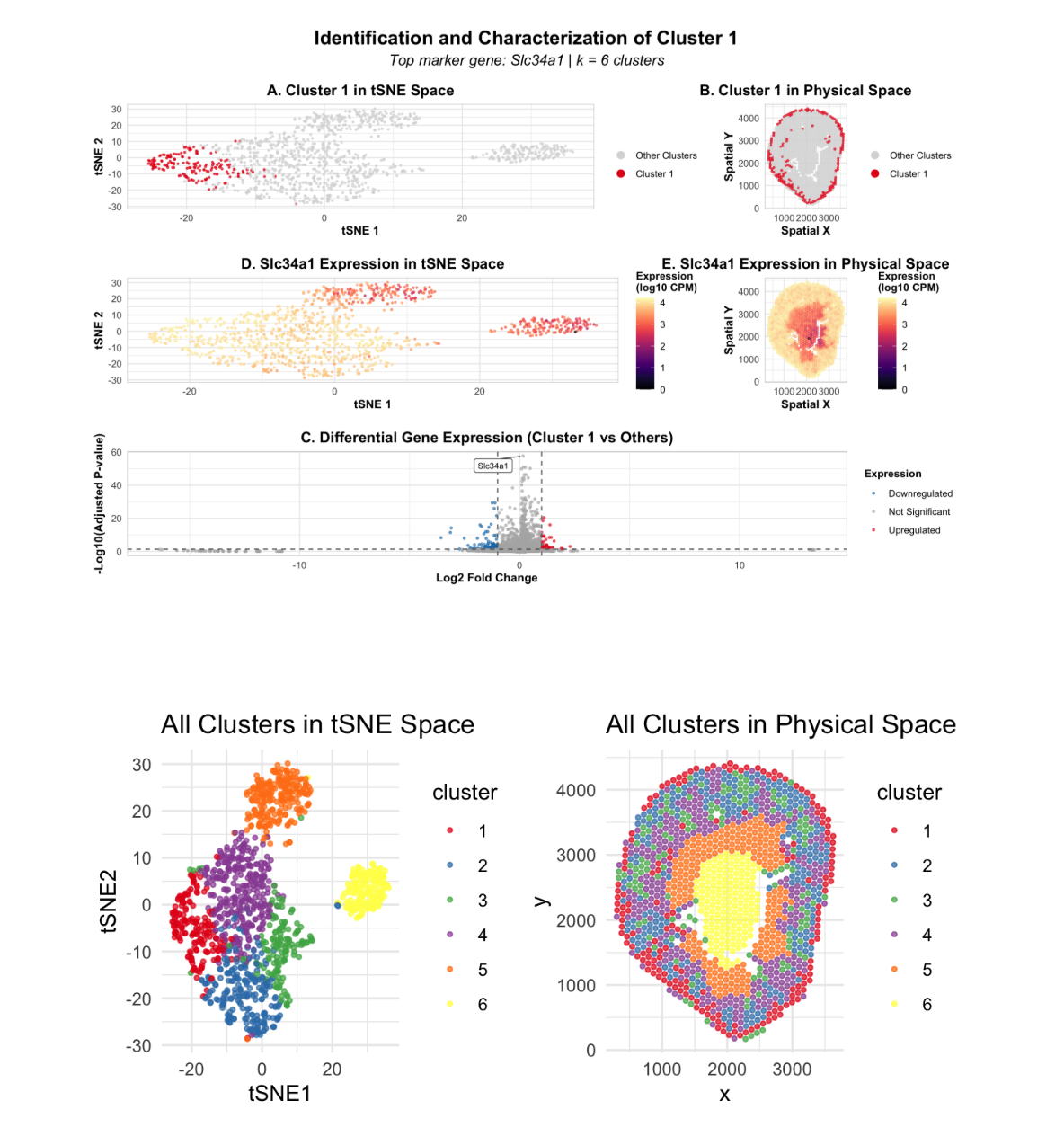
Description This multi-panel visualization combines a multitude of concepts essential in spatial transcriptomic data analysis and visualization, including normalization/log-transformation, dimensionality reduction, k-means clustering, and differential expression. By combining these methods,...
This figure explores a transcriptionally distinct cluster of Visium spots identified using PCA, t-SNE, and k-means clustering. In the t-SNE plot (top left), the cluster of interest appears as a...
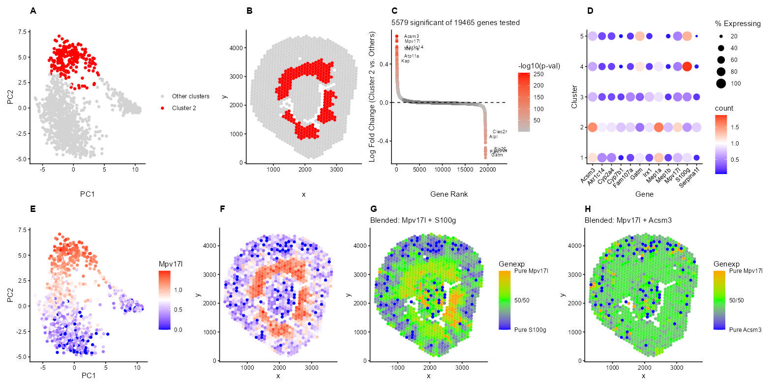
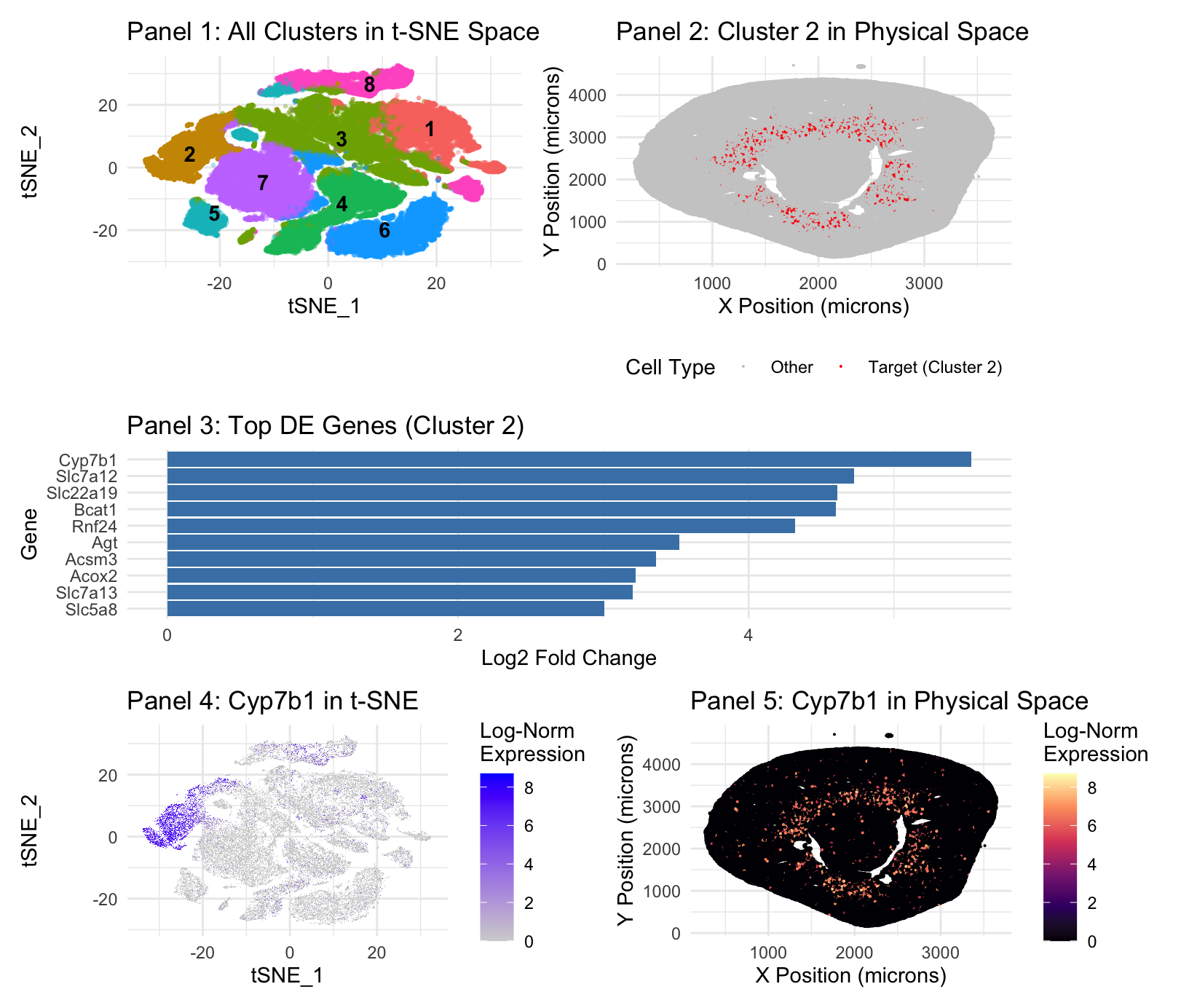
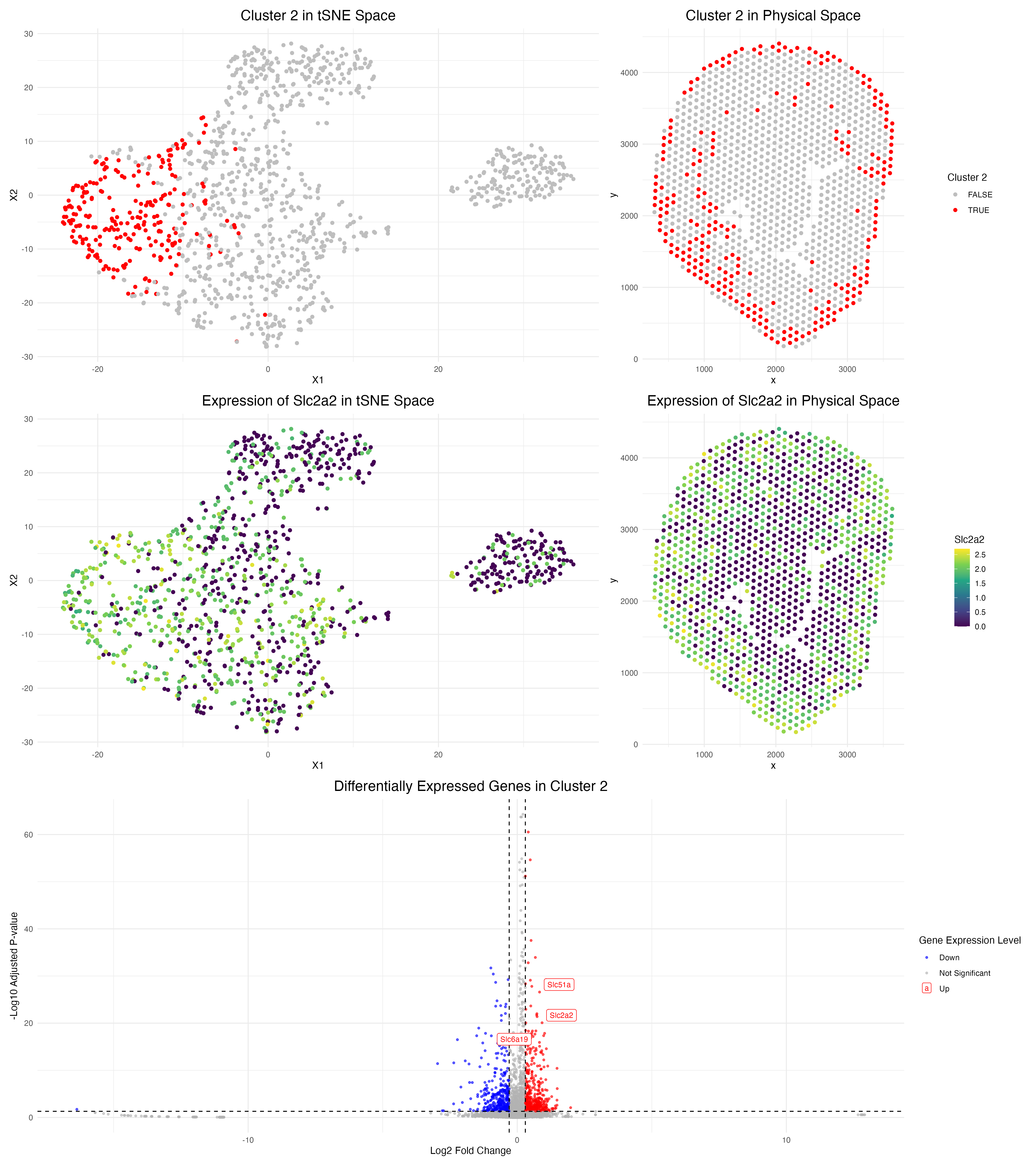
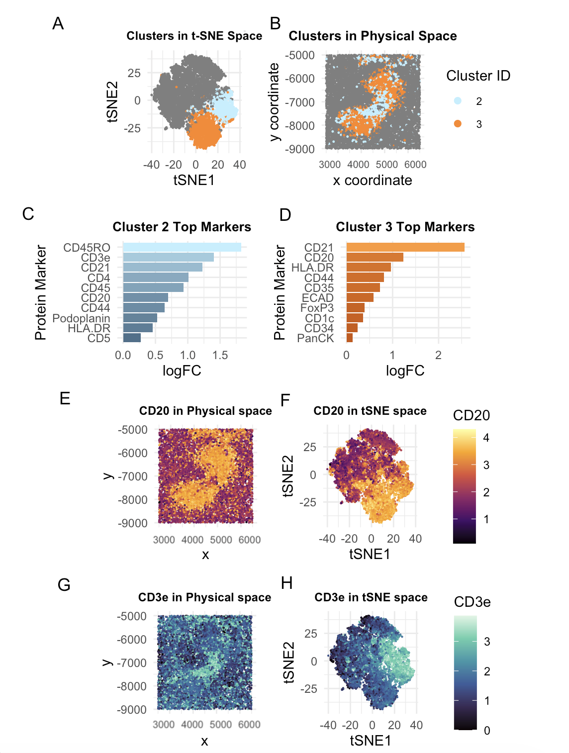
Description I’m depicting the identification and characterization of Cluster 2 in the Visium spatial transcriptomics data from a mouse kidney sample. The top row shows the discovery and validation of...
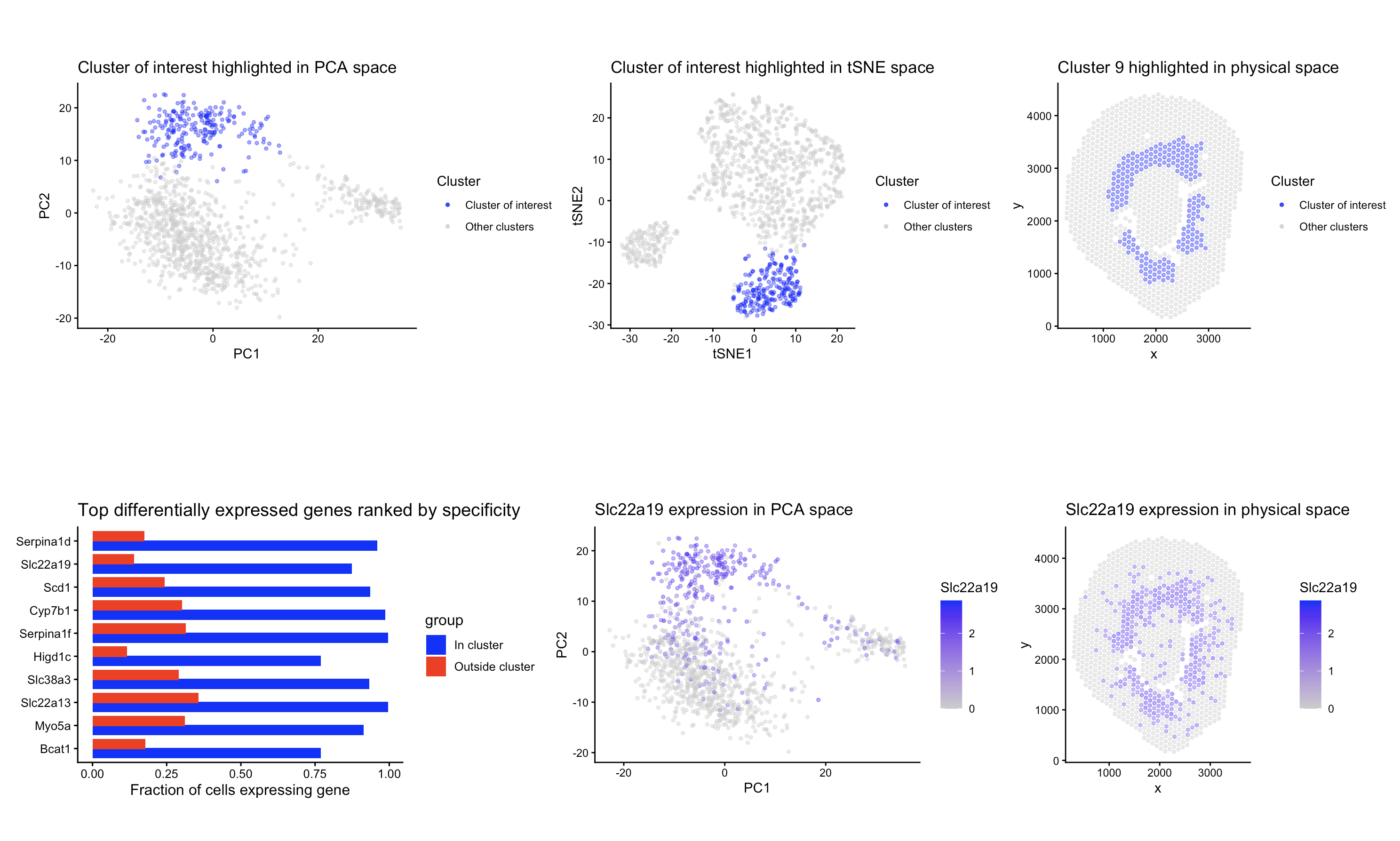
1. Figure description This multi-panel data visualization uses principal component analysis, k-means clustering, and differential expression analysis to characterize a cluster of interest based on gene expression patterns. In the...
Describe your figure briefly so we know what you are depicting (you no longer need to use precise data visualization terms as you have been doing). Write a description to...
Description To identify and characterize a transcriptionally distinct cell cluster from the Xenium dataset, I first normalized the raw counts and did PCA for dimensionality reduction. Based on the scree...
Description of Data Visualization:
The raw Xenium dataset was normalized according to library size and log normalization before having its dimensionality reduced using principal component analysis.
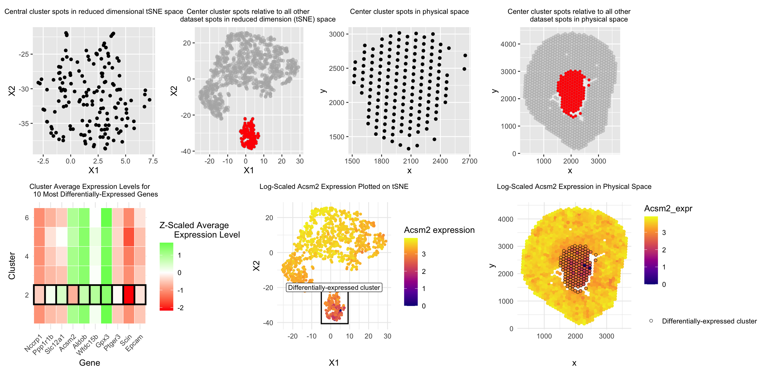
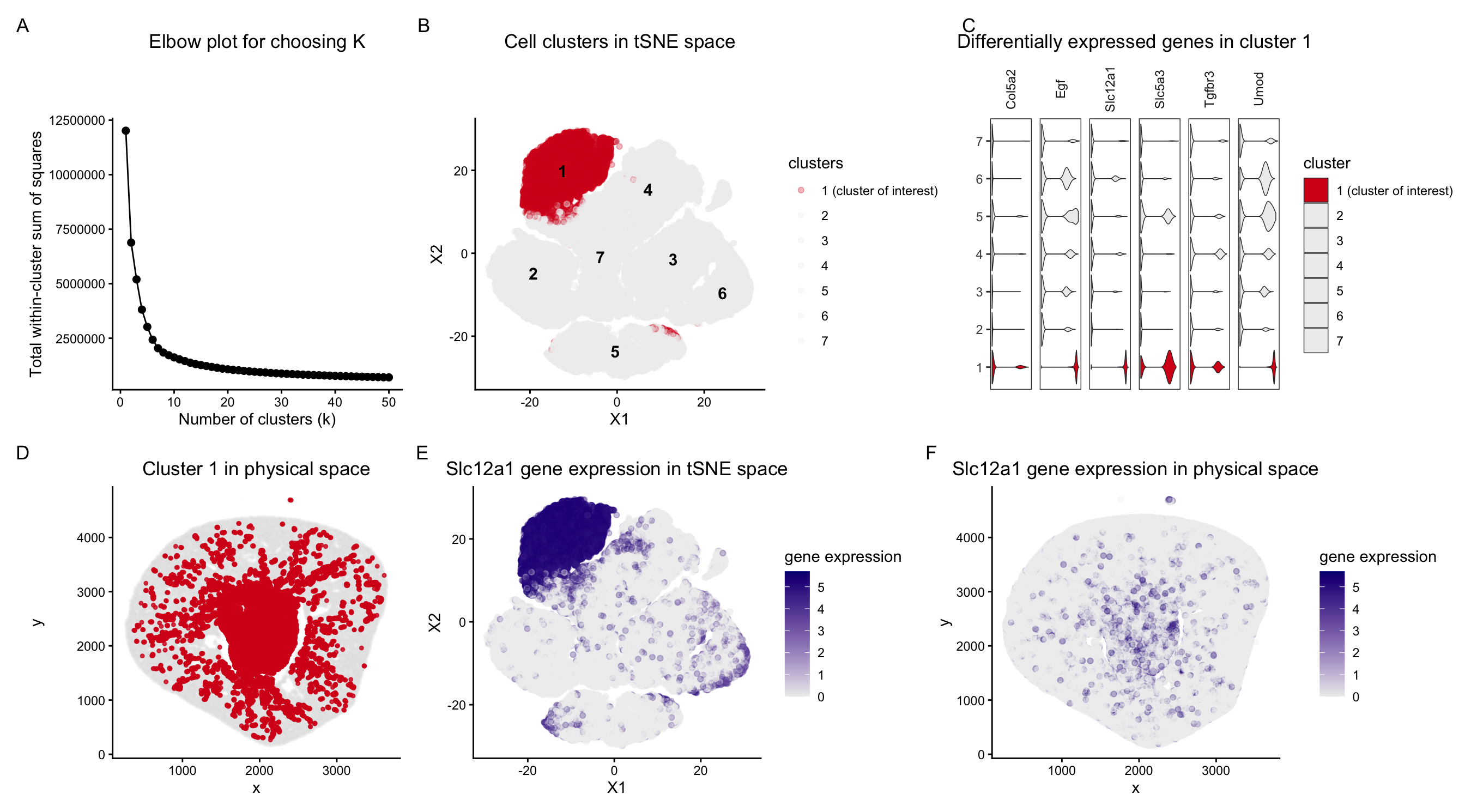
In this data visualization, I explored the gene expression of Cluster 1 from a single-cell resolution spatial kidney tissue sample. The two uppermost plots highlight this cluster of interest by...
1. Describe your figure briefly so we know what you are depicting (you no longer need to use precise data visualization terms as you have been doing). Write a description...
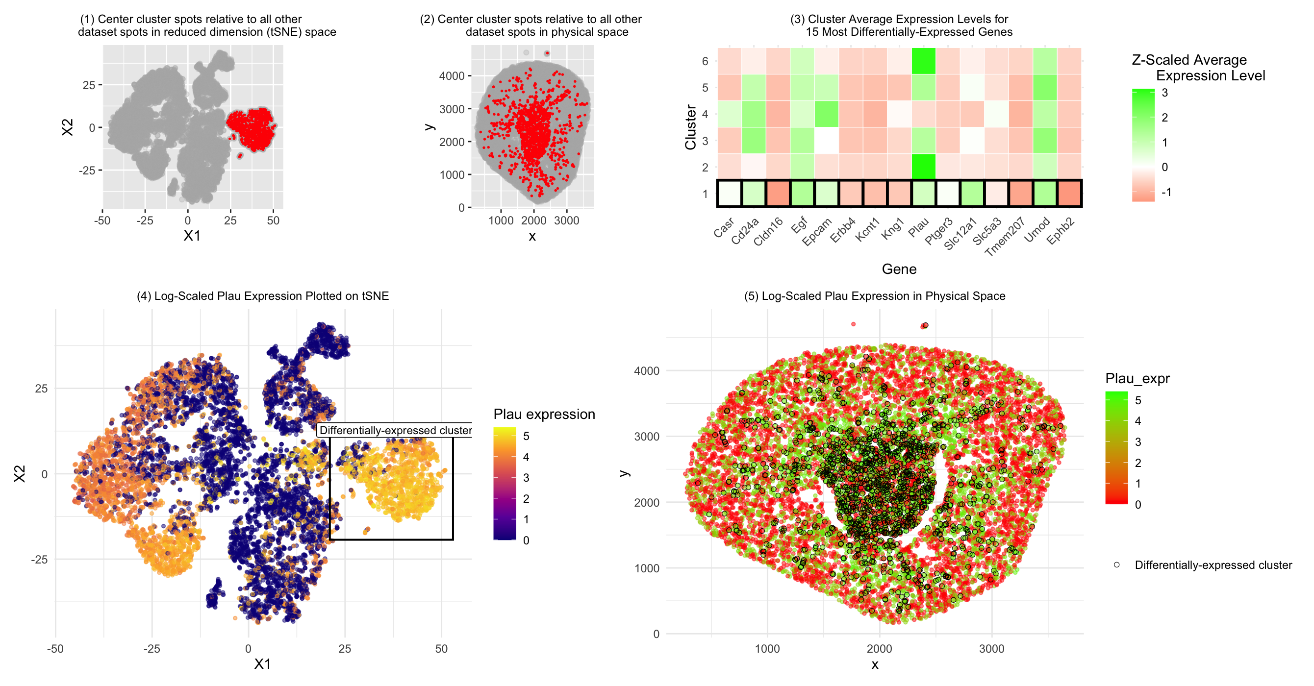
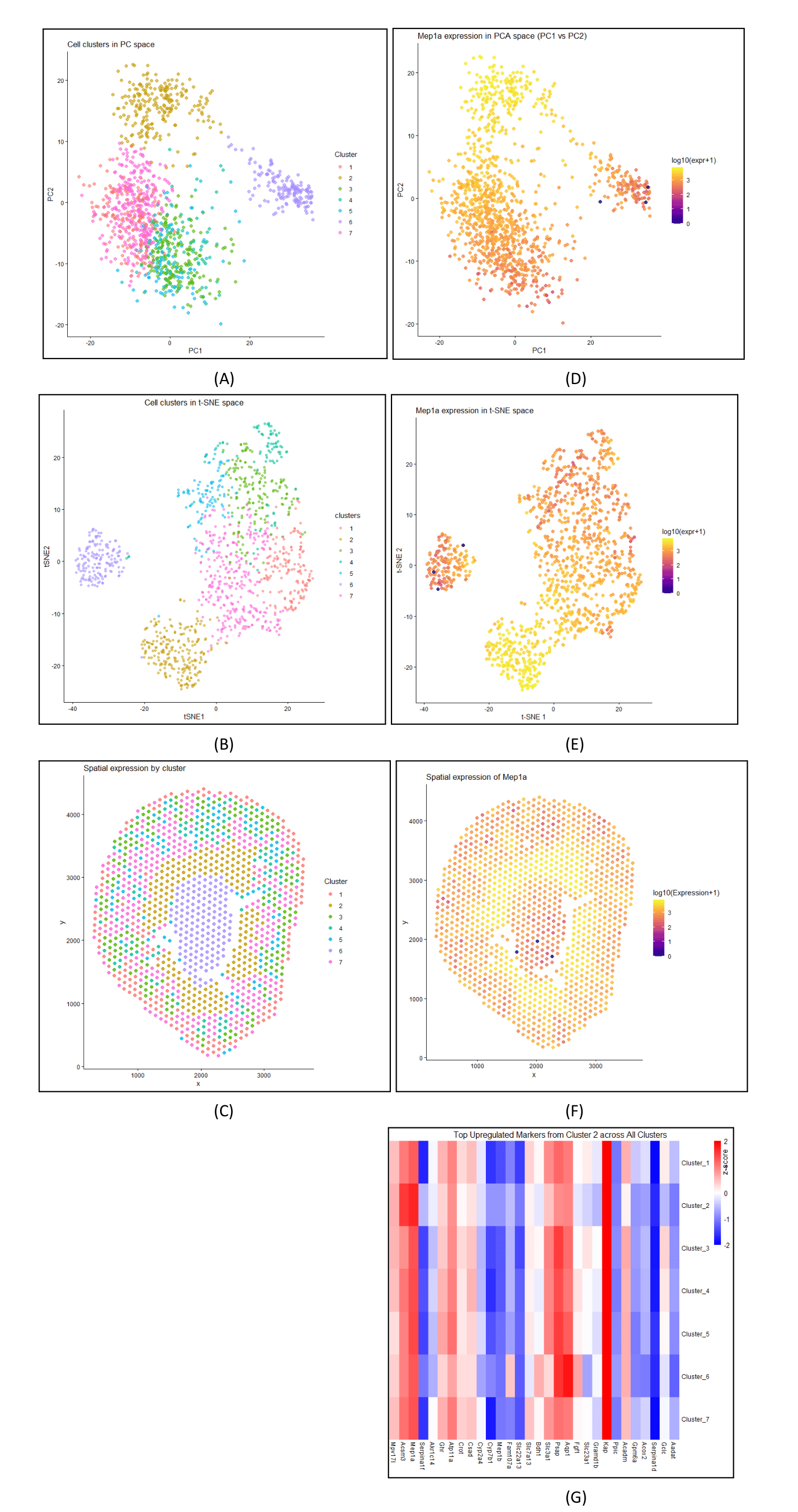
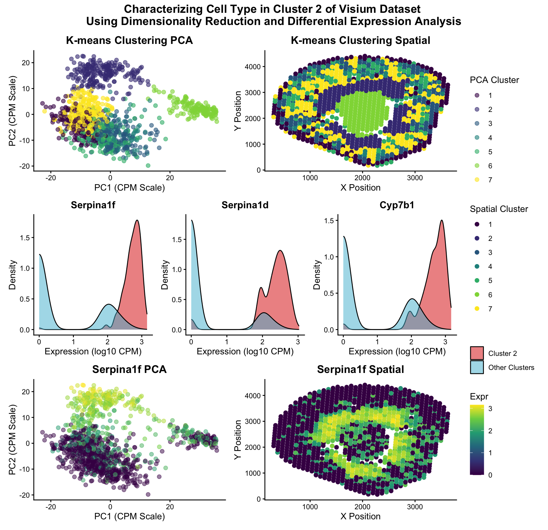
In this data visualization, I explored the gene expression patterns of Cluster 2 from a Visium spatial transcriptomics dataset of kidney tissue. The visualization consists of five integrated panels that...
Instructions: Create a multi-panel data visualization that includes at minimum the following components: (1) A panel visualizing your one cluster of interest in reduced dimensional space (PCA, tSNE, etc), (2)...
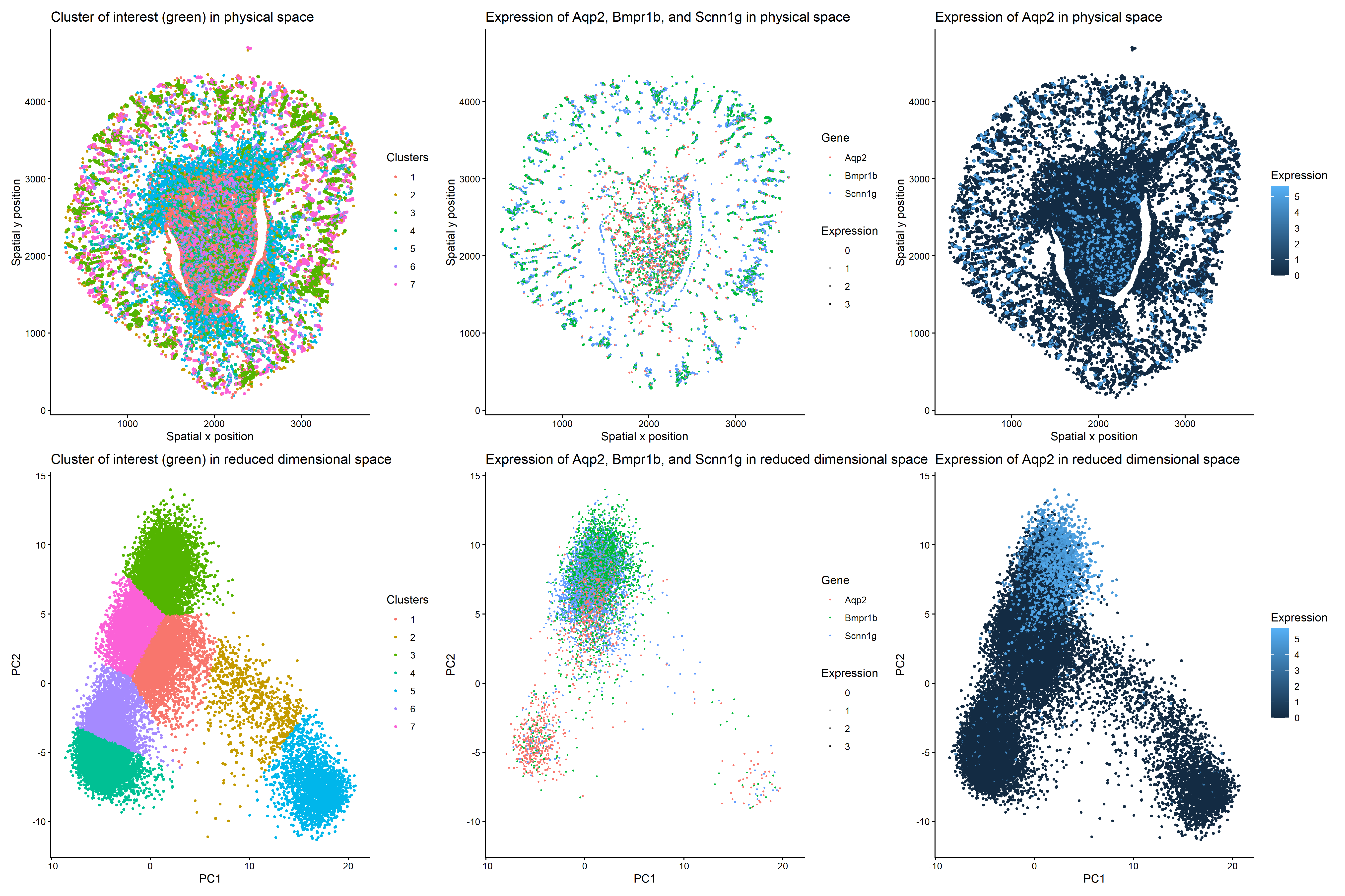
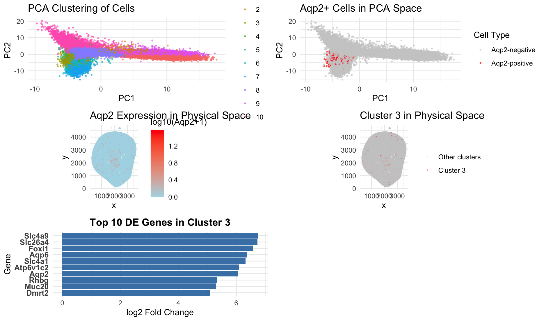
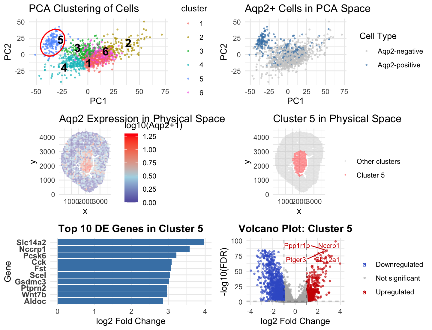
Figure Description and Interpretation This figure integrates dimensionality reduction, spatial mapping, and differential expression analysis to characterize an Aqp2-positive cell population. In PCA space, cells form distinct clusters, with Cluster...
Describe your figure briefly so we know what you are depicting (you no longer need to use precise data visualization terms as you have been doing). Write a description to...
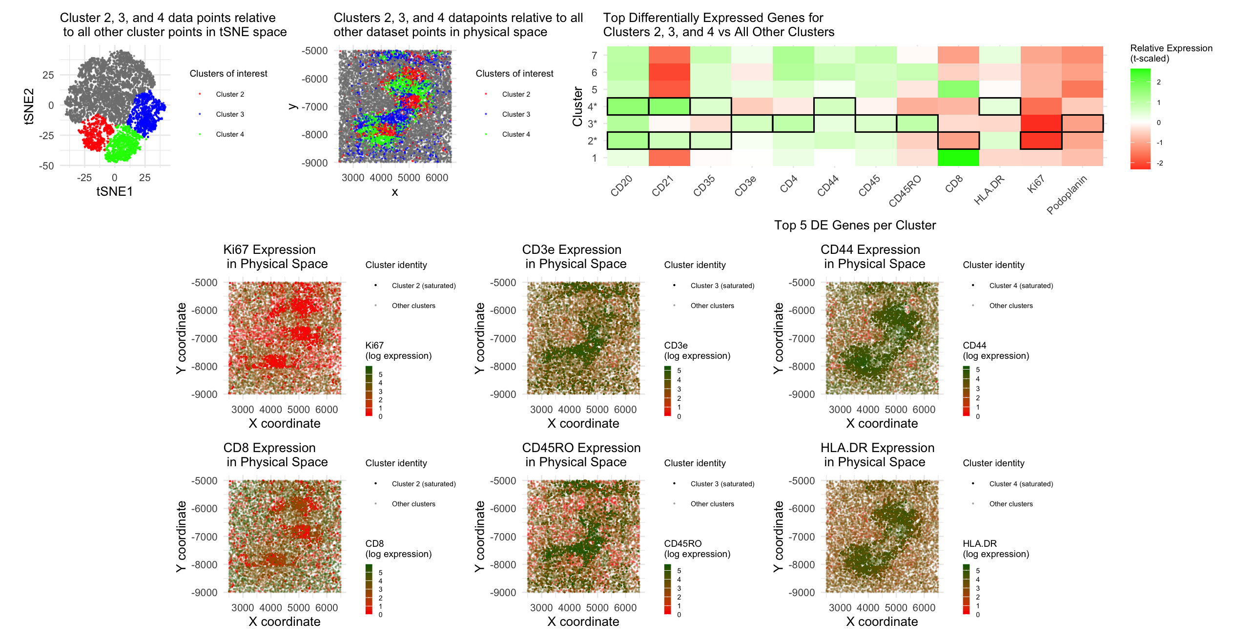
Panel 1 represents t-SNE clustering, Panel 2 represents cluster 2 spatial mapping. Panel 3 is top DE genes in cluster 2. Panel 4 is t-SNE mapping of the top cluster...
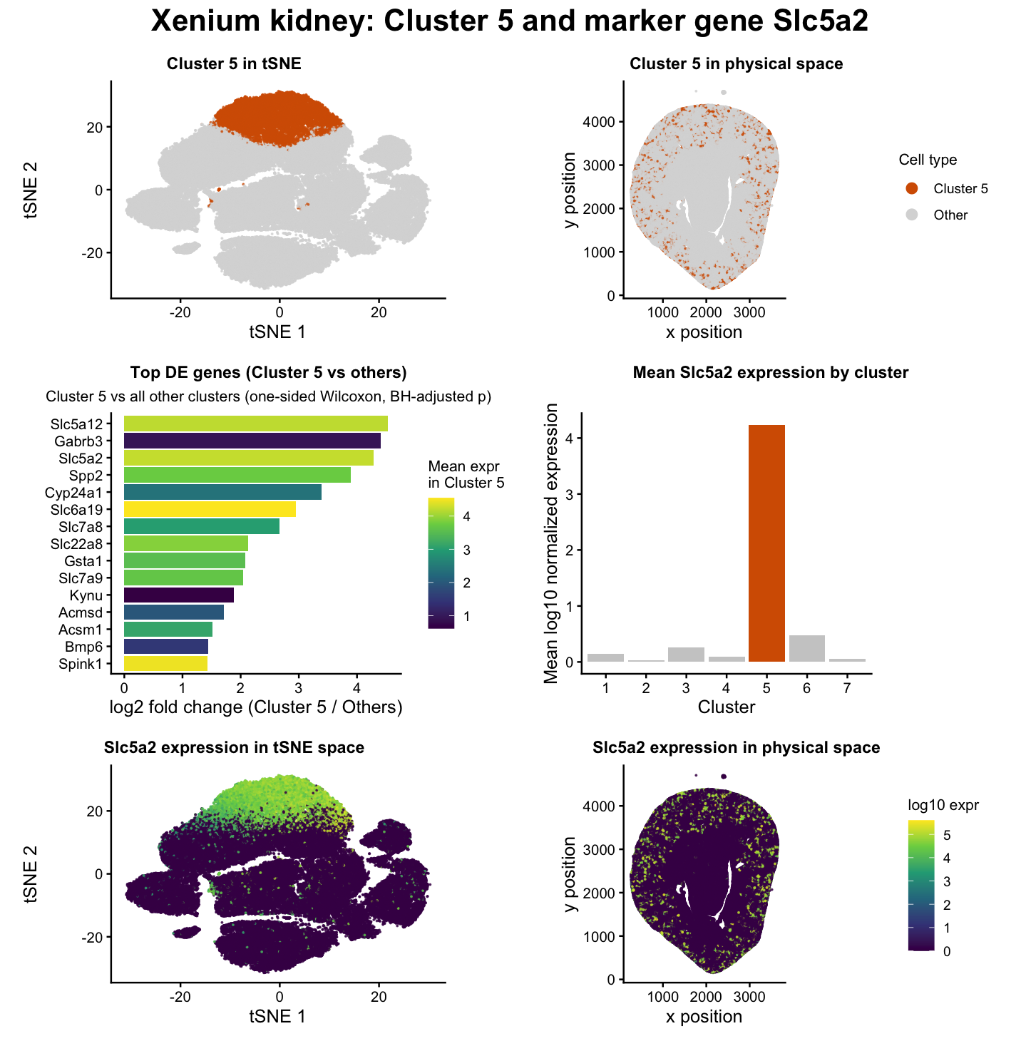
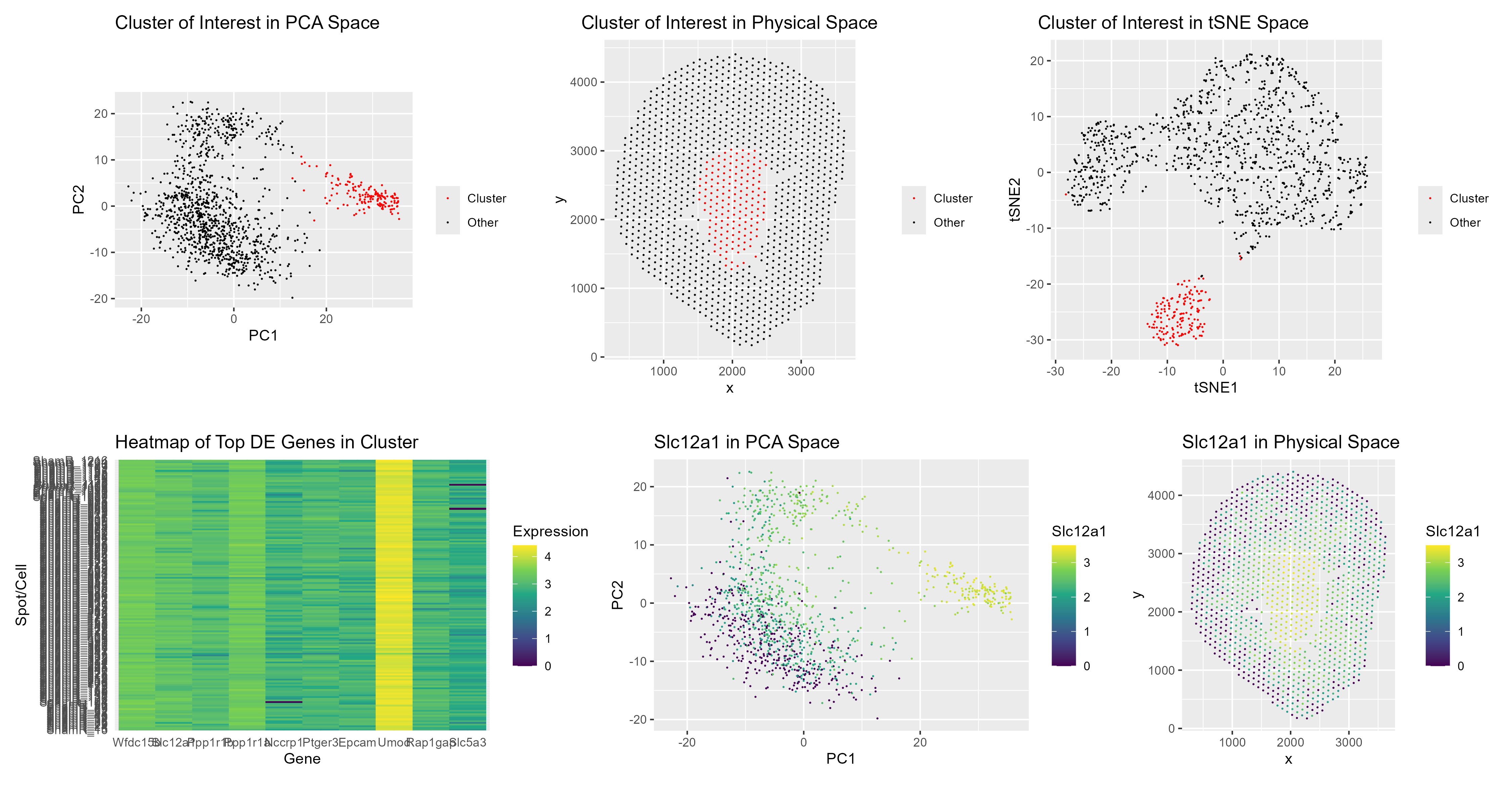
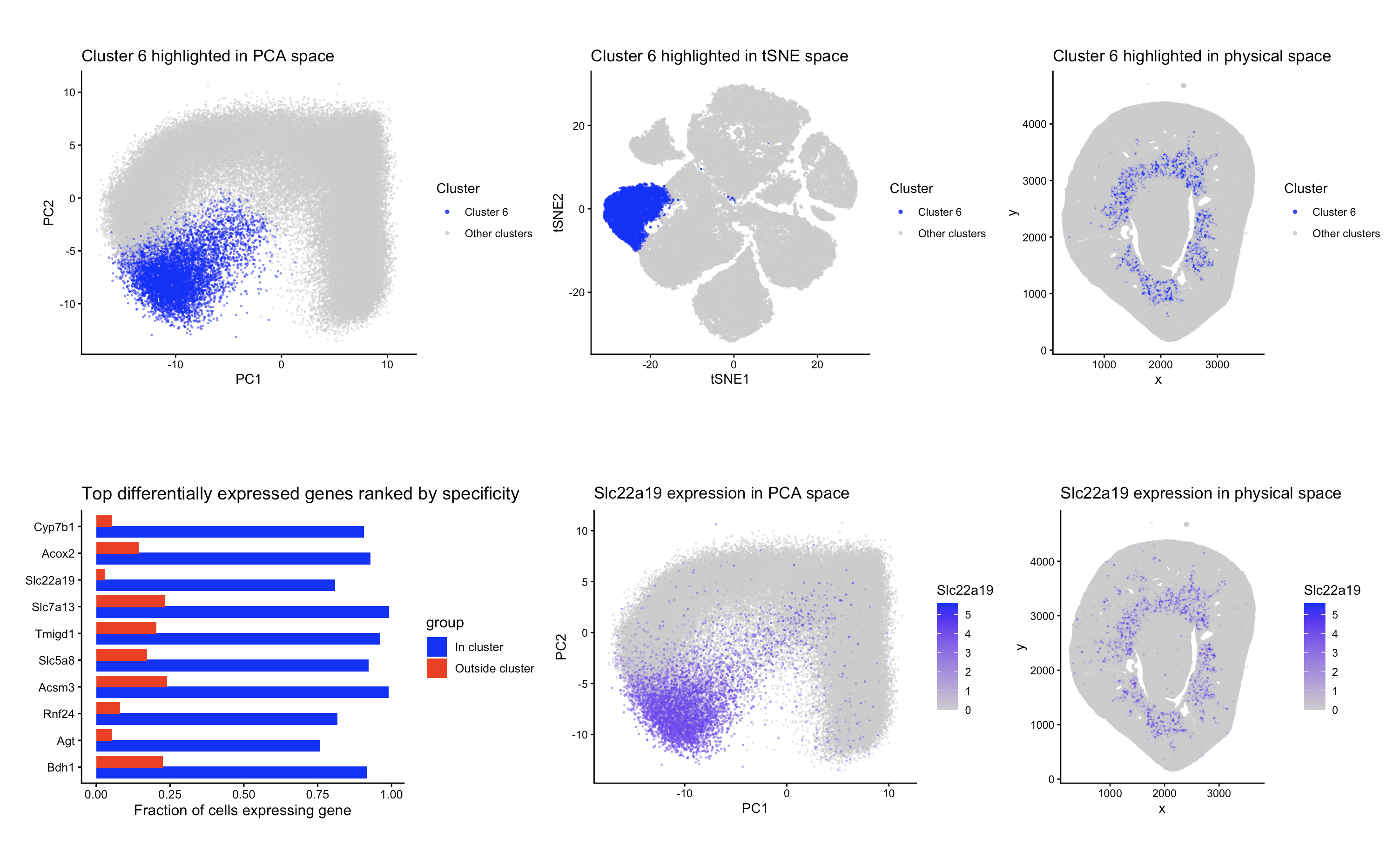
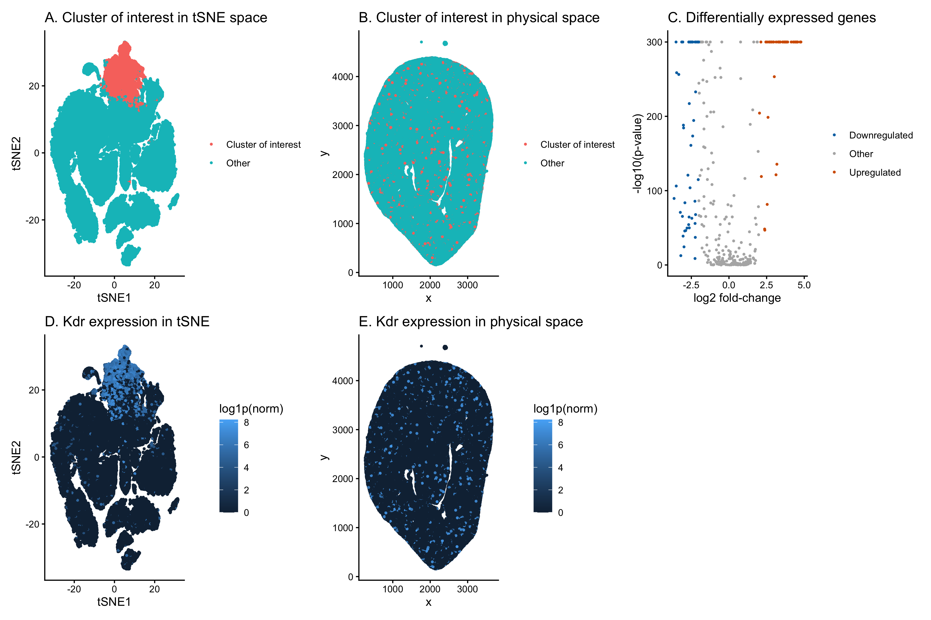
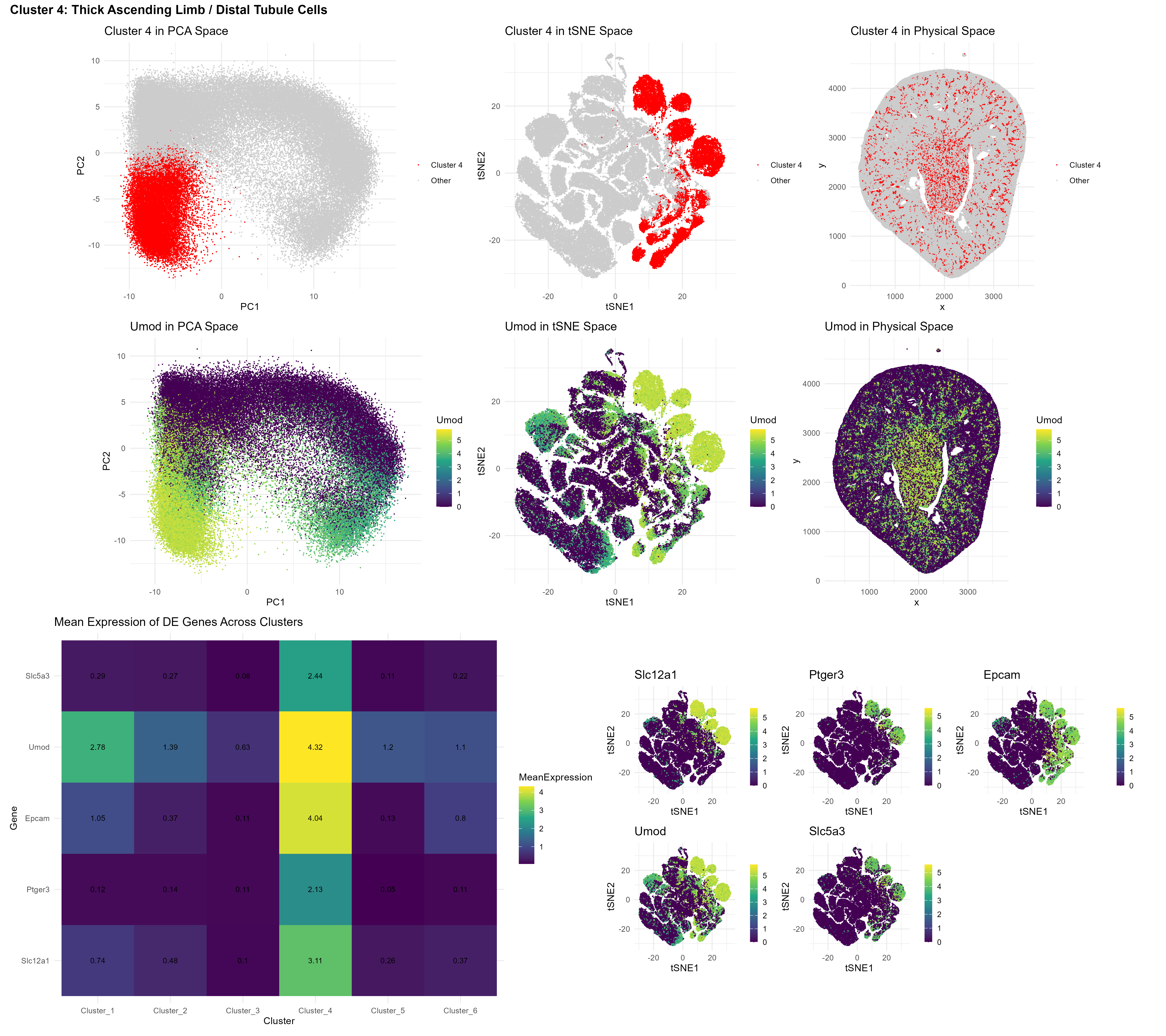
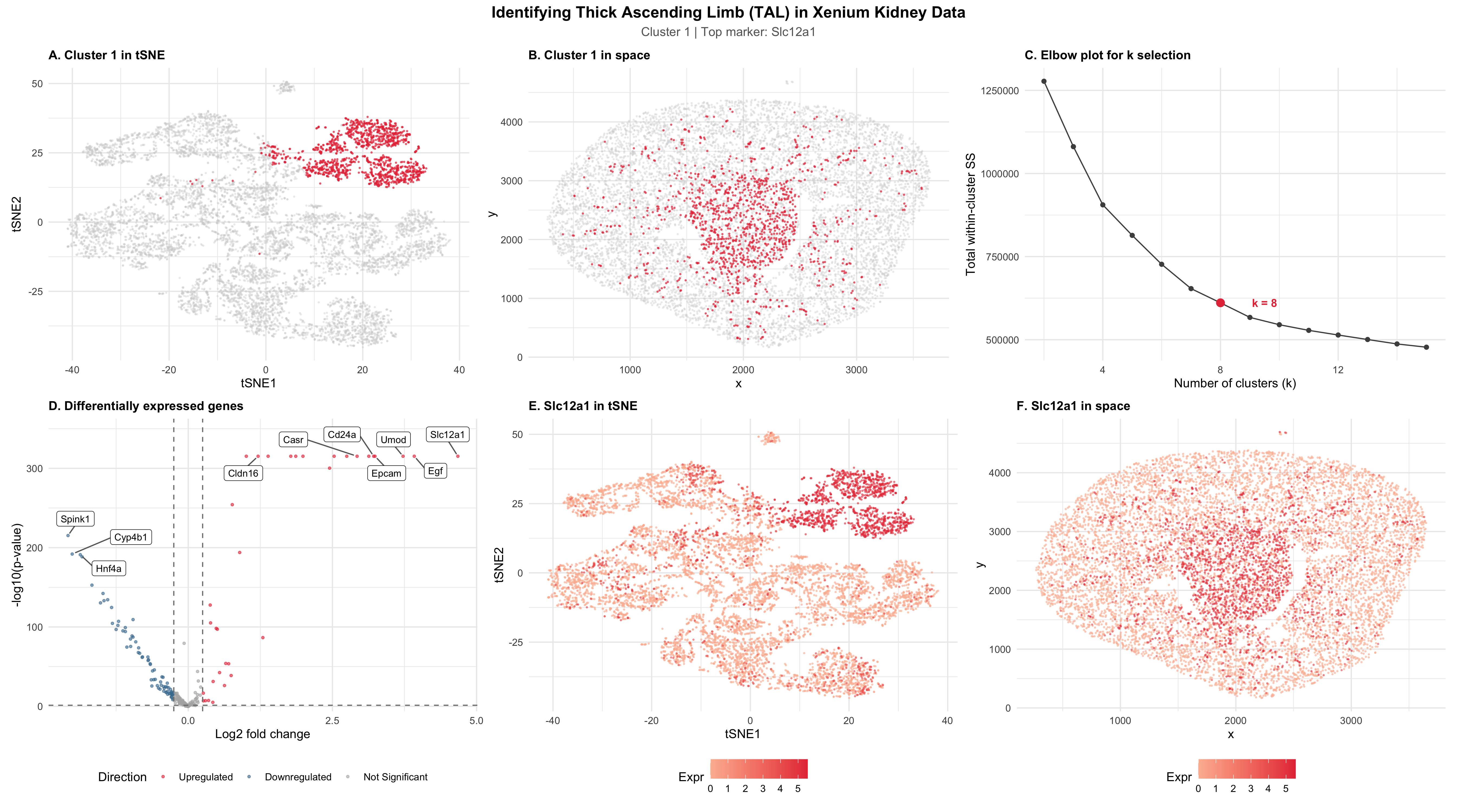
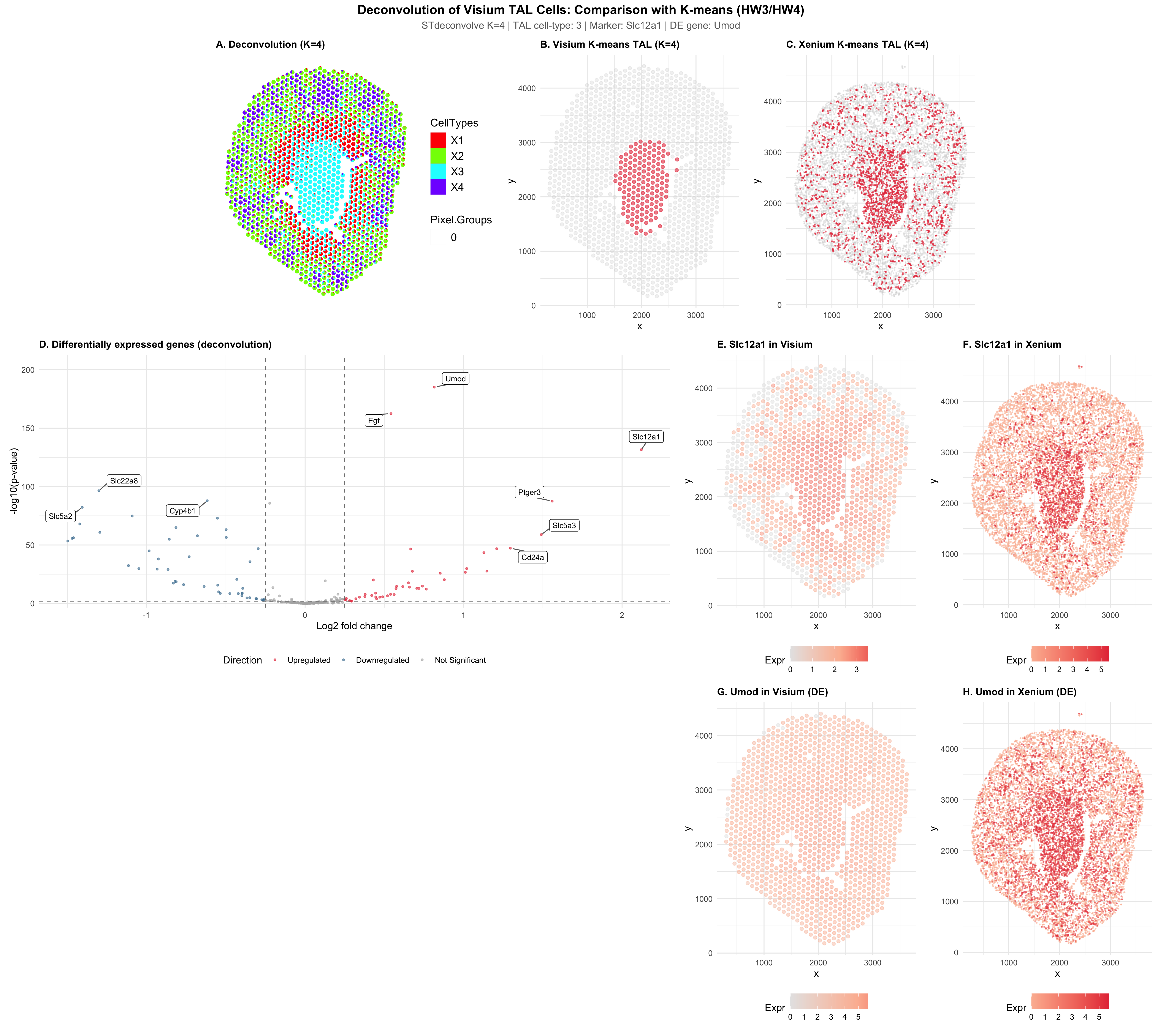
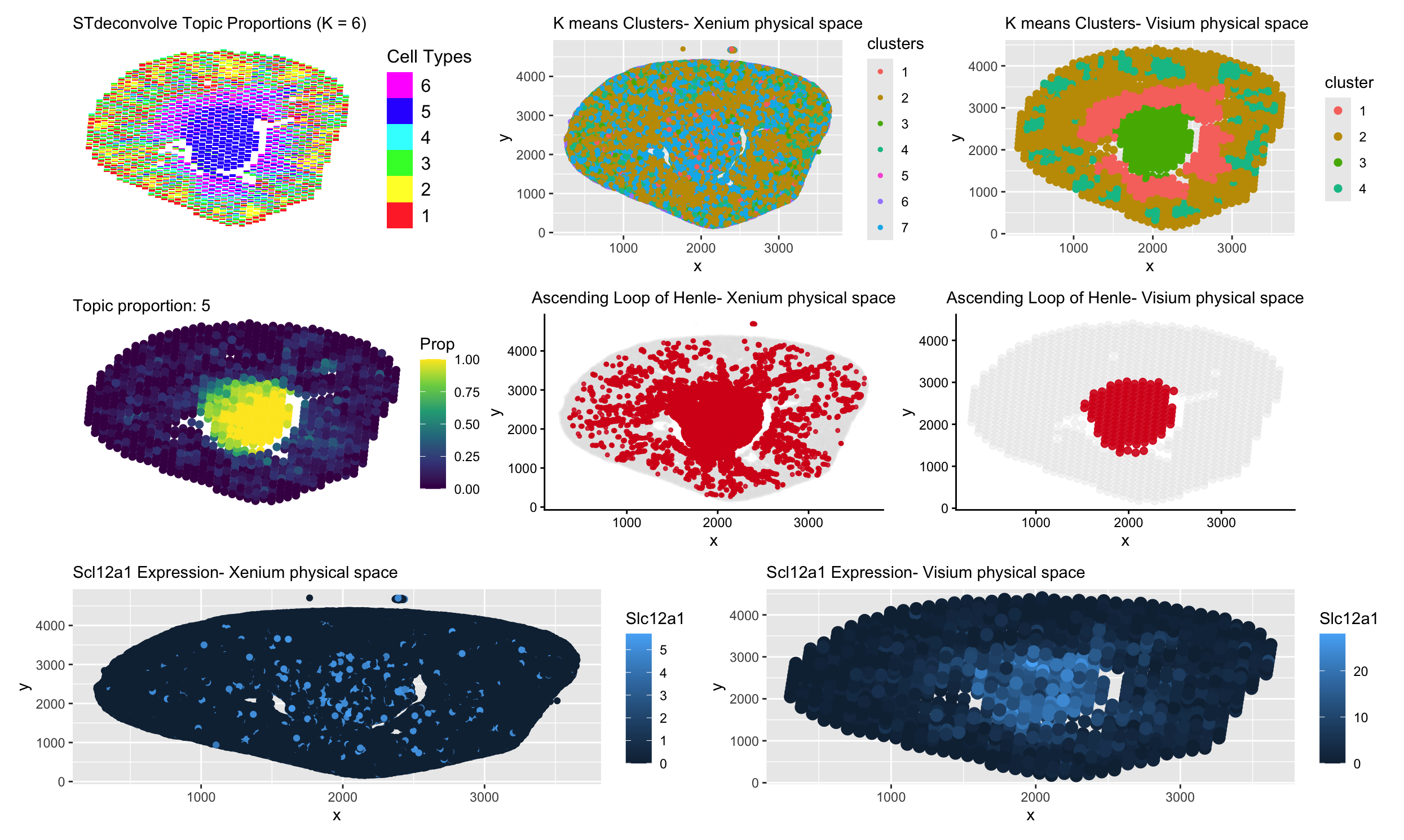
In HW3, I worked with the Visium dataset and identified a cluster corresponding to thick ascending limb (TAL) / distal tubule epithelial cells. That cluster stood out because of its...
#Use/adapt your code from HW3 to identify the same cell-type in the other dataset. Create a multi-panel visualization and write a description to convince me you found the same cell-type...
Describe your figure briefly so we know what you are depicting (you no longer need to use precise data visualization terms as you have been doing). Write a description to...
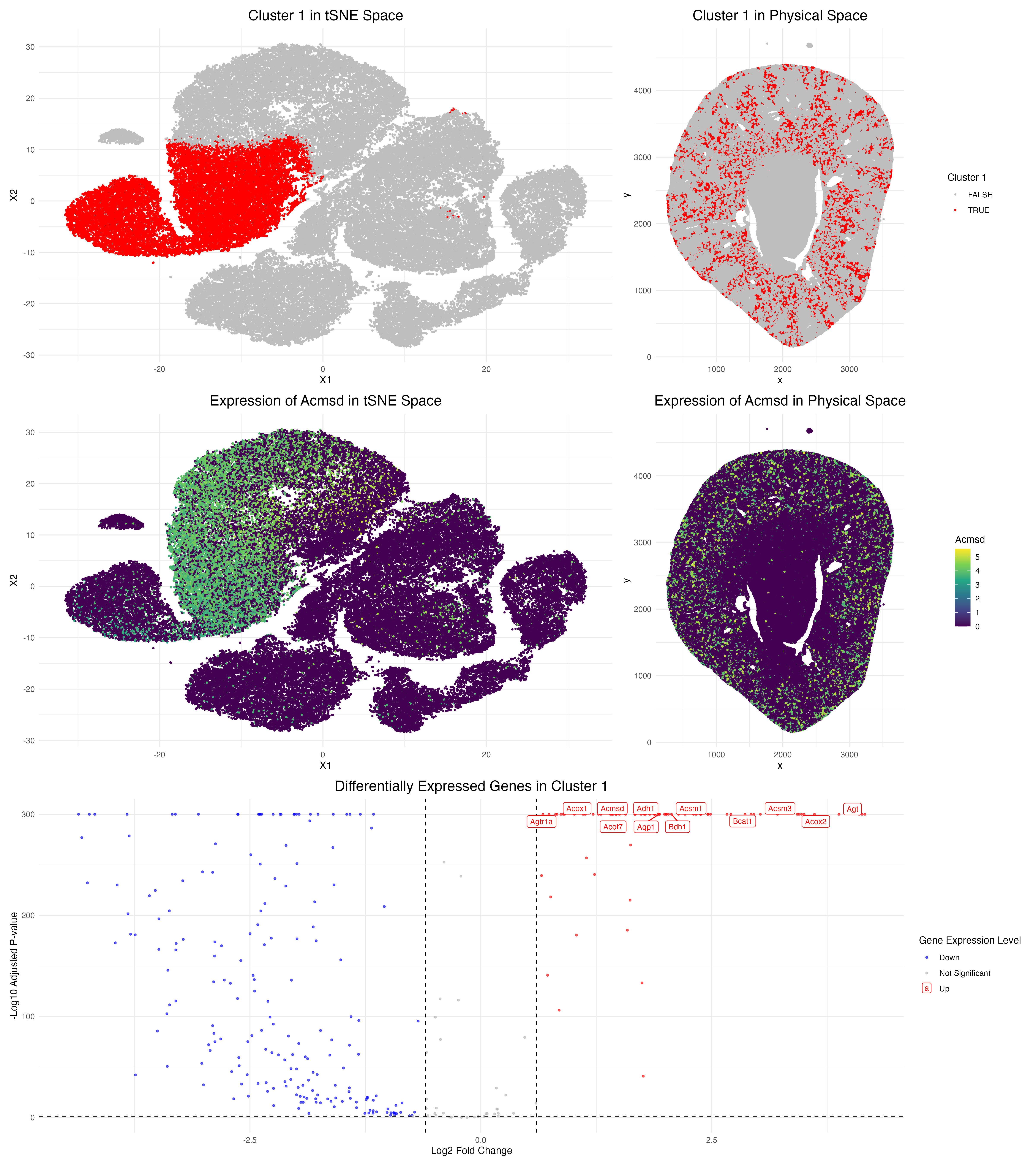
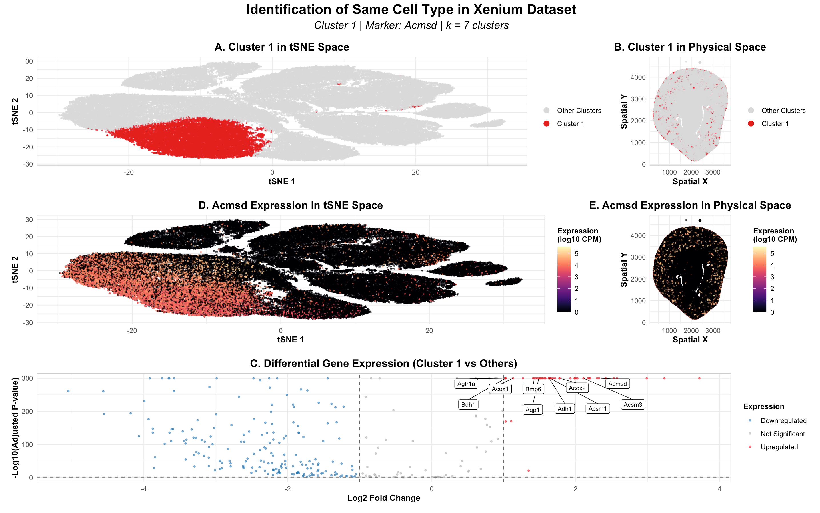
Changes made to code from HW3: Switched from Visium to Xenium and had to cut down data frame to first 10,000 cells in order to make the dataset more manageable...
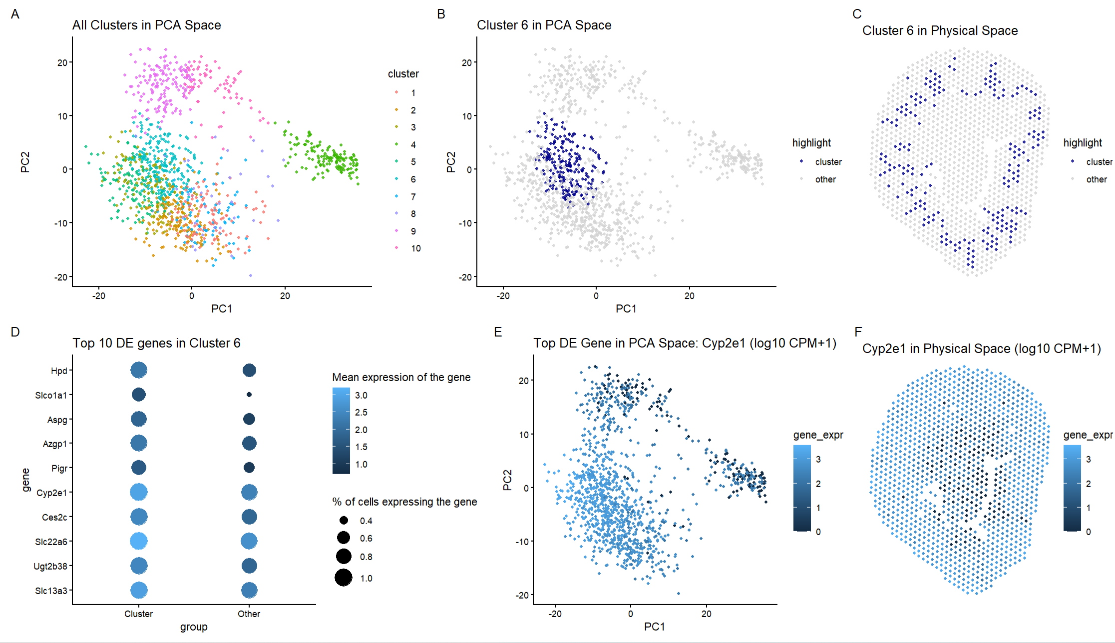
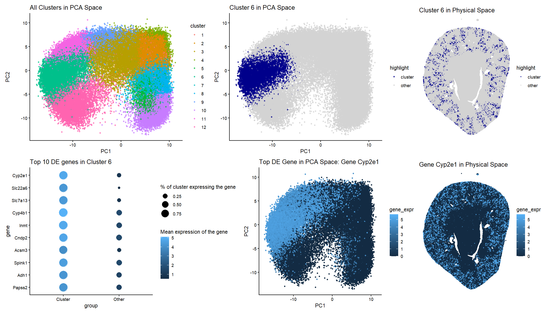
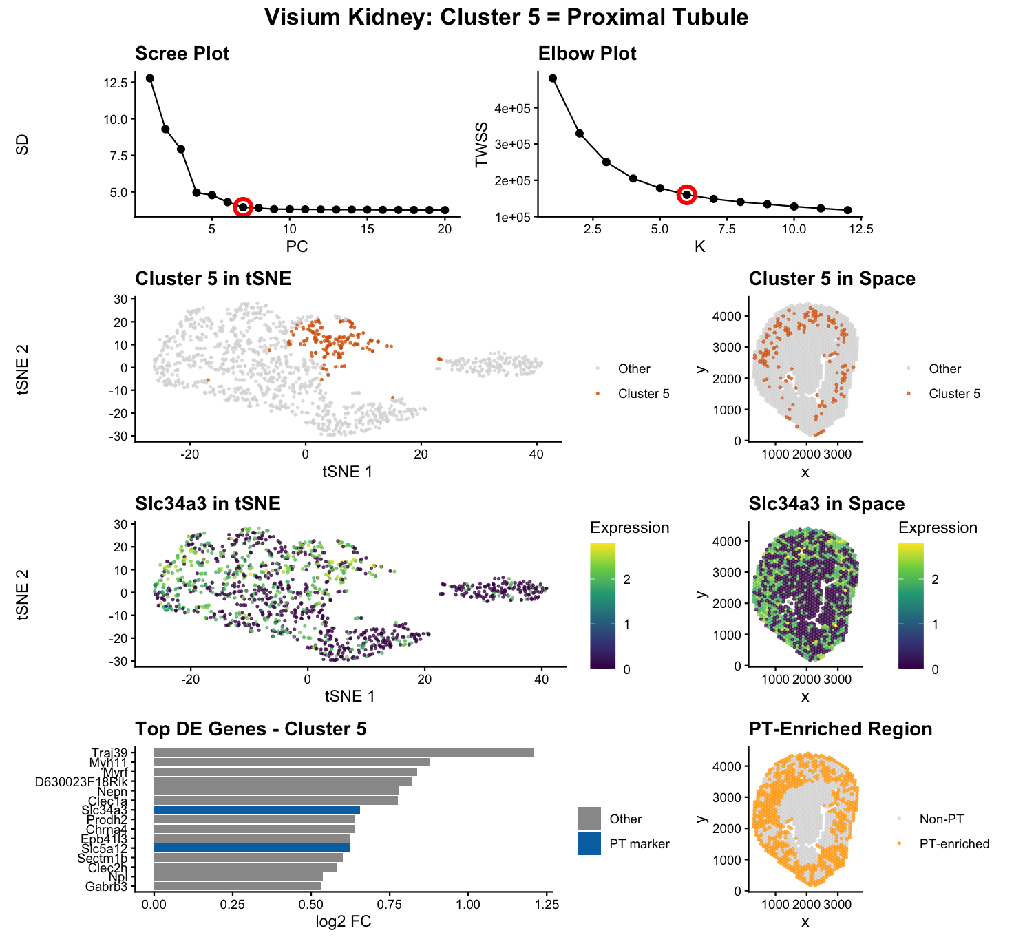
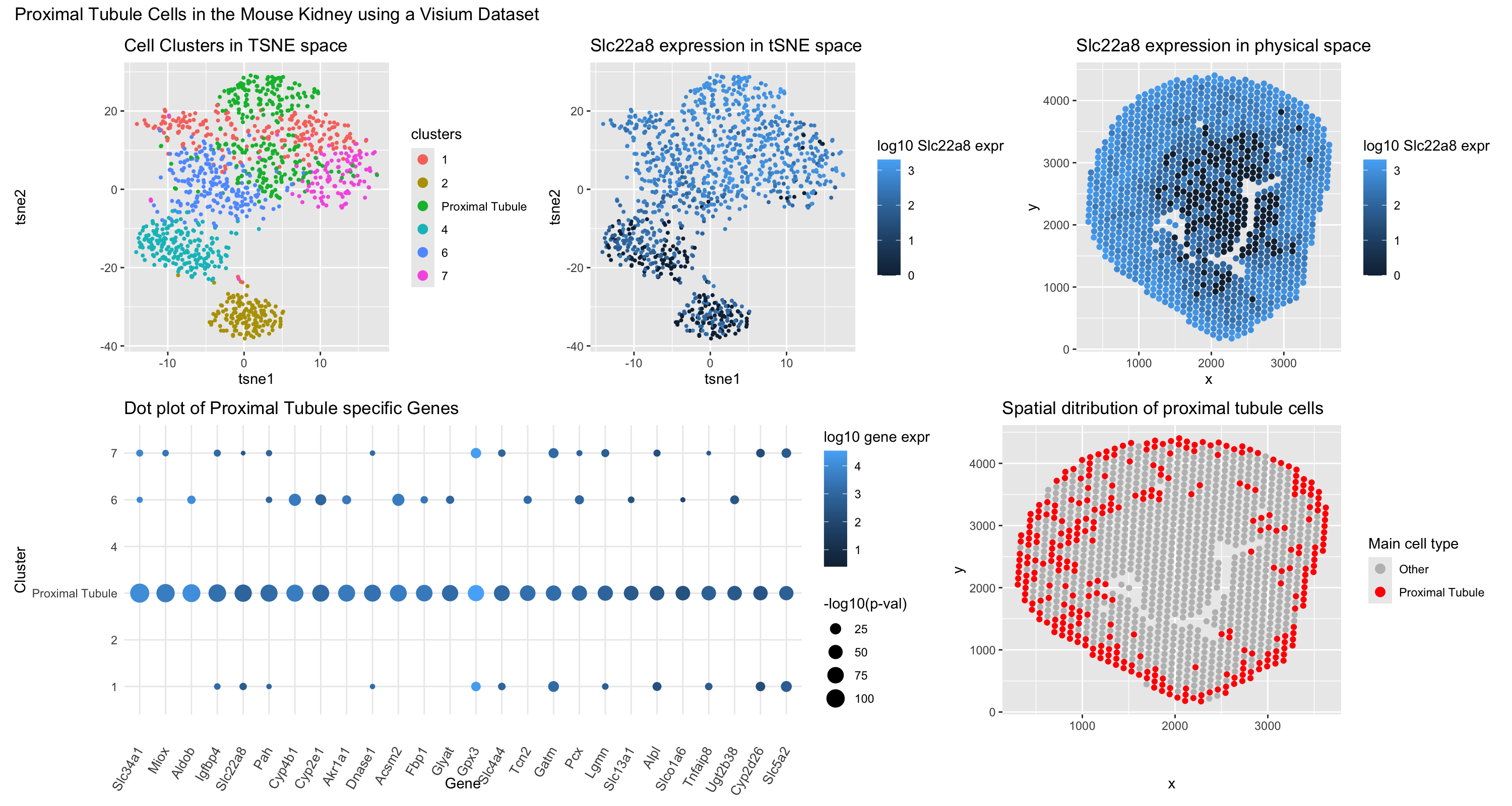
For this visualization, the Visium dataset is analyzed. The previous visualization with the Xenium dataset analysis brought to light the PCT cell-type, particularly the early segments of proximal tubules located...
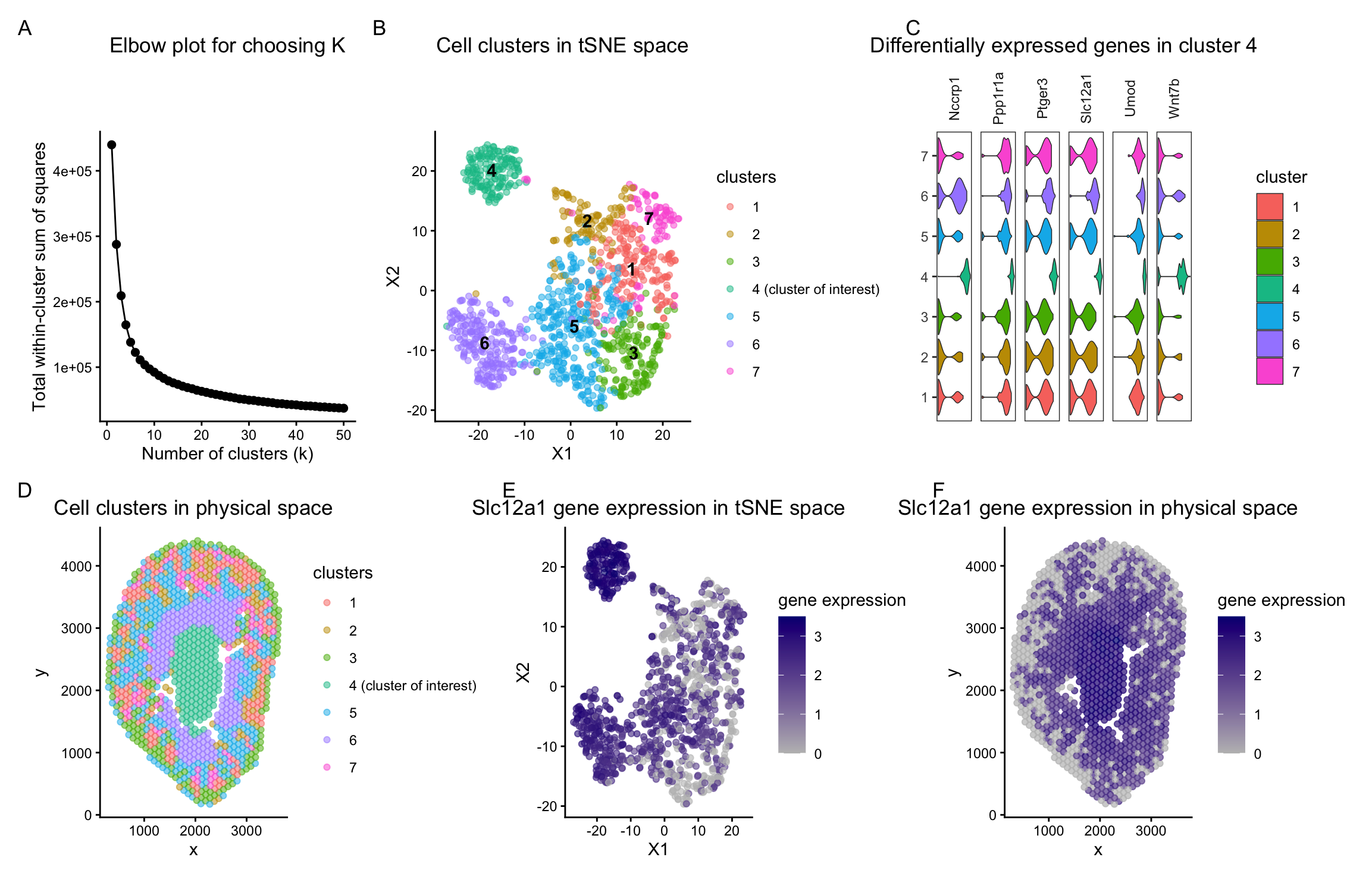
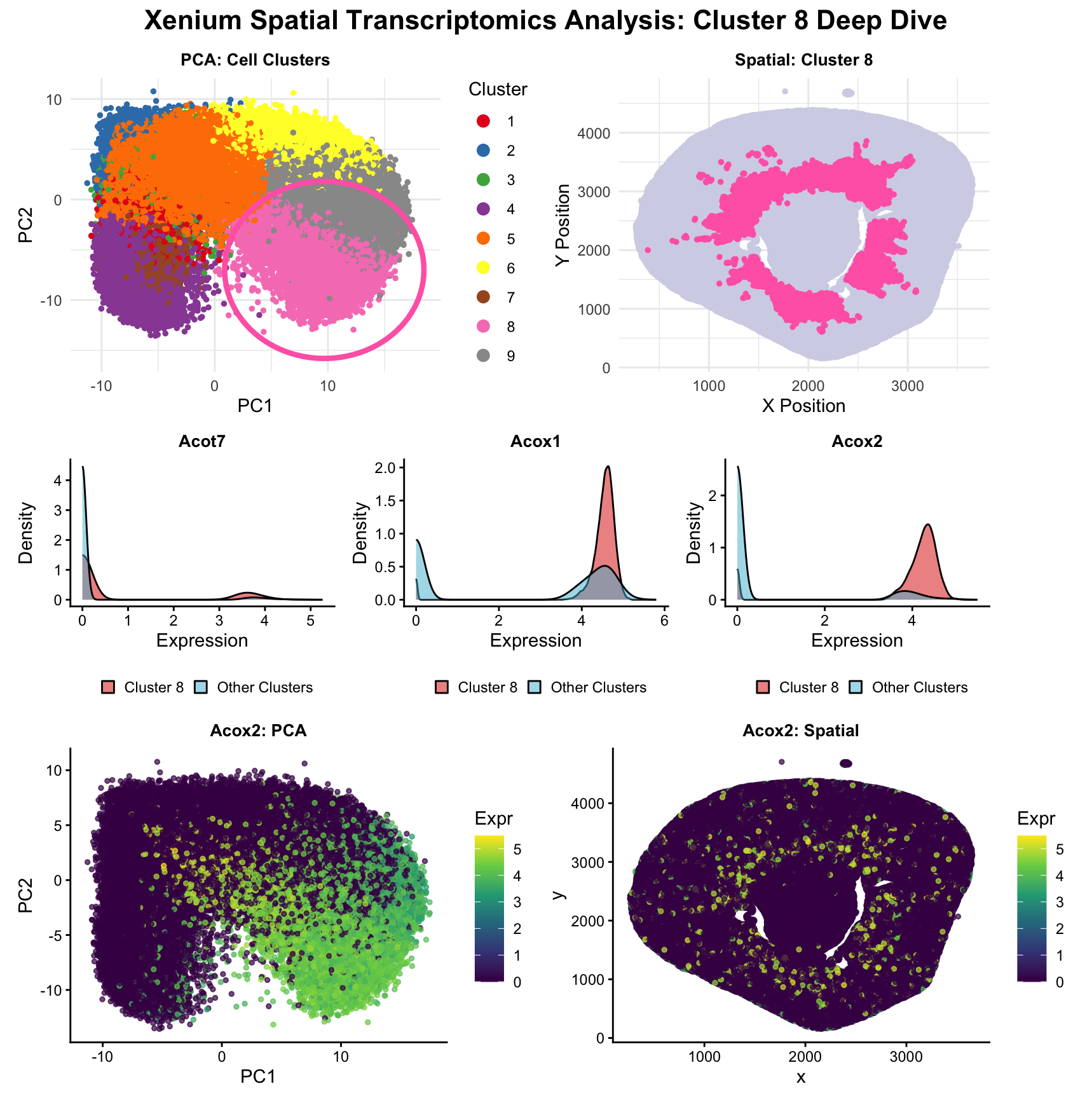
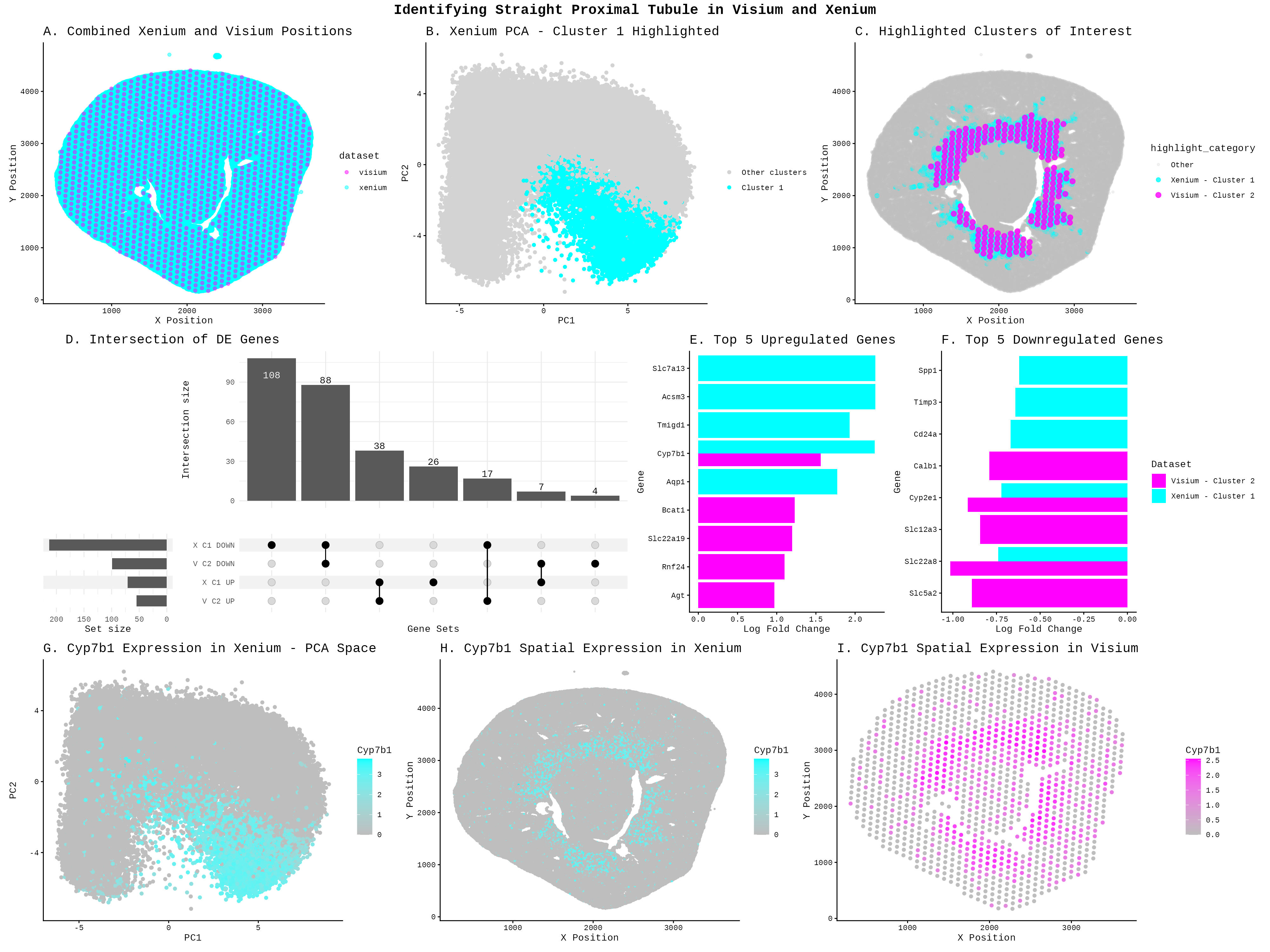
Description To identify the Straight Proximal Tubule (SPT) in the Xenium dataset using my HW3 Visium code, I increased the number of k-means clusters from 5 to 7 centers =...
1. Figure description This multi-panel data visualization uses principal component analysis (PCA), t-distributed stochastic neighbor embedding (tSNE), k-means clustering, and differential expression analysis to characterize a cluster of interest based...
Description To identify the same group of cells in the Visium dataset, I adapted the same analysis I used previously for the Xenium dataset. Like before, I normalized the raw...
For these visualizations, I switched over to the spot-resolution Visium dataset from the single-cell Xenium dataset. I was able to successfully apply the same pre-processing pipeline and maintain parameters from...
Write a description to convince me you found the same cell-type. You will likely need to change your code from HW3. Write a description of what you changed and why...
Visium –> Xenium I made three main code changes when switching from Visium to Xenium. First, I updated the data source to Xenium-IRI-ShamR_matrix.csv.gz. Second, I reduced point size from 0.6...
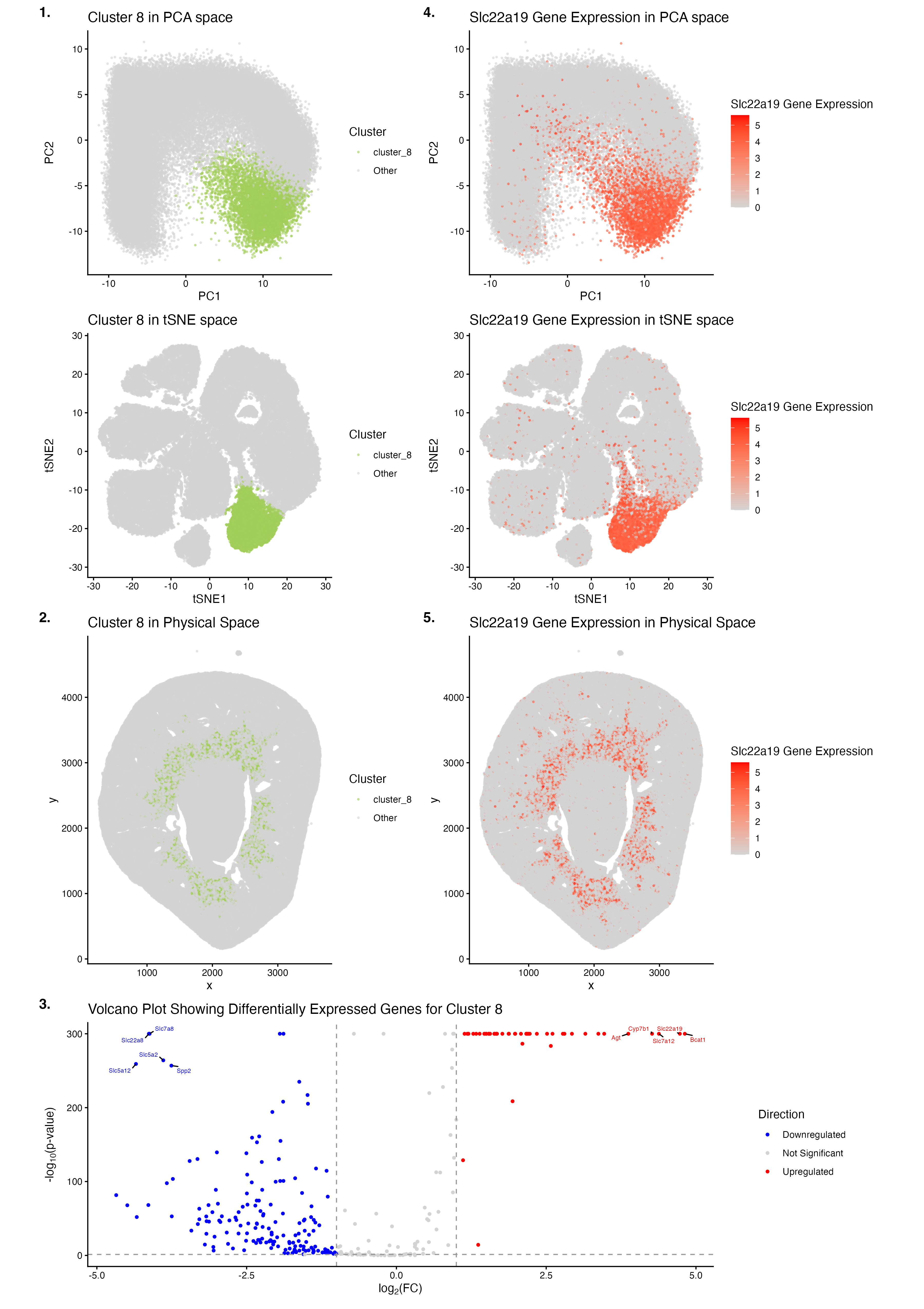
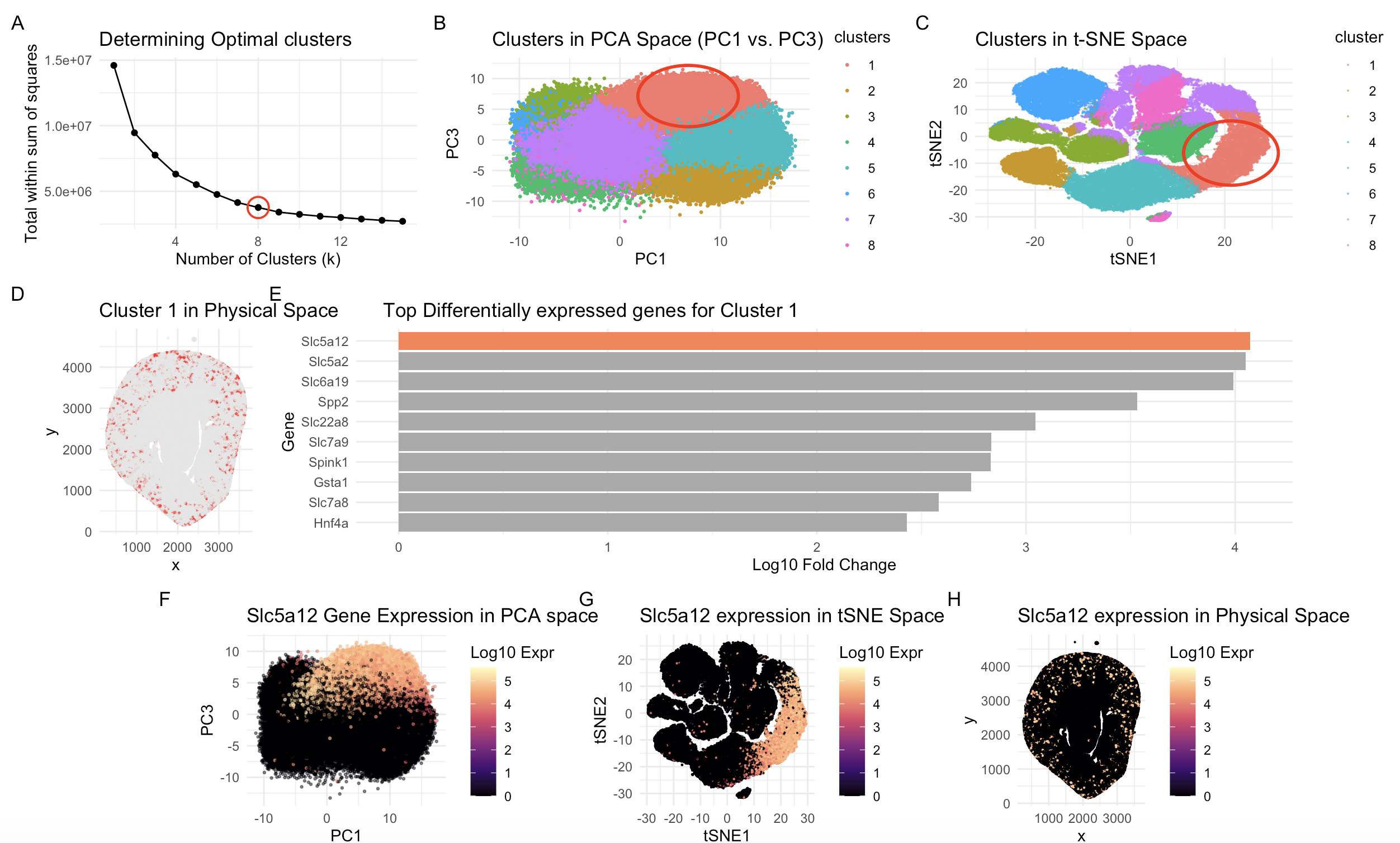
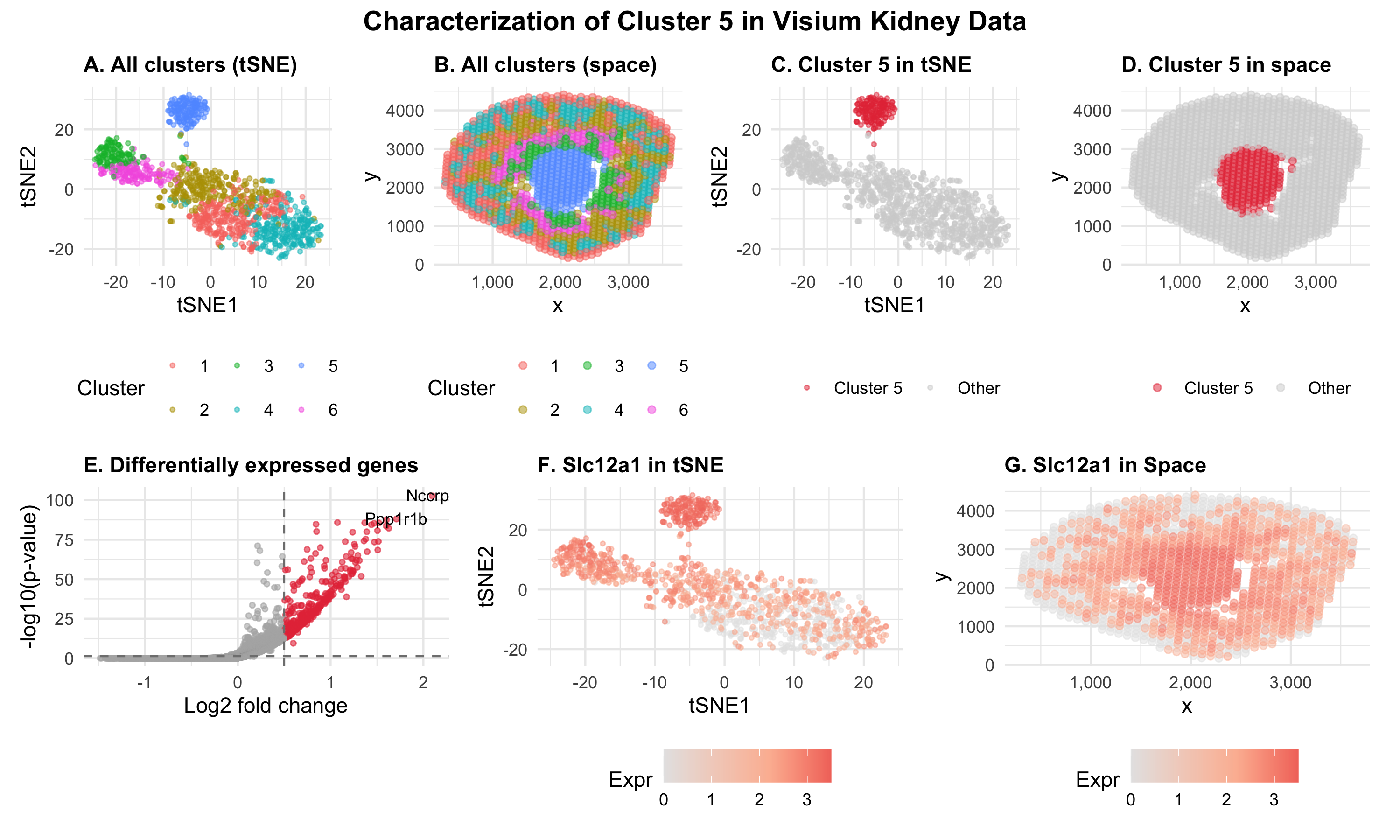
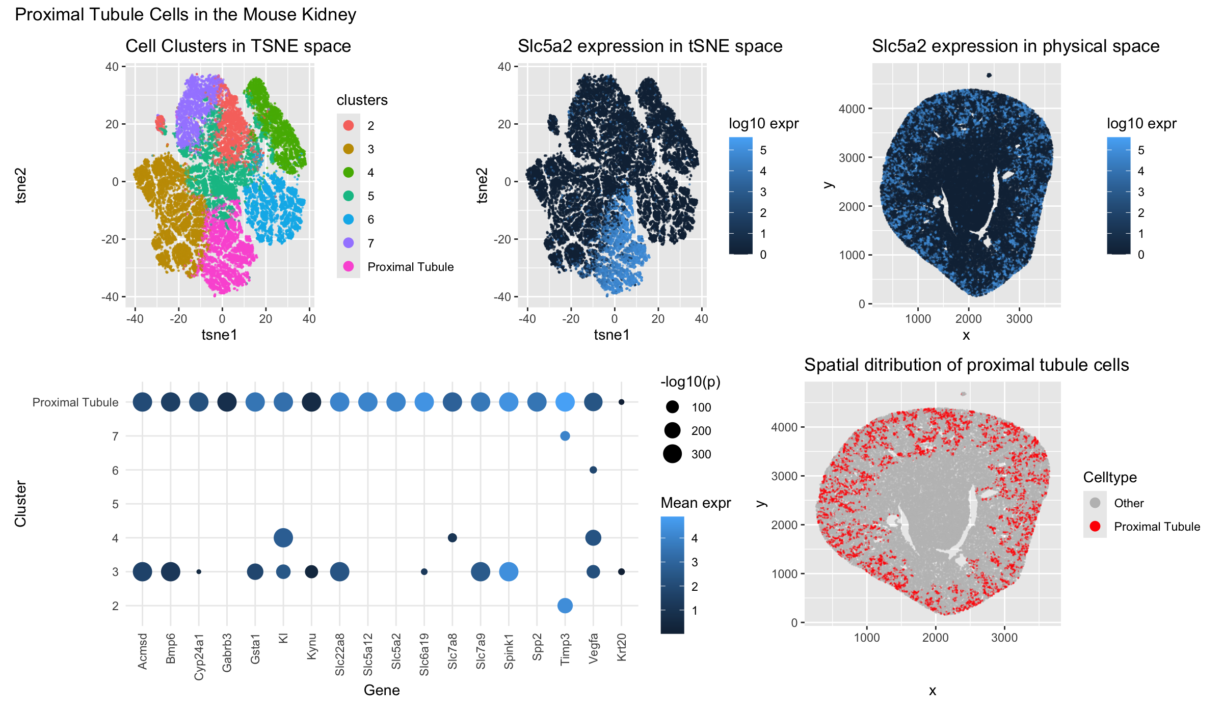
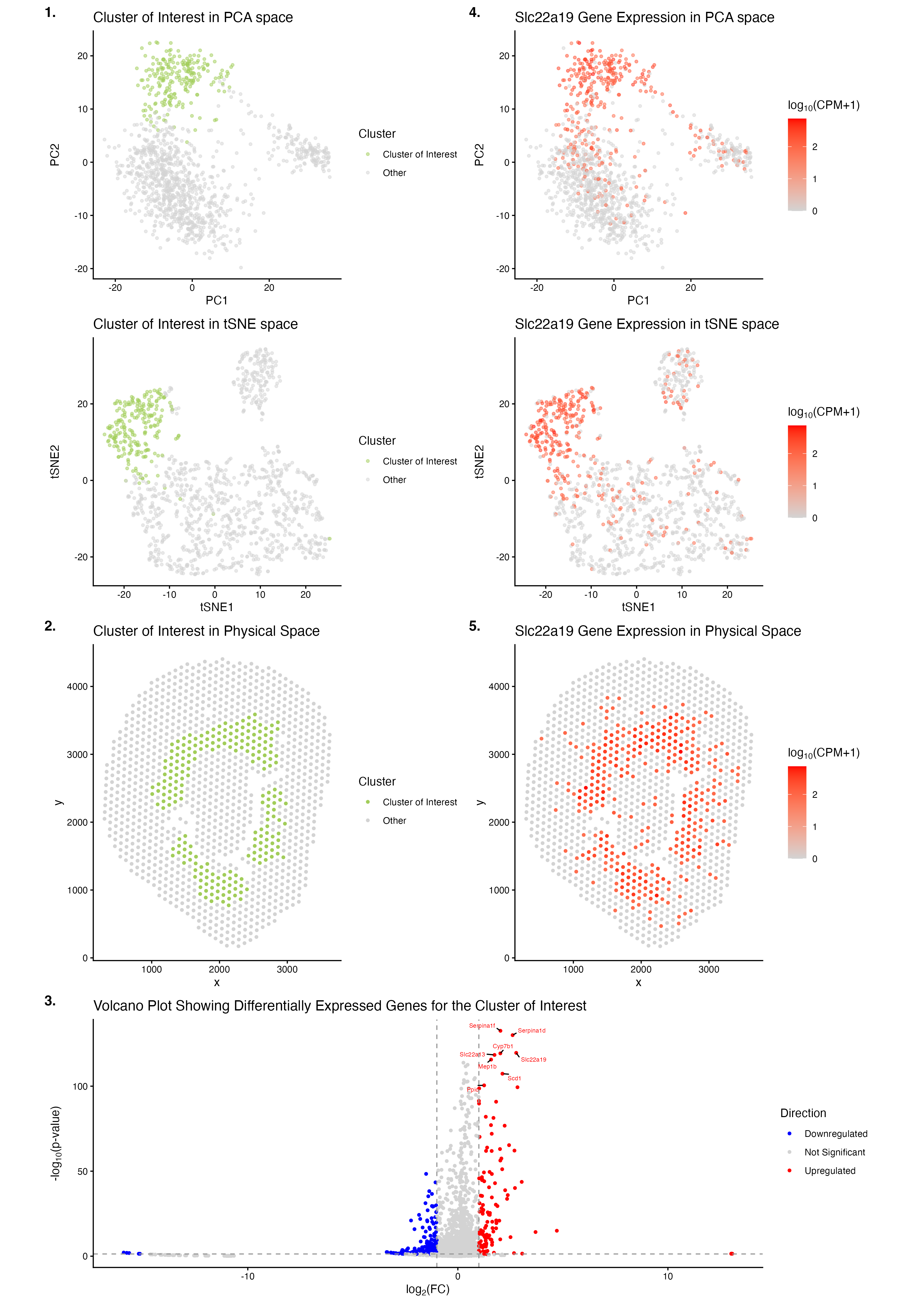
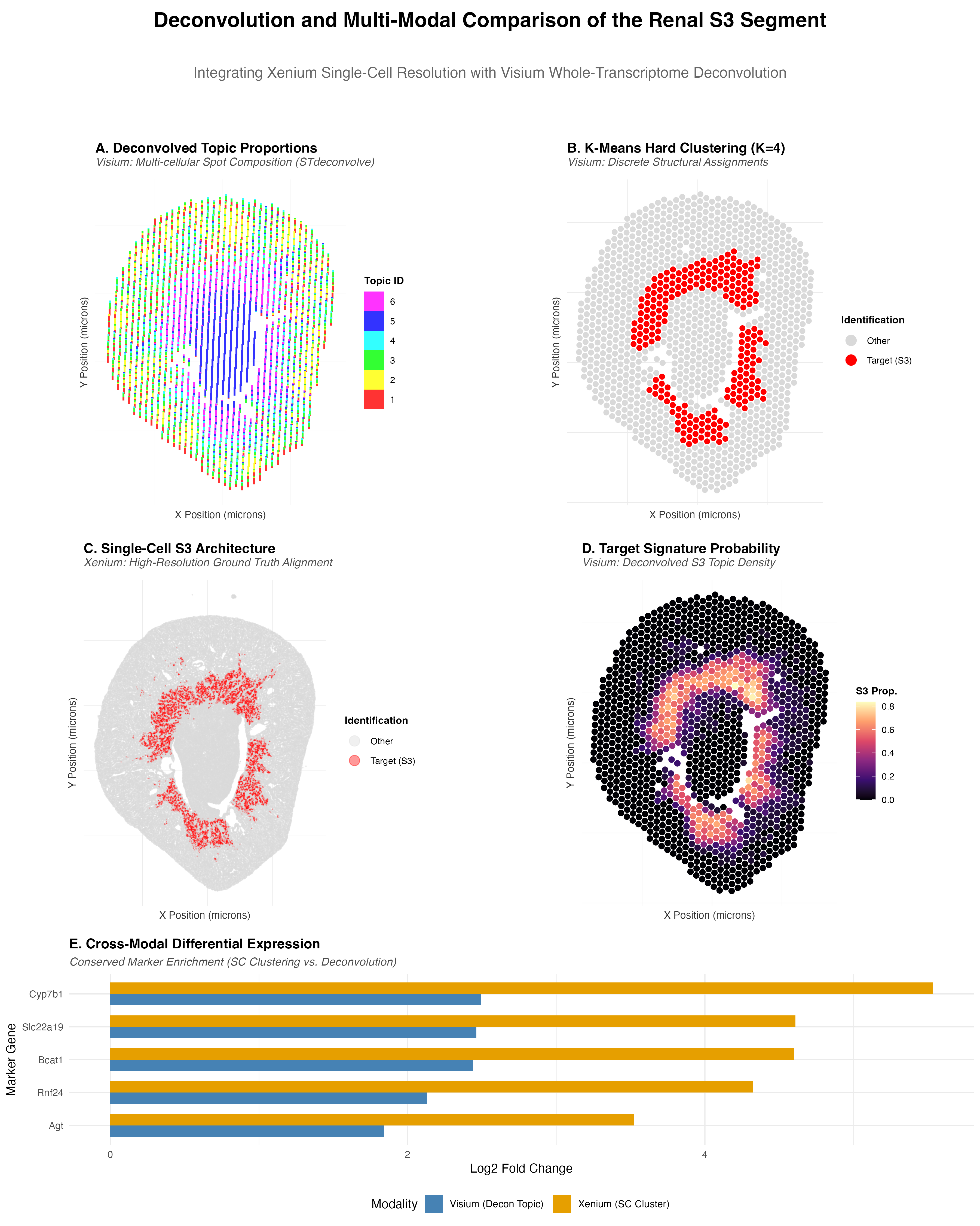
Write a description to convince me you found the same cell-type. Cluster 2 most likely represents proximal tubule S3 epithelial cells. This is supported by its inner stripe/outer medulla location...
Use/adapt your code from HW3 to identify the same cell-type in the other dataset. Create a multi-panel data visualization and write a description to convince me you found the same...
Describe your figure briefly so we know what you are depicting (you no longer need to use precise data visualization terms as you have been doing). Write a description to...
I’ve been analyzing Visium data so far, and this time I switched to Xenium data to try to identify the same cell type I found in HW3 using Visium. However,...
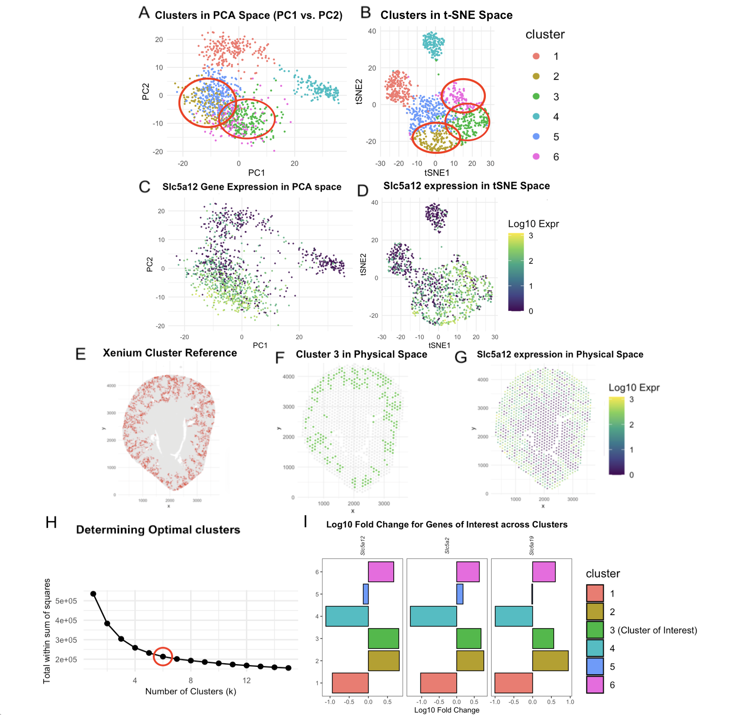
Figure Description and Interpretation In Homework 3, I analyzed the Xenium dataset using k-means clustering with k = 10 and identified cluster 3 as an Aqp2-enriched population corresponding to collecting...
Description of Data Visualization: The Visium dataset was normalized (CPM) and its dimensionality was reduced using principal component analysis. The data was then plotted in 2 dimensional (PC1, PC2) space...
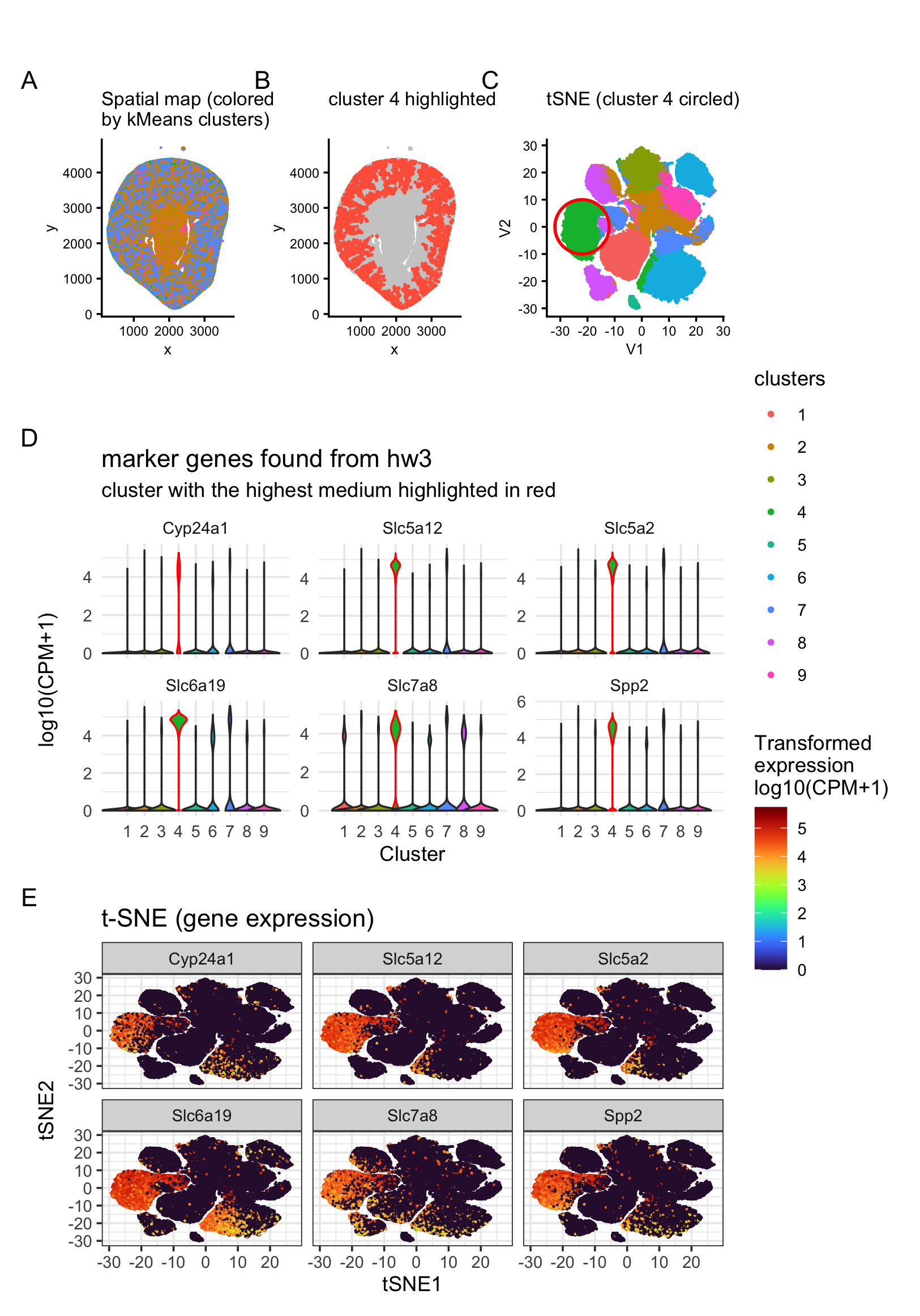
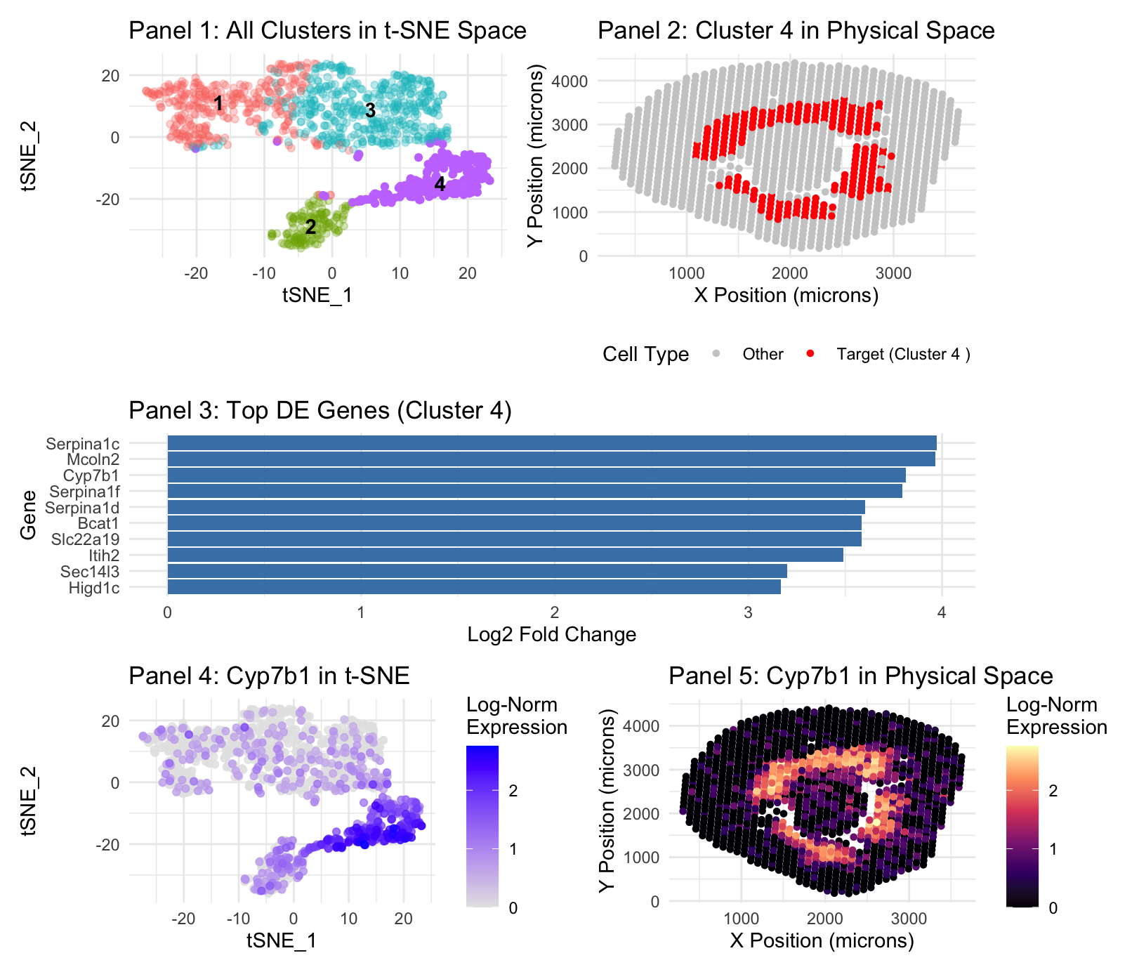
Panel 1 represents t-SNE clustering, Panel 2 represents cluster 4 spatial mapping. Panel 3 is top DE genes in cluster 4. Panel 4 is t-SNE mapping of the top cluster...
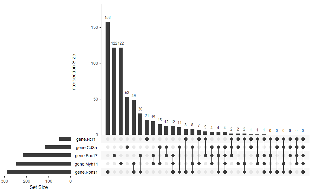
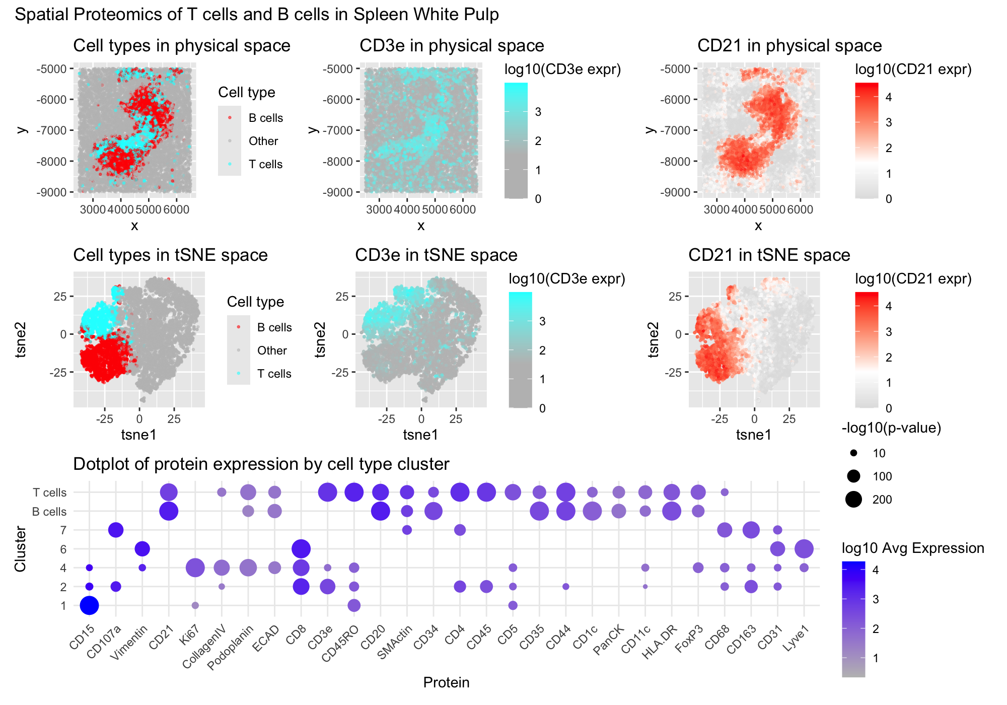
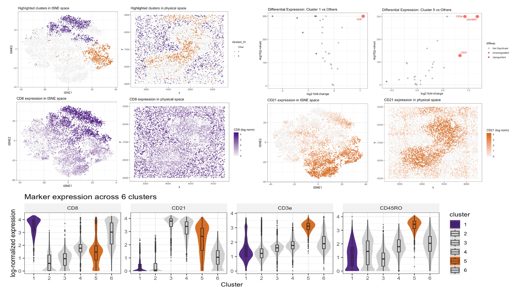
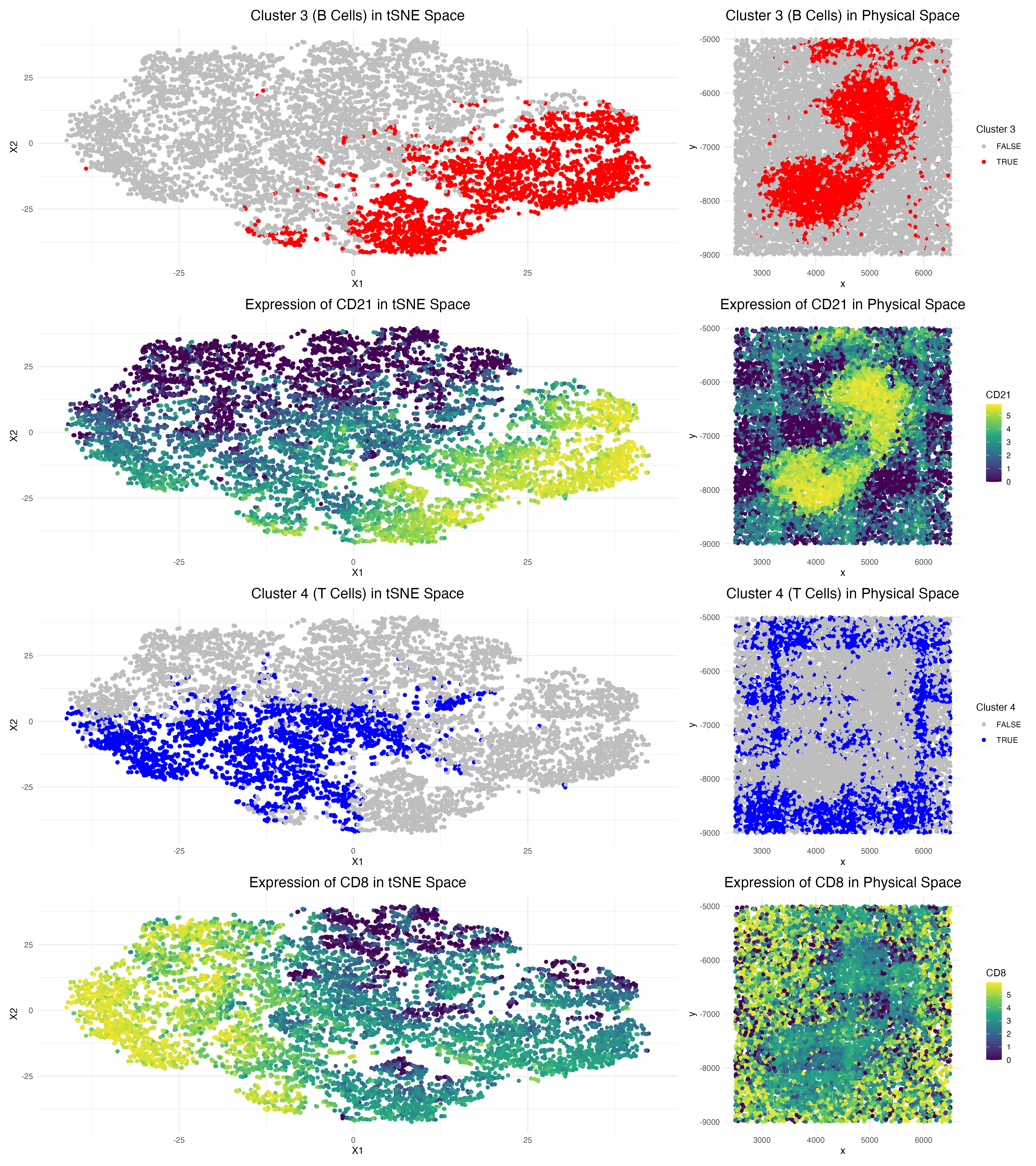
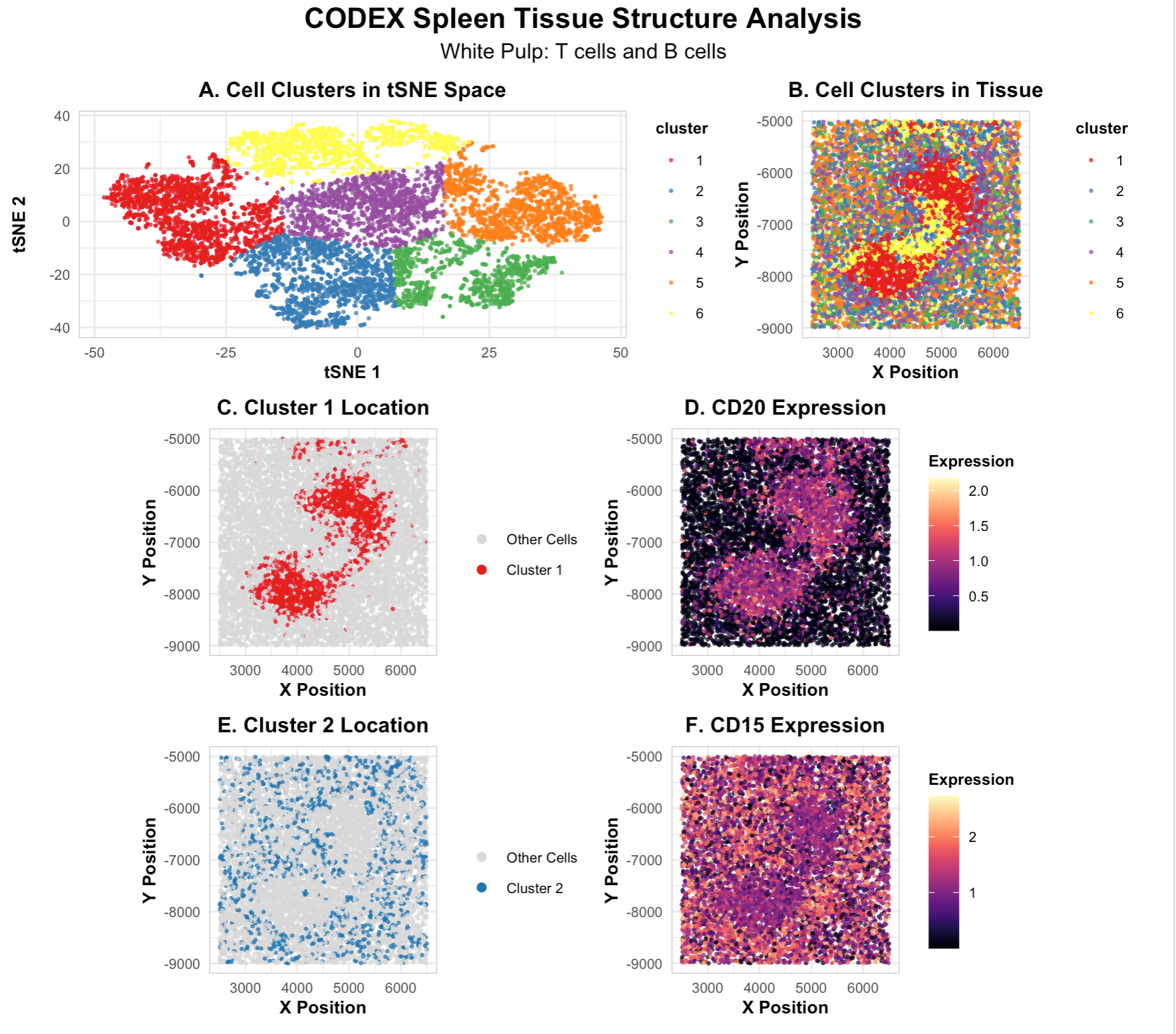
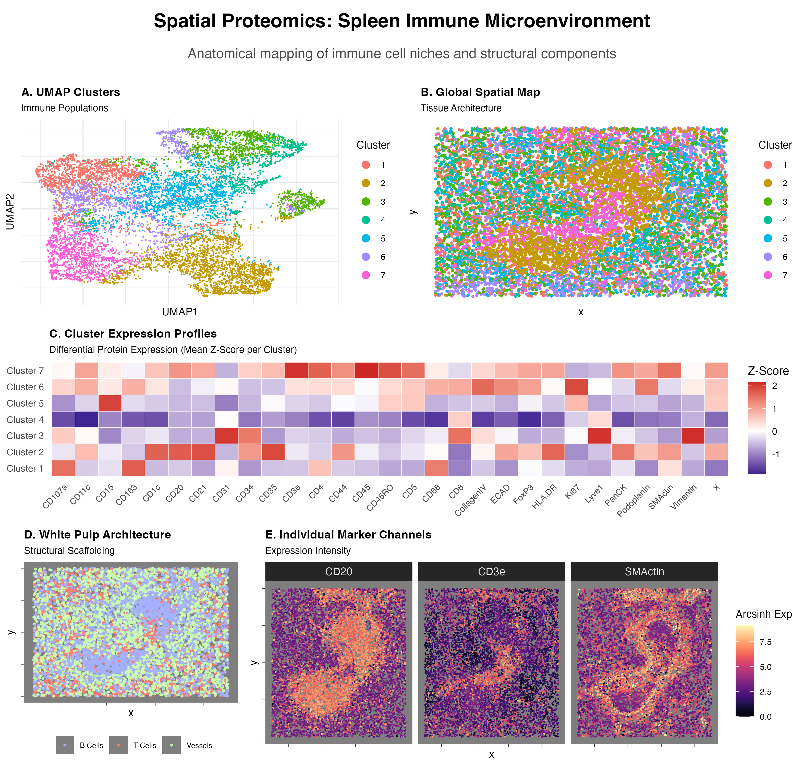
1. Figure Description I created a multipanel figure to show the distribution of B cells and T cells in thhe spleen. Throughout, I used the gestalt principle of similarity to...
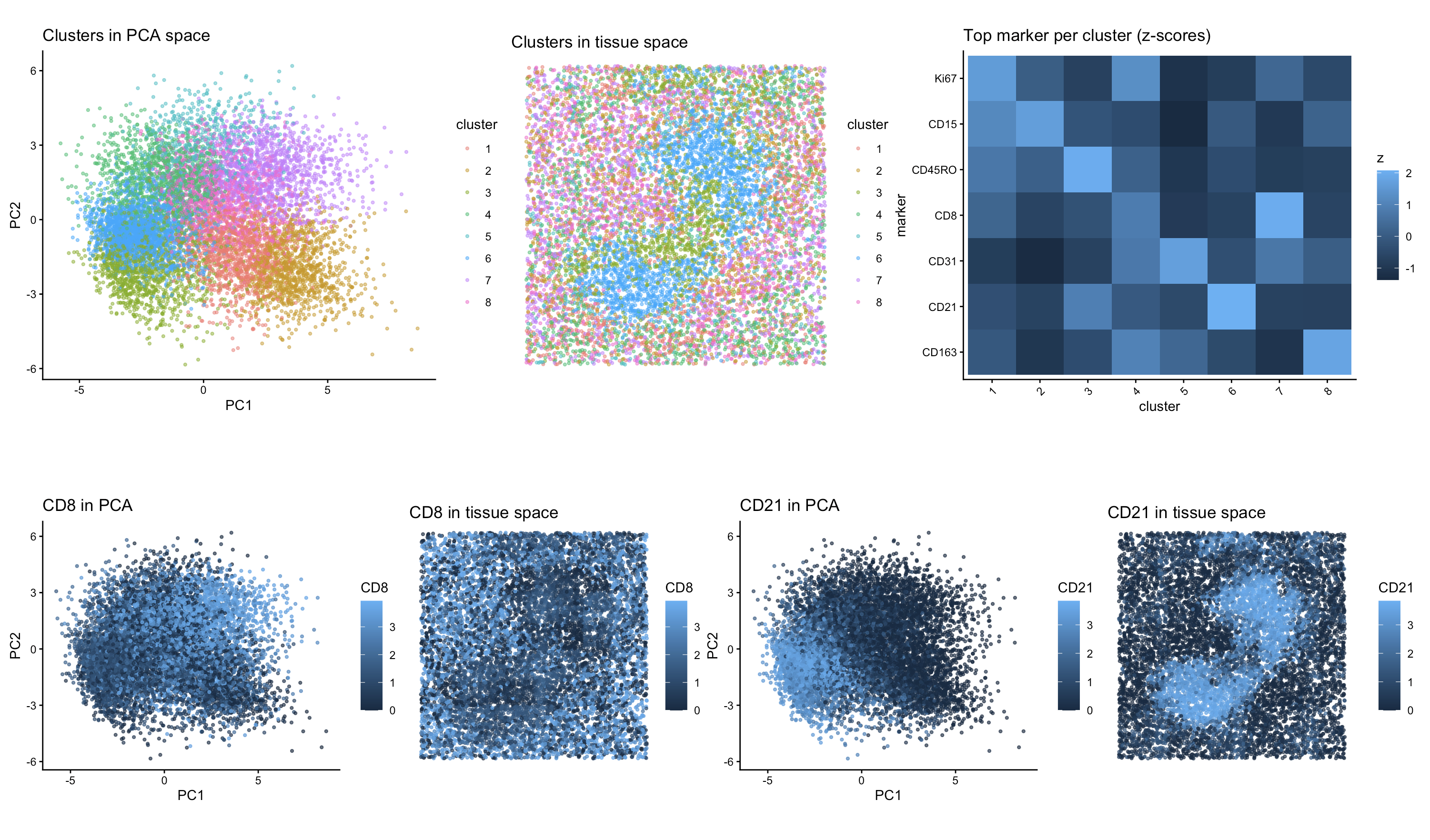
Description of Data Visualization: The CODEX dataset was normalized (log10(CPM+1)) by library size and its dimensionality was reduced using tSNE (seed(123)). The normalized dataset was also reduced using PCA, from...
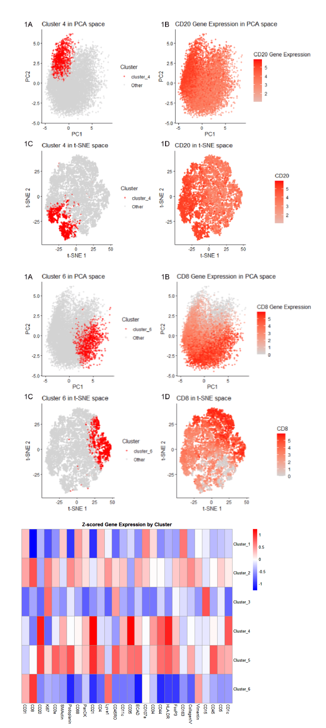
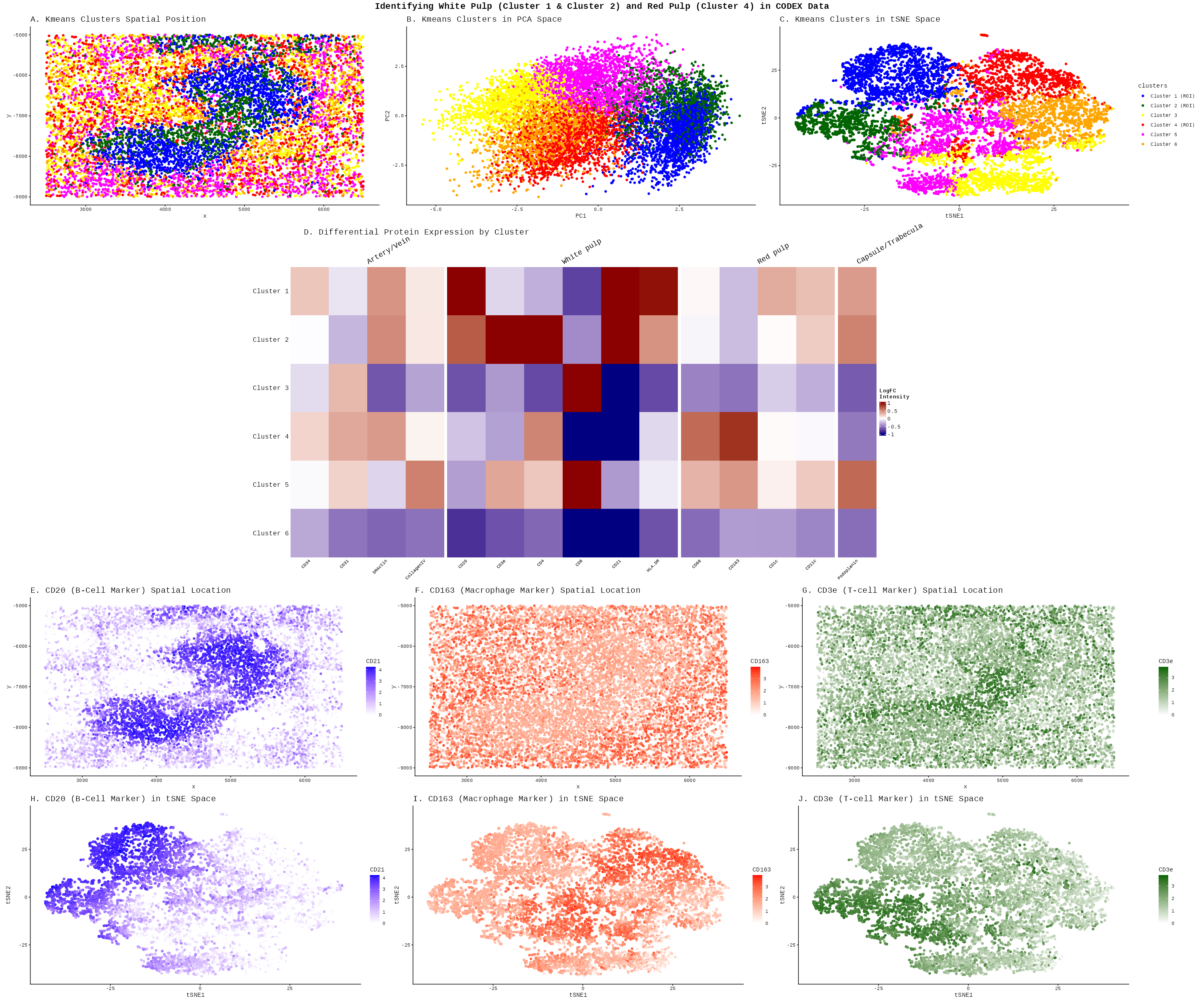
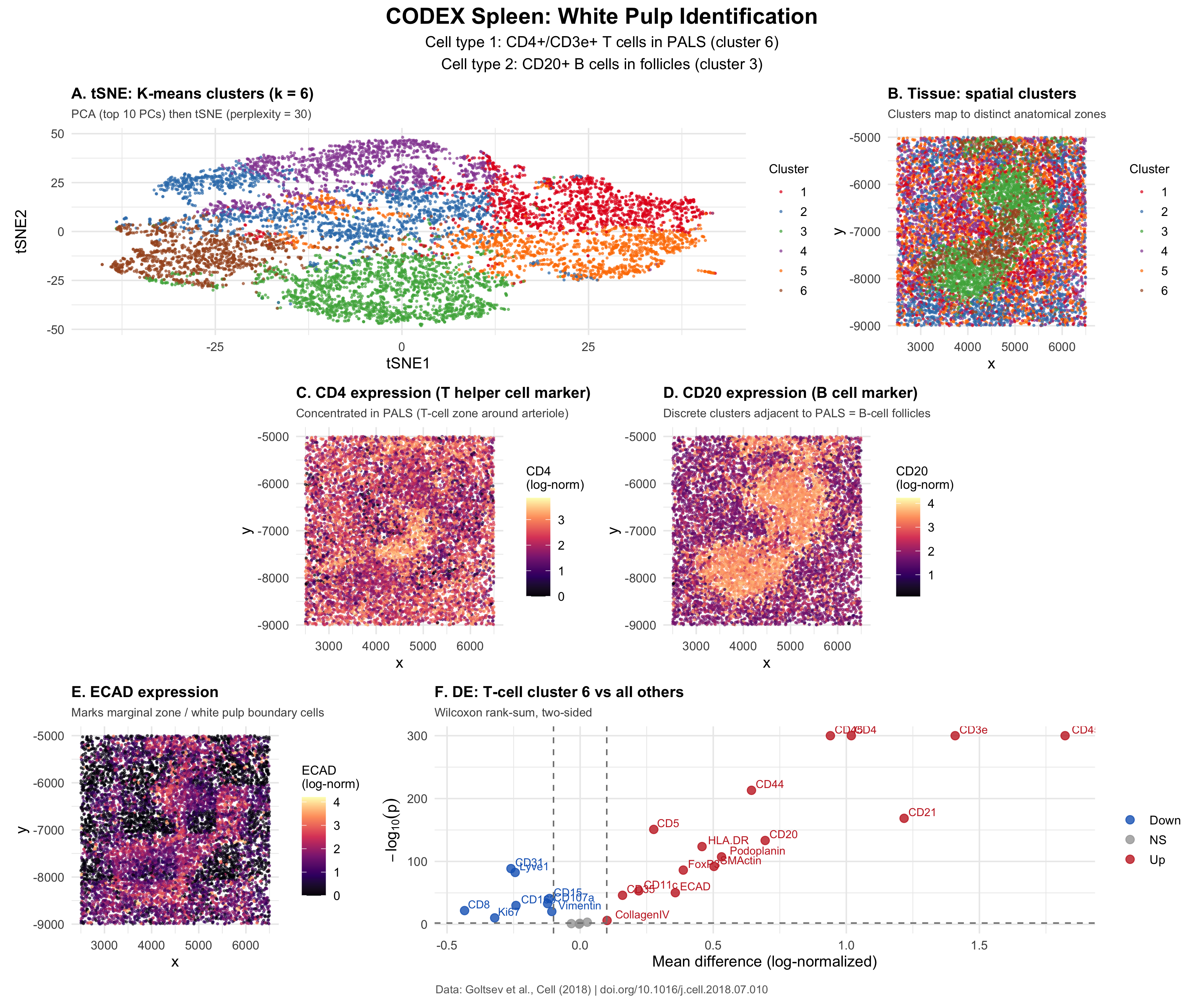
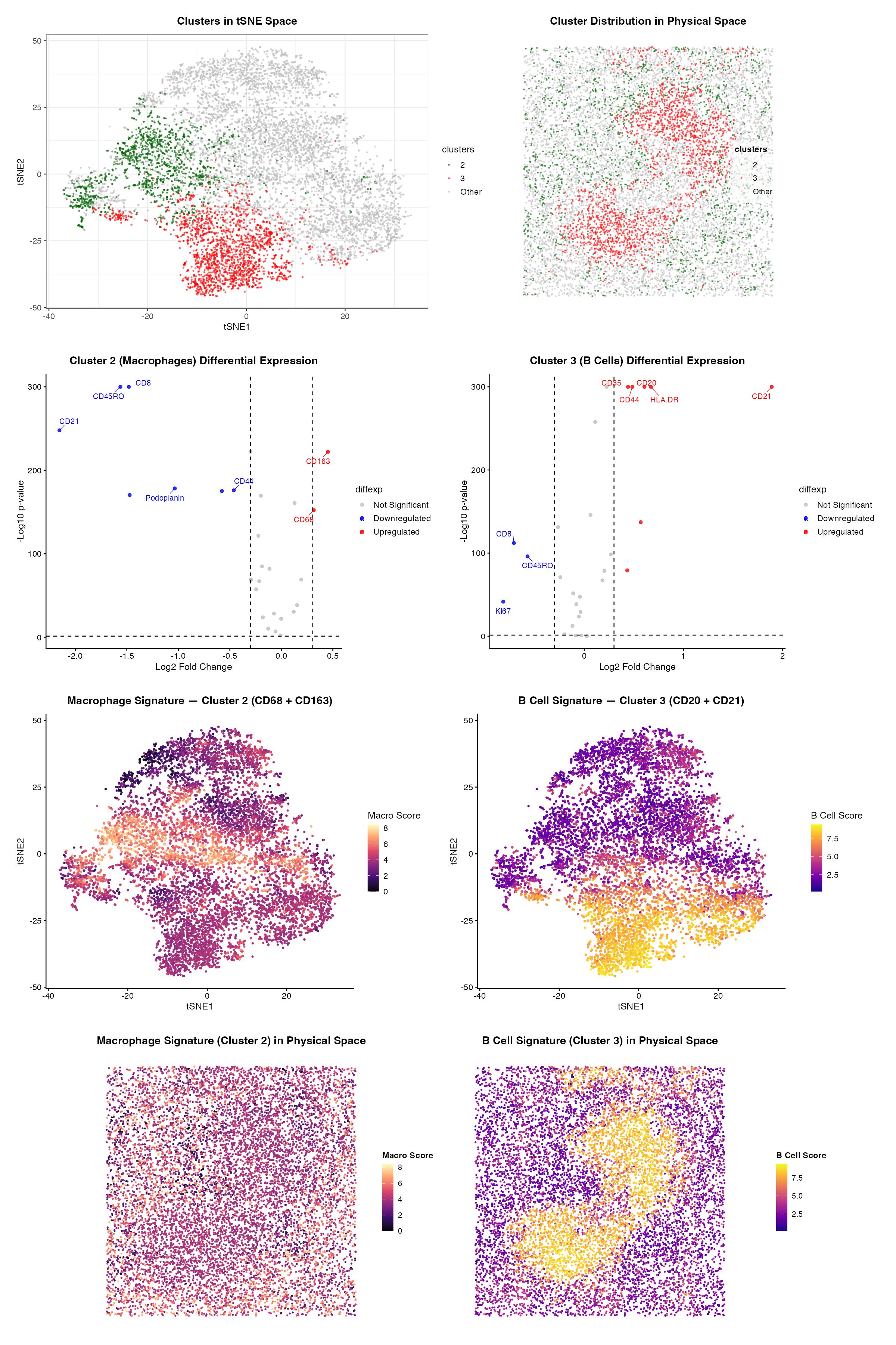
Write a description to convince me you found the same cell-type. Cluster 4 most likely represents white pulp due to its association with CD20 expression, a B-cell marker found in...
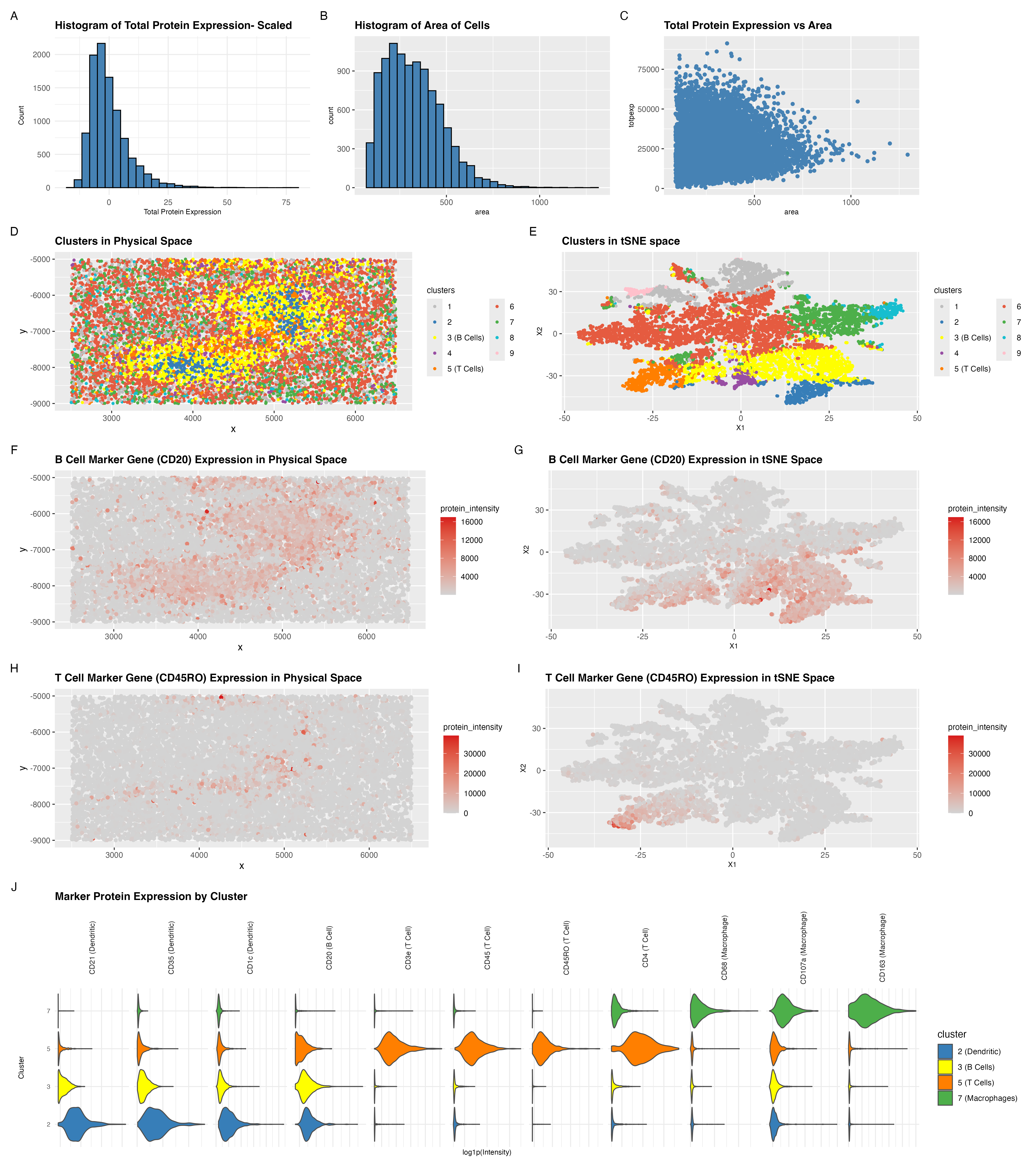
##Description I filtered out the bottom and top 1% of cells by total signal and cell area to remove dead cells, doublets, and extreme outliers, retaining 9,599 out of 10,000...
Perform a full analysis (quality control, dimensionality reduction, kmeans clustering, differential expression analysis) on your data. Your goal is to figure out what tissue structure is represented in the CODEX...
I checked total protein signal and its relationship with cell area, then log-transformed the protein intensities (log1p), ran PCA, embedded cells with tSNE using the top PCs, and applied k-means...
Figure out what tissue structure is represented in the CODEX data. Options include: (1) Artery/Vein, (2) White pulp, (3) Red pulp, (4) Capsule/Trabecula. You will need to visualize and interpret...
Instructions Perform a full analysis (quality control, dimensionality reduction, kmeans clustering, differential expression analysis) on your data. Your goal is to figure out what tissue structure is represented in the...
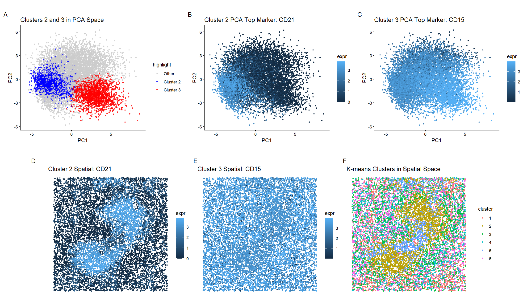
The CODEX dataset for spleen tissue was analyzed in this visualization. To identify a tissue structure in the data, a combination of methods were utilized such as normalization, PCA and...
1. Figure description This multi-panel data visualization uses principal component analysis (PCA), t-distributed stochastic neighbor embedding (tSNE), k-means clustering, and differential expression analysis to characterize clusters of interest based on...
Description My full analysis followed a similar pipeline to the previous homework assignments. I began by performing quality control by removing cells in the bottom 1% of total protein expression...
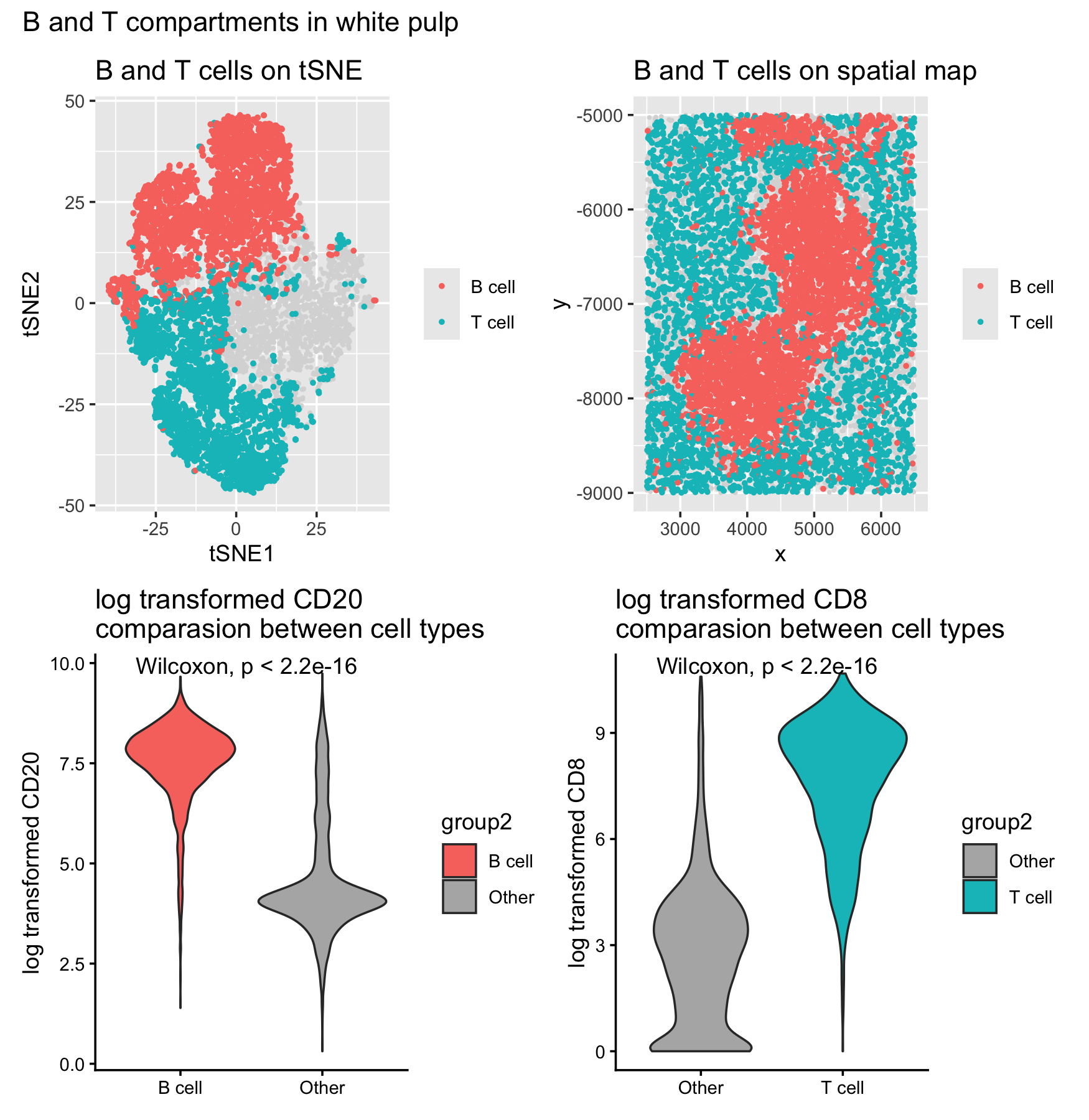
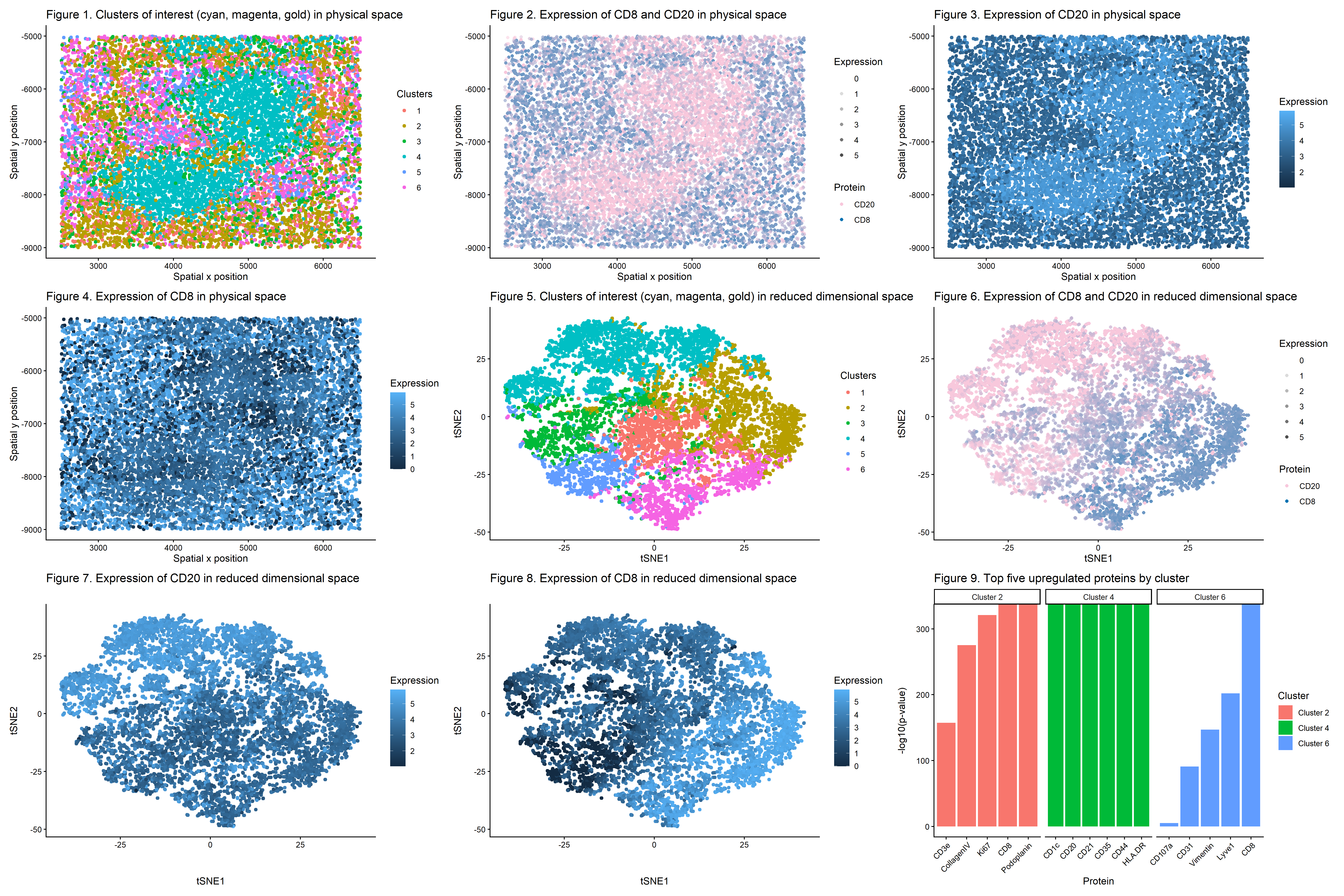
This data visualization of a spleen CODEX dataset highlights two cell clusters, B cells and T cells, identifying the tissue as white pulp based on protein markers and physical organization...
Perform a full analysis (quality control, dimensionality reduction, kmeans clustering, differential expression analysis) on your data. Your goal is to figure out what tissue structure is represented in the CODEX...
Description In this analysis, I used CODEX spatial proteomics data from spleen tissue to identify what tissue structure was present. After filtering out low-quality cells by area, I performed tSNE...
###Summary To identify the tissue structure represented in this CODEX dataset, I performed quality control, dimensionality reduction, k means clustering, differential expression analysis, and cell-type signature scoring. Proteins with low...
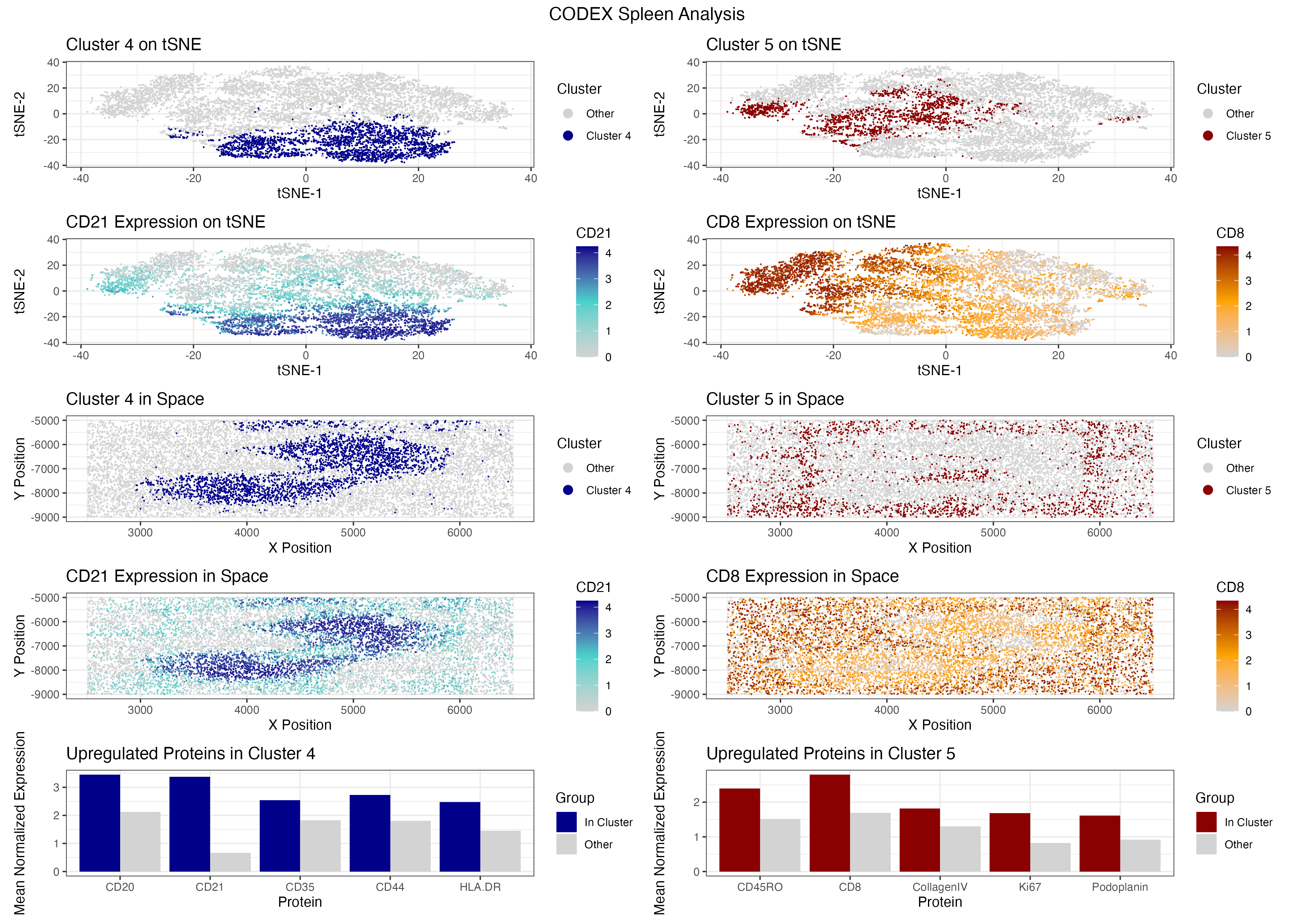
Visualized is a UMAP Cluster graph(A), a Global Spatial Map based on cluster labels(B), a Cluster Expression Profile heatmap(C), a Spatial Map of higlighted cell type(B cells—CD20, T cells—CD3e, Vessels—)(D),...
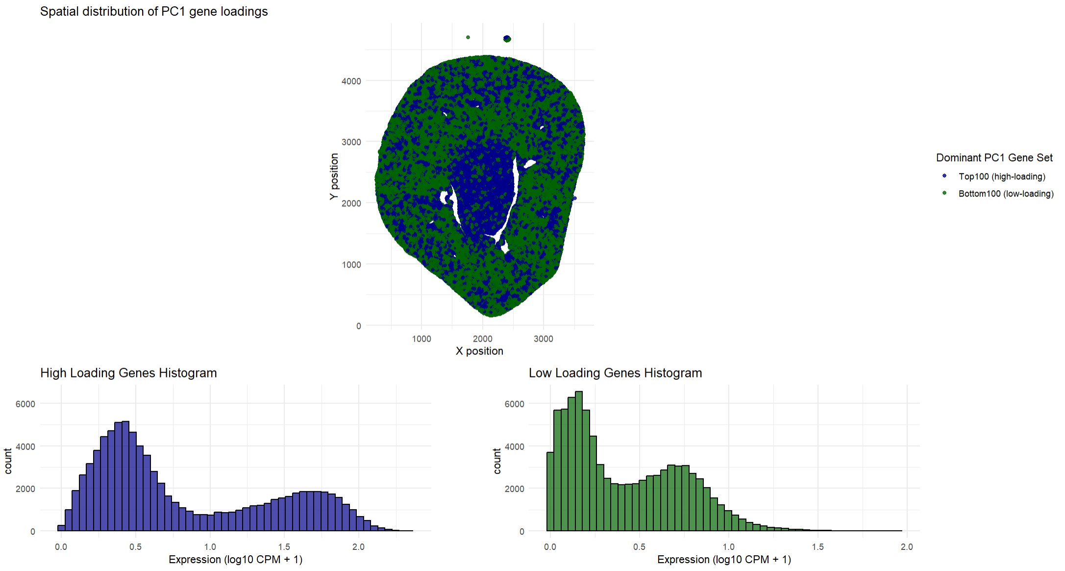
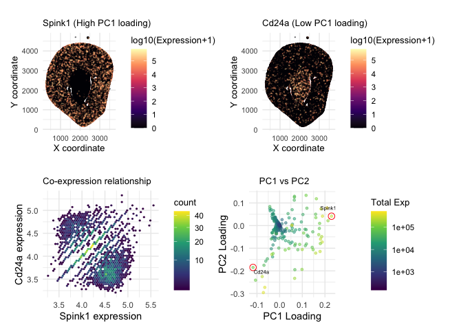
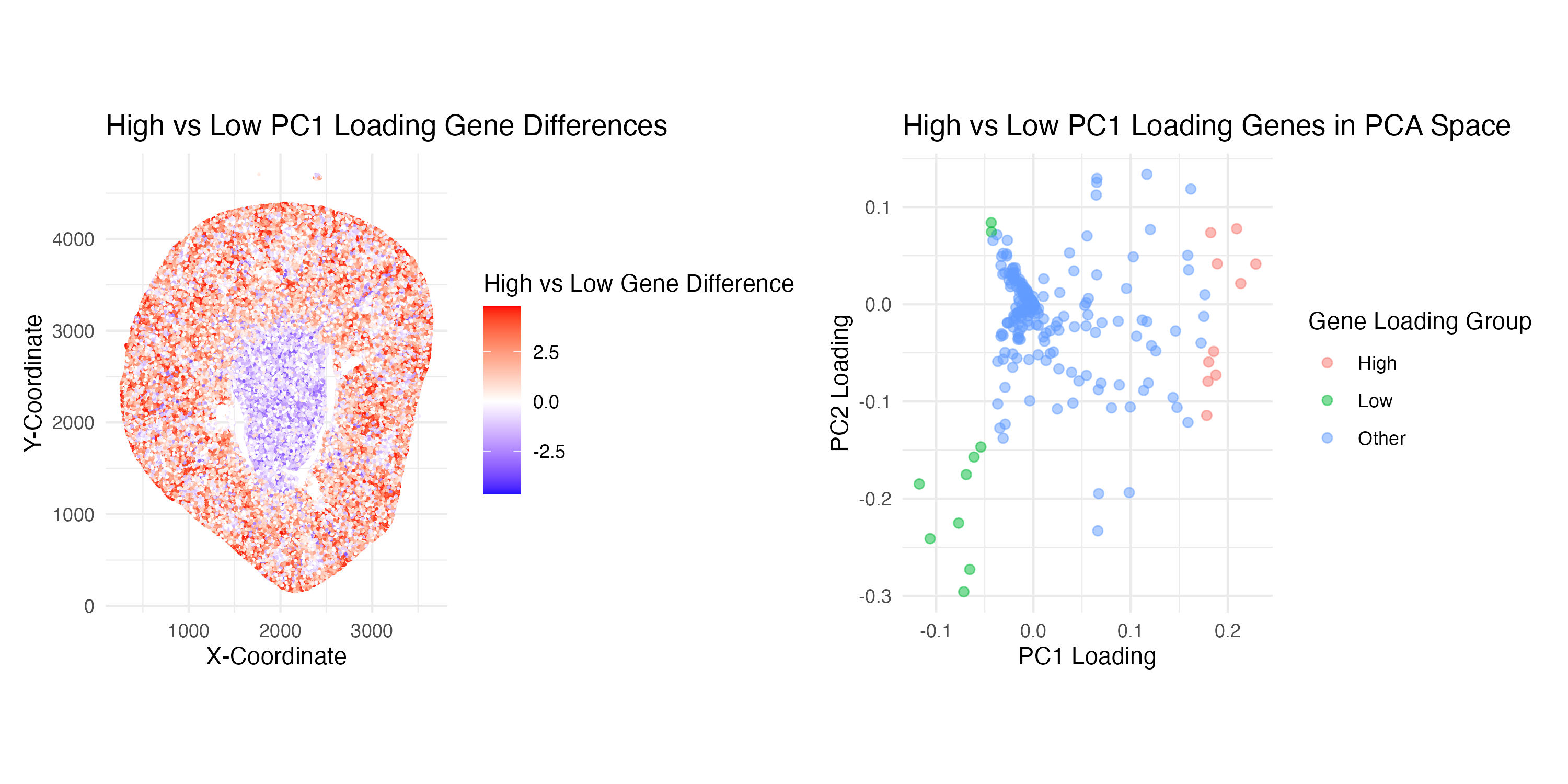
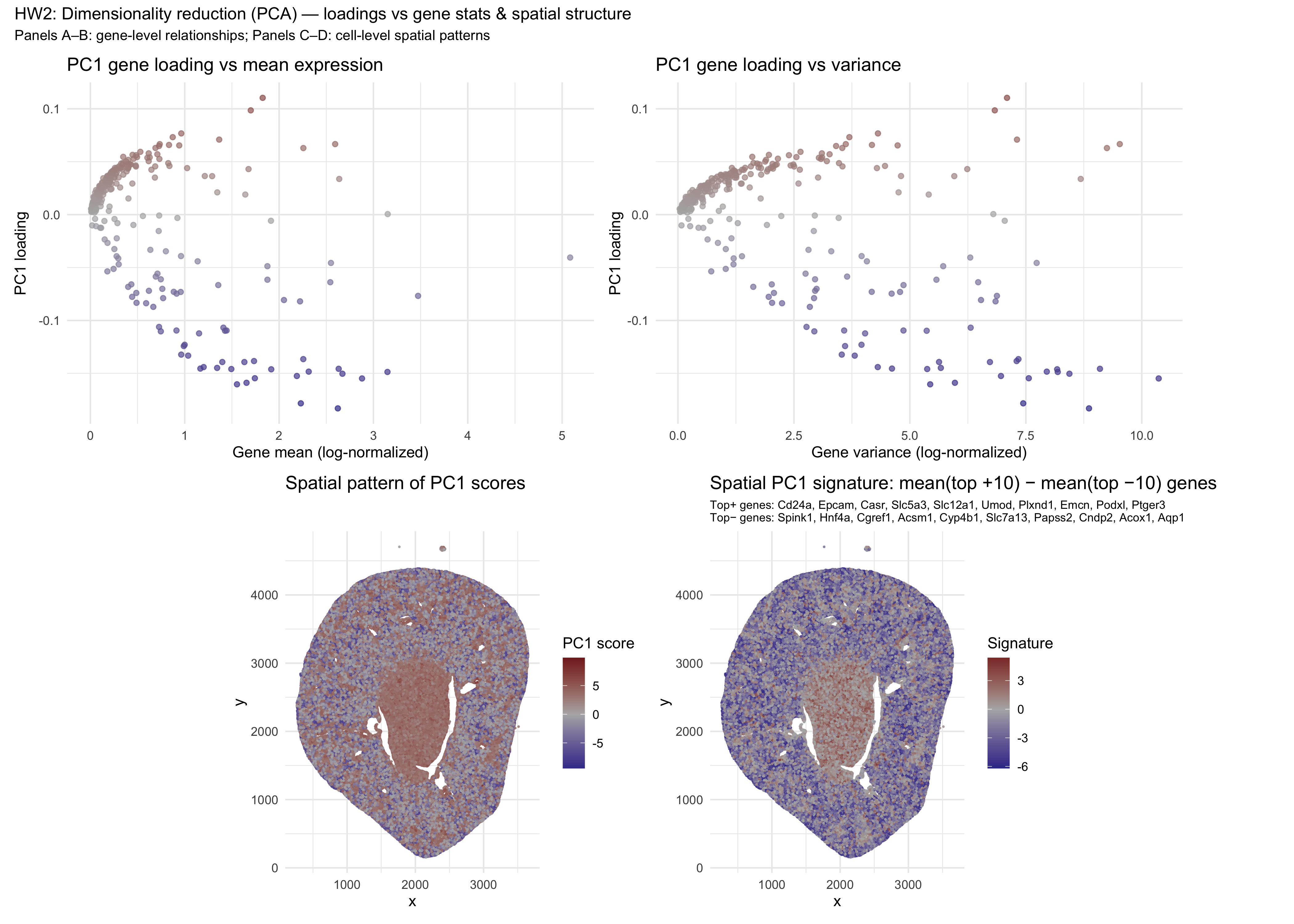
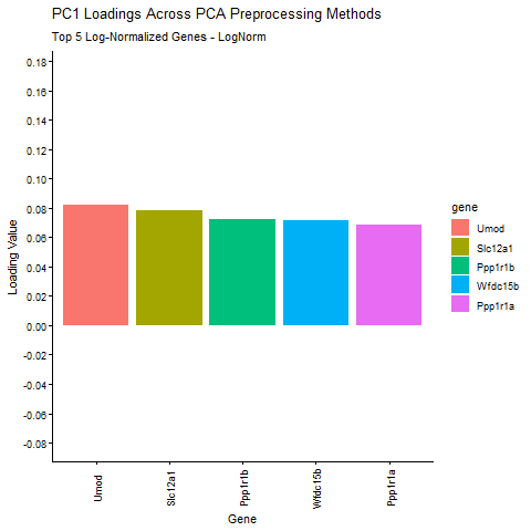
## In this homework, I wanted to explore the following question: How do the genes with high versus low loadings relate to each other? How are they patterned relative to...
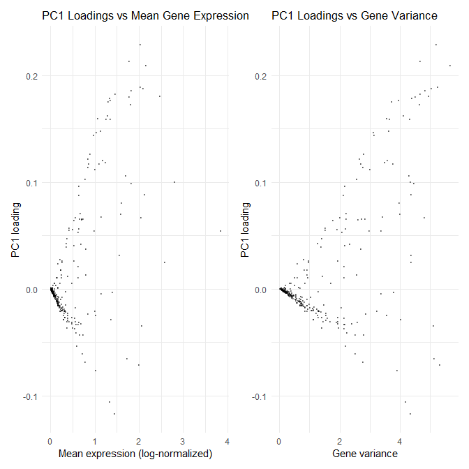
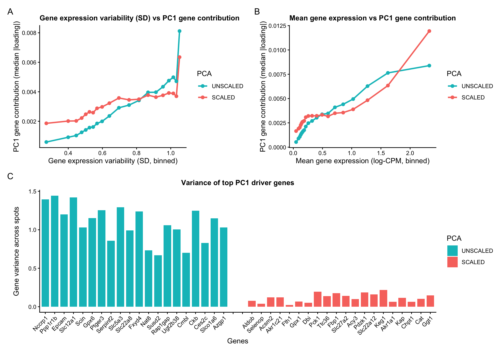
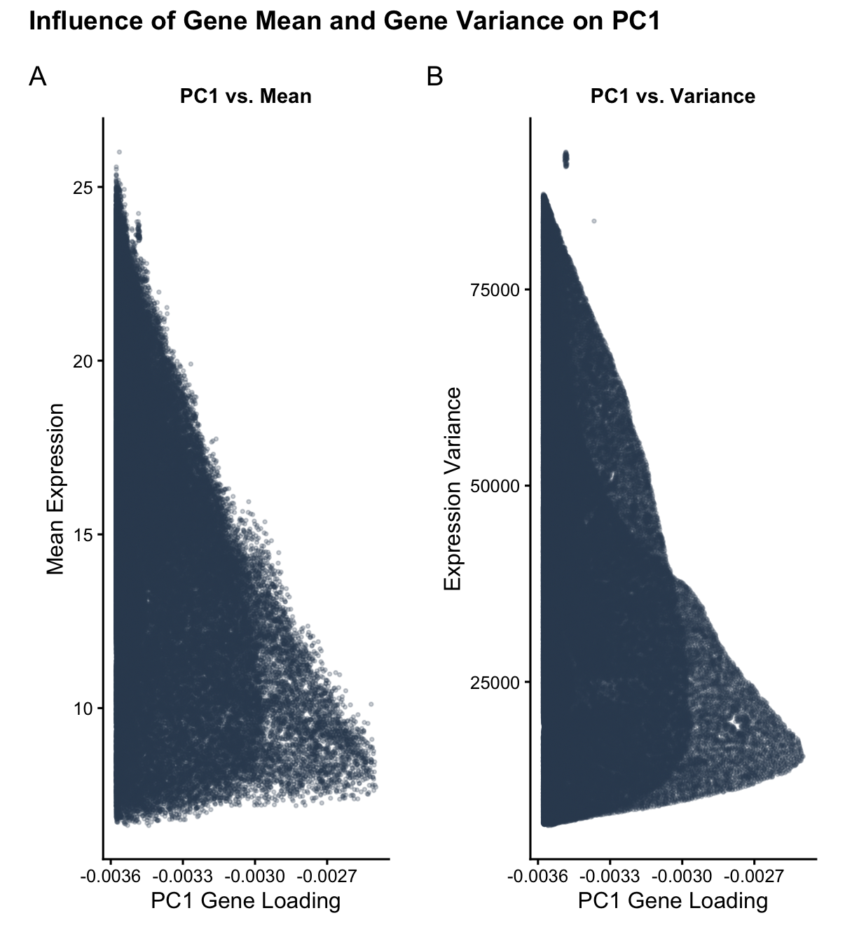
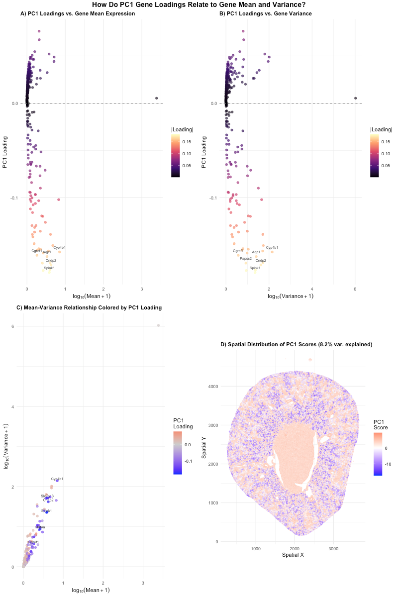
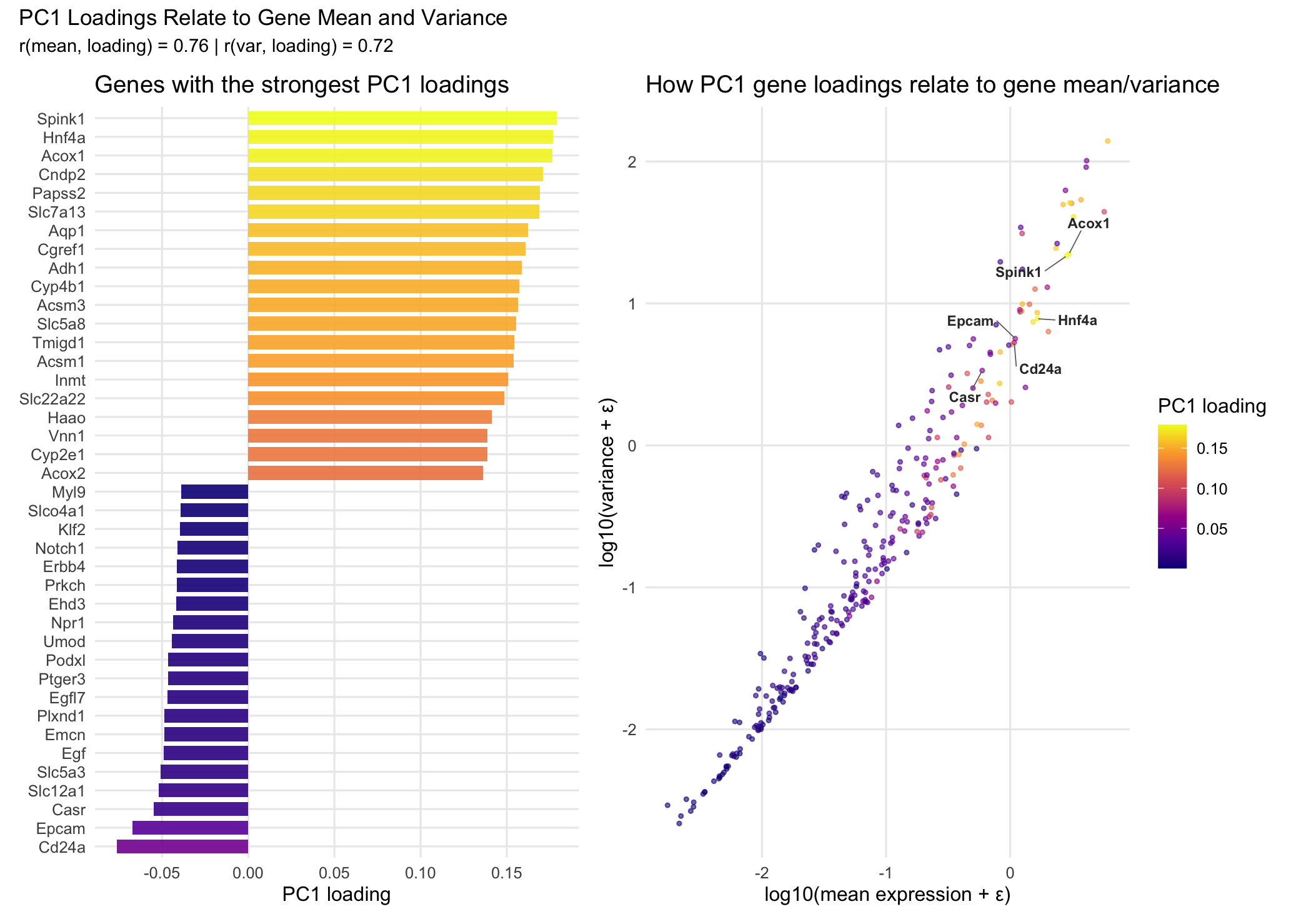
1. How do the gene loadings on the first PC relate to features of the genes such as its mean or variance? For context, the data was log-transformed, but not...
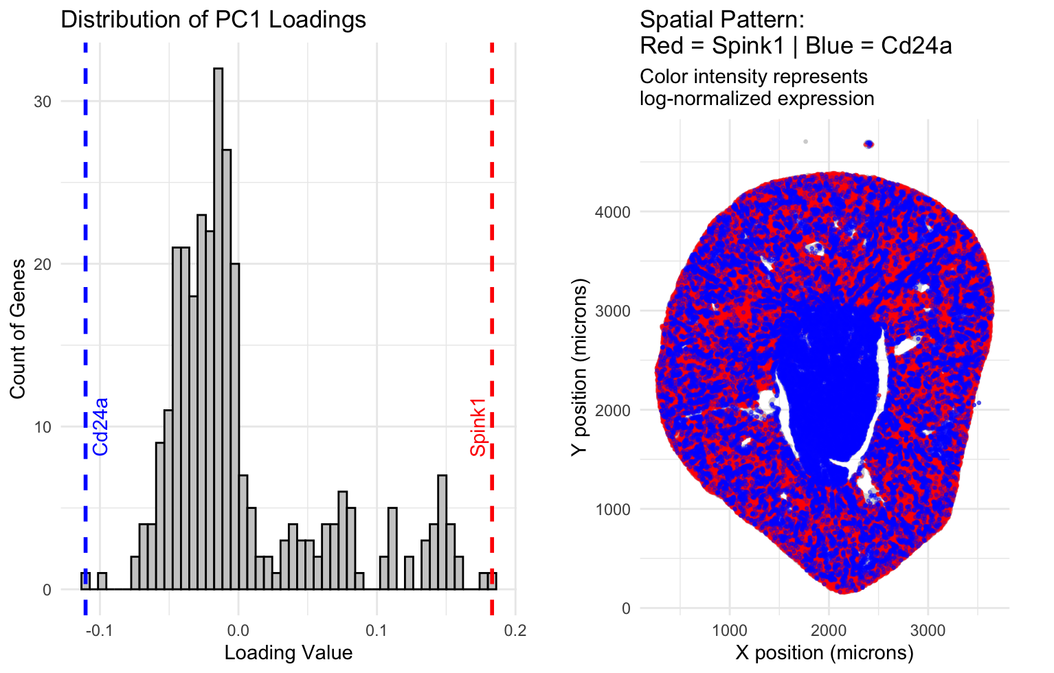
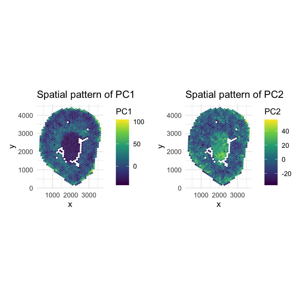
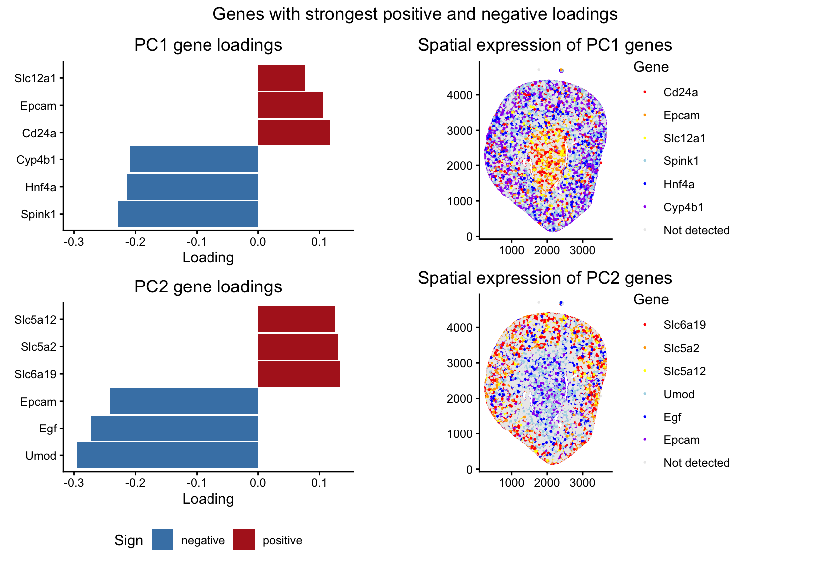
2. How do the genes with high versus low loadings relate to each other? How are they patterned relative to each other in the tissue? Genes with high loadings on...
1. What data types are you visualizing?
Categorical- PCA unscaled and PCA scaled
Quantitative data- PC1 gene loading
Gene expression variability (variance)
Mean gene expression
Aim: How do the genes with high versus low loadings relate to each other? How are they patterned relative to each other in the tissue? Note: Panel numbers reference the...
1. How do the gene loadings on the first PC relate to features of the genes such as its mean or variance? The first principal component captures the direction of...
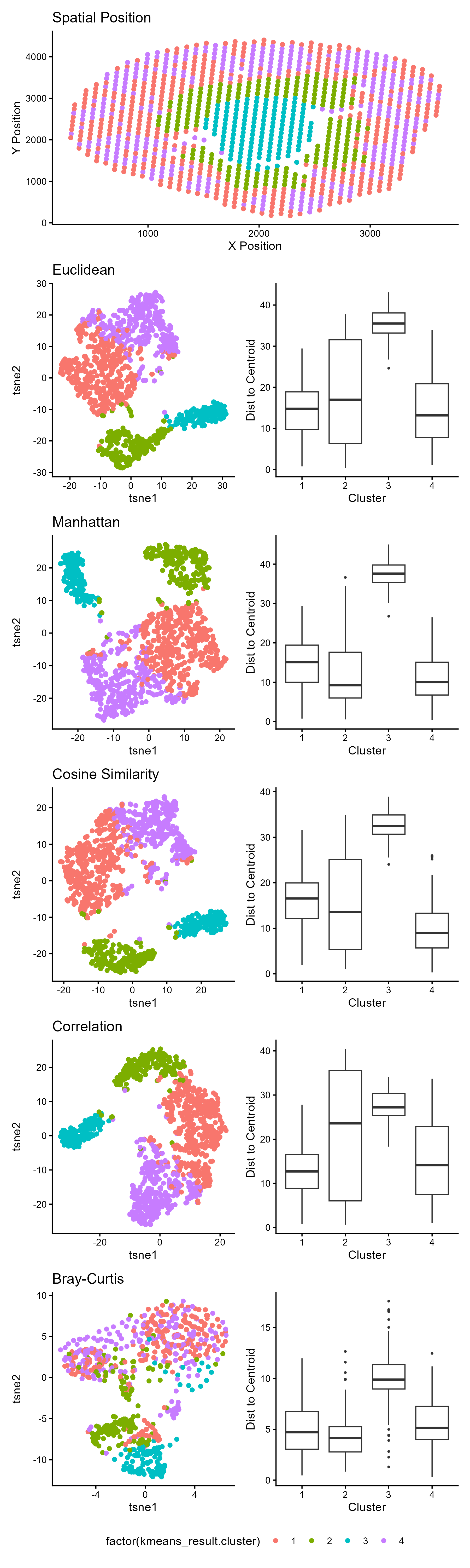
1. What data types are you visualizing? Spatial data: X and Y coordinates representing physical tissue location Quantitative data: t-SNE embeddings (continuous numerical values) and euclidean distances to centroids Categorical...
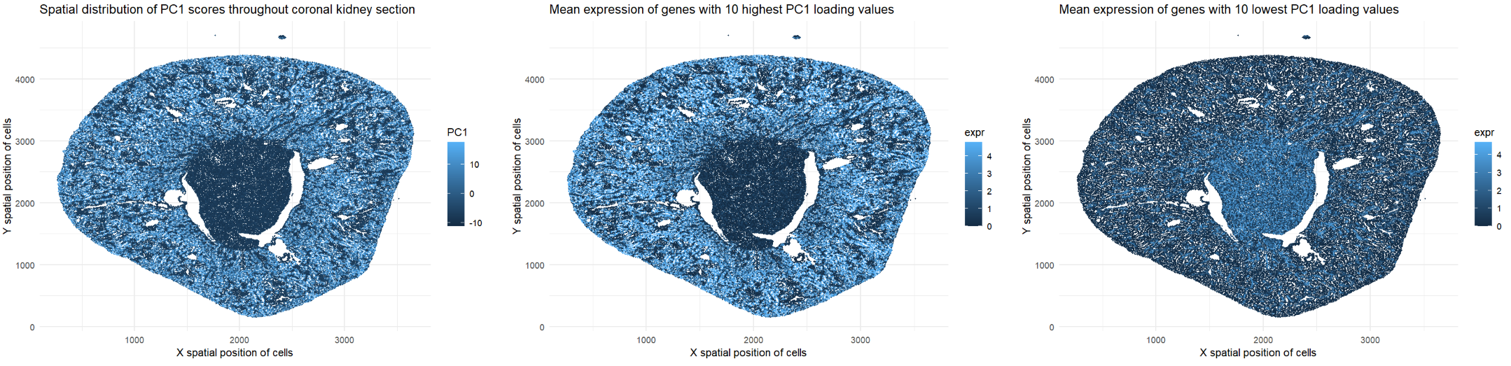
1. What data types are you visualizing? The represented data type is quantitative. I am visualizing the x and y spatial positions of cells in the coronal kidney section (all...
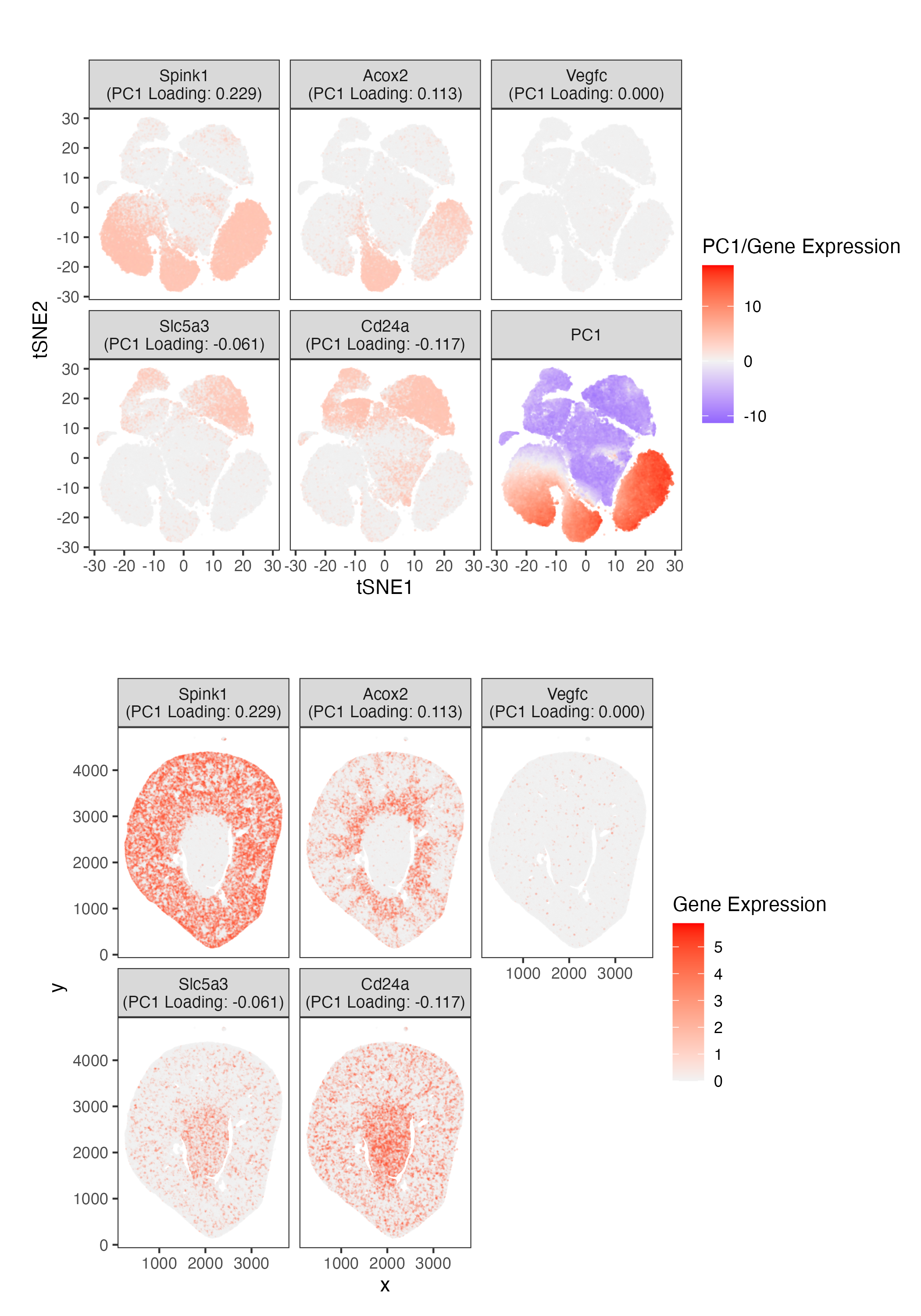
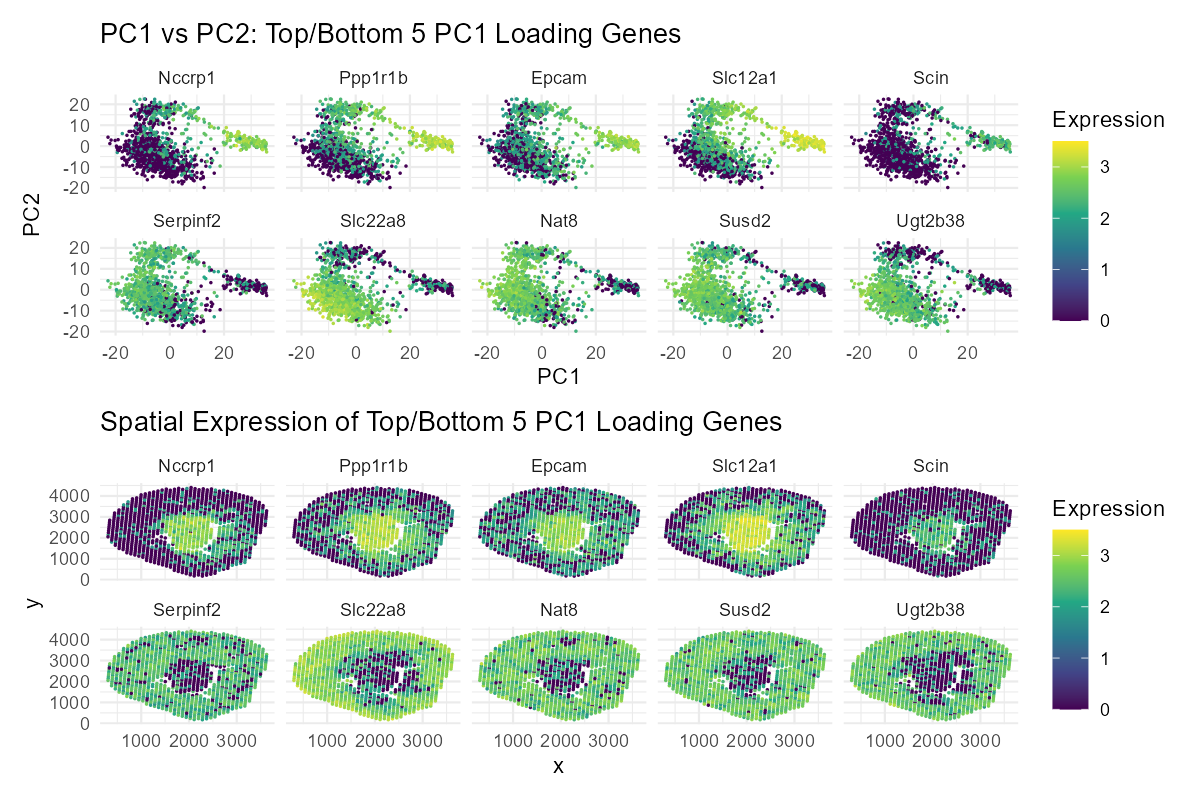
1. Write a description explaining what you are trying to make salient This visualization shows the expression of the five genes that contribute most positively and most negatively to PC1....
1. What data types are you visualizing? I’m visualizing both quantitative and categorical data. The dataset has quantitative spatial information of x and y coordinates for each spot in the...
1. What data types are you visualizing? I am visualizing quantitative data of: 1) the mean expression of each gene, averaged across all of all spatial spots within the data...
Write a description explaining what you are trying to make salient and why you believe your data visualization is effective, using vocabulary terms from Lesson 1. (Question 2: How do...
1. What data types are you visualizing? I am visualizing quantitative data for the genes, including the PC1 loadings, mean expression per gene, and variance per gene. I also visualized...
1. Write a description explaining what you are trying to make salient and why you believe your data visualization is effective using vocabulary terms from Lesson 1.
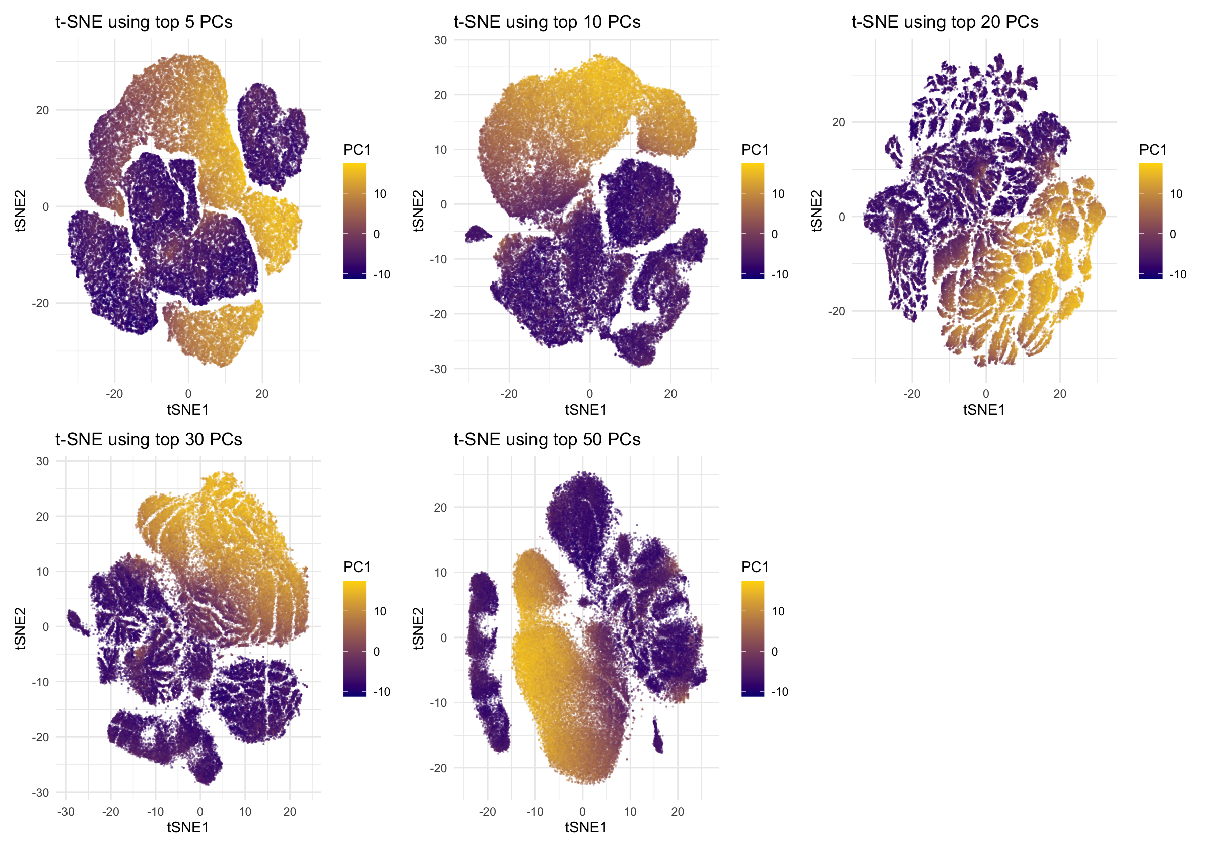
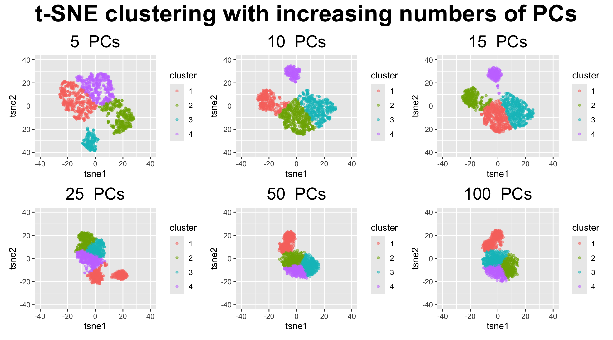
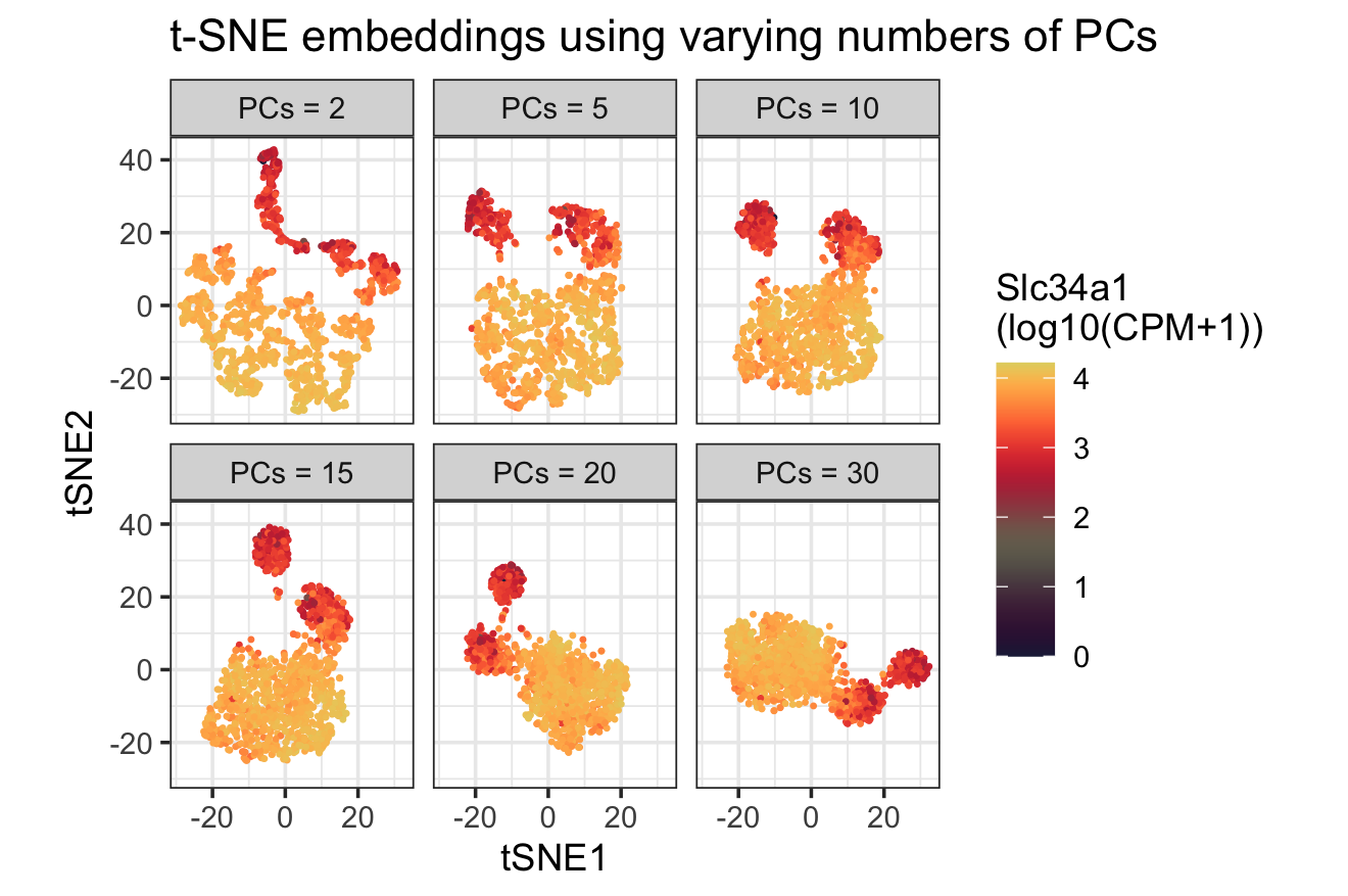
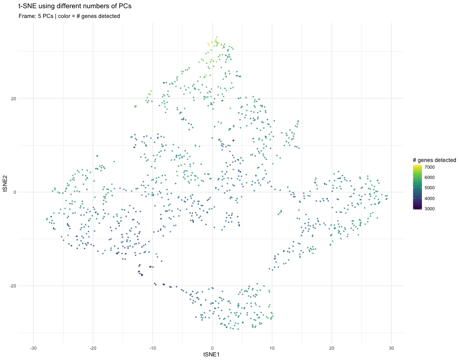
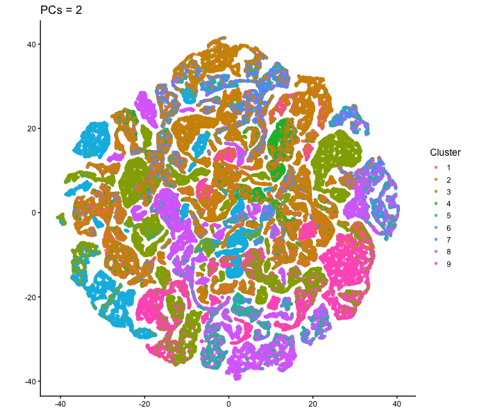
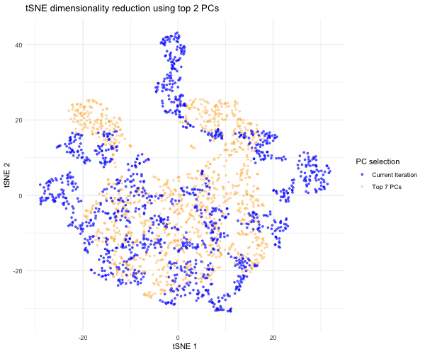
1. What data types are you visualizing? I am answering how do tSNE coordinates change as increasing the number of PCs. I computed PCA on the log-transformed, normalized gene expression...
1. What data types are you visualizing? I am visualizing both categorical and quantitative data. The categorical data is the set of gene names in the left panel, since each...
external resources: prompt: make setwd as output path, improve the layout structure. 1. What data types are you visualizing? I visualize (1) quantitative gene-level data: PC1 loadings, mean expression, and...
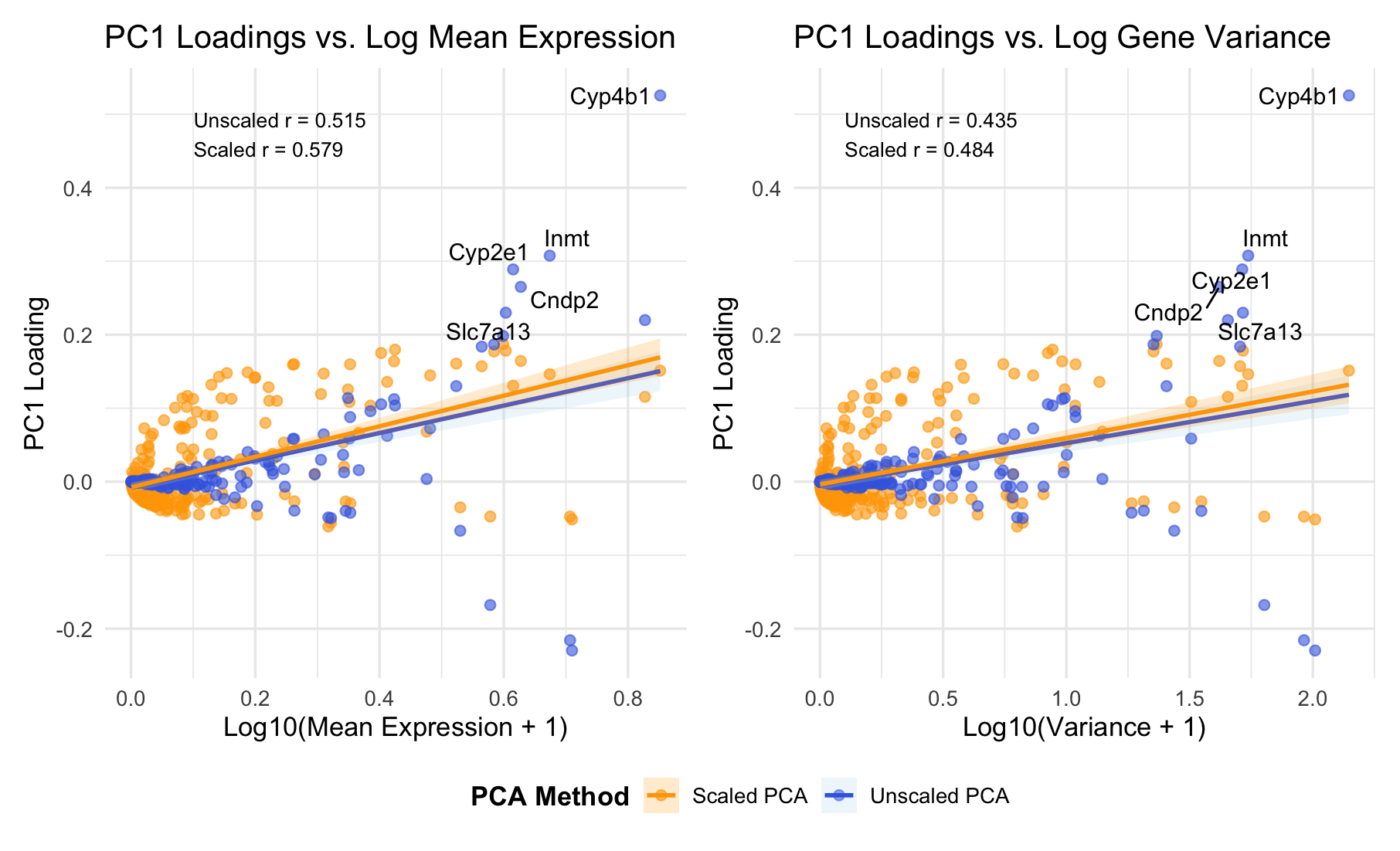
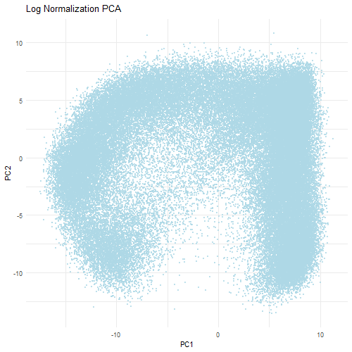
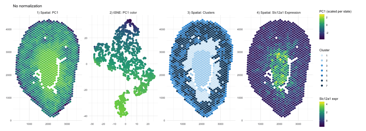
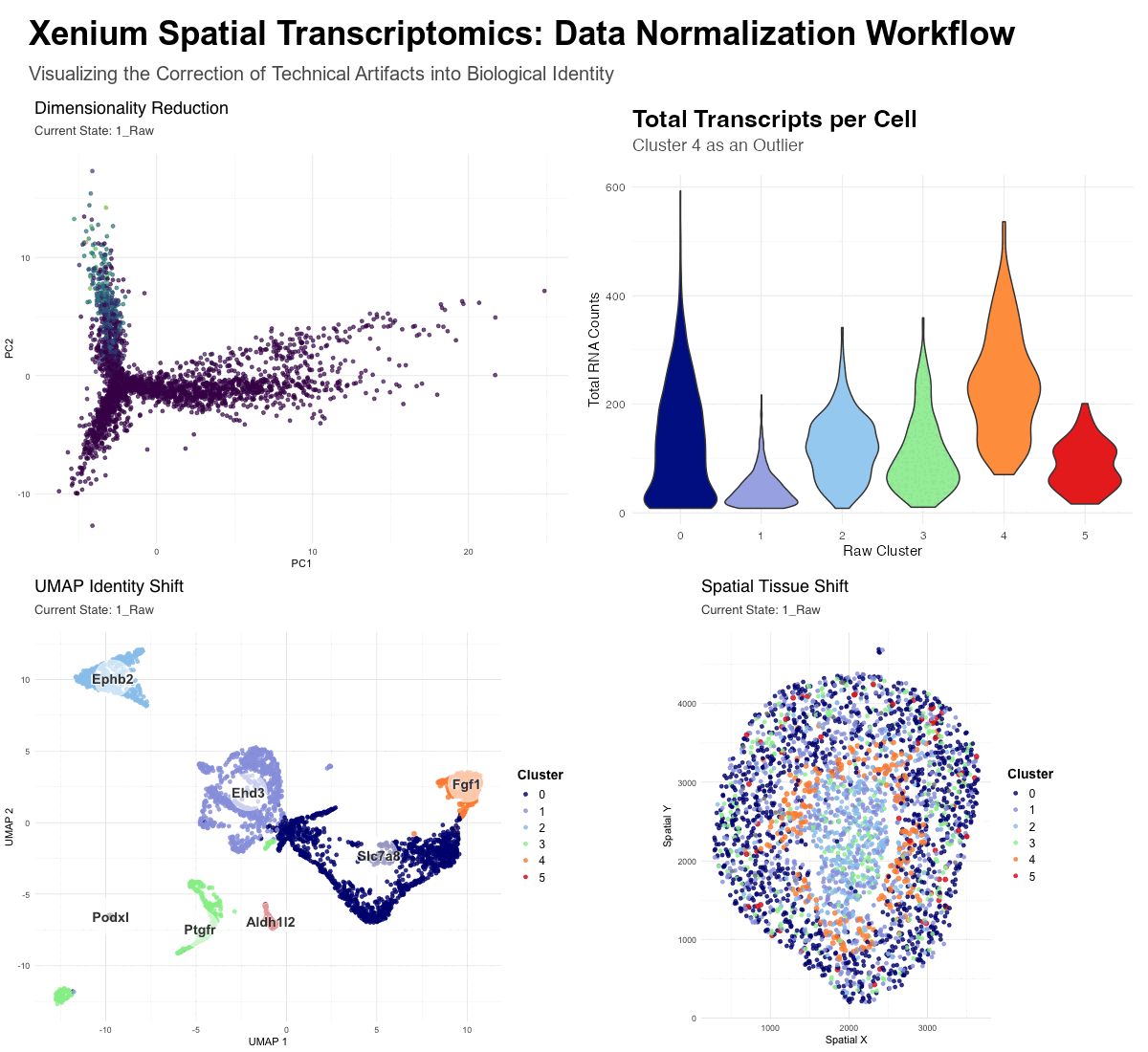
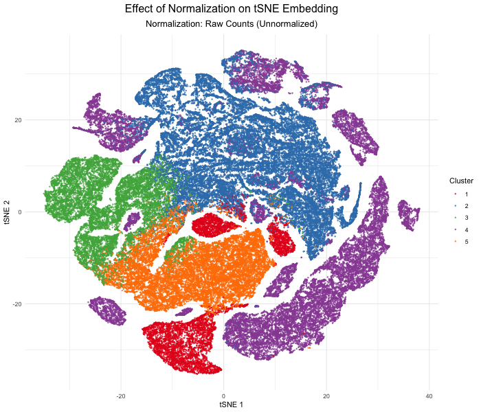
Discussion For this homework, I wanted to answer this question: What happens if I do or not not normalize and/or transform the gene expression data (e.g. log and/or scale) prior...
Note, the gif is named “oluwadurotimioni.gif” instead of “hwEC1_ooni5.gif” as this is what the assignment powerpoint instructed, that we use “names.gif”.
Description
Question: What happens if I do or not not normalize and/or transform the gene expression data (e.g. log and/or scale) prior to dimensionality reduction?
Description
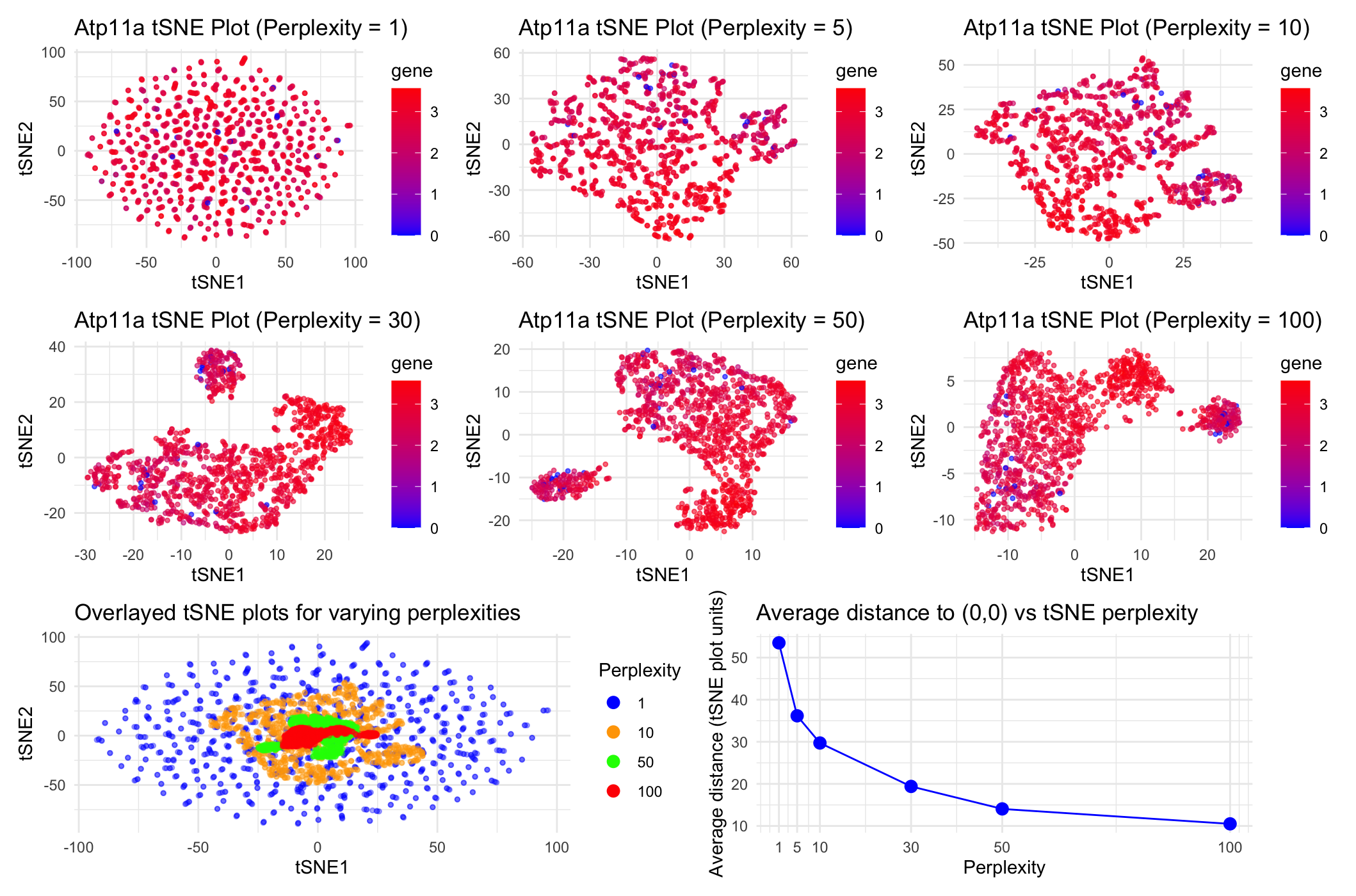
This animation adresses the question: “If I perform non-linear dimensionality reduction on PCs, what happens when I vary how many PCs I use?”
What happens if I do or not not normalize and/or transform the gene expression data (e.g. log and/or scale) prior to dimensionality reduction? In this analysis, I compared tSNE embeddings...
4. If I perform non-linear dimensionality reduction on PCs, what happens when I vary how many PCs I use? Write a brief description of your figure so we know what...
Instructions Make a new data visualization of your spatial transcriptomics dataset to explore one of the following questions. Selected question: “(4) If I perform non-linear dimensionality reduction on PCs, what...
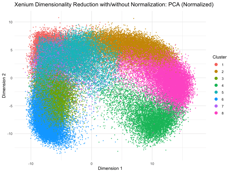
This animation depicts how normalization and log-transformation steps are essential in accurate dimensionality reduction that allows biological interpretation rather than being obscured in noise. Without normalization, the PCA space appears...
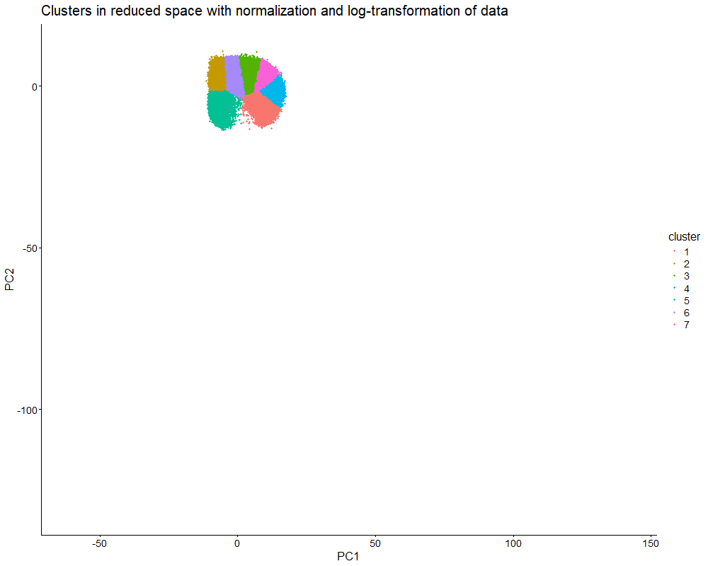
1. Figure description This data visualization uses animation to visualize the effect of data normalization and log-transformation before performing principal component analysis (PCA) and k-means clustering. The data being analyzed...
Description In HW2, I had forgotten to normalize my data by library size. So, when seeing “What happens if I do or not not normalize and/or transform the gene expression...
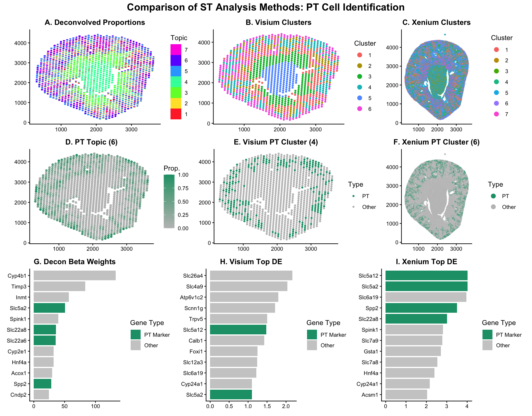
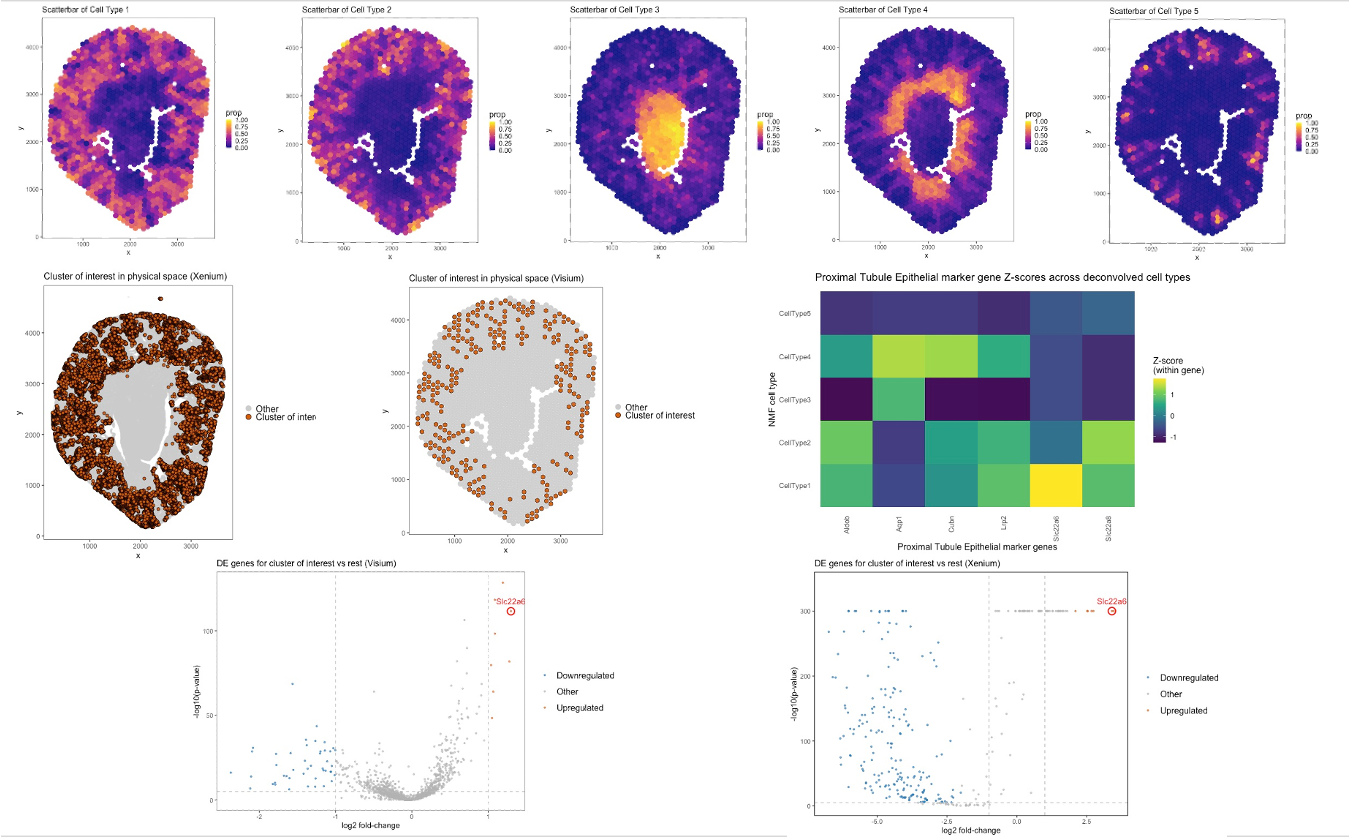
Description Panel A: Scatterbar plot showing deconvolved cell-type proportions across Visium tissue spots (STdeconvolve, K=6), where each stacked bar represents the mixture of cell types at a given spatial location....
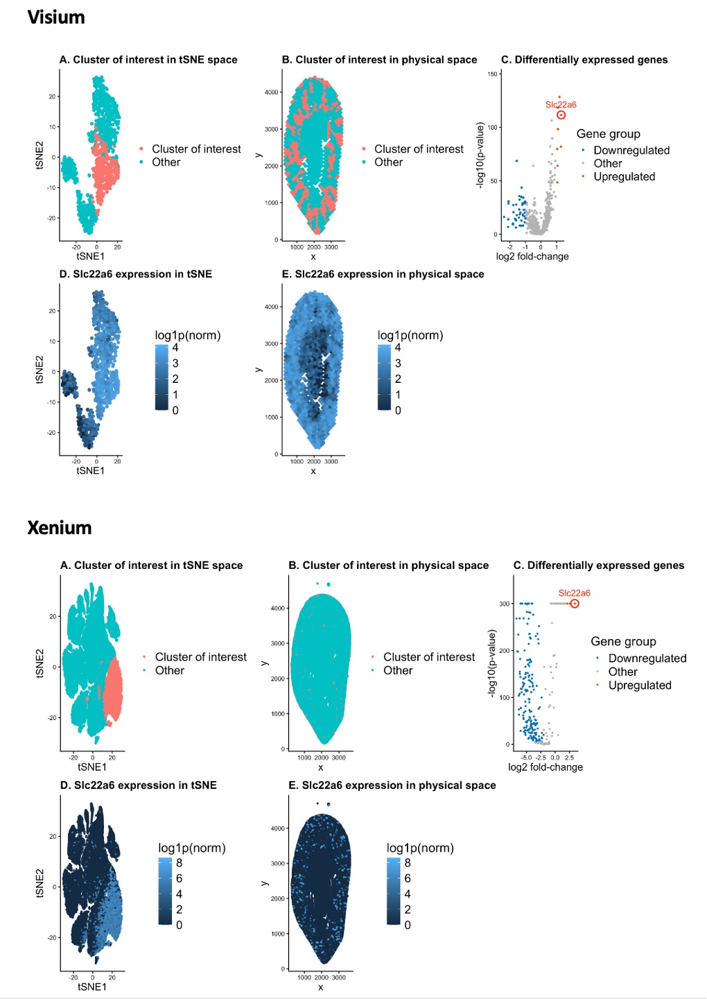
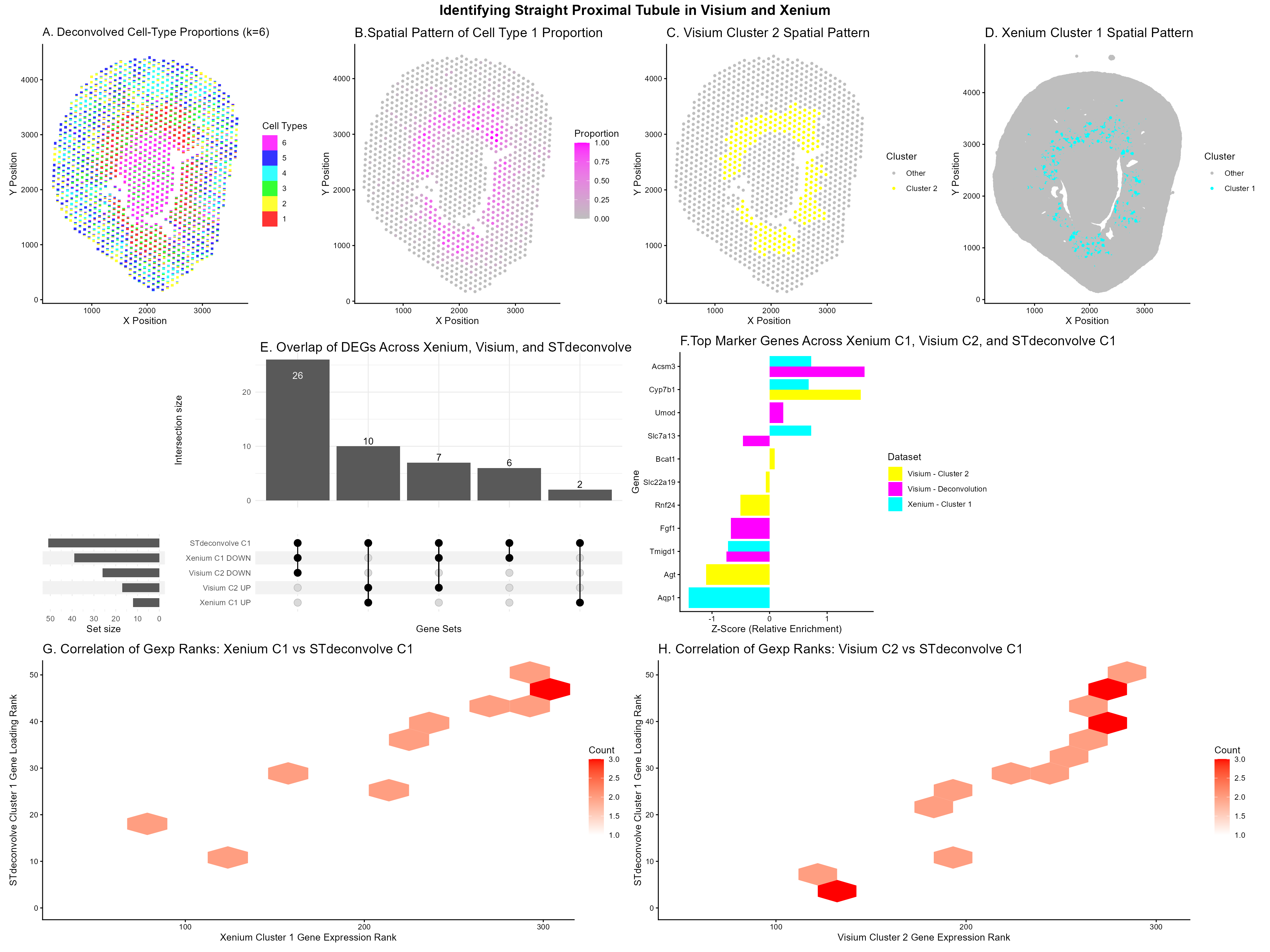
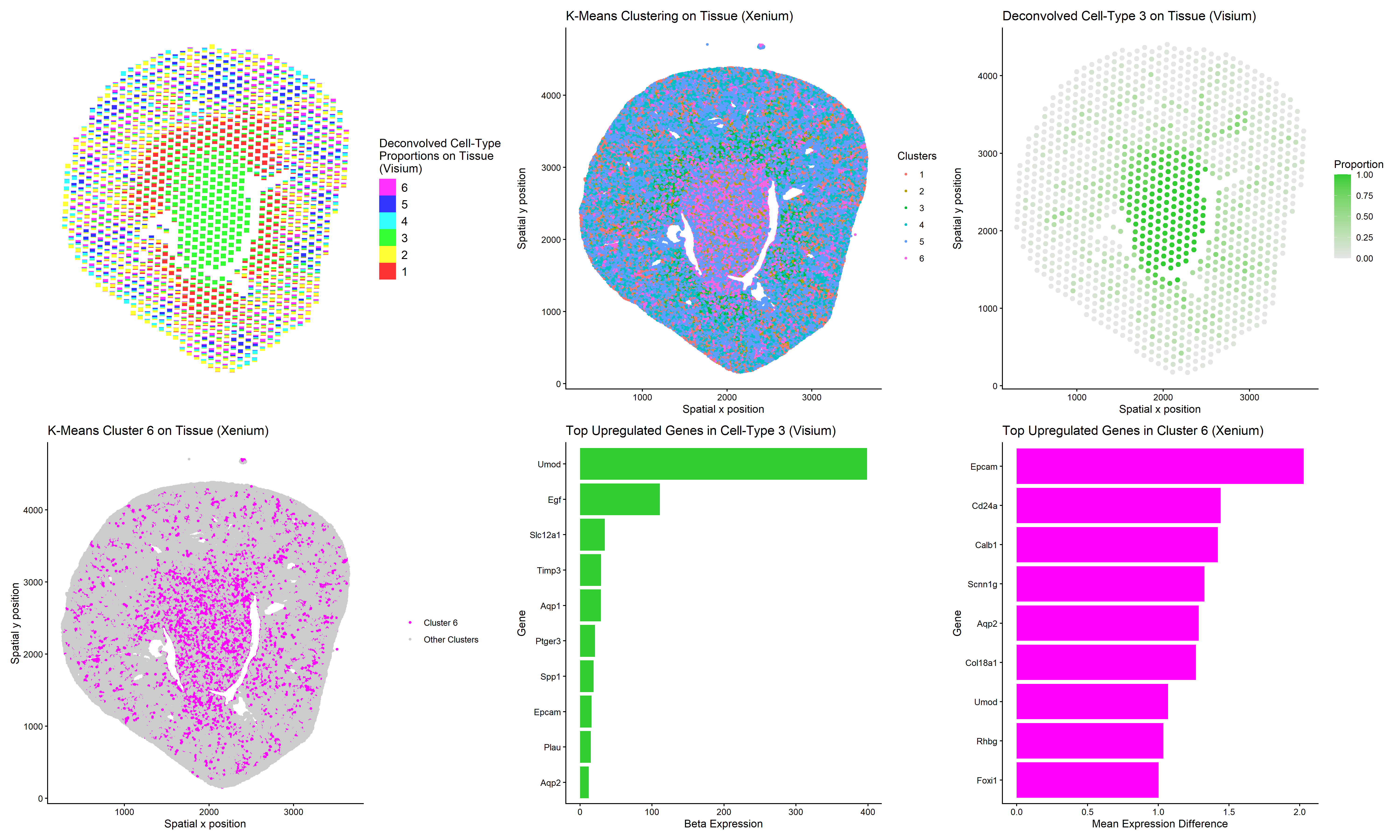
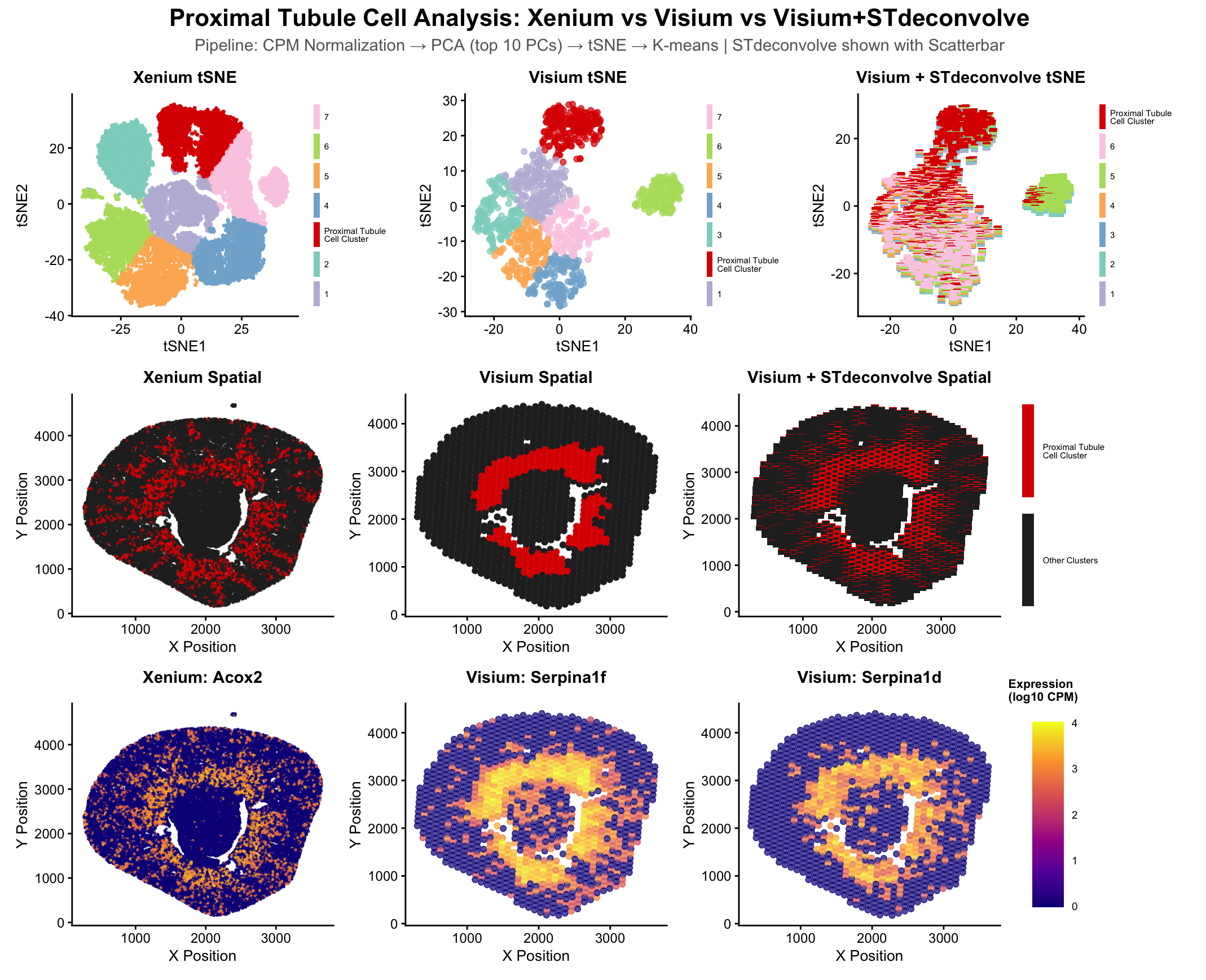
##Description This figure compares three different spatial transcriptomic analysis strategies to identify proximal tubule (PT) cells in mouse kidney tissue using both Visium and Xenium data. From HW3 Research I...
Instructions Make a new data visualization of the multi-cellular spot resolution spatial transcriptomics sequencing dataset. Compare your result with the clustering and differential expression analysis you did previously in HW3/4....
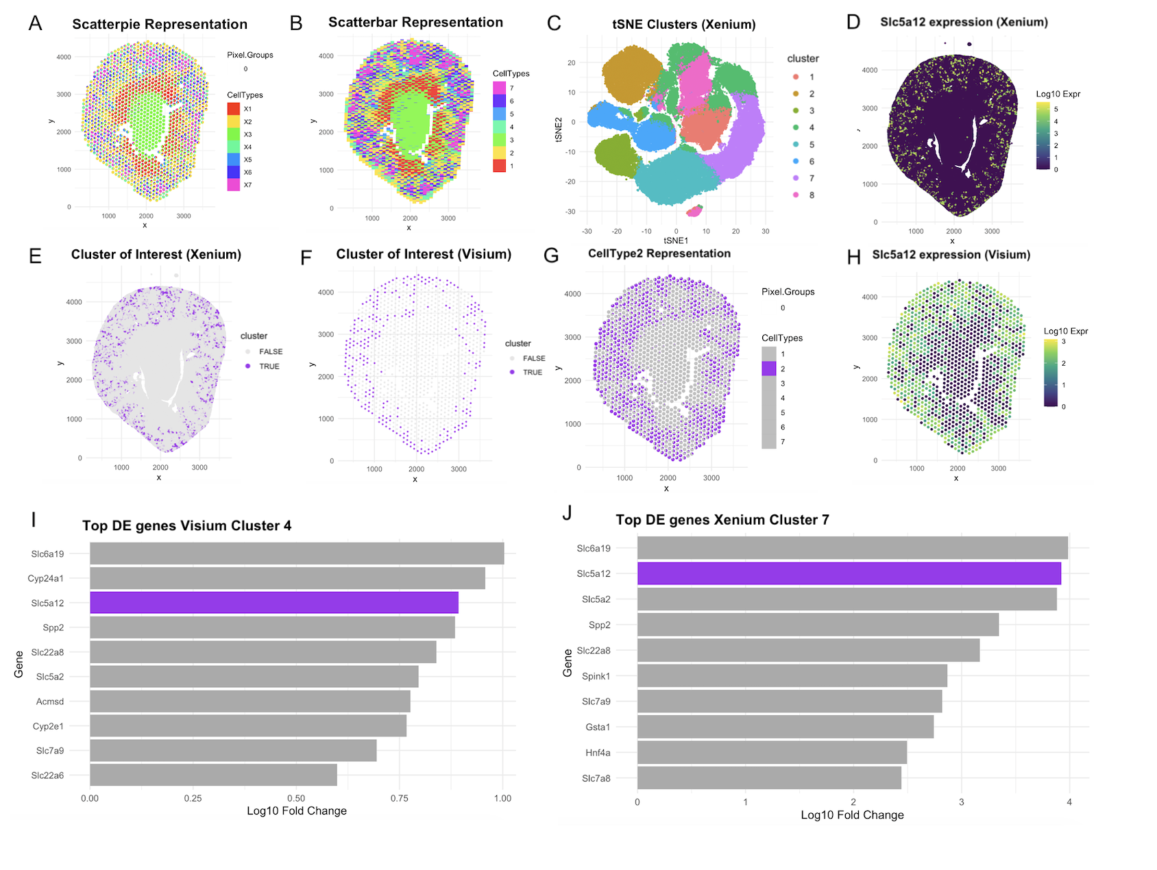
This visualization assesses a coronal kidney tissue section using deconvolution and clustering across Xenium and Visium Platforms. Using STdeconvolve, Panel A depicts 7 distinct cell types in a scatterpie visualization....
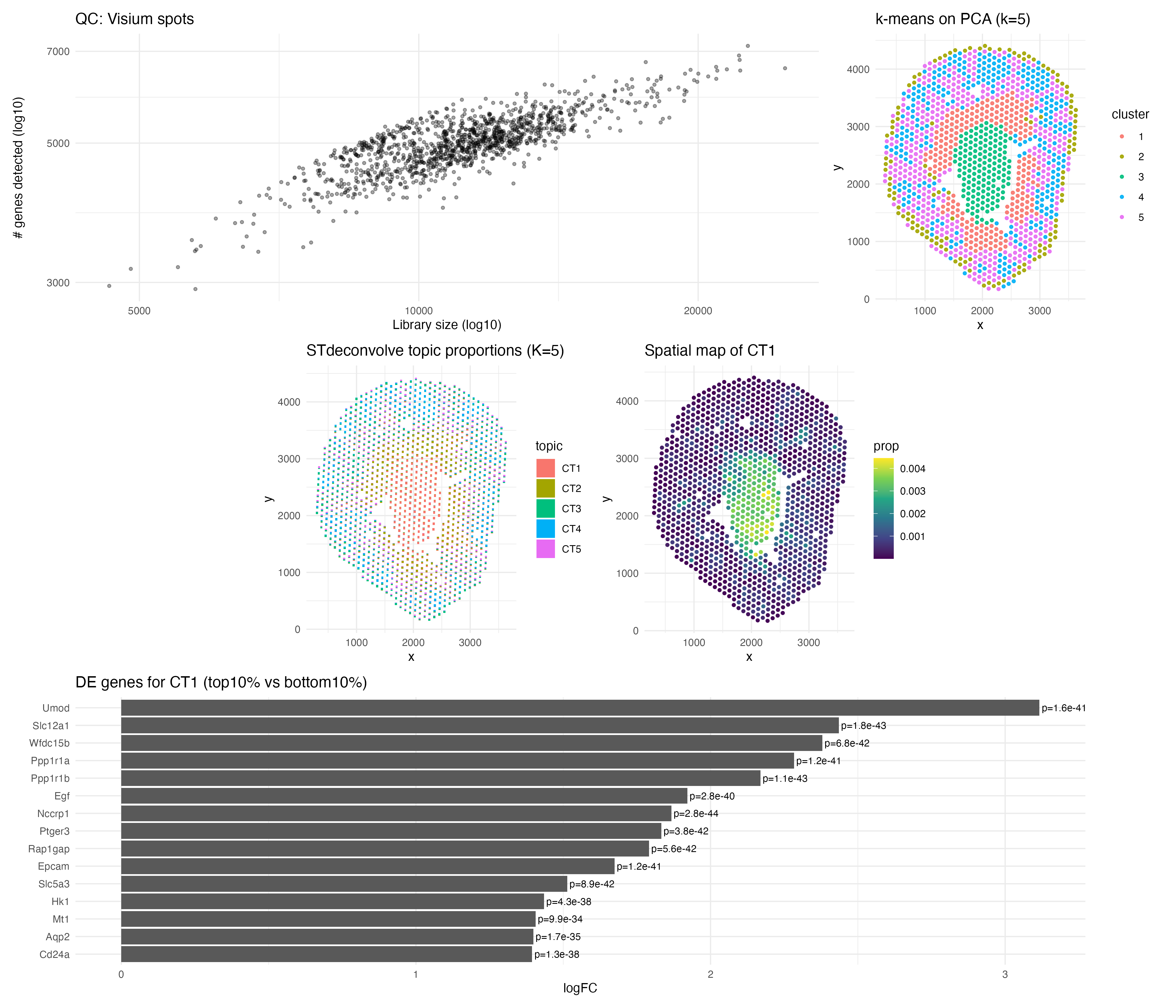
For this analysis, I performed deconvolution on the Visium IRI spatial transcriptomics dataset to estimate the cell-type composition within each multi-cellular spot. Because each Visium spot captures transcripts from multiple...
1. Figure description This multi-panel data visualization uses principal component analysis (PCA), t-distributed stochastic neighbor embedding (tSNE), k-means clustering, deconvolution, and differential expression analysis to compare the analyses of different...
Compare your result with the clustering and differential expression analysis you did previously in HW3/4. Explain how your results are similar or different. Create a data visualization comparing all three...
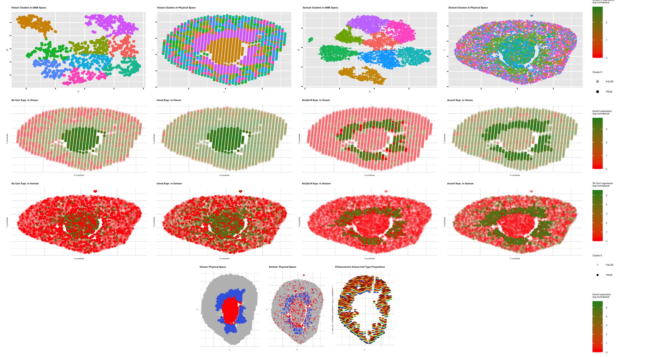
Description This multipanel data visualization displays the tSNE and spatial clustering of the proximal tubule cell type in serial podocyte tissue sections using gene expression data from the Xenium, Visium,...