Welcome
Welcome to the Course Website for EN.580.428 Genomic Data Visualization!
As the primary mode through which analysts and audience members alike consume data, data visualization remains an important hypothesis generating and analytical technique in data-driven research to facilitate new discoveries. However, if done poorly, data visualization can also mislead, bias, and slow down progress. This hands-on course will cover the principles of perception and cognition relevant for data visualization and apply these principles to genomic data, including large-scale spatially-resolved omics datasets, using the R statistical programming language. Students will be expected to complete class readings, create weekly data visualizations as homework assignments, and make a major class presentation.
Course Information
Course Staff: Prof. Jean Fan and Suki
Lectures: 8:00am-9:50am Monday, Wednesday, and Friday. See Canvas for location details.
Office Hours: 10:00am-10:50am Monday, Wednesday, and by request. See Canvas for location details.
Course Details
☞ see Course tabFeatured Visualizations
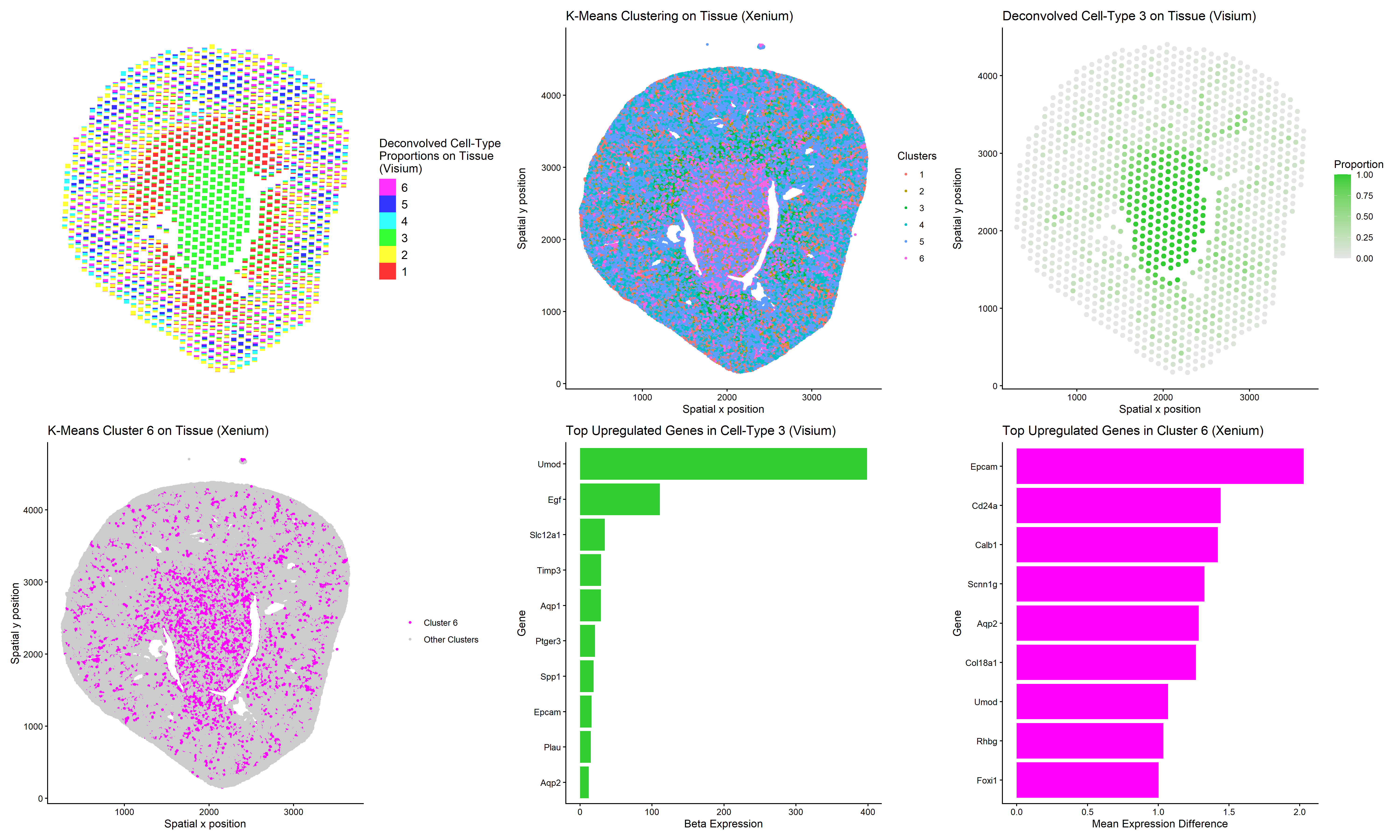
Using clustering and deconvolution to visualize cell types and upregulated genes in different data sets
1. Figure description This multi-panel data visualization uses principal component analysis (PCA), t-distributed stochastic neighbor embedding (tSNE), k-means clustering, deconvolution, and differential expression analysis to...

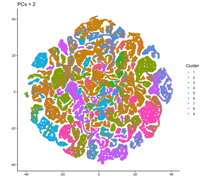
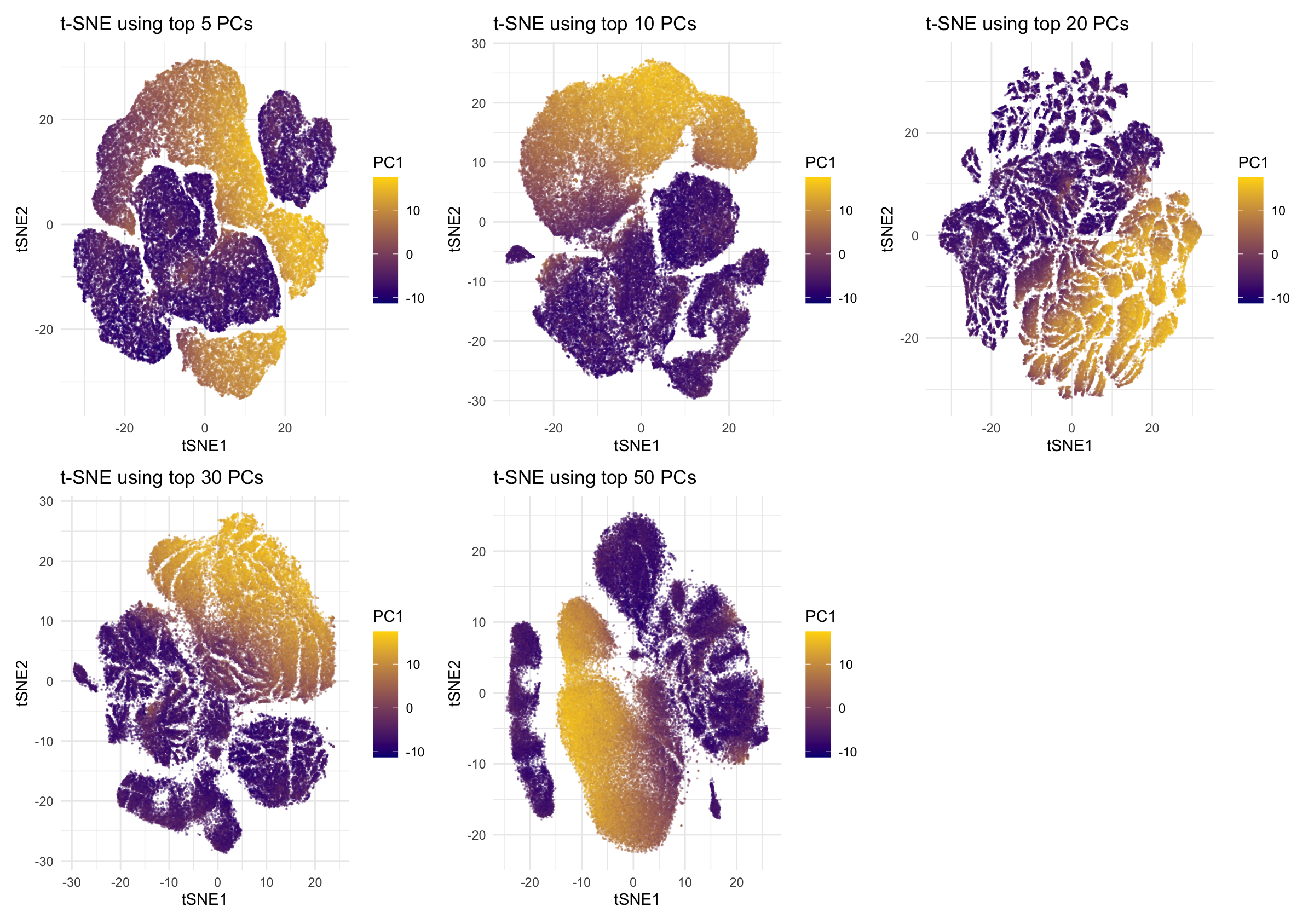
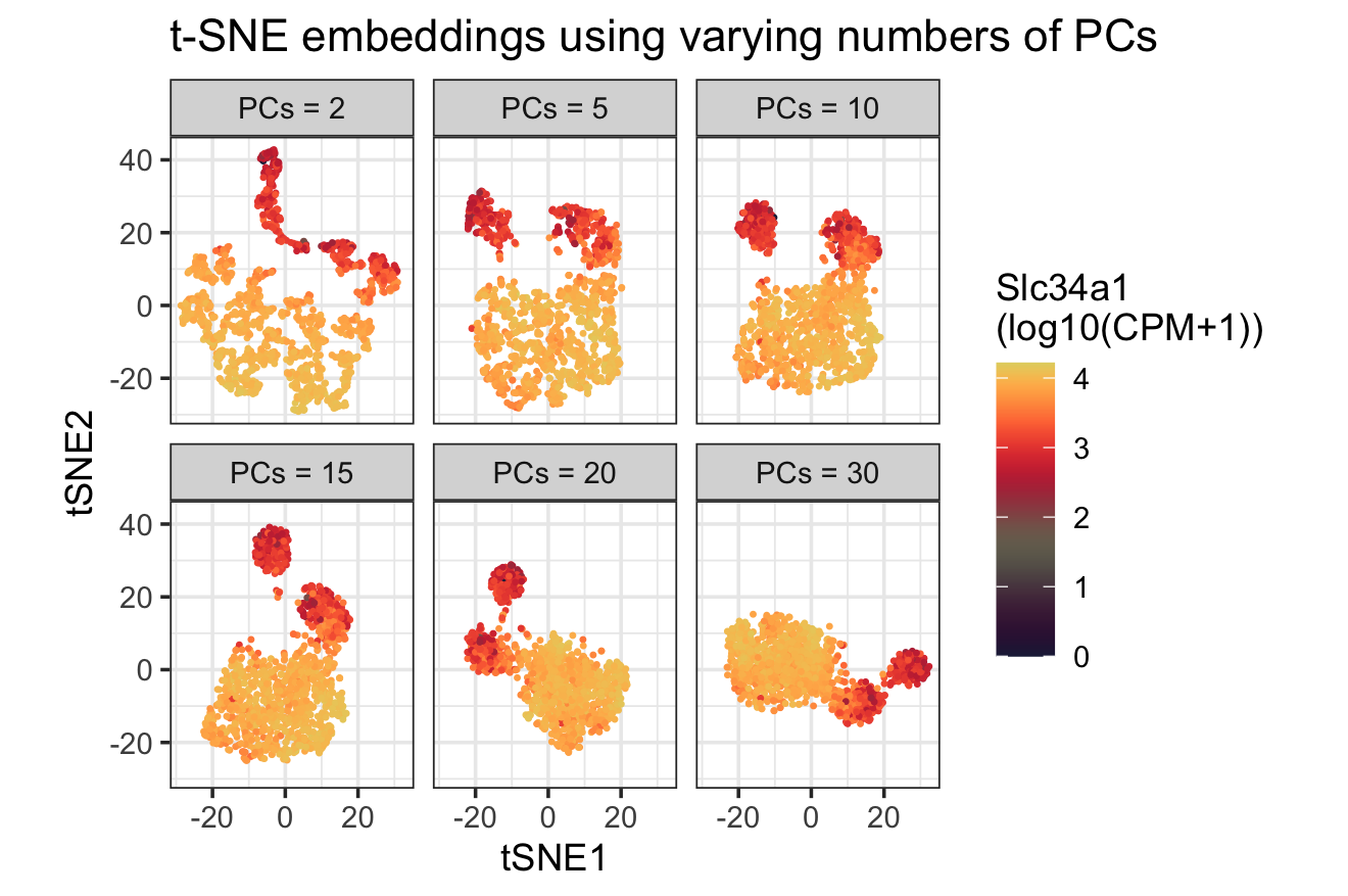
tSNE on varying PC numbers
Description This animation adresses the question: “If I perform non-linear dimensionality reduction on PCs, what happens when I vary how many PCs I use?”

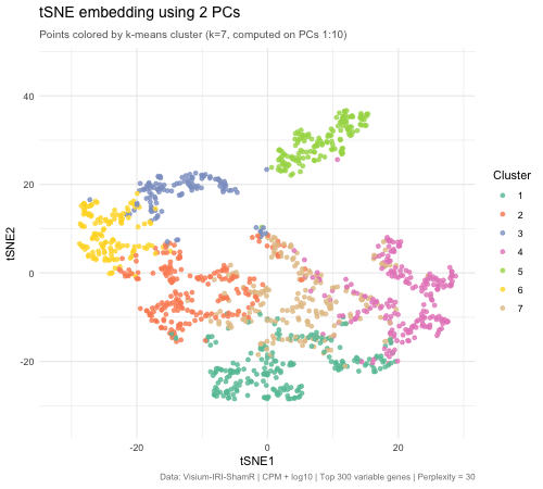
Effect of Varying PC Count on tSNE Space - Visium
Write a a brief description of your figure so we know what you are visualizing.

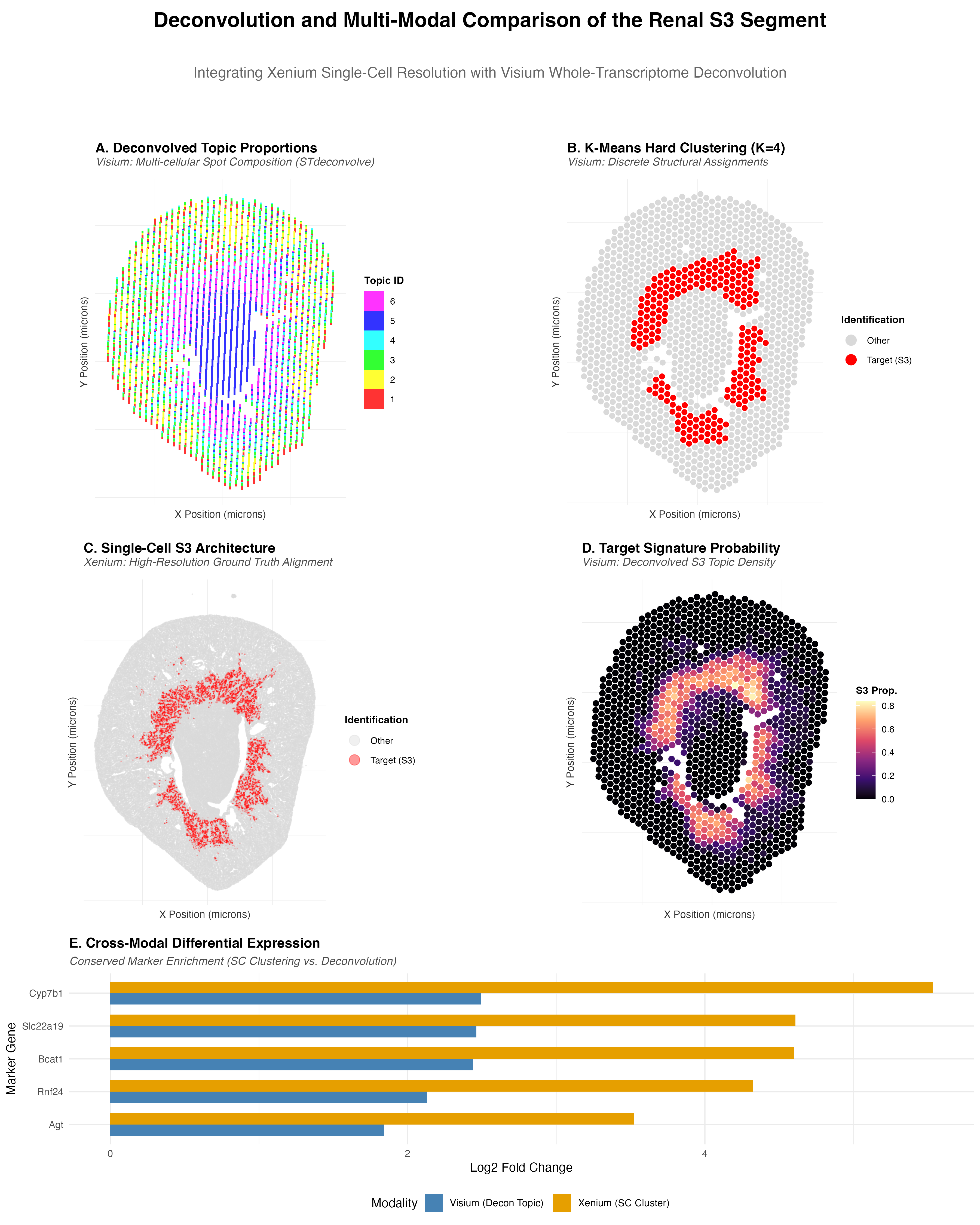
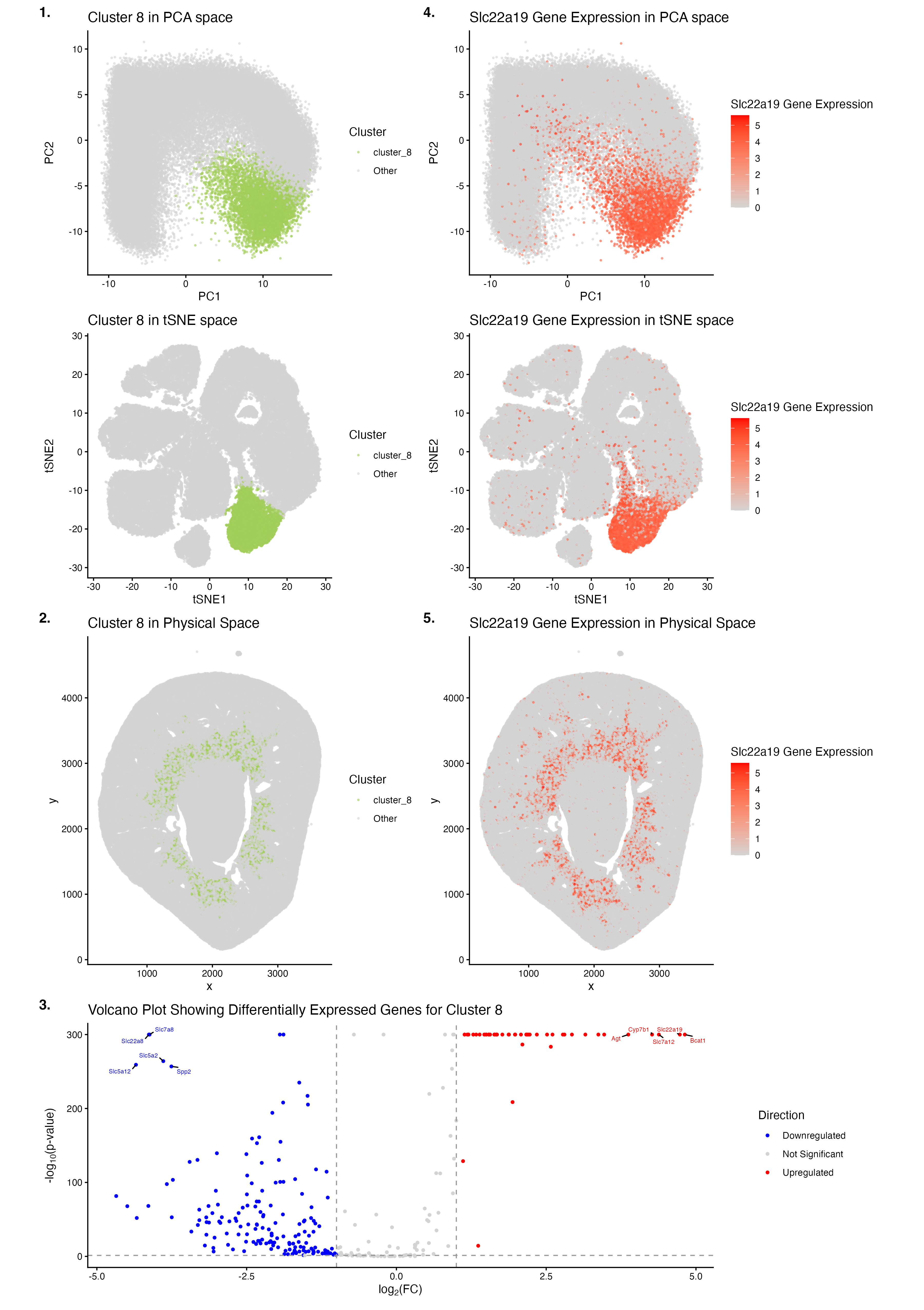
Deconvolution and Multi-Modal Comparison of the Renal S3 Segment
Note, the png is named “EC2_ooni5.png”, as a desired name was not specified in the HW powerpoint.

HW5
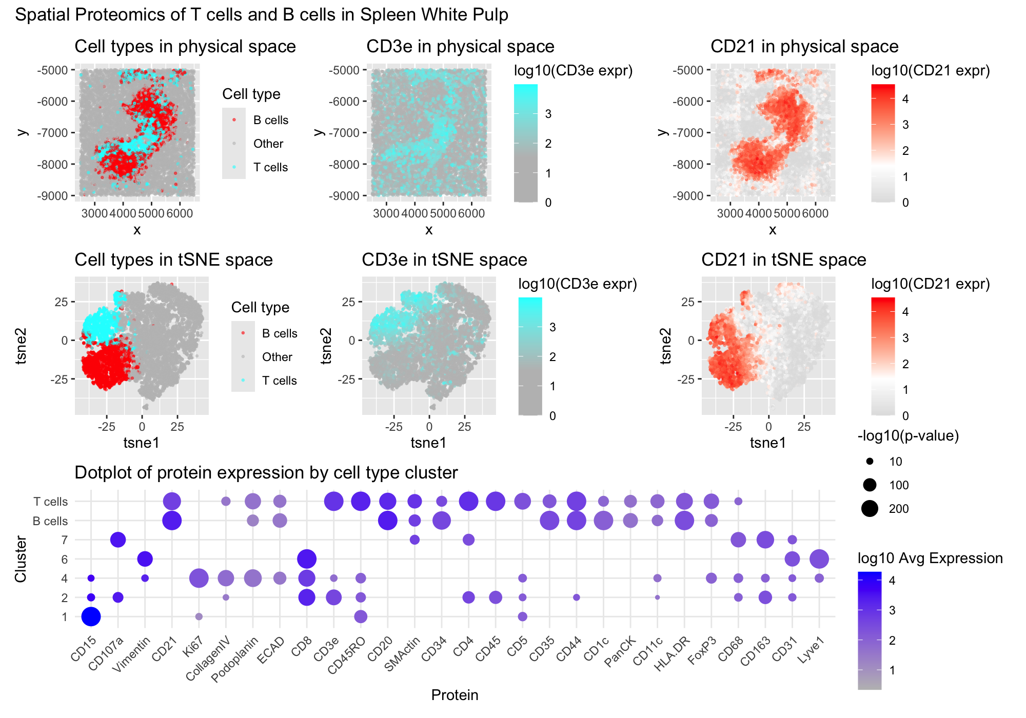
1. Figure Description I created a multipanel figure to show the distribution of B cells and T cells in thhe spleen. Throughout, I used the...

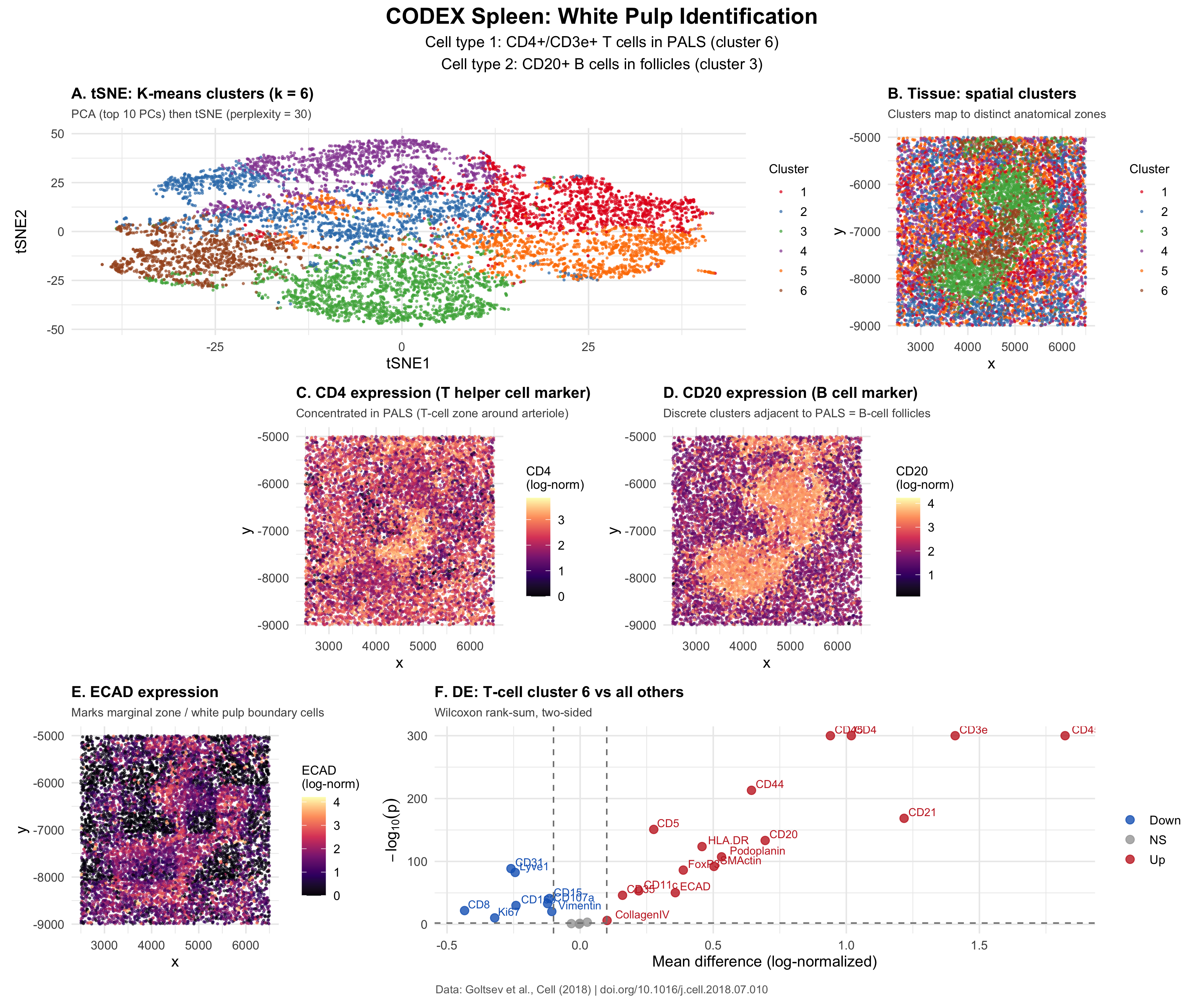
Identification of CODEX data as White Pulp
Perform a full analysis (quality control, dimensionality reduction, kmeans clustering, differential expression analysis) on your data. Your goal is to figure out what tissue structure...
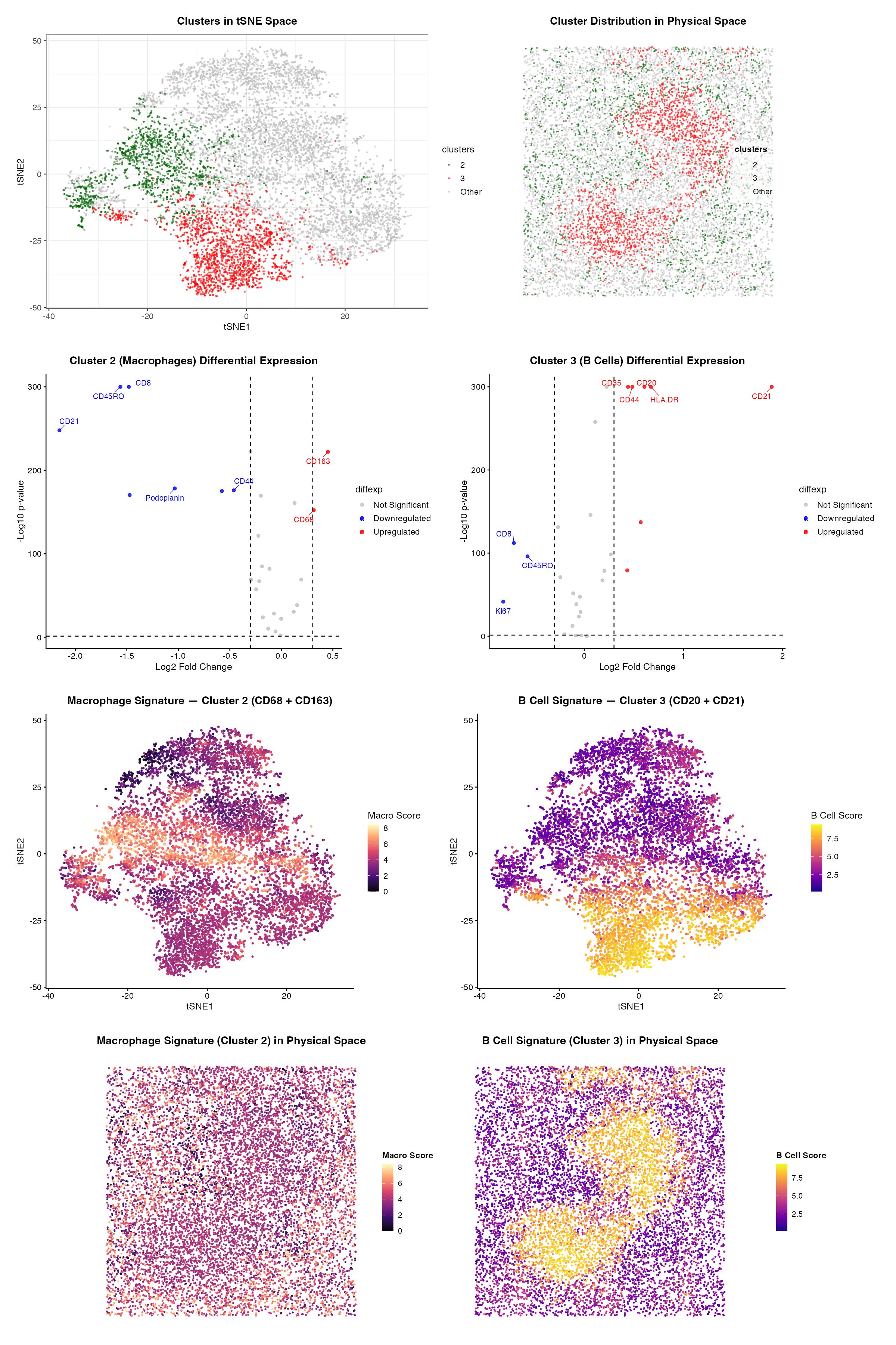
HW 5
###Summary To identify the tissue structure represented in this CODEX dataset, I performed quality control, dimensionality reduction, k means clustering, differential expression analysis, and cell-type...

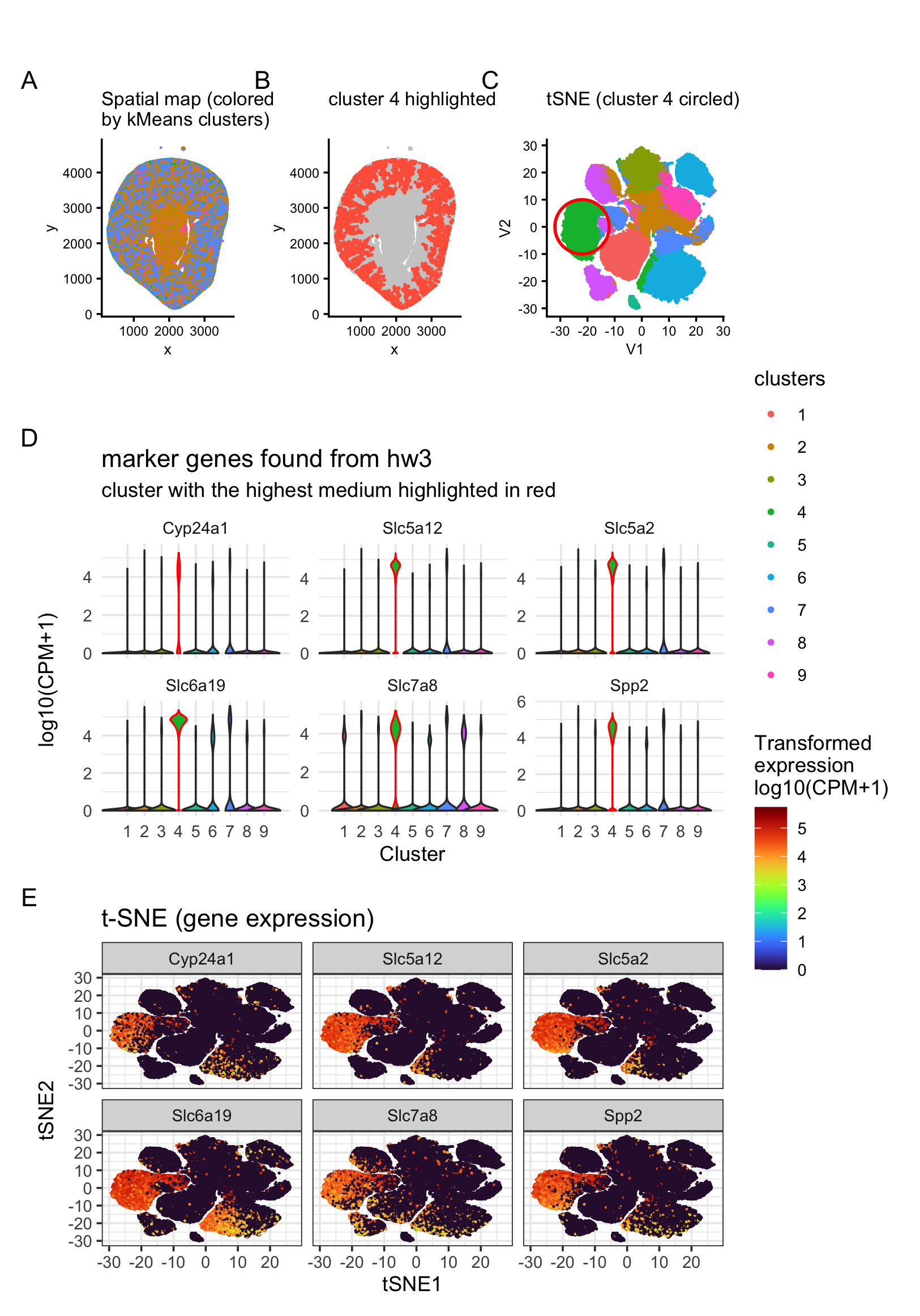
Identification of kidney collecting duct principal cells through dimensionality reduction, k-means clustering, and differential expression analysis
1. Figure description This multi-panel data visualization uses principal component analysis (PCA), t-distributed stochastic neighbor embedding (tSNE), k-means clustering, and differential expression analysis to characterize...
hw4: cortical tubule area in Xenium data
I’ve been analyzing Visium data so far, and this time I switched to Xenium data to try to identify the same cell type I found...

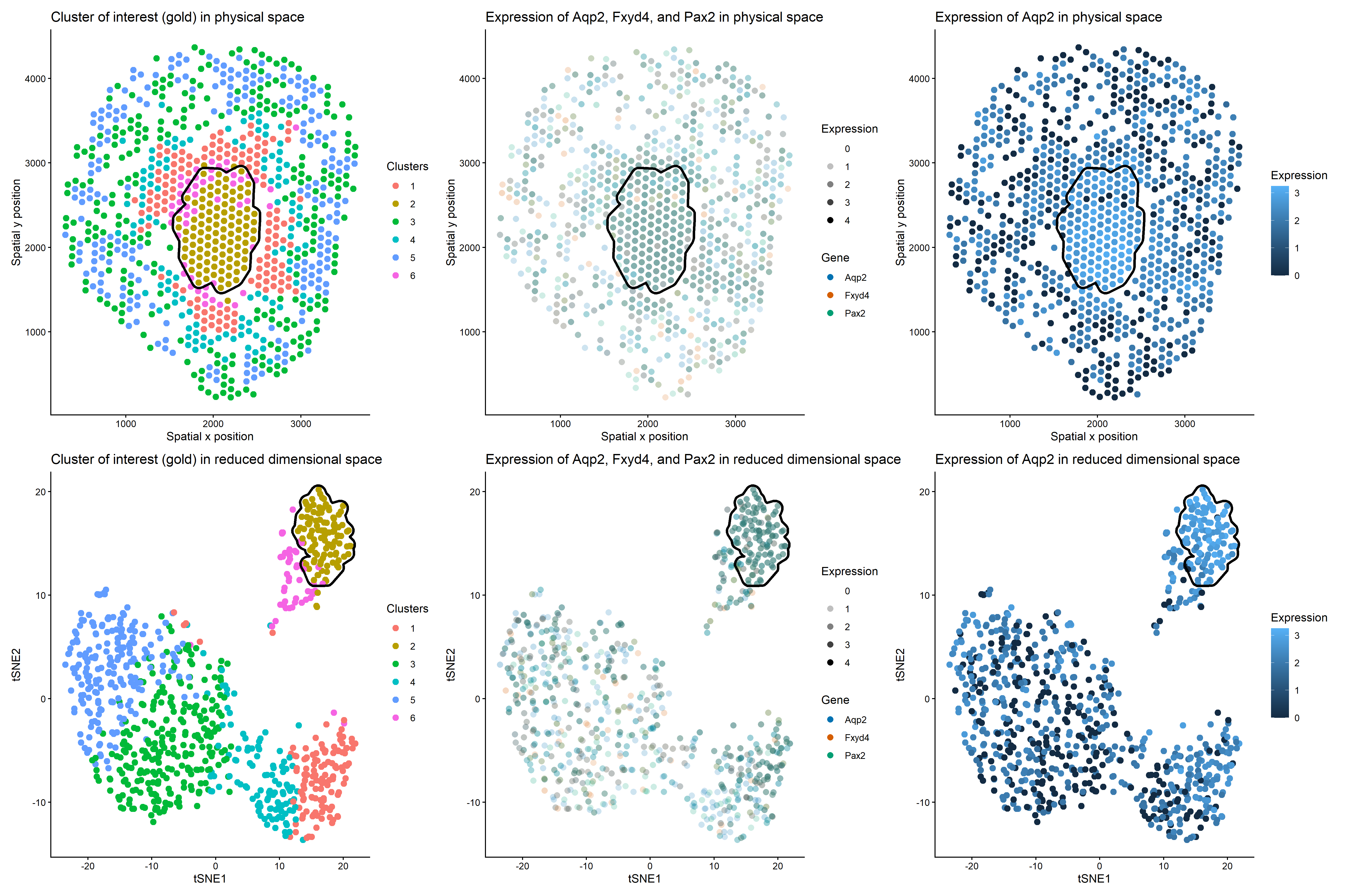
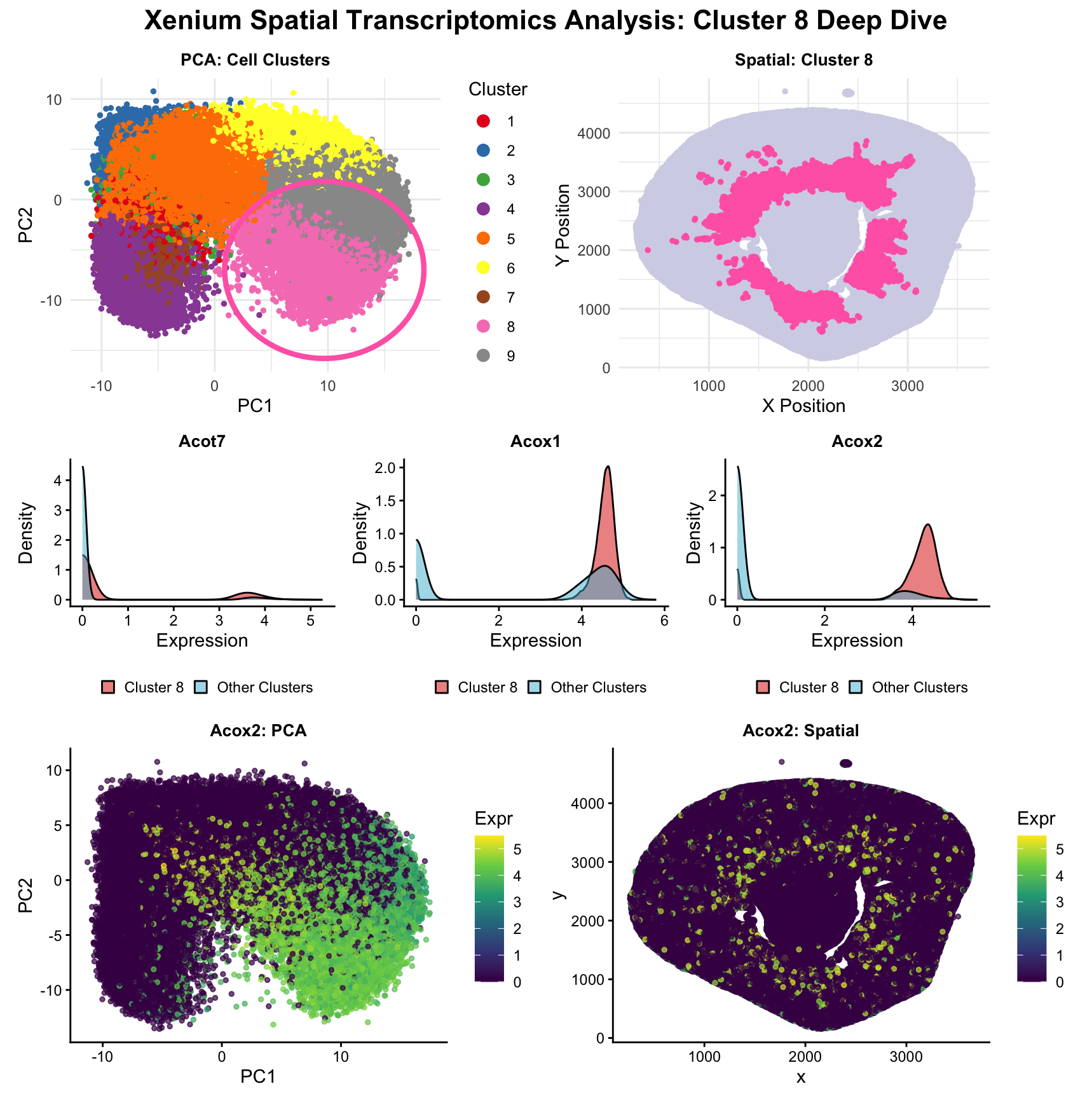
HW3: Multi-Panel Data Visualization of a Transcriptionally Distinct Proximal Tubule Epithelial Cell Cluster in the Xenium Dataset
Describe your figure briefly so we know what you are depicting (you no longer need to use precise data visualization terms as you have been...

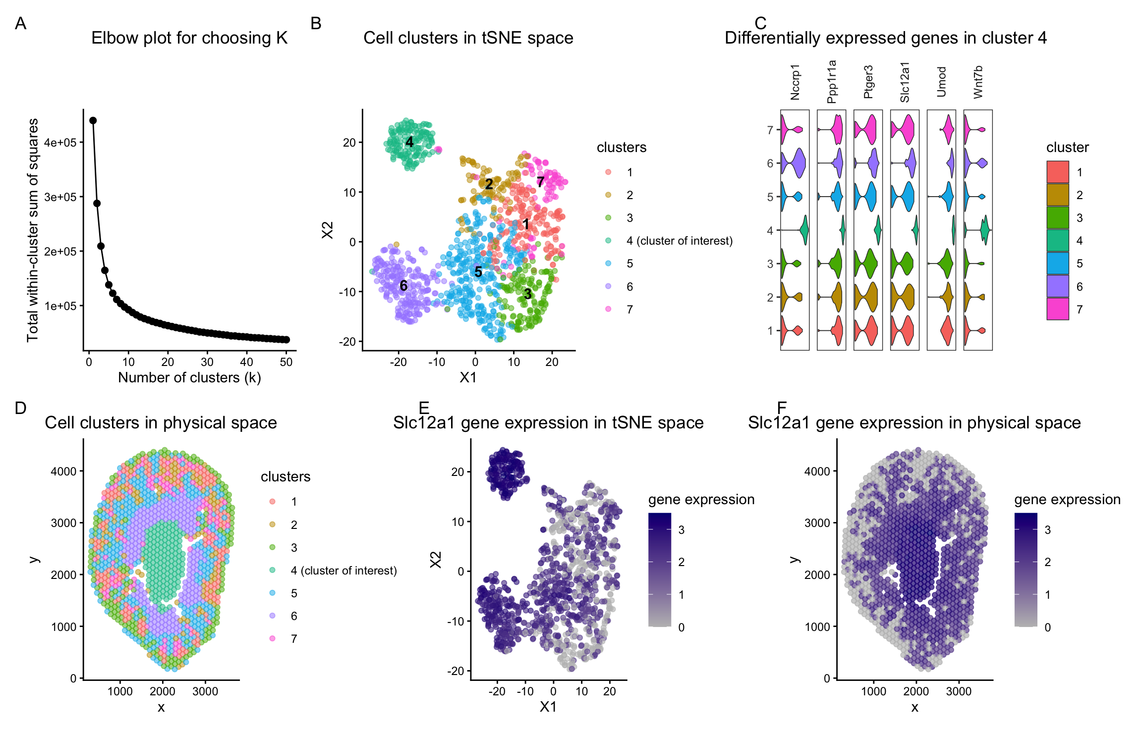
A multipanel data visualization distinguishing the ascending loop of henle in mouse kidney tissue
Describe your figure briefly so we know what you are depicting (you no longer need to use precise data visualization terms as you have been...

Visualization of Proximal Tubule Cells in Kidney Tissue Sample
Description of Data Visualization: The raw Xenium dataset was normalized according to library size and log normalization before having its dimensionality reduced using principal component...

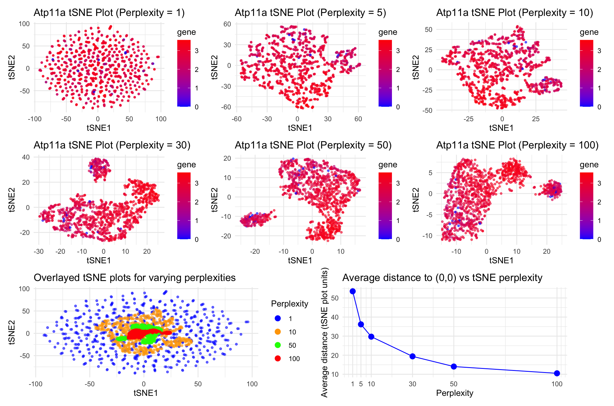
HW2
Question explored: “How do tSNE coordinates change as you increase or decrease the perplexity?”

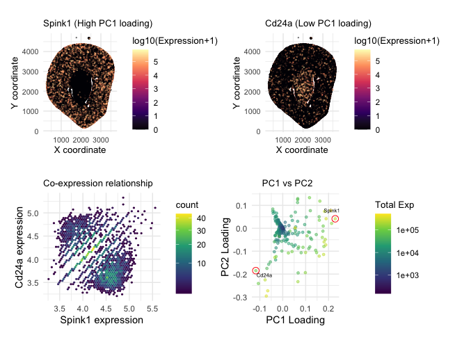
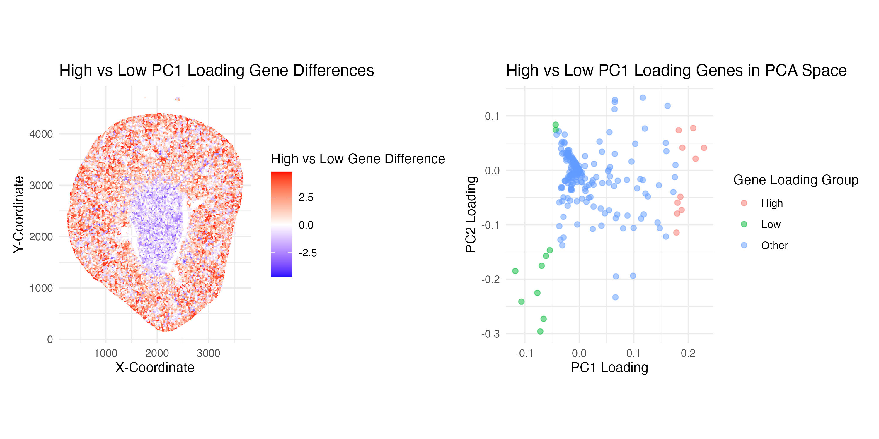
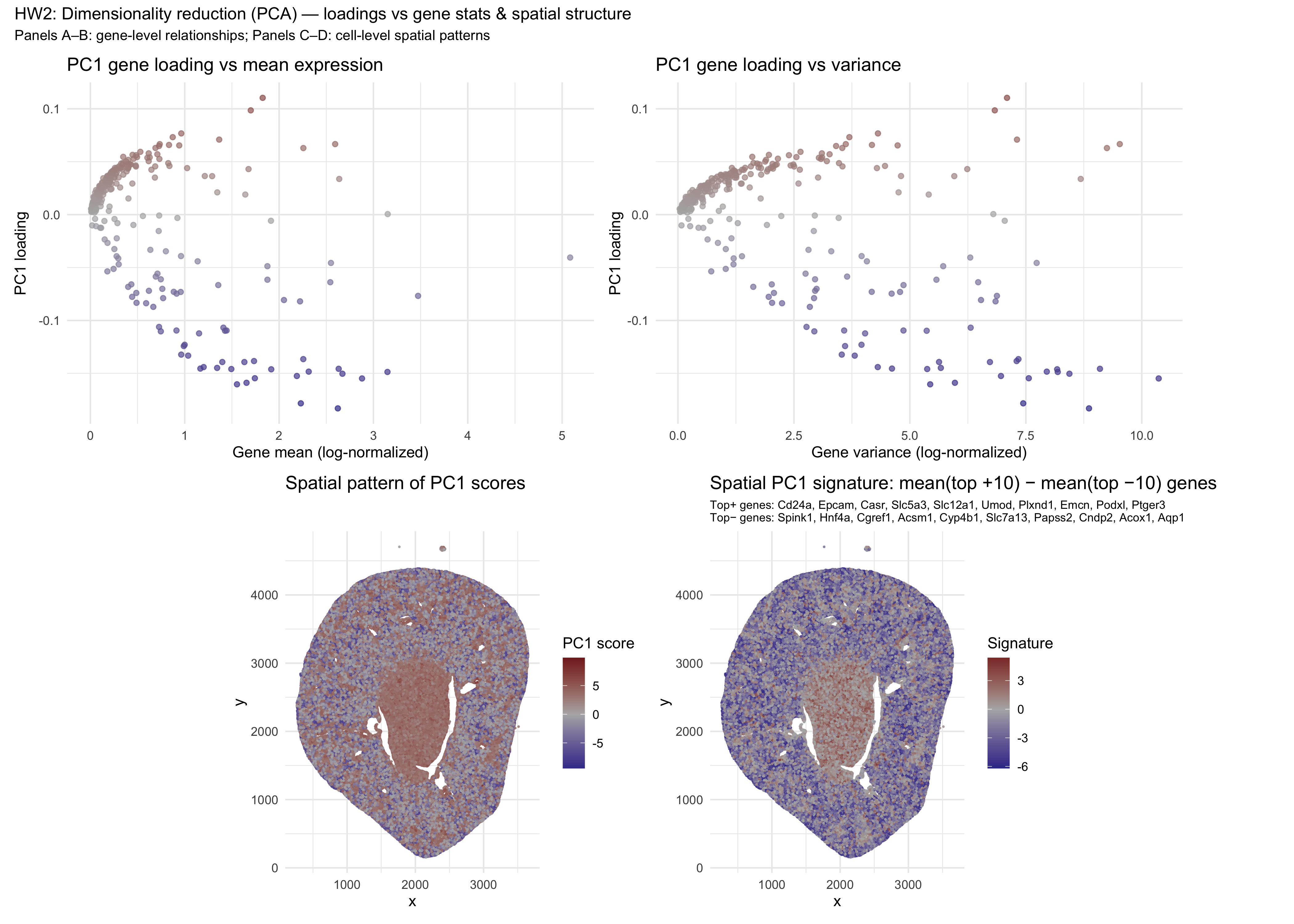
Comparing high vs. low PC1 loading genes
Aim: How do the genes with high versus low loadings relate to each other? How are they patterned relative to each other in the tissue?...

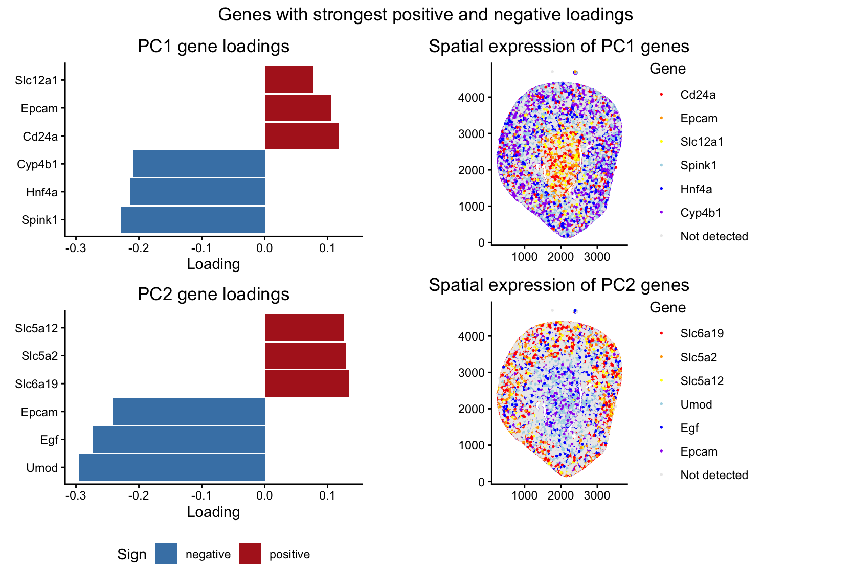
Spatial Organization of Genes with Extreme PCA Loadings
1. What data types are you visualizing? I’m visualizing both quantitative and categorical data. The dataset has quantitative spatial information of x and y coordinates...
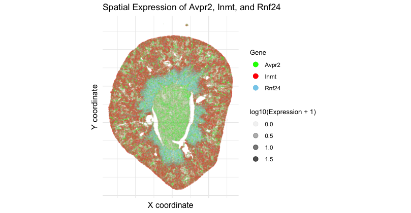
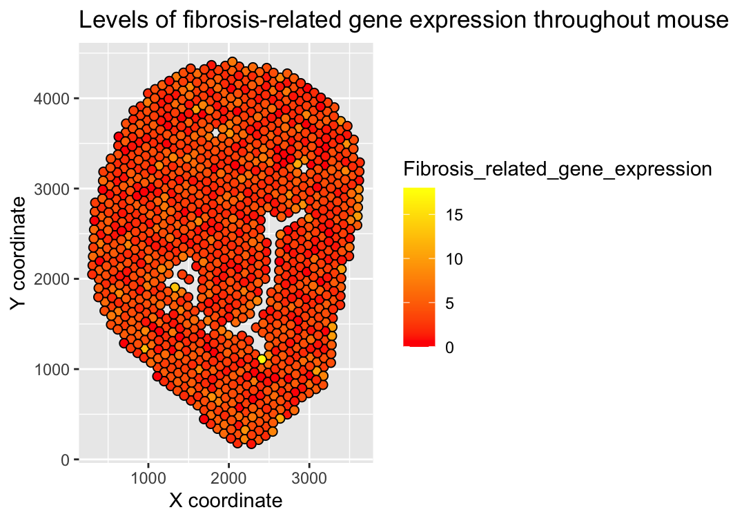
Spatial Expression of Avpr2, Inmt, and Rnf24
1. What data types are you visualizing? I am visualizing 3 data types. First, categorical data of 3 genes: Avpr2, Inmt, and Rnf24. Second, spatial...
HW1 Submission
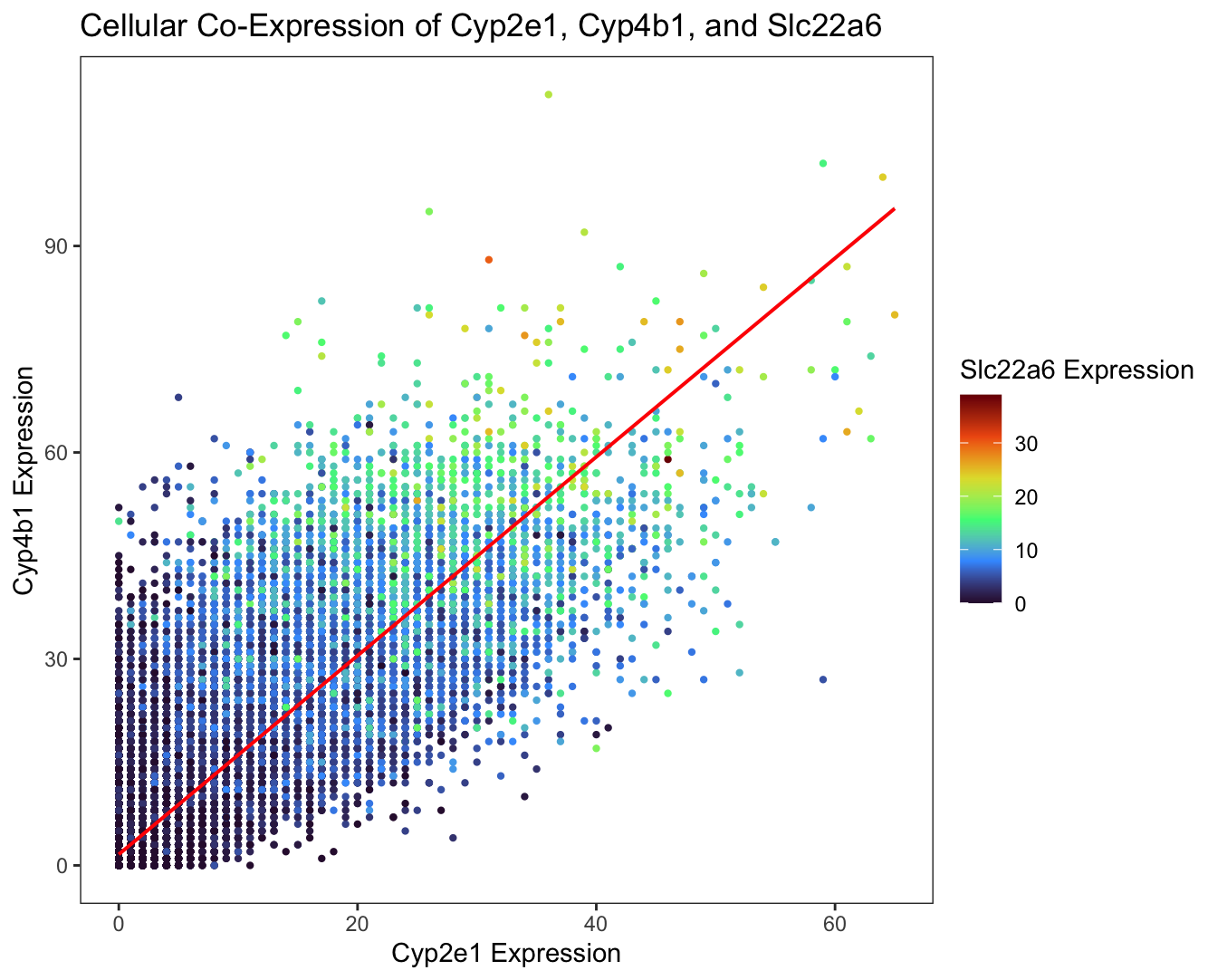
1. What data types are you visualizing? I am visualizing quantitative data of the gene expression counts of the Cyp2e1, Cyp4b1, and Slc22a6 genes for...
HW1
1. What about the data would you like to make salient through this data visualization? Since I am working with Visium 10x geneomics data, every...

All Visualizations
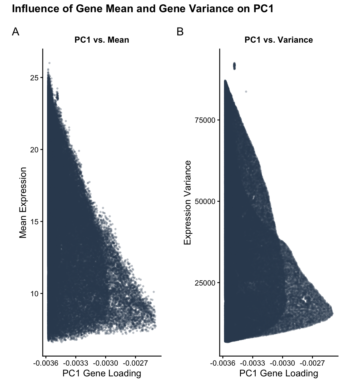
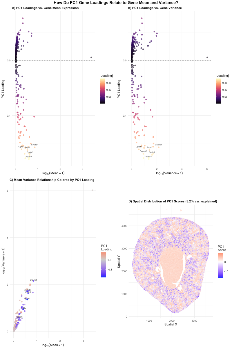
Influence of Gene Mean and Gene Variance on PC1
1. What data types are you visualizing? I am visualizing quantitative data of: 1) the mean expression of each gene, averaged across all of all spatial spots within the data...
Comparing High and Low Loading Genes Across Spatial and PCA Spaces
Write a description explaining what you are trying to make salient and why you believe your data visualization is effective, using vocabulary terms from Lesson 1. (Question 2: How do...

HW 2 How Gene Loadings on the First PC Relates to Mean and Variance
1. What data types are you visualizing? I am visualizing quantitative data for the genes, including the PC1 loadings, mean expression per gene, and variance per gene. I also visualized...
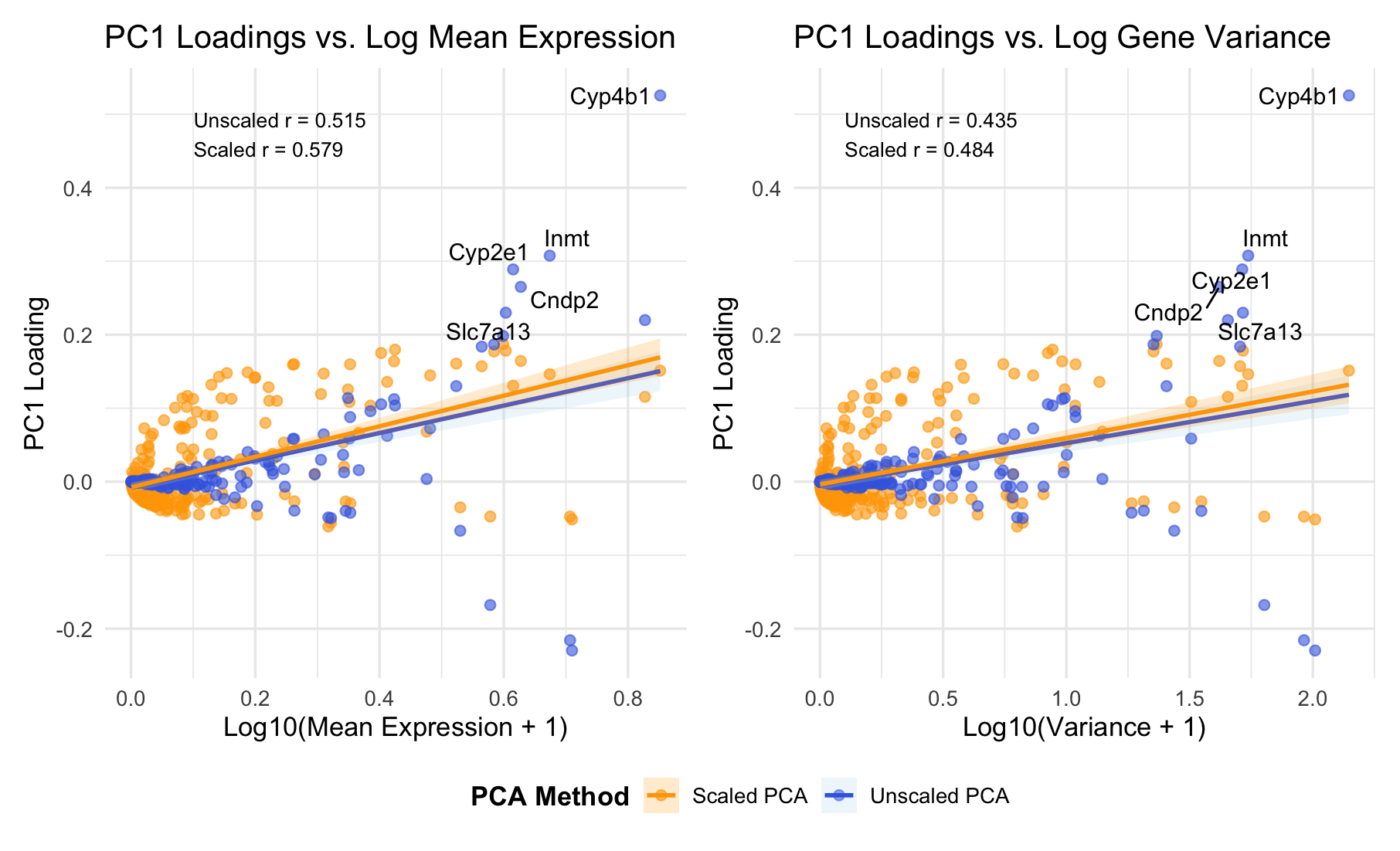
HW 2
###Summary PC1 loadings correlate positively with both mean expression (r = 0.52-0.58) and variance (r = 0.44-0.48). This indicates PC1 primarily captures overall expression magnitude - highly expressed genes dominate...
Impact of Principal Component Selection on t-SNE Coordinates
1. What about the data would you like to make salient?

HW2
1. Write a description explaining what you are trying to make salient and why you believe your data visualization is effective using vocabulary terms from Lesson 1.
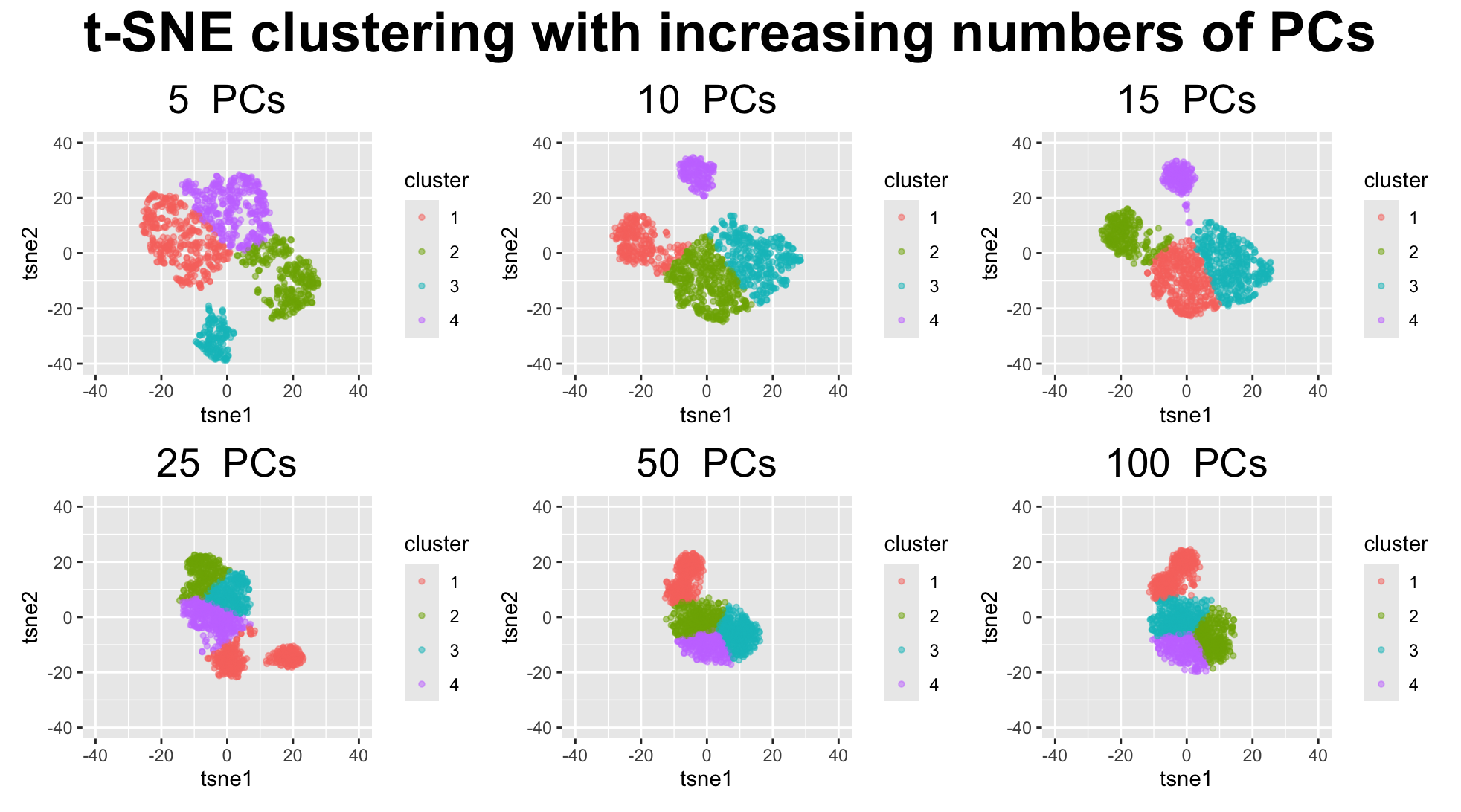
How do tSNE coordinates change as increasing the number of PCs?
1. What data types are you visualizing? I am answering how do tSNE coordinates change as increasing the number of PCs. I computed PCA on the log-transformed, normalized gene expression...
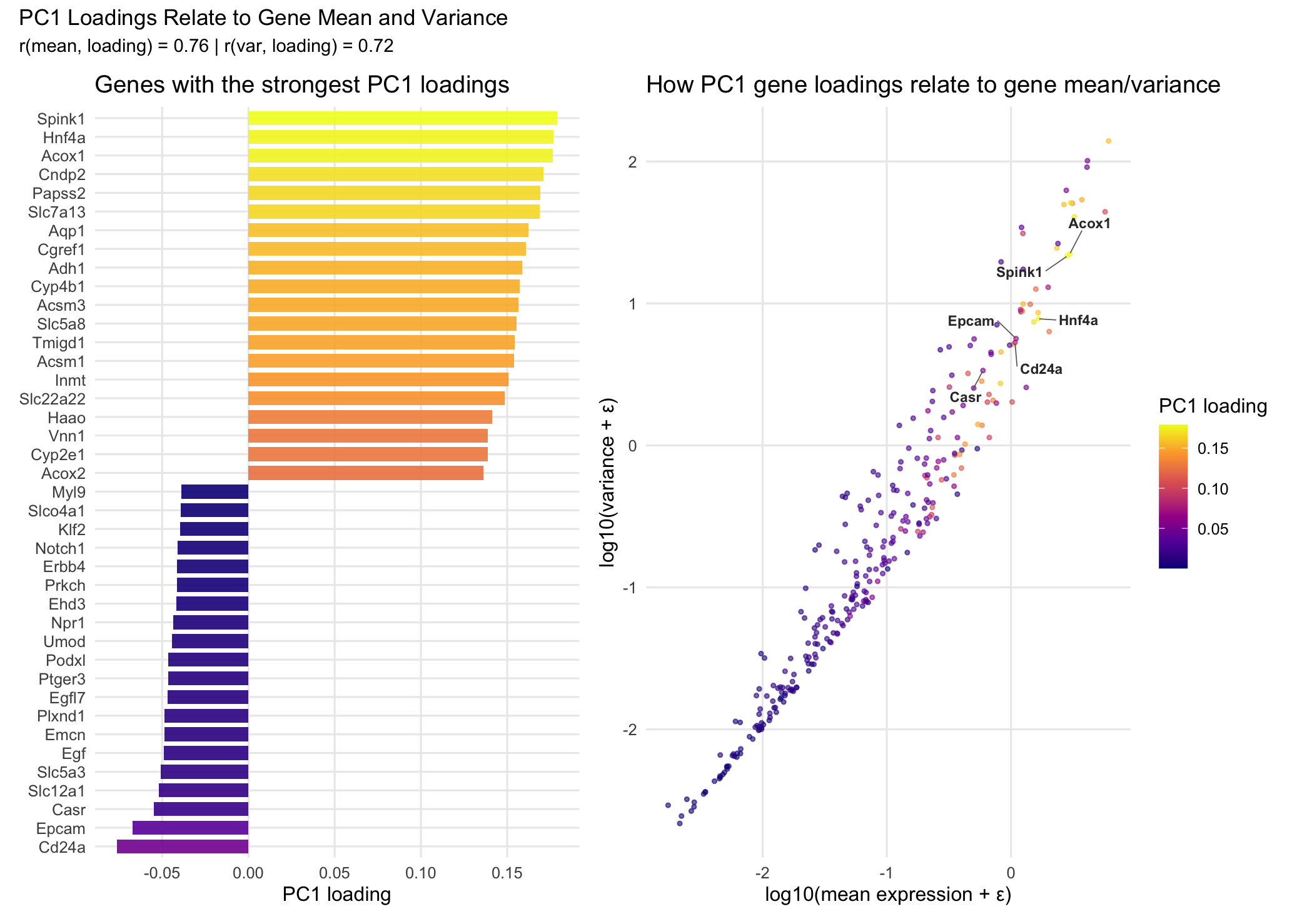
How PC1 Gene Loadings Relate to Gene Mean Expression and Variance
1. What data types are you visualizing? I am visualizing both categorical and quantitative data. The categorical data is the set of gene names in the left panel, since each...

HW2
external resources: prompt: make setwd as output path, improve the layout structure. 1. What data types are you visualizing? I visualize (1) quantitative gene-level data: PC1 loadings, mean expression, and...

HW1
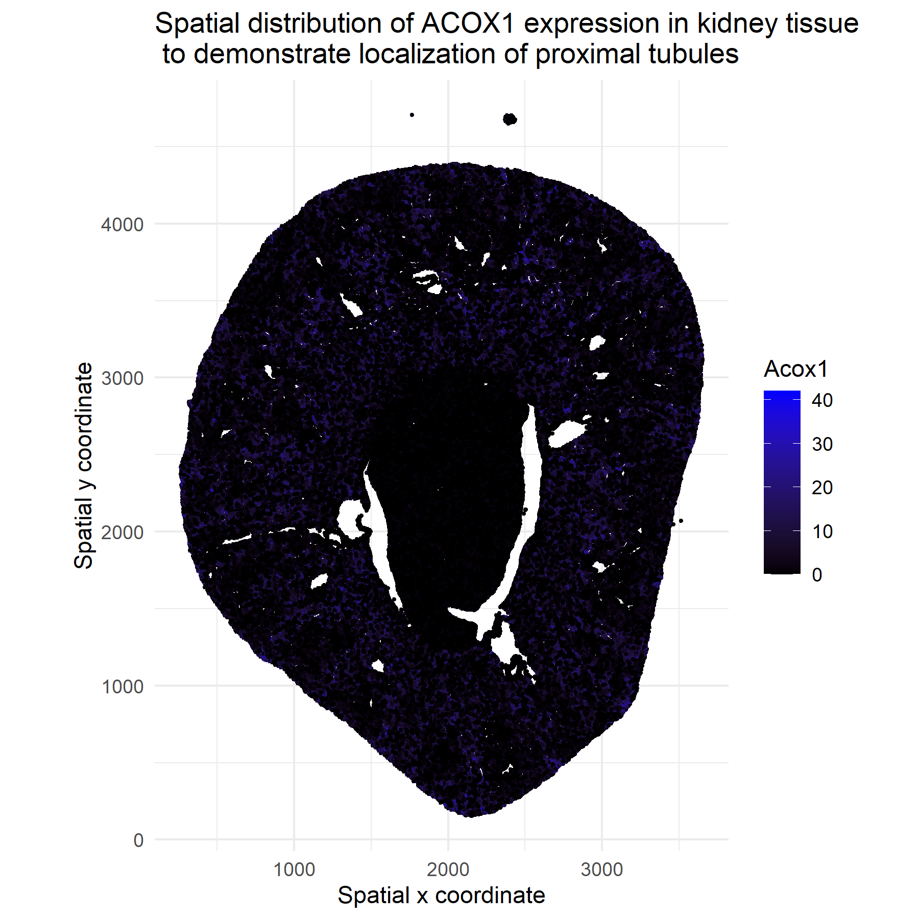
1. What data types are you visualizing? I am plotting 2D spatial coordinates and quantitative data through ACOX1 expression counts.

A data visualization for sequencing spatial transcriptomics data
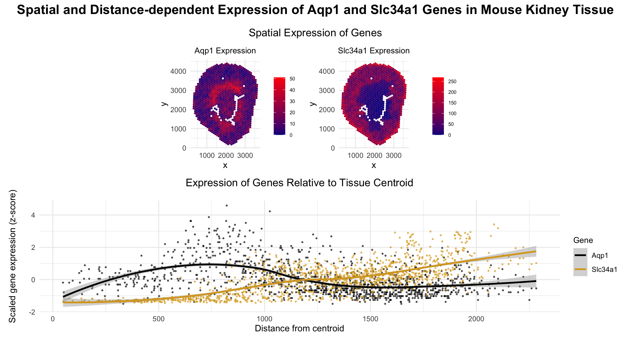
1. What data types are you visualizing? Categorical- Gene type Aqp1, Slc34a1 (in the second plot) Quantitative data- Expression levels of genes Aqp1 and Slc34a1 in each cell The euclidean...