Classmate Visualization: Visualizing Locations of Different Gene Expressions

Whose code are you applying?
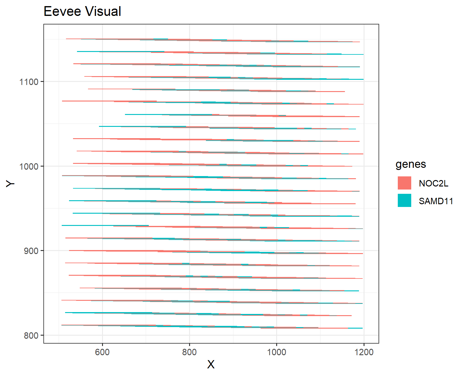
https://jef.works/genomic-data-visualization-2024/blog/2024/01/29/dvelazq5/
Critique the resulting visualization when applied to your data. Do you think the author was effective in making salient the point they said they wanted to make? How could you improve the data visualization in making salient the point they said they wanted to make? If you don’t think the data visualization can be improved, explain why the data visualization is already effective.
It was interesting to observe the different genes expressed spatially and how the geometric primitive using points for spatial data resembles lines and area shows gene expression. In additon, the visual channel of position. Therefore, you can get an overall idea of how the expression changes as the area increases. However, the use of the visual channels of hue showed different genes expressed. One small remark, was the difficulty in distinguishing the different genes as the lines were thin and there seemed to be some overlap between the genes.
I would maybe suggest that the number of genes were reduced to limit the amount of overlaping between different genes. In addition, I would maybe suggest a selection of more distinct colors to better understand which genes are which, as many genes have similar shades of the same color.