Looking for Breast Cancer Cell Types in Eevee Dataset

Description of Plot
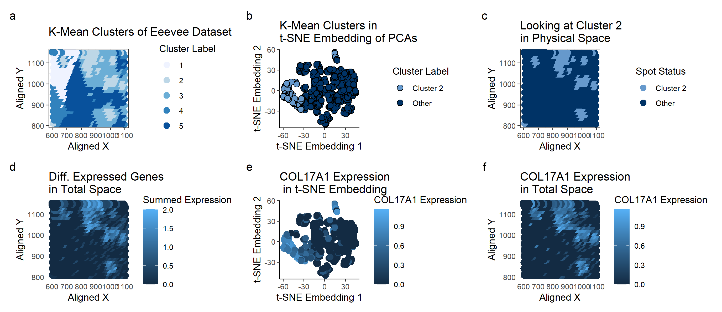
I used the K-means clustering method to identify potential groupings of cell types in the Eevee dataset, specifically for breast cancer tissue.
Plot A shows how the K-means algorithm identifies 5 clusters (k=5 derived based on total withiness). A scale of colors ranging from dark blue to light blue correspons to the cluster label of 5 to 1. With the prior knowledge that we’re looking for breast cancer tissue, I picked cluster 2 for further investigation because it looked like distinct clusters. My hope was that these clusters were tumors, and thus would have gene expressions corresponding to breast cancer.
Plot B shows the Cluster 2 on a t-SNE embedding. Cluster 2 seems to be somewhat distinct from the rest of the samples, suggesting that this particular cluster of cells may have a unique characteristics.
Plot C highlights the spatial location of Cluster 2 samples, specifically how they are physically clustered together. This makes it seem more likely that cluster 2 corresponds to cancer tumors.
To look at the differentially expressed genes, we perform a Wilcox test, as we can’t check every single gene to see if it has a Gaussian distribution inside and outside of the cluster. The genes with the lowest p-value were COL17A1 (5.19e-73) and ACTG2 (4.71e-72). Plot D looks at the summed expressions of these two genes on the physical space. Both of these genes are localized on the tissue samples and are not expressed much outside of their tumor-esque area.
For the rest of the analysis, I looked specifically at COL17A1.
Plot E shows the COL17A1 Expression on a t-SNE embedding, with the color corresponding to the expression. It shows a rather specific expression corresponding to the cluster 2 location, suggesting that it is unique to cluster 2.
Plot F has the same color schematic as before, but mapped on the physical space. Again, comparing with Plot C, we can see that areas of high COL17A1 expression (shown in light blue on Plot F) seems to correspond with the cluster 2 locations on Plot C.
With all of these plots, I have enough to suspect that COL17A1 is something that is expressed in strange clumps of cells (and we have prior information that these are breast cancer tissues). A quick search on the internet connects COL17A1 with breast cancer, with a high expression being indicative of a good prognosis. (https://www.proteinatlas.org/ENSG00000065618-COL17A1/pathology/breast+cancer).
1
2
3
4
5
6
7
8
9
10
11
12
13
14
15
16
17
18
19
20
21
22
23
24
25
26
27
28
29
30
31
32
33
34
35
36
37
38
39
40
41
42
43
44
45
46
47
48
49
50
51
52
53
54
55
56
57
58
59
60
61
62
63
64
65
66
67
68
69
70
71
72
73
74
75
76
77
78
79
80
81
82
83
84
85
86
87
88
89
90
91
92
93
94
95
96
97
98
99
100
101
102
103
104
105
106
107
108
109
110
111
112
113
114
115
116
117
118
119
120
121
122
123
124
125
126
127
128
129
130
131
132
133
134
135
136
137
138
139
140
141
142
143
144
145
146
147
148
149
150
151
152
153
154
155
156
157
158
159
160
161
162
163
164
165
166
167
168
169
170
171
172
173
174
175
176
177
178
179
180
181
182
183
184
185
186
187
188
189
190
191
192
193
194
195
196
197
# homework 4

# Perform clustering on the cells (or spots) in your data. Pick at least one cluster
# and figure out what cell-type (or multiple cell-types) it corresponds to.
#Create a multi-panel data visualization that includes at minimum the following components:
# 1. A panel visualizing your one cluster of interest in reduced dimensional space (PCA, tSNE, etc)
# 2. A panel visualizing your one cluster of interest in physical space
# 3. A panel visualizing differentially expressed genes for your cluster of interest
# 4. A panel visualizing one of these genes in reduced dimensional space (PCA, tSNE etc)
# 5. A panel visualizing one of these genes in space

set.seed(1)
data <- read.csv('C:\\Users\\emw\\OneDrive - Johns Hopkins\\spring 2024\\genomic-data-visualization-2024\\data\\eevee.csv.gz', row.names=1)
dim(data)
library(ggplot2)
pos <- data[,2:3]
gexp <- data[, 4:ncol(data)]

## just looking at the top genes
topgene <- names(sort(apply(gexp, 2, var), decreasing=TRUE)[1:1000])
gexpfilter <- gexp[,topgene]
dim(gexpfilter)

## normalize
gexpnorm <- log10(gexpfilter/rowSums(gexpfilter) * mean(rowSums(gexpfilter))+1)


## elbow code taken from https://www.statology.org/elbow-method-in-r/
#library(cluster)
#library(factoextra)
#fviz_nbclust(gexpnorm, kmeans, method = "wss")

#based on above plot, do centers = 5
com <- as.factor(kmeans(gexpnorm, centers=5)$cluster)
df <- data.frame(pos,gexpnorm, com)

# Looking at the plots to determine cluster of interest
library(RColorBrewer)
p_clusters <- ggplot(df) +
  geom_point(aes(x = aligned_x, y = aligned_y, col=df$com), size=3) +
  theme_bw() +
  labs(
    title = "K-Mean Clusters of Eeevee Dataset",
    x = "Aligned X",
    y = "Aligned Y", color="Cluster Label"
  ) +scale_color_brewer(palette='Blues')
p_clusters


## Looking at Cluster 2 based on p_cluster plot
cluster_of_interest = 2;
df_cluster = df[df$com==cluster_of_interest,]

# Comparing All Clusters to Cluster of Interest
# 1. A panel visualizing your one cluster of interest in reduced dimensional space (PCA, tSNE, etc)

#pca of all datapoints
pcs_whole <- prcomp(df[, colnames(gexpnorm)])
dim(pcs_whole$x)
#df2_whole <- data.frame(pcs_whole$x[,1:2])
#p_pca_whole <- ggplot(df2_whole) + geom_point(aes(x = PC1, y = PC2, col = com)) + theme_classic()
#p_pca_whole

## t-SNE
library(Rtsne)
emb1_whole <- Rtsne(pcs_whole$x[,1:30], dims = 2, perplexity = 5) ## what happens if we run tSNE on PCs?
df_whole <- data.frame(emb1_whole=emb1_whole$Y)
## NOTE TO SELF THIS CODE IS KINDA WEIRD
doIcare <- as.factor(df$com != cluster_of_interest)#*1.5+2
doIcare_cluster <- factor(doIcare, labels = c('Cluster 2', 'Other') )

p_tsne_whole <- ggplot(df_whole) +
  geom_point(aes(x = emb1_whole.1, y = emb1_whole.2, fill=doIcare_cluster), shape=21,size=3) +
  theme_classic() +
  labs(
    title = "K-Mean Clusters in \nt-SNE Embedding of PCAs",
     x = "t-SNE Embedding 1",
    y = "t-SNE Embedding 2", fill="Cluster Label"
  ) +
  scale_fill_manual(values = c("Cluster 2" = "#6699CC",
                               "Other"="#003366"))
p_tsne_whole

# 2. A panel visualizing your one cluster of interest in physical space
# Comparing against whole

df_physicalspace <- data.frame(df, cluster_interest = doIcare_cluster)
p_physicalspace <- ggplot(df_physicalspace) +
  geom_point(aes(x = aligned_x, y = aligned_y, col=cluster_interest), size=3) +
  theme_bw() +
  labs(
    title = "Looking at Cluster 2 \nin Physical Space",
    x = "Aligned X",
    y = "Aligned Y", color="Spot Status"
  ) +
  scale_color_manual(values = c("Cluster 2" = "#6699CC",
                                "Other"="#003366"))
p_physicalspace
# 3. A panel visualizing differentially expressed genes for your cluster of interest
all_pvals <- c(length(colnames(gexpnorm)))
i <- 0
#calculate a p-value for all.
# It's too difficult to check the distribution for each and every gene
# doing Mann-Whitney since at least that doesn't assume Gaussian
for (g in colnames(gexpnorm)) {
  i <- i+1
  p_value <- (wilcox.test(gexpnorm[com == cluster_of_interest, g],
               gexpnorm[com != cluster_of_interest, g],
               alternative = "two.sided")$p.val)
  all_pvals[i] <-p_value

}

#doIcare <- as.factor(df$com != cluster_of_interest)

#find the genes with the lowest p-values
df_pvalue <- data.frame(gene_name = colnames(gexpnorm), pval = as.numeric(all_pvals))
head(df_pvalue)
df_pvalue_sorted <- df_pvalue[order(df_pvalue$pval), ]
rownames(df_pvalue_sorted) <- NULL #allows for proper sorting of bar plot later

head(df_pvalue_sorted)

df_pvalue_sorted$gene_name <- factor(df_pvalue_sorted$gene_name,                                    # Factor levels in decreasing order
                  levels = df_pvalue_sorted$gene_name[order(df_pvalue_sorted$pval)])


# quickly look at the distributions as a sanity check
gene_of_interest = 'COL17A1'
doIcare <- factor(doIcare, labels = c('Inside Cluster', 'Outside Cluster') )
df_hist <- data.frame(df, doIcare)

p_hist <- ggplot(df_hist, aes(x = df_hist[,'COL17A1'], fill = df_hist$doIcare)) +
  geom_histogram(binwidth = 0.2, alpha = 0.5, position = "identity") +
  labs(
    title = "Distribution for COL17A1 \nin Relation to Cluster 2",
    x = "COL17A1",
    y = "Count", fill="Where is COL17A1"
  ) +
  scale_fill_manual(values = c("Inside Cluster" ="#6699CC",
                                "Outside Cluster"="#003366"))
p_hist

p_bestpvalues<-ggplot(data=df_pvalue_sorted[1:30, ], aes(x=gene_name, y=pval)) +
  geom_bar(stat="identity") +scale_y_log10()+ scale_x_discrete(guide = guide_axis(angle = 90)) +
labs( title = "Which Genes are Differentially Expressed",
  x = "Gene Name",
  y = "p-value (Log10)")
#scale_y_discrete(guide = guide_axis(angle = 90))
p_bestpvalues

# 4. A panel visualizing one of these genes in reduced dimensional space (PCA, tSNE etc)
#pcs <- prcomp(gexpnorm)
#emb <- Rtsne(pcs$x[,1:30], dims = 2, perplexity = 5) ## what happens if we run tSNE on PCs?
## plot
df_COL17A1_reduced <- data.frame(pcs_whole$x[,1:2], emb=emb1_whole$Y, gene = gexpnorm[, 'COL17A1'], doIcare)
p_COL17A1_reduced <- ggplot(df_COL17A1_reduced) + geom_point(aes(x = emb.1, y = emb.2, col=gene), size=3) +
  theme_classic() +
  labs(
    title = "COL17A1 Expression \n in t-SNE Embedding",
    x = "t-SNE Embedding 1",
    y = "t-SNE Embedding 2", color="COL17A1 Expression"
  )
p_COL17A1_reduced

# 5. A panel visualizing one of these genes in space
## Look at gene expression of genes from above
## look at the sum of the genes of interest within cluster
# size_param <- as.numeric(df$com == cluster_of_interest)*1.5+2
#COL17A1
df_physicalspace_COL17A1 <- data.frame(df, COL17A1_Expression = gexpnorm[, 'COL17A1'])
p_physicalspace_COL17A1 <- ggplot(df_physicalspace_COL17A1) +
  geom_point(aes(x = aligned_x, y = aligned_y, col=COL17A1_Expression), size=4) +
  theme_minimal() +
  labs(
    title = "COL17A1 Expression \nin Total Space",
    x = "Aligned X",
    y = "Aligned Y", color="COL17A1 Expression"
  )
p_physicalspace_COL17A1


df_physicalspace_diffgene <- data.frame(df, gexp_diff_gexp = gexpnorm[, 'COL17A1']+gexpnorm[, 'ACTG2'])
p_physicalspace_diffgene <- ggplot(df_physicalspace_diffgene) +
  geom_point(aes(x = aligned_x, y = aligned_y, col=gexp_diff_gexp), size=4) +
  theme_minimal() +
  labs(
    title = "Diff. Expressed Genes \nin Total Space",
    x = "Aligned X",
    y = "Aligned Y", color="Summed Expression"
  )
library(patchwork)
p_clusters + p_tsne_whole + p_physicalspace + p_physicalspace_diffgene + p_COL17A1_reduced+plot_annotation(tag_levels = 'a')+p_physicalspace_COL17A1+ plot_layout(ncol = 3)