CODEX data analysis

Genes extracted from cluster analysis
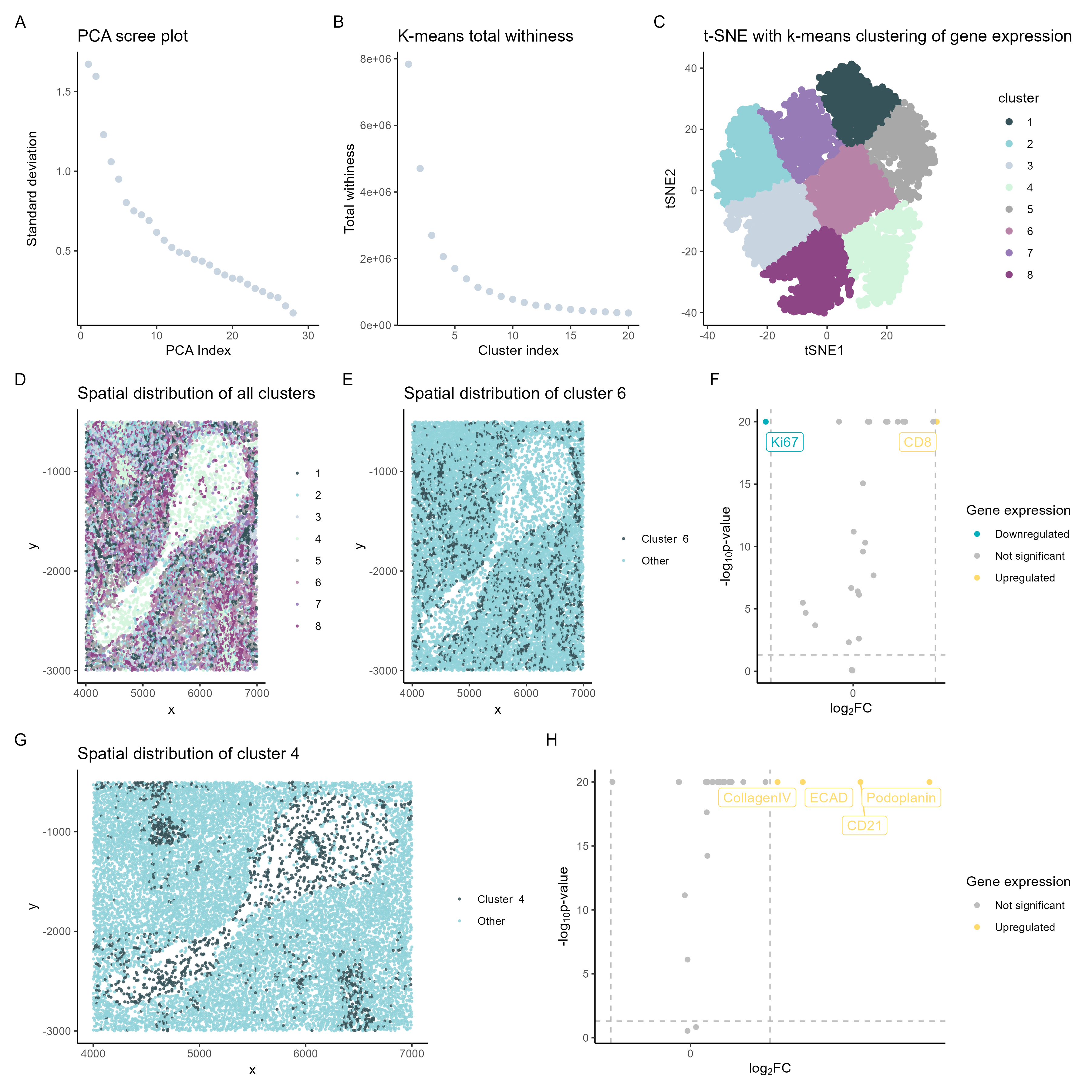
In the spleen data analyzed, the upregulated gene expressed in cluster 4 was CD8. On the other k-means cluster 6 analyzed, the upregulated genes were colagenIV, ECAD, CD21, and Podoplanin.
Options listed as potential tissues
- Arteries/Veins
- White pulp
- Red pulp
- Capsule/Trabeculae
Clusters data matched with respective tissue component
In summary, the CD8+ T-cell cluster 4 suggests white pulp.[1]
On the other hand, cluster 6 expresses the genes collagen IV, E-cadherin, CD21, and Podoplanin, which indicate cell types found in the blood vessels.[3]
So the data is most consistent with analysis of the white pulp and blood vessels.
References
1.Cesta MF. Normal Structure, Function, and Histology of the Spleen. Toxicologic Pathology. 2006;34(5):455-465. <doi:10.1080/01926230600867743>
2.https://teachmephysiology.com/gastrointestinal-system/other/function-of-spleen/
3.Chi, Jen-Tsan Ashley et al. “Endothelial cell diversity revealed by global expression profiling.” Proceedings of the National Academy of Sciences of the United States of America 100 (2003): 10623 - 10628. https://biostatsquid.com/volcano-plots-r-tutorial/ https://cran.r-project.org/web/packages/gridExtra/vignettes/arrangeGrob.html
#### author ####
# Andre Forjaz
# jhed: aperei13

#### load packages ####
library(Rtsne)
library(ggplot2)
library(patchwork)
library(gridExtra)
library(umap)
library(ggrepel)
library(tidyverse)
library(RColorBrewer)

#### Input ####
outpth <-'~/genomic-data-visualization-2024/homework/hw6/'
pth <-'~/genomic-data-visualization-2024/data/codex_spleen_subset.csv.gz'
data <- read.csv(pth, row.names=1)
# pick color palette
colpal <- c("#365359", "#91D2D9", "#c8d5e1","#D4F5DD","#a8a8a8","#b784a7","#967bb6","#8e4585")


# data preview
data[1:5,1:8]

# xy data
pos <- data[, 1:2]
# area
area <- data[, 3]
# gene data
pexp <- data[4:ncol(data)]
head(pexp)

# normalize the data with log10 mean
pexpnorm <- log10(pexp/rowSums(pexp) * mean(rowSums(pexp))+1)

rownames(pos) <- rownames(pexpnorm) <- data$cell_id
head(pos)
head(pexpnorm)

# PCA
pcs <- prcomp(pexpnorm)
plot(pcs$sdev[1:30])

## PANEL A
## scree plot pca
df_a <- data.frame(standard_deviation = pcs$sdev[1:30],
                   PCA_index =1:30)

pa <- ggplot(df_a) +
  geom_point(aes(x=PCA_index,y= standard_deviation),size = 2, color = colpal[3]) +
  labs(x = "PCA Index",y = "Standard deviation")+
  ggtitle("PCA scree plot")+
  theme_classic()
pa

# tsne on pcs
emb <- Rtsne::Rtsne(pcs$x)$Y
plot(emb)

## kmeans clustering
tw <- sapply(1:20, function(i) {
  kmeans(emb, centers=i)$tot.withinss
})
plot(tw, type='l')

## PANEL B
## total withiness kmeans clustering
df_b <- data.frame(total_withiness = tw,
                   cluster_index =1:20)

pb <- ggplot(df_b) +
  geom_point(aes(x=cluster_index,y= total_withiness),size = 2, color = colpal[3]) +
  labs(x = "Cluster index",y = "Total withiness")+
  ggtitle("K-means total withiness")+
  theme_classic()
pb

# identify clusters kmeans
com <- as.factor(kmeans(emb, centers = 8)$cluster)

## Panel C
# tsne visualization
df_c <- data.frame(V1 = emb[,1],
                   V2 = emb[,2],
                   cluster = com)

pc <- ggplot(df_c) +
  geom_point(aes(V1, V2, color=cluster),size = 2) +
  scale_color_manual(values = colpal) +
  labs(x = "tSNE1",y = "tSNE2")+
  ggtitle("t-SNE with k-means clustering of gene expression")+
  theme_classic()

pc

## Panel D
##################### spatial resolved clusters
df_d <- data.frame(x = pos$x,
                   y = pos$y,
                   cluster = com)

pd <- ggplot(df_d) +
  geom_point(aes(x, y,
                 color= factor(cluster)),
             size =0.5,
             alpha = 0.8) +
  scale_color_manual(values = colpal, guide = guide_legend(title = NULL))+
  ggtitle("Spatial distribution of all clusters")+
  theme_classic()
pd

## Panel E
# spatial resolved cluster 6
cluster_kmeans <-6
pe <- ggplot(df_d) +
  geom_point(aes(x, y,
                 color= ifelse(cluster == cluster_kmeans, paste("Cluster ",cluster_kmeans), "Other")),
             size =0.5,
             alpha = 0.8) +
  scale_color_manual(values = colpal, guide = guide_legend(title = NULL))+
  ggtitle(paste("Spatial distribution of cluster", cluster_kmeans))+
  theme_classic()
pe

## Panel F
# differentially expressed genes for your cluster of interest
pv <- sapply(colnames(pexpnorm), function(i) {
  # print(i) ## print out gene name
  wilcox.test(pexpnorm[com == cluster_kmeans, i], pexpnorm[com != cluster_kmeans, i])$p.val
})

logfc <- sapply(colnames(pexpnorm), function(i) {
  # print(i) ## print out gene name
  log2(mean(pexpnorm[com == cluster_kmeans, i])/mean(pexpnorm[com != cluster_kmeans, i]))
})

# volcano plot
df_f <- data.frame(pv=pv, logfc, gene_symbol=colnames(pexpnorm))
# Credit: https://biostatsquid.com/volcano-plots-r-tutorial/
df_f$diffexpressed <- "NO"
# Set as "UP" if log2Foldchange > 0.6 and pvalue < 0.05
df_f$diffexpressed[df_f$logfc > 0.6 & df_f$pv < 0.05] <- "UP"
# Set as "DOWN" if log2Foldchange < -0.6 and pvalue < 0.05
df_f$diffexpressed[df_f$logfc < -0.6 & df_f$pv <0.05] <- "DOWN"
# df_f$delabel <- NA
df_f$delabel <- ifelse(df_f$gene_symbol %in% head(df_f[order(df_f$pv),"gene_symbol"],50),df_f$gene_symbol, NA)

# Explore the data
head(df_f[order(df_f$pv) & df_f$diffexpressed == 'UP', ])


pf <- ggplot(df_f, aes(x = logfc, y = -log10(pv+1e-20), col = diffexpressed, label = delabel)) +
  geom_point(aes(x = logfc, y = -log10(pv+1e-20))) +
  geom_vline(xintercept = c(-0.6, 0.6), col = "gray", linetype = 'dashed') +
  geom_hline(yintercept = -log10(0.05), col = "gray", linetype = 'dashed') +
  # scale_color_manual(values = c( "grey", "#FFDB6D"),
  #                    labels = c( "Not significant", "Upregulated"))+
  scale_color_manual(values = c("#00AFBB", "grey", "#FFDB6D"),
                     labels = c("Downregulated", "Not significant", "Upregulated")) +
  labs(color = 'Gene expression',
       x = expression("log"[2]*"FC"), y = expression("-log"[10]*"p-value")) +
  scale_x_continuous(breaks = seq(-10, 10, 2)) +
  theme_classic() +
  geom_label_repel(data = subset(df_f, diffexpressed != "NO"),
                  aes(label = delabel),
                  box.padding = 0.5,
                  point.padding = 0.5,
                  show.legend = FALSE,
                  max.overlaps = 40)
pf

## Panel G
# spatial resolved cluster 4
cluster_kmeansg <-4
pg <- ggplot(df_d) +
  geom_point(aes(x, y,
                 color= ifelse(cluster == cluster_kmeansg, paste("Cluster ",cluster_kmeansg), "Other")),
             size =0.5,
             alpha = 0.8) +
  scale_color_manual(values = colpal, guide = guide_legend(title = NULL))+
  ggtitle(paste("Spatial distribution of cluster", cluster_kmeansg))+
  theme_classic()
pg

## Panel H
# differentially expressed genes for your cluster of interest
pv2 <- sapply(colnames(pexpnorm), function(i) {
  # print(i) ## print out gene name
  wilcox.test(pexpnorm[com == cluster_kmeansg, i], pexpnorm[com != cluster_kmeansg, i])$p.val
})

logfc2 <- sapply(colnames(pexpnorm), function(i) {
  # print(i) ## print out gene name
  log2(mean(pexpnorm[com == cluster_kmeansg, i])/mean(pexpnorm[com != cluster_kmeansg, i]))
})

# volcano plot
df_h <- data.frame(pv2=pv2, logfc2, gene_symbol=colnames(pexpnorm))
# Credit: https://biostatsquid.com/volcano-plots-r-tutorial/
df_h$diffexpressed <- "NO"
# Set as "UP" if log2Foldchange > 0.6 and pvalue < 0.05
df_h$diffexpressed[df_h$logfc2 > 0.6 & df_h$pv2 < 0.05] <- "UP"
# Set as "DOWN" if log2Foldchange < -0.6 and pvalue < 0.05
df_h$diffexpressed[df_h$logfc2 < -0.6 & df_h$pv2 <0.05] <- "DOWN"
# df_h$delabel <- NA
df_h$delabel <- ifelse(df_h$gene_symbol %in% head(df_h[order(df_h$pv2),"gene_symbol"],50),df_h$gene_symbol, NA)

# Explore the data
head(df_h[order(df_h$pv2) & df_h$diffexpressed == 'UP', ])


ph <- ggplot(df_h, aes(x = logfc2, y = -log10(pv2+1e-20), col = diffexpressed, label = delabel)) +
  geom_point(aes(x = logfc2, y = -log10(pv2+1e-20))) +
  geom_vline(xintercept = c(-0.6, 0.6), col = "gray", linetype = 'dashed') +
  geom_hline(yintercept = -log10(0.05), col = "gray", linetype = 'dashed') +
  scale_color_manual(values = c( "grey", "#FFDB6D"),
                     labels = c( "Not significant", "Upregulated"))+
  # scale_color_manual(values = c("#00AFBB", "grey", "#FFDB6D"),
  #                    labels = c("Downregulated", "Not significant", "Upregulated")) +
  labs(color = 'Gene expression',
       x = expression("log"[2]*"FC"), y = expression("-log"[10]*"p-value")) +
  scale_x_continuous(breaks = seq(-10, 10, 2)) +
  theme_classic() +
  geom_label_repel(data = subset(df_h, diffexpressed != "NO"),
                   aes(label = delabel),
                   box.padding = 0.25,
                   point.padding = 0.25,
                   show.legend = FALSE,
                   max.overlaps = 40)
ph


#### Plot results ####

# combined_plot <-grid.arrange( pa , pb , pc, pd , pe , pf , pg, ph , layout_matrix = lay)
# combined_plot <-(pa + pb + pc+ pd) / ( pe + pf+pg+ ph)  + plot_annotation(tag_levels = 'A')
combined_plot <-(pa + pb + pc) / ( pd+ pe + pf)/(pg+ ph)  + plot_annotation(tag_levels = 'A')

#### Save results ####
ggsave(paste0(outpth, "hw6_aperei13.png"),
       plot = combined_plot,
       width = 12,
       height = 12,
       units = "in")