Exploring tissue type for CODEX data

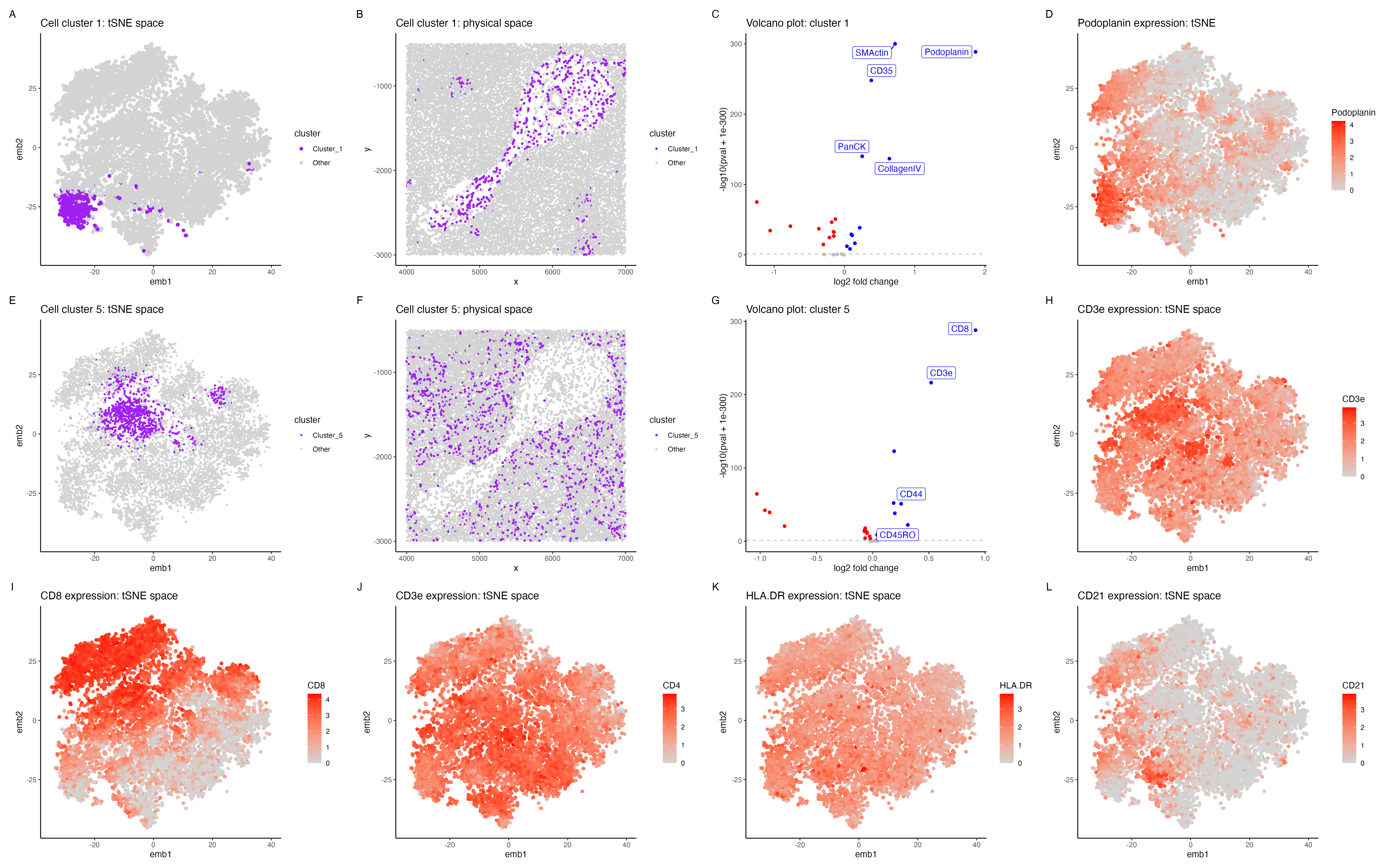
In the above visualization I have identified a cluster that belongs to endothelial cells (panels A-D), a
cluster that belongs to T cells (panels E-H), followed by exploring highly expressed immune markers (panels
I-L) in the CODEX dataset.
I started with normalizing the protein expression followed by dimensionality redcution (PCA and tSNE).To
perform k-means clustering I iteratively computed the total withinness score for different values of k and
found 10 clusters to be an optimal number. I then picked clusters 1 and 5 for cell type exploration.
Cluster 1 (panels A-D)
Panel A shows cluster 1 in the lower dimensional space (tSNE) and panel B shows cluster 1 in the spatial dimension. Further I performed differential protein expression analyses using a Wilcoxon rank sum test, comparing cluster 1 with the rest of the cells. Panel E shows a volcano plot with log2 fold change on the x axis and -log10(pval +1e-300) on the y-axis. The points in blue shows SMActin, Podoplanin, PanCK, CollagenIV are significantly upregulated (p < 0.05). Podoplanin is shown to be highly expressed in endothelial cells, plays an important role in lymphatic endothelial cells [1]. CollagenIV is also shown to be an important marker for endothelial cells [2] and SMActin has also shown to be highly expressed in vascular endothelial cells [3], hence cluster 1 is potentially endothelial cells.
Cluster 5 (panels E-H) Panel E shows cluster 1 in the lower dimensional space (tSNE) and panel H shows cluster 5 in the spatial dimension. Panel I shows CD8, CD3e, CD44, CD45RO to be highly expressed in cluster 5. CD8 is known to be a marker for cytotoxic T cells [4] and CD3e is also shown to be a marker for T cells in the protein atlas. Further CD45RO has been shown to be a marker for memory T cells [6], hence cluster 5 is potentially T cells.
Exploring tissue type (panels I-L) In general the tissue seems to have a high expression of immune cell markers such as CD8 and CD4 (markers for T cells)[4] , CD21 (markers for B cells) [7]. The tissue probably belongs to white pulp of the spleen, which has a very high expression of immune cell markers [8]. The high expression of endothelial cells in the central part of the tissue (panel B) probably corresponds to splenic blood vessels that innervate the white pulp [9].
[1] https://www.ncbi.nlm.nih.gov/pmc/articles/PMC3439854/ [2] https://www.ncbi.nlm.nih.gov/pmc/articles/PMC3093941/#:~:text=type%20iv%20collagen%20is%20a,adhesion%2C%20migration%2C%20and%20angiogenesis. [3] https://pubmed.ncbi.nlm.nih.gov/15588509/ [4] https://www.thermofisher.com/us/en/home/life-science/cell-analysis/cell-analysis-learning-center/immunology-at-work/cytotoxic-t-cell-overview.html [5] https://www.proteinatlas.org/ENSG00000198851-CD3E [6] https://www.ncbi.nlm.nih.gov/pmc/articles/PMC2734248/ [7] https://www.thermofisher.com/antibody/product/CD21-Mature-B-Cell-and-Follicular-Dendritic-Cell-Marker-Antibody-clone-CR2-3990R-Recombinant-Monoclonal/1380-RBM12-P1#:~:text=CD21%20is%20useful%20in%20the,also%20useful%20in%20identifying%20abnormal. [8] https://www.sciencedirect.com/topics/veterinary-science-and-veterinary-medicine/white-pulp [9] https://training.seer.cancer.gov/anatomy/lymphatic/components/spleen.html#:~:text=Surrounded%20by%20a%20connective%20tissue,mainly%20of%20lymphocytes%20around%20arteries.
library(dplyr)
library(tidyverse)
library(ggplot2)
library(Rtsne)
library(patchwork)
library(viridis)
library(ggrepel)

set.seed(123)

setwd("/Users/archanabalan/Karchin Lab Dropbox/Archana Balan/Coursework/Spring2024/GDV/homework/")
data <- read.csv("./data/codex_spleen_subset.csv.gz", row.names =1)

# subset dataset
# Ref: Dr. Fan's code from lesson 12
pos <- data[, 1:2]
area <- data[, 3]
pexp <- data[, 4:31]
head(pexp)

## plot x,y coordinates and visualize area
df <- data.frame(pos, area)
ggplot(df) + geom_point(aes(x=x, y=y, col=area), size=0.1)

## normalize the protein expression data
pexpnorm <- log10(pexp/rowSums(pexp) * mean(rowSums(pexp))+1)

# dimensionality reduction
pcs= prcomp(pexpnorm,  center = TRUE, scale. = FALSE)

# scree plot
# screen plot of first 50 PCs
sd.df = data.frame(sd = pcs$sdev) %>% mutate(x = 1:nrow(.))

# Ref:
https://stackoverflow.com/questions/11775692/how-to-specify-the-actual-x-axis-values-to-plot-as-x-axis-ticks-in-r
p0.pca <- ggplot(data = sd.df, aes (x=x, y = sd)) +
  geom_point() +
  theme_classic() +
  theme(axis.text.x = element_text(angle=90)) +
  scale_x_continuous(breaks = seq(0,315,by=10 ))+
  labs(x = "PCs", y = "Standard Deviation") +
  ggtitle("PCA Scree Plot")


# tsne on pexpnorm
tsne = Rtsne(pexpnorm, dims =2, pca = FALSE)

## iteratively compute tot.withinness score for different values of k
withinnes.list = sapply(c(1:18), function(x) {
  print(x)
  tmp = kmeans(pexpnorm, centers = x)
  return(tmp$tot.withinss)} )

## visualize data to determine the elbow of the plot
p0.tsne = ggplot(data.frame(k = c(1:18), tot.withinss = withinnes.list),
                 aes(k, tot.withinss)) +
  geom_point()

# k=10 is found to be an optimal number for clustering the data
com = kmeans(pexpnorm, centers = 10)$cluster


## Select clusters to explore cell types : clusters 1 and 5

# Cluster 1
# Visualize cluster 1: tSNE
select.cluster = 1
cluster.cols <- c("purple", "lightgrey" )
names(cluster.cols ) <- c( "Cluster_1", "Other")

plot.df <- data.frame(emb1 = tsne$Y[,1],
                      emb2 = tsne$Y[,2],
                      cluster = ifelse(com == select.cluster, "Cluster_1", "Other"))

p1 <- ggplot(plot.df, aes(emb1, emb2,col=cluster)) +
  geom_point() +
  theme_classic() +
  scale_color_manual(values = cluster.cols)+
  ggtitle("Cell cluster 1: tSNE space")

# Visualize cluster 1: spatial coords
plot.df <- data.frame(x = pos$x,
                      y = pos$y,
                      cluster = ifelse(com == select.cluster, "Cluster_1", "Other"))

p2 <- ggplot(plot.df, aes(x, y, col=cluster)) +
  geom_point(size = 0.8) +
  theme_classic() +
  scale_color_manual(values = cluster.cols)+
  ggtitle("Cell cluster 1: physical space")

# Differential Expression for cluster 1

# Iteratively compute wilcox p-value for all proteins for cluster 1
w.res = sapply(colnames(pexpnorm), function(x){
  wilcox.test(pexpnorm[com == select.cluster, x],
              pexpnorm[!com == select.cluster, x],
              alternative = "two.sided")$p.val})

# compute log2 fold change for cluster 1
logfc = sapply(colnames(pexp), function(i){
  log2(mean(pexpnorm[com ==select.cluster, i])/mean(pexpnorm[com !=select.cluster, i]))})

# Volcano plot
plot.df =  data.frame(pv = -log10(w.res + 1e-300),
                      logfc = logfc,
                      name = colnames(pexpnorm)) %>%
  mutate(prot.reg = case_when( pv >1.30103 &  logfc <  0 ~ "Downregulated",
                               pv >1.30103 &  logfc >= 0 ~ "Upregulated",
                               .default  = "No_difference"))


gene.cols = c("red", "blue", "grey")
names(gene.cols) = c("Downregulated",  "Upregulated", "No_difference")

#Ref: https://ggplot2.tidyverse.org/reference/geom_abline.html
#Ref: https://www.datanovia.com/en/blog/how-to-remove-legend-from-a-ggplot/

p3 <- ggplot(data = plot.df , aes(x = logfc, y = pv, col = prot.reg)) +
  geom_point()+
  geom_hline(yintercept = 1.30103, linetype='dashed', col = 'grey')+
  geom_label_repel(data=subset(plot.df, pv> 1.30103) %>% filter( logfc >=0.25 ) ,
                   aes(logfc,pv,label=name)) +
  theme_classic() +
  theme(legend.position = "None")+
  scale_color_manual(values = gene.cols) +
  xlab( "log2 fold change")+
  ylab("-log10(pval + 1e-300)") +
  ggtitle("Volcano plot: cluster 1")

# Visualize Podoplanin gene
plot.df <- data.frame(emb1 = tsne$Y[,1],
                      emb2 = tsne$Y[,2],
                      Podoplanin = pexpnorm$Podoplanin)

p4 <-ggplot(plot.df, aes(emb1, emb2,col=`Podoplanin`)) +
  geom_point() +
  theme_classic() +
  scale_color_gradient(low='lightgrey', high='red')+
ggtitle("Podoplanin expression: tSNE")


# Cluster 5
# Visualize cluster : tSNE
select.cluster = 5
cluster.cols <- c("purple", "lightgrey" )
names(cluster.cols ) <- c( "Cluster_5", "Other")

plot.df <- data.frame(emb1 = tsne$Y[,1],
                      emb2 = tsne$Y[,2],
                      cluster = ifelse(com == select.cluster, "Cluster_5", "Other"))

p5 <- ggplot(plot.df, aes(emb1, emb2,col=cluster)) +
  geom_point(size = 0.6) +
  theme_classic() +
  scale_color_manual(values = cluster.cols)+
  ggtitle("Cell cluster 5: tSNE space")

# Visualize cluster 1: spatial coords
plot.df <- data.frame(x = pos$x,
                      y = pos$y,
                      cluster = ifelse(com == select.cluster, "Cluster_5", "Other"))

p6 <- ggplot(plot.df, aes(x, y, col=cluster)) +
  geom_point(size = 0.8) +
  theme_classic() +
  scale_color_manual(values = cluster.cols)+
  ggtitle("Cell cluster 5: physical space")

# Differential Expression for cluster 5

# Iteratively compute wilcox p-value for all proteins for cluster 1
w.res = sapply(colnames(pexpnorm), function(x){
  wilcox.test(pexpnorm[com == select.cluster, x],
              pexpnorm[!com == select.cluster, x],
              alternative = "two.sided")$p.val})

# compute log2 fold change for cluster 1
logfc = sapply(colnames(pexp), function(i){
  log2(mean(pexpnorm[com ==select.cluster, i])/mean(pexpnorm[com !=select.cluster, i]))})

# Volcano plot
plot.df =  data.frame(pv = -log10(w.res + 1e-300),
                      logfc = logfc,
                      name = colnames(pexpnorm)) %>%
  mutate(prot.reg = case_when( pv >1.30103 &  logfc <  0 ~ "Downregulated",
                               pv >1.30103 &  logfc >= 0 ~ "Upregulated",
                               .default  = "No_difference"))


gene.cols = c("red", "blue", "grey")
names(gene.cols) = c("Downregulated",  "Upregulated", "No_difference")

#Ref: https://ggplot2.tidyverse.org/reference/geom_abline.html
#Ref: https://www.datanovia.com/en/blog/how-to-remove-legend-from-a-ggplot/

p7 <- ggplot(data = plot.df , aes(x = logfc, y = pv, col = prot.reg)) +
  geom_point()+
  geom_hline(yintercept = 1.30103, linetype='dashed', col = 'grey')+
  geom_label_repel(data=subset(plot.df, pv> 1.30103) %>% filter( logfc >=0.25 ) ,
                   aes(logfc,pv,label=name)) +
  theme_classic() +
  theme(legend.position = "None")+
  scale_color_manual(values = gene.cols) +
  xlab( "log2 fold change")+
  ylab("-log10(pval + 1e-300)") +
  ggtitle("Volcano plot: cluster 5")


# Visualize CD3e gene
plot.df <- data.frame(emb1 = tsne$Y[,1],
                      emb2 = tsne$Y[,2],
                      CD3e = pexpnorm$CD3e)

p8 <- ggplot(plot.df, aes(emb1, emb2,col=`CD3e`)) +
  geom_point() +
  theme_classic() +
  scale_color_gradient(low='lightgrey', high='red')+
  ggtitle("CD3e expression: tSNE space")


# Visualize CD8 gene
plot.df <- data.frame(emb1 = tsne$Y[,1],
                      emb2 = tsne$Y[,2],
                      CD8 = pexpnorm$CD8)

p9 <- ggplot(plot.df, aes(emb1, emb2,col=`CD8`)) +
  geom_point() +
  theme_classic() +
  scale_color_gradient(low='lightgrey', high='red')+
  ggtitle("CD8 expression: tSNE space")


# Visualize CD4 gene
plot.df <- data.frame(emb1 = tsne$Y[,1],
                      emb2 = tsne$Y[,2],
                      CD4 = pexpnorm$CD4)

p10 <- ggplot(plot.df, aes(emb1, emb2,col=`CD4`)) +
  geom_point() +
  theme_classic() +
  scale_color_gradient(low='lightgrey', high='red')+
  ggtitle("CD3e expression: tSNE space")


# Visualize HLA.DR
plot.df <- data.frame(emb1 = tsne$Y[,1],
                      emb2 = tsne$Y[,2],
                      HLA.DR = pexpnorm$HLA.DR)

p11 <- ggplot(plot.df, aes(emb1, emb2,col=`HLA.DR`)) +
  geom_point() +
  theme_classic() +
  scale_color_gradient(low='lightgrey', high='red')+
  ggtitle("HLA.DR expression: tSNE space")


# Visualize CD21
plot.df <- data.frame(emb1 = tsne$Y[,1],
                      emb2 = tsne$Y[,2],
                      CD21 = pexpnorm$CD21)

p12 <- ggplot(plot.df, aes(emb1, emb2,col=`CD21`)) +
  geom_point() +
  theme_classic() +
  scale_color_gradient(low='lightgrey', high='red')+
  ggtitle("CD21 expression: tSNE space")


plot.layout <- "
ABCD
EFGH
IJKL
"
hw6.plt <- p1 + p2 +  p3 + p4 + p5 + p6 + p7 + p8 + p9 + p10 + p11 + p12+
            plot_layout(design = plot.layout)+
               plot_annotation(tag_levels = 'A')

ggsave( "./hw6/hw6_abalan2.png",hw6.plt, width = 24, height = 15)