Identifying Cell-types from Spleen CODEX Dataset using K-means Clustering, tSNE, and Wilcox-test

Describe your figure briefly so we know what you are depicting (you no longer need to use precise data visualization terms as you have been doing)
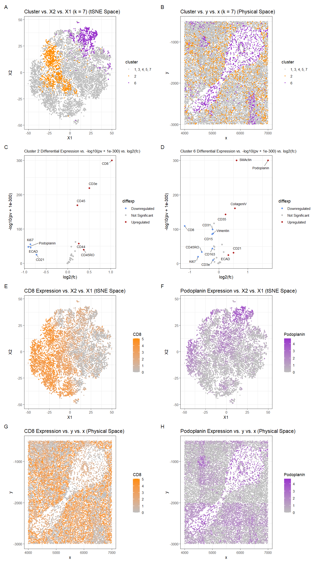
For plot A, I am visualizing the quantitative data of the X1 and X2 tSNE embedding values, and categorical data of the cluster the cell belongs to. I am using the geometric primitive of points to represent each cell. To encode the X1 embedding value, I am using the visual channel of position along the x axis. To encode the X2 value, I am using the visual channel of position along the y axis. To encode the categorical cluster the cell belongs to, I am using the visual channel of hue with orange for cluster 2, purple for cluster 6, and gray for the other clusters.
For plot B, I am visualizing the spatial data of the x and y positions for each cell, and categorical data of the cluster the cell belongs to. I am using the geometric primitive of points to represent each cell. To encode the spatial x position, I am using the visual channel of position along the x axis. To encode the spatial y position, I am using the visual channel of position along the y axis. To encode the categorical cluster the cell belongs to, I am using the visual channel of hue with orange for cluster 2, purple for cluster 6, and gray for the other clusters.
For plots C and D, I am visualizing the quantitative data of the log-transformed p-value, the quantitative data of the log-transformed fold change, and the ordinal data for the differential expression level for each protein for cluster 2 and cluster 6 respectively. I am using the geometric primitive of points to represent each protein. To encode the log-transformed fold change, I am using the visual channel of position along the x axis. To encode the log-transformed p-value, I am using the visual channel of position along the y axis. To encode the differential expression level, I am using visual channel of color hue with blue representing downregulated expression, red representing upregulated expression, and grey representing no significant differential expression for a given protein.
For plot E, I am visualizing the quantitative data of the X1 and X2 tSNE embedding values, and quantitative data of normalized log-scaled CD8 expression for each cell. I am using the geometric primitive of points to represent each cell. To encode the X1 embedding value, I am using the visual channel of position along the x axis. To encode the X2 value, I am using the visual channel of position along the y axis. To encode the quantitative normalized log-scaled CD8 expression, I am using the visual channel of saturation going from an unsaturated light grey to a saturated orange.
For plot F, I am visualizing the quantitative data of the X1 and X2 tSNE embedding values, and quantitative data of normalized log-scaled Podoplanin expression for each cell. I am using the geometric primitive of points to represent each cell. To encode the X1 embedding value, I am using the visual channel of position along the x axis. To encode the X2 value, I am using the visual channel of position along the y axis. To encode the quantitative normalized log-scaled Podoplanin expression, I am using the visual channel of saturation going from an unsaturated light grey to a saturated purple.
For plot G, I am visualizing the spatial data of the x and y positions for each cell, and quantitative data of normalized log-scaled CD8 expression for each cell. I am using the geometric primitive of points to represent each cell. To encode the spatial x position, I am using the visual channel of position along the x axis. To encode the spatial y position, I am using the visual channel of position along the y axis. To encode the quantitative normalized log-scaled CD8 expression, I am using the visual channel of saturation going from an unsaturated light grey to a saturated orange.
For plot H, I am visualizing the spatial data of the x and y positions for each cell, and quantitative data of normalized log-scaled Podoplanin expression for each cell. I am using the geometric primitive of points to represent each cell. To encode the spatial x position, I am using the visual channel of position along the x axis. To encode the spatial y position, I am using the visual channel of position along the y axis. To encode the quantitative normalized log-scaled Podoplanin expression, I am using the visual channel of saturation going from an unsaturated light grey to a saturated purple.
Plots A, B, E, F, G, and H are scatter plots. Plot C and D are volcano plots.
The Gestalt principles of proximity and similarity are present because the more similar plots are adjacent. For example, A and B both involve the categorical cluster variable and contain both orange and purple colors since they depict both cluster 2 and cluster 6. C and D are both volcano plots showing differential expression and have the same color scheme with blue representing downregulated expression, red representing upregulated expression, and grey representing no significant differential expression for a given protein. E and F are both in tSNE space and show expression for a protein of interest. G and H are both in physical space and show expression for a protein of interest. E and G both show CD8 expression. F and H both show Podoplanin expression. The colors used for cluster 2 (orange) and cluster 6 (purple) in Figures A and B are also used in the saturation gradient for their most upregulated protein (CD8 and Podoplanin respectively) in plots E, F, G, and H.
The Gestalt principle of continuity is used because progressing from plot A to plot H (left to right, top to bottom) aligns with the steps used to identify clusters 2 and 6’s cell-types (described below). The vertical columns formed by Figures C down to G and D down to H, align with the cluster the plots refer to (2 and 6 respectively).
Interpret at least two cell-types. Create a data visualization and write a description to convince me that your interpretation is correct.
To cluster the data, k-means clustering with k=7 was used. k=7 was found by constructing an elbow plot and picking the elbow as well as choosing a number of clusters large enough for the differential expression plots (C and D) to give significant and distinct results.
Clusters 2 and 6 were chosen because they appeared to be relatively well-defined in tSNE space and separate from the other clusters and each other (Figure A). Also when plotted in physical space, cluster 6 appeared to be localized in the “spoon” in the center of the plot while cluster 2 was found more in the background regions around the “spoon” (Figure B). Since they clusters had distinct localizations, this suggested that they likely correspond to different structures and cell-types, so they would be interesting to compare.
To find the differentially expressed proteins, a two-sided Wilcox test was used comparing the protein expression levels for cluster 2 with those of the other clusters for each protein. Then another two-sided Wilcox test was used comparing the protein expression levels for cluster 6 with those of the other clusters for each protein.
The p-values were -log10 transformed with an offset of 1e-300, so small p-values would map to high values. This offset was necessary because otherwise, the log transforms would result in infinite values, since the respective arguments of the log were so small they rounded to 0. 1e-300 was chosen because it is one of the smallest values to represent and so wouldn’t change the result of the logarithm too much. Still, because of the rounding, which cells have a greater -log10 transformed p-values is unclear near the upper bound. Using whether the log2 fold change was positive or negative, the direction of the differential expression, upregulated or downregulated respectively, could be ascertained. Points with p-values >= 0.01 and with absolute value of log2 fold change less than 0.20 (fold-change of 1.15) were considered insignificant.
Finally, downregulated and upregulated proteins were labeled with their names. CD8 was chosen as a protein of interest for cluster 2 because it had the highest upregulation and its expression was graphed in tSNE and physical space. In the tSNE and physical space, Cluster 2 was contained within the regions of high CD8 expression, but the regions of high CD8 expression were more vast than cluster 2, indicating that some of the other clusters likely also upregulate CD8. Podoplanin was chosen as a protein of interest for cluster 6. Similarly for cluster 6 and Podoplanin there were some regions of high Podoplanin expression which were not contained in cluster 6, but the effect was not as dramatic as for cluster 2 and CD8. These findings are likely related to the k-means clustering, since the elbow for this dataset was weaker than in previous homeworks, and the clusters are perhaps not as distinguished. For the spatial plots in physical space, the protein expression values generally aligned with the cluster locations with CD8 being expression in the background around the central “spoon” and Podoplanin expression in the “spoon” region.
For cluster 2, the top most upregulated proteins (CD8, CD3e, CD45), were searched for on Human Protein Atlas to identify the cell-type the cluster corresponds to (https://www.proteinatlas.org). Knowing that the tissue sample was from the spleen, CD8 is known to have notable expression in and specificity to the spleen’s T-cells. The Human Protein Atlas’s dataset has the number of CD8 transcripts per million (nTPM) at 779.2 for T-cell cluster c-1 (z-score = 1.28), 542.4 nTPM for T-cell cluster c-7 (z-score = 1.13), and 341.5 nTPM for T-cell cluster c-6 (z-score = 0.98) (https://www.proteinatlas.org/ENSG00000153563-CD8A/single+cell+type/spleen). This is significantly higher expression of CD8 than that of the other cell type clusters (macrophages, B-cells, Plasma cells), which are < 50 nTPM and have negative z-scores. CD3e is also upregulated in the T-cells of the spleen and noted as having “selective cytoplasmic expression in T-cells” (https://www.proteinatlas.org/ENSG00000198851-CD3E). CD3e has an nTPM of 1102.9 (z-score = 0.91) for T-cell cluster c-1, 1102.9 (z-score = 0.91) 1005.6 nTPM (z-score = 0.87) for c-2, 896.6 nTPM (z-score = 0.82) for c-6, and 1042.8 nTPM (z-score = 0.89) for c-7. The expression levels for the other cell-types were again < 50 nTPM and have negative z-scores. CD45 (PTPRC) is noted as having “selective cytoplasmic expression in lymphoid tissue and immune cells” (https://www.proteinatlas.org/ENSG00000081237-PTPRC). CD45 is upregulated in the T-cells of the spleen, with an nTPM of 1632.0 (z-score = 1.05) for T-cell cluster c-1, 1190.6 nTPM (z-score = 0.65) for c-2, and 1188.6 nTPM (z-score = 0.65) for c-5. The expression level of CD45 for macrophages is also relatively high, but not as large at 879.2 nTPM and z-score of 0.27. The other cell types (B-cells and plasma cells) had negative z-scores. Overall, these findings suggest that cluster 2 consists of T-cells.
For cluster 6, the top most upregulated proteins were Podoplanin, SMActin, and CollagenIV. Podoplanin’s tissue profile states that it has “Distinct expression in alveoli, lymphatic vessels, placental and ovarian stroma, myoepithelium and basal cells of squamous epithelia” (https://www.proteinatlas.org/ENSG00000162493-PDPN). The expression for lympathic epithelial cells is significant at 304.9 nTPM. SMActin (ACTA2) is known to have “Selective expression in smooth muscle cells and myoepithelial cells” (https://www.proteinatlas.org/ENSG00000107796-ACTA2). The expression for smooth muscle cells is very significant at 4036.1 nTPM. CollagenIV (COL4A1) enhanced in the “Extravillous trophoblasts, Smooth muscle cells, Adipocytes, Endometrial stromal cells, Fibroblasts, Endothelial cells, Sertoli cells” (https://www.proteinatlas.org/ENSG00000187498-COL4A1). The expression for smooth muscle is significant at 412.6 nTPM. Overall, these findings suggest that cluster 6 consists of the smooth muscle cells and lymphatic endothelial cells lining the vessels of the spleen. This aligns with figures B and H, which show cluster 6 and Podoplanin expression concentrated around a circular object, likely a vessel.
From this, I predict this tissue structure to be predominantly white pulp because of the high concentration of lymphocytes and organization around a central vessel. The white pulp is known to be “located around a central arteriole” and “is composed of the periarteriolar lymphoid sheath (PALS, T-cell area)” (https://www.ncbi.nlm.nih.gov/pmc/articles/PMC1828535/). Thus is makes sense that two of the cell-types identified would be T-cells and smooth muscle cells. The images of white pulp in spleen tissue samples in the above reference seem to match the spatial plots created from this dataset.
Please share the code you used to reproduce this data visualization.
data <-
    read.csv("genomic-data-visualization-2024/data/codex_spleen_subset.csv.gz",
             row.names = 1)

data[1:10, 1:10]
pos <- data[, 1:2]
area <- data[, 3]
pexp <- data[4:ncol(data)]

library(ggplot2)
ggplot(data.frame(pos, area)) + geom_point(aes(x=x, y=y, col=area))+
    scale_color_gradient(high = "darkred", low = "gray")

hist(log10(colSums(pexp) + 1))
hist(log10(rowSums(pexp) + 1))

hist(log10(pexp + 1)[,'Ki67'])
hist(log10(pexp / area * mean(area) + 1)[,'Ki67'])
hist(log10(pexp / rowSums(pexp) * mean(rowSums(pexp)) + 1)[,'Ki67'])

pexpnorm <- log10(pexp/area * mean(area)+1)

pvar <- apply(pexpnorm, 2, var)
pmean <- apply(pexpnorm, 2, mean)

sort(pvar, decreasing=TRUE)
plot(pmean, pvar)

pcs <- prcomp(pexpnorm)

library(Rtsne)
set.seed(42)
emb <- Rtsne(pexpnorm, perplexity=15)$Y

ggplot(data.frame(pcs$x, pexpnorm)) +
    geom_point(aes(x = PC1, y = PC2, col = Ki67), size = 1) +
    scale_color_gradient(high = "darkred", low = "gray")

ggplot(data.frame(emb, pexpnorm)) +
    geom_point(aes(x = X1, y = X2, col = Ki67), size = 1) +
    scale_color_gradient(high = "darkred", low = "gray")

set.seed(42)
tw <- sapply(1:15, function(i) {
    print(i)
    kmeans(pexpnorm, centers=i, iter.max = 50)$tot.withinss
})
plot(tw, type='o')

set.seed(42)
com <- as.factor(kmeans(pcs$x, centers=7)$cluster)

ggplot(data.frame(pos, pexpnorm, com)) +
    geom_point(aes(x = x, y = y, col = com), size = 1)

ggplot(data.frame(pcs$x, pexpnorm, com)) +
    geom_point(aes(x = PC1, y = PC2, col = com), size = 1)

ggplot(data.frame(emb, pexpnorm, com)) +
    geom_point(aes(x = X1, y = X2, col = com), size = 1)

clusterofinterest <- 2
clusterofinterest2 <- 6

df1 <- data.frame(pos, emb, pcs$x, pexpnorm, com)

df2 <- df1
df2[df1["com"]!=clusterofinterest, "com"] = 1
df2[df1["com"]==clusterofinterest2, "com"] = clusterofinterest2

p1 <- ggplot(df2) +
    geom_point(aes(x = X1, y = X2, col=com), size=0.8) +
    scale_color_manual(values = c("gray","darkorange", "darkorchid"),
                       labels = c("1, 3, 4, 5, 7", "2", "6" ))+
    labs(col='cluster') +
    labs(title = 'Cluster vs. X2 vs. X1 (k = 7) (tSNE Space)') +

    theme_bw()
p1

df3 <- data.frame(pos, df2)
p2 <- ggplot(df3) +
    geom_point(aes(x = x, y = y, col=com), size=0.8) +
    scale_color_manual(values = c("gray","darkorange", "darkorchid"),
                       labels = c("1, 3, 4, 5, 7", "2", "6"))+
    labs(col='cluster') +
    labs(title = 'Cluster vs. y vs. x (k = 7) (Physical Space)') +

    theme_bw()
p2

pv <- sapply(colnames(pexpnorm), function(i) {
    print(i) ## print out protein name
    wilcox.test(pexpnorm[com == clusterofinterest, i],
                pexpnorm[com != clusterofinterest, i])$p.val
})
logfc <- sapply(colnames(pexpnorm), function(i) {
    print(i) ## print out protein name
    log2(mean(pexpnorm[com == clusterofinterest, i])
         / mean(pexpnorm[com != clusterofinterest, i]))
})

df4 <- data.frame(pv = pv, logpv=-log10(pv + 1e-300), logfc)
df4["protein"] <- rownames(df4)
df4["diffexp"] = "Not Significant"
df4[df4["pv"] < 0.01 & df4["logfc"] > 0.2, "diffexp"] = "Upregulated"
df4[df4["pv"] < 0.01 & df4["logfc"] < -0.2, "diffexp"] = "Downregulated"
df4$diffexp = as.factor(df4$diffexp)

library(ggrepel)
p3 <- ggplot(df4) + geom_point(aes(x = logfc, y = logpv, color=diffexp)) +
    scale_color_manual(values = c("cornflowerblue", "grey", "firebrick")) +
    geom_text_repel(aes(label=ifelse(diffexp != "Not Significant",as.character(protein), "")
                        , x = logfc, y = logpv), size=3, max.overlaps = Inf, box.padding = .5) +
    labs(title = 'Cluster 2 Differential Expression vs. -log10(pv + 1e-300) vs. log2(fc)') +
    ylab("-log10(pv + 1e-300)")+
    xlab("log2(fc)")+
    theme_bw() +
    theme(plot.title = element_text(size=10))
p3

pv2 <- sapply(colnames(pexpnorm), function(i) {
    print(i) ## print out protein name
    wilcox.test(pexpnorm[com == clusterofinterest2, i],
                pexpnorm[com != clusterofinterest2, i])$p.val
})
logfc2 <- sapply(colnames(pexpnorm), function(i) {
    print(i) ## print out protein name
    log2(mean(pexpnorm[com == clusterofinterest2, i])
         / mean(pexpnorm[com != clusterofinterest2, i]))
})

df5 <- data.frame(pv = pv2, logpv=-log10(pv2 + 1e-300), logfc = logfc2)
df5["protein"] <- rownames(df5)
df5["diffexp"] = "Not Significant"
df5[df5["pv"] < 0.01 & df5["logfc"] > 0.2, "diffexp"] = "Upregulated"
df5[df5["pv"] < 0.01 & df5["logfc"] < -0.2, "diffexp"] = "Downregulated"
df5$diffexp = as.factor(df5$diffexp)

p4 <- ggplot(df5) + geom_point(aes(x = logfc, y = logpv, color=diffexp)) +
    scale_color_manual(values = c("cornflowerblue", "grey", "firebrick")) +
    geom_text_repel(aes(label=ifelse(diffexp != "Not Significant",as.character(protein), "")
                        , x = logfc, y = logpv), size=3, max.overlaps = Inf, box.padding = .5) +
    labs(title = 'Cluster 6 Differential Expression vs. -log10(pv + 1e-300) vs. log2(fc)') +
    ylab("-log10(pv + 1e-300)")+
    xlab("log2(fc)")+
    theme_bw() +
    theme(plot.title = element_text(size=10))
p4

df6 <- data.frame(pos, pexpnorm, emb, com)
p5 <- ggplot(df6) +
    geom_point(aes(x = X1, y = X2, col=CD8), size=0.8) +
    labs(title = 'CD8 Expression vs. X2 vs. X1 (tSNE Space)') +
    scale_color_gradient(low="grey", high="darkorange")+
    theme_bw()
p5

p6 <- ggplot(df6) +
    geom_point(aes(x = x, y = y, col=CD8), size=0.8) +
    labs(title = 'CD8 Expression vs. y vs. x (Physical Space)') +
    scale_color_gradient(low="grey", high="darkorange")+
    theme_bw()
p6

p7 <- ggplot(df6) +
    geom_point(aes(x = X1, y = X2, col=Podoplanin), size=0.8) +
    labs(title = 'Podoplanin Expression vs. X2 vs. X1 (tSNE Space)') +
    scale_color_gradient(low="grey", high="darkorchid")+
    theme_bw()
p7

p8 <- ggplot(df6) +
    geom_point(aes(x = x, y = y, col=Podoplanin), size=0.8) +
    labs(title = 'Podoplanin Expression vs. y vs. x (Physical Space)') +
    scale_color_gradient(low="grey", high="darkorchid")+
    theme_bw()
p8

library(patchwork)

p1 + p2 + p3 + p4 + p5 + p7 + p6 + p8 + plot_annotation(tag_levels = 'A') + plot_layout(nrow = 4, ncol = 2)