Interpreting the tissue structure represented in the CODEX data

Your goal is to figure out what tissue structure is represented in the CODEX data. Options include: (1) Artery/Vein, (2) White pulp, (3) Red pulp, (4) Capsule/Trabecula
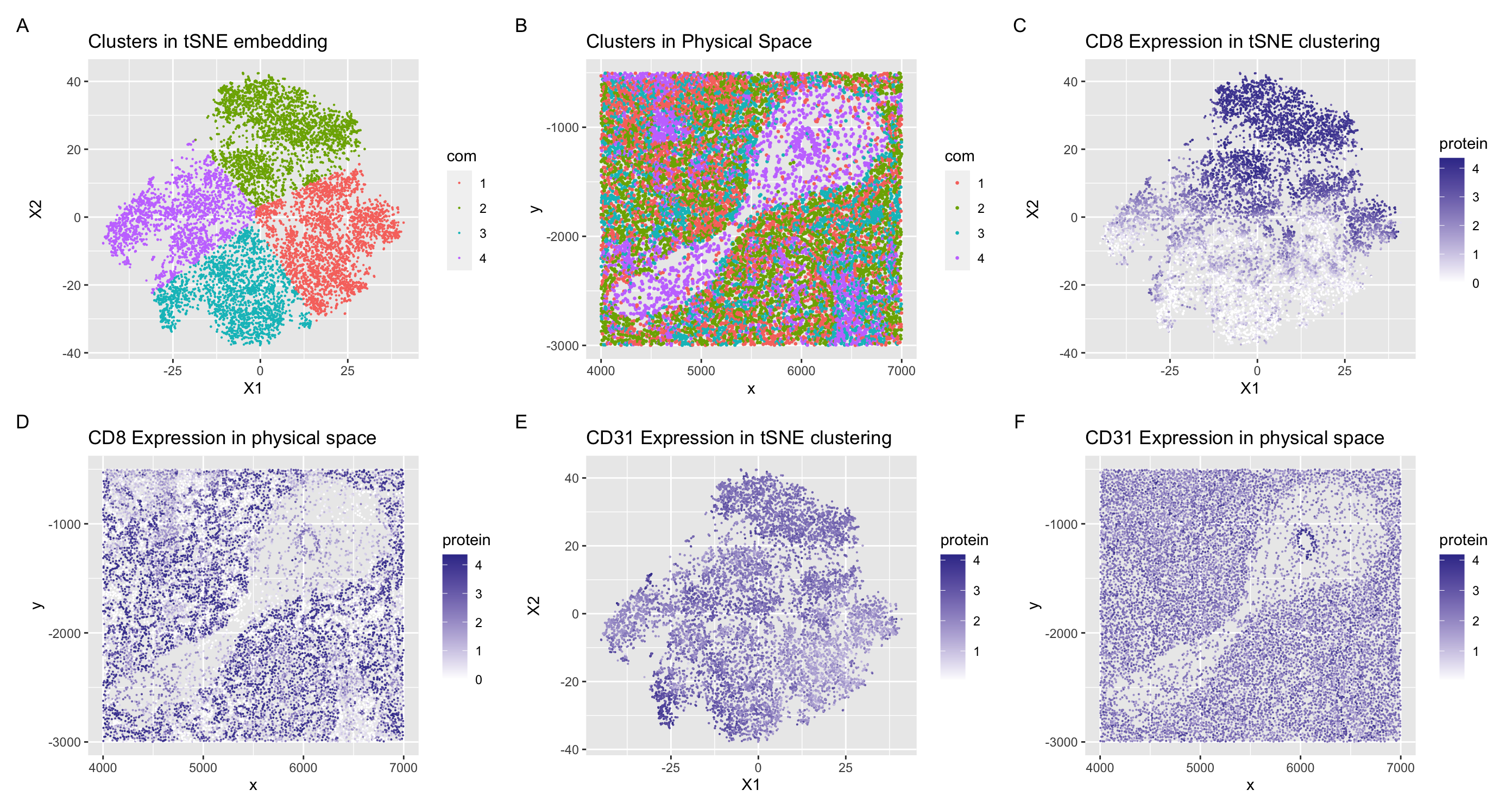
The tissue structure that I believe is represented in the CODEX data is a section of spleen tissue which include arteries and white pulp. I can come to this conclusion through the cell types that I identified in my data visualizations. I visualized clusters 2 and 3 of my tSNE embedding in panel (A). In cluster 2, CD8 was upregulated throughout the cluster (C) and had higher expression in the physical space around the spoon looking formation. I know that CD8 is a marker for CD8+ T cells (1) which are found mainly in the white pulp section of the spleen (2, 3). The white pulp portion of the spleen is where the majority of T cells and B cells are located (3), and looking at the expression of CD8+ T cells in panel (C), I can conclude that this section of spleen tissue contains portions of white pulp. In the other cluster I analyzed, I found an upregulation of CD31 in cluster 3, seen in panel (E). CD31 is also known as PECAM-1 (platelet/endothelial cell adhesion molecule-1)(4) and highly expressed in both leukocytes and endothelial cells which line the inner surface of blood vessels (5)(ie. arteries/veins). In physical space, we can also see that the CD31 is highly expressed in a little ring in the center of the ‘spoon’ structure. I hypothesize that this could represent a blood vessel/artery with a high population of endothelial cells. For these reasons, I can hypothesize that the section of spleen tissue represented in the data set contains portions of white pulp and arteries/veins based on interpreting my clusters in my data visualization as well as analyzing representations of the physical space.
Citations
1) https://www.biocompare.com/Editorial-Articles/569888-A-Guide-to-T-Cell-Markers/ 2) https://www.nature.com/articles/nri1669 3) https://www.sciencedirect.com/science/article/pii/S1074761308003658?via%3Dihub 4) https://www.ncbi.nlm.nih.gov/pmc/articles/PMC4986701/ 5) https://www.sciencedirect.com/science/article/pii/B9780123742797070156
data <- read.csv('/Users/conniechen/Documents/Genomic Data Visualization 2024/GDV HW/codex_spleen_subset.csv.gz', row.names = 1)

library(Rtsne)
library(ggplot2)
library(patchwork)

head(data)
dim(data)

### Reorganized the data a little bit
pos <- data[, 1:2]
area <- data[, 3]
gexp <- data[, 4:31]

### plot the x y coordinates and visualize area
df <- data.frame(pos, area)
ggplot(df) + geom_point(aes(x = x, y = y, col= area), size = 0.1)

### Limit the number of genes
# subset for faster processing
gexp <- gexp[, colSums(gexp) > 1000] ## highly expressed genes
# probably also normalize...
gexpnorm <- log10(gexp/rowSums(gexp) * mean(rowSums(gexp))+1)

### PCA
pcs <- prcomp(gexpnorm)
dim(pcs$x)
plot(pcs$sdev[1:100])

### tsne
emb <- Rtsne(pcs$x[,1:5])$Y


### Kmeans clustering and tsne plotting
totw <- sapply(1:5, function(i) {
  com <- kmeans(pcs$x[,1:5], centers=i)
  return(com$tot.withinss)
})
plot(totw)
com <- as.factor(kmeans(pcs$x[,1:5], centers=4)$cluster)
head(com)

p1 <- ggplot(data.frame(emb, com)) + geom_point(aes(x = X1, y = X2, col=com), size = 0.05) + ggtitle("Clusters in tSNE embedding")
p1

p2 <- ggplot(data.frame(pos, com)) + geom_point(aes(x = x, y = y, col=com), size = 0.05) + ggtitle("Clusters in physical space")
p2

### Focusing on clusters 1 and 3
pv <- sapply(colnames(gexpnorm), function(i) {
  #print(i) ## print out gene name
  wilcox.test(gexpnorm[com == 1, i], gexpnorm[com != 1, i])$p.val
})
logfc <- sapply(colnames(gexpnorm), function(i) {
  #print(i) ## print out gene name
  log2(mean(gexpnorm[com == 1, i])/mean(gexpnorm[com != 1, i]))
})

df <- data.frame(pv=-log10(pv), logfc)
p3 <- ggplot(df) + geom_point(aes(x = logfc, y = pv)) + ggtitle('Cluster 1 Differentially Expressed Genes')

pv <- sapply(colnames(gexpnorm), function(i) {
  #print(i) ## print out gene name
  wilcox.test(gexpnorm[com == 3, i], gexpnorm[com != 3, i])$p.val
})
logfc <- sapply(colnames(gexpnorm), function(i) {
  #print(i) ## print out gene name
  log2(mean(gexpnorm[com == 3, i])/mean(gexpnorm[com != 3, i]))
})

df <- data.frame(pv=-log10(pv), logfc)
p4 <- ggplot(df) + geom_point(aes(x = logfc, y = pv)) + ggtitle('Cluster 3 Differentially Expressed Genes')

### differentially expressed genes
diffgexp <- sapply(colnames(gexpnorm), function(g) {
  #g = 'Kctd13'
  wilcox.test(gexpnorm[com == 1, g], gexpnorm[com != 1, g],
              alternative='greater')$p.val
})
head(sort(diffgexp, decreasing=FALSE))

### tSNE for differentially expressed in cluster 1
geneclusters <- as.factor(kmeans(t(gexpnorm), centers=4)$cluster)
head(geneclusters[geneclusters == 1])


p5 <- ggplot(data.frame(emb, gene=gexpnorm[,'CD8'])) +
  geom_point(aes(x = X1, y = X2, col=gene), size = 0.05) + ggtitle("CD8 Expression in tSNE clustering") +
  scale_color_gradient2(high = scales::muted("blue"), mid = 'white', low = scales::muted("red"))
p6 <- ggplot(data.frame(pos, gene=gexpnorm[,'CD8'])) +
  geom_point(aes(x = x, y = y, col=gene), size = 0.05) + ggtitle("CD8 Expression in physical space") +
  scale_color_gradient2(high = scales::muted("blue"), mid = 'white', low = scales::muted("red"))


### tSNE for differentially expressed in cluster 3
geneclusters <- as.factor(kmeans(t(gexpnorm), centers=4)$cluster)
head(geneclusters[geneclusters == 3])

p7 <- ggplot(data.frame(emb, gene = gexpnorm[, 'Podoplanin'])) +
  geom_point(aes(x = X1, y = X2, col = gene), size = 0.05) + ggtitle("Podoplanin Expression in tSNE clustering") +
  scale_color_gradient2(high = scales::muted("blue"), mid = 'white', low = scales::muted("red"))
p8 <- ggplot(data.frame(pos, gene = gexpnorm[, 'Podoplanin'])) +
  geom_point(aes(x = x, y = y, col = gene), size = 0.05) + ggtitle("Podoplanin Expression in physical space") +
  scale_color_gradient2(high = scales::muted("blue"), mid = 'white', low = scales::muted("red"))


p1 + p2 + p5 + p6 + p7 + p8 + plot_layout(ncol = 3, nrow = 2) + plot_annotation(tag_levels = "A")