Making an Animated Visualization using gganimate on HW3

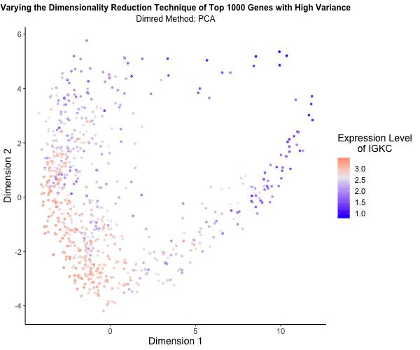
What’s the difference if I perform linear or nonlinear dimensionality reduction to visualize my cells in 2D?
I decided to explore the impact of linear versus nonlinear dimensionality reduction techniques for visualizing my data in two dimensions. Using the Eevee (10x Visium) dataset and scripts from my third homework assignment, I applied Principal Component Analysis (PCA), t-Distributed Stochastic Neighbor Embedding (t-SNE), and Uniform Manifold Approximation and Projection (UMAP) to the top 1,000 genes exhibiting the highest variance. PCA serves as a linear method for dimensionality reduction, whereas t-SNE and UMAP offer nonlinear approaches. To vividly illustrate the differences among these methods, I utilized gganimate to generate an animated visualization. This animation portrays the expression levels of the gene IGKC, one of the top 1,000 genes with the highest variance, using a color gradient that transitions from blue to white to red representing low to high expression. Pretty cool to see the differences in the visualizations!
### HW EC1 ###
## Caleb Hallinan ##
## Eevee sequencing data ##


# import libraries
library(here)
library(ggplot2)
library(Rtsne)
library(patchwork)
library(umap)


# set seed
set.seed(02052024)

# read in data
data = read.csv(here("data/eevee.csv.gz"), row.names = 1)
# dim(data)

# get info from data
pos <- data[,2:3]
gexp <- data[,4:ncol(data)]
# colnames(gexp)

# check variance
topgenes <- names(sort(apply(gexp, 2, var), decreasing=TRUE)[1:1000])
topgenes

# filter
gexpfilter <- gexp[,topgenes]
# dim(gexpfilter)

# normalize log2
gexpnorm <- log10(gexpfilter/rowSums(gexpfilter) * mean(rowSums(gexpfilter))+1)

# gene to plot
gene <- topgenes[1]


# perform pca
pcs <- prcomp(gexpnorm)

# df
df_pca <- data.frame(x = pcs$x[,1],
                      y = pcs$x[,2],
                      gene = gexpnorm[[gene]])

# plot pcs
p_pca <- ggplot(df_pca) +
    geom_point(aes(x = PC1, y = PC2, color = gexpnorm[[gene]])) +
    theme_classic() +
    labs(
        title = "PCA on Top 1000 Genes with High Variance",
        color = gene
    ) +
    scale_color_gradient2(midpoint = median(gexpnorm[[gene]]), low = "blue", mid = "#ECECEC", high = "red", space = "Lab" ) +
    theme(legend.title.align=0.5,plot.title = element_text(hjust = 0.5, face="bold", size=14), text = element_text(size = 13))


# run tsne
emb <- Rtsne(gexpnorm) # can change dims from
# names(emb)

# df
df_tsne <- data.frame(x = emb$Y[,1],
                     y = emb$Y[,2],
                     gene = gexpnorm[[gene]])

# plot tsne
p_tsne <- ggplot(df_tsne) +
    geom_point(aes(x = tsne1, y = tsne2, color = gexpnorm[[gene]])) +
    theme_classic() +
    labs(
        title = "tSNE on Top 1000 Genes with High Variance",
        color = gene,
        x = "tSNE1",
        y = "tSNE2"
    ) +
    scale_color_gradient2(midpoint = median(gexpnorm[[gene]]), low = "blue", mid = "#ECECEC", high = "red", space = "Lab" ) +
    theme(legend.title.align=0.5,plot.title = element_text(hjust = 0.5, face="bold", size=14), text = element_text(size = 13))

# use patchwork to plot 2 plots
p_pca + p_tsne + plot_annotation(tag_levels = 'a') + plot_layout(ncol = 1)


### UMAP ###

# run umap
umap_df <- umap(gexpnorm)

# df
df_umap <- data.frame(x = umap_df$layout[,1],
                      y = umap_df$layout[,2],
                     gene = gexpnorm[[gene]])

p_umap <- ggplot(df_umap) +
    geom_point(aes(x = umap1, y = umap2, color = gexpnorm[[gene]])) +
    theme_classic() +
    labs(
        title = "UMAP on Top 1000 Genes with High Variance",
        color = gene,
        x = "UMAP1",
        y = "UMAP2"
    ) +
    scale_color_gradient2(midpoint = median(gexpnorm[[gene]]), low = "blue", mid = "#ECECEC", high = "red", space = "Lab" ) +
    theme(legend.title.align=0.5,plot.title = element_text(hjust = 0.5, face="bold", size=14), text = element_text(size = 13))


# combine data
df <- rbind(cbind(df_pca, order="PCA", size=1),
            cbind(df_tsne, order="tSNE", size=1),
            cbind(df_umap, order="UMAP", size=1))
head(df)

# gganimate
library(gganimate)
# set seed
set.seed(02052024)

animated_plot <- ggplot(df) +
    geom_point(aes(x = x, y = y, col = gene), size = 1) +
    transition_states(order) +
    view_follow() +
    scale_color_gradient2(midpoint = median(gexpnorm[[gene]]), low = "blue", mid = "#ECECEC", high = "red", space = "Lab" ) +
    theme_classic() +
    labs(subtitle = 'Dimred Method: {closest_state}', title = "Varying the Dimensionality Reduction Technique of Top 1000 Genes with High Variance",
         color = paste0("Expression Level\nof ", gene),
         x = "Dimension 1",
         y = "Dimension 2") +
    theme(legend.title.align=0.5,plot.title = element_text(hjust = 0.5, face="bold", size=12),
          text = element_text(size = 14), plot.subtitle = element_text(hjust = 0.5, size = 12))

# animate
animate(animated_plot, height = 500, width = 600, nframes = 200)

# save
anim_save(here("hwEC1_challin1.gif"), animate(animated_plot, height = 500, width = 600, nframes = 200))