Normalizing and Transforming Gene Expression

Description of my visualization:
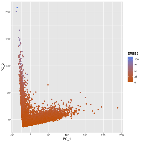
To explore the question of what happens if you do or do not normalize and transform gene expression data prior to dimensionallity reduction, I created a gif that shows the dimensionality reduction with and without normalization and transformation. I created a plot of principal component analysis done on the original gene expression data, one on normalized gene expression data (gexp / rowSums(gexp) * mean(rowSums(gexp)) + 1), and one on the log transform of the normalized data, and then combined them in an animation to see where each point goes as a result. From the animation, we can see that un-normalized data has biases that can lead to skewed results. This would make it difficult to compare samples and the expression of various genes accurately. The transformation also help with accurate analysis as it ensures that highly expressed genes do not dominate the analysis, allowing us to capture the underlying structure with PCA more easily.
The entire code used to generate the figure so that it can be reproduced.
library(ggplot2)
library(Rtsne)
library(gganimate)

data <- read.csv('/Users/shailitripathi/Downloads/GENOMIC/Homework/pikachu.csv.gz', row.names=1)

data[1:5, 1:5]
pos <- data[,4:5]
geneofinterest <- data$ERBB2

# Data
gexp <- data[6:ncol(data)]
gexpnorm <- gexp / rowSums(gexp) * mean(rowSums(gexp)) + 1
gexpnorm_log <- log10(gexpnorm)

# Plots
pc1 <- prcomp(gexp)
df1 <- data.frame(pc1$x[,1:2], gene = geneofinterest)
colnames(df1) <- c('PC_1', 'PC_2', 'ERBB2')
ggplot(df1) +
  geom_point(aes(PC_1, y=PC_2, col=ERBB2)) +
  labs(title = "PCs of Original Data") +
  scale_color_gradient(low = "darkorange3", high = "cornflowerblue")

pc2 <- prcomp(gexpnorm)
df2 <- data.frame(pc2$x[,1:2], gene = geneofinterest)
colnames(df2) <- c('PC_1', 'PC_2', 'ERBB2')
ggplot(df2) +
  geom_point(aes(PC_1, y=PC_2, col=ERBB2)) +
  labs(title = "PCs of Normalized Data") +
  scale_color_gradient(low = "darkorange3", high = "cornflowerblue")

pc3 <- prcomp(gexpnorm_log)
df3 <- data.frame(pc3$x[,1:2], gene = geneofinterest)
colnames(df3) <- c('PC_1', 'PC_2', 'ERBB2')
ggplot(df3) +
  geom_point(aes(PC_1, y=PC_2, col=ERBB2)) +
  labs(title = "PCs of Log-transformed Normalized Data") +
  scale_color_gradient(low = "darkorange3", high = "cornflowerblue")

# Combine Plots Statically
df <- rbind(cbind(df1, order=1),
            cbind(df2, order=2),
            cbind(df3, order=3))
p <- ggplot(df) +
  geom_point(aes(x=PC_1, y=PC_2, col=ERBB2)) +
  scale_color_gradient(low = "darkorange3", high = "cornflowerblue")

# Combine Plots as Animation
animated_plot <- p + transition_states(order) + view_follow()
anim_save("shailitripathi.gif", animate(animated_plot))