Dimensionality Reduction using GGanimate

Description of figure
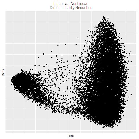
In the gif, I visualized the pca (linear) dimensionality reduction in 2D space which transitions into the tSNE (nonlinear) dimensionality reduciton in 2D space. The axes for the pcs are PC1 and PC2 since those principle components capture the most variance in the data. The two kinds of dimensionality reduction seem to show that they can tell you drastically different things about a dataset. The tSNE seems to suggest there are several clusters/cell types or bundles of genes that are related whereas the PCA tells you that there are distinctly 2 groups in the data. Whether or not there are further groupings in those 2 groups isn’t told by the PCA. The benefit of pca is that you can be confident that your results are correct in the sense that the dimension reduction is linear which means it preserves spatial relationships. On the other hand, the tSNE does not necessarily preserve spatial relationships and aims more to minimize the KL divergence between distributions which could lead to incorrectly interpretted results.
Code:
gganimate EC
clear everything
rm(list = ls())
load data
data <- read.csv(paste(‘C:/Users/Amand/OneDrive/Documents/JHU-undergrad’, ‘/Junior Year/Sem2/Genomic Data/Amanda-K/data/pikachu.csv.gz’, sep = ‘’), row.names = 1)
load relevant Libraries
library(ggplot2) library(gganimate) library(Rtsne) library(patchwork)
normalize the data
pos <- data[,4:5] gexp <- data[,6:ncol(data)]
gexp[1:5,1:5] gexpnorm <- log10(gexp/rowSums(gexp) * mean(rowSums(gexp))+1) hist(rowSums(gexpnorm))
linear dimensionality reduction (pca)
pcs <- prcomp(gexpnorm) df <- data.frame(pcs$x) p1 <- ggplot(df) + geom_point(aes(x=PC1, y=PC2))
p1
nonlinear dimensionality reduction (emb)
set.seed(123) emb <- Rtsne(gexpnorm)$Y df2 <- data.frame(emb) p2 <- ggplot(df2) + geom_point(aes(x=X1, y=X2))
p2
use gganimate
pc12 <- df[,1:2] colnames(pc12) <- c(‘Dim1’, ‘Dim2’) tsne <- df2 colnames(tsne) <- c(‘Dim1’, ‘Dim2’)
df3 <- rbind(cbind(pc12, order=”PCA”), cbind(tsne, order=”tSNE”)) df3$order <- factor(df3$order)
Create animated plot
animated_plot <- ggplot(df3) + geom_point(aes(Dim1,Dim2)) + labs(title = “Linear vs. NonLinear \n Dimensionality Reduction”) + transition_states( order, transition_length = 2, state_length = 1 ) + view_follow() + theme(plot.title = element_text(hjust=0.5)) # center the title
animated_plot anim_save(“EC1.gif”, animated_plot, path = ‘C:/Users/Amand/OneDrive/Documents/JHU-undergrad/Junior Year/Sem2/Genomic Data/EC’)