Analyzing Connectivity of Spleen CODEX dataset using CRAWDAD on K-means Clusters

What data types are you visualizing?
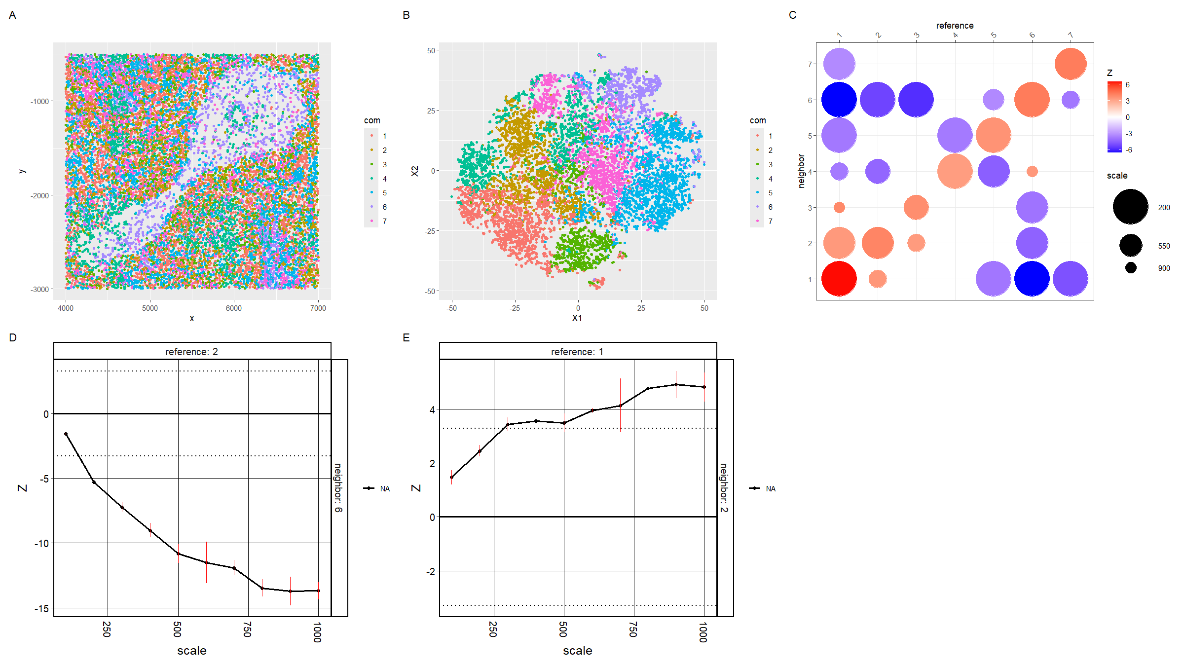
For plot A, I am visualizing the spatial data of the x and y positions for each cell, and categorical data of the cluster the cell belongs to. I am using the geometric primitive of points to represent each cell. To encode the spatial x position, I am using the visual channel of position along the x axis. To encode the spatial y position, I am using the visual channel of position along the y axis. To encode the categorical cluster the cell belongs to, I am using the visual channel of hue.
For plot B, I am visualizing the quantitative data of the X1 and X2 tSNE embedding values, and categorical data of the cluster the cell belongs to. I am using the geometric primitive of points to represent each cell. To encode the X1 embedding value, I am using the visual channel of position along the x axis. To encode the X2 value, I am using the visual channel of position along the y axis. To encode the categorical cluster the cell belongs to, I am using the visual channel of hue.
For plot C, I am visualizing the categorical data of the neighbor cluster using the y axis position. I am visualizing the categorical data of the reference cluster using the x axis position. I am visualizing the quantitative data of the z-score using the visual channel of color hue. I am visualizing the quantitative data of the scale using the visual channel of area.
For plots D and E, I am visualizing the quantitative data of the z-score using the visual channel of y axis position. I am visualizing the quantitative data of the scale using the visual channel of x axis position.
The Gestalt principle of similarity and proximity because D and E are both line plots and are adjacent, and plots A and B which have the same color scheme are adjacent.
Please share the code you used to reproduce this data visualization.
data <-
    read.csv("genomic-data-visualization-2024/data/codex_spleen_subset.csv.gz",
             row.names = 1)

data[1:10, 1:10]
pos <- data[, 1:2]
area <- data[, 3]
pexp <- data[4:ncol(data)]

pexpnorm <- log10(pexp/area * mean(area)+1)

library(ggplot2)
ggplot(data.frame(pos, area)) + geom_point(aes(x=x, y=y, col=area))+
    scale_color_gradient(high = "darkred", low = "gray")

library(Rtsne)
set.seed(42)
emb <- Rtsne(pexpnorm, perplexity=15)$Y

set.seed(42)
tw <- sapply(1:15, function(i) {
    print(i)
    kmeans(pexpnorm, centers=i, iter.max = 50)$tot.withinss
})
plot(tw, type='o')

set.seed(42)
com <- as.factor(kmeans(pexpnorm, centers=7)$cluster)

p1 <- ggplot(data.frame(pos, pexpnorm, com)) +
    geom_point(aes(x = x, y = y, col = com), size = 1)

p2 <- ggplot(data.frame(emb, pexpnorm, com)) +
    geom_point(aes(x = X1, y = X2, col = com), size = 1)

## https://github.com/JEFworks-Lab/CRAWDAD/blob/main/docs/3_spleen.md
library(crawdad)
crawdad_df <- data.frame(x = pos[,1], y = pos[,2], com)

ncores <- 8
set.seed(42)
## convert to sp::SpatialPointsDataFrame
seq <- crawdad:::toSF(pos = crawdad_df[,c("x", "y")],
                        celltypes = crawdad_df$com)
set.seed(42)
## generate background
shuffle.list <- crawdad::makeShuffledCells(seq,
                                           scales = seq(100, 1000, by=100),
                                           perms = 3,
                                           ncores = ncores,
                                           seed = 1,
                                           verbose = TRUE)
set.seed(42)
## find trends, passing background as parameter
results <- crawdad::findTrends(seq,
                               dist = 50,
                               shuffle.list = shuffle.list,
                               ncores = ncores,
                               verbose = TRUE,
                               returnMeans = FALSE) # for error bars

set.seed(42)
## convert results to data.frame
dat <- crawdad::meltResultsList(results, withPerms = T)

## multiple-test correction
ntests <- length(unique(dat$reference)) * length(unique(dat$reference))
psig <- 0.05/ntests # bonferroni correction
zsig <- round(qnorm(psig/2, lower.tail = F), 2)

p3 <- vizColocDotplot(dat, reorder = FALSE, zsig.thresh = zsig, zscore.limit = zsig*2, dot.sizes = c(6, 20)) +
    theme(legend.position='right',
          axis.text.x = element_text(angle = 45, h = 0))
p3

library(tidyverse)
dat_filter <- dat %>%
    filter(reference == '2') %>%
    filter(neighbor == '6')
p4 <- vizTrends(dat_filter, lines = T, withPerms = T, sig.thresh = zsig)


dat_filter <- dat %>%
    filter(reference == '1') %>%
    filter(neighbor == '2')
p5 <- vizTrends(dat_filter, lines = T, withPerms = T, sig.thresh = zsig)

library(patchwork)
p1 + p2 + p3 + p4 + p5 + plot_annotation(tag_levels = 'A') + plot_layout(nrow = 2, ncol = 3)