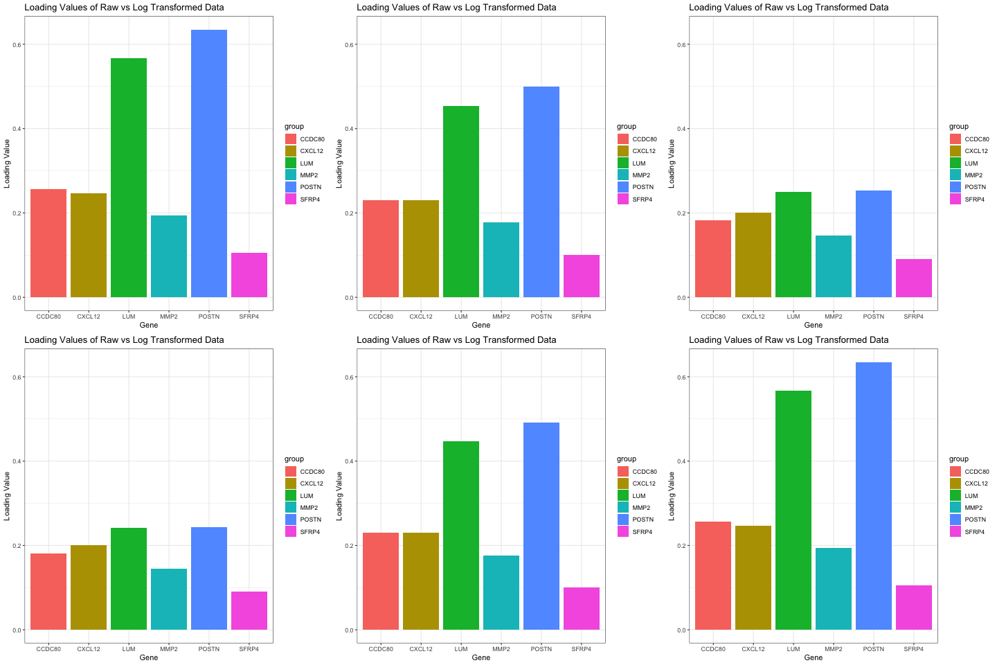
Comparison of Loading Values on PC1 in Raw and Log Transformed Data

Write a a brief description of your figure so we know what you are visualizing. You do not need to use the vocabulary terms from Lesson 1.
I chose to compare the loading values on the first PC in raw and log transformed data. My visual is a bar graph showing the loading values of 6 genes when the data is raw and when the data has been log transformed. To do this, I ran PCA on both the raw and normalized data. I then found the genes with the six highest loading values on PC1 for the raw data. I found the loading values for these same six genes on PC1 for the normalized data as well, and that is what this graph is oscillating between.
library(patchwork)
library(ggplot2)
library(gganimate)
library(dplyr)

## set up set of genes expressed
data <- read.csv('pikachu.csv.gz', row.names = 1)
pos <- data[,4:5]
gexp <- data[, 6:ncol(data)]


gexpnorm2 <- log10(gexp/rowSums(gexp) * mean(rowSums(gexp))+1)

## Principle component analysis
pcs <- prcomp(gexp)
pc2 <- prcomp(gexpnorm2)


h1 <- as.data.frame(head(sort(pcs$rotation[,1], decreasing=TRUE)))
colnames(h1) <- c('loading_val')
d2 <- as.data.frame(sort(pc2$rotation[,1], decreasing=TRUE))

a <- data.frame(group = rownames(h1), values = h1$loading_val, frame=rep('a',6))
## for h3
col <- d2 %>%
  filter(row.names(d2) %in% rownames(h1))
b <- data.frame(group = rownames(col), values = col[,1], frame=rep('b',6))
data <- rbind(a,b)


ggplot(data, aes(x=group, y=values, fill=group)) +
  geom_bar(stat='identity') +
  theme_bw() +
  # gganimate specific bits:
  transition_states(
    frame,
    transition_length = 2,
    state_length = 1
  ) +
  ease_aes('sine-in-out') +
  xlab('Gene') + ylab('Loading Value') +
  labs(title = 'Loading Values of Raw vs Log Transformed Data')

anim_save("eholter1.gif")

## Sources:
## https://r-graph-gallery.com/288-animated-barplot-transition.html
## https://scales.arabpsychology.com/stats/how-to-select-rows-of-dataframe-by-name-using-dplyr/#:~:text=Using%20the%20dplyr%20package%20in,form%20of%20a%20logical%20expression.
