CD15 and CD8 Expression in White Pulp

Perform a full analysis (quality control, dimensionality reduction, kmeans clustering, differential expression analysis) on your data. Your goal is to figure out what tissue structure is represented in the CODEX data. Options include: (1) Artery/Vein, (2) White pulp, (3) Red pulp, (4) Capsule/Trabecula. You will need to visualize and interpret at least two cell-types. Create a data visualization and write a description to convince me that your interpretation is correct.
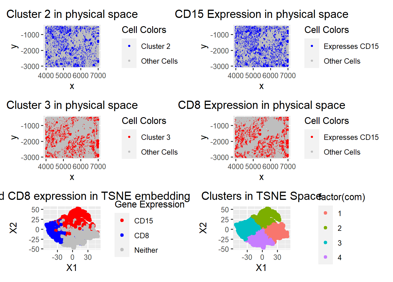
I started the data analysis by plotting the total withiness and determining that 3-4 clusters is the ideal number of clusters. I ultimately decided on 4 clusters after plotting the gene expressions of the genes with most variations since 4 clusters better describe the gene expression spatial boundaries in reduced dimensions.
After deciding on 4 clusters, I found that the most prominent differentially expressed genes in each cluster is as follows: 1. CD107a, 2. CD15, 3. CD8, 4. Vimentin. I also found that the most expressed genes in the dataset are the same 4 genes.
Most expressed in order: Genes with most variance:
- CD15 1. CD15
- Vimentin 2. CD8
- CD107a 3. Vimentin
- CD8 4. CD107a
The above further support the clustering of my cells in lower dimensional space. Given these 4 clusters, I plotted the most prominent differentially expressed cells to see how well they align with their assigned cluster. Clusters 1 and 2 visibly aligned the most as seen the figures for CD15 and CD8, their clusters visualized in physical space align well with their gene expression visualzied in physical space. From researching the genes, I found that CD8 is highly associated with CD8+ T-cells and that CD15 are highly associated with macrophages. These classfiications of cell types/populations makes sense in the context that the data is taken from the spleen for several reasons. First, the spleen is known for it’s function in immune response which is regulated by the white pulp, and immune responses to infection, etc, involve the activation or proliferation of T cells located in the white pulp of the spleen. Second, macrophages which are invovled in clearance of red blood cells are also present in the spleen. Often found in the red pulp but also found in the white pulp.
Now that we know CD8 is likely a cell population of T cells and CD15 represents a cell population of macrophages, looking further into the other 2 clusters researched, we can conclude that this dataset is most likely representing the White pulp of the spleen. This is supported by the high expression of Vimentin which is commonly associated with fibroblasts in the white pulp and macrophages in the red pulp. Additionally, CD107a is associated with natural killer (NK) cells which are incredibly abundant in the white pulp. Although 2 of these genes are associated with cells in the red pulp, CD8 and Vimentin are more strongly observed in the white pulp and thus I believe that the tissue structure being represented is the white pulp.
References:
- CD15 cell type: https://pubmed.ncbi.nlm.nih.gov/2052920/
-
CD8 cell type: https://www.ncbi.nlm.nih.gov/pmc/articles/PMC4669000/#:~:text=Experiments%20with%20influenza%20virus%20antigens,monocytogenes%20and%20lymphocytic%20choriomeningitis%20virus.
- CD107a cell type: https://pubmed.ncbi.nlm.nih.gov/15604012/
- vimentin cell type/spleen location: https://www.proteinatlas.org/ENSG00000026025-VIM/tissue/spleen
Code:
Homework 6
load relevant libraries
library(ggplot2) library(Rtsne) library(patchwork) library(ggrepel) library(dplyr)
load the data
data <- read.csv(paste(‘C:/Users/Amand/OneDrive/Documents/JHU-undergrad’, ‘/Junior Year/Sem2/Genomic Data/Amanda-K/data/codex_spleen_subset.csv.gz’, sep = ‘’), row.names = 1)
data[1:5,1:5] pos <- data[,1:2] head(pos)
gexp <- data[,4:ncol(data)] # 28 genes
select the top 10 genes for inspection
topgene <- names(sort(apply(gexp, 2, var), decreasing=TRUE))[1:10]
Normalize the data
df <- data.frame(pos = data[,topgene]$pos) ggplot(df) + geom_point(aes(x=pos$x,y=pos$y), size = 1) hist(data$area) hist(rowSums(gexp))
gexpnorm <- log10(gexp/rowSums(gexp) * mean(rowSums(gexp)) + 1)
gexpnorm <- log10(gexp/rowSums(gexp) + 1)
gexpnorm <- log10(gexp[,topgene]/rowSums(gexp[,topgene]) * mean(rowSums(gexp[,topgene]))+1)
gexpnorm <- gexp/rowSums(gexp)
gexpnorm <- log10(gexp - apply(gexp, 2, median)/ apply(gexp,2,median) + 1)
hist(rowSums(gexpnorm))
dimensionality reduction
pca ————————————————————————–
pcs <- prcomp(gexpnorm) plot(pcs$sdev)
feed all the pcs into Rtsne
set.seed(123) emb <- Rtsne(pcs$x)$Y ggplot(data.frame(emb)) + geom_point(aes(x=X1, y = X2))
find optimal k
totw <- sapply(1:10, function(i) { # best looks like it’s 3 com <- kmeans(emb, centers = i) return(com$tot.withinss) })
data analysis
plot(totw, type = “l”) com <- kmeans(emb, centers = 4)$cluster ggplot(data.frame(emb, cluster = factor(com), gene = gexpnorm$CD15)) + geom_point(aes(x = X1, y = X2, col = cluster))
results2 <- sapply(1:4, function(i) { results <- sapply(colnames(gexpnorm), function(g) { wilcox.test(gexpnorm[com == i, g], gexpnorm[com != i, g], alternative = “greater”)$p.val }) return(names(head(sort(results, decreasing = FALSE)))) })
results2
ggplot(data.frame(emb, as.factor(com), gene = gexpnorm$CD15)) + geom_point(aes(x = X1, y = X2, col = gene)) ggplot(data.frame(emb, as.factor(com), gene = gexpnorm$CD8)) + geom_point(aes(x = X1, y = X2, col = gene)) ggplot(data.frame(emb, as.factor(com), gene = gexpnorm$CD107a)) + geom_point(aes(x = X1, y = X2, col = gene)) ggplot(data.frame(emb, as.factor(com), gene = gexpnorm$Vimentin)) + geom_point(aes(x = X1, y = X2, col = gene))
looks like there’s 3 clusters of cell populations…
gene = gexpnorm$CD15 df <- data.frame(gexpnorm, pos, gene = gexpnorm$SMActin) ggplot(df) + geom_point(aes(x = x, y = y, col = gene))
C1: CD8 : T cell receptor: white pulp has CD8, Red pulp has CD8 in SLC cells
results3 <- sapply(1:4, function(i) { results <- sapply(colnames(gexpnorm), function(g) { t.test(gexpnorm[com == i, g], gexpnorm[com != i, g], alternative = “greater”)$p.val }) return(names(head(sort(results, decreasing = FALSE)))) }) results3
visualize cell clusters in physical space:
colnames(emb) <- c(‘X1’, ‘X2’) tmp <- gexp[,’CD15’] > mean(gexp[, ‘CD15’]) tmp2 <- gexp[,’CD8’] > mean(gexp[,’CD8’]) df <- data.frame(pos, emb, com, gene = gexpnorm$CD15, gexpnorm, tmp, tmp2)
cluster2_colors <- c(“Cluster 2” = “blue”, “Other Cells” = “grey”) cluster3_colors <- c(“Cluster 3” = “red”, “Other Cells” = “grey”) gene2_colors <- c(“Expresses CD15” = “blue”, “Other Cells” = “grey”) gene3_colors <- c(“Expresses CD15” = “red”, “Other Cells” = “grey”)
credit: Andrea Cheng
plot of cluster 2
p1 <- ggplot(df) + geom_point(aes(x=x, y = y, col = ifelse(com == 2, “Cluster 2”, “Other Cells”)), size = 0.8) + labs(col = ‘Cell Colors’) + scale_color_manual(values = cluster2_colors) + ggtitle(‘Cluster 2 in physical space’) + theme(plot.title = element_text(hjust = 0.5))
p2 <- ggplot(df) + geom_point(aes(x=x, y = y, col = ifelse(tmp == TRUE, “Expresses CD15”, “Other Cells”)), size = 0.8) + labs(col = ‘Cell Colors’) + scale_color_manual(values = gene2_colors) + ggtitle(‘CD15 Expression in physical space’) + theme(plot.title = element_text(hjust = 0.5))
p3 <- ggplot(df) + geom_point(aes(x=x, y = y, col = ifelse(com == 3, “Cluster 3”, “Other Cells”)), size = 0.8) + labs(col = ‘Cell Colors’) + scale_color_manual(values = cluster3_colors) + ggtitle(‘Cluster 3 in physical space’) + theme(plot.title = element_text(hjust = 0.5))
p4 <- ggplot(df) + geom_point(aes(x=x, y = y, col = ifelse(tmp2 == TRUE, “Expresses CD15”, “Other Cells”)), size = 0.8) + labs(col = ‘Cell Colors’) + scale_color_manual(values = gene3_colors) + ggtitle(‘CD8 Expression in physical space’) + theme(plot.title = element_text(hjust = 0.5))
check the top 10 most expressed genes
mostGenes <- sort(apply(gexp, 2, sum), decreasing = TRUE)[1:10]
plot the gene expressions and also the clustering choices to show it was a good choice
p6 <- ggplot(df) + geom_point(aes(x = emb[, ‘X1’], y = emb[, ‘X2’], col = factor(com))) + labs(title = “Clusters in TSNE Space”, x = “X1”, y = “X2”) + # This sets the legend title theme(plot.title = element_text(hjust = 0.5))
df2 <- data.frame(emb, com = factor(com)) df3 <- data.frame(emb, gexp)
df3 <- df3 %>% mutate(color = case_when( CD15 > mean(CD15) ~ “red”, # Cells expressing CD15 CD8 > mean(CD8) ~ “blue”, # Cells expressing CD8 # CD107a > mean(CD107a) ~ “green”, # Cells expressing CD107a # Vimentin > mean(Vimentin) ~ “purple”, # Cells expressing Vimentin TRUE ~ “gray” # Cells expressing neither ))
credit: chat gpt: I asked it to label the colors and the axes labels
p5 <- ggplot(df3) + geom_point(aes(x = emb[, ‘X1’], y = emb[, ‘X2’], col = color)) + scale_color_manual(values = c(“red” = “red”, “blue” = “blue”, “gray” = “gray”), name = “Gene Expression”, labels = c(“red” = “CD15”, “blue” = “CD8”, “gray” = “Neither”), breaks = c(“red”, “blue”, “gray”)) + labs(title = “CD15 and CD8 expression in TSNE embedding”, x = “X1”, y = “X2”, color = “Genes”) + # This sets the legend title theme(plot.title = element_text(hjust = 0.5))
final visualization:
p1 + p2 + p3 + p4 + p5 + p6 + plot_layout(ncol = 2)