Characterizing the Codex Dataset

What tissue structure is represented in the Codex Data?
I propose that the Codex data is a vascularized area of red pulp in the spleen.
Description
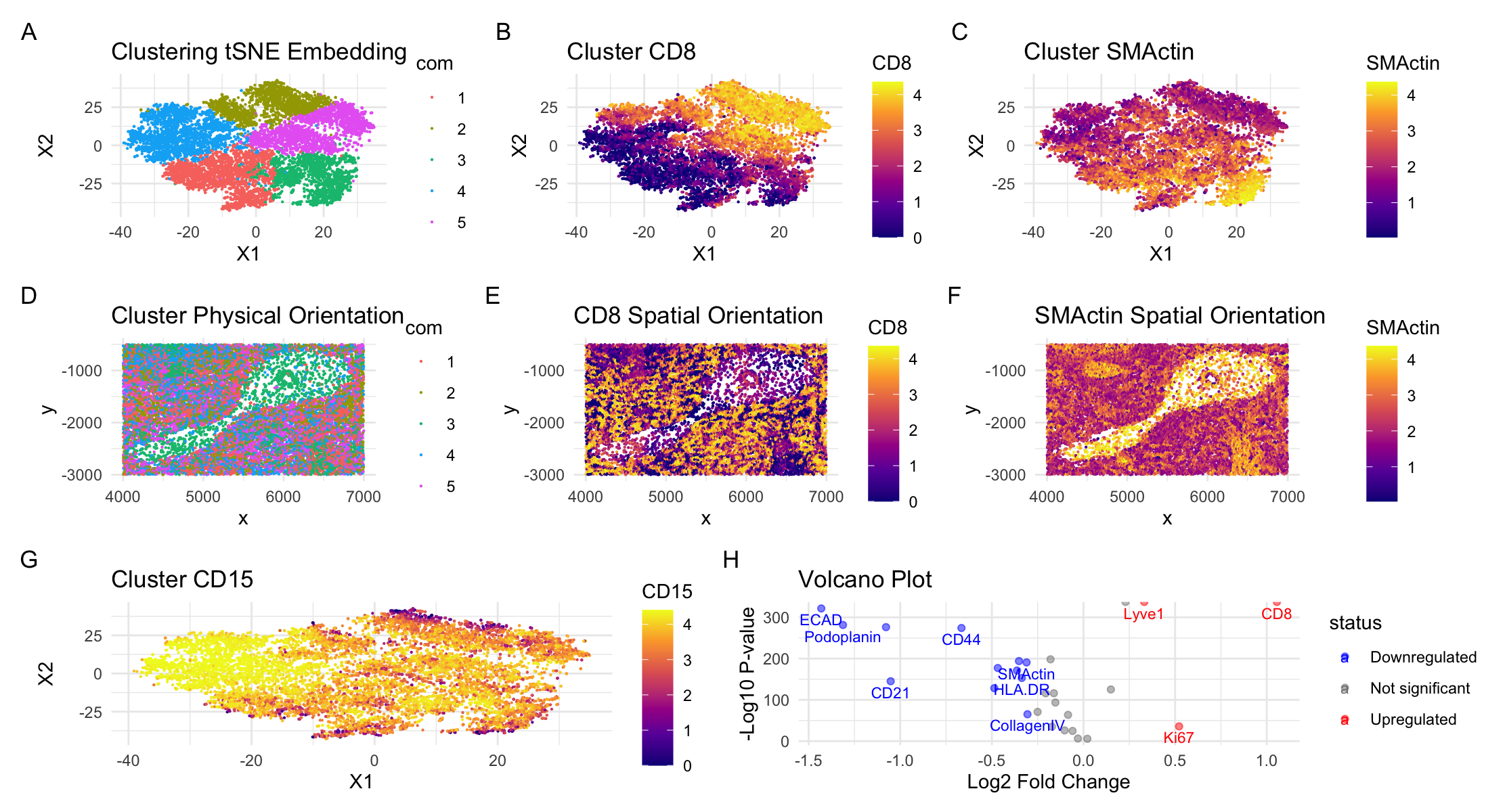
I performed quality control, linear dimensionality reduction (PCA), nonlinear dimensionality reduction (tSNE), and then clustering (kmeans clustering) on the tSNE embeddings. This initial processing generated the clustering seen in panel A with 5 clusters (chosen to optimize total withiness). In panel D I analyzed the spatial configuration of the clusters. In this panel it is apparent that there is one area of the tissue that is significantly less dense than the others and which is primarily in cluster 3. To determine specific cell-types, I determined the most differentially expressed gene in each cluster and researched what cell type and/or tissue they are commonly found in. To begin with, all of the markers and the tissue options in the homework assignment indicate that the dataset is from the spleen. The spleen is a large lymphatic organ surrounded by connective tissue and is divided into two types of tissue. The white pulp is composed of lymphocytes surrounding arteries while the red pulp is made up of macrophages and veins (1). The first cluster had a high expression of CD68 which is primarily a macrophage marker (2). In the spleen specifically, this would mean CD68 is highly expressed in the red pulp (3). The second and fifth clusters showed CD8 as the most highly differentiable gene expressed. This makes sense because the spleen is an important site for the generation of CD8 T cells and priming of cell immunity (4). According to the human protein atlas, CD8 is highly expressed in both the red and white pulp of the spleen (5). However, CD8 T cell specifically line the sinuses (a splenic sub-structure) of the red pulp (6). The third cluster expresses SMActin which is particularly prominent in vascular smooth muscle cells and endothelial cells. This indicates that regions with cells from this cluster are vessels, either an artery or a vein. Given that most of the other markers are red pulp, it is likely a vein. Finally, the fourth cluster expressed the CD15 marker which, while expressed throughout all of the clusters, was primarily expressed in the fourth cluster. CD15 is another macrophage marker, and given knowledge of splenic structure we can say that it is likely most expressed in the red pulp (7).
In order to move beyond cell types and understand what tissue structure we are studying, I focused on the two clusters and markers that were largely opposite each other in the spatial orientation. The most obvious to study to get a more holistic view of the tissue were 2 and 5 expressing primarily red pulp markers (CD15) compared with cluster 3 expressing primarily actin markers (SMActin). Looking first at clusters 2 and 5, I specifically focused on CD8 expression. Panel B visualizes the expression levels of CD8 across the clusters while Panel E visualizes spatial CD8 expression. Similarly, for cluster 3 I focused on SMActin expression. Panel C visualizes expression level of SMActin across the clusters while Panel F visualizes the spatial configuration of SMActin. In each panel, the brighter the color, the higher the expression level. Comparing these four panels, we can see that the expression levels of CD8 and SMActin are almost completely inverse to each other. Given the cell-types of these markers specifically, this indicates that there are two clear tissue structures present: the red pulp of the spleen and the vein vascularizing the region. This is further supported by the fact that the SMActin is primarily expressed in the less-dense region when looking at the spatial orientation, which implies this region is a large vessel. One weakness of just this analysis is that CD8 cells are expressed in both red and white pulp. As a result, I also looked at the expression of CD15, another macrophage marker in the red pulp. As seen in panel G, this marker was expressed most highly in cluster 4, but was expressed throughout the tissue. This validates that the non-vessel tissue is most likely red pulp. Further validation of differential gene expression can be seen in the volcano plot in panel H. Based on this analysis, I concluded that the Codex dataset was a vein surrounded by red pulp.
References
[1]https://training.seer.cancer.gov/anatomy/lymphatic/components/spleen.html#:~:text=The%20spleen%20is%20the%20largest,mainly%20of%20lymphocytes%20around%20arteries.
[2]https://www.sciencedirect.com/topics/neuroscience/cd68#:~:text=CD68%20is%20a%20sialomuc in%20and,5%2C%20109%2C%20110%5D.
[3]https://www.proteinatlas.org/ENSG00000129226-CD68/tissue/spleen
[4]https://www.ncbi.nlm.nih.gov/pmc/articles/PMC4655190/#:~:text=Spleen%20is%20the%20most%20important,like%20Listeria%20monocytogenes%20(Lm).
[5]https://www.proteinatlas.org/ENSG00000153563-CD8A/tissue/spleen
[6]https://www.researchgate.net/figure/CD8-LCs-form-a-major-component-of-human-splenic-red-pulp-Top-left-middle-left-and_fig1_223971938#:~:text=Uniquely%20in%20the%20red%20pulp,CD8a%20red%20in%20Figure%20S7d).
[7]https://pubmed.ncbi.nlm.nih.gov/2052920/
## code credit to the hands-on activity in class
## read in the data
data = read.csv('/Users/Kyra_1/Documents/College/Junior/Spring/Genomic_Data_Visualization/Homework_1/codex_spleen_subset.csv.gz',
                row.names = 1)

head(data)
dim(data)

pos <- data[, 1:2]
area <- data[, 3]
pexp <- data[, 4:31]
head(pexp)

## import necessary libraries
library(ggplot2)
library(patchwork)
library(dplyr)

## plot x,y coordinates and visualize area
df <- data.frame(pos, area)
ggplot(df) + geom_point(aes(x=x, y=y, col=area), size=0.1)

## normalize the protein expression data
hist(log10(colSums(pexp)+1))
hist(log10(rowSums(pexp)+1))
plot(log10(area+1), log10(rowSums(pexp)+1), pch=".")

pexp.norm <- log10(pexp/rowSums(pexp) * mean(rowSums(pexp))+1)

hist(pexp.norm[,'CD4'])
hist(log10(pexp.norm[,'CD4']+1))

## kmeans clustering
tw <- sapply(1:30, function(i) {
  kmeans(pexp.norm, centers=i)$tot.withinss
})
plot(tw, type='l')

## dimensionality reduction
pvar <- apply(pexp.norm, 2, var)
pmean <- apply(pexp.norm, 2, mean)
sort(apply(pexp.norm, 2, var))

pcs <- prcomp(pexp.norm)
head(pcs$x)

plot(pcs$sdev[1:30])
emb <- Rtsne::Rtsne(pexp.norm)$Y
head(emb)


## get clusters
tw <- sapply(1:20, function(i) {
  print(i)
  kmeans(emb, centers=i)$tot.withinss
})
plot(tw, type='l')

# 6 is probably ideal, testing 2
com = as.factor(kmeans(emb, centers=5)$cluster)

# clustering in reduced dimensional space
p1=ggplot(data.frame(emb, com=com)) + geom_point(aes(x = X1, y = X2, col=com), size=0.1)+
  labs(title = "Clustering tSNE Embedding")+ theme_minimal()

# clustering in physical space
p2 = ggplot(data.frame(pos, com = com))+ geom_point(aes(x = x, y = y, col = com), size = 0.1)+
  labs(title = "Cluster Physical Orientation") + theme_minimal()


## most differentially expressed gene in each cluster
results2 <- sapply(1:5, function(i){
  print(i)
  results = sapply(colnames(pexp), function(g){
    wilcox.test(pexp.norm[com == i, g],
                pexp.norm[com != i, g],
                alternative = "greater")$p.val
  })
  topgene = names(head(sort(results, decreasing= F))[1])
  print(topgene)
  return(topgene)
})

# cluster 1 most differentially expressed gene
ggplot(data.frame(emb, com=com)) + geom_point(aes(x = X1, y = X2, col=pexp.norm$CD68), size=0.1)+
  scale_color_viridis_c('CD68', option="C")+
  labs(title = "Cluster CD68")+theme_minimal()

# cluster 2+5 most differentially expressed gene
p3 = ggplot(data.frame(emb, com=com)) + geom_point(aes(x = X1, y = X2, col=pexp.norm$CD8), size=0.1)+
  scale_color_viridis_c('CD8', option="C")+
  labs(title = "Cluster CD8")+theme_minimal()
# spatial representation of this gene
p4 = ggplot(data.frame(pos, com=com)) + geom_point(aes(x = x, y = y, col=pexp.norm$CD8), size=0.1)+
  scale_color_viridis_c('CD8', option="C")+
  labs(title = "CD8 Spatial Orientation")+theme_minimal()

# cluster 3
p5 = ggplot(data.frame(emb, com=com)) + geom_point(aes(x = X1, y = X2, col=pexp.norm$SMActin), size=0.1)+
  scale_color_viridis_c('SMActin', option="C")+
  labs(title = "Cluster SMActin")+theme_minimal()
p6 = ggplot(data.frame(pos, com=com)) + geom_point(aes(x = x, y = y, col=pexp.norm$SMActin), size=0.1)+
  scale_color_viridis_c('SMActin', option = "C")+
  labs(title = "SMActin Spatial Orientation")+theme_minimal()

# cluster 4
p7 = ggplot(data.frame(emb, com=com)) + geom_point(aes(x = X1, y = X2, col=pexp.norm$CD15), size=0.1)+
  scale_color_viridis_c('CD15', option = "C")+
  labs(title = "Cluster CD15")+theme_minimal()

## calculating pvals and fold change
pvals <- sapply(colnames(pexp), function(p) {
  print(p)
  test <- t.test(pexp.norm[com == 2, p], pexp.norm[com != 2, p])
  test$p.value
})
fc <- sapply(colnames(pexp), function(p) {
  print(p)
  mean(pexp.norm[com == 2, p])/mean(pexp.norm[com != 2, p])
})
pvals
fc
df <- data.frame(pv = -log10(pvals), log2fc = log2(fc), label=colnames(pexp))
head(df)
ggplot(df) + geom_point(aes(x = log2fc, y = pv)) +
  geom_text(aes(x = log2fc, y = pv, label=label))

## volcano plot
# Convert p-values and fold changes into a data frame
df <- data.frame(pv = -log10(pvals), log2fc = log2(fc), label = colnames(pexp))

# Add a column to classify genes
df$status <- ifelse(df$log2fc > 0.3 & df$pv > -log10(0.05), "Upregulated",
                    ifelse(df$log2fc < -0.3 & df$pv > -log10(0.05), "Downregulated", "Not significant"))

# Basic volcano plot with color coding
volcano_plot <- ggplot(df, aes(x = log2fc, y = pv, color = status)) +
  geom_point(alpha=0.5) +
  scale_color_manual(values = c("Upregulated" = "red", "Downregulated" = "blue", "Not significant" = "grey50")) +
  theme_minimal() +
  labs(x = "Log2 Fold Change", y = "-Log10 P-value", title = "Volcano Plot")

# Identifying the most differentially expressed genes to label
# You can adjust the thresholds for labeling as per your data
label_genes <- df %>% filter(pv > -log10(0.05) & (log2fc > 0.3 | log2fc < -0.3))

# Adding labels to the plot
p8 = volcano_plot + geom_text(data = label_genes, aes(label = label), vjust = 1.5, hjust = 0.5, size = 3, check_overlap = TRUE)


## put it all together with patchwork
row1 <- p1 + p3 + p5
row2 = p2 + p4 + p6
top_rows = row1/row2

third_row <- p7 | p8

# Combine the rows into one plot with specified heights and widths
final_plot <- top_rows /
  third_row +
  plot_layout(heights = c(1, 1, 1), widths = c(1, 2))+plot_annotation(tag_levels = 'A')

print(final_plot)