Interpreting tissue structure represented in the CODEX dataset

Describe your data visualization
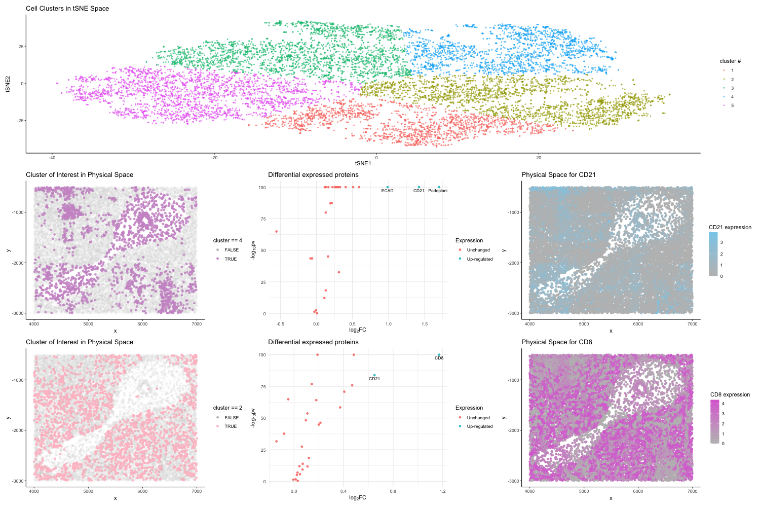
After normalizing the protein expression, I applied PCA and t-SNE for dimensionality reduction. Then I determined the optimal number of clusters using the elbow method. Choosing k=5 for K-Means clustering is based on this analysis. To aid in the spatial understanding of cellular organization, I generated plots on my two interested clusters (cluster#4 and cluster #2) represented in physical space.
Additionally, I performed differential expression analysis to identify significant changes in protein expression between the identified cluster of interest (cluster#4 and cluster #2) and the rest and used volcano plots to visualize which proteins are differentially expressed in the interested clusters.
As a result of the differential expression analysis, I focused on two up-regulated genes CD21 and CD8 in my interested clusters by plotting them in the physical space and encoding their expression levels using color gradient.
Interpret cell clusters as a particular cell tyoe
I hypothesized the tissue structure represented is most likely the White Pulp of the Spleen based on the upregulation of specific markers such as CD8, CD21, ECAD shown from the visualization.
Specifically, CD21 is a marker for B cells, indicating areas where B cells are prevalent, such as in the follicles of the spleen’s white pulp, which is a key site for initiating adaptive immune responses.[1]
CD8 marks cytotoxic T lymphocytes which are crucial for cell-mediated immunity. The presence of CD8+ T cells is characteristic of the periarteriolar lymphoid sheaths (PALS) within the white pulp, where T cells are activated and proliferate.[2]
ECAD (E-cadherin) and Podoplanin are not direct markers of immune cells but their upregulation suggests the involvement of epithelial and possibly lymphatic endothelial cells, supporting the complex microenvironment within the white pulp where immune cells interact with other cell types. [3] [4]
The white pulp of the spleen is a specialized lymphoid tissue that plays a pivotal role in the immune system, organizing B and T lymphocytes for efficient response to pathogens.[2] The upregulation of these markers indicates active immune processes typical of the white pulp, where lymphocytes are organized into distinct areas for optimal function in the adaptive immune response.
Reference:
-
Cariappa A, Tang M, Parng C, et al. The follicular versus marginal zone B lymphocyte cell fate decision is regulated by Aiolos, Btk, and CD21. Immunity. 2001;14(5):603-615. doi:10.1016/s1074-7613(01)00135-2
-
Elmore S. A. (2006). Enhanced histopathology of the spleen. Toxicologic pathology, 34(5), 648–655. https://doi.org/10.1080/01926230600865523
-
Cheng, S. Y., Shi, K., Bai, X. R., Wu, Q. W., & Lv, X. Q. (2018). Double-staining of E-cadherin and podoplanin offer help in the pathological diagnosis of indecisive early-invasive oral squamous cell carcinoma. International journal of clinical and experimental pathology, 11(1), 38–47.
-
Astarita JL, Acton SE, Turley SJ. Podoplanin: emerging functions in development, the immune system, and cancer. Front Immunol. 2012;3:283. Published 2012 Sep 12. doi:10.3389/fimmu.2012.00283
library(ggplot2)
library(Rtsne)
library(patchwork)
library(ggrepel)
library(viridis)
library(tidyverse)

data <- read.csv('codex_spleen_subset.csv.gz', row.names=1)
pos <- data[, 1:2]
area <- data[, 3]
pexp <- data[, 4:ncol(data)]

# normalize pexp
pexpnorm <- log10(pexp/rowSums(pexp) * mean(rowSums(pexp))+1)
head(pexpnorm)

set.seed(2000)
# pca
pcs <- prcomp(pexpnorm)

# Run tSNE on PCs
emb <- Rtsne(pexpnorm)

k.max <- 8
wss <- sapply(1:k.max,
              function(k){kmeans(emb$Y, k, nstart=50,iter.max = 15 )$tot.withinss})
# elbow plot
plot(1:k.max, wss,
     type="b", pch = 19, frame = FALSE,
     xlab="Number of clusters K",
     ylab="Total within-clusters sum of squares")

# kmeans
clusters <- as.factor(kmeans(emb$Y, 5)$cluster)
data <- data.frame(pos, emb$Y, clusters)

p <- ggplot(data) +
  geom_point(aes(x = X1, y = X2, col=clusters), alpha = 0.5, size  = 0.7) +
  labs(title = 'Cell Clusters in tSNE Space',
       x = 'tSNE1', y = 'tSNE2', col = "cluster #") +
  theme_bw() +
  theme_classic()

alpha <- ifelse(data$clusters ==4, 0.85, 0.1)
p1 <- ggplot(data) +
  geom_point(aes(x = X1, y = X2, color = (clusters ==4)), alpha = alpha) +
  theme_bw() +
  labs(title = "Cluster of Interest in tSNE Space",
       x = "tSNE1", y = "tSNE2", col = "cluster == 4") +
  theme_classic()

p2 <- ggplot(data) +
  geom_point(aes(x = x, y = y, color = (clusters ==4)), alpha = alpha) +
  labs(title = "Cluster of Interest in Physical Space",
       col = "cluster == 4") +
  scale_color_manual(values = c("gray", "plum3")) +
  theme_classic()


# differential expression analysis
#p-value
pv <- sapply(colnames(pexpnorm), function(i){
  wilcox.test(group1 <- pexpnorm[clusters ==4, i], pexpnorm[clusters !=4,i])$p.val
})

# Adjust p-values using the Benjamini-Hochberg correction
pv <- p.adjust(pv, method = "BH")

# log2 fold change
logfc <- sapply(colnames(pexpnorm), function(i){
  log2(mean(pexpnorm[clusters ==4, i])/mean(pexpnorm[clusters !=4,i]))
})


volc_df <- data.frame(pv, logfc)
volc_df <- volc_df %>%
  mutate(
    Expression = case_when(logfc >= 0.6 & pv <= 0.05 ~ "Up-regulated",
                           logfc <= -0.6 & pv <= 0.05 ~ "Down-regulated",
                           TRUE ~ "Unchanged")
  )

gene_names <- colnames(pexpnorm)
volc_df$gene <- gene_names

label_data <- volc_df %>%
  filter(Expression %in% c("Up-regulated", "Down-regulated")) %>%
  arrange(desc(abs(logfc)))


p3 <- ggplot(volc_df , aes(logfc, -log10(pv+1e-100))) +
  geom_point(aes(color = Expression), alpha = 0.85) +
  xlab(expression("log"[2]*"FC")) +
  ylab(expression("-log"[10]*"pv")) +
  ggtitle("Differential expressed proteins") +
  theme_bw() +
  theme_minimal()+
  guides(colour = guide_legend(override.aes = list(size=1.5))) +
  geom_text(data = label_data, aes(label = gene), vjust = 1.5, hjust = 0.5, check_overlap = TRUE, size = 3)


deg_df <- cbind(data, CD21 = pexpnorm$CD21)
p4 <- ggplot(deg_df) +
  geom_point(aes(x = X1, y = X2, color=CD21)) +
  scale_color_gradient(low="grey", high="orchid")+
  labs(title = "tSNE Space for CD21",
       x = "tSNE1", y = "tSNE2", col = "CD21 expression") +
  theme_classic()


p5 <- ggplot(deg_df) +
  geom_point(aes(x = x, y = y, color=  CD21)) +
  scale_color_gradient(low="grey", high="skyblue")+
  labs(title = "Physical Space for CD21", col = "CD21 expression") +
  theme_classic()


alpha <- ifelse(data$clusters ==2, 0.85, 0.1)
p6 <- ggplot(data) +
  geom_point(aes(x = X1, y = X2, color = (clusters ==2)), alpha = alpha) +
  theme_bw() +
  labs(title = "Cluster of Interest in tSNE Space",
       x = "tSNE1", y = "tSNE2", col = "cluster == 2") +
  theme_classic()

p7 <- ggplot(data) +
  geom_point(aes(x = x, y = y, color = (clusters ==2)), alpha = alpha) +
  labs(title = "Cluster of Interest in Physical Space",
       col = "cluster == 2") +
  scale_color_manual(values = c("gray", "pink")) +
  theme_classic()

# differential expression analysis
#p-value
pv2 <- sapply(colnames(pexpnorm), function(i){
  wilcox.test(group1 <- pexpnorm[clusters ==2, i], pexpnorm[clusters !=2,i])$p.val
})

# Adjust p-values using the Benjamini-Hochberg correction
pv2 <- p.adjust(pv2, method = "BH")

# log2 fold change
logfc2 <- sapply(colnames(pexpnorm), function(i){
  log2(mean(pexpnorm[clusters ==2, i])/mean(pexpnorm[clusters !=2,i]))
})


volc_df2 <- data.frame(pv2, logfc2)
volc_df2 <- volc_df2 %>%
  mutate(
    Expression = case_when(logfc2 >= 0.6 & pv2 <= 0.05 ~ "Up-regulated",
                           logfc2 <= -0.6 & pv2 <= 0.05 ~ "Down-regulated",
                           TRUE ~ "Unchanged")
  )

gene_names <- colnames(pexpnorm)
volc_df2$gene <- gene_names

label_data2 <- volc_df2 %>%
  filter(Expression %in% c("Up-regulated", "Down-regulated")) %>%
  arrange(desc(abs(logfc2)))


p8 <- ggplot(volc_df2 , aes(logfc2, -log10(pv2+1e-100))) +
  geom_point(aes(color = Expression), alpha = 0.85) +
  xlab(expression("log"[2]*"FC")) +
  ylab(expression("-log"[10]*"pv")) +
  ggtitle("Differential expressed proteins") +
  theme_bw() +
  theme_minimal()+
  guides(colour = guide_legend(override.aes = list(size=1.5))) +
  geom_text(data = label_data2, aes(label = gene), vjust = 1.5, hjust = 0.5, check_overlap = TRUE, size = 3)


deg_df <- cbind(data, CD8 = pexpnorm$CD8)
p9 <- ggplot(deg_df) +
  geom_point(aes(x = X1, y = X2, color=CD8)) +
  scale_color_gradient(low="grey", high="orchid")+
  labs(title = "tSNE Space for CD8",
       x = "tSNE1", y = "tSNE2", col = "CD8 expression") +
  theme_classic()


p10 <- ggplot(deg_df) +
  geom_point(aes(x = x, y = y, color=  CD8)) +
  scale_color_gradient(low="grey", high="orchid")+
  labs(title = "Physical Space for CD8", col = "CD8 expression") +
  theme_classic()


png(file="hw6_plot.png",
    width=1500, height=1000)
(p)/ (p2 | p3 | p5) / (p7 | p8  | p10)
dev.off()