Identify cell clusters, through the expression of CD8 and CD21, in CODEX dataset

Perform a full analysis (quality control, dimensionality reduction, kmeans clustering, differential expression analysis) on your data. Your goal is to figure out what tissue structure is represented in the CODEX data. Options include: (1) Artery/Vein, (2) White pulp, (3) Red pulp, (4) Capsule/Trabecula You will need to visualize and interpret at least two cell-types. Create a data visualization and write a description to convince me that your interpretation is correct.
Your description should reference papers and content that allowed you to interpret your cell clusters as a particular cell-types. You must provide attribution to external resources referenced. Links are fine; formatted references are not required.
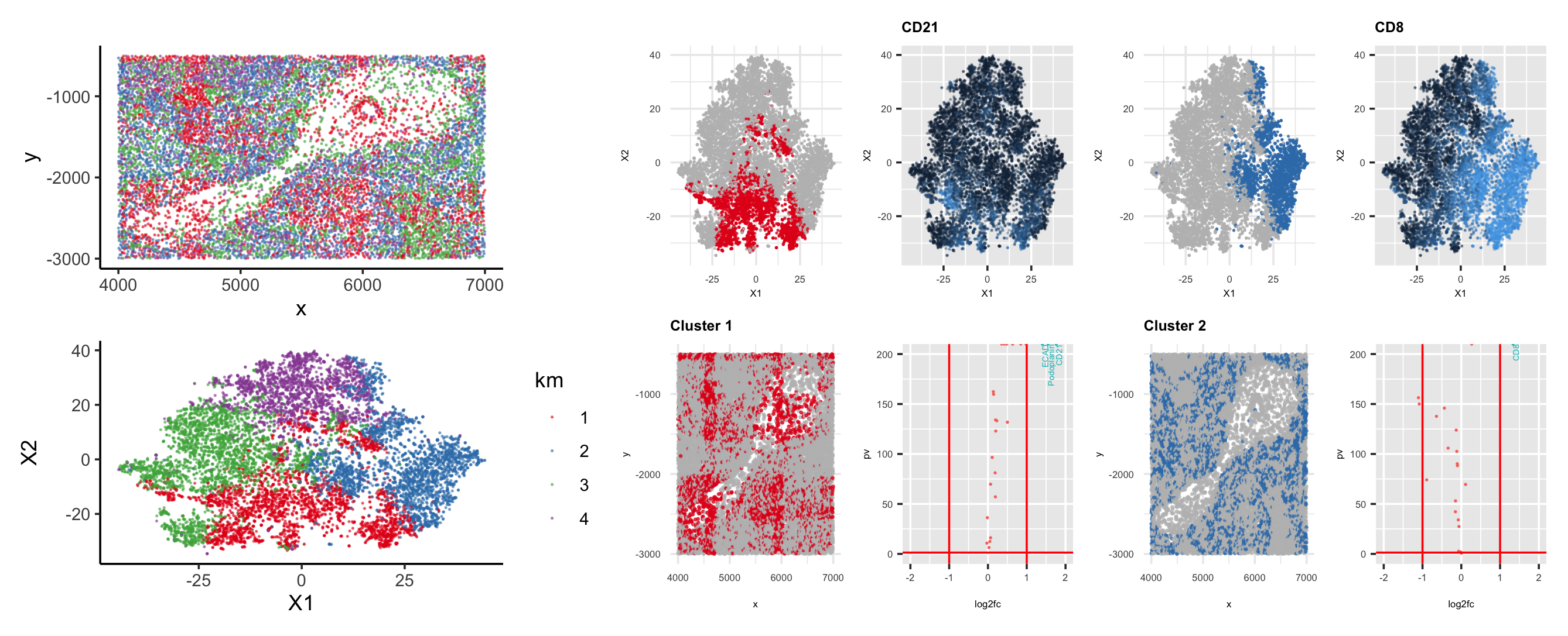
I performed k-means clustering on the log transformed normalized gene expression data. It is a bit difficult to decide which is the optimal k because the total withinness keeps decreasing as k increases. I just picked k=4 since the total witness stopped dropping drastically after k=4. We can see how cells are distributed in physical and t-SNE space (left panels). I picked cluster 1 and 2 to further explore their cell types. I did Wilcoxon tests for differential expression analysis in cluster 1 and 2 respectively. The second column with four sub-panels corresponds to cluster 1 and the third column with four sub-panels corresponds to cluster 2. I plotted their log10 of p values vs. log2 fold change where significantly expressed genes (e.g., the top ones) are labeled with blue text.
For cluster 1 (labeled with color red), the top expressed gene is CD21, which is primarily in B lymphocytes and follicular dendritic cells [1,2]. We can see that in the physical space, there could be a follicular-shaped structure that belongs to cluster 1 (e.g., in the middle of the “cavity”). There are also other red cells spread elsewhere in the physical space. They could also be B cells in red pulp. For cluster 2 (labeled with color blue), the top expressed gene is CD8. We can see from its t-SNE plot that CD8 is highly expressed (i.e., the blue color is lighter in its t-SNE plot) in this cluster. CD8 is primarily expressed in and associated with T cells in the red pulp [3,4,5]. The evidence found might suggest that this piece of tissue was taken from red pulp.
References
[1] https://academic.oup.com/intimm/article/11/11/1841/741961 [2] https://pubmed.ncbi.nlm.nih.gov/9723706/ [3] https://www.ncbi.nlm.nih.gov/pmc/articles/PMC4655190/ [4] https://www.ncbi.nlm.nih.gov/pmc/articles/PMC4669000/ [5] https://www.ncbi.nlm.nih.gov/pmc/articles/PMC4267692/
Please share the code you used to reproduce this data visualization.
library(tidyr)
library(ggplot2)
library(patchwork)
data = read.csv('codex_spleen_subset.csv.gz', row.names = 1)
# data = read.csv('~/Documents/JHU/Genomic data viz/codex_spleen_subset.csv.gz', row.names = 1)

pos = data[,1:2]
area = data[,3]
gexp = data[,4:ncol(data)]
gexpnorm = gexp/rowSums(gexp) * mean(rowSums(gexp))
gexpnormlog = log10(gexp/rowSums(gexp) * mean(rowSums(gexp))+1)

library(RColorBrewer)
colpal <- c(RColorBrewer::brewer.pal(8, "Set1"))
My_Theme = theme(
  axis.title.x = element_text(size = 5),
  axis.text.x = element_text(size = 5),
  axis.title.y = element_text(size = 5),
  axis.text.y = element_text(size = 5),
  plot.title = element_text(size = 7.5, face = "bold"),
  legend.position = "none")

set.seed(0)
km = kmeans(gexpnormlog, centers=4)
com = as.factor(km$cluster)
g1 = ggplot(data.frame(pos, km=com)) + geom_point(aes(x=x, y=y, col=km), size=0.1, alpha=0.5) + scale_color_manual(values=colpal, guide='none') + theme_classic()
g2 = ggplot(data.frame(emb, km=com)) + geom_point(aes(x=X1, y=X2, col=km), size=0.1, alpha=0.5) + scale_color_manual(values=colpal) + theme_classic()

### cluster 1
cluster_of_interest = 1
pvals <- sapply(colnames(gexp), function(p) {
  # print(p)
  test <- wilcox.test(gexpnormlog[com == cluster_of_interest, p],
                      gexpnormlog[com != cluster_of_interest, p],)
  test$p.value
})

fc <- sapply(colnames(gexp), function(p) {
  # print(p)
  mean(gexpnormlog[com==cluster_of_interest,p])/mean(gexpnormlog[com!=cluster_of_interest, p])
})

df1 <- data.frame(emb, kmeans=as.factor(com == cluster_of_interest))
p1 = ggplot(df1) + geom_point(aes(x=X1, y=X2, col=kmeans),
                              size=0.1, alpha=0.7) + theme_minimal() +
  scale_color_manual(breaks = c('FALSE', 'TRUE'), values=c("gray", colpal[1]),
                     guide="none") + My_Theme

df2 <- data.frame(pos, kmeans=as.factor(com == cluster_of_interest))
p2 = ggplot(df2) + geom_point(aes(x = x, y=y, col=kmeans),
                              size=0.3, alpha=0.7) + theme_minimal() +
  scale_color_manual(breaks = c('FALSE', 'TRUE'), values=c("gray", colpal[1]),
                     guide='none') + ggtitle(paste('Cluster',1)) + My_Theme

df3 <- data.frame(pv = -log10(pvals), log2fc = log2(fc), gene=colnames(gexp))
library(dplyr)
pval = df3 %>%
  mutate(regulation = case_when((log2fc>=1 & pv>-log10(0.05)) ~ "upregulated",
                                (log2fc<1 | pv<=-log10(0.05))  ~ "None"))

p3 = ggplot(pval, aes(x=log2fc, y=pv, col=regulation)) +
  geom_point(size=0.1) +
  geom_vline(xintercept = 1, col='red') + geom_vline(xintercept = -1, col='red')+
  geom_hline(yintercept = -log10(0.05), col='red') +
  geom_text(aes(label=ifelse(((pv>-log10(0.05))&(log2fc>=1)),gene, ""))
            ,hjust=1,vjust=1, size=1.5, angle=90) +
  theme(legend.position = "none") + My_Theme + xlim(-2, 2) + ylim(0, 200)


df <- data.frame(pv = -log10(pvals), log2fc = log2(fc), label=colnames(gexp))
top_genes = df[df$log2fc >= 0.9 & df$pv > -log10(0.05), ]
# print(top_genes)

if (cluster_of_interest == 1){
  p0 = ggplot(data.frame(emb, gene = gexpnormlog[, "CD21"])) +
    geom_point(aes(x=X1, y=X2, col=gene), size=0.1, alpha=0.3) +
    ggtitle("CD21") + My_Theme
}

#### cluster 2
cluster_of_interest = 2
pvals <- sapply(colnames(gexp), function(p) {
  # print(p)
  test <- wilcox.test(gexpnormlog[com == cluster_of_interest, p],
                      gexpnormlog[com != cluster_of_interest, p],)
  test$p.value
})

fc <- sapply(colnames(gexp), function(p) {
  # print(p)
  mean(gexpnormlog[com==cluster_of_interest,p])/mean(gexpnormlog[com!=cluster_of_interest, p])
})

df1 <- data.frame(emb, kmeans=as.factor(com == cluster_of_interest))
p11 = ggplot(df1) + geom_point(aes(x=X1, y=X2, col=kmeans),
                              size=0.1, alpha=0.7) + theme_minimal() +
  scale_color_manual(breaks = c('FALSE', 'TRUE'), values=c("gray", colpal[2]),
                     guide="none") + My_Theme

df2 <- data.frame(pos, kmeans=as.factor(com == cluster_of_interest))
p22 = ggplot(df2) + geom_point(aes(x = x, y=y, col=kmeans),
                              size=0.3, alpha=0.7) + theme_minimal() +
  scale_color_manual(breaks = c('FALSE', 'TRUE'), values=c("gray", colpal[2]),
                     guide='none') + ggtitle(paste('Cluster',2)) + My_Theme

df3 <- data.frame(pv = -log10(pvals), log2fc = log2(fc), gene=colnames(gexp))
library(dplyr)
pval = df3 %>%
  mutate(regulation = case_when((log2fc>=1 & pv>-log10(0.05)) ~ "upregulated",
                                (log2fc<1 | pv<=-log10(0.05))  ~ "None"))

p33 = ggplot(pval, aes(x=log2fc, y=pv, col=regulation)) +
  geom_point(size=0.1) +
  geom_vline(xintercept = 1, col='red') + geom_vline(xintercept = -1, col='red')+
  geom_hline(yintercept = -log10(0.05), col='red') +
  geom_text(aes(label=ifelse(((pv>-log10(0.05))&(log2fc>=1)),gene, ""))
            ,hjust=1,vjust=1, size=1.5, angle=90) +
  theme(legend.position = "none") + My_Theme + xlim(-2, 2) + ylim(0, 200)


df <- data.frame(pv = -log10(pvals), log2fc = log2(fc), label=colnames(gexp))
top_genes = df[df$log2fc >= 0.9 & df$pv > -log10(0.05), ]
# print(top_genes)

if (cluster_of_interest == 2){
  p00 = ggplot(data.frame(emb, gene = gexpnormlog[, "CD8"])) +
    geom_point(aes(x=X1, y=X2, col=gene), size=0.1, alpha=0.3) +
    ggtitle("CD8") + My_Theme
}

plot((g1/g2) | ((p1|p0) /(p2|p3)) | ((p11|p00) /(p22|p33)))