Animating The Effects of Normalization & Transformation on Loading Values for PCA

Figure Description:
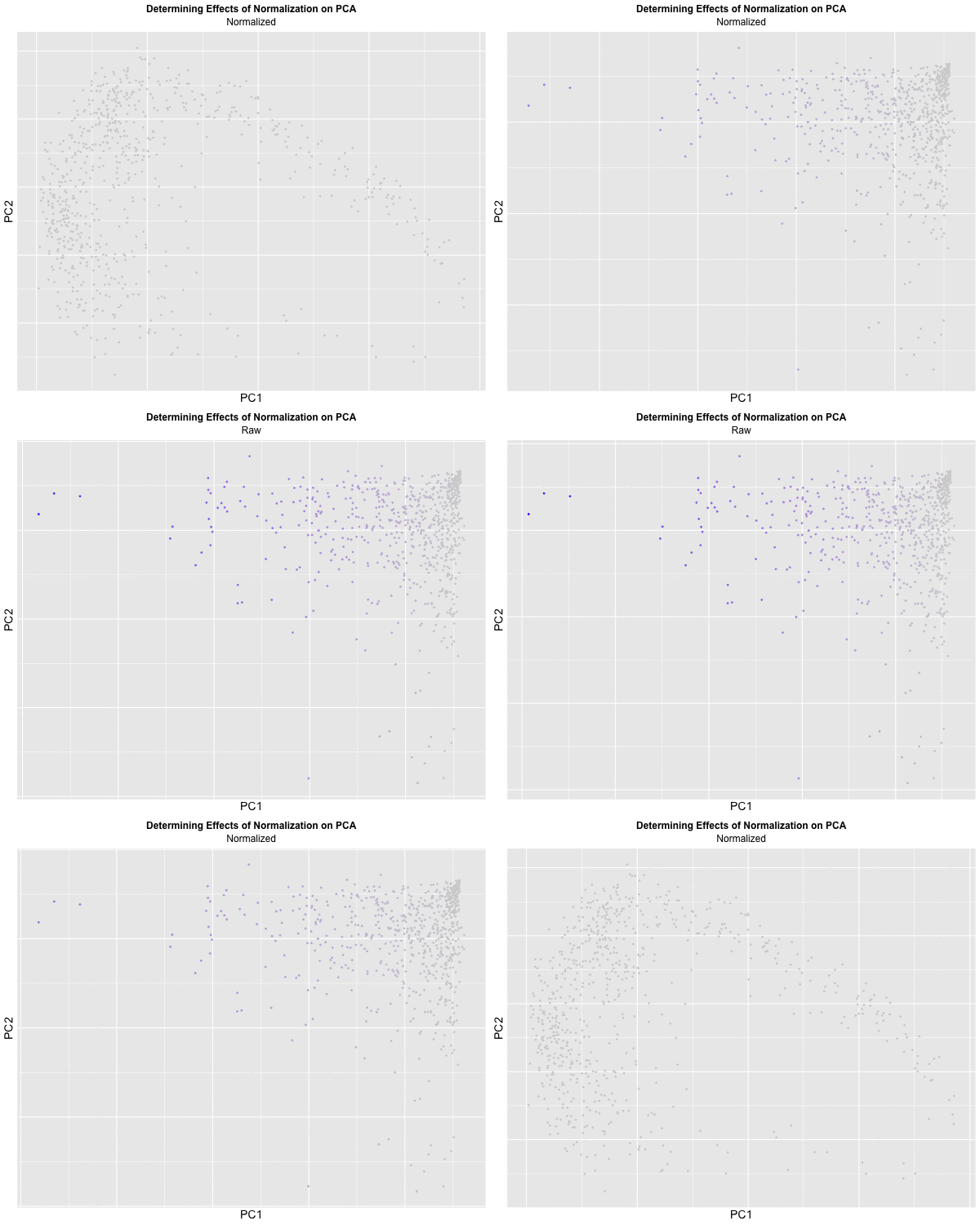
I decided to animate the effects of normalization and transformation on PCA by transitioning between two plots: (1) where the data is not normalized or transformed and (2) where the data is normalized and transformed. I had some difficulty with gganimate’s ability to actually display the PC1 and PC2 values on the x and y-axis respectively and the ability to label the color within the graph, which should correspond to CPB1 expression. But with the understanding that more “blue” means higher expression and “light grey” means lower expression, we can visualize how with the raw dataset, there is significantly more presence of “high” expression. On the other hand, with the normalized dataset, there is practically no “high” expression. A limitation of this methodology, though, is that the scale coloring of “light grey” to “blue” does not reflect the actual relative expression level of CPB1 for each individual plot. The reality is that there are areas of “high” expression in the normalized dataset, but when compared to the raw dataset, the values are all considered “low”.
## Code was mostly adapted from hw3
library(ggplot2)
library(patchwork)
library(here)
data <- read.csv('eevee.csv.gz', row.names = 1)

dim(data)
colnames(data)

## Initialization of variables
x_pos <- data[,2]
y_pos <- data[,3]
gen_exp <- data[,4:ncol(data)]
genes <- colnames(gen_exp)

## Filter out data to reduce stack overflow issue with tSNE
topgene <- sort(apply(gen_exp, 2, var), decreasing=TRUE)[1:1000]
topgene <- names(topgene)
gen_expFilter <- gen_exp[,topgene]

## Going to compare the effects of not normalizing v.s.
## normalizing the data

## Normalize the data
tot_gen_exp <- rowSums(gen_expFilter)
norm_gen_exp <- gen_expFilter/tot_gen_exp * median(tot_gen_exp)
log_norm_gen_exp <- log10(norm_gen_exp + 1)

## PCA Analysis
pcs_norm <- prcomp(log_norm_gen_exp) ## normalized and scaled
pcs <- prcomp(gen_expFilter) ## not normalized and not scaled

## genes with high loadings on PC1 for not normalized and not scaled data
head(sort(pcs$rotation[,1], decreasing = TRUE)) # for PC1

## genes with high loadings on PC1 for normalized and scaled data
head(sort(pcs_norm$rotation[,1], decreasing = TRUE)) # for PC1

## look at loading values for normalized & log scaled data
loading_pcs_norm <- data.frame(PC1 = pcs_norm$rotation[,1])
df_loading_norm <- data.frame(gene_names = c('CPB1', 'CEACAM6'),
                              loading = c(loading_pcs_norm['CPB1',], loading_pcs_norm['CEACAM6',])
)

loading_pcs_norm_graph <- ggplot(data = df_loading_norm, aes(x = factor(gene_names, levels = rev(levels(factor(gene_names)))), y = loading, fill = gene_names)) +
  geom_col(width = 0.75) +
  scale_fill_manual(values = c('red', 'blue')) +
  xlab('Name of Gene') +
  ylab('PC1 Loading Value') +
  theme_classic() +
  theme(legend.position = 'none') +
  ggtitle("Normalized & Transformed Data's Loading Values") +
  theme(plot.title = element_text(hjust = 0.5))

## look at loading values for raw data
loading_pcs <- data.frame(PC1 = pcs$rotation[,1])
df_loading <- data.frame(gene_names = c('CPB1', 'ERBB2'),
                         loading = c(loading_pcs['CPB1',], loading_pcs['ERBB2',])
)

loading_pcs_graph <- ggplot(data = df_loading, aes(x = gene_names, y = loading, fill = gene_names)) +
  geom_col(width = 0.75) +
  scale_fill_manual(values = c('blue', 'red')) +
  xlab('Name of Gene') +
  ylab('PC1 Loading Value') +
  theme_classic() +
  theme(legend.position = 'none') +
  ggtitle("Raw Data's Loading Values") +
  theme(plot.title = element_text(hjust = 0.5))

## Prepare dataframes for graphing
df_norm <- data.frame(PC1 = pcs_norm$x[,1], PC2 = pcs_norm$x[,2], cpb1 = log_norm_gen_exp[, "IGKC"])
norm_plot <- ggplot(df_norm, aes(x = PC1, y = PC2, color = cpb1)) +
  geom_point(size = 0.5) +
  scale_color_gradient(low = "lightgrey", high = "blue") +
  labs(x = "PC1", y = "PC2", color = "CPB1") +
  ggtitle("Normalized & Transformed Data's PCA") +
  theme(plot.title = element_text(hjust = 0.5)) +
  theme_classic()

norm_plot

df <- data.frame(PC1 = pcs$x[,1], PC2 = pcs$x[,2], cpb1 = data[, "IGKC"])
plot <- ggplot(df, aes(x = PC1, y = PC2, color = cpb1)) +
  geom_point(size = 0.5) +
  scale_color_gradient(low = "lightgrey", high = "orange") +
  labs(x = "PC1", y = "PC2", color = "CPB1") +
  ggtitle("Raw Data's PCA") +
  theme(plot.title = element_text(hjust = 0.5)) +
  theme_classic()

plot

plot + loading_pcs_graph + norm_plot + loading_pcs_norm_graph

## Combine plots that are not normalized
no_norm <- plot + loading_pcs_graph
no_norm

## Combine plots that are normalized
norm <- norm_plot + loading_pcs_norm_graph
norm

## Create a combined dataset with an identifier for each plot
df_combined <- rbind(
  cbind(df, order = "Raw", size = 1),
  cbind(df_norm, order = "Normalized", size = 1)
)

## Plot the transition
library(gganimate)
animated <- ggplot(df_combined) +
  geom_point(aes(x = PC1, y = PC2, color = cpb1), size = 0.5) +
  transition_states(order, transition_length = 1.5, state_length = 1) +
  view_follow() +
  scale_color_gradient(low = "lightgrey", high = "blue") +
  labs(subtitle = '{closest_state}',
       color = "CPB1",
       title = "Determining Effects of Normalization on PCA") +
  theme(legend.title.align=0.5,plot.title = element_text(hjust = 0.5, face="bold", size=12),
        text = element_text(size = 14), plot.subtitle = element_text(hjust = 0.5, size = 12)) +
  enter_fade() +
  exit_fade()

animated

## Save animation
anim_save(here("hwEC1_jwang428.gif"), animate(animated, height = 500, width = 600, nframes = 100))
