Animating Effects of Not Normalizing vs. Normalizing on PCA

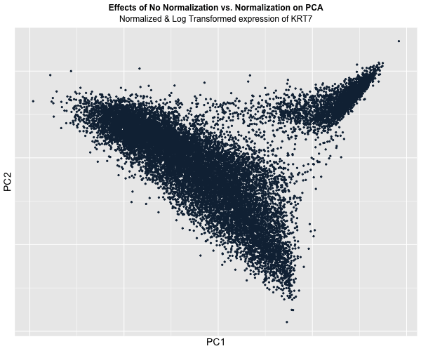
Figure Description:
I animated the transition between two plots: one depicting the raw, unaltered data, and the other showcasing the data after normalization and log transformation. In the initial plot, where the data remains untouched, a conspicuous prevalence of “high” KRT7 expression is evident, denoted by a predominance of lighter blue. Conversely, in the normalized and transformed dataset, the prominence of “high” expression substantially diminishes, with the plot predominantly draped in darker blue, indicating lower expression levels. Though, this phenomenon also raises a crucial acknowledgement in a limitation of this approach: the color gradient on the plots fails to precisely mirror the relative expression levels of KRT7 within each plot.
This is because even in the normalized dataset, pockets of “high” expression exist. However, when compared / animated with the raw dataset, these values register as “low” due to the normalization process. Despite this limitation though, the animated comparison effectively underscores the transformative impact of normalization and transformation on PCA outcomes, accentuating the nuanced alterations in expression profiles across datasets.
Some challenges remained unresolved with gganimate though, namely the ability to display the values of PC1 and PC2 on the respective axes and also the encoding of the label for KRT7.
library(ggplot2)
library(patchwork)
library(gganimate)
library(here)

data <- read.csv('pikachu.csv.gz', row.names = 1)
dim(data)
data[1:5, 1:5]

# matrix for position and gene expression
pos <- data[,4:5]
head(pos)
gexp <- data[, 6:ncol(data)]
head(gexp)

## recommend limiting the number of genes (not all genes are expressed)
# get the top 150 genes with a variance of more than 0 (is being expressed)
topgene = names(sort(apply(gexp, 2, var), decreasing = TRUE)[1:150])

# now we get all the expressions of the top genes
gexpfilter <- gexp[, topgene]

# let's try calculating the pcs with pca
pcs <- prcomp(gexpfilter)
dim(pcs$x)
plot(pcs$sdev)

# let's explore the loading values for PC1
top_loading_pc1 <- names(sort(pcs$rotation[,1], decreasing = TRUE)[1:5])
pc1_load <- data.frame(top_loading_pc1, pcs$rotation[top_loading_pc1,1])
pc1_load
dim(pc1_load)
#KRT7 > TACSTD2 > KRT8 > CEACADM6 > SERPINA3 > EPCAM

# let's plot the results for the raw data
library(ggplot2)
df_rawpcs <- data.frame(PC1 = pcs$x[,1], PC2 = pcs$x[,2], KRT7 = gexpfilter[, 'KRT7'])
p1 <- ggplot(df_rawpcs) + geom_point(aes(x = PC1, y=PC2, col = KRT7)) +
  labs(title = "PC1 vs. PC2 for the Raw Data",
       x = "PC1",
       y = "PC2")

df_rawloadings <- data.frame(genes = pc1_load[,1], loadings = pc1_load[,2])
p2 <- ggplot(df_rawloadings) +
  geom_bar(aes(x = genes, y = loadings), stat = "identity", width = 0.75)+
  labs(title = "Genes with Highest Loading Values for PC1 Raw",
       x = "Type of Gene",
       y = "Loading Value")

# now let's explore the question of normalization
gexpfilter_norm <- gexpfilter/rowSums(gexpfilter)
gexpfilter_log <- log(gexpfilter_norm+1)

pcs_log <- prcomp(gexpfilter_log)

dim(pcs_log)
plot(pcs_log$sdev)

# let's explore the loading values for the normalized data
log_loading_pc1 <- names(sort(pcs_log$rotation[,1], decreasing = TRUE)[1:5])
logpc1_load <- data.frame(log_loading_pc1, pcs_log$rotation[log_loading_pc1,1])
logpc1_load
dim(logpc1_load)

# let's plot the results based on the PCA analysis
df_log <- data.frame(PC1 = pcs_log$x[,1], PC2 = pcs_log$x[,2], KRT7 = gexpfilter_log[, 'KRT7'])
p3 <- ggplot(df_log) + geom_point(aes(x = PC1, y=PC2, col = KRT7)) +
  labs(title = "PC1 vs. PC2 for the Normal Data",
       x = "PC1",
       y = "PC2")

df_logloadings <- data.frame(genes = logpc1_load[,1], loadings = logpc1_load[,2])
p4 <- ggplot(df_logloadings) +
  geom_bar(aes(x = genes, y = loadings), stat = "identity", width = 0.75)+
  labs(title = "Genes with the Highest Loading Values for PC1 Normalized",
       x = "Type of Gene",
       y = "Loading Value")

p1+p2+p3+p4

# animate results
df_tog <- rbind(
  cbind(df_rawpcs, order = "Raw", size = 1),
  cbind(df_log, order = "Normalized & Log Transformed", size = 1)
)

animate_plot <- ggplot(df_tog) +
  geom_point(aes(x = PC1, y = PC2, color = KRT7), size = 0.75) +
  transition_states(order, state_length = 2, transition_length = 10) +
  view_follow() +
  labs(subtitle = '{closest_state} expression of KRT7',
       color = "KRT7",
       title = "Effects of No Normalization vs. Normalization on PCA") +
  theme(legend.title.align=0.5,plot.title = element_text(hjust = 0.5, face="bold", size=12),
        text = element_text(size = 14), plot.subtitle = element_text(hjust = 0.5, size = 12))

animate(animate_plot, duration = 60)
anim_save(here("hwEC1_wyang51.gif"), animate(animate_plot, height = 500, width = 600))