Effect of Normalization on PCA

What happens if I do or not not normalize and/or transform the gene expression data (e.g. log and/or scale) prior to dimensionality reduction?
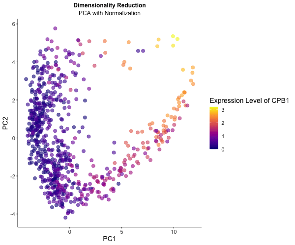
To explore the impact of normalization on dimensionality reduction techniques for visualizing gene expression data, I conducted an analysis using the Eevee dataset. Initially, I applied PCA directly to the gene expression data, followed by normalization using row sums to ensure comparability across samples. Normalization is crucial for ensuring each gene contributes equally to the principal components, leading to distinct patterns across PC1 and PC2. Additionally, log transformation stabilizes variance, particularly for highly expressed genes.
To illustrate these differences, I utilized gganimate to generate an animated visualization. This dynamic representation showcases CPB1 expression levels through color saturation, highlighting how normalization influence the resulting PCA plot.
You must include the entire code you used to generate the figure so that it can be reproduced. You must provide attribution to external resources referenced (if any) in writing your code.
library(viridis)
library(patchwork)
library(Rtsne)
library(ggplot2)
library(gganimate)
data <- read.csv('/Users/nidhisoley/Desktop/GDataViz/eevee.csv.gz', row.names=1)
pos <- data[, 2:3]
gexp <- data[, 4:ncol(data)]

#top genes
top_gene <- names(sort(apply(gexp, 2, var), decreasing = TRUE)[1:1000])
gexp_filter <- gexp[, top_gene]

#PC to gexp without normalizing
pcs_without_norm <- prcomp(gexp_filter)
geneofinterest <- log10(gexp$CPB1 + 1)
df_pcs_without <- data.frame(pcs_without_norm$x, gene = geneofinterest, order = 'without')
p1 <- ggplot(df_pcs_without) +
  geom_point(aes(x = PC1, y = PC2, col = gene),size=2) +
  scale_color_viridis(option = 'plasma')+
  theme_classic()
p1
#normalize the data and apply PCA
gexp_norm <- log10(gexp_filter / rowSums(gexp_filter) * mean(rowSums(gexp_filter)) + 1)
pcs <- prcomp(gexp_norm)
df_pcs <- data.frame(pcs$x, gene = geneofinterest, order = 'with')
p2 <- ggplot(df_pcs) +
  geom_point(aes(x = PC1, y = PC2, col = gene),size=2) +
  scale_color_viridis(option = 'plasma')+
  theme_classic()
p2
#dataframes for animation
df <- rbind(df_pcs_without, df_pcs)

animated_plot <- ggplot(df) +
  geom_point(aes(x = PC1, y = PC2, col = gene), size = 3, alpha=0.6) +
  transition_states(order) +
  view_follow() +
  ease_aes('cubic-in-out')+
  scale_color_viridis(option = 'plasma')+
  theme_classic() +
  labs(subtitle = ("PCA {closest_state} Normalization"),
       title = "Dimensionality Reduction",
       col = "Expression Level of CPB1") +
  theme(legend.title.align = 0.5, plot.title = element_text(hjust = 0.5, face = "bold", size = 12),
        text = element_text(size = 14), plot.subtitle = element_text(hjust = 0.5, size = 12))

#animate
animate(animated_plot, height = 500, width = 600, nframes = 200)

#save
anim_save(("hwEC1_nsoley1.gif"), animate(animated_plot, height = 500, width = 600, nframes = 200))