Linear Dimensionality Reduction on original, normalized, and log transformed normalized data of gene expression

What happens if I do or do not normalize and/or transform the gene expression data (e.g. log and/or scale) prior to dimensionality reduction?
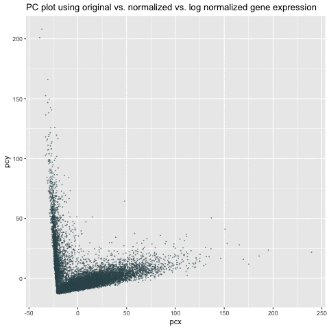
My animation demonstrates the comparison among three different visualizations – linear dimensionality reduction (i.e., PCA) on the original, normalized/scaled, and log-transformed normalized gene expression in the pikachu dataset. The x-axis and y-axis represents PC1 and PC2, respectively.
As we can see from the animation, without normalization, the first two PCs of the original gene expression could range from 0 to 200. These large value (i.e., outliers) could be due to the bias from different expression-level scales among different genes. For example, some genes tend to have more counts in general than others. We can roughly see from the PC of the original data that there could be two clusters. After normalization, these two clusters are more distinct and values tend to be centered as 0. Log transform on the normalized data are still centered and show similar patterns as the normalized data. However, the scale is even smaller. It is a good habit to log transform and normalize data before doing analysis.
Please share the code you used to reproduce this data visualization.
library(ggplot2)
library(gganimate)
library(Rtsne)
colpal <- c("#365359", "#91D2D9")
data <- read.csv('./pikachu.csv.gz', row.names = 1)
pos <- data[, 4:5]
gexp <- data[,6:ncol(data)]
gexpnorm <- gexp/(rowSums(gexp) * mean(rowSums(gexp)))
gexplog <- log10(gexp/(rowSums(gexp) * mean(rowSums(gexp)))+1)
emb <- prcomp(gexp)
emb_norm <- prcomp(gexpnorm)
emb_log <- prcomp(gexplog)

df1 = data.frame(emb$x[,1:2])
colnames(df1) = c('pcx','pcy')
ggplot(df1) + geom_point(aes(x=pcx,y=pcy))

df2 = data.frame(emb_norm$x[,1:2])
colnames(df2) = c('pcx','pcy')
ggplot(df2) + geom_point(aes(x=pcx,y=pcy))

df3 = data.frame(emb_log$x[,1:2])
colnames(df3) = c('pcx','pcy')
ggplot(df3) + geom_point(aes(x=pcx,y=pcy))

df = rbind(cbind(df1, order=1), cbind(df2, order=2), cbind(df3, order=3))
p = ggplot(df) + geom_point(aes(x=pcx,y=pcy), color=colpal[1], size=0.1,alpha=0.5) +
  ggtitle("PC plot using original vs. normalized vs. log normalized gene expression") +
  transition_states(order) + view_follow()

animate(p)