Visualizing Top Genes Driving Reduced Dimensionality Components

What are you visualizing? What genes are driving my reduced dimensionality components?
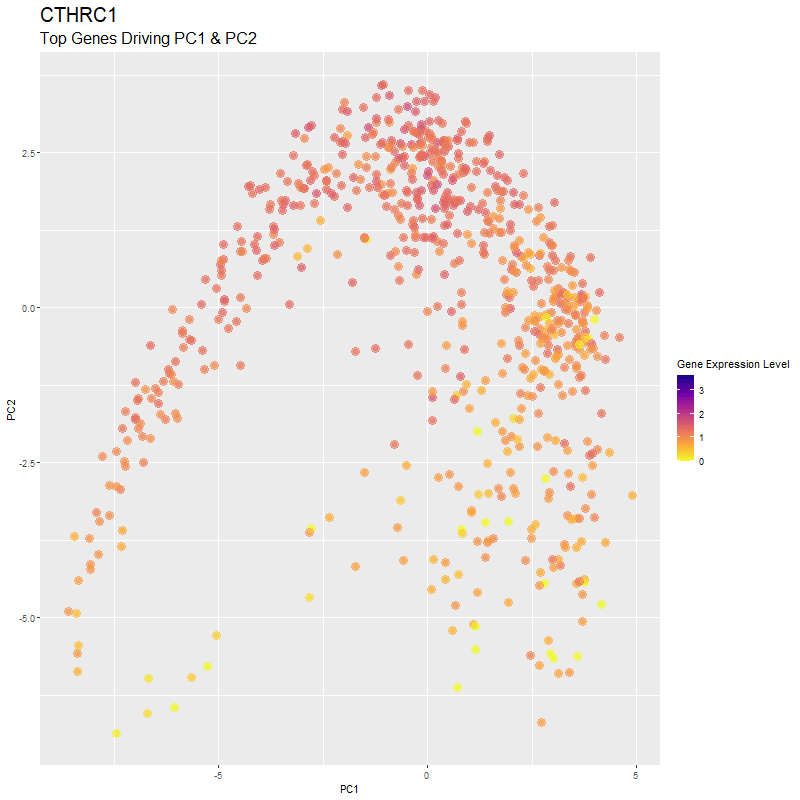
I used gganimate to visualize the gene expression levels of genes that are driving the principal components (PC1 and PC2) in my PCA. These genes are: ‘RNASE1’,’PLTP’,’CXCL12’, ‘IGHG1’, ‘F13A1’, ‘TNXB’, ‘IGHA1’,’JCHAIN’,’IGKC’, ‘IGLC1’, and ‘CTHRC1’. You can see how there are high expression levels of certain genes and through the axes, see them reflect which are driving PC1 and PC2. ‘IGHG1’ seems to be an important driver for both PC1 and PC2.
I was able to know what genes are driving the PCA by doing head(sort(pca$rotation[,1], decreasing=TRUE)) and head(sort(pca$rotation[,2], decreasing=TRUE)). From there, I created a vector to store these genes to them create a combined df for all top-driving genes. Note that I filtered the number of genes by getting top 1500 genes based on expression level in the eevee dataset after normalization. It was pretty cool to see how certain genes drive the PCA in real-time and give it its shape.
Resources
To help with using gganimate, I used the following references: https://jef.works/blog/2020/12/28/animating-the-cell-cycle/ https://jef.works/blog/2021/08/12/story-telling-with-data-visualization/
# Dee Velazquez
# HW EC 1

# Get data
data <- read.csv('eevee.csv.gz', row.names = 1)

#Get pos
pos <- data[,2:3]
#Get genes
gexp <- data[,4:ncol(data)]

#Normalize
gexp_norm <- log10(gexp/rowSums(gexp) *
                     mean(rowSums(gexp))+1)
#Filter number of genes by getting top 1500 genes based on expression level
top_genes <- names(sort(apply(gexp_norm, 2, mean), decreasing=TRUE)[1:1500])
gexp_norm <- gexp_norm[, top_genes]

dim(gexp_norm)
#PCA
pca <- prcomp(gexp_norm)
plot(pca$sdev[1:25])
head(pca$x[,1:10])
head(pca$rotation[,1:10])
head(sort(pca$rotation[,1], decreasing=TRUE))
#RNASE1      PLTP    CXCL12     IGHG1     F13A1      TNXB
head(sort(pca$rotation[,2], decreasing=TRUE))
#IGHA1     JCHAIN       IGKC      IGLC1      IGHG1     CTHRC1
df <- data.frame(pca$x, gexp_norm)

#Find optimal k clusters
results <- sapply(seq(1, 25, by=1), function(i) {
  #print(i)
  com <- kmeans(pca$x[,1:25], centers=i)
  return(com$tot.withinss)
})
plot(results, type="l")


#From plotting tot.withinss, there seems to be around 10 cell types
com <- kmeans(pca$x[,1:25], centers=10)

com2 <- kmeans(gexp_norm, centers=10)
com2 <- as.factor(kmeans(gexp_norm, centers=10)$cluster)

df2 <- data.frame(pos, Cluster=as.factor(com$cluster))
head(df2)
p1 <- ggplot(df2) + geom_point(aes(x = aligned_x, y=aligned_y, col=Cluster),
                               size=2) + theme_minimal()
p1
df3 <- data.frame(pca$x[,1:25], Cluster=as.factor(com$cluster))
p2 <- ggplot(df3) + geom_point(aes(x = PC1, y=PC2, col=Cluster),
                               size=2) + theme_minimal()
p2

#tSNE
emb <- Rtsne(pca$x[,1:25])$Y
df4 <- data.frame(emb, Clusters=as.factor(com$cluster))
p3 <- ggplot(df4) + geom_point(aes(x = X1, y = X2, col=Clusters), size=2, alpha=0.5) +
  theme_bw()
p3

#Top 5 genes on PC1 & PC2
gene <- c('RNASE1','PLTP','CXCL12', 'IGHG1', 'F13A1', 'TNXB', 'IGHA1','JCHAIN','IGKC', 'IGLC1', 'CTHRC1')

#Prepare df for ggganimate
df5 <- data.frame(PC1=pca$x[,1],PC2=pca$x[,2], gexp_norm)

genes.final <- gene

#Create combined df for all top genes
df.all <- do.call(rbind, lapply(genes.final, function(gene_name) {
  gexp <- df5[[gene_name]]
  df <- data.frame(df5$PC1, df5$PC2, gexp, gene=gene_name)
}))

#Create the plot
p <- ggplot(df.all, aes(x = df5.PC1, y = df5.PC2, color = gexp)) +
  geom_point(size=2, alpha=0.5) +
  scale_color_viridis_c(option = "C",  name = "Gene Expression Level",
                        direction = -1) + labs(x= "PC1", y="PC2")

#Create the animation
anim <- p + transition_states(gene, transition_length = 5, state_length = 5) +
  labs(x= "PC1", y="PC2", title = '{closest_state}', subtitle = "Top Genes Driving PC1 & PC2") +
  theme(plot.title = element_text(size = 20)) + theme(plot.subtitle = element_text(size = 16)) +
  geom_point(size = 4, alpha=0.5) +
  enter_fade() + exit_fade()
anim

#Save gif
anim_save("hwEC1_dvelazq5.gif", animate(anim, height = 800, width = 800, nframes = 200))