Customizing scatterbar
Dee Velazquez and Jean Fan
2025-03-03
Source:vignettes/customizing_scatterbar.Rmd
customizing_scatterbar.RmdCustomizing scatterbar
Below, we will simulate some data for demo purposes. We will create a
small dataset to demonstrate the scatterbar function.
# Load the scatterbar library
library(scatterbar)

# Define positional data: coordinates (x, y) for each spot
pos <- data.frame(x = c(1,1,2,2),
                  y = c(1,2,1,2))

# Define proportional data: proportions of different categories (p1, p2, p3, p4) at each spot
prop <- matrix(c(0.5, 0.5,  0,   0,
                 0.5, 0,    0,   0.5,
                 0,   0.5,  0.5, 0,
                 0,   0,    0.5, 0.5), nrow=4)

# Assign row names to both positional and proportional data, representing the spot identifiers
rownames(pos) <- rownames(prop) <- c('a','b','c','d')

# Assign column names to the proportional data, representing the categories/groups
colnames(prop) <- c('Dogs', 'Cats', 'Fish', 'Snakes')

# Print out the positional data
print(pos)
## x y
## a 1 1
## b 1 2
## c 2 1
## d 2 2
# Print out the positional data
print(prop)
## Dogs Cats Fish Snakes
## a 0.5 0.5 0.0 0.0
## b 0.5 0.0 0.5 0.0
## c 0.0 0.0 0.5 0.5
## d 0.0 0.5 0.0 0.5Here, we will create scatterbar plots using the scatterbar function and demonstrate various customization options using ggplot2.
# Basic scatterbar plot with default settings
scatterbar(prop, pos)
## Calculated size_x: 0.5## Calculated size_y: 0.5## Applied padding_x: 0## Applied padding_y: 0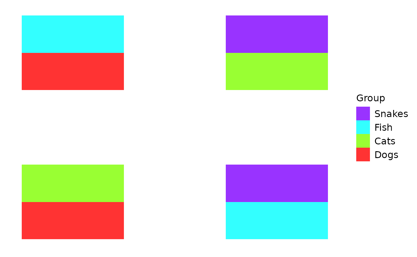
# Scatterbar plot with a black-and-white theme and customized y-axis label
scatterbar(prop, pos) +
  ggplot2::theme_bw() + ggplot2::ylab('y')
## Calculated size_x: 0.5## Calculated size_y: 0.5## Applied padding_x: 0## Applied padding_y: 0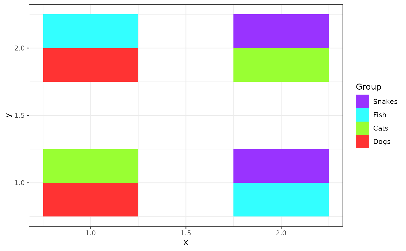
# Scatterbar plot with fixed x and y scale factors of 1 (size_x and size_y)
scatterbar(prop, pos,
                  size_x = 1, size_y = 1) +
  ggplot2::theme_bw() + ggplot2::ylab('y')
## Calculated size_x: 1## Calculated size_y: 1## Applied padding_x: 0## Applied padding_y: 0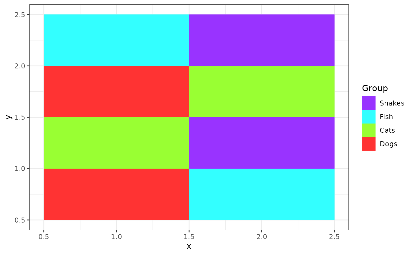
# Scatterbar plot with padding applied to the x and y axes, making the tiles slightly smaller
scatterbar(prop, pos,
                  size_x = 1, size_y = 1,
                  padding_x = 0.1, padding_y = 0.1) +
  ggplot2::theme_bw() + ggplot2::ylab('y')
## Calculated size_x: 0.9## Calculated size_y: 0.9## Applied padding_x: 0.1## Applied padding_y: 0.1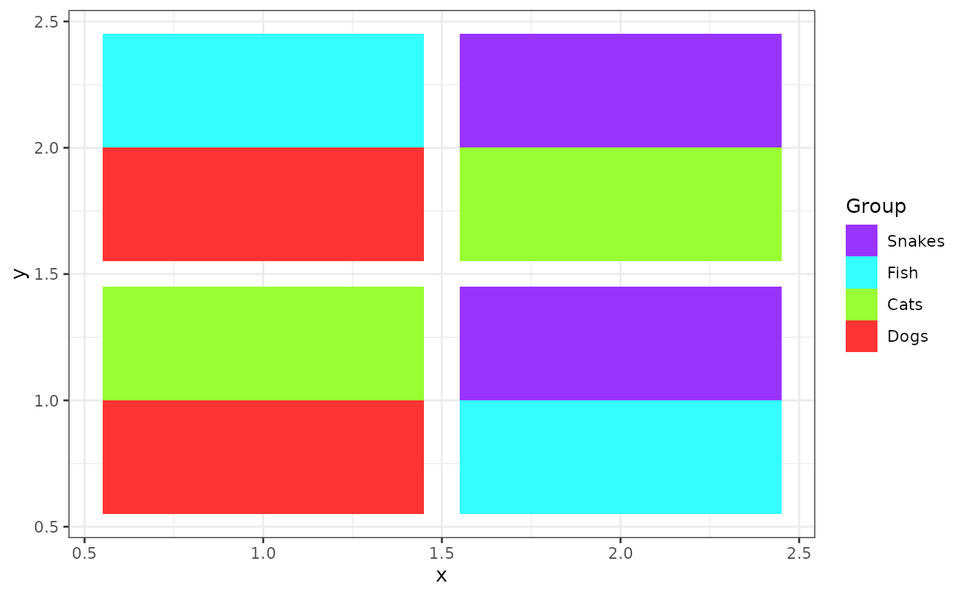
# Scatterbar plot with flipped coordinates, so that x and y axes are interchanged
scatterbar(prop, pos,
                  size_x = 1, size_y = 1,
                  padding_x = 0.1, padding_y = 0.1) +
  ggplot2::theme_bw() + ggplot2::ylab('y') +
  ggplot2::coord_flip()
## Calculated size_x: 0.9## Calculated size_y: 0.9## Applied padding_x: 0.1## Applied padding_y: 0.1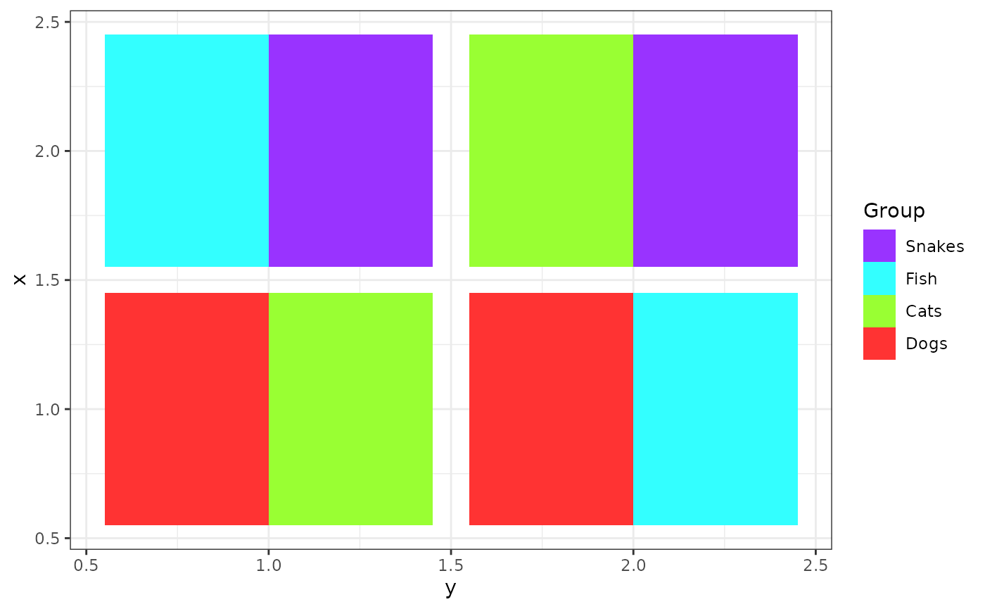
# Scatterbar plot with customized legend title
scatterbar(prop, pos,
                  size_x = 1, size_y = 1,
                  padding_x = 0.1, padding_y = 0.1, legend_title= "Animals") +
  ggplot2::theme_bw() + ggplot2::ylab('y')
## Calculated size_x: 0.9## Calculated size_y: 0.9## Applied padding_x: 0.1## Applied padding_y: 0.1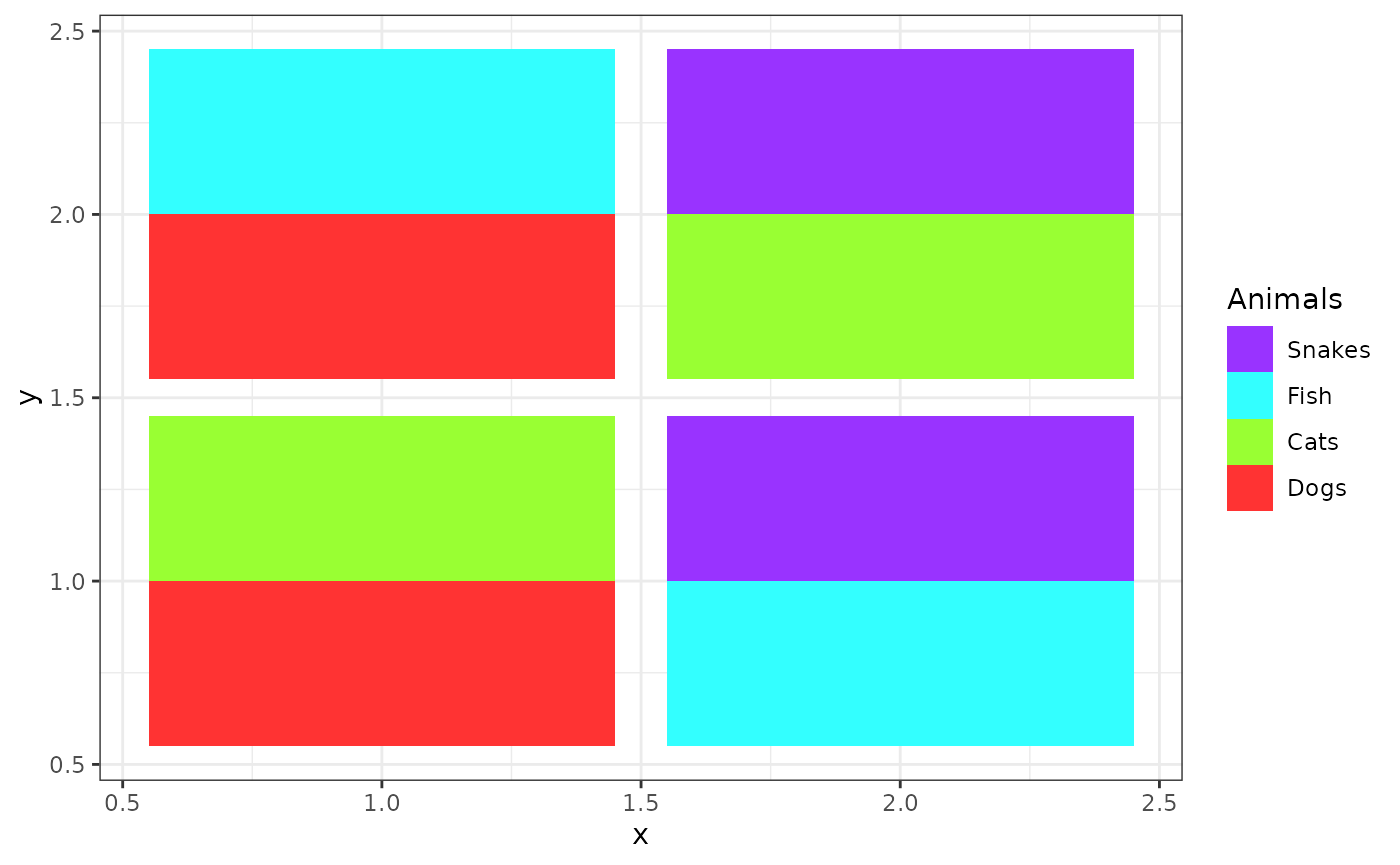
# Scatterbar plot using the custom colors
# Define a custom set of colors for the categories
custom_colors <- c("#FF0000",  # Red
                   "#00FF00",  # Green
                   "#0000FF",  # Blue
                   "#A020F0")  # Purple
scatterbar(prop, pos,
                  size_x = 1, size_y = 1,
                  padding_x = 0.1, padding_y = 0.1, legend_title= "Animals", colors=custom_colors) +
  ggplot2::theme_bw() + ggplot2::ylab('y')
## Calculated size_x: 0.9## Calculated size_y: 0.9## Applied padding_x: 0.1## Applied padding_y: 0.1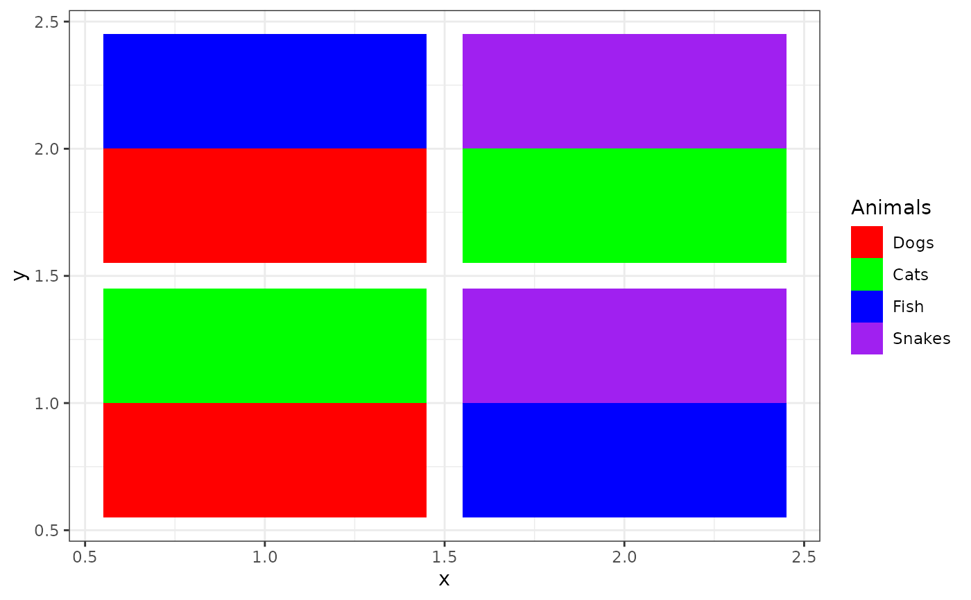
# Scatterbar plot with title
scatterbar(prop, pos,
                  size_x = 1, size_y = 1,
                  padding_x = 0.1, padding_y = 0.1, legend_title= "Animals", colors=custom_colors) +
  ggplot2::theme_bw() + ggplot2::ylab('y') + ggplot2::labs(title="Favorite Animals Among Classrooms")
## Calculated size_x: 0.9## Calculated size_y: 0.9## Applied padding_x: 0.1## Applied padding_y: 0.1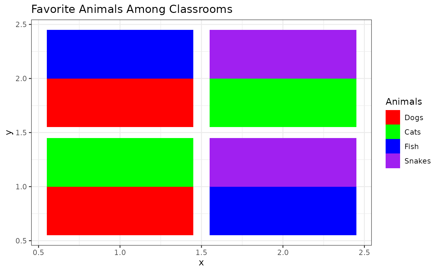
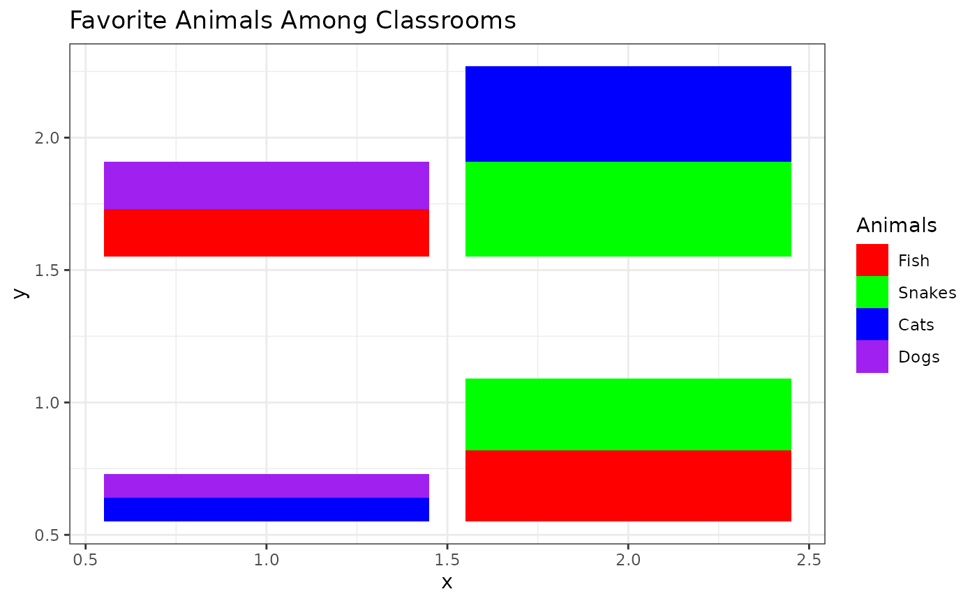
# Scatterbar plot modifying the order of categories plotted
scatterbar(prop[, c("Fish", "Snakes", "Cats", "Dogs")], pos,
                  size_x = 1, size_y = 1,
                  padding_x = 0.1, padding_y = 0.1, legend_title= "Animals", colors=custom_colors) +
  ggplot2::theme_bw() + ggplot2::ylab('y') + ggplot2::labs(title="Favorite Animals Among Classrooms")
## Calculated size_x: 0.9## Calculated size_y: 0.9## Applied padding_x: 0.1## Applied padding_y: 0.1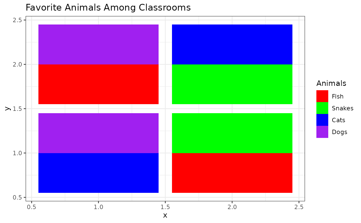
What if my proportions don’t add up to 1?
# Define a new proportional data matrix where proportions do not sum to 1
prop <- matrix(c(0.1, 0.2,  0,   0,
                 0.1, 0,    0,   0.4,
                 0,   0.2,  0.3, 0,
                 0,   0,    0.3, 0.4), nrow=4)

# Assign row names representing the spots
rownames(prop) <- c('a','b','c','d')

# Assign column names representing the categories/groups
colnames(prop) <- c('Dogs', 'Cats', 'Fish', 'Snakes')

# Print the new proportional data
print(prop)
## Dogs Cats Fish Snakes
## a 0.1 0.1 0.0 0.0
## b 0.2 0.0 0.2 0.0
## c 0.0 0.0 0.3 0.3
## d 0.0 0.4 0.0 0.4
# Create a scatterbar plot with the new data
scatterbar(prop, pos)
## Calculated size_x: 0.5## Calculated size_y: 0.5## Applied padding_x: 0## Applied padding_y: 0
# Customize the scatterbar plot using a black-and-white theme and customized y-axis label
scatterbar(prop, pos) +
  ggplot2::theme_bw() + ggplot2::ylab('y')
## Calculated size_x: 0.5## Calculated size_y: 0.5## Applied padding_x: 0## Applied padding_y: 0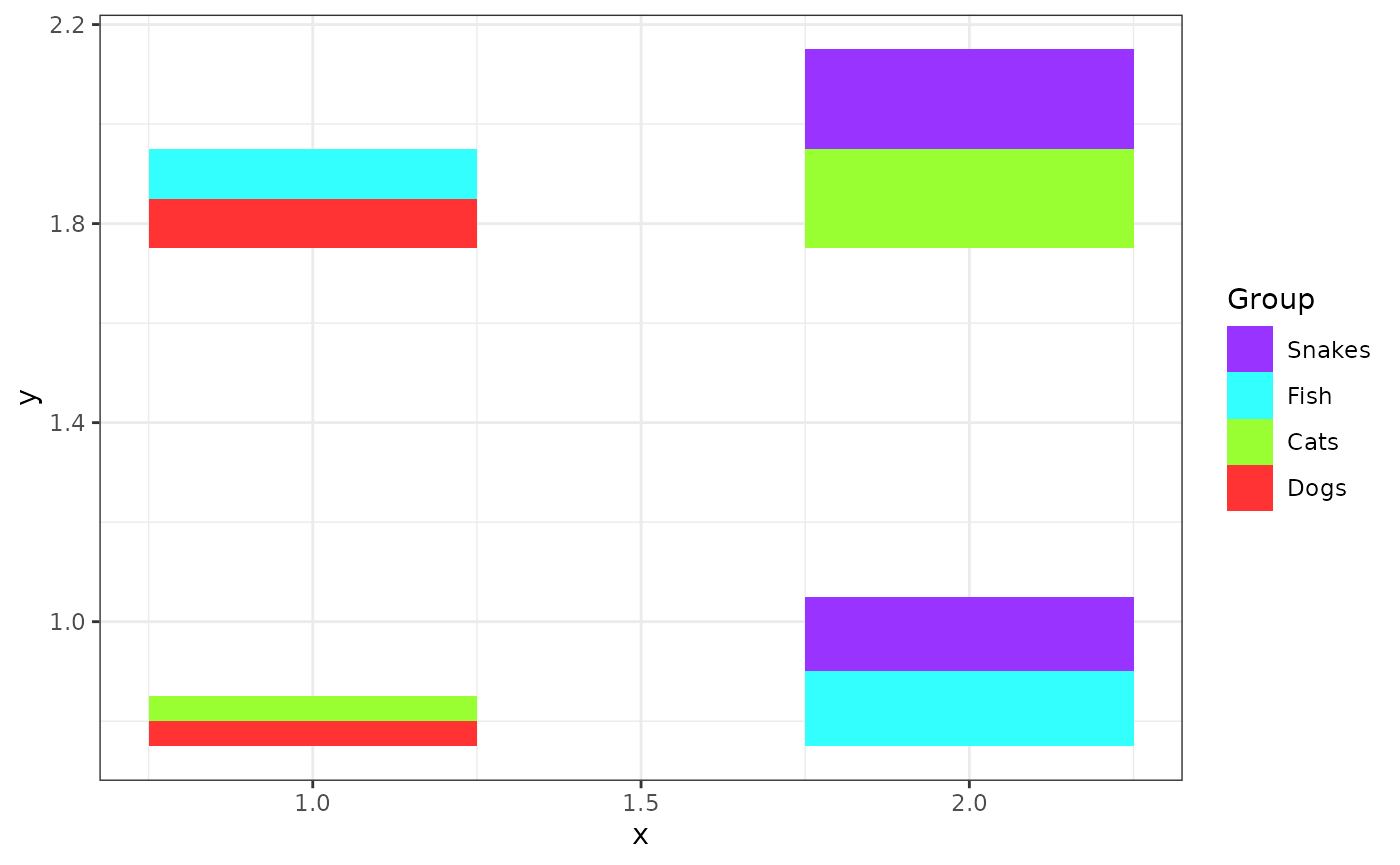
# Create a scatterbar plot with fixed x and y scales and customized theme
scatterbar(prop, pos,
                  size_x = 1, size_y = 1) +
  ggplot2::theme_bw() + ggplot2::ylab('y')
## Calculated size_x: 1## Calculated size_y: 1## Applied padding_x: 0## Applied padding_y: 0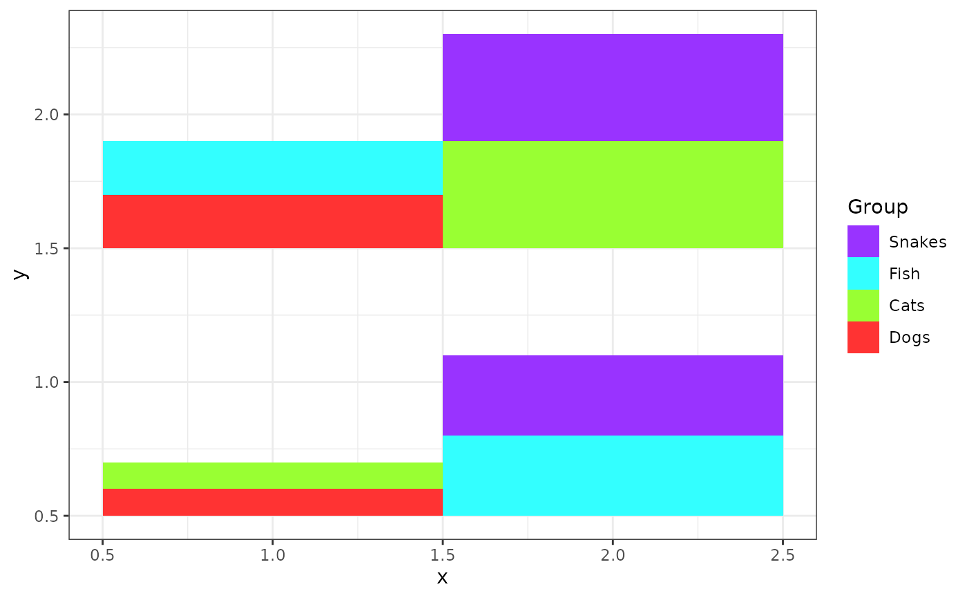
# Apply padding to the scatterbar plot to make the tiles smaller
scatterbar(prop, pos,
                  size_x = 1, size_y = 1,
                  padding_x = 0.1, padding_y = 0.1) +
  ggplot2::theme_bw() + ggplot2::ylab('y')
## Calculated size_x: 0.9## Calculated size_y: 0.9## Applied padding_x: 0.1## Applied padding_y: 0.1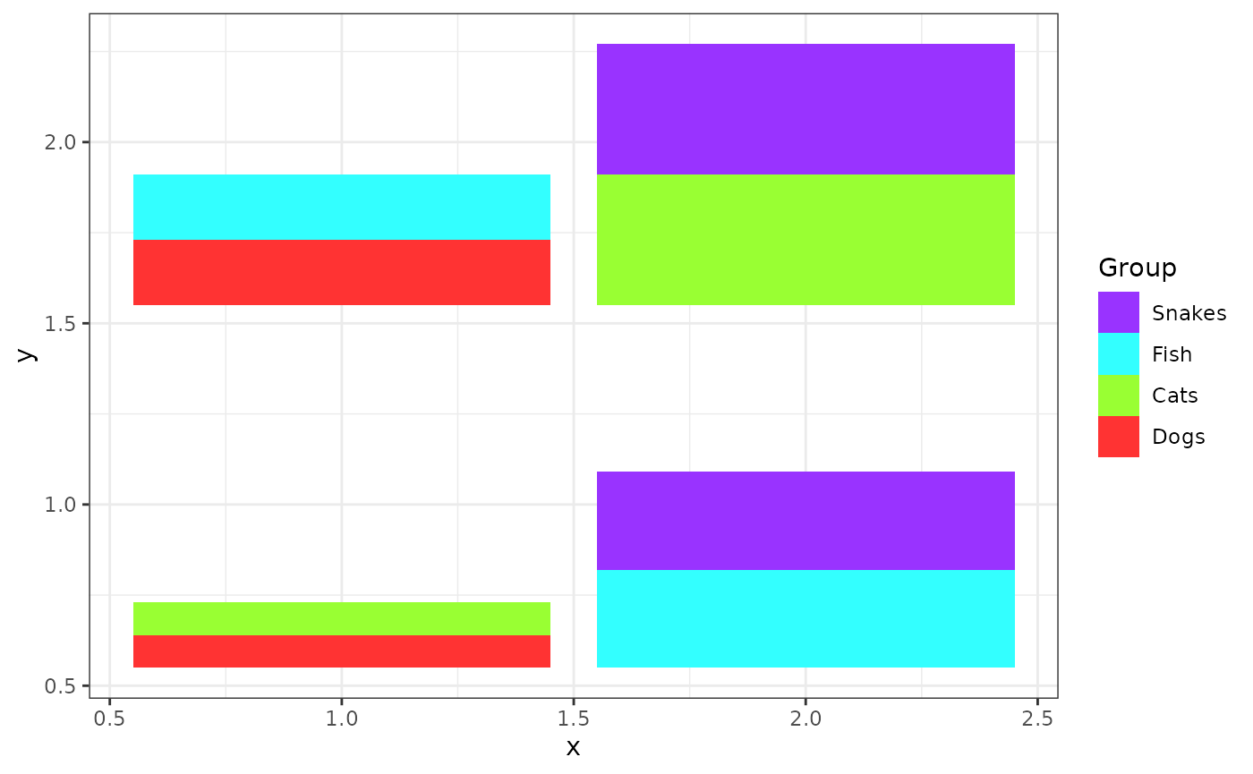
# Scatterbar plot with flipped coordinates
scatterbar(prop, pos,
                  size_x = 1, size_y = 1,
                  padding_x = 0.1, padding_y = 0.1) +
  ggplot2::theme_bw() + ggplot2::ylab('y') +
  ggplot2::coord_flip()
## Calculated size_x: 0.9## Calculated size_y: 0.9## Applied padding_x: 0.1## Applied padding_y: 0.1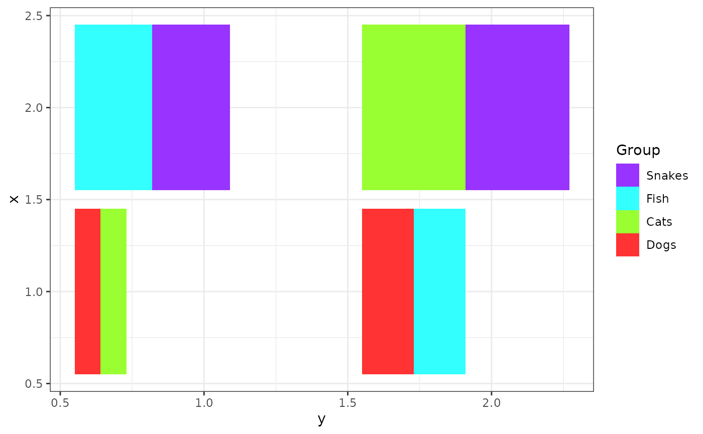
# Scatterbar plot with customized legend title
scatterbar(prop, pos,
                  size_x = 1, size_y = 1,
                  padding_x = 0.1, padding_y = 0.1, legend_title= "Animals") +
  ggplot2::theme_bw() + ggplot2::ylab('y')
## Calculated size_x: 0.9## Calculated size_y: 0.9## Applied padding_x: 0.1## Applied padding_y: 0.1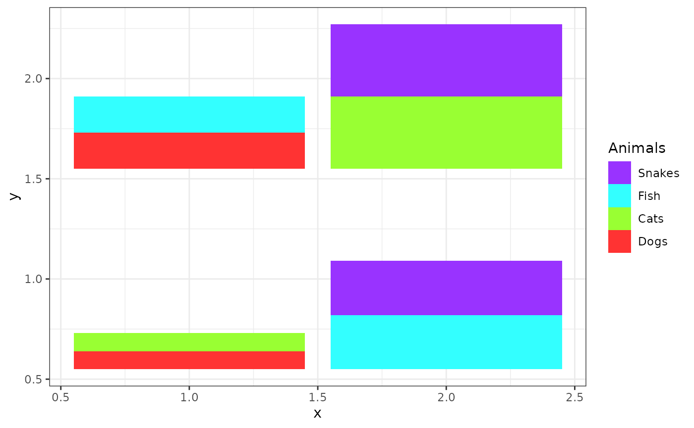
# Scatterbar plot using the custom colors
# Define a custom set of colors for the categories
custom_colors <- c("#FF0000",  # Red
                   "#00FF00",  # Green
                   "#0000FF",  # Blue
                   "#A020F0")  # Purple
scatterbar(prop, pos,
                  size_x = 1, size_y = 1,
                  padding_x = 0.1, padding_y = 0.1, legend_title= "Animals", colors=custom_colors) +
  ggplot2::theme_bw() + ggplot2::ylab('y')
## Calculated size_x: 0.9## Calculated size_y: 0.9## Applied padding_x: 0.1## Applied padding_y: 0.1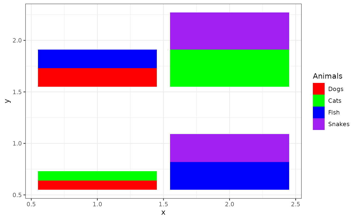
# Scatterbar plot with title
scatterbar(prop, pos,
                  size_x = 1, size_y = 1,
                  padding_x = 0.1, padding_y = 0.1, legend_title= "Animals", colors=custom_colors) +
  ggplot2::theme_bw() + ggplot2::ylab('y') + ggplot2::labs(title="Favorite Animals Among Classrooms")
## Calculated size_x: 0.9## Calculated size_y: 0.9## Applied padding_x: 0.1## Applied padding_y: 0.1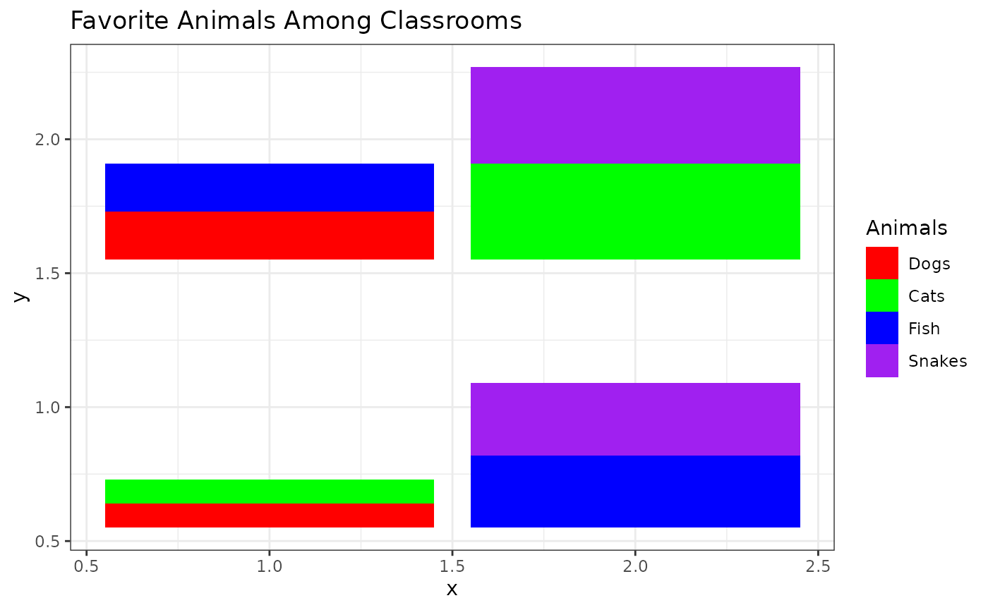
# Scatterbar plot modifying the order of categories plotted
scatterbar(prop[, c("Fish", "Snakes", "Cats", "Dogs")], pos,
                  size_x = 1, size_y = 1,
                  padding_x = 0.1, padding_y = 0.1, legend_title= "Animals", colors=custom_colors) +
  ggplot2::theme_bw() + ggplot2::ylab('y') + ggplot2::labs(title="Favorite Animals Among Classrooms")
## Calculated size_x: 0.9## Calculated size_y: 0.9## Applied padding_x: 0.1## Applied padding_y: 0.1