Reference-free cell-type deconvolution of multi-cellular spatially resolved transcriptomics data
In this tutorial, we will walk through some of the main functionalities
of STdeconvolve.
library(STdeconvolve)
Given a counts matrix from pixel-resolution spatial transcriptomics data where each spatially resolved measurement may represent mixtures from potentially multiple cell-types, STdeconvolve infers the putative transcriptomic profiles of cell-types and their proportional representation within each multi-cellular spatially resolved pixel. Such a pixel-resolution spatial transcriptomics dataset of the mouse olfactory bulb is built in and can be loaded.
data(mOB)
pos <- mOB$pos ## x and y positions of each pixel
cd <- mOB$counts ## matrix of gene counts in each pixel
annot <- mOB$annot ## annotated tissue layers assigned to each pixel
STdeconvolve first feature selects for genes most likely to be
relevant for distinguishing between cell-types by looking for highly
overdispersed genes across ST pixels. Pixels with too few genes or genes
with too few reads can also be removed.
## remove pixels with too few genes
counts <- cleanCounts(counts = cd,
                      min.lib.size = 100,
                      min.reads = 1,
                      min.detected = 1,
                      verbose = TRUE)
## Converting to sparse matrix ...

## Filtering matrix with 262 cells and 15928 genes ...

## Resulting matrix has 260 cells and 14828 genes
## feature select for genes
corpus <- restrictCorpus(counts,
                         removeAbove = 1.0,
                         removeBelow = 0.05,
                         alpha = 0.05,
                         plot = TRUE,
                         verbose = TRUE)
## Removing 124 genes present in 100% or more of pixels...

## 14704 genes remaining...

## Removing 3009 genes present in 5% or less of pixels...

## 11695 genes remaining...

## Restricting to overdispersed genes with alpha = 0.05...

## Calculating variance fit ...

## Using gam with k=5...

## 232 overdispersed genes ...

##  Using top 1000 overdispersed genes.

##  number of top overdispersed genes available: 232
STdeconvolve then applies latent Dirichlet allocation (LDA), a
generative statistical model commonly used in natural language
processing, to discover K latent cell-types. STdeconvolve fits a
range of LDA models to inform the choice of an optimal K.
## Note: the input corpus needs to be an integer count matrix of pixels x genes
ldas <- fitLDA(t(as.matrix(corpus)), Ks = seq(2, 9, by = 1),
               perc.rare.thresh = 0.05,
               plot=TRUE,
               verbose=TRUE)
## Warning in serialize(data, node$con): 'package:stats' may not be available
## when loading

## Warning in serialize(data, node$con): 'package:stats' may not be available
## when loading

## Warning in serialize(data, node$con): 'package:stats' may not be available
## when loading

## Warning in serialize(data, node$con): 'package:stats' may not be available
## when loading

## Warning in serialize(data, node$con): 'package:stats' may not be available
## when loading

## Warning in serialize(data, node$con): 'package:stats' may not be available
## when loading

## Warning in serialize(data, node$con): 'package:stats' may not be available
## when loading

## Time to fit LDA models was 0.42 mins

## Computing perplexity for each fitted model...

## Warning in serialize(data, node$con): 'package:stats' may not be available
## when loading

## Warning in serialize(data, node$con): 'package:stats' may not be available
## when loading

## Warning in serialize(data, node$con): 'package:stats' may not be available
## when loading

## Warning in serialize(data, node$con): 'package:stats' may not be available
## when loading

## Warning in serialize(data, node$con): 'package:stats' may not be available
## when loading

## Warning in serialize(data, node$con): 'package:stats' may not be available
## when loading

## Warning in serialize(data, node$con): 'package:stats' may not be available
## when loading

## Time to compute perplexities was 0.16 mins

## Getting predicted cell-types at low proportions...

## Time to compute cell-types at low proportions was 0 mins

## Plotting...
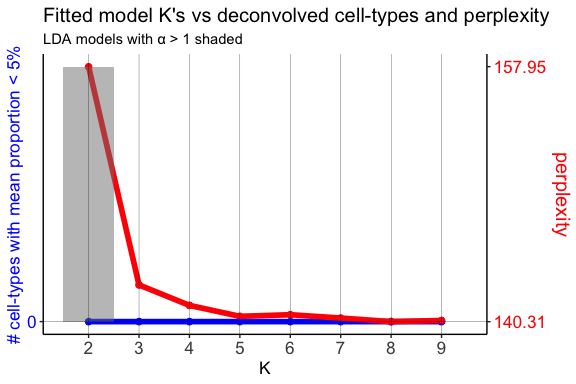
In this example, we will use the model with the lowest model perplexity.
The shaded region indicates where a fitted model for a given K had an
alpha > 1. alpha is an LDA parameter that is solved for during
model fitting and corresponds to the shape parameter of a symmetric
Dirichlet distribution. In the model, this Dirichlet distribution
describes the cell-type proportions in the pixels. A symmetric Dirichlet
with alpha > 1 would lead to more uniform cell-type distributions in
the pixels and difficulty identifying distinct cell-types. Instead, we
want models with alphas < 1, resulting in sparse distributions where
only a few cell-types are represented in a given pixel.
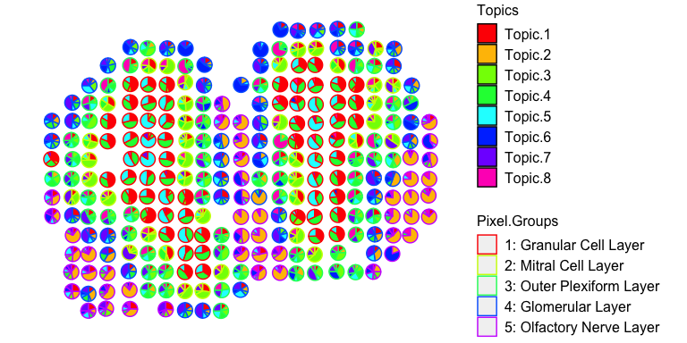
The resulting theta matrix can be interpreted as the proportion of
each deconvolved cell-type across each spatially resolved pixel. The
resulting beta matrix can be interpreted as the putative gene
expression profile for each deconvolved cell-type normalized to a
library size of 1. This beta matrix can be scaled by a depth factor
(ex. 1000) for interpretability.
## select model with minimum perplexity
optLDA <- optimalModel(models = ldas, opt = "min")

## extract pixel cell-type proportions (theta) and cell-type gene expression profiles (beta) for the given dataset
## we can also remove cell-types from pixels that contribute less than 5% of the pixel proportion
## and scale the deconvolved transcriptional profiles by 1000
results <- getBetaTheta(optLDA,
                        perc.filt = 0.05,
                        betaScale = 1000)
## Filtering out cell-types in pixels that contribute less than 0.05 of the pixel proportion.
deconProp <- results$theta
deconGexp <- results$beta
We can now visualize the proportion of each deconvolved cell-type across the original spatially resolved pixels.
vizAllTopics(deconProp, pos,
             groups = annot,
             group_cols = rainbow(length(levels(annot))),
             r=0.4)
## Plotting scatterpies for 260 pixels with 8 cell-types...this could take a while if the dataset is large.
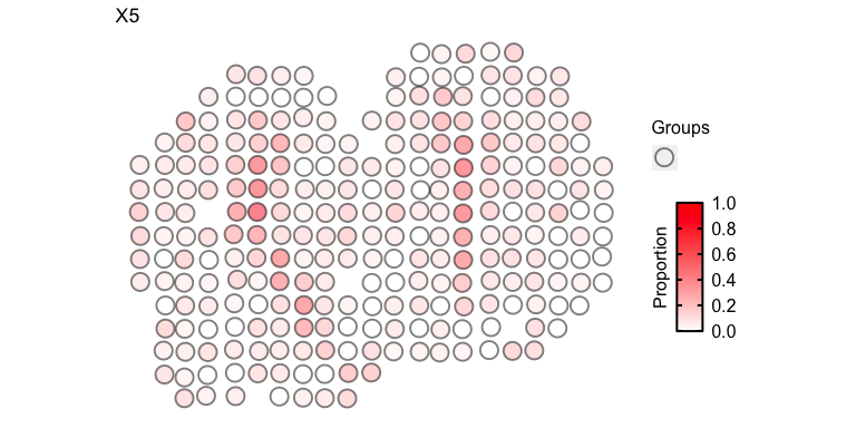
For faster plotting, we can visualize the pixel proportions of a single
cell-type separately using vizTopic():
vizTopic(theta = deconProp, pos = pos, topic = "5", plotTitle = "X5",
         size = 5, stroke = 1, alpha = 0.5,
         low = "white",
         high = "red")
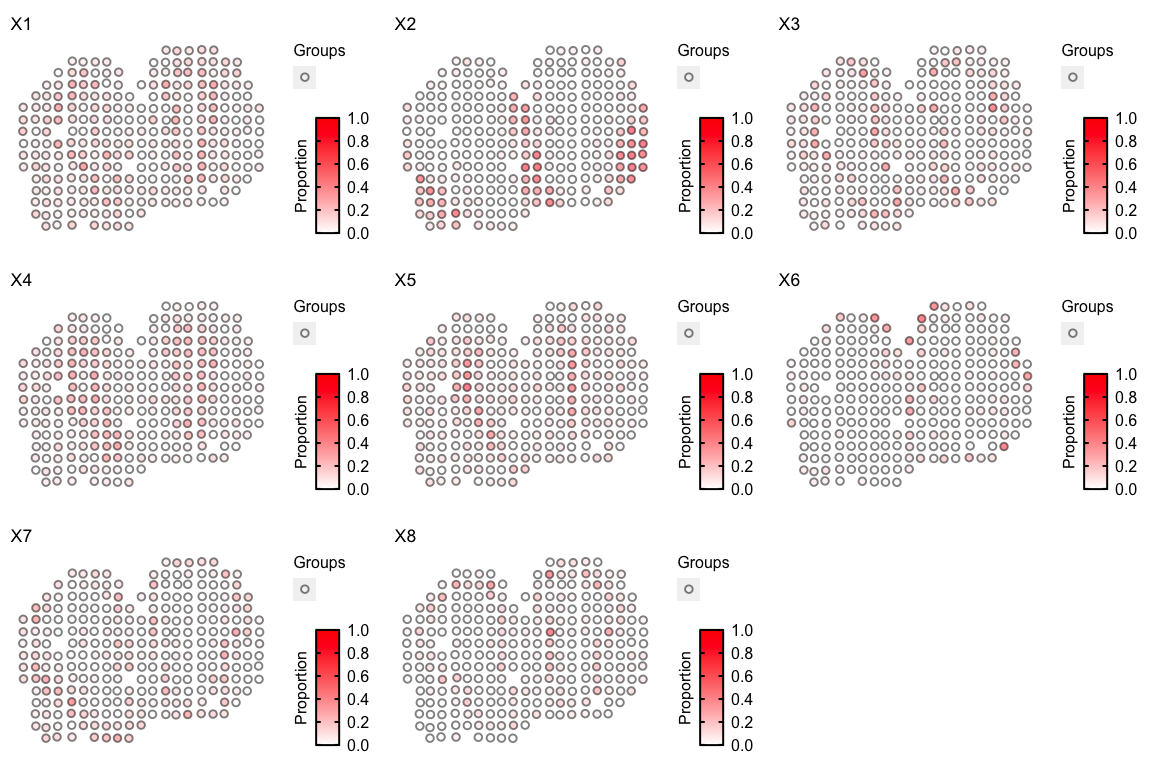
We can loop through all cell-types to visualize them all together:
ps <- lapply(colnames(deconProp), function(celltype) {

  vizTopic(theta = deconProp, pos = pos, topic = celltype, plotTitle = paste0("X", celltype),
         size = 2, stroke = 1, alpha = 0.5,
         low = "white",
         high = "red")

})
gridExtra::grid.arrange(
  grobs = ps,
  layout_matrix = rbind(c(1, 2, 3),
                        c(4, 5, 6),
                        c(7, 8, 9))
)
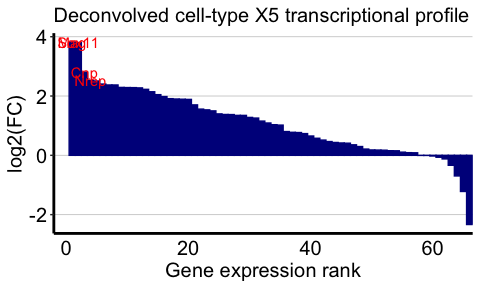
We can also visualize the top marker genes for each deconvolved
cell-type. We will use deconvolved cell-types 5 and 1 as examples
here. We will define the top marker genes here as genes highly expressed
in the deconvolved cell-type (count > 5) that also have the top 4
highest log2(fold change) when comparing the deconvolved cell-type’s
expression profile to the average of all other deconvolved cell-types’
expression profiles.
celltype <- 5
## highly expressed in cell-type of interest
highgexp <- names(which(deconGexp[celltype,] > 5))
## high log2(fold-change) compared to other deconvolved cell-types
log2fc <- sort(log2(deconGexp[celltype,highgexp]/colMeans(deconGexp[-celltype,highgexp])), decreasing=TRUE)
markers <- names(log2fc)[1:4]

# -----------------------------------------------------
## visualize the transcriptional profile
dat <- data.frame(values = as.vector(log2fc), genes = names(log2fc), order = seq(length(log2fc)))
# Hide all of the text labels.
dat$selectedLabels <- ""
dat$selectedLabels[1:4] <- markers

plt <- ggplot2::ggplot(data = dat) +
  ggplot2::geom_col(ggplot2::aes(x = order, y = values,
                                 fill = factor(selectedLabels == ""),
                                 color = factor(selectedLabels == "")), width = 1) +

  ggplot2::scale_fill_manual(values = c(STdeconvolve::transparentCol("darkblue", percent = 0),
                                        STdeconvolve::transparentCol("darkblue", percent = 0)
                                        )) +
  ggplot2::scale_color_manual(values = c(STdeconvolve::transparentCol("darkblue", percent = 0),
                                         STdeconvolve::transparentCol("darkblue", percent = 0)
                                         )) +

  ggplot2::scale_y_continuous(expand = c(0, 0), limits = c(min(log2fc) - 0.3, max(log2fc) + 0.3)) +
  ggplot2::scale_x_continuous(expand = c(0, 0), limits = c(-2, NA)) +

  ggplot2::labs(title = "Deconvolved cell-type X5 transcriptional profile",
                x = "Gene expression rank",
                y = "log2(FC)") +

  ggplot2::geom_text(ggplot2::aes(x = order, y = values, label = selectedLabels), color = "red") +

  ggplot2::theme_classic() +
  ggplot2::theme(axis.text.x = ggplot2::element_text(size=15, color = "black"),
                 axis.text.y = ggplot2::element_text(size=15, color = "black"),
                 axis.title.y = ggplot2::element_text(size=15, color = "black"),
                 axis.title.x = ggplot2::element_text(size=15, color = "black"),
                 axis.ticks.x = ggplot2::element_blank(),
                 plot.title = ggplot2::element_text(size=15),
                 legend.text = ggplot2::element_text(size = 15, colour = "black"),
                 legend.title = ggplot2::element_text(size = 15, colour = "black", angle = 90),
                 panel.background = ggplot2::element_blank(),
                 plot.background = ggplot2::element_blank(),
                 panel.grid.major.y = ggplot2::element_line(size = 0.3, colour = STdeconvolve::transparentCol("gray80", percent = 0)),
                 axis.line = ggplot2::element_line(size = 1, colour = "black"),
                 legend.position="none"
                 )
plt
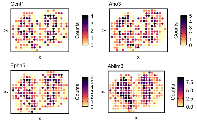
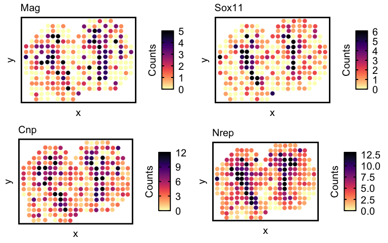
Now lets visualize the spatial expression of the top 4 genes.
## visualize spatial expression of top genes
df <- merge(as.data.frame(pos),
            as.data.frame(t(as.matrix(counts[markers,]))),
            by = 0)
ps <- lapply(markers, function(marker) {
  vizGeneCounts(df = df,
              gene = marker,
              # groups = annot,
              # group_cols = rainbow(length(levels(annot))),
              size = 3, stroke = 0.1,
              plotTitle = marker,
              winsorize = 0.05,
              showLegend = TRUE) +

    ## remove the pixel "groups", which is the color aesthetic for the pixel borders
    ggplot2::guides(colour = "none") +

    ## change some plot aesthetics
    ggplot2::theme(axis.text.x = ggplot2::element_text(size=0, color = "black", hjust = 0, vjust = 0.5),
                   axis.text.y = ggplot2::element_text(size=0, color = "black"),
                   axis.title.y = ggplot2::element_text(size=15),
                   axis.title.x = ggplot2::element_text(size=15),
                   plot.title = ggplot2::element_text(size=15),
                   legend.text = ggplot2::element_text(size = 15, colour = "black"),
                   legend.title = ggplot2::element_text(size = 15, colour = "black", angle = 90),
                   panel.background = ggplot2::element_blank(),
                   ## border around plot
                   panel.border = ggplot2::element_rect(fill = NA, color = "black", size = 2),
                   plot.background = ggplot2::element_blank()
                   ) +
    ggplot2::guides(fill = ggplot2::guide_colorbar(title = "Counts",
                                                   title.position = "left",
                                                   title.hjust = 0.5,
                                                   ticks.colour = "black",
                                                   ticks.linewidth = 2,
                                                   frame.colour= "black",
                                                   frame.linewidth = 2,
                                                   label.hjust = 0
                                                   ))
})
gridExtra::grid.arrange(
  grobs = ps,
  layout_matrix = rbind(c(1, 2),
                        c(3, 4))
)
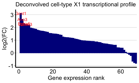
And now for cell-type 1:
celltype <- 1
## highly expressed in cell-type of interest
highgexp <- names(which(deconGexp[celltype,] > 5))
## high log2(fold-change) compared to other deconvolved cell-types
log2fc <- sort(log2(deconGexp[celltype,highgexp]/colMeans(deconGexp[-celltype,highgexp])), decreasing=TRUE)
markers <- names(log2fc)[1:4]

# -----------------------------------------------------
## visualize the transcriptional profile
dat <- data.frame(values = as.vector(log2fc), genes = names(log2fc), order = seq(length(log2fc)))
# Hide all of the text labels.
dat$selectedLabels <- ""
dat$selectedLabels[1:4] <- markers

plt <- ggplot2::ggplot(data = dat) +
  ggplot2::geom_col(ggplot2::aes(x = order, y = values,
                                 fill = factor(selectedLabels == ""),
                                 color = factor(selectedLabels == "")), width = 1) +

  ggplot2::scale_fill_manual(values = c(STdeconvolve::transparentCol("darkblue", percent = 0),
                                        STdeconvolve::transparentCol("darkblue", percent = 0)
                                        )) +
  ggplot2::scale_color_manual(values = c(STdeconvolve::transparentCol("darkblue", percent = 0),
                                         STdeconvolve::transparentCol("darkblue", percent = 0)
                                         )) +

  ggplot2::scale_y_continuous(expand = c(0, 0), limits = c(min(log2fc) - 0.3, max(log2fc) + 0.3)) +
  ggplot2::scale_x_continuous(expand = c(0, 0), limits = c(-2, NA)) +

  ggplot2::labs(title = "Deconvolved cell-type X1 transcriptional profile",
                x = "Gene expression rank",
                y = "log2(FC)") +

  ggplot2::geom_text(ggplot2::aes(x = order, y = values, label = selectedLabels), color = "red") +

  ggplot2::theme_classic() +
  ggplot2::theme(axis.text.x = ggplot2::element_text(size=15, color = "black"),
                 axis.text.y = ggplot2::element_text(size=15, color = "black"),
                 axis.title.y = ggplot2::element_text(size=15, color = "black"),
                 axis.title.x = ggplot2::element_text(size=15, color = "black"),
                 axis.ticks.x = ggplot2::element_blank(),
                 plot.title = ggplot2::element_text(size=15),
                 legend.text = ggplot2::element_text(size = 15, colour = "black"),
                 legend.title = ggplot2::element_text(size = 15, colour = "black", angle = 90),
                 panel.background = ggplot2::element_blank(),
                 plot.background = ggplot2::element_blank(),
                 panel.grid.major.y = ggplot2::element_line(size = 0.3, colour = STdeconvolve::transparentCol("gray80", percent = 0)),
                 axis.line = ggplot2::element_line(size = 1, colour = "black"),
                 legend.position="none"
                 )
plt
And the spatial expression of the top genes:
## visualize spatial expression of top genes
df <- merge(as.data.frame(pos),
            as.data.frame(t(as.matrix(counts[markers,]))),
            by = 0)
ps <- lapply(markers, function(marker) {
  vizGeneCounts(df = df,
              gene = marker,
              # groups = annot,
              # group_cols = rainbow(length(levels(annot))),
              size = 3, stroke = 0.1,
              plotTitle = marker,
              winsorize = 0.05,
              showLegend = TRUE) +

    ## remove the pixel "groups", which is the color aesthetic for the pixel borders
    ggplot2::guides(colour = "none") +

    ## change some plot aesthetics
    ggplot2::theme(axis.text.x = ggplot2::element_text(size=0, color = "black", hjust = 0, vjust = 0.5),
                   axis.text.y = ggplot2::element_text(size=0, color = "black"),
                   axis.title.y = ggplot2::element_text(size=15),
                   axis.title.x = ggplot2::element_text(size=15),
                   plot.title = ggplot2::element_text(size=15),
                   legend.text = ggplot2::element_text(size = 15, colour = "black"),
                   legend.title = ggplot2::element_text(size = 15, colour = "black", angle = 90),
                   panel.background = ggplot2::element_blank(),
                   ## border around plot
                   panel.border = ggplot2::element_rect(fill = NA, color = "black", size = 2),
                   plot.background = ggplot2::element_blank()
                   ) +
    ggplot2::guides(fill = ggplot2::guide_colorbar(title = "Counts",
                                                   title.position = "left",
                                                   title.hjust = 0.5,
                                                   ticks.colour = "black",
                                                   ticks.linewidth = 2,
                                                   frame.colour= "black",
                                                   frame.linewidth = 2,
                                                   label.hjust = 0
                                                   ))
})
gridExtra::grid.arrange(
  grobs = ps,
  layout_matrix = rbind(c(1, 2),
                        c(3, 4))
)