Cells Clustered By Gene Expression

What data are you visualizing
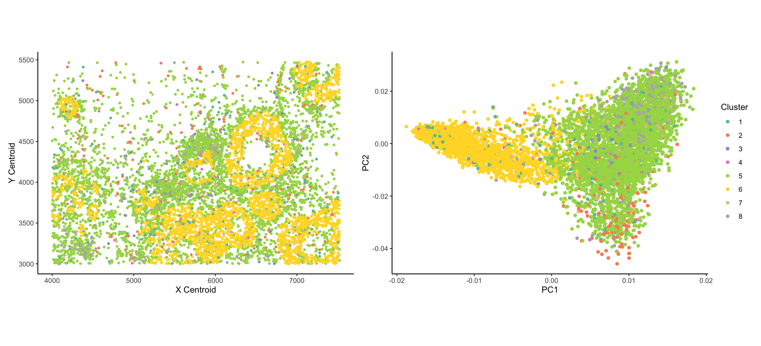
I wanted to visualize how the expression of different genes distinguishes types of cells and how the distinct types of cells are organized spatially. Coloring the cells by expression of a given gene is useful for this, but a priori I can’t tell which genes are useful for this task, and I am very limited in the number of genes I can visualize at once in this manner. Therefore, prior to plotting, I clustered the data using k-means clustering. I both panels, I am visualizing categorical data of the cluster of each cell - clustering is based on the quantitative MERFISH count data. [From what I can tell, the ordering of clusters is arbitrary; if cluster numbers were meaningful, data would be ordinal]. In the left panel, I visualize the spatial data of x centroid and y centroid location. In the right panel, I visualize the quantitative data of principal components 1 and 2 of the data.
What data encodings (geometric primitives and visual channels) are you using to visualize these data types?
In both plots, cells are represented by the geometric primitive of points. Cluster identity is represented using the color visual channel. In the left panel, I use the visual channels of x position and y position to represent the x and y centroids, respectively. In the right panel, I use the visual channel of x and y position to represent the PC1 and PC2 values corresponding to each cell.
What type of data visualization is this? What about the data are you trying to make salient through this data visualization?
My data visualizations are two scatter plots. The plot on the left tries to make salient the relationship between cell type (represented by cluster) and spatial organization. The visualization in particular shows that cells from cluster 6 tend to form ring-like structures; cells from cluster 5 are evenly and widely dispersed throughout the area; and cells from other clusters are more sparsely distributed. The figure on the right tries to address the proportion of cell expression variance represented by different cell clusters. The figure demonstrates that cells can broadly be divided between cluster 6 and all other clusters.
What Gestalt principles or knowledge about perceptiveness of visual encodings are you using to accomplish this?
Explicitly, I am making use of the Gestalt principle of Similarity - cells that are colored the same belong to the same cluster. The color-coding reinforces their group identity. From the lecture, Dr. Fan mentioned that the visible spectrum is commonly divided into ~8 clusters; based on this, I divided the data into 8 clusters. [The original paper uses a more rigorous criteria for identifying the number of clusters, but this was beyond the scope of what I could get done for this assignment]. In the right plot, I make use of the Gestalt principle of proximity - cells that are nearby on the PCA plot are more similar to each other. Looking at the left plot, the rings structures of cluster 6 cells demonstrate the Gestalt principle of Continuity - the cells are not actually forming a continuous ring structure, but the ring structures emerge as being evident. This, however, is a result of the underlying data and is not a conscious design decision made by me.
library(ggplot2)
library(tidyverse)

# Data import
squirtle <- read.csv('~/genomic_data_viz/squirtle.csv.gz')

# Dr. Fan's data manipulations
# Taken from live coding
pos <- squirtle[,2:3]
area <- squirtle[,4]
gexp <- squirtle[,5:ncol(squirtle)]
rownames(pos) <-  names(area) <- rownames(gexp) <-  squirtle[,1]

# Normalization based on methods from Zhang, M., Eichhorn, S.W., Zingg, B. et al.
#Spatially resolved cell atlas of the mouse primary motor cortex by MERFISH.
#Nature 598, 137–143 (2021). https://doi.org/10.1038/s41586-021-03705-x

#############################
#Normalizing by Median Count#
#############################

# "we normalized the total RNA counts for each cell to the median total RNA counts of all cells and log-transformed the cell-by-gene matrix"

# Getting counts per cell and median
totalCountsPerCell <- rowSums(gexp)
medCountPerCell <- median(totalCountsPerCell)

# Normalization function
normalizeMedCount <- function(exp_data, rnumber, medCount) {
  for (i in 1:length(exp_data[rnumber,])){
    exp_data[rnumber, i] <- as.numeric(exp_data[rnumber,i]/totalCountsPerCell[rnumber]*medCountPerCell)
  }
  return(exp_data[rnumber, ])
}

# Running normalization function an all rows
gexpNorm <- gexp

for (j in 1:nrow(gexpNorm)) {
  gexpNorm[j,] <-  normalizeMedCount(gexpNorm, j, medCountPerCell)
}

# One row has NaN for all normalized counts since all raw counts were 0.
# Found it with this line of code: gexpNorm[is.nan(rowSums(gexpNorm)),] - it is cell 13612

# Removing it:
gexpNorm <- gexpNorm[!(row.names(gexpNorm) == "13612"),]

####################
#Log Transformation#
####################
gexpNormLog <- gexpNorm + 1 # adding one to avoid negative infinity for 0 counts

gexpNormLog <-  log(gexpNormLog)

##################
#Z Transformation#
##################

# `We then normalized their expression profiles by computing the z-score for each gene.`

# Z score function
zTransform <- function(exp_data, colNum) {
  m <- mean(exp_data[, colNum])
  s <- sd(exp_data[, colNum])
  for (i in 1:nrow(exp_data)){
    exp_data[i, colNum] <-  (exp_data[i, colNum] - m) / s
  }
  return(exp_data[, colNum])
}

# Z score transformation
gexpNormLogZtransformed <- gexpNormLog

for (j in 1:ncol(gexpNormLogZtransformed)) {
  gexpNormLogZtransformed[,j] <-  zTransform(gexpNormLogZtransformed, j)
}

#####
#PCA#
#####

# Transposed so that taking PCA across cells, not across genes
pca_out <- prcomp(t(gexpNormLogZtransformed))

# Finding number of PCs to retain based on Kaiser Criterion
#eig.val <- pca_out$sdev^2
#sum(eig.val > 1)
# This gives 312

####################
#K Means Clustering#
####################
k_8 <- kmeans(pca_out$rotation[,1:312], centers=8, nstart = 25)
k_16 <- kmeans(pca_out$rotation[,1:312], centers=16, nstart = 25)

# Extracting cluster info
clus_8 <- k_8$cluster
clus_16 <- k_16$cluster

##########
#Plotting#
##########

pos <- pos[!(row.names(pos) == "13612"),]
plot_me <- cbind(pos, clus_8)
plot_me <- cbind(pos, clus_16) %>%
  mutate(clus_8 = as.factor(clus_8)) %>%
  mutate(clus_16 = as.factor(clus_16))

p1 <- ggplot(data=plot_me, aes(x = x_centroid, y=y_centroid, color = clus_8)) +
  geom_point(size = 1) +
  xlab('X Centroid') +
  ylab('Y Centroid') +
  scale_color_brewer(palette = "Set2", name = "Cluster", guide="none") +
  theme_classic() +
  coord_fixed()


# Adding PCA Plot
pca_coords <- cbind(PC1=pca_out$rotation[, "PC1"], PC2=pca_out$rotation[, "PC2"])
pca_coords <- cbind(pca_coords, PC3=pca_out$rotation[, "PC3"])
pca_coords <- cbind(pca_coords, Cluster = clus_8)
pca_coords <- as.data.frame(pca_coords) %>%
  mutate(Cluster = as.factor(Cluster))

p2 <- ggplot(data=pca_coords, aes(x = PC1, y=PC2, color = Cluster)) +
  geom_point() +
  xlab('PC1') +
  ylab('PC2') +
  theme_classic() +
  scale_color_brewer(palette = "Set2", name = "Cluster")

p1 + p2
Sources:
I based data pre-processing and clustering on the methods from the following paper: Zhang, M., Eichhorn, S.W., Zingg, B. et al. Spatially resolved cell atlas of the mouse primary motor cortex by MERFISH.Nature 598, 137–143 (2021). https://doi.org/10.1038/s41586-021-03705-x
I skipped a number of pre-processening steps, but followed the data normalization pipeline fairly closely.
Consulted this page to learn how to unname a named number: https://stackoverflow.com/questions/32506116/subsetting-data-frame-without-column-names
Row removing code adapted from here: https://stackoverflow.com/questions/37525937/how-to-delete-a-row-in-a-data-frame-by-name-in-r There’s got to a be an easier way to remove a row by name, but I honestly can’t think of one rn. [This whole issue with the empty row would have been avoided if I had done some of the preprocssesing steps that I skipped]
For z transformation, I consluted this source: https://stackoverflow.com/questions/15215457/standardize-data-columns-in-r
Found the base R PCA function here: https://www.datacamp.com/tutorial/pca-analysis-r
Following this doc for clustering: https://rpubs.com/Bury/ClusteringOnPcaResults
Eigenvalue formula taken from here: https://stat.ethz.ch/pipermail/r-help/2005-August/076610.html
Adapted k-means clustering approach from here: https://uc-r.github.io/kmeans_clustering
ggplot2 legend title modification taken from here: https://stackoverflow.com/questions/14622421/how-to-change-legend-title-in-ggplot
scale_color_brewer palette info: https://ggplot2.tidyverse.org/reference/scale_brewer.html#palettes