Comparing the relationship between Growth Factor Receptors Expression and Cell Area

What data types are you visualizing?
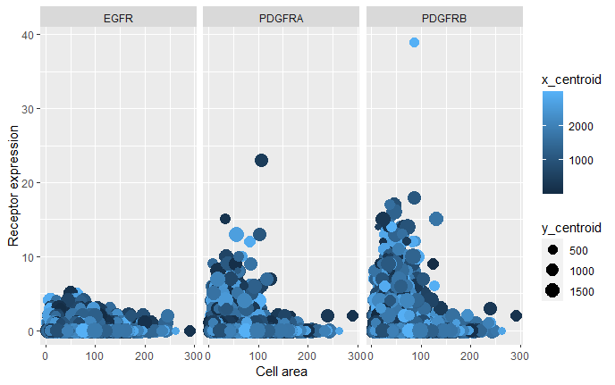
I am visualizing quantitative data of the expression count of the EGFR, PDGFRA and PDGFRB genes for each cell, quantitative data of the area for each cell, and spatial data regarding the x,y centroid positions for each cell. For comparison, the gene expression of each receptor in plotted side by side.
What data encodings are you using to visualize these data types?
I am using the geometric primitive of points to represent the cells. To encode expression count of the growth factor receptor genes, I am using the visual channel of position along the y axis. To encode the area for each cell, I am using the visual channel of position along the x axis. To encode the different receptors, I am using the visual channel of position side-by-side plots (Gestalt principle of proximity and enclosure, by using different plots). To encode the spatial x position, I am using the visual channel of color saturation (from black to light-blue). To encode the spatial y position, I am using the visual channel of size.
What type of data visualization is this? What about the data are you trying to make salient through this data visualization?
My data visualization seeks to make more salient the different amounts of each receptor expression per cell area.
What Gestalt principles or knowledge about perceptiveness of visual encodings are you using to accomplish this?
I am using the Gestalt principle of proximity to show each receptor gene, and their distribution per cell area.
Code
file <- '~/Desktop/genomic-data-visualization-2023/data/pikachu.csv.gz'
data <- read.csv(file, row.names=1)

#Install and call libraries:

# install.packages("writexl")
# install.packages("reshape2")
# install.packages("tibble")
# install.packages("dplyr")
# library(ggplot2)
# library(dplyr)
# library(reshape2)

# Upload data to data frame:

?read.csv
data <- read.csv('pikachu.csv.gz')

# # Filter and melt data:
new_data2 <- data[,c('x_centroid','y_centroid','area','EGFR','PDGFRA','PDGFRB')]
melted_data <- melt(new_data2,id = c("area", "x_centroid","y_centroid"),variable.name = 'Receptor')

# Visualize data
ggplot(melted_data, aes(x = area, y = value, color = x_centroid, size = y_centroid)) + geom_point() + facet_grid(. ~Receptor) + ylab('Receptor expression') + xlab('Cell area')
References
This work was designed based on the following references: https://rpubs.com/guester/192565 https://sparkbyexamples.com/r-programming/create-dataframe-from-existing-dataframe-in-r/ https://www.statology.org/plot-multiple-columns-in-r/
(do you think my data visualization is effective? why or why not?)