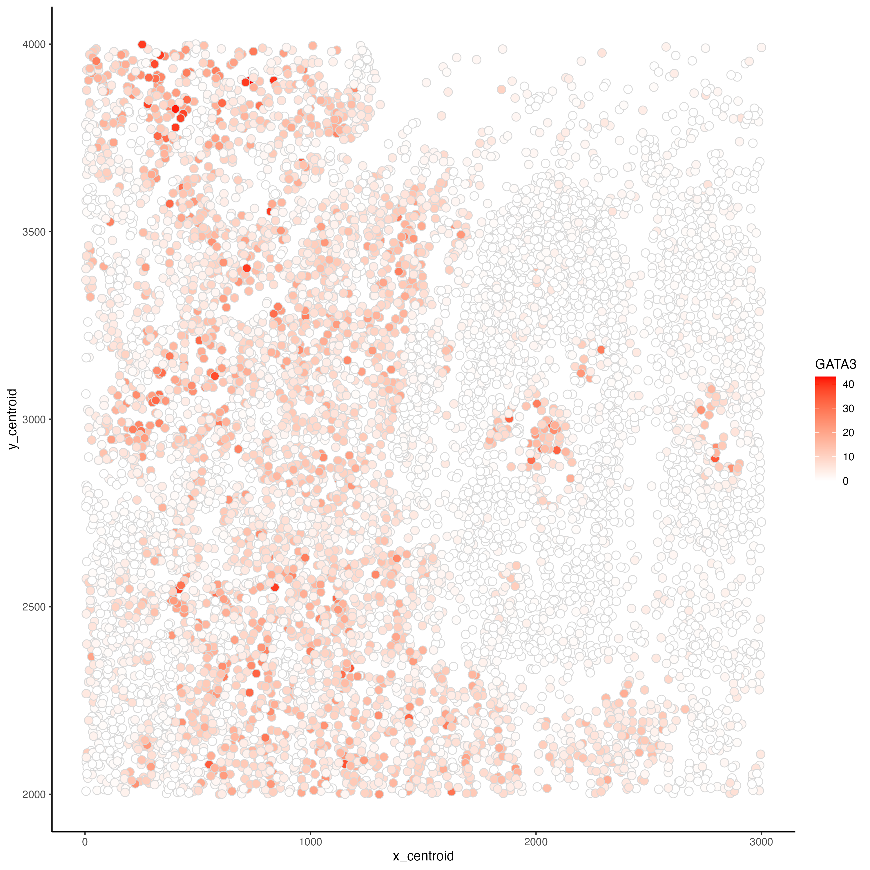
Relationship between cells' spatial position and GATA3 expression

What data types are you visualizing?
In this plot, I am visualizing quantitative data of each cell’s expression count of the GATA3 gene and quantitative data of each cell’s spatial data on the x,y centroid positions.
What data encodings are you using to visualize these data types?
Each cell is represented as points on the plot, using the geometric primitive of points. To encode spatial data on the x,y centroid positions, I used the visual channel of position along the x axis and y axis for x centroid positions and y centroid positions, respectively. To encode the expression count of the GATA3 gene, I am using the visual channel of saturation going from white to red with increasing expression count. In addition, since I am using the color white for 0 expression count, I am also using the visual channel of color light grey to mark the edges of each point to prevent cells with 0 expression count from obscuring each others’ positions.
What type of data visualization is this? What about the data are you trying to make salient through this data visualization?
In this explanatory data visualization, I seek to make more salient the relationship between GATA3 expression and cells’ x,y centroid positions to identify any spatial pattern on GATA3 expression.
What Gestalt principles or knowledge about perceptiveness of visual encodings are you using to accomplish this?
Even though GATA3 expression count is a quantitative data, I am using the Gestalt principle of similarity to suggest that red colored cells belong to a certain cell type or subset of a cell type while white colored cells do not.
Code
## load library
library(ggplot2)

## read in data
data <- read.csv('~/Desktop/genomic data visualization 2023 data (copy)/bulbasaur.csv.gz')

## plot
# reference for scale_colour_gradient (applied this concept to scale_fill_gradient): https://r-graphics.org/recipe-colors-palette-continuous
# reference for changing geom_point edge color: https://stackoverflow.com/questions/10437442/place-a-border-around-points
# reference for pch symbols: http://www.sthda.com/english/wiki/r-plot-pch-symbols-the-different-point-shapes-available-in-r
# reference for predefined colour names: http://sape.inf.usi.ch/quick-reference/ggplot2/colour
# reference for saving ggplot as png: https://www.datanovia.com/en/blog/how-to-save-a-ggplot/, https://ggplot2.tidyverse.org/reference/ggsave.html

pl <- ggplot(data = data) +
  geom_point(aes(x = x_centroid, y = y_centroid,
                 fill = GATA3),
             colour = "grey85", pch = 21, size = 3) +
  scale_fill_gradient(
    low = "white",
    high = "red"
  ) +
  theme_classic()

## save plot
ggsave("hw1_gaihara1.png", plot = pl, width = 10, height = 10, dpi = 300)
(do you think my data visualization is effective? why or why not?)