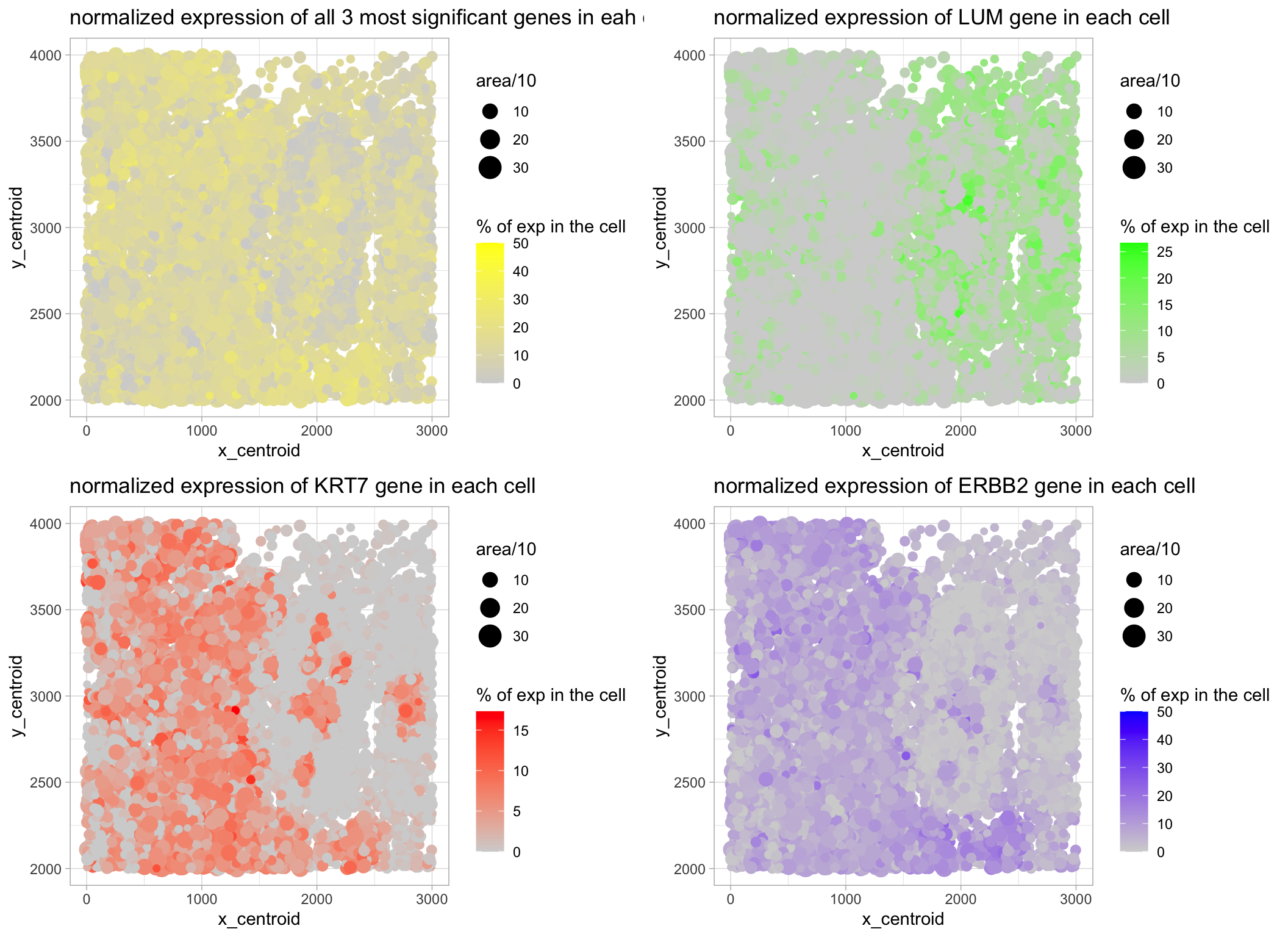
Spatial Expression of the 3 Most Significantly Expressed Genes in All Cells

What data types are you visualizing?
I am visualizing quantitative data of the expression level of the three most significantly expressed genes across all cells for each cell, quantitative data of the area for each cell, and spatial data regarding the x,y centroid positions for each cell. ** To rank the most robustly expressed genes, I ranked the raw expression count of each gene across all cell. To acquire how much of the total gene expression of a given cell could be attributed to each gene (representing it in percentage), I first normalized the expression of each cell according to the mean value of the total expression of each cell.
What data encodings are you using to visualize these data types?
I am using the geometric primitive of points to represent each cell. To encode expression count of each gene, I am using the visual channel saturation going from an unsaturated lightgrey to a saturated blue. To encode different cells, I am using the visual channel of color. To encode the area for each cell, I am using the visual channel of size (area/10). To encode the spatial x position, I am using the visual channel of position along the x axis. To encode the spatial y position, I am using the visual channel of position along the y axis. (answer modified from Prof. Fan:)
What type of data visualization is this? What about the data are you trying to make salient through this data visualization?
My explanatory data visualization seeks to make more salient to see if there is a relationship between the spatial position & size and how robust is the expression of gene of interest in any cell (% of total expression). Also, I am trying to make more salient if there is a spatial difference between the expression levels of the 3 most significantly expressed genes, and their pooled levels.
What Gestalt principles or knowledge about perceptiveness of visual encodings are you using to accomplish this?
I am using the Gestalt principle of proximity to put my legends on one side, and the principle of similarity by representing expression of different genes / pooled expression with different colors. (answer modified from Dr. Fan)
Code
Reference:
Thanks to classmates for some ideas:)

drop all columns whose values sum to 0: https://stat.ethz.ch/pipermail/r-help/2007-April/130646.html

get the most highly expressed gene name:
https://stackoverflow.com/questions/20679702/r-find-column-with-the-largest-column-sum

figure out how to concatenate strings:
https://www.geeksforgeeks.org/string-concatenation-in-r-programming/

figure out how to access the names in a ~soft way:
https://stackoverflow.com/questions/67128776/cannot-access-column-when-using-for-loop-in-r

figure out how to arrange plots:
http://www.sthda.com/english/articles/24-ggpubr-publication-ready-plots/81-ggplot2-easy-way-to-mix-multiple-graphs-on-the-same-page/

```{r setup, include=FALSE}
knitr::opts_chunk$set(echo = TRUE,fig.height = 4, fig.width = 5.5)

library(ggplot2)
library(gridExtra)
library(dplyr)

data <- read.csv("~/Desktop/GitHub_Repo/genomic-data-visualization-notes/project/bulbasaur.csv",row.names = 1)

# screen valid entries only
gexp <- data[,5:ncol(data)]
data <- data[(rowSums(gexp)>0),]
data$mean <- rowSums(gexp)
meanCount <- mean(data$mean)

# normalize
data[,5:ncol(data)] <- data[,5:ncol(data)] / meanCount

# drop col sums 0 (genes not expressed in any samples)
data <- data[, which(colSums(data) != 0)]

# get the names of the most higly expressed genes

highest_genes <- names(sort(colSums(gexp[,2:length(gexp)]), decreasing = TRUE)[1:3])


```{r plotting}

p1 <- ggplot(data = data) + geom_point(aes (x = x_centroid, y = y_centroid, col = 100*data[[highest_genes[1]]]/mean, size = area/10)) +
    scale_colour_gradient(low ='lightgrey',high='blue',name = "% of exp in the cell" )+
    theme_light() +
    ggtitle(paste("normalized expression of",highest_genes[1],"gene in each cell", sep = " "))

p2 <- ggplot(data = data) + geom_point(aes (x = x_centroid, y = y_centroid, col = 100*data[[highest_genes[2]]]/mean, size = area/10)) +
    scale_colour_gradient(low ='lightgrey',high='red',name = "% of exp in the cell" )+
    theme_light() +
    ggtitle(paste("normalized expression of",highest_genes[2],"gene in each cell", sep = " "))

p3 <- ggplot(data = data) + geom_point(aes (x = x_centroid, y = y_centroid, col = 100*data[[highest_genes[3]]]/mean, size = area/10)) +
    scale_colour_gradient(low ='lightgrey',high='green',name = "% of exp in the cell" )+
    theme_light() +
    ggtitle(paste("normalized expression of",highest_genes[3],"gene in each cell", sep = " "))

p4 <- ggplot(data = data) + geom_point(aes (x = x_centroid, y = y_centroid, col = 100*(data[[highest_genes[3]]] +data[[highest_genes[2]]] + data[[highest_genes[1]]]) /mean, size = area/10)) +
    scale_colour_gradient(low ='lightgrey',high='yellow',name = "% of exp in the cell" )+
    theme_light() +
    ggtitle(paste("normalized expression of all 3 most significant genes in eah cell", sep = " "))


grid.arrange(p4, p3,p2,p1, nrow =2)