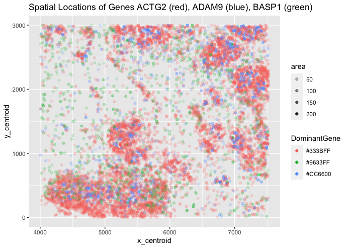
Spatial Relationship between ACTG2, ADAM9, and BASP1

What data types are you visualizing?
My categorical data is the gene with the highest expression dictating the color, my spatial data is the x and y centroids depicting the spatial location of the expressions, and my quantitative data is the area of each expression (as well as the spatial centroid positions).
What data encodings are you using to visualize these data types?
I am using points to visualize specific gene expressions, colors to visualize gene dominance, and position to visualize spatial relationships. These encodings cover both geometric primitives and visual channels. For colors, ACTG2 is red, ADAM9 is blue, and BASP1 is green. Note that these are displaying the dominant gene in the spatial area, so other genes may be expressed at lower levels without being shown by this graphic.
What type of data visualization is this? What about the data are you trying to make salient through this data visualization?
I am attempting to visualize the spatial relationships between dominant gene expression across 3 possible genes. I am trying to make more saliant the 3-way relationship between gene expression, hopefully allowing the viewer to quickly understand where each gene dominants spatially.
What Gestalt principles or knowledge about perceptiveness of visual encodings are you using to accomplish this?
I am attempting to use the Gestalt principle of similarity and proximity to group each cluster of alike gene dominances together quickly, and a small bit of continuity as these clusters form apparent groups in the viewers eye (especially for red and blue genes). This allows the distinction between gene dominance groups to be as clear as possible without limiting the information provided to the viewer. Relative to some other charts, it is not the cleanest graphic, but I chose to sacrifice a little bit of saliance to try to capture more information for the viewer (such as area being involved instead of simple, solid colors).
Code
set.seed(0)

data <- read.csv("charmander.csv")

library(ggplot2)

nonZero = list()
geneList1 = data['ACTG2']
geneList2 = data['ADAM9']
geneList3 = data['BASP1']

i = 1
while (i < 8487) {
  num1 = geneList1[i,]
  num2 = geneList2[i,]
  num3 = geneList3[i,]
  if (num1 >= num2 && num1 >= num3){
    nonZero <- append(nonZero, "#333BFF")
    }
  else if (num2 >= num1 && num2 >= num3){
    nonZero <- append(nonZero, "#CC6600")
    }
  else if (num3 >= num2 && num3 >= num1){
    nonZero <- append(nonZero, "#9633FF")
    }
  i = i + 1
}

DominantGene = unlist(nonZero)

ggplot(data = data) +
  geom_point((aes(x = x_centroid, y = y_centroid, color = DominantGene, alpha = area))) +
  ggtitle("Spatial Locations of Genes ACTG2 (red), ADAM9 (blue), BASP1 (green)")

ggsave(filename = 'esimon10_hw1_gdv.png')

#I give credit to https://stackoverflow.com/questions/17180115/manually-setting-group-colors-for-ggplot2 for the information of setting manual colors.