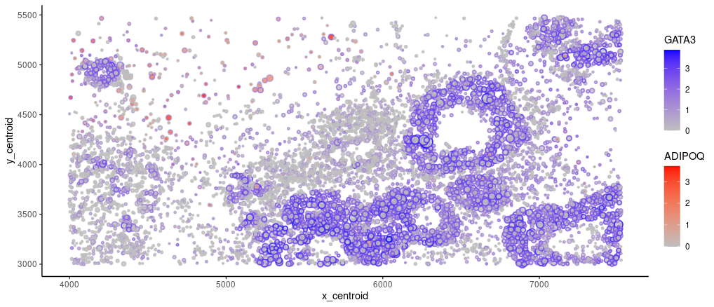
Spatial Distribution of GATA3 and ADIPOQ expressions

What data types are you visualizing?
I am visualizing quantitative data of the expression of GATA3 (gene of interest) and ADIPOQ (the most highly variable) gene for cells with at least 1 UMI. I am also displaying quantitative data of the cell areas and x, y centroid positions.
What data encodings are you using to visualize these data types?
I am using the geometric primitive of points to represent cells. The visual channel of positions along y axis and along x axis encode cells’ centroid positions. Visual channel of size is used to encode segmented cell area. Visual channel of saturation is used to encode gene expression of GATA3 and ADIPOQ. GATA3’s expression is represented with points’ broder color, which goes from unsaturated gray to saturated blue. ADIPOQ’s expression is represented with points’ filled color, which goes from unsaturated gray to saturated red.
What type of data visualization is this? What about the data are you trying to make salient through this data visualization?
My data visualization seeks to make more salient the tissue origin by highlighting GATA3 (highly expressed in endotheliel cells) d ADIPOQ (highly expressed in adipose cells)’s expression distribution.
What Gestalt principles or knowledge about perceptiveness of visual encodings are you using to accomplish this?
I am using the Gestalt principle of proximity to indicate a cluster of cells, potentially sharing a common cell type identity.
Code
library(ggplot2)

# Read in data, partition metadata and counts
data <- read.csv("squirtle.csv.gz")
posn <- data[,2:3]
area <- data[,4]
gene <- data[,5:ncol(data)]
rownames(posn) <- names(area) <- rownames(gene) <- data$X

# Remove cells with 0 UMI count
UMIs <- rowSums(gene)
valid<- UMIs > 0
posn <- posn[valid,]
area <- area[valid ]
gene <- gene[valid,]

# Log transformation pseudo-count matrix (assume already normalized)
gene <- log(1+gene)

# Find the most highly variable gene by dispersion
variance <- apply(gene, 2, var)
means    <- colMeans(gene)
dispersn <- variance / means
most_hvg <- names(which.max(dispersn))

# Re-build a data matrix
newdata <- cbind(posn, area, gene)

# Visualize (both HVG and my gene of interest GATA)
ggplot(data=newdata,
       aes(x=x_centroid,
           y=y_centroid)) +
  geom_point(aes_string(color="GATA3",
                        fill =most_hvg),
             size  =area/50,
             shape =21,
             stroke=1,
             alpha =0.8) +
  scale_color_gradient(low="gray", high="blue") +
  scale_fill_gradient (low="gray", high="red") +
  theme_classic()