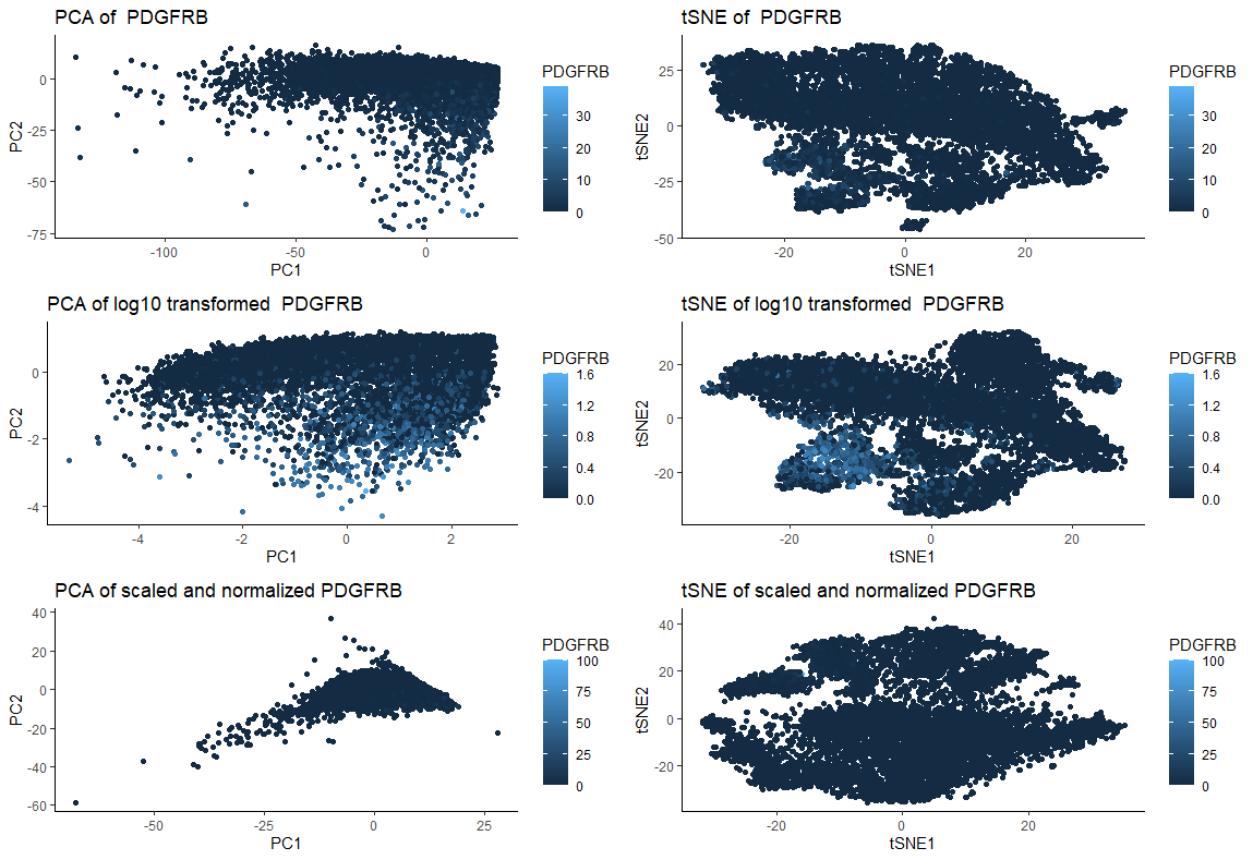
The effects of log transformation, scaling and normalization prior to PCA and non-linear dimensionality reduction (tSNE) on PDGFRB gene expression data

What data types are you visualizing?
I am visualizing quantitative data of 2 dimensional reduction through PCA and tSNE of original PDGFRB expression for each cell, quantitative data of 2 dimensional reduction through PCA and tSNE of log10 transformed PDGFRB expression for each cell, and 2 dimensional reduction through PCA and tSNE of scaled and normalized (to maximum gene expression) PDGFRB expression for each cell.
What data encodings are you using to visualize these data types?
I am using the geometric primitive of points to represent each cell. For expression count of the gene, I am using the visual channel of color saturation (from light blue to dark blue).
What type of data visualization is this? What about the data are you trying to make salient through this data visualization? What Gestalt principles have you applied towards achieving this goal if any?
My goal was to make salient and visually compare the effects of performing log10 transformation or scaling followed by normalization with using untransformed/unscaled/unnormalized data prior to dimensionality reduction with PCA and tSNE. For that, I am applying the Gestalt principle of similarity (similar color representing similar gene expression). In the figure, the left column of plots represent PCA and the right represent tSNE. The first line shows the response of the “original” (untransformed/not scaled/ unnormalized) data. The second line shows the response to dimensionality reduction post log10 transformation. Finally, the last line shows the response to dimensionality reduction post scaling and normalization (to maximum gene expression). Both PCA and tSNE are sensitive to the to the relative scale of the features used (https://towardsdatascience.com/understanding-pca-fae3e243731d), as we can see by the graphics. Therefore, not scaling the data can lead to misleading results.
References:
1) https://datavizpyr.com/how-to-make-tsne-plot-in-r/ 2) Lecture from Dr. Fan. 3) https://crunchingthedata.com/when-to-use-t-sne/#:~:text=Sensitive%20to%20scale.,undue%20influence%20on%20the%20results.
Please share the code you used to reproduce this data visualization.
# install.packages('tidyverse')
library(tidyverse)
library(Rtsne)
library(ggplot2)
library(gridExtra)
theme_set(theme_bw(18))

data <- read.csv('pikachu.csv.gz', row.names = 1)
gexp <- data[, 4:ncol(data)] # drop initial columns

## Log 10 transformed data:

mat <- log10(gexp+1) #  log transform gene expression data +1

################################################################################
##################################################################################

## PCA log10 transformed:


pcs <- prcomp(mat) ## raw counts --> principal component analysis on data mat
###### make a data visualization to explore our first two PCs
df <- data.frame(pcs$x[,1:2], PDGFRB = log10(gexp[,'PDGFRB']+1))


################################################################################
##################################################################################


## tSNE log10 transformed:


# Remove missing data and add unique ID row:
genes <- mat %>%
  drop_na()%>%
  mutate(ID=row_number())

# Select a gene:
genes_meta <- genes %>%
  select(ID,PDGFRB)

# performing tSNE
set.seed(0)
tSNE_fit <- genes %>%
  select(where(is.numeric)) %>%
  column_to_rownames("ID") %>%
  Rtsne(check_duplicates = FALSE)

tSNE_df <- tSNE_fit$Y %>%
  as.data.frame() %>%
  rename(tSNE1="V1",
        tSNE2="V2") %>%
  mutate(ID=row_number())

tSNE_df <- tSNE_df %>%
  inner_join(genes_meta, by="ID")

# Plot data:


p1 <- ggplot(data = df, aes(x = PC1, y = PC2, col=PDGFRB)) +
  geom_point() +
  theme_classic() +
   ggtitle('PCA of log10 transformed  PDGFRB ')

p2 <- ggplot(data = tSNE_df,aes(x = tSNE1,
                 y = tSNE2,
                 color = PDGFRB)) +
  geom_point()+
  theme_classic() +
    theme(legend.position="right") + ggtitle('tSNE of log10 transformed  PDGFRB ')


##################################################################################
###################################################################################
# original data
################################################################################
##################################################################################

## PCA original
mat_not_norm <- gexp #


pcs2 <- prcomp(mat_not_norm) ## raw counts --> principal component analysis on data mat
###### make a data visualization to explore our first two PCs

df2 <- data.frame(pcs2$x[,1:2], PDGFRB = (gexp[,'PDGFRB']))


################################################################################
##################################################################################


## tSNE original:


# Remove missing data and add unique ID row:
genes2 <- mat_not_norm %>%
  drop_na()%>%
  mutate(ID=row_number())

# Select a gene:
genes_meta2 <- genes2 %>%
  select(ID,PDGFRB)

# performing tSNE
set.seed(0)
tSNE_fit2 <- genes2 %>%
  select(where(is.numeric)) %>%
  column_to_rownames("ID") %>%
  Rtsne(check_duplicates = FALSE)

tSNE_df2 <- tSNE_fit2$Y %>%
  as.data.frame() %>%
  rename(tSNE1="V1",
         tSNE2="V2") %>%
  mutate(ID=row_number())

tSNE_df2 <- tSNE_df2 %>%
  inner_join(genes_meta2, by="ID")

# Plot data:


p3 <- ggplot(data = df2, aes(x = PC1, y = PC2, col=PDGFRB)) +
  geom_point() +
  theme_classic() + ggtitle('PCA of  PDGFRB ')


p4 <- ggplot(data = tSNE_df2,aes(x = tSNE1,
                                y = tSNE2,
                                color = PDGFRB))+
  geom_point()+
  theme_classic() +
theme(legend.position="right")+ ggtitle('tSNE of  PDGFRB ')


##################################################################################
###################################################################################
# Scaled data
################################################################################
##################################################################################

## PCA scaled and normalized
mat_sc <- scale(gexp) #

totgenes <- rowSums(gexp)
good.cells <- names(totgenes)[totgenes > 0]
mat_sc <- gexp[good.cells,]/totgenes[good.cells] # Normalizing data
mat_sc <- mat_sc * 100 # scaling data


pcs3 <- prcomp(mat_sc) ## raw counts --> principal component analysis on data mat
###### make a data visualization to explore our first two PCs

df3 <- data.frame(pcs3$x[,1:2], PDGFRB = (mat_sc[,'PDGFRB']))


################################################################################
##################################################################################


## tSNE scaled:

# Remove missing data and add unique ID row:
genes3 <- mat_sc %>%
  drop_na()%>%
  mutate(ID=row_number())

# Select a gene:
genes_meta3 <- genes3 %>%
  select(ID,PDGFRB)

# performing tSNE
set.seed(0)

tSNE_fit3 <- genes3 %>%
  select(where(is.numeric)) %>%
  column_to_rownames("ID") %>%
  Rtsne(check_duplicates = FALSE)

tSNE_df3 <- tSNE_fit3$Y %>%
  as.data.frame() %>%
  rename(tSNE1="V1",
         tSNE2="V2") %>%
  mutate(ID=row_number())

tSNE_df3 <- tSNE_df3 %>%
  inner_join(genes_meta3, by="ID")

# Plot data:


p5 <- ggplot(data = df3, aes(x = PC1, y = PC2, col=PDGFRB)) +
  geom_point() +
  theme_classic() + ggtitle('PCA of scaled and normalized PDGFRB ')


p6 <- ggplot(data = tSNE_df3,aes(x = tSNE1,
                                 y = tSNE2,
                                 color = PDGFRB))+
  geom_point()+
  theme_classic() +
  theme(legend.position="right")+ ggtitle('tSNE of scaled and normalized PDGFRB ')


par(mfrow=c(3,2))
plot(p1)
plot(p2)
plot(p3)
plot(p4)
plot(p5)
plot(p6)

grid.arrange(p3,p4,p1,p2,p5, p6, ncol=2, nrow =3)
(do you think my data visualization is effective? why or why not?)