Effects of normalizing by gene count in the reduced dimension visualization

What data types are you visualizing?
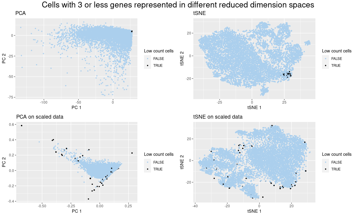
I present quantitative data of the PCA and tSNE reduced dimension applied to the raw gene expression data and the normalized by gene count one. I also show the ordinal data of less than three genes.
What data encodings are you using to visualize these data types?
The quantitative data is represented by the geometric primitive of a point and the visual channel of position while the ordinal data use the visual channel of hue.
What type of data visualization is this? What about the data are you trying to make salient through this data visualization?
I am showing how the normalization of gene expression by gene count affects the position of a group of cells in PCA and tSNE visualizations. Using this visualization, it is clear to see that when the data was not normalized, the cells with low gene count stayed close to each other, in accordance with what happened in the spatial data (https://jef.works/genomic-data-visualization-2023/blog/2023/01/27/rpeixot1/). However, when the data was normalized, the features that contributed to this situation were removed and the cells got sparse. For example, PCs 1 and 2 suffered from a high contribution of a set of genes, as the low gene count cells did not express many of those genes, they were located close to the (0,0) position, but when the data was normalized, this did not happen.
What Gestalt principles or knowledge about perceptiveness of visual encodings are you using to accomplish this?
I use the Gestalt principle of similarity to show that cells with the same color correspond to a group. The Gestalt principle of proximity was used to put the title on the top of the figures and legends on the side, showing which graphs they belonged to.
Code
library(tidyverse)

## load data
data <- read.csv("./data/pikachu.csv.gz", row.names = 1)
gexp <- as.matrix(data[4:ncol(data)])
dim(gexp)

## remove empty cells and update data
empty_cells <- rowSums(gexp) == 0
sum(empty_cells)
data <- data[!empty_cells, ]

## update variables
metadata <- data[, 1:4]
gexp <- as.matrix(data[4:ncol(data)])
dim(gexp)

## create position graph
p_pos <- metadata %>%
    mutate(count = rowSums(gexp)) %>%
    mutate(low_count_cells = ((count <= 3))) %>%
    ggplot() +
    geom_point(aes(x=x_centroid, y=y_centroid, color=low_count_cells),
               size=.8) +
    scale_color_manual(values=c("#ABCFED", "#000000")) +
    labs(title = "Spatial position of cells with low gene count",
         subtitle = "Cells with 3 or less genes expressed",
         x = "x centroid", y = "y centroid",
         color = "Low count cells")

## create PCA graph
pca <- prcomp(gexp)
p_pca <- pca$x[, 1:2] %>%
    data.frame() %>%
    mutate(count = rowSums(gexp)) %>%
    mutate(low_count_cells = ((count <= 3))) %>%
    ggplot() +
    geom_point(aes(x=PC1, y=PC2, color=low_count_cells),
               size=.8) +
    scale_color_manual(values=c("#ABCFED", "#000000")) +
    labs(title = "PCA",
         x = "PC 1", y = "PC 2",
         color = "Low count cells")

## create tSNE graph
library(Rtsne)
emb <- Rtsne(gexp, check_duplicates=FALSE)
p_tsne <- emb$Y %>%
    data.frame() %>%
    mutate(count = rowSums(gexp)) %>%
    mutate(low_count_cells = ((count <= 3))) %>%
    ggplot() +
    geom_point(aes(x=X1, y=X2, color=low_count_cells),
               size=.8) +
    scale_color_manual(values=c("#ABCFED", "#000000")) +
    labs(title = "tSNE",
         x = "tSNE 1", y = "tSNE 2",
         color = "Low count cells")

## normalize data
scl_gexp <- t(apply(gexp, 1, FUN = function(x){
    x/sum(x)
}))
dim(gexp)
dim(scl_gexp)

## scaled PCA
scl_pca <- prcomp(scl_gexp)
p_scl_pca <- scl_pca$x[,1:2] %>%
    data.frame() %>%
    mutate(count = rowSums(gexp)) %>%
    mutate(low_count_cells = ((count <= 3))) %>%
    ggplot() +
    geom_point(aes(x=PC1, y=PC2, color=low_count_cells),
               size=.8) +
    scale_color_manual(values=c("#ABCFED", "#000000")) +
    labs(title = "PCA on scaled data",
         x = "PC 1", y = "PC 2",
         color = "Low count cells")

## scaled tSNE
scl_emb <- Rtsne(scl_gexp, check_duplicates=FALSE)
p_scl_tsne <- scl_emb$Y %>%
    data.frame() %>%
    mutate(count = rowSums(gexp)) %>%
    mutate(low_count_cells = ((count <= 3))) %>%
    ggplot() +
    geom_point(aes(x=X1, y=X2, color=low_count_cells),
               size=.8) +
    scale_color_manual(values=c("#ABCFED", "#000000")) +
    labs(title = "tSNE on scaled data",
         x = "tSNE 1", y = "tSNE 2",
         color = "Low count cells")

## grid
library(grid)
library(gridExtra)
# grid.arrange title code from: https://stackoverflow.com/questions/14726078/changing-title-in-multiplot-ggplot2-using-grid-arrange
grid.arrange(p_pca, p_tsne, p_scl_pca, p_scl_tsne,
             top = textGrob("Cells with 3 or less genes represented in different reduced dimension spaces", gp=gpar(fontsize=20)))