Comparison of using normalized and unnormalized data on gene expression clustering in t-SNE graphs

What data types are you visualizing?
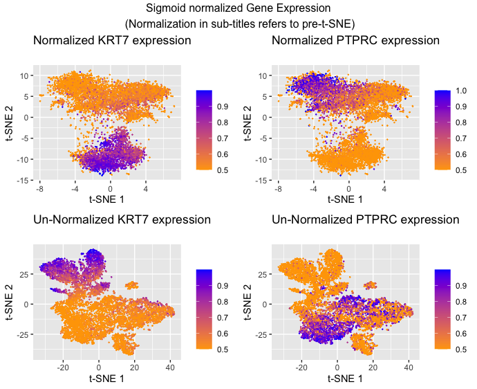
I am visualizing quantitative data of the comparative gene expression of two genes KRT7 and PTPRC. I am also visualizing the quantitative data of gene expression, specifically the quantitative similarity between gene expression in each cell (quantitative similarity scores used by t-SNE). Additionally, I am visualizing categorical data in the form of which gene expression data I’m showing and whether or not the data was normalized before t-SNE(Answer modified from Prof. Fan’s sample answer)
What data encodings are you using to visualize these data types?
I am using the geometric primitive of points to represent each cell. I am using points since these are typically recognized to mean individual data points (as opposed to lines and areas). To encode quantitative expression, I am using the visual channel of hue to represent the relative level of expression because while the data encoded is quantitative, I want to make more salient the trend of expression as you move positionally from cluster to cluster as opposed to the raw numbers being used which hue is better suited for as opposed to length or area. To encode the gene expression similarity I am using the visual channel of position along the x and y axis with closer values on the x-axis representing greater similarity of t-SNE 1 and closer values on the y-axis representing greater similarity of t-SNE 2. This is because (according to the chart) the best way to make a trend in position more salient is to use position. I also decided to separate the categories of normalized data from unnormalized data because the main encoding is the position of the points (which are different in those categories because of the different inputs to the t-SNE generation of position) making it hard to visualize in the same graph with the sheer number of points in the dataset. Finally, I decided to separate the categories of KRT7 and PTPRC because the main encoding of these points is the quantitative gene expression which is represented by hue. To encode this in the same graph you would need four colors (high and low for each) and this can make the trend confusing to see (at least to me). (Answer modified from Prof. Fan’s sample answer)
What type of data visualization is this? What about the data are you trying to make salient through this data visualization?
The goal of this data visualization was to investigate the usefulness of normalizing data (scaling) before doing dimensionality reduction in the form of t-SNE as an example. To make the usefulness of clustering salient in the visualization, I decided to overlay gene expression of two genes that I knew were anti-correlated as a way of demonstrating how effective the clustering was. The idea is that the two genes should be highly expressed in separate clusters and there shouldn’t be much overlap of where the genes are expressed for clusters that have done an effective job. Hopefully, it should be apparent that normalization does help t-SNE clustering as the clusters appear to be more homogenous in color in the normalized graphs as opposed to the unnormalized graphs.
What Gestalt principles or knowledge about perceptiveness of visual encodings are you using to accomplish this?
I am making sure the KRT7 and PTPRC graphs within each normalization category have the same point sizes, scales, shapes, and positions so that because of the Gestalt principle of similarity the viewer will recognize that they are the same points but with different types of gene expression being shown. The hardest decision was to keep the same color gradient between the two. I ultimately kept the same gradient for all four graphs because I thought that the separate graphs would make it clear enough that it’s plotting different categories but I wanted it to be similar enough so that the viewer could recognize that I am plotting the same general idea (low to high cell expression). I am also enclosing each of the four categories with graph boundaries to take advantage of the Gestalt principle of enclosure to make sure the viewer understands that each of the four graphs are separate. This is not a choice that I made per se, but the Gestalt principle of proximity is a feature of the output produced by t-SNE.
Code
##The majority of this code was adapted from Prof. Fan’s hands-on component of class ##with alterations to the genes chosen, type of normalization, and perplexity of the t-SNE method library(Rtsne) library(tidyverse)
data <- read.csv(‘Downloads/charmander.csv.gz’,row.names=1)
##Capture gene expression gexp <- data[,4:ncol(data)]
##Normalize totgenes <- rowSums(gexp) good.cells <- names(totgenes)[totgenes > 0]
mat <- gexp[good.cells,] matNorm <- gexp[good.cells,]/totgenes[good.cells]
set.seed(8)
matNormUnique <- unique(matNorm) embNorm <- Rtsne(matNormUnique, perplexity=1000)
matUnique <- unique(mat) emb <- Rtsne(matUnique, perplexity=1000)
##https://statisticsglobe.com/r-change-colors-axis-labels-values-of-plot For labels and titles dfNorm <- data.frame(embNorm$Y, KRT7=matNormUnique[,’KRT7’], PTPRC=matNormUnique[,’PTPRC’]) df <- data.frame(emb$Y, KRT7=matUnique[,’KRT7’], PTPRC=matUnique[,’PTPRC’])
plot1 <- ggplot(dfNorm,aes(x=X1,y=X2,col=(1/(1 + exp(-30*KRT7))))) + geom_point(size = 0.1)+ labs(title = “Normalized KRT7 expression\n”, x = “t-SNE 1”, y = “t-SNE 2”, color = “”)+ scale_color_gradient(low=’orange’,high=’blue’)
plot2 <- ggplot(dfNorm,aes(x=X1,y=X2,col=(1/(1 + exp(-50*PTPRC))))) + geom_point(size = 0.1)+ labs(title = “Normalized PTPRC expression\n”, x = “t-SNE 1”, y = “t-SNE 2”, color = “”)+ scale_color_gradient(low=’orange’,high=’blue’)
plot3 <- ggplot(df3,aes(x=X1,y=X2,col=(1/(1 + exp(-0.1*KRT7))))) + geom_point(size = 0.1)+ labs(title = “Un-Normalized KRT7 expression\n”, x = “t-SNE 1”, y = “t-SNE 2”, color = “”)+ scale_color_gradient(low=’orange’,high=’blue’)
plot4 <- ggplot(df4,aes(x=X1,y=X2,col=(1/(1 + exp(-0.6*PTPRC))))) + geom_point(size = 0.1)+ labs(title = “Un-Normalized PTPRC expression\n”, x = “t-SNE 1”, y = “t-SNE 2”, color = “”)+ scale_color_gradient(low=’orange’,high=’blue’)
grid.arrange(plot1, plot2, plot3, plot4, ncol = 2, nrow = 2, top=”Sigmoid normalized Gene Expression\n (Normalization in sub-titles refers to pre-t-SNE)”)