Determining Cell Type with Kmeans Approach
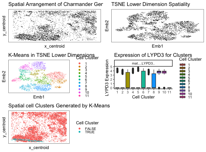
I used kmeans clustering to identify different cell types by looking at clusters in my data. I preproceessed my data by normalizing by total gene count and putting everything on a log scale. I ended up going with 11 clusters because it seemed to categorize and separate everything out pretty well. This number was hard to validate externally because most sources said there were many many types of cells in breast tissue, so I had to use my own judgement. Different sources said different numbers depending on how specific they get.
My LYPD3 gene in cluster 5 is the most upregulated gene. After doing some research, LYPD3 is suggested to enable laminin binding activity and act upstream of or within cell-matrix adhesion. It is commonly associated with epithelial cells, so this leads me to believe that my cell type for cluster 5 chosen is epithelial cells on a breast tissue! (maybe cancerous as well).
I think this makes sense because choosing the most upregulated gene should have the highest probability of correctly identifying the cell type. The only scenario I could see that not being true is if a gene was upregulated in many many cell types.
Code
library(gridExtra)
library(ggrepel)
library(ggplot2)
library(Rtsne)

data <- read.csv("Charmander.csv")
pos <- data[, c('x_centroid', 'y_centroid')]
rownames(pos) <- data[,1]
gexp <- data[, 4:ncol(data)]
rownames(gexp) <- data[,1]


j <- sample(rownames(pos))
pos <- pos[j,]
gexp <- gexp[j, ]
df0 <- data.frame(x = pos$x_centroid, y = pos$y_centroid)
library(scattermore)
p0 <- ggplot(data = df0,
             mapping = aes(x = x, y = y)) +
  geom_scattermore(mapping = NULL, pointsize=0.75) +
  ggtitle("Spatial Arrangement of Charmander Genes") +
  labs(x = "x_centroid", y = "y_centroid") + theme_bw() + theme(panel.grid.major = element_blank(),
                                                                                             panel.grid.minor = element_blank(), axis.ticks.x=element_blank(),
                                                                                             axis.text.x=element_blank(), axis.ticks.y=element_blank(),axis.text.y=element_blank(), legend.key.height = unit(0.2, 'cm'))

#CPM normalize
numgenes <- rowSums(gexp)
normgexp <- gexp/rowSums(gexp)*1e6


#PCA
mat <- log10(normgexp+1)
pcs <- prcomp(mat)
names(pcs)
dim(pcs$x)
plot(pcs$sdev[1:30], type='l')
# PC index = 7 seems to capture a good bit of variance and be a bend in the elbow
library(ggplot2)
df1 <- data.frame(pc1 = pcs$x[,1],
                  pc2 = pcs$x[,2],
                  col = pcs$x[,3])
p1 <- ggplot(data = df1,
             mapping = aes(x = pc1, y = pc2)) +
  geom_point(mapping = aes(col=col))
p1

#non-linear dimensional reduction to our PCs (TSNE).
library(Rtsne)
set.seed(0)
emb <- Rtsne(pcs$x[, 1:15], dims=2, perplexity = 30, check_duplicates = FALSE)$Y
rownames(emb) <- rownames(mat)
df2 <- data.frame(x = emb[,1], y = emb[,2])
p2 <- ggplot(data = df2,
             mapping = aes(x = x, y = y)) +
  geom_scattermore(mapping = NULL, pointsize=0.75) +
  ggtitle("TSNE Lower Dimension Spatiality") +
  labs(x = "Emb1", y = "Emb2") + theme_bw() + theme(panel.grid.major = element_blank(),
                                                    panel.grid.minor = element_blank(), axis.ticks.x=element_blank(),
                                                    axis.text.x=element_blank(), axis.ticks.y=element_blank(),axis.text.y=element_blank(), legend.key.height = unit(0.2, 'cm'))
p2

#K-means
set.seed(0)
com <- kmeans(emb, centers=11)
#Selected number of centers by re-running it until groups scattered
df3 <- data.frame(x = emb[,1],
                  y = emb[,2],
                  col = as.factor(com$cluster))
p3 <- ggplot(data = df3,
             mapping = aes(x = x, y = y)) +
  geom_scattermore(mapping = aes(col = col), pointsize=0.75) +
  ggtitle("K-Means in TSNE Lower Dimensions") +
  labs(x = "Emb1", y = "Emb2", color = "Cell Cluster") + theme_classic() + theme_bw() + theme(panel.grid.major = element_blank(),
                                                                                              panel.grid.minor = element_blank(), axis.ticks.x=element_blank(),
                                                                                              axis.text.x=element_blank(), axis.ticks.y=element_blank(),axis.text.y=element_blank(), legend.key.height = unit(0.05, 'cm'))
p3

#Cluster 5 seems to be isolated---> find up/down regulated genes
g <- 'LYPD3'
viii <- com$cluster == 5
p_values <- sapply(colnames(mat), function(g) {
  x = wilcox.test(mat[viii, g], mat[!viii, g],
                  alternative='two.sided')
  return(x$p.value)
})
adjusted <- p.adjust(p_values)
fold_changes <- sapply(colnames(mat), function(g) {
  x = mean(mat[viii, g])/mean(mat[!viii, g])
  return(x)
})
#Generate heatmap of differentially expressed genes.
n <- names(which(adjusted < 0.05))
n <- names(sort(fold_changes[n], decreasing=TRUE))
m <- mat[names(sort(com$cluster)),n]
col = rainbow(10)[as.factor(com$cluster)]
names(col) <- names(com$cluster)
p6 <- heatmap(as.matrix(m), Rowv=NA, Colv=NA, scale='none',
        RowSideColors = col[rownames(m)])
a <- 'LYPD3'
p_values2 <- sapply(colnames(mat), function(a) {
  x = wilcox.test(mat[viii, a], mat[!viii, a],
                  alternative='greater')
  return(x$p.value)
})
sorted_diff <- sort(-log10(p.adjust(p_values2)), decreasing=TRUE)
sorted_diff[1:20]
#Most upregulated genes: LYPD3 ANKRD30A     KRT8    EPCAM   TFAP2A     ESR1    MYO5B     ELF3    TPD52    HOOK2
#It appears cluster 5 has a high expression of LYPD3.

df4 <- reshape2::melt(
  data.frame(id=rownames(mat),
             mat[, 'LYPD3'],
             col=as.factor(com$cluster)))
p4 <- ggplot(data = df4, mapping = aes(x=col, y=value, fill=col)) +
  geom_boxplot() + theme_classic() + facet_wrap(~variable) +
  ggtitle("Expression of LYPD3 for Clusters") +
  labs(x = "Cell Cluster", y = "LYPD3 Expression", fill = "Cell Cluster") + theme(legend.key.height = unit(0.05, 'cm'))
p4


df5 <- data.frame(x = pos[,1],
                  y = pos[,2],
                  col = viii)
p5 <- ggplot(data = df5, mapping = aes(x = x, y = y)) + geom_scattermore(mapping = aes(col = col), pointsize=2) +
  ggtitle("Spatial cell Clusters Generated by K-Means") +
  labs(x = "x_centroid", y = "y_centroid", color = "Cell Cluster") + theme_classic() + theme_bw() + theme(panel.grid.major = element_blank(),
                                                                                                                                                       panel.grid.minor = element_blank(), axis.ticks.x=element_blank(),
                                                                                                                                                       axis.text.x=element_blank(), axis.ticks.y=element_blank(),axis.text.y=element_blank(), legend.key.height = unit(0.2, 'cm'))
p5

library(gridExtra)
grid.arrange(p0, p2, p3, p4, p5, ncol=2)


# sources
# code template from class code + previous assignments
# https://www.mdpi.com/2079-7737/9/2/39
# https://www.ncbi.nlm.nih.gov/gene/27076
# https://www.statology.org/ggplot2-legend-size/
# https://www.nature.com/articles/s42003-021-02201-2