Multi-panel data visualization of k-means clustering results and gene expression

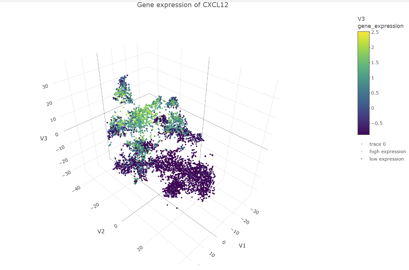
The data visualization chooses cluster 3 to be analyzed. It then identifies gene that are differentially expressed in that cluster compared to all the other clusters in the dataset. The top 6 genes that are the most significantly differentially expressed are chosen to create a box plot for their multiple expression levels in cells for the cluster of interest and all the other clusters. This was done by calculating the mean expression of each of the genes of interest and all the other cells, calculating the p-values with differential expression between each group for each gene, then ordering the genes by p-value and returning the top 6 genes from the list. Then creating a subset of the expression matrix including only these top 6 genes and cells for the clusters of interest, to then be reshaped and melted to create the data for the box plot. For each of the top six genes, a box plot is constructed with two panels, one for cells in the cluster of interest and another for cells in all other clusters. Each panel is subdivided further into a box plot for each gene. The y-axis represents expression levels, while the x-axis represents clusters. The box plot aids in visualizing the differential expression of genes in the cluster of interest and comparing them to other cells in the data set. All the significant genes can also be visualized in a volcano plot. Interpreting the data visualization for the box plots, the genes CXCL12, EDNRB, and CRISPLD2 have significant expression in the cluster of interest. Using the Human Protein Atlas website
(https://www.proteinatlas.org/).
Code used:
1
2
3
4
5
6
7
8
9
10
11
12
13
14
15
16
17
18
19
20
21
22
23
24
25
26
27
28
29
30
31
32
33
34
35
36
37
38
39
40
41
42
43
44
45
46
47
48
49
50
51
52
53
54
55
56
57
58
59
60
61
62
63
64
65
66
67
68
69
70
71
72
73
74
75
76
77
78
79
80
81
82
83
84
85
86
87
88
89
90
91
92
93
94
95
96
97
98
99
100
101
102
103
104
105
106
107
108
109
110
111
112
113
114
115
116
117
118
119
120
121
122
123
124
125
126
127
128
129
130
131
132
133
134
135
136
137
138
139
140
141
142
143
144
145
146
147
148
149
150
151
152
153
154
155
156
157
158
159
160
161
162
163
164
165
166
167
168
169
170
171
172
173
174
175
176
177
178
179
180
181
182
183
184
185
186
187
188
189
190
191
192
193
194
195
196
197
198
199
200
201
202
203
204
205
206
207
208
209
210
211
212
213
214
215
216
217
218
219
220
221
222
223
224
225
226
227
228
229
230
231
232
233
#Load the necessary libraries
library(ggplot2)
#Read in the data and perform data preprocessing
data <- read.csv('/Users/moneeraalsuwailm/Desktop/data/squirtle.csv.gz'', row.names = 1)
pos <- data[, 1:2]
gexp <- data[, 4:ncol(data)]
good.cells <- rownames(gexp)[rowSums(gexp) > 10]
pos <- pos[good.cells,]
gexp <- gexp[good.cells,]
totgexp <- rowSums(gexp)
mat <- gexp / totgexp
mat <- mat * median(totgexp)
mat <- log10(mat + 1)
#Set the number of clusters and perform k-means clustering
k <- 3
kmeans_model <- kmeans(mat, k)
#Select one cluster and get the cluster center
cluster_number <- 3
my_cluster <- mat[kmeans_model$cluster == cluster_number, ]
cluster_center <- kmeans_model$centers[cluster_number,]
#1. A panel visualizing your one cluster of interest in reduced dimensional space (PCA, tSNE,
etc)
#Perform t-SNE with 2 dimensions
library(Rtsne)
tsne_model <- Rtsne(my_cluster, dims = 2, perplexity = 30, verbose = TRUE)
#Create a data frame with t-SNE coordinates and cluster labels
tsne_df <- data.frame(X = tsne_model$Y[, 1], Y = tsne_model$Y[, 2], Cluster =
factor(cluster_number))
#Create the panel with t-SNE plot
panel_1 <- ggplot(data = tsne_df, aes(x = X, y = Y, color = Cluster)) +
geom_point(size = 2, alpha = 0.5) +
scale_color_manual(values = c("darkblue", "darkgreen", "darkred")) +
ggtitle("t-SNE Plot of Cluster 3") +
xlab("t-SNE Dimension 1") +
ylab("t-SNE Dimension 2") +
theme(plot.title = element_text(hjust = 0.5, size = 14, face = "bold"),
axis.title.x = element_text(size = 12, face = "bold"),
axis.title.y = element_text(size = 12, face = "bold"),
axis.text = element_text(size = 10),
legend.text = element_text(size = 10, face = "bold"),
legend.title = element_text(size = 12, face = "bold")) +
guides(color = guide_legend(title = "Cluster", title.position = "top", title.hjust = 0.5,
label.position = "right"))
panel_1
#2. A panel visualizing your one cluster of interest in space
#Perform t-SNE with 3 dimensions
library(Rtsne)
tsne_model <- Rtsne(my_cluster, dims = 3, perplexity = 30, verbose = TRUE)
tsne_df <- as.data.frame(tsne_model$Y)
colnames(tsne_df) <- c("V1", "V2", "V3")
#Create 3D scatterplot
library(plotly)
panel_2 <- plot_ly(tsne_df, x = ~V1, y = ~V2, z = ~V3, color = I("blue"), marker = list(size = 3),
type = "scatter3d", name = "Cluster 3") %>%
add_markers(marker = list(size = 1, color = "#1f77b4"), name = "Individual cells") %>%
add_markers(x = cluster_center[1], y = cluster_center[2], z = cluster_center[3], color = I("red"),
size = 3, mode = "markers", name = "Cluster center") %>%
layout(scene = list(xaxis = list(title = "t-SNE 1", titlefont = list(size = 14, family = "sans-serif")),
yaxis = list(title = "t-SNE 2", titlefont = list(size = 14, family = "sans-serif")),
zaxis = list(title = "t-SNE 3", titlefont = list(size = 14, family = "sans-serif")),
camera = list(eye = list(x = -1.5, y = 1.5, z = 1.5)),
margin = list(l = 0, r = 0, b = 0, t = 50, pad = 0),
showlegend = TRUE,
legend = list(orientation = "h", x = 0.5, y = -0.1))) %>%
add_markers(x = cluster_center[1], y = cluster_center[2], z = cluster_center[3], color = I("red"),
size = 3, name = "Cluster center")
panel_2
#3. A panel visualizing multiple differentially expressed genes for your cluster of interest
#Load the necessary libraries
library(dplyr)
#Select one cluster and get the cluster center
cluster_number <- 3
my_cluster <- mat[kmeans_model$cluster == cluster_number, ]
cluster_center <- kmeans_model$centers[cluster_number,]
#Select differentially expressed genes
cluster.of.interest <- names(which(kmeans_model$cluster == cluster_number))
cluster.other <- names(which(kmeans_model$cluster != cluster_number))
genes <- colnames(mat)
volcano_data <- data.frame(Gene = genes, Pvalue = NA, Log2FoldChange = NA)
for (i in 1:length(genes)) {
a <- mat[cluster.of.interest, i]
b <- mat[cluster.other, i]
res <- wilcox.test(a, b, alternative = "two.sided")
volcano_data$Pvalue[i] <- res$p.value
volcano_data$Log2FoldChange[i] <- log2(mean(a) / mean(b))
}
#Filter the differentially expressed genes by P-value
volcano_data_filtered <- volcano_data %>%
filter(Pvalue < 1e-8)
#Create volcano plot
volcano_plot <- ggplot(volcano_data, aes(x = Log2FoldChange, y = -log10(Pvalue))) +
geom_point(size = 1, color = "#1f77b4", alpha = 0.7) +
scale_color_manual(values = c("darkred", "darkblue", "darkgreen")) +
xlab("Log2(Fold Change)") +
ylab("-log10(P-value)") +
ggtitle("Volcano Plot of Differentially Expressed Genes in Cluster 3") +
theme(plot.title = element_text(hjust = 0.5, size = 14, face = "bold"),
axis.title.x = element_text(size = 12, face = "bold"),
axis.title.y = element_text(size = 12, face = "bold"),
axis.text = element_text(size = 10),
legend.text = element_text(size = 10, face = "bold"),
legend.title = element_text(size = 12, face = "bold")) +
guides(color = guide_legend(override.aes = list(size = 2, alpha = 1)))
#Add labels for differentially expressed genes
volcano_plot_labeled <- volcano_plot +
ggrepel::geom_label_repel(data = volcano_data_filtered, aes(label = Gene), box.padding = 0.5)
#Show the plot
volcano_plot_labeled
#Select cluster of interest
cluster.of.interest <- which(com$cluster == 3)
#Get the mean expression of each gene for the cluster of interest and for all other cells
means <- apply(mat, 2, function(x) c("cluster.of.interest" = mean(x[cluster.of.interest]),
"other.cells" = mean(x[-cluster.of.interest])))
#Calculate the p-values for differential expression between cluster 3 and all other cells for each
gene
pvals <- apply(mat, 2, function(x) wilcox.test(x[cluster.of.interest], x[-
cluster.of.interest])$p.value)
#Order the genes by p-value
sorted_pvs <- sort(pvals)
#Get the top 6 genes
top_genes <- names(sorted_pvs)[1:6]
#Subset the expression matrix to include only the top 6 genes and the cells in the cluster of
interest
mat_sub <- mat[cluster.of.interest, top_genes]
library(ggnewscale)
#Reshape the data to long format
mat_sub_long <- reshape2::melt(mat_sub, varnames = c("Cell", "Gene"))
#Create a new column for rownames of mat_sub_long
mat_sub_long$CellName <- rownames(mat_sub_long)
#Match the rownames of mat_sub_long to the rownames of mat_sub
mat_sub_long$Cell <- match(mat_sub_long$CellName, rownames(mat))
#Create a new column indicating whether each cell is in the cluster of interest or not
mat_sub_long$Cluster <- ifelse(mat_sub_long$Cell %in% cluster.of.interest, "Cluster of
Interest", "Other Clusters")
#Create a new variable to identify cells that do not belong to the cluster of interest
all.other.clusters <- setdiff(1:nrow(mat), cluster.of.interest)
#Create a new data frame for cells in all other clusters
mat_sub_long_all <- mat_sub_long[mat_sub_long$Cluster == "Other Clusters",]
#Update the Cluster variable to "all other clusters"
mat_sub_long_all$Cluster <- "All Other Clusters"
#Assign the all.other.clusters variable to the Cell variable
mat_sub_long_all$Cell <- all.other.clusters[1:nrow(mat_sub_long_all)]
#Bind the two data frames together
mat_sub_long <- rbind(mat_sub_long, mat_sub_long_all)
#Remove the Cell and CellName columns
mat_sub_long$Cell <- NULL
mat_sub_long$CellName <- NULL
#Filter to include only the data for cluster of interest and all other clusters
mat_sub_long <- mat_sub_long[mat_sub_long$Cluster %in% c("Cluster of Interest", "All Other
Clusters"),]
#Create the box plot for each gene and cluster
panel_3 <- ggplot(mat_sub_long, aes(x = Cluster, y = value, fill = Cluster)) +
geom_boxplot() +
facet_wrap(~variable, scales = "free_y") +
xlab("") +
ylab("Gene Expression") +
ggtitle("Gene Expression in Cluster 3 vs. All Other Clusters") +
scale_fill_manual(values = c("Cluster of Interest" = "red", "All Other Clusters" = "gray")) +
theme_classic() +
theme(plot.title = element_text(hjust = 0.5),
axis.text.x = element_text(angle = 45, hjust = 1, vjust = 1, size = 8))
#Add the second x-axis for "All Other Clusters"
panel_3 <- panel_3 +
ggnewscale::new_scale_fill() +
geom_blank(data = mat_sub_long[mat_sub_long$Cluster == "Cluster of Interest",], aes(x =
variable, y = value)) +
geom_boxplot(data = mat_sub_long[mat_sub_long$Cluster == "All Other Clusters",], aes(x =
variable, y = value, fill = Cluster)) +
scale_fill_manual(values = c("Cluster of Interest" = "gray", "All Other Clusters" = "red"))
#Set the legend position
panel_3 <- panel_3 + theme(legend.position = "bottom")
#Display the plot
panel_3
#Panel 4: Visualize one of these genes in reduced dimensional space (PCA, tSNE, etc)
#Normalize the data
mydata_norm <- apply(mat, 2, function(x) (x - min(x)) / (max(x) - min(x)))
gene_name <- "CXCL12"
gene_index <- which(colnames(mydata_norm) == gene_name)
set.seed(123) # For reproducibility
tsne_obj <- Rtsne(mydata_norm, dims = 2, perplexity = 30, verbose = TRUE)
tsne_mat <- as.matrix(tsne_obj$Y)
panel_4 <- ggplot(data = data.frame(x = tsne_mat[, 1], y = tsne_mat[, 2], expr = mydata_norm[,
gene_index]), aes(x = x, y = y, color = expr)) +
geom_point(size = 1) +
scale_color_gradient(low = "black", high = "red") +
theme_classic() +
xlab("t-SNE1") +
ylab("t-SNE2") +
ggtitle(paste("Gene Expression of", gene_name))
panel_4
#Panel 5: Visualize one of these genes in space
library(plotly)
#Normalize the data
mydata_norm <- apply(mat, 2, function(x) (x - min(x)) / (max(x) - min(x)))
#Standardize the data
mydata_stand <- scale(mydata_norm)
#Perform t-SNE with 3 dimensions
tsne_model <- Rtsne(mydata_stand, dims = 3, perplexity = 30, verbose = TRUE)
#Convert matrix to data frame with named columns
tsne_df <- as.data.frame(tsne_model$Y)
colnames(tsne_df) <- c("V1", "V2", "V3")
#Select a differentially expressed gene to visualize in space
gene_expression <- mydata_stand[, gene_name]
#Create a data frame with t-SNE coordinates and gene expression values
tsne_gene_df <- cbind(tsne_df, gene_expression)
#Filter out missing values
tsne_gene_df <- na.omit(tsne_gene_df)
#3D scatter plot of cells colored by gene expression
my_palette <- colorRampPalette(c("blue", "white", "red"))(n = 100)
panel_5 <- plot_ly(data = tsne_gene_df, x = ~V1, y = ~V2, z = ~V3,
type = "scatter3d", mode = "markers", marker = list(size = 2)) %>%
add_markers(color = ~gene_expression, colors = my_palette,
name = ifelse(gene_expression > 0, "high expression", "low expression")) %>%
layout(scene = list(aspectmode = "data"),
title = paste("Gene expression of", gene_name))
panel_5