Cell Type Exploration of Visium Data Set

Description of HW6:
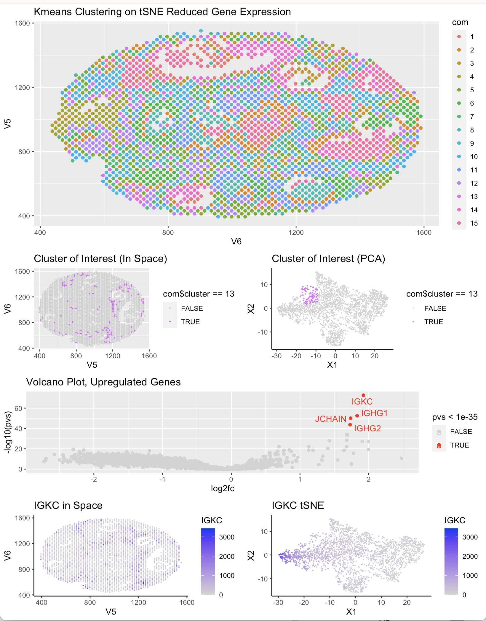
After choosing cluster 13 as the cluster of interest, I determined the top 4 most upregulated genes using a wilcox test and a volcano plot. After determining this list, I researched their function and specific expression in certain cell types using Protein Atlas. I found that all of the top 4 highest expressed genes (IGKC, JCHAIN, IGHG1, IGHG2) are present in lymphoid breast tissue and most of them are markers markers of breast cancer. This would make sense as lymph nodes are present in metastatic cancer pathways and the upregulation of these genes could indicate the presence of cancerous cells. With this trend I determined that the cells in cluster 13 are likely cancerous lymphatic breast cells.
https://www.proteinatlas.org/ENSG00000132465-JCHAIN https://www.proteinatlas.org/ENSG00000211592-IGKC https://www.proteinatlas.org/ENSG00000211893-IGHG2 https://www.proteinatlas.org/search/IGHG1
Code: #source: Homework 9, In class from 2/20 data <- read.csv(‘~/Desktop/GDV/GDV23/visium_breast_cancer.csv.gz’, row.names = 1)
data[1:5,1:5] pos <- data[,1:2] gexp <- data[,3:ncol(data)]
##how many spots? dim(data) #2518 rows ##how many genes? #7037
##how many mitochondrial genes? #probably 0, would have prefix MT
hist(log10(colSums(gexp)+1))
table(grepl(‘^MT-‘, colnames(gexp)))
#
#human or mouse?
#human, gene names capitalized
#
#look at the distribution, QC
hist(log10(rowSums(gexp) + 1))
p1 <- ggplot(data, aes(x = V6, y= V5, col = CD68 )) + geom_point() +
scale_color_gradient(low = ‘lightgrey’, high = ‘red’) + theme_classic()
p2 <- ggplot(data, aes(x = V6, y= V5, col = HES4 )) + geom_point() +
scale_color_gradient(low = ‘lightgrey’, high = ‘red’) + theme_classic()
#
grid.arrange(p1,p2)
#normalize mat <- gexp/rowSums(gexp) mat <- mat*mean(rowSums(gexp))
p3 <- ggplot(data, aes(x = V6, y= V5, col = mat[, ‘CD68’] )) + geom_point() +
scale_color_gradient(low = ‘lightgrey’, high = ‘red’) + theme_classic()
p4 <- ggplot(data, aes(x = V6, y= V5, col = mat[,’HES4’] )) + geom_point() +
scale_color_gradient(low = ‘lightgrey’, high = ‘red’) + theme_classic()
#
grid.arrange(p3,p4)
##what would happen with no normalization?
probably just find a cluster that just corresponds to spots with a lot of cells
##tSNE emb <- Rtsne::Rtsne(mat, perplexity = 100, check = FALSE) com <- kmeans(emb$Y, centers = 15)
##kmeans set.seed(0) com1 <- kmeans(mat, centers = 15) com2 <- kmeans(em, centers = 15)
df <- data.frame(pos, com1 = as.factor(com1$cluster),com2 = as.factor(com2$cluster),com = as.factor(com$cluster))
p1 <- ggplot(df, aes(x = V6, y = V5, col = com)) + geom_point() + ggtitle(‘Kmeans Clustering on tSNE Reduced Gene Expression’)
df_clus <- data.frame(pos, emb$Y , cluster = as.factor(com$cluster), IGKC = mat[,’IGKC’] )
pCluster_Space <- ggplot(df_clus, aes(x = V5, y = V6, col = com$cluster == 13)) + geom_point(size = .3) + scale_color_manual(values= c(“lightgrey”, “mediumorchid1”)) + ggtitle(“Cluster of Interest in Space)”)
pCluster_pca<- ggplot(df_clus, aes(x = X1, y = X2, col= com$cluster == 13)) + geom_point(size = 0.1) + theme_classic() + scale_color_manual(values=c(“lightgrey”, “mediumorchid1”)) + ggtitle(‘Cluster of Interest tSNE’)
pIGKC_space <- ggplot(df_clus, aes(x = V5, y = V6, col = IGKC)) + geom_point(size = 0.1) + theme_classic() + scale_color_continuous(low = “lightgrey”,high = “blue”) + ggtitle(‘IGKC in Space’)
pIGKC_tsne <- ggplot(df_clus, aes(x = X1, y = X2, col = IGKC)) + geom_point(size = 0.1) + theme_classic() + scale_color_continuous(low = “lightgrey”,high = “blue”) + ggtitle(‘IGKC tSNE’)
grid.arrange(pCluster_Space,pCluster_pca) gene_names <- colnames(gexp)
#source: Todd’s “Cell Exploration of Charmander Data Set” https://jef.works/genomic-data-visualization-2023/blog/2023/02/17/thartm10/ cluster.cells <- which(com1$cluster == 13) other.cells <- which(com1$cluster != 13)
pvs <- sapply(gene_names, function(g) { a <- gexp[cluster.cells, g] b <- gexp[other.cells, g] wilcox.test(a,b,alternative=”two.sided”)$p.val })
log2fc <- sapply(gene_names, function(g) {
a <- gexp[cluster.cells, g]
b <- gexp[other.cells, g]
log2(mean(a)/mean(b))
})
upreg <- pvs[pvs < 1e-25]
df2 <- data.frame(pvs, log2fc)
upreg_gene_names = names(which(pvs < 1e-35))
p_volcano<- ggplot(df2, aes(y=-log10(pvs), x=log2fc, col = pvs < 1e-35)) + geom_point() + scale_color_manual(values = c(‘lightgrey’,’red’)) + ggrepel::geom_text_repel(data = df2[pvs < 1e-35,], label = upreg_gene_names) + ggtitle(‘Volcano Plot, Upregulated Genes’)
library(gridExtra) #source: Gohta’s “Running tSNE analysis on genes or PCs” https://jef.works/genomic-data-visualization-2023/blog/2023/02/06/gaihara1/ lay <- rbind(c(1,1,1,1,1,1), c(1,1,1,1,1,1), c(3,3,3,4,4,4), c(5,5,5,5,5,5), c(6,6,6,7,7,7)) grid.arrange(p1, pCluster_Space, pCluster_pca, p_volcano, pIGKC_space, pIGKC_tsne, layout_matrix = lay)