
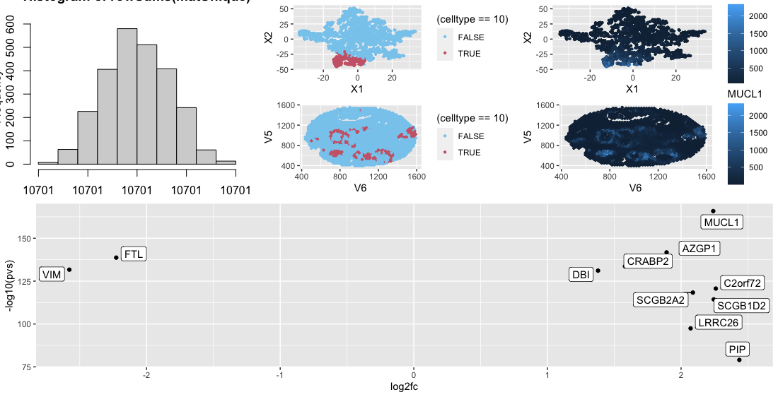
Looking at the cluster I found that the MUCL1 gene was heavily upregulated in the cluster. Looking at ProteinAtlas (https://www.proteinatlas.org/ENSG00000172551-MUCL1) this gene is heavily expressed in mammary glands. Considering the fact that this data was collected on breast tissue and the fact that spatially the clusters for rings thoughout, this leads to the conclusion that this cluster is part of the mammary gland.
Code
library(Rtsne)
library(tidyverse)
library(ggokabeito)
library(gganimate)
library(gifski)
library(ggrepel)
library(gridExtra)
library(rcartocolor)
library(grid)
library(ggplotify)

##Most code adapted from Prof. Fan "code-02-13-2023" code unless otherwise noted
data <- read.csv('Downloads/visium_breast_cancer.csv.gz',row.names=1)

##Capture gene expression
pos <- data[,1:2]
gexp <- data[,3:ncol(data)]

##Normalize
good.cells <-rownames(gexp)[rowSums(gexp) > 10]
pos <- pos[good.cells,]
gexp <- gexp[good.cells,]
totgexp <- rowSums(gexp)
mat <- gexp/totgexp
mat <- mat*median(totgexp)

#Get only unique values because tsne gets mad
matUnique <- unique(mat)
p1 <- as.ggplot(~hist(log10(colSums(matUnique))))
p2 <- as.ggplot(~hist(rowSums(matUnique)))

#Find principal component number that makes sense (taken from class)
pcs <- prcomp(matUnique)
par(mfrow=c(1,1))
plot(1:20,pcs$sdev[1:20],type='l')

#Using above graph, used only ten principal components
set.seed(8)
pcsIm <- pcs$x[,1:10]
emb <- Rtsne::Rtsne(pcsIm)

#Create tSne dataframe
dfTsne = data.frame(emb$Y)

#Taken from Prof. Fan/I think Ryan in class on how to decide how many clusters to pick (10)
results <- do.call(rbind, lapply(seq_len(25), function(k) {
  out <- kmeans(pcsIm,centers=k, iter.max=50)
  c(out$tot.withinss,out$betweenss)
}))
plot(seq_len(25),results[,1], main='tot.withinss')
plot(seq_len(25),results[,2], main='tot.betweenss')

#Best number from this was 11 centers
com <- kmeans(pcsIm, centers=11)

#I am colorblind so I was using this to look at clusters and ended up keeping it just for binary stuff because I like the colors
safe_colorblind_palette <- c("#88CCEE", "#CC6677", "#DDCC77", "#117733", "#332288", "#AA4499",
                                      "#44AA99", "#999933", "#882255", "#661100", "#6699CC", "#888888")

##Cluster 10 looked the more interesting to me from the above analysis so I decided to look in to it
p3 <- ggplot(df, aes(x = X1, y = X2, col=(celltype==10))) + geom_point(size = 0.8) +
  scale_color_manual(values=safe_colorblind_palette)
p4 <- ggplot(df, aes(x = V6, y = V5, col=(celltype==10))) +
  geom_point(size = 0.8) + scale_color_manual(values=safe_colorblind_palette)
p4
cluster.of.interest <- names(which(com$cluster == 10))
cluster.other <- names(which(com$cluster != 10))

#Taken from Prof. Fan's code
genes <- colnames(matUnique)
pvs <- sapply(genes, function(g) {
  a <- matUnique[cluster.of.interest, g]
  b <- matUnique[cluster.other, g]
  wilcox.test(a,b,alternative="two.sided")$p.val
})

log2fc <- sapply(genes, function(g) {
  a <- matUnique[cluster.of.interest, g]
  b <- matUnique[cluster.other, g]
  log2(mean(a)/mean(b))
})

#There were too many points so I took only the interesting ones
df2 = data.frame(pvs,log2fc)
df2 = df2[df2$pvs < 1e-130 | df2$log2fc > 2,]
p5 <- ggplot(df2, aes(y=-log10(pvs), x=log2fc)) + geom_point() +
  ggrepel::geom_label_repel(label=rownames(df2),max.overlaps=100)

#Plot specifically MUCL1 to see if it matches the cluster distribution
df3 <- data.frame(pos, emb$Y, gexp)
p6 <- ggplot(df3, aes(x = X1, y = X2, col=MUCL1)) + geom_point(size = 0.8) + scale_fill_gradient(low = "#88CCEE", high = "#CC6677")
p7 <- ggplot(df3, aes(x = V6, y = V5, col=MUCL1)) + scale_fill_gradient(low = "#88CCEE", high = "#CC6677") + geom_point(size = 0.8)
g1 <- grid.arrange(nrow=2,p3,p4)
g2 <- grid.arrange(nrow=2,p6,p7)
g3 <- grid.arrange(ncol=3,p2,g1,g2)

grid.arrange(nrow=2,g3,p5)