Analysis of Spleen CODEX data

Cell-type annotation
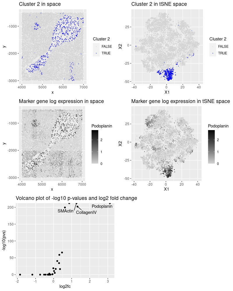
After reading, cleaning and normalizing the data, I performed kmeans clustering and observed that cluster 2 presented an interesting pattern in space. The most significant proteins (low p-value and high fold change) for this tissue and the cell-types they mark:
- Podoplanin: lymphatic endothelium, mesothelium, various epithelia, hematopoietic dendritic cells, follicular dendritic cells. (https://www.sciencedirect.com/topics/medicine-and-dentistry/podoplanin)
- SMActin (smooth muscle actin): lymphatic and vessel endothelial cells. (https://www.ncbi.nlm.nih.gov/pmc/articles/PMC9010440/)
- CollagenIV: vascular markers (https://pubmed.ncbi.nlm.nih.gov/7479359/)
Based on this information, I conclude that there is a higher chance of cluster 2 being endothelial cells.
Please share the code you used to reproduce this data visualization.
The code was adapted from HW5.
## code adapted from my HW5

library(tidyverse)
library(gridExtra)
library(ggrepel)
set.seed(42)


# Load and process the data -----------------------------------------------

data <- read.csv('data/codex_spleen_subset.csv.gz', row.names = 1)
data[1:5, 1:5]
dim(data)

pos <- data[, 1:2]
area <- data[, 3]
gexp <- data[4:ncol(data)]

pos %>%
    ggplot() +
    geom_point(aes(x, y),
               size = .1)

## no empty cells to remove
rownames(gexp)[rowSums(gexp) == 0]

gexp[1:5, 1:5]
## see distribution of proteins and counts per cell
hist(rowSums(gexp))
hist(colSums(gexp))

## normalize cells by count
totgexp <- rowSums(gexp)
mtx <- gexp/totgexp
mtx <- mtx*1000
mtx <- log10(mtx + 1)


# Reduced dimension and clustering ----------------------------------------

## calculate tsne
emb <- Rtsne::Rtsne(mtx, check = F)

emb$Y %>%
    data.frame() %>%
    ggplot() +
    geom_point(aes(X1, X2),
               size = .1)

## calculate multiple k means and select k value
kmeans_ss <- lapply(1:25, function(x){
    com <- kmeans(mtx, centers = x, iter.max = 25)
    kmeans_vals <- list(wss = com$tot.withinss,
                        bss = com$betweenss,
                        clusters = com$cluster)
    return(kmeans_vals)
})

df_ss <- data.frame(k = 1:25,
                    wss = sapply(kmeans_ss, "[[", 1),
                    bss = sapply(kmeans_ss, "[[", 2))

p_wss <- df_ss %>% ggplot() +
    geom_line(aes(x=k, y=wss))
p_bss <- df_ss %>% ggplot() +
    geom_line(aes(x=k, y=bss))

grid.arrange(p_wss, p_bss)

## it is not clear what the number of clusters is from the plot
## the slope starts decreasing more at 3, but there are significant changes at
## 6 and 13

## based on the graphs, I test k = 3
com <- kmeans(mtx, centers = 3)
clusters <- com$cluster

## colorblind-friendly palette: http://www.cookbook-r.com/Graphs/Colors_(ggplot2)/
cbbPalette <- c("#000000", "#E69F00", "#56B4E9", "#009E73", "#F0E442", "#0072B2", "#D55E00", "#CC79A7")[2:4]

## visualize clusters
pos %>%
    mutate(cluster = as.factor(clusters)) %>%
    ggplot() +
    geom_point(aes(x, y, color = cluster),
               size = .5) +
    scale_color_manual(values = cbbPalette) +
    guides(colour = guide_legend(override.aes = list(size=5))) +
    facet_wrap(cluster ~ .)

emb$Y %>%
    data.frame() %>%
    mutate(cluster = as.factor(clusters)) %>%
    ggplot() +
    geom_point(aes(X1, X2, color = cluster),
               size = .5) +
    scale_color_manual(values = cbbPalette) +
    guides(colour = guide_legend(override.aes = list(size=5)))

## the clusetring could be improved, so we use k = 6
com <- kmeans(mtx, centers = 6)
clusters <- com$cluster
cbbPalette <- c("#000000", "#E69F00", "#56B4E9", "#009E73", "#F0E442", "#0072B2", "#D55E00", "#CC79A7")[2:8]
## visualize clusters
pos %>%
    mutate(cluster = as.factor(clusters)) %>%
    ggplot() +
    geom_point(aes(x, y, color = cluster),
               size = .5) +
    scale_color_manual(values = cbbPalette) +
    guides(colour = guide_legend(override.aes = list(size=5))) +
    facet_wrap(cluster ~ .)
emb$Y %>%
    data.frame() %>%
    mutate(cluster = as.factor(clusters)) %>%
    ggplot() +
    geom_point(aes(X1, X2, color = cluster),
               size = .5) +
    scale_color_manual(values = cbbPalette) +
    guides(colour = guide_legend(override.aes = list(size=5)))

## 6 clusters seem good, especially cluster 5, but I will test k = 13
com <- kmeans(mtx, centers = 13)
clusters <- com$cluster
## visualize clusters
pos %>%
    mutate(cluster = as.factor(clusters)) %>%
    ggplot() +
    geom_point(aes(x, y, color = cluster),
               size = .5) +
    guides(colour = guide_legend(override.aes = list(size=5))) +
    facet_wrap(cluster ~ .)
## the spatial structure of cluster 5 seems to be maintained in cluster 2,
## while the other cluster were divided. Since I will focus on cluster 2,
## it is better to keep k = 13 because it will be cleaner

## cluster 2 has a nice spatial pattern
plot_clus_pos <- pos %>%
    mutate(cluster = as.factor(clusters)) %>%
    ggplot() +
    geom_point(aes(x, y, color = cluster == 2),
               size = .1) +
    scale_color_manual(values = c("lightgray", "blue")) +
    labs(title = "Cluster 2 in space", color = "Cluster 2")

plot_clus_emb <- emb$Y %>%
    data.frame() %>%
    mutate(cluster = as.factor(clusters)) %>%
    ggplot() +
    geom_point(aes(X1, X2, color = cluster == 2),
               size = .1) +
    scale_color_manual(values = c("lightgray", "blue")) +
    labs(title = "Cluster 2 in tSNE space", color = "Cluster 2")


# Differentially expressed genes ------------------------------------------

## select a cluster
selected_cluster <- 2
cluster_of_interest <- names(which(clusters == selected_cluster))
other_clusters <- names(which(clusters != selected_cluster))

## loop through the genes and test each one
genes <- colnames(mtx)
pvs <- sapply(genes, function(g){
    a <- mtx[cluster_of_interest, g]
    b <- mtx[other_clusters, g]
    wilcox.test(a, b, alternative = "greater")$p.val
})

## see marker genes
names(which(pvs < 1e-8))

## calculate a fold change
log2fc <- sapply(genes, function(g){
    a <- mtx[cluster_of_interest, g]
    b <- mtx[other_clusters, g]
    log2(mean(a)/mean(b))
})

pvs['Podoplanin']
log2fc['Podoplanin']

tail(sort(log2fc))

## half volcano plot
df <- data.frame(pvs, log2fc)
head(df)
plot_deg <- df %>%
    ggplot(aes(log2fc, -log10(pvs))) +
    geom_point() +
    geom_text_repel(aes(label = ifelse(log2fc > 1, as.character(rownames(df)), '')),
                    hjust=0, vjust=0) +
    labs(title = "Volcano plot of -log10 p-values and log2 fold change")

## for ESR1
g <- 'Podoplanin'
plot_gene_pos <- pos %>%
    mutate(gene = mtx[,g]) %>%
    ggplot() +
    geom_point(aes(x, y, color = gene),
               size = .1) +
    scale_color_gradient(low = "lightgray", high = "black") +
    labs(title = "Marker gene log expression in space", color = g)

plot_gene_emb <- emb$Y %>%
    data.frame() %>%
    mutate(gene = mtx[,g]) %>%
    ggplot() +
    geom_point(aes(X1, X2, color = gene),
               size = .1) +
    scale_color_gradient(low = "lightgray", high = "black") +
    labs(title = "Marker gene log expression in tSNE space", color = g)


## join all plots
grid.arrange(plot_clus_pos, plot_clus_emb,
             plot_gene_pos, plot_gene_emb,
             plot_deg)