Welcome
Welcome to the Course Website for EN.580.428 Genomic Data Visualization!
As the primary mode through which analysts and audience members alike consume data, data visualization remains an important hypothesis generating and analytical technique in data-driven research to facilitate new discoveries. However, if done poorly, data visualization can also mislead, bias, and slow down progress. This hands-on course will cover the principles of perception and cognition relevant for data visualization and apply these principles to genomic data, including large-scale single-cell and spatially-resolved omics datasets, using the R statistical programming language. Students will be expected to complete class readings, create weekly data visualizations as homework assignments, and make a major class presentation.
Course Information
Course Staff: Prof. Jean Fan and Rafael dos Santos Peixoto
Lectures: 8:00am-9:50am Monday, Wednesday, and Friday. See Canvas for location details.
Office Hours: 10:00am-10:50am Monday, Wednesday, and Friday. See Canvas for location details.
Course Details
☞ see Course tabFeatured Visualizations
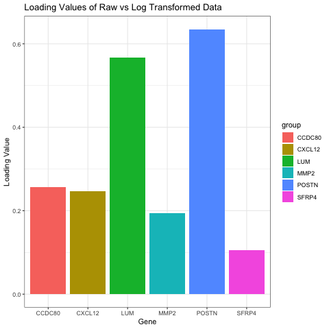
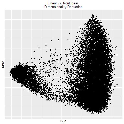
Comparison of Loading Values on PC1 in Raw and Log Transformed Data
Write a a brief description of your figure so we know what you are visualizing. You do not need to use the vocabulary terms from...

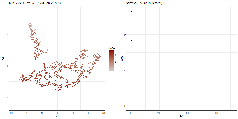
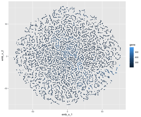
gganimate: Visualizing IGKC in tSNE Space with Non-linear Dimensionality Reduction on Varying Numbers of PCs
What data types are you visualizing? For the plots on the left side of the animation, I am visualizing the quantitative data of the X1...

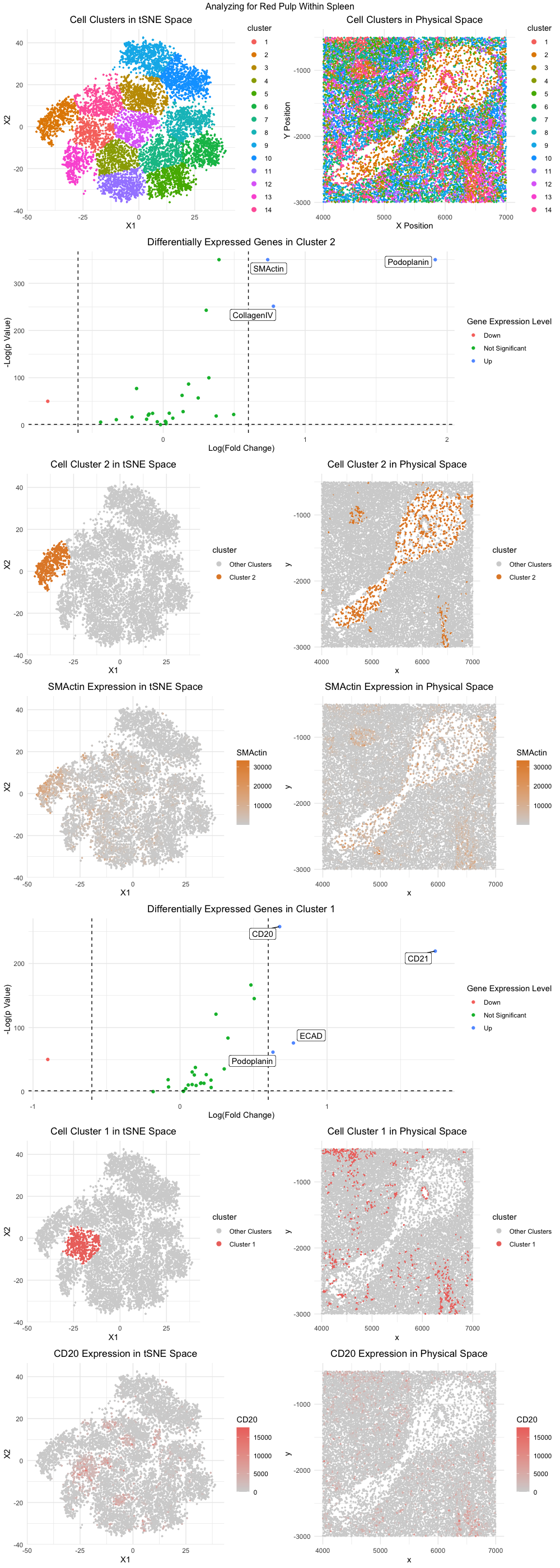
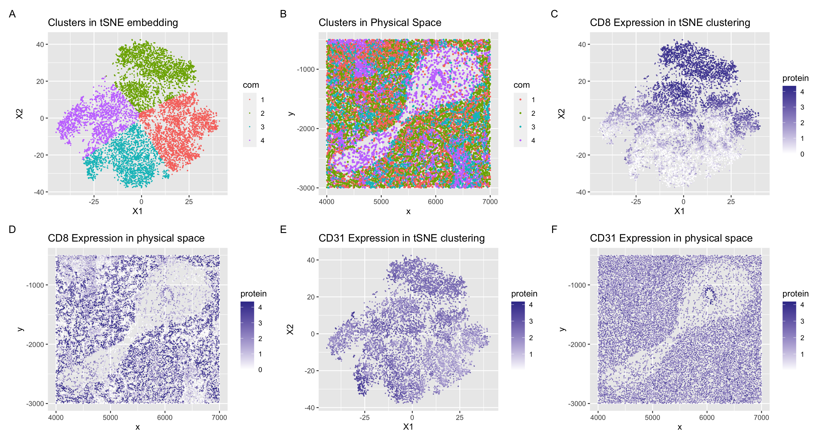
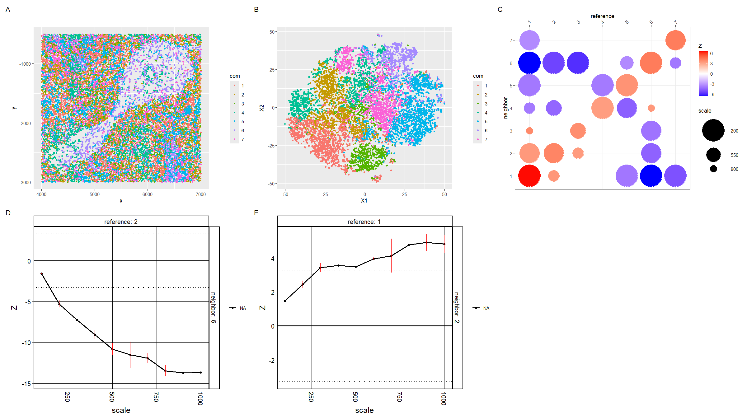
Identification of Red Pulp Tissue Structure within CODEX Dataset
Figure Description: The general workflow from homework 5 was applied with some modifications, namely utilizing tSNE instead of PCA for dimensionality reduction, to analyze the...

Interpreting the tissue structure represented in the CODEX data
Your goal is to figure out what tissue structure is represented in the CODEX data. Options include: (1) Artery/Vein, (2) White pulp, (3) Red pulp,...

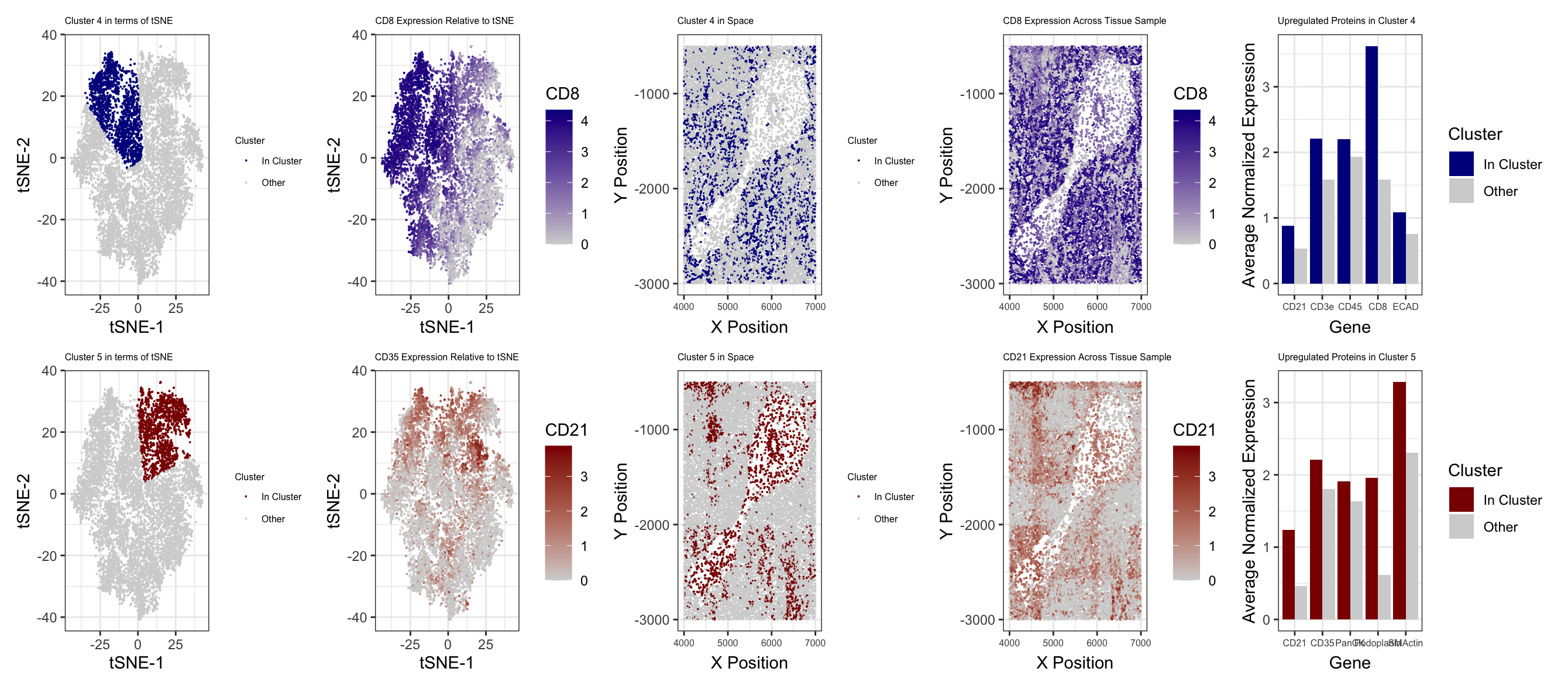
Identifying Cell-types from Spleen CODEX Dataset using K-means Clustering, tSNE, and Wilcox-test
Describe your figure briefly so we know what you are depicting (you no longer need to use precise data visualization terms as you have been...
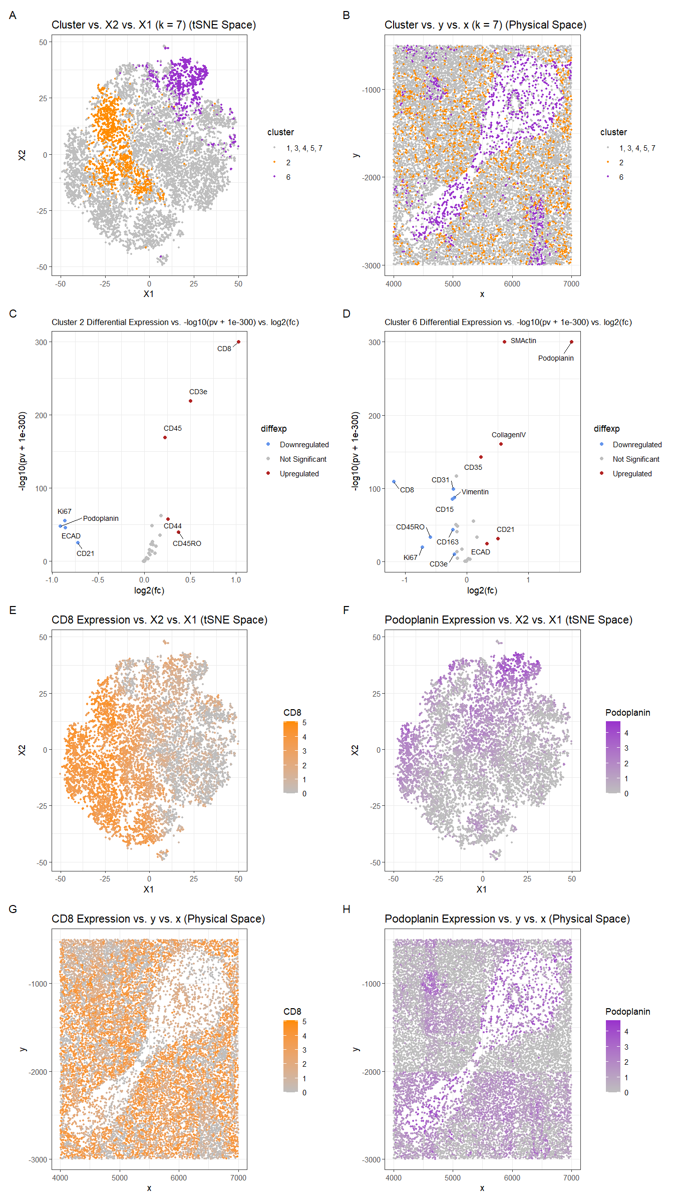
Identifying Type of Tissue in the Spleen
You will need to visualize and interpret at least two cell-types. Create a data visualization and write a description to convince me that your interpretation...
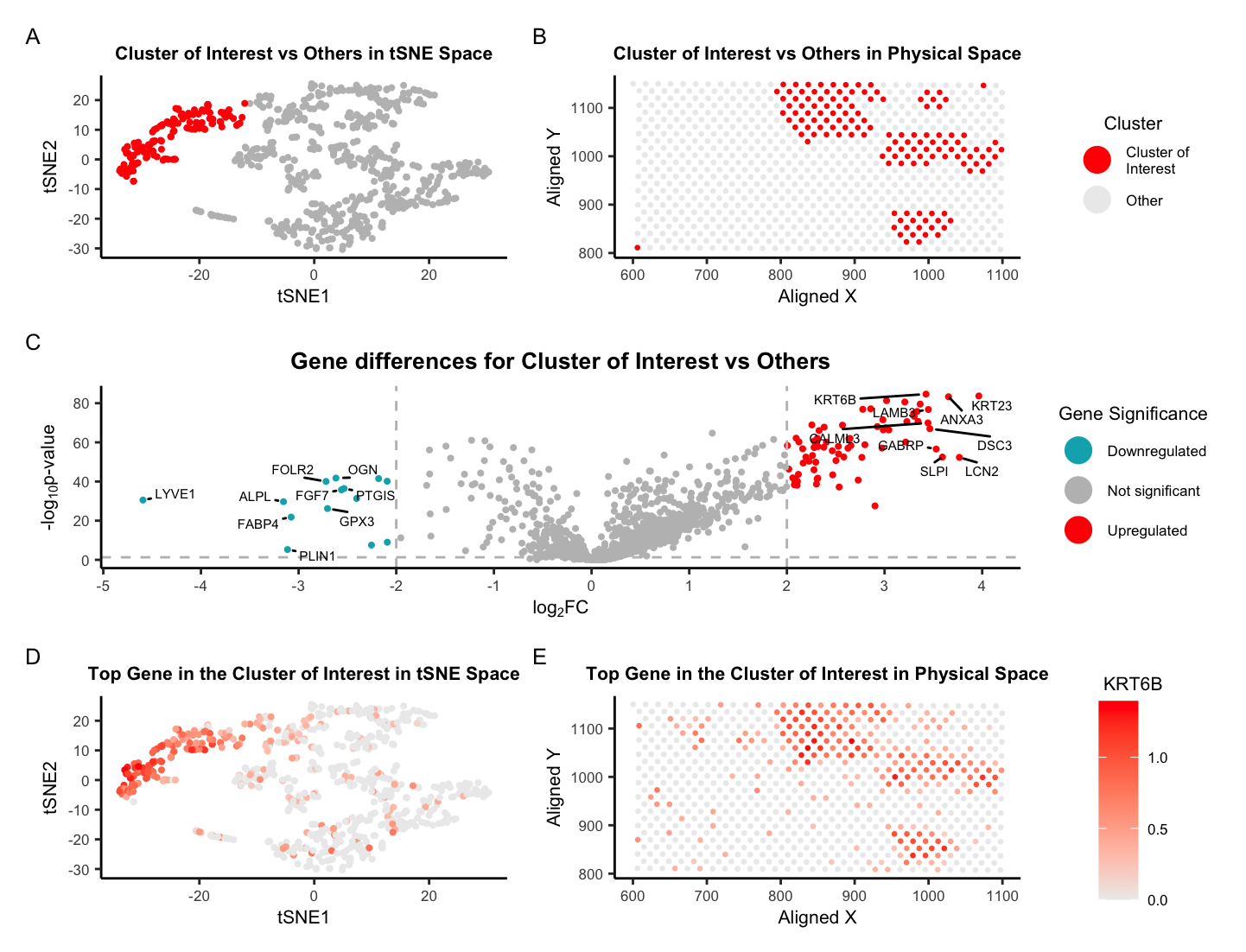
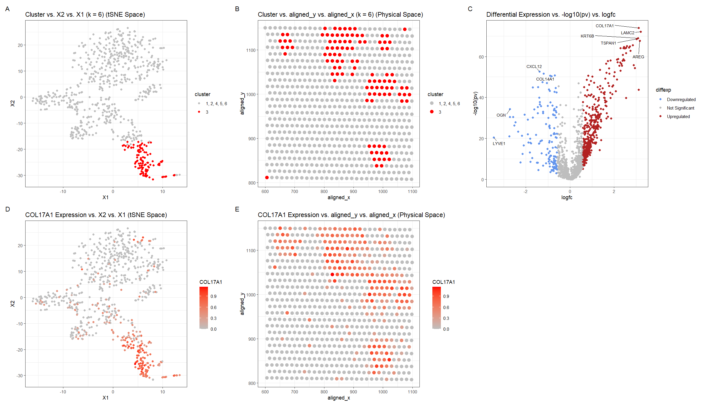
Locating a cell type in breast tissue using spatial transcriptomics data
Describe your figure briefly so we know what you are depicting (you no longer need to use precise data visualization terms as you have been...

Identifying Cell-type from Breast Cancer Tissue Spatial Transcriptomics Data using K-means Clustering, tSNE, and Wilcox-test
Describe your figure briefly so we know what you are depicting (you no longer need to use precise data visualization terms as you have been...

KRT8 Expression in Breast Cancer
In this visualization, I explore the expression of KRT8, a cancer related gene, in breast cancer tissue. In panel A and E, I use points...

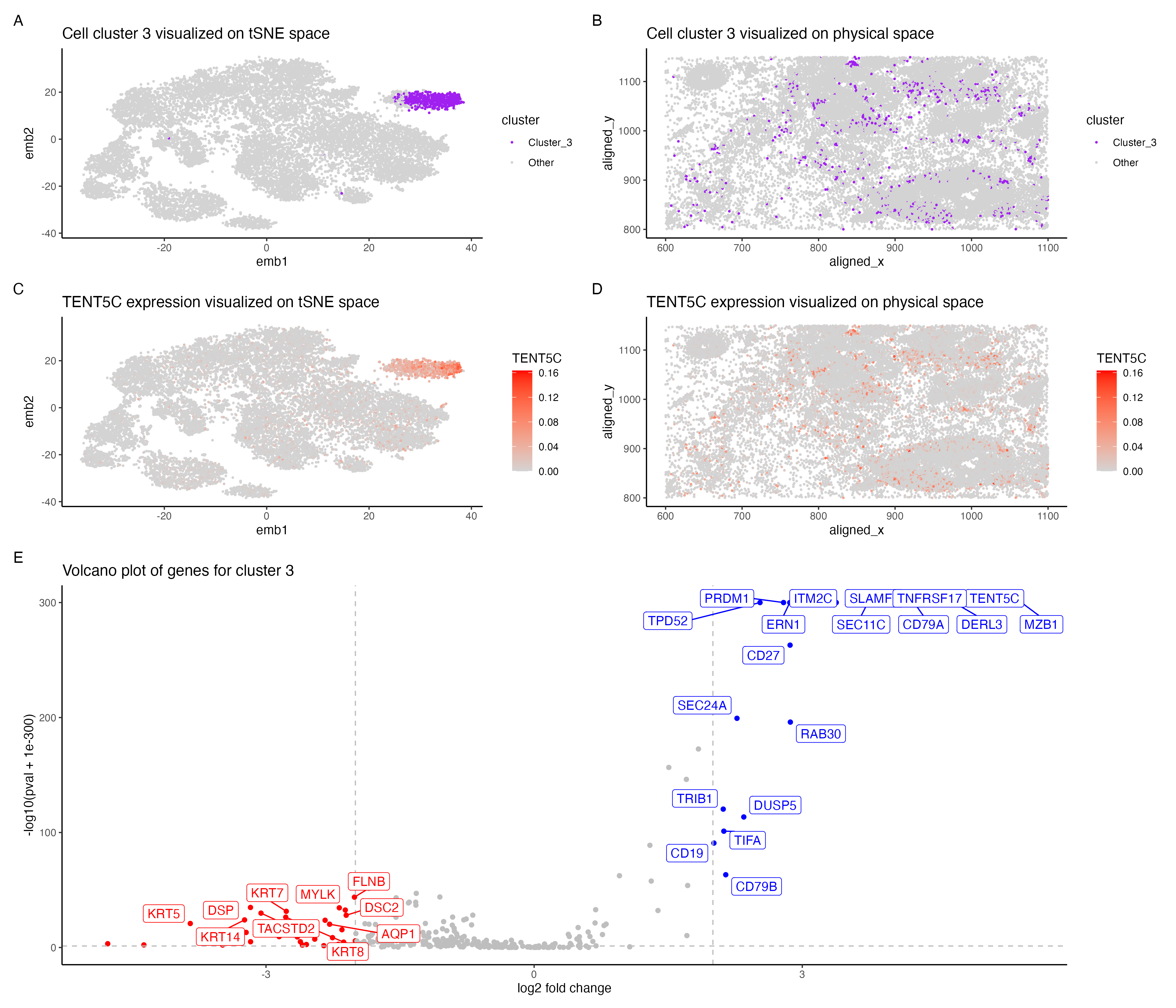
Cell type exploration using differential gene expression analyses
In the above visualization I have identified a cluster that belong to plasma cells or mature B cells. I started with normalizing the gene expression...

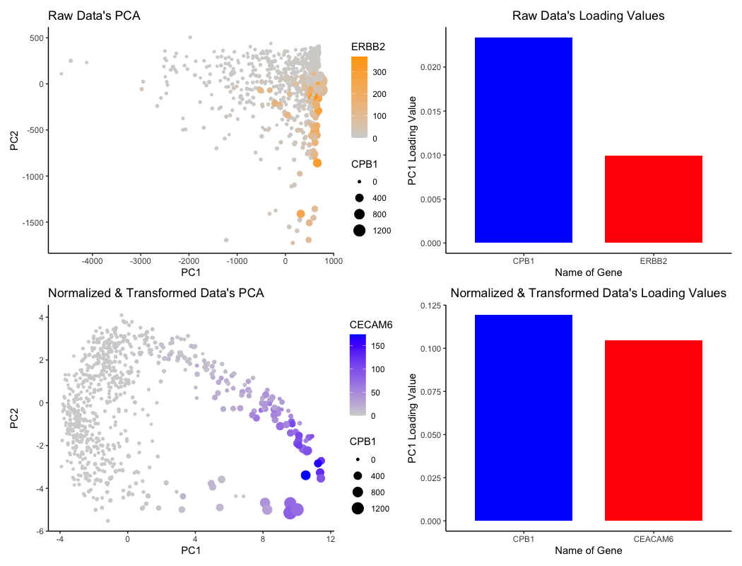
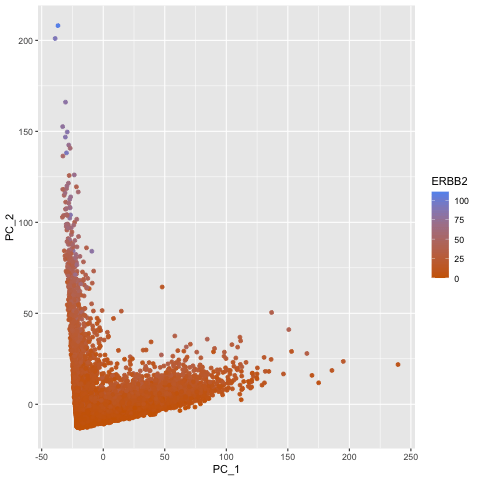
The Effects of Normalization & Transformation on Loading Values for PCA
What data types are you visualizing? For the graph titled “Raw Data’s PCA”, I am visualizing the (1) quantitative data of ERBB2 expression, (2) quantitative...

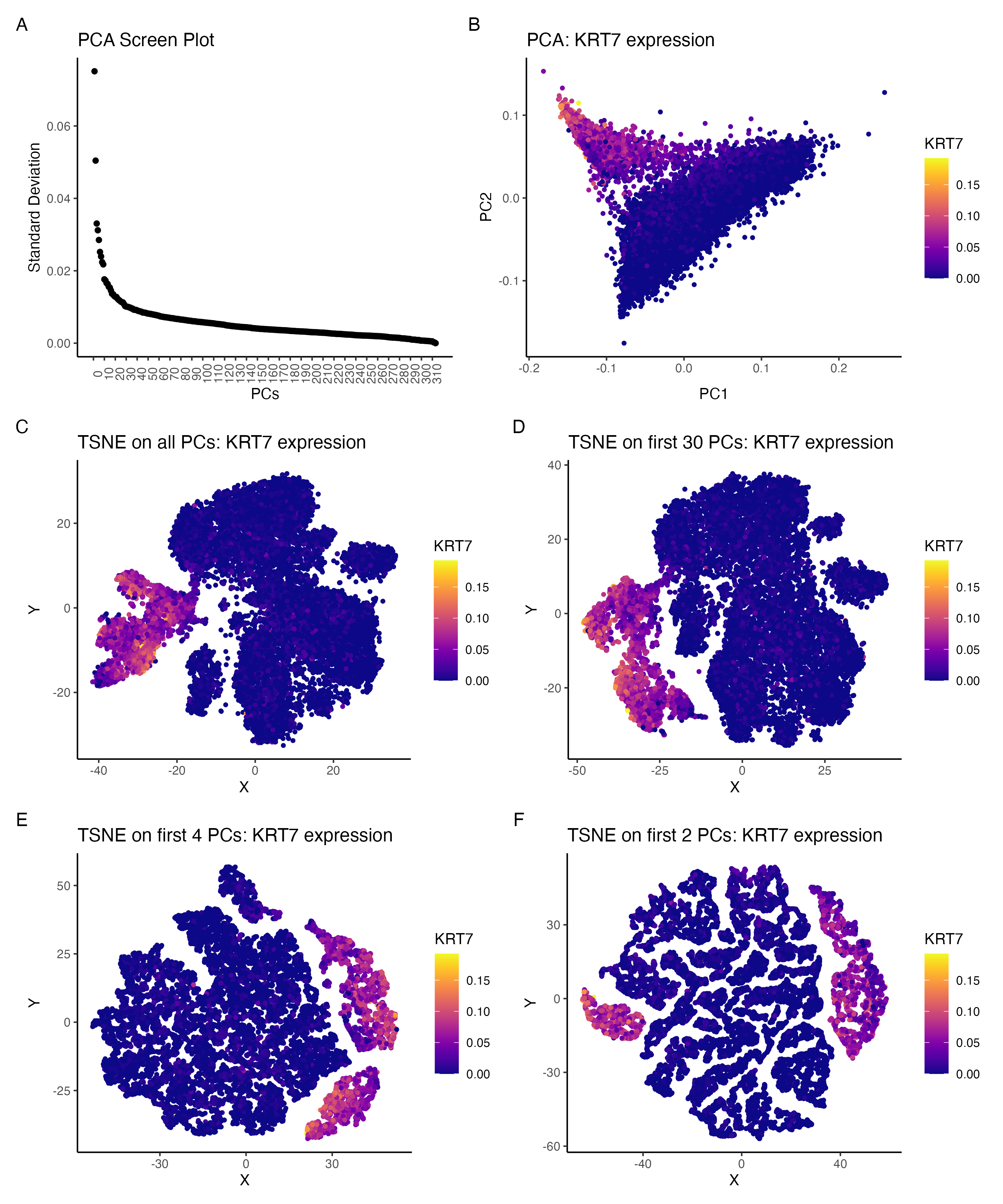
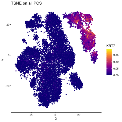
Comparing the effect of tSNE on varying number of PCs:KRT7 expression
I am visualizing the effect of performing non-linear dimensionality reduction (TSNE) on varying number of PCs. The gene expression was normalized (by total gene expression...
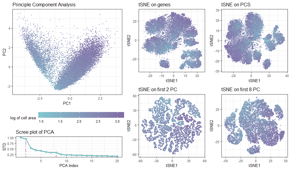
Effect of Introducing Principle Components on Non-linear Dimensionality Reduction
What data types are you visualizing? In the multi-panel plot, I am visualizing spatial and quantitative data with diffrerent projection approaches. The visualization contains spatial...

Comparison of Gene Influence on PC1 in Raw and Cell Area-Normalized Data
Write a description describing your data visualization using vocabulary terms from Lesson 1. What data types are you visualizing? What data encodings (geometric primitives and...
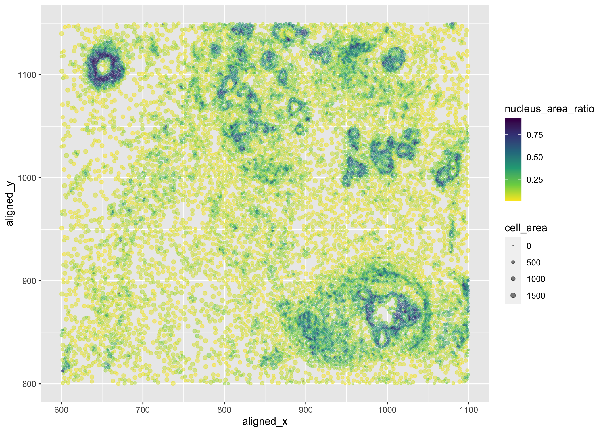
Centroid positions, cell and nucleus areas of each cell
What data types are you visualizing? I am visualizing quantitative data of the ratio of nucleus area to cell area for each cell, quantitative data...

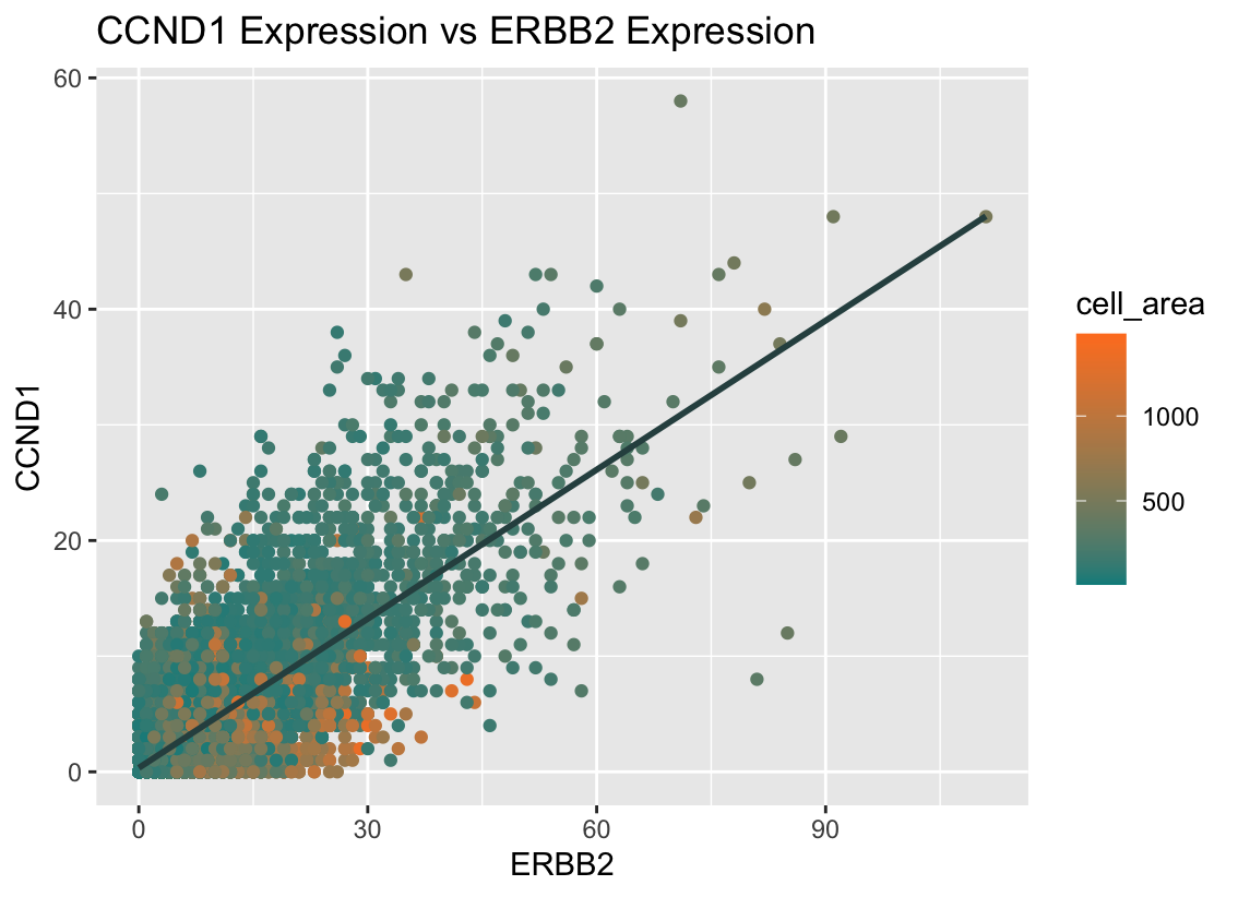
CCND1 Expression vs ERBB2 Expression
What data types are you visualizing? I am visualizing quantitative data for the expression counts of ERBB2 and CCND1, as well as the quantitative data...


Spatial Distribution of Gene Expression
What data types are you visualizing? I am visualizing quantitative data of the log-10-transformed expression level of the TP53 gene, quantitative data of the total...

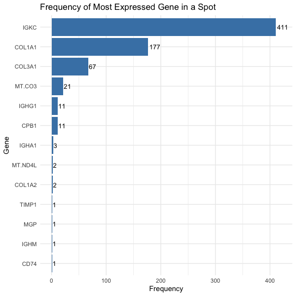
Frequency of Most Expressed Gene in a Spot
What data types are you visualizing? We are visualizing quantitative data, the number of spots in which the gene is most expressed, and categorical data,...

All Visualizations
Gganimate on HW3 of Varying PC's Influence on tSNEs
If I perform non-linear dimensionality reduction on PCs, what happens when I vary how many PCs should I use? If I perform non-linear dimensionality reduction on varying PCs the clustering...
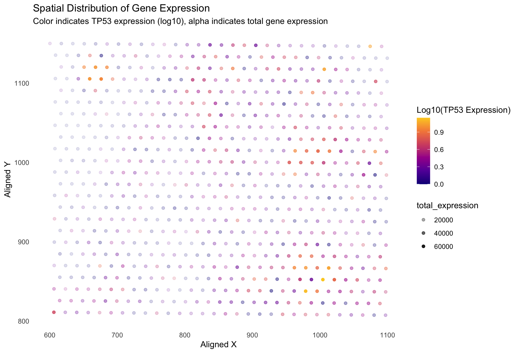
Spatial Distribution of Gene Expression
What data types are you visualizing? I am visualizing quantitative data of the log-10-transformed expression level of the TP53 gene, quantitative data of the total gene expression, and spatial data...
Using CRAWDAD on pikachu dataset
Apply SEraster, STalign, or CRAWDAD to a spatial omics dataset from the class I applied CRAWDAD to the pikachu dataset. After normalizing the dataset, I performed Kmeans clustering using the...

Comparison of Loading Values on PC1 in Raw and Log Transformed Data
Write a a brief description of your figure so we know what you are visualizing. You do not need to use the vocabulary terms from Lesson 1.
Analyzing Connectivity of Spleen CODEX dataset using CRAWDAD on K-means Clusters
What data types are you visualizing?
Dimensionality Reduction using GGanimate
Description of figure In the gif, I visualized the pca (linear) dimensionality reduction in 2D space which transitions into the tSNE (nonlinear) dimensionality reduciton in 2D space. The axes for...

Comparing the effect of tSNE on varying number of PCs:KRT7 expression (using gganimate)
If I perform non-linear dimensionality reduction on PCs, what happens when I vary how many PCs should I use?
gganimate: Visualizing IGKC in tSNE Space with Non-linear Dimensionality Reduction on Varying Numbers of PCs
What data types are you visualizing? For the plots on the left side of the animation, I am visualizing the quantitative data of the X1 and X2 tSNE embedding values,...
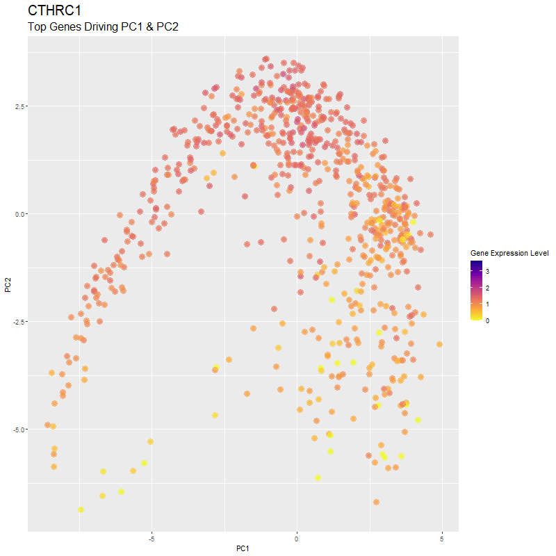
Visualizing Top Genes Driving Reduced Dimensionality Components
What are you visualizing? What genes are driving my reduced dimensionality components? I used gganimate to visualize the gene expression levels of genes that are driving the principal components (PC1...

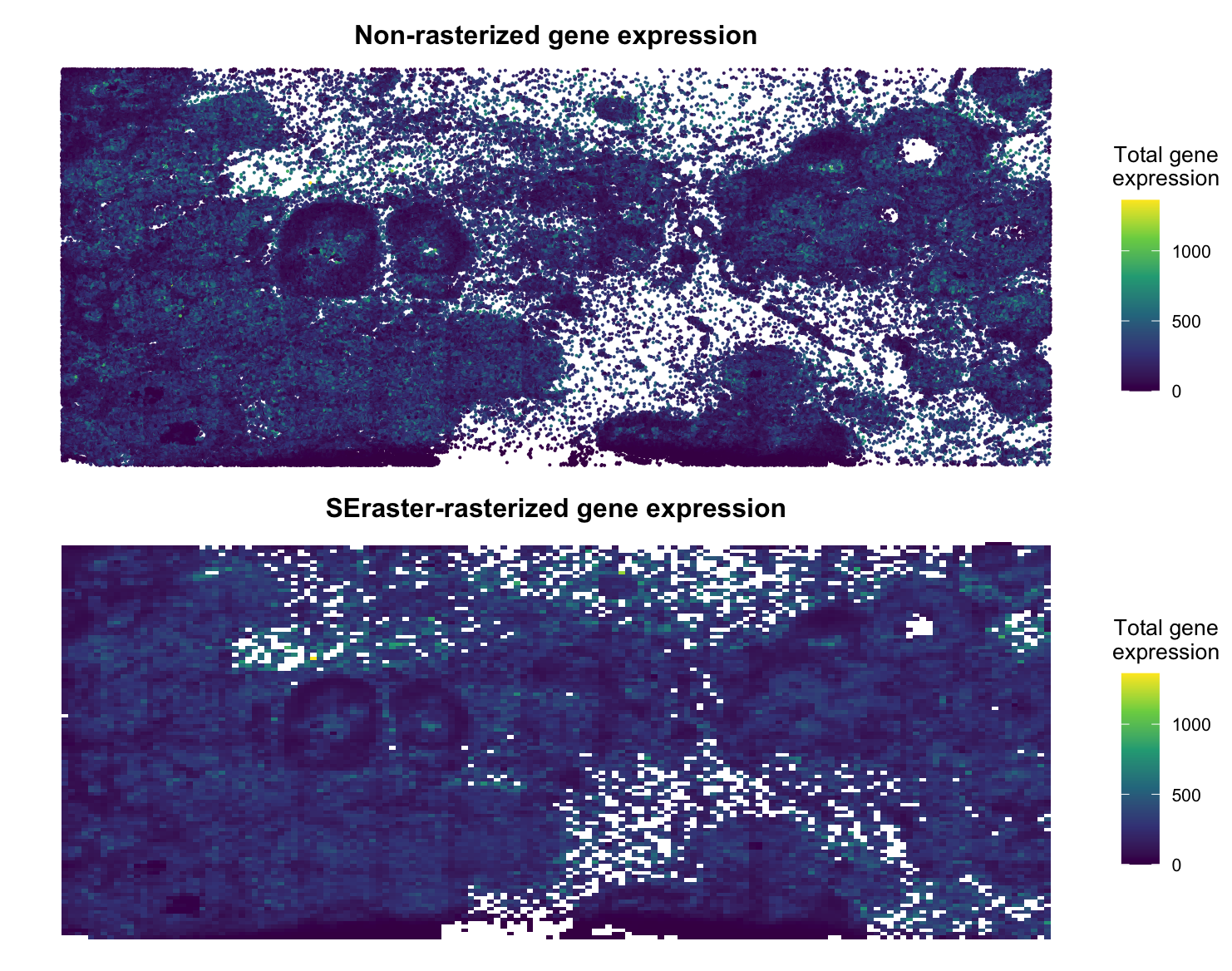
Using SEraster on Xenium Breast Cancer Data
Brief Description I decided to utilize SEraster on a Xenium breast cancer dataset (https://www.10xgenomics.com/products/xenium-in-situ/preview-dataset-human-breast) to rasterize gene expression. Plotted below is the non-rasterized gene expression compared to the rasterized gene...