Exploring the Relationship Between Gene Expression and Physical Space Using PCA in Spatial Transcriptomics

1. What data types are you visualizing?
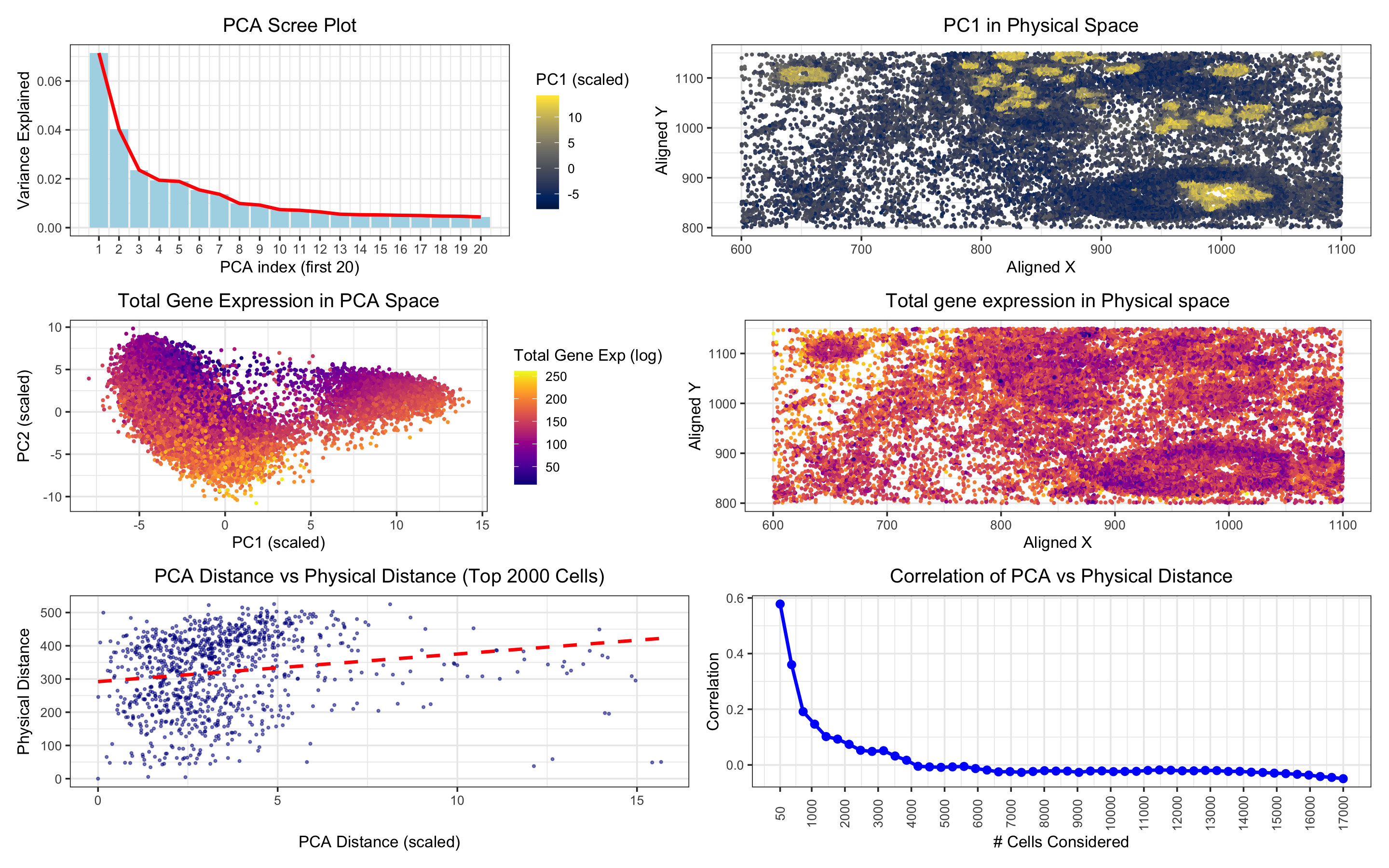
In “PCA Scree Plot,” the data type visualized is quantitative (the variance explained by each principal component, a continuous numerical value).
In “PC1 in Physical Space,” the data types visualized are spatial (the spatial coordinates of cells, aligned_x, aligned_y) and quantitative (gene expression, represented by PC1 as a continuous numerical value).
In “Total Gene Expression in PCA Space,” the data types visualized are quantitative (total gene expression, represented by totalgene as a continuous numerical value) and spatial (PCA coordinates, PC1 and PC2, representing the cells in a reduced-dimensionality space).
In “Total Gene Expression in Physical Space,” the data types visualized are spatial (the spatial coordinates of cells, aligned_x, aligned_y) and quantitative (total gene expression, represented by totalgene).
In “PCA Distance vs Physical Distance,” the data types visualized are quantitative (PCA distance, calculated between cells based on PCA projections, and physical distance, calculated based on spatial coordinates).
In “Correlation of PCA vs Physical Distance” the data type visualized is quantitative (the correlation between PCA distance and physical distance for varying numbers of top cells).
2. What data encodings (geometric primitives and visual channels) are you using to visualize these data types?
In “PCA Scree Plot,” the geometric primitive is thick lines representing the variance explained by each principal component. The visual channels include position (the x-axis for principal components and the y-axis for the variance explained) and color (thick lines filled with light blue, and the trend line representing cumulative variance in red).
In “PC1 in Physical Space,” the geometric primitive used is points representing individual cells. The visual channels include position (cells positioned according to their spatial coordinates, aligned_x, aligned_y) and color (color of points mapped to PC1, using the viridis color scale).
In “Total Gene Expression in PCA Space,” the geometric primitive is points representing individual cells in PCA space. The visual channels include position (cells are positioned based on the values of PC1 and PC2) and color (points are colored based on totalgene, using the viridis color scale).
In “Total Gene Expression in Physical Space,” the geometric primitive is points representing individual cells. The visual channels include position (cells are positioned based on spatial coordinates, aligned_x, aligned_y) and color (points are colored based on totalgene, using the viridis color scale).
In “PCA Distance vs Physical Distance,” the geometric primitive used is points representing the calculated distances between cells in both PCA and physical space. The visual channels include position (PCA distance on the x-axis and physical distance on the y-axis), color (points colored in dark blue with alpha for transparency, so overlaps can be observed), and shape (a dash line added to show the trend between the two distances).
In “Correlation of PCA vs Physical Distance,” the geometric primitive used is points and lines representing the correlation values across different subsets of top cells. The visual channels include position (x-axis for the number of cells and y-axis for the correlation value), color (points and lines in blue), and size (point size is adjusted for visibility).
3. What about the data are you trying to make salient through this data visualization?
In the “PCA Scree Plot,” the visualization highlights the proportion of variance explained by each principal component, focusing on the first 20 components. This allows me to assess how much of the variability in gene expression data is captured by the initial components and aids in decisions regarding dimensionality reduction. The significance of PC1 is emphasized, providing insights for further analysis of gene expression patterns using just this first principal component.
In “PC1 in Physical Space,” the goal is to visualize the spatial distribution of the first principal component (PC1), which captures the largest variance in gene expression. This plot helps me understand whether cells with similar gene expression profiles are spatially clustered together within the tissue. The color distribution appears random, suggesting no clear spatial correlation with PC1. This randomness is also evident when examining “Total Gene Expression in Physical Space,” where the spatial distribution of gene expression shows no distinct pattern, contrasting with the “Total Gene Expression in PCA Space” plot. In this PCA space plot, a clear clustering of cells by color indicates a transcriptional similarity among cells within certain regions of the PCA space.
The “PCA Distance vs Physical Distance” plot explores whether cells that are transcriptionally similar in PCA space are also physically close to one another. Despite the linear fit line, the distribution of points suggests no strong linear relationship between PCA and physical distances. Lastly, “Correlation of PCA vs Physical Distance” examines the correlation between transcriptional similarity (PCA distance) and spatial proximity (physical distance) by calculating distances for each cell relative to a reference cell. The plot reveals that the correlation remains low even with a small number of cells and becomes negative as the number of cells increases, further suggesting that transcriptional similarity does not directly align with spatial proximity.
4. What Gestalt principles or knowledge about perceptiveness of visual encodings are you using to accomplish this?
In the “PCA Scree Plot,” the key Gestalt principle is continuity. By displaying the variance explained by each principal component and connecting the bars with a line, it creates a continuous representation of how the variance is distributed across the components. This visual structure allows the viewer to easily follow the pattern of explained variance and observe the significance of early principal components.
In “PC1 in Physical Space” and “Total Gene Expression in Physical Space,” the principle of proximity is used. The cells that are geographically close to each other in the tissue are placed near each other on the plot, helping to convey spatial relationships. However, since there is no clear clustering of color (PC1 and total gene expression values), the proximity of cells does not correspond to their gene expression similarity, suggesting that spatial organization does not necessarily align with transcriptional similarity.
For “Total Gene Expression in PCA Space,” both similarity and proximity are used. The coloring of points according to total gene expression makes use of the principle of similarity—cells with similar expression profiles appear similar in color. Additionally, cells that are close in PCA space (i.e., those with similar gene expression) are visually grouped together using proximity, making it easier to show how gene expression correlates with transcriptional similarity.
In the “Correlation of PCA vs Physical Distance” plot, continuity is applied to represent the smooth trend of correlation as cell count increases. The line reflects how correlation shifts from positive to negative, with the continuous trend line illustrating how the relationship evolves with more data points.
5. Code (paste your code in between the ``` symbols)
1
2
3
4
5
6
7
8
9
10
11
12
13
14
15
16
17
18
19
20
21
22
23
24
25
26
27
28
29
30
31
32
33
34
35
36
37
38
39
40
41
42
43
44
45
46
47
48
49
50
51
52
53
54
55
56
57
58
59
60
61
62
63
64
65
66
67
68
69
70
71
72
73
74
75
76
77
78
79
80
81
82
83
84
85
86
87
88
89
90
91
92
93
94
95
96
97
98
99
100
101
102
103
104
105
106
107
108
109
110
111
112
113
114
115
116
117
118
119
120
121
122
123
124
125
126
127
# Load necessary libraries
library(ggplot2)
library(viridis)
library(patchwork)
library(scales)

# set plot theme
plot_theme <- theme_bw() +
  theme(text = element_text(size = 10), legend.key.size = unit(0.5, 'cm'))

# Load the data
data <- read.csv('~/Desktop/genomic_data_visualization/genomic-data-visualization-2025/data/pikachu.csv.gz')

# Extract physical coordinates and gene expression data
pos <- data[, 5:6]
gexp <- data[, 7:ncol(data)]

# Normalize and log-transform the gene expression data
norm <- gexp / rowSums(gexp) * 10000
lognorm <- log10(norm + 1)

# Perform PCA on the normalized gene expression data
pcs <- prcomp(lognorm, center = TRUE, scale. = TRUE)

# Create a dataframe for PCA results, spatial coordinates, and total gene expression
df <- data.frame(pcs$x)
df$aligned_x <- pos$aligned_x
df$aligned_y <- pos$aligned_y
df$totalgene <- rowSums(lognorm)

# Plot 1: PC1 in physical space
p1 <- ggplot(df, aes(x = aligned_x, y = aligned_y, col = PC1)) +
  geom_point(size = 0.5) +
  scale_color_viridis(option = 'cividis') +
  plot_theme +
  labs(title = 'PC1 in Physical Space', x = 'Aligned X',
       y = 'Aligned Y', col = 'PC1 (scaled)') +
  theme(legend.position = 'left') +
  theme(plot.title = element_text(hjust = 0.5))

# Plot 2: PCA Scree Plot
variance_explained <- pcs$sdev^2 / sum(pcs$sdev^2)
scree_df <- data.frame(PC = 1:length(variance_explained), Variance = variance_explained)
p2 <- ggplot(scree_df[1:20, ], aes(x = PC, y = Variance)) +
  geom_bar(stat = "identity", fill = "lightblue") +
  geom_line(color = "red", size = 1) +
  plot_theme +
  labs(title = "PCA Scree Plot", x = "PCA index (first 20)", y = "Variance Explained") +
  scale_x_continuous(breaks = 1:20) +
  theme(legend.position = "none") +
  theme(plot.title = element_text(hjust = 0.5))

# Plot 3: Total gene expression in PCA space
p3 <- ggplot(df, aes(x = PC1, y = PC2, col = totalgene)) +
  geom_point(size = 0.5) +
  scale_color_viridis(option = 'plasma') +
  plot_theme +
  labs(title = "Total Gene Expression in PCA Space", x = "PC1 (scaled)",
       y = "PC2 (scaled)", col = "Total Gene Exp (log)") +
  theme(legend.position = "none") +
  theme(plot.title = element_text(hjust = 0.5))

# Plot 4: Total gene expression in physical space
p4 <- ggplot(df, aes(x = aligned_x, y = aligned_y, col = totalgene)) +
  geom_point(size = 0.5) +
  scale_color_viridis(option = 'plasma') +
  plot_theme +
  labs(title = "Total gene expression in Physical space", x = "Aligned X",
       y = "Aligned Y", col = "Total Gene Exp (log)") +
  theme(legend.position = 'left') +
  theme(plot.title = element_text(hjust = 0.5))

# Plot 5: PCA distance vs Physical distance (Top 2000 cells)
top_cells <- df[order(df$totalgene, decreasing = TRUE)[1:2000], ]
first_cell_pca <- top_cells[1, c("PC1", "PC2")]
first_cell_pos <- top_cells[1, c("aligned_x", "aligned_y")]
top_cells$pca_distance <- sqrt((top_cells$PC1 - first_cell_pca$PC1)^2 +
                                 (top_cells$PC2 - first_cell_pca$PC2)^2)
top_cells$physical_distance <- sqrt((top_cells$aligned_x - first_cell_pos$aligned_x)^2 +
                                      (top_cells$aligned_y - first_cell_pos$aligned_y)^2)
correlation <- cor(top_cells$pca_distance, top_cells$physical_distance)

p5 <- ggplot(top_cells, aes(x = pca_distance, y = physical_distance)) +
  geom_point(size = 0.5, color = "darkblue", alpha = 0.5) +
  plot_theme +
  labs(title = "PCA Distance vs Physical Distance (Top 2000 Cells)",
       x = "PCA Distance (scaled)",
       y = "Physical Distance") +
  theme(legend.position = "none") +
  geom_smooth(method = "lm", se = FALSE, color = "red", linetype = "dashed") +
  theme(plot.title = element_text(hjust = 0.5, vjust = 1))

# Plot 6: Correlation of PCA vs Physical Distance
cell_counts <- seq(50, 17000, length.out = 50)
correlations <- sapply(cell_counts, function(n) {
  subset <- df[order(df$totalgene, decreasing = TRUE)[1:n], ]
  subset_pca_dist <- sqrt((subset$PC1 - subset$PC1[1])^2 + (subset$PC2 - subset$PC2[1])^2)
  subset_phys_dist <- sqrt((subset$aligned_x - subset$aligned_x[1])^2 +
                             (subset$aligned_y - subset$aligned_y[1])^2)
  cor(subset_pca_dist, subset_phys_dist)
})

cor_df <- data.frame(CellCount = cell_counts, Correlation = correlations)

p6 <- ggplot(cor_df, aes(x = CellCount, y = Correlation)) +
  geom_point(size = 2, color = "blue") +
  geom_line(size = 1, color = "blue") +
  plot_theme +
  labs(title = "Correlation of PCA vs Physical Distance",
       x = "# Cells Considered",
       y = "Correlation") +
  scale_x_continuous(breaks = c(50, seq(1000, 17000, by = 1000)),
                     labels = c(50, seq(1000, 17000, by = 1000))) +
  theme(plot.title = element_text(hjust = 0.5),
        axis.text.x = element_text(angle = 90, vjust = 0.5))

# Combine the plots using patchwork with adjusted widths
(p2 + p1 + plot_layout(widths = c(2, 3))) /
  (p3 + p4 + plot_layout(widths = c(2, 3))) /
  (p5 + p6 + plot_layout(widths = c(1, 1)))

## References
# https://r4ds.hadley.nz/data-visualize
# https://cran.r-project.org/web/packages/viridis/vignettes/intro-to-viridis.html
# https://www.r-bloggers.com/2021/05/principal-component-analysis-pca-in-r/
# https://patchwork.data-imaginist.com/
# https://scales.r-lib.org/