Relationship between gene features and PC1 loading

1. What data types are you visualizing?
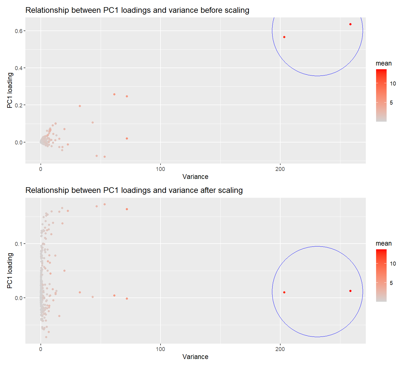
I am visualizing the quantitative data of PC1 loading from each gene, the quantitative data of variance of gene expressions of each gene, and the quantitative data of mean of gene expressions of each gene.
2. What data encodings (geometric primitives and visual channels) are you using to visualize these data types?
I am using the geometric primitive of points to represent each gene. To encode the loading on PC1, I am using the visual channel of position along the y axis. To encode variance of each gene, I am using the visual channel of position along the x axis. To encode the mean for each gene, I am using the visual channel of saturation going from an unsaturated lightgrey to a saturated red.
3. What about the data are you trying to make salient through this data visualization?
My data visualization seeks to make more salient the observation that… Genes with higher variance in their expression has higher loading in PC1, close to 0.6. Similarly genes with higher mean in their expression has higher loading in PC1. This shows that genes with high variances and means have a high contribution to PC1, or more generally, the PCA loading. However, after scaling, with variables scaled to have unit variance, the PC1 loading of the 2 genes with the high variances dropped to close to 0. The PC1 is no longer dominated by these 2 genes, but instead, some genes with lower variances now exhibit higher PC1 loading. This demonstrates that scaling removes the dependence of PC1 on extreme variance, making the PCA representation more balanced.
4. What Gestalt principles or knowledge about perceptiveness of visual encodings are you using to accomplish this?
a. I am using the principle of Enclosure by circling the 2 genes with super high variance and mean on both graphs before and after scaling. The difference in the y-position of the circle in these 2 graphs shows that scaling removes the skewing / dependence of PC1 on these 2 genes with high variances. b. I am also using the principle of Similarity as genes with similar expression mean has similar hue. c. I am also using the principle of Proximity as genes with similar variances and PC1 loading are near to one another.
5. Code (paste your code in between the ``` symbols)
1
2
3
4
5
6
7
8
9
10
11
12
13
14
15
16
17
18
19
20
21
22
23
24
25
26
27
28
29
30
31
32
33
34
35
36
37
38
39
40
41
42
43
44
45
46
47
48
49
50
51
52
53
54
55
56
57
58
59
60
61
62
63
64
65
66
67
68
69
70
71
72
73
74
75
76
77
78
79
80
81
82
83
84
85
86
87
88
89
90
91
92
93
94
95
file <- "data/pikachu.csv.gz"
data<- read.csv(file)
library(ggplot2)

rownames(pos)<- data$cell_id
gexp<-data[,7:ncol(data)]
rownames(gexp)<- data$id
pos<-data[,5:6]

## pca before scaling
pcs<- prcomp(gexp)

## exploring pca
names(pcs)
pcs$sdev
pcs$rotation[1:5,1:5]
?prcomp

## Focus on genes: How do the gene loadings on the first PC relate to
## features of the genes such as its mean or variance?

## mean of each gene
allmeans <- sapply(gexp[,1:ncol(gexp)], function(i) {
  mean(i)
})

## variance of each gene
allvars <- sapply(gexp[,1:ncol(gexp)], function(i){
  var(i)
})

## visualizing the plot before scaling
df<- data.frame(mean=allmeans,var=allvars,loading=pcs$rotation, index=1:length(pcs$sdev))
ggplot(df, aes(x=var, y=loading.PC1, col=mean))+geom_point()+
  scale_color_gradient(low = 'lightgrey', high='red')+
  labs(title = "Relationship between PC1 loadings and variance before scaling",
       x= 'Variance',
       y='PC1 loading')

## Finding the center of a circle around the 2 outlier genes with high variances before scaling
var_center<- sum( sort(df$var,decreasing=TRUE)[1:2] )/2
PC1_center<- sum( sort(df$loading.PC1,decreasing=TRUE)[1:2] )/2

## Plot before scaling
p1<-ggplot(df, aes(x=var, y=loading.PC1, col=mean))+geom_point()+
  scale_color_gradient(low = 'lightgrey', high='red')+
  labs(title = "Relationship between PC1 loadings and variance before scaling",
       x= 'Variance',
       y='PC1 loading') +
  geom_point(data = df, aes(x = var_center, y = PC1_center), shape = 1, size = 70, color = "blue")  # Hollow circles for outliers


## pca after scaling
s_pcs<- prcomp(gexp, scale=TRUE)

## visualizing plot after scaling
s_df<- data.frame(mean=allmeans,var=allvars,loading=s_pcs$rotation)
ggplot(s_df, aes(x=var, y=loading.PC1, col=mean))+geom_point()+
  scale_color_gradient(low = 'lightgrey', high='red')+
  labs(title = "Relationship between PC1 loadings and variance after scaling",
       x= 'Variance',
       y='PC1 loading')

## Finding the center of a circle around the 2 outlier genes with high variances after scaling
# find the 2 genes with the highest variances
highest_var<- names(sort(allvars,decreasing=TRUE)[1:2] )

# extract respective PC1 loadings
h1_loading <- s_pcs$rotation[highest_var, "PC1"][1]
h2_loading <- s_pcs$rotation[highest_var, "PC1"][2]

## Finding the center of a circle around the 2 outlier genes with high variances before scaling
s_PC1_center<- sum( h1_loading,h2_loading)/2

## Plot after scaling
p2<- ggplot(s_df, aes(x = var, y = loading.PC1, col = mean)) +
  geom_point() +
  scale_color_gradient(low = 'lightgrey', high = 'red') +
  labs(title = "Relationship between PC1 loadings and variance after scaling",
       x = 'Variance',
       y = 'PC1 loading')+
  geom_point(aes(x = var_center, y = s_PC1_center), shape = 1, size = 70, color = "blue")  # Hollow circles for outliers

p2

library(patchwork)


## Combine plots with patchwork
p1 / p2