Relationship Between Gene Expression in Cells vs. their Physical Position

1. What data types are you visualizing?
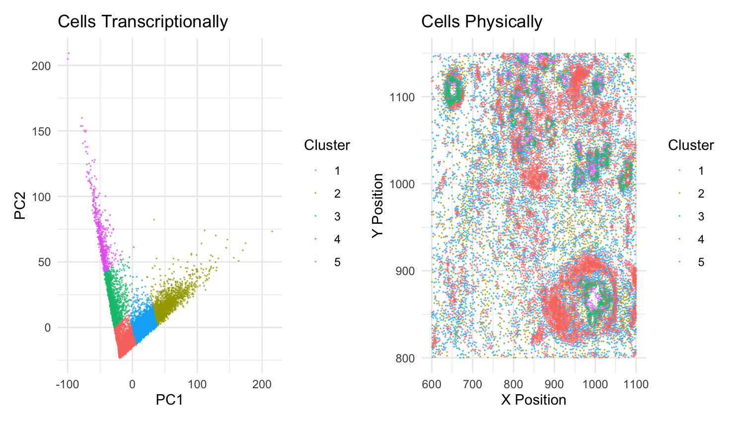
I am visualizing quantitative data of the X and Y position of the cells. I am also visualizing quantitative data of the gene expression of all the genes in the Pikachu imaging dataset. The expression has been reduced to two dimensions, by PCA.
2. What data encodings (geometric primitives and visual channels) are you using to visualize these data types?
I am using the geometric primitive of points to represent cells in both graphs. I am using the visual channel of color (code provided by ChatGPT) to represent the different cell clusters. This is to reconcile which cells express similar gene expression (shown in the left graph) to their position in the sample (shown in the right graph). I am also using the visual channel of position to indicate where the cells physically are in the sample in the graph on the right. The graph on the left uses position to show cells that express similar gene expression clustered near each other.
3. What about the data are you trying to make salient through this data visualization?
My data visualization seeks to make more salient the relationship between gene expression in cells versus physical space in cells. Specifically, it aims to make clear if cells that have similar gene expression are also located near each other. Looking at the graph, we can see that the cells in the green and red clusters are relatively near each other but the blue and yellow are spatially dispersed.
4. What Gestalt principles or knowledge about perceptiveness of visual encodings are you using to accomplish this?
I am using the similarity Gestalt principle. Since the cells that are transcriptionally similar are the same color, it is easy for the viewer to know that they are similar.
5. Code (paste your code in between the ``` symbols)
1
2
3
4
5
6
7
8
9
10
11
12
13
14
15
16
17
18
19
20
21
22
23
24
25
26
27
28
29
30
31
32
33
34
35
36
37
38
39
40
41
42
43
44
45
46
47
48
file <- '/Users/anishkabhartiya/Desktop/genomic-data-visualization-2025/data/pikachu.csv.gz'
data <- read.csv(file)
data[1:5, 1:10]

area <- data[, 3:4]
pos <- data[, 5:6]
rownames(pos) <- data$barcode
head(pos)
gexp <- data[, 7:ncol(data)]
rownames(gexp) <- data$barcode
gexp[1:5,1:5]
dim(gexp)

norm <- gexp / log10(data$cell_area+1) * 3
norm[1:5, 1:5]

pcs <- prcomp(norm)

set.seed(1)
clusters <- kmeans(pca_df[,1:2], centers = 5)$cluster

pca_df <- data.frame(
  PC1 = pcs$x[,1],
  PC2 = pcs$x[,2],
  X = data$aligned_x,
  Y = data$aligned_y,
)

pca_df$Cluster <- as.factor(clusters)

library(ggplot2)
library(patchwork)

g1 <- ggplot(pca_df, aes(x = PC1, y = PC2, color = Cluster)) +
  geom_point(alpha = 0.6, size=0.01) +
  labs(title = "Cells Transcriptionally",
       x = "PC1",
       y = "PC2") +
  theme_minimal()

g2 <- ggplot(pca_df, aes(x = X, y = Y, color = Cluster)) +
  geom_point(alpha = 0.6, size=0.01) +
  labs(title = "Cells Physically",
       x = "X Position",
       y = "Y Position") +
  theme_minimal()

print(g1 + g2)